Surveying the May 2021 Sell-off
After one of the most dramatic sell-offs in Bitcoin history, the conviction of investors has been put to the test, and we assess the markets response on-chain.


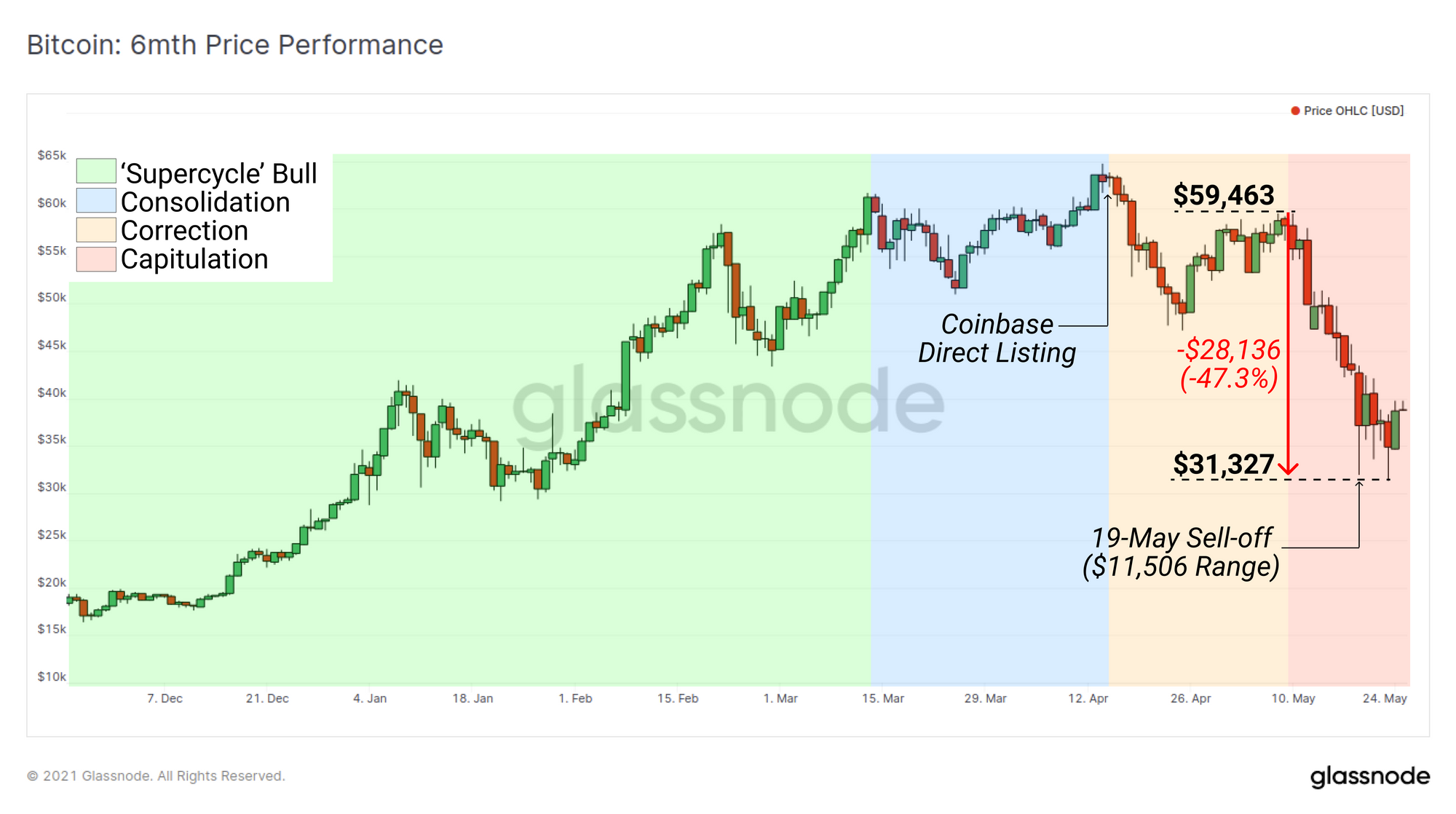
On 19 May 2021, Bitcoin market experienced one of the most significant liquidity events and price draw-downs since Black Thursday in March 2020. This capitulation event followed a multi-month long consolidation above $50k, and was initiated after the market failed to sustain new highs in response to the much anticipated Coinbase direct listing.
The worst of the sell-off on 19 May printed the largest daily candle in Bitcoin history with an intra-day price range of $11,506. Bitcoins price fell a total of 47.3% since 9-May.
Such dramatic downside price action took a large cross section of the market by surprise, especially as this event occurred during Bitcoins most widely observed bull market in history. As such, it has many wondering if the bull market has been cut short, and whether Bitcoin has returned to longer term bear market structure.
In this piece we investigate the metrics which describe the market structure both leading into the sell-off, as well as an assessment of the bull and bear cases moving forwards. This piece will explore:
- Metrics that suggested early warning of slowing institutional demand and distribution in on-chain spending patterns.
- Analysis of the flow of coins to/from exchanges and the demand for exit liquidity (or dry powder) in stablecoins.
- Comparisons to previous cycles, sell-offs, and holder behaviour to identify whether a macro bull or bear bias is more appropriate moving forwards.
This piece is a companion piece to The Week On-chain (Week 21) newsletter which goes into detail regarding the magnitude of the sell off, the markets response, and realised profit and loss during the event.
Changes in Institutional Demand
As the Bitcoin market grows in valuation and matures, it both attracts, and requires larger pools of capital and volume to sustain and reach new highs. A principle driver of this bull cycle momentum was undoubtedly institutional inflows, largely in response to the extraordinary monetary and fiscal response to the COVID pandemic.
The largest investment vehicle available for traditional investors is the Grayscale GBTC Trust product. For much of 2020 and early 2021, investors took advantage of strong institutional demand via in-kind arbitrage of the persistent GBTC price premium. This served a dual purpose as it removed BTC coins from liquid circulation, creating a self-reinforcing supply squeeze that fuelled growing institutional demand.
Through Jan 2021, the GBTC trust saw inflows of almost +50k BTC whilst GBTC traded at a consistent premium between 10% and 20% to spot. Arbitrage began to drive the premium below 10% in late January, and BTC inflows began to slow dramatically in response. In late February, inflows stopped completely, and GBT started trading at a perpetually worsening discount to spot pricing.
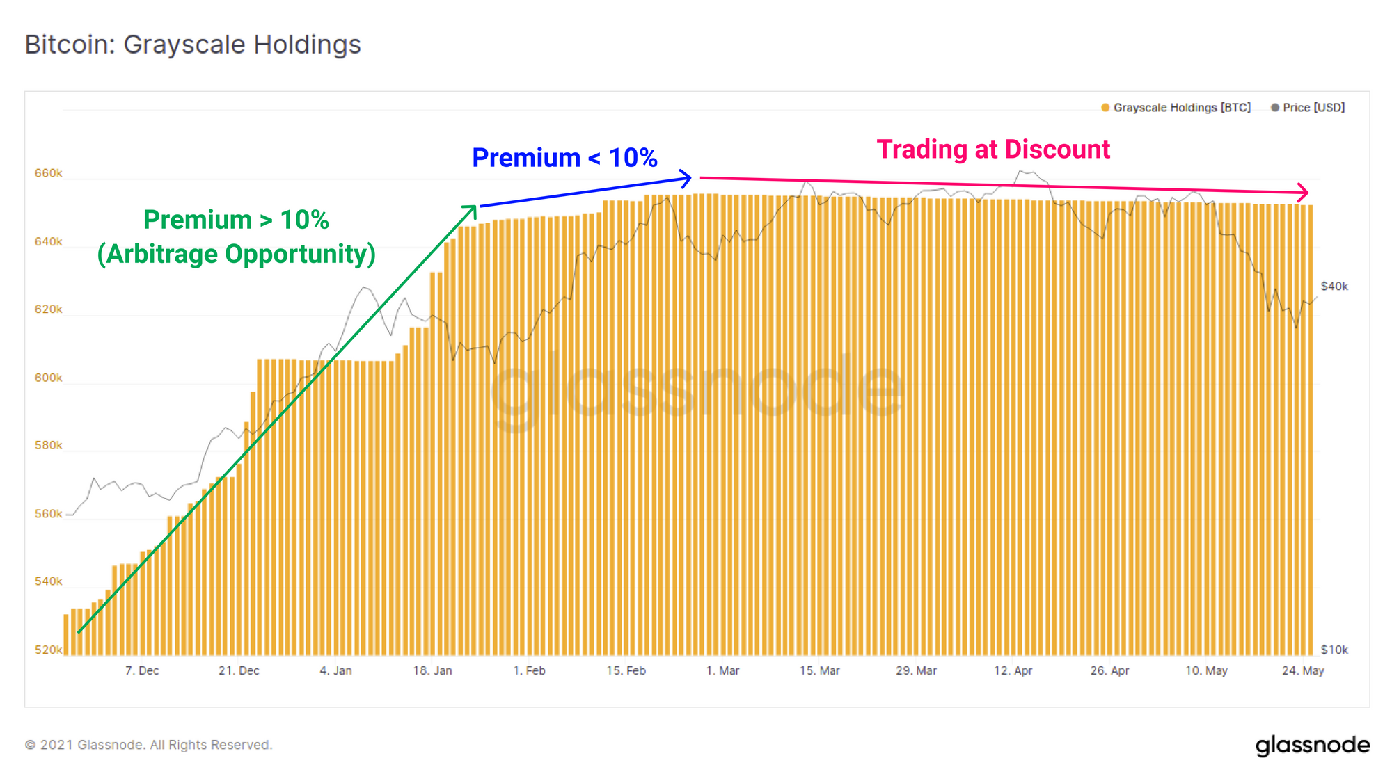
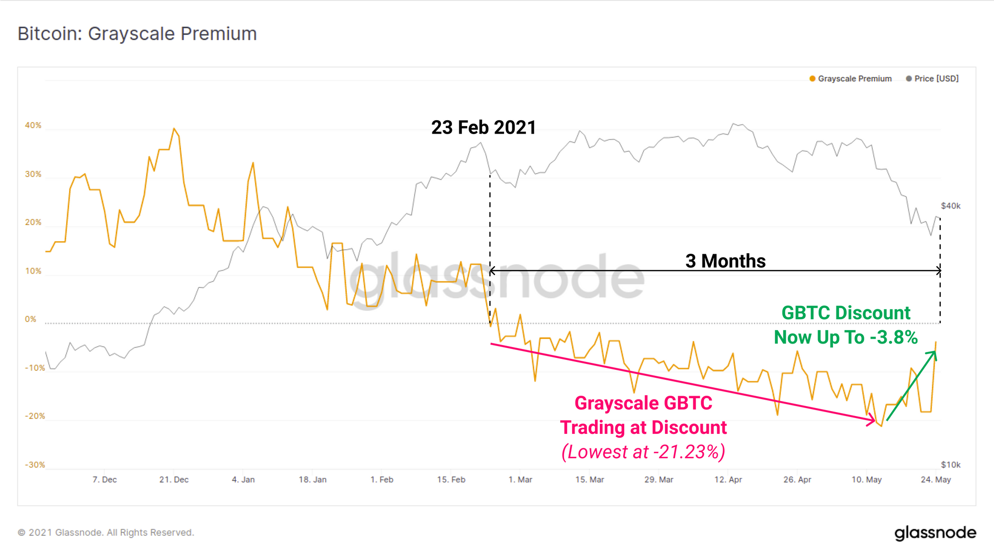
The GBTC price has now traded at a discount for over 3-months, reaching a peak low of 21.23% on May 13. The presence of a GBTC discount both eliminates the enormous supply sink, and also provided advance warning that institutional demand had softened considerably since late February.
As the recent sell-off played out however, the GBTC discount has started to close, reaching -3.8%. This suggests that institutional interest, or at the very arbitrage trader conviction, has risen as Bitcoin spot prices have fallen.
Telling a similar story, the Canadian Purpose Bitcoin ETF received consistent capital inflows through to late April and early May. After this, outflows began to dominate as the market began showing signs of weakness. However, similar to GBTC, demand flows appear to be recovering meaningfully in following the price correction with inflows back on the rise as of late-May.
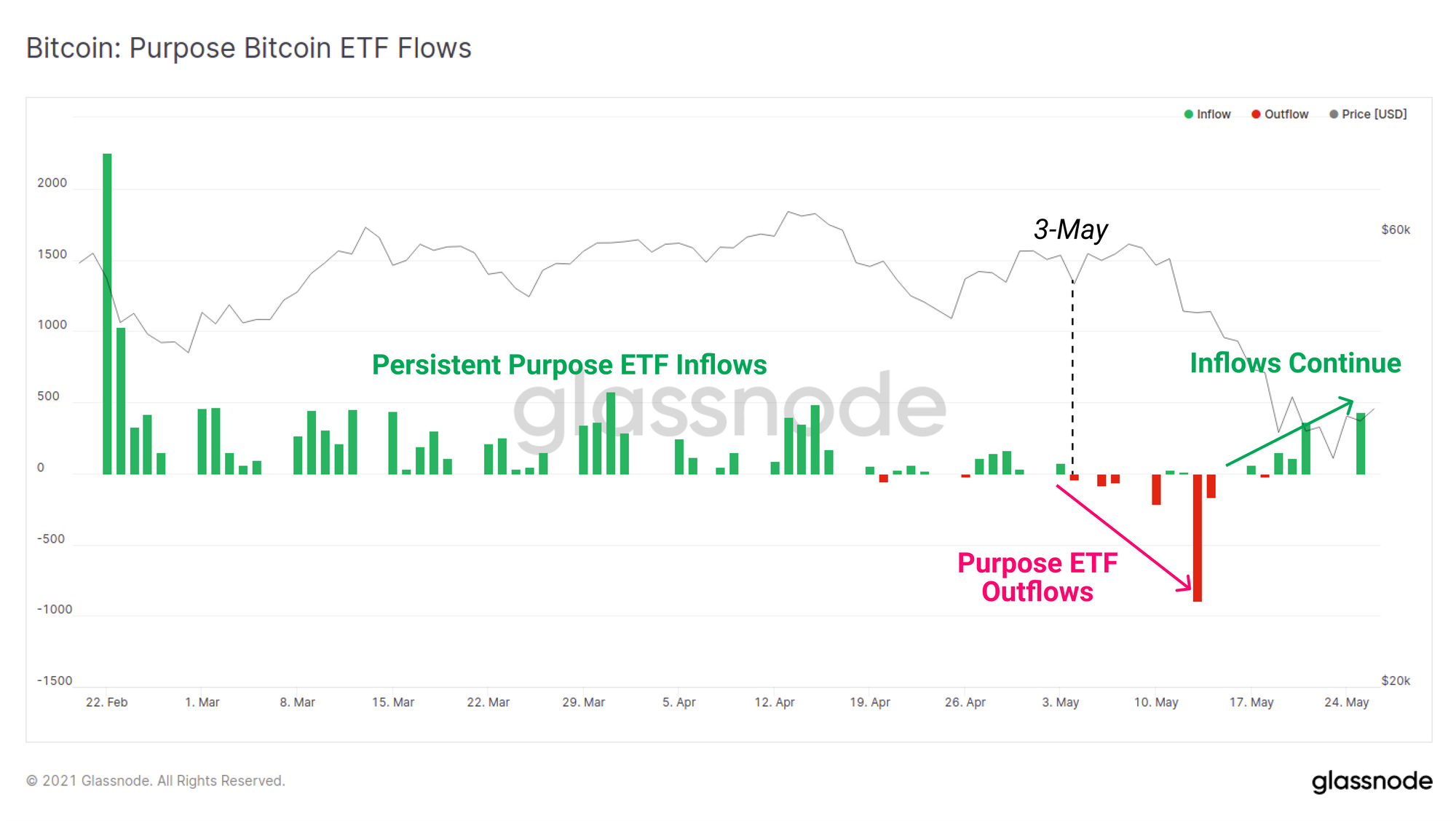
Both the GBTC and Purpose ETF inflows indicated that institutional demand had softened from Feb through to May and both will have had an impact on liquid BTC supply. On a positive note, the recent sell-off appears to have motivated investors in both products as the GBTC discount begins to close, and Purpose ETF inflows have recommenced.
Exchange Dynamics
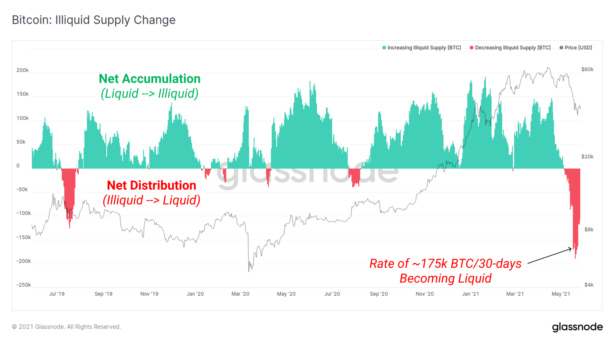
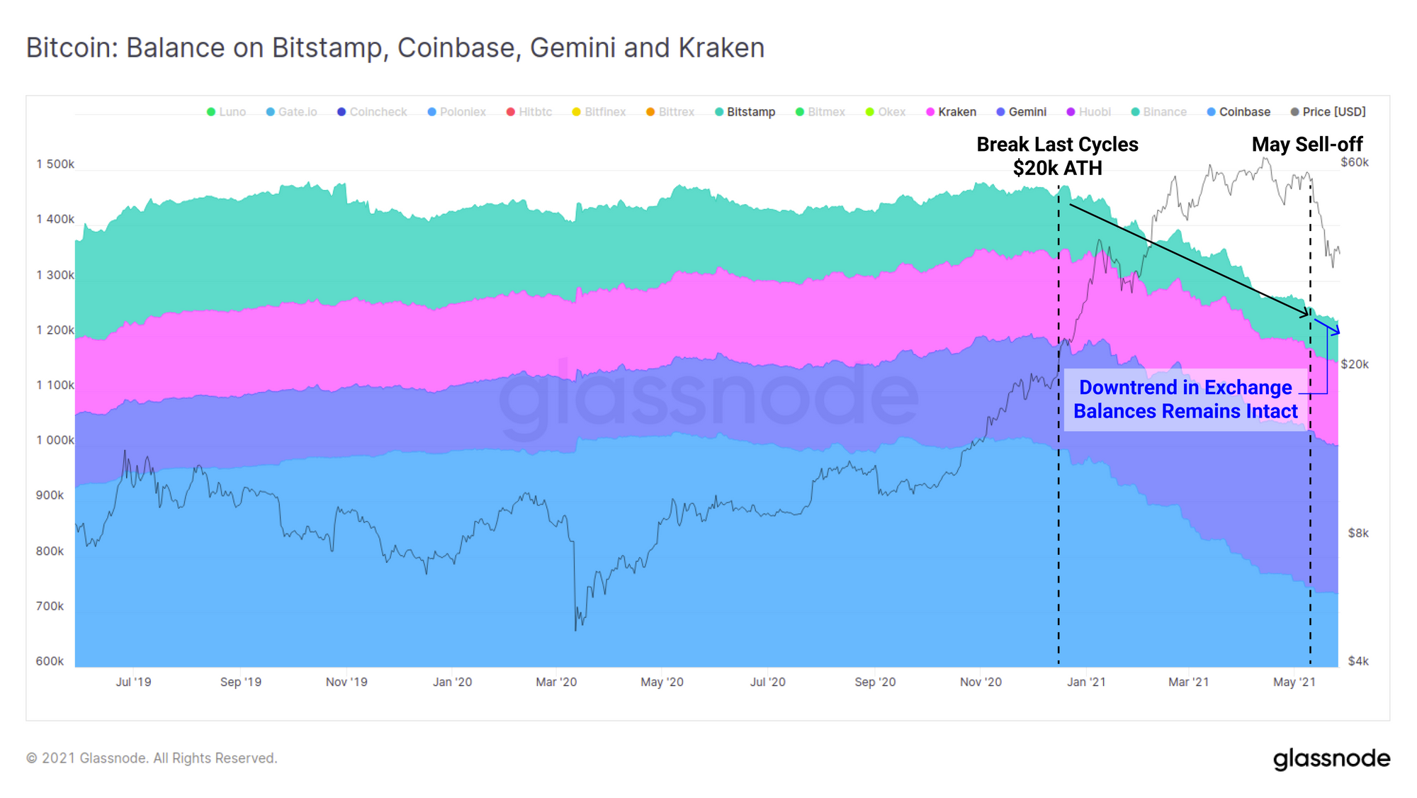
Bitcoin stepped onto the world macro-economic stage after March 2020, a effect that is clearly observed in the balances held on exchanges. Exchange balances underwent a dramatic reversal from the perpetual accumulation, into an uninterrupted outflow. BTC volume was being moved from liquid to illiquid state creating a self-reinforcing supply squeeze, with coins transferred from exchanges into institutional custodians and/or cold storage wallets.
The illiquid supply change metric shows this rate of coins transitioning from liquid to illiquid state over the last 30-days (green bars). The magnitude of accumulation over the past two years is remarkable, however the scale of the sell-pressure in May is also notable. Investors were clearly spooked during this recent sell-off.
Whilst it will likely take time for the dust to settle, a return of this metric to accumulation would be a strong signal that conviction has returned. If not, it may indicate further distribution is ahead.
In the months leading into the sell-off, it can also be seen that a trend was developing for increasingly large deposit volumes sent to exchanges. Conversely, as prices fell, an opposing trend has recently developed as larger volumes of coins leading exchanges as investors step in to buy the dip.
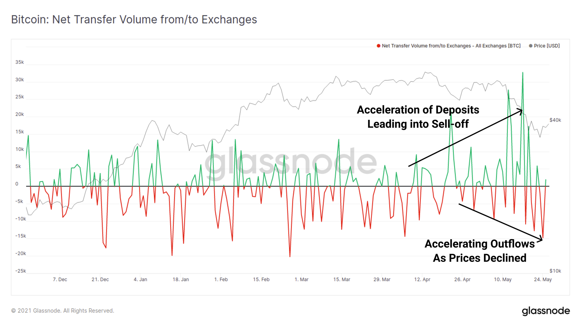
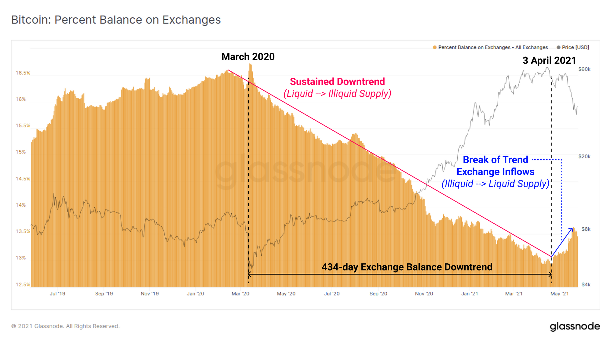
The trend of aggregate exchange balance declines had persisted for over 434-days, however on 3 April a notable uptick in exchange inflows is observed. This aligns with the flow of previously illiquid coins coming back into liquid circulation in the charts above. Note that there are a number of explanations for this behaviour which are all likely to be in play at the same time:
- Exchange inflows for the purpose of distribution and sale.
- Provision of collateral for loans, futures and margin trading.
- Capital rotation into other assets (in particular ETH which we analysed here).
- Retail lead speculation and trading, particularly associated with Binance Smart Chain.
Breaking down this trend more closely indicates that exchange outflows actually continued or were net-neutral for most exchanges, with the exception of three: Binance, Bittrex and Bitfinex. These exchanges saw accelerating inflows of BTC throughout 2021, with Binance in particular leading the lions share of this. During the May sell-off, the combined balance held on these exchanges expanded by over 100k BTC in 1 week.
Considering these exchange service non-US entities, this may indicate a difference in market response and conviction around the events leading into sell-off between various international jurisdictions.
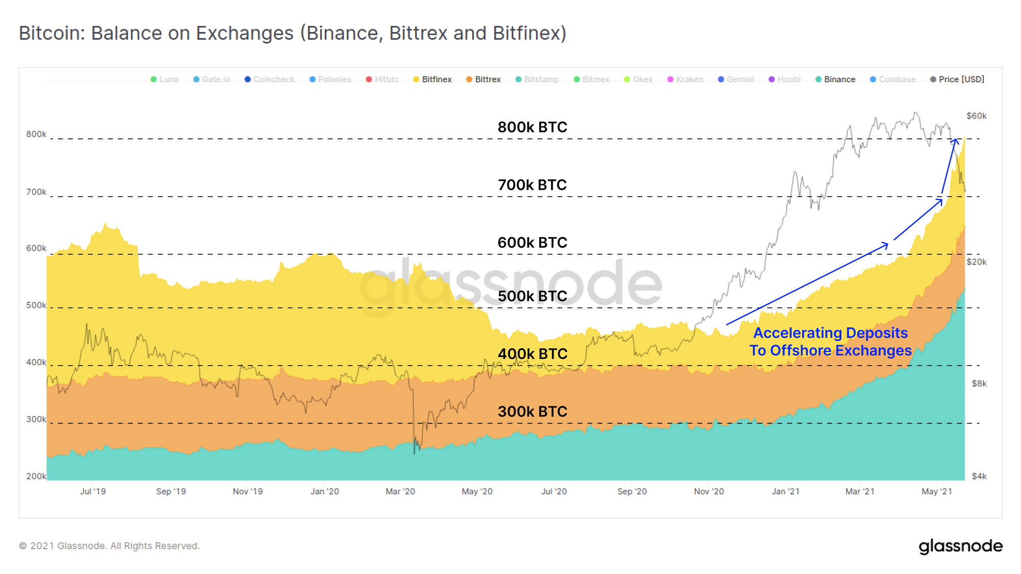
Conversely, the balances of US-regulated exchanges Coinbase, Gemini, Kraken and Bitstamp have continued to decline with almost on meaningful impact on the trend throughout May.
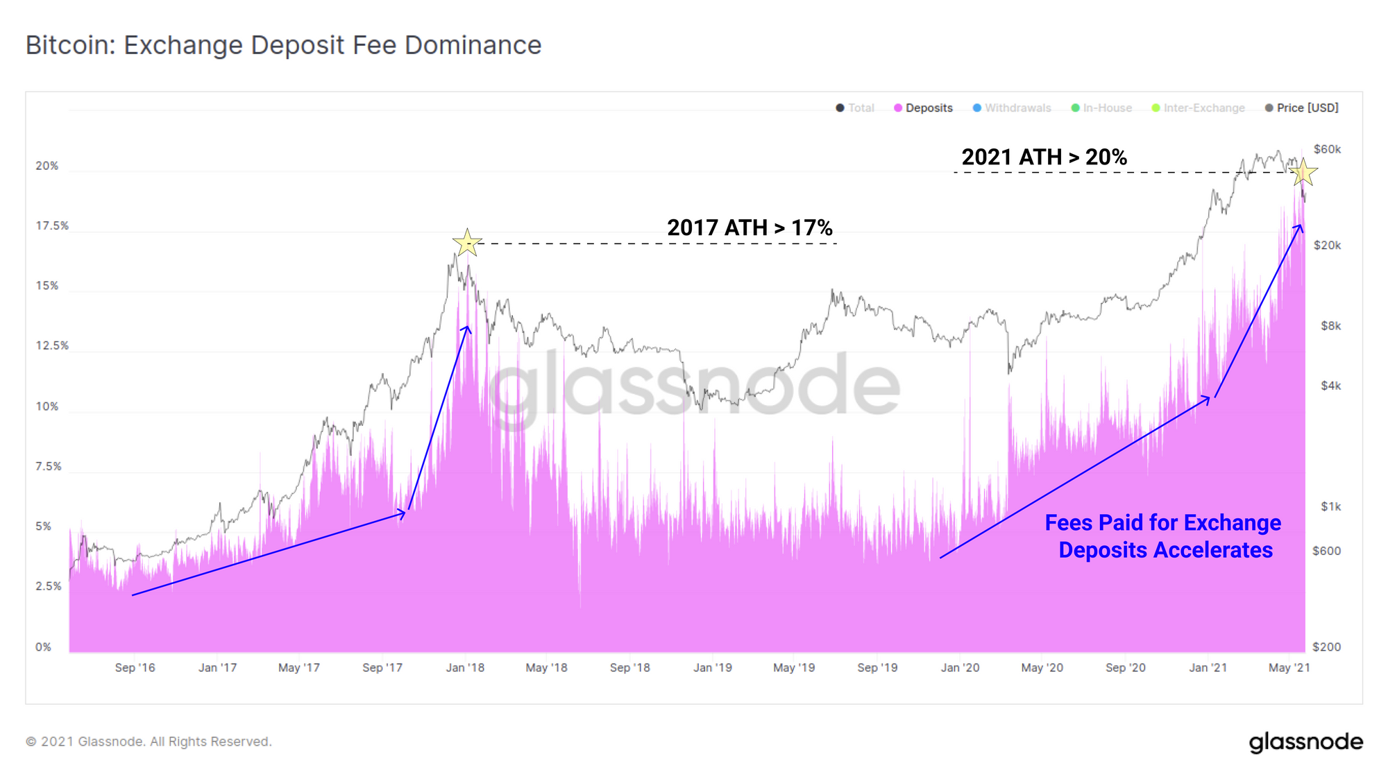
The proportion of on-chain transaction fees spent on deposits to exchanges has also accelerated of late. Similar to the 2017 macro top, the demand for deposits to exchanges accelerated throughout the bull market before reaching a new ATH, this time over 20% of all on-chain fees. This suggests an urgency for coin holders to prioritise deposits whether out of panic, or to re-collateralise margin positions during the correction.
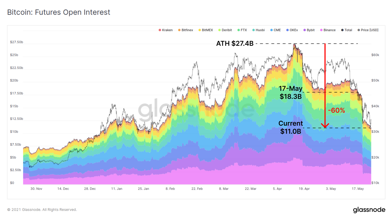
Finally on the exchange front, there was a huge deleveraging in derivatives markets which created a cascade of market selling, margin calls and liquidations. From the $27.4B peak in futures open interest set in mid April, over 60% of open interest has been cleared from the books. It is important to note that futures open interest is but one form of leverage available in cryptocurrency markets. Additional sources of margin arise from crypto-backed loans, options markets and increasingly in DeFi protocols for which we discuss the response to this sell-off further in this article.
Exit Liquidity vs. Dry Powder
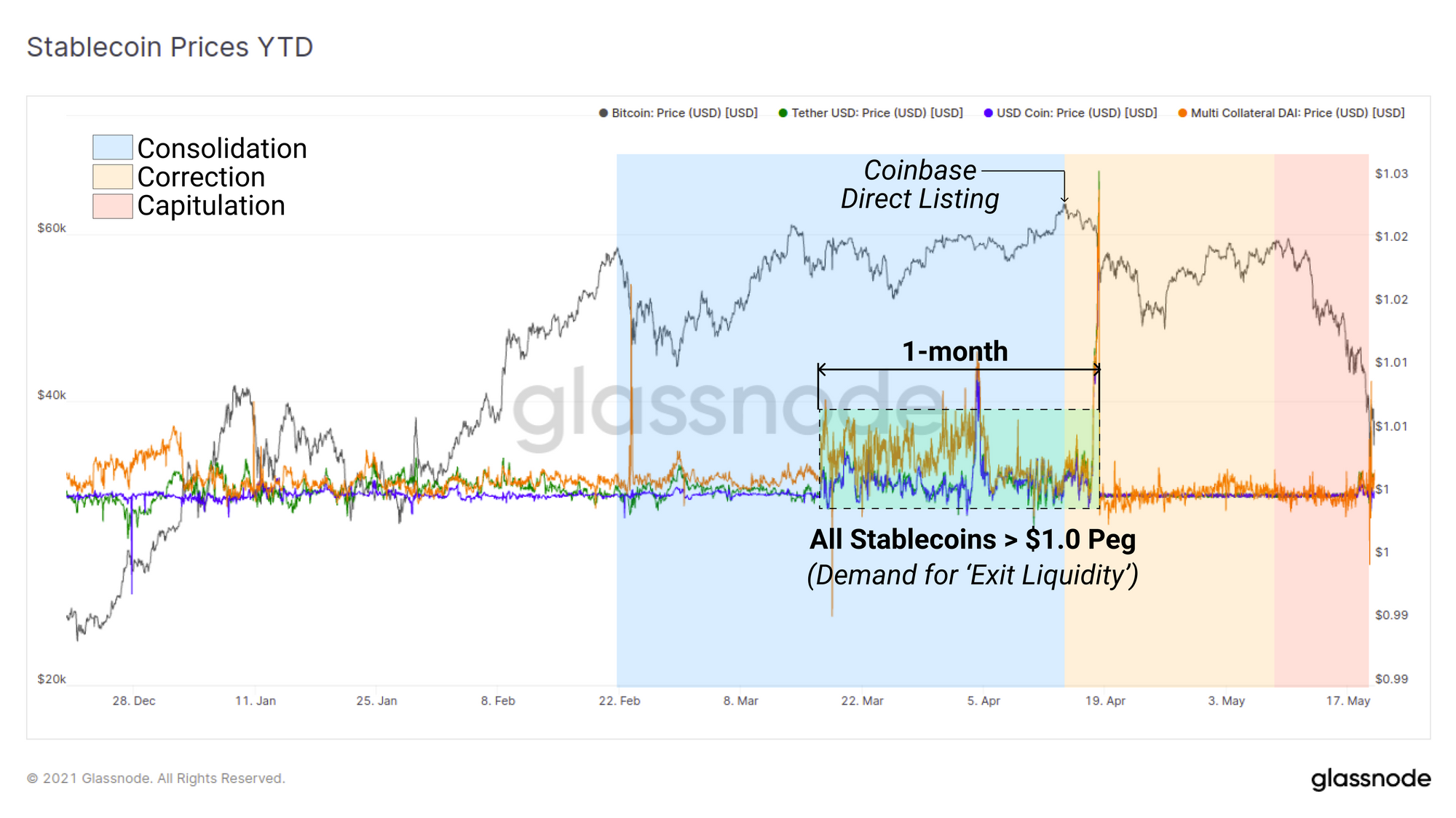
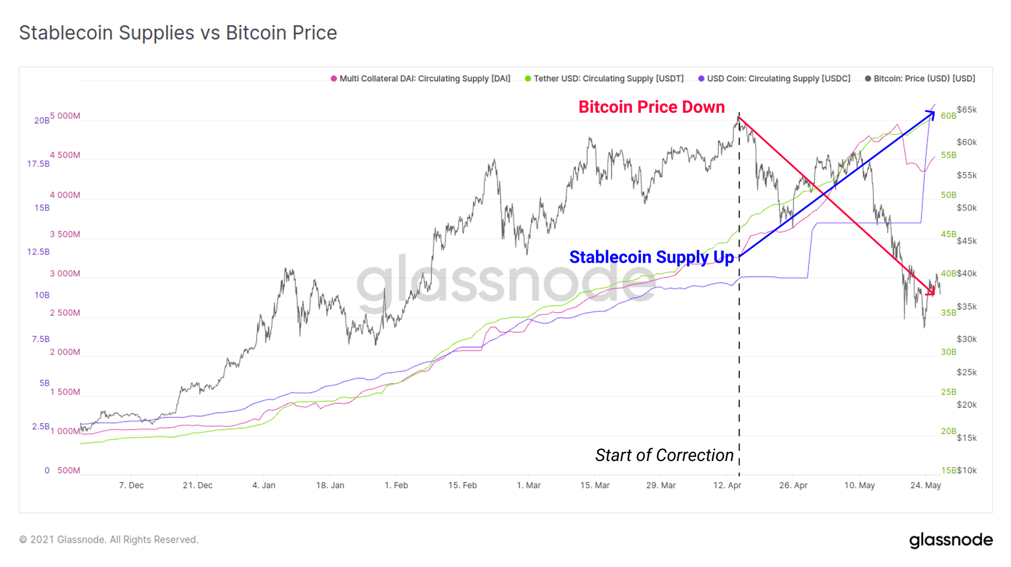
Stablecoins have undoubtedly assumed a role as a reserve asset in the industry, with each having unique mechanisms to remain 'stable'. The price performance of stablecoins relative to their $1 peg can thus provide insight into the demand for exit liquidity. Through March and April in particular, the big three stablecoins USDT, USDC and DAI all traded for a 1-month period above the peg, right up to the Coinbase direct listing. This suggests that there may have been strong demand for stablecoin exit liquidity, potentially in anticipation of 'selling the news'.
On the other side of this sell-off however, the circulating supplies of stablecoins have since hit fresh all-time highs. Since the start of the correction on 14 April, stablecoin supplies have expanded by the following amounts in the last 1.5 months:
- USDT up $14.2B (+30%)
- USDC up $9.72B (+88%)
- DAI up $1.22B (+38%)
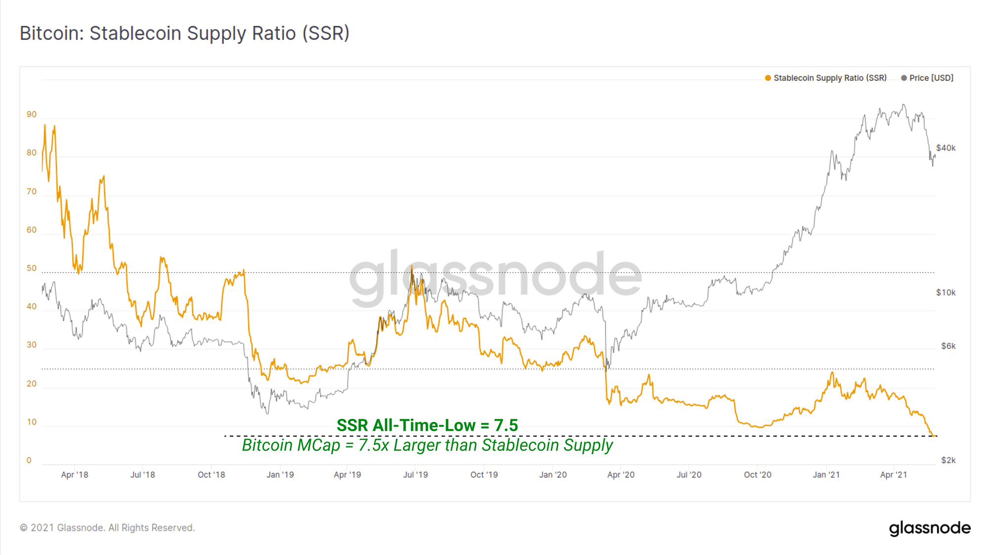
The Stablecoin Supply Ratio (SSR) compares the market cap of Bitcoin to the aggregate supply of all stablecoins as a metric indicative of crypto-native, dollar-denominated buying power. Lower SSR values means the stablecoin supply is large (dry powder) relative to the Bitcoin market cap. As Bitcoins valuation has contracted, and stablecoin supplies increased, the SSR ratio has now been driven to an all time low of 7.5x.
This convincingly represents the largest crypto-native dollar buying power in history.
HODLer Spending Behaviour
Finally, we will investigate the spending vs HODLing behaviour of the market. In particular we will focus on the balance between new investors, who may be relatively new to the volatile and FUD-fuelled world of Bitcoin (Short Term Holders, STH), and long term holders (LTH) whose conviction is shaped by years of battle scars.
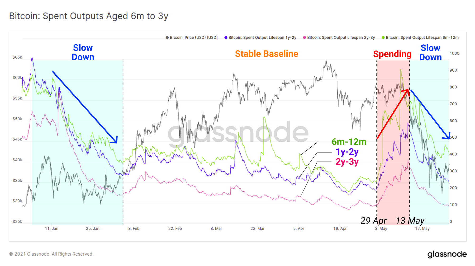
Through the 2020-21 bull market, coins aged between 6m and 3y (representing last cycles buyers) have seen two periods of increased spending:
- Dec 2020 to Feb 2021 as profits were realised during market strength on the rally from $10k to $42k.this
- Late April to mid-May as older BTC were spent, potentially via capital rotation (ETH price doubled in this time), and potentially in response to the weakening market structure as discussed above.
Following both of these periods however, the spending of older coins slowed considerably as prices corrected. What this indicates is that older hands are reasonably proficient at selling prior to a major correction (their distribution also adds overhead supply), however they also tend to return to hodling conviction (and likely buying dips) as prices get cheaper.
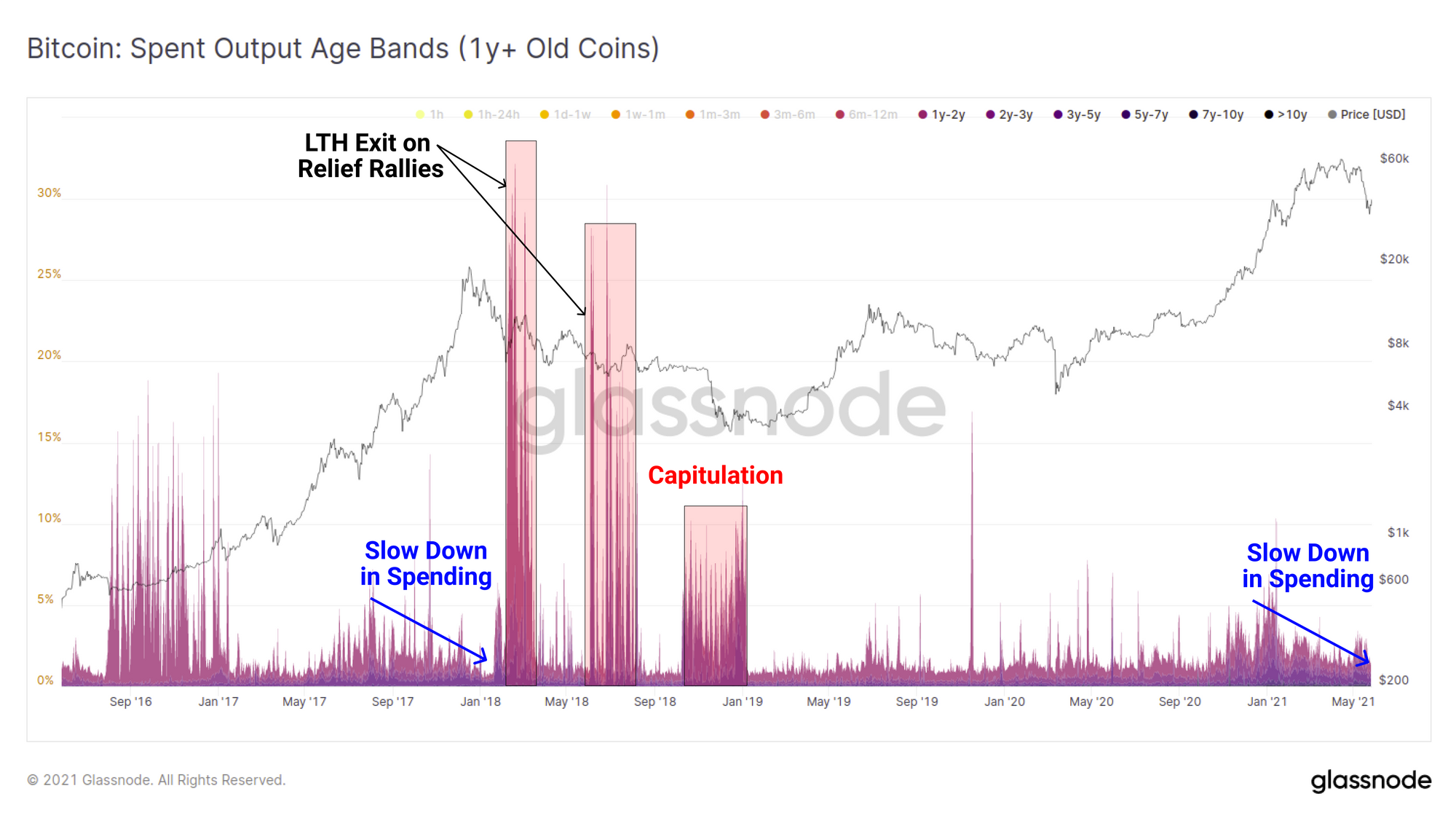
If we compare the spending behaviour of old coins to the 2017 macro top, we can see a somewhat similar pattern has played out where old hands slowed down spending as the market turned euphoric. However, it was on the first relief rally that the proportion of old coins came roaring back to life, as the probabilities of a bear market increased. Similar events occurred during most bear market rallies in 2018 as well as the eventual capitulation in November.
This is an important metric to keep an eye on in the current market structure as it may indicate whether a similar mass exit of old coins occurs on any relief bounces. Conversely, the absence of these old illiquid coins being distributed would suggest a more bullish outlook remains amongst battle scarred HODLers.
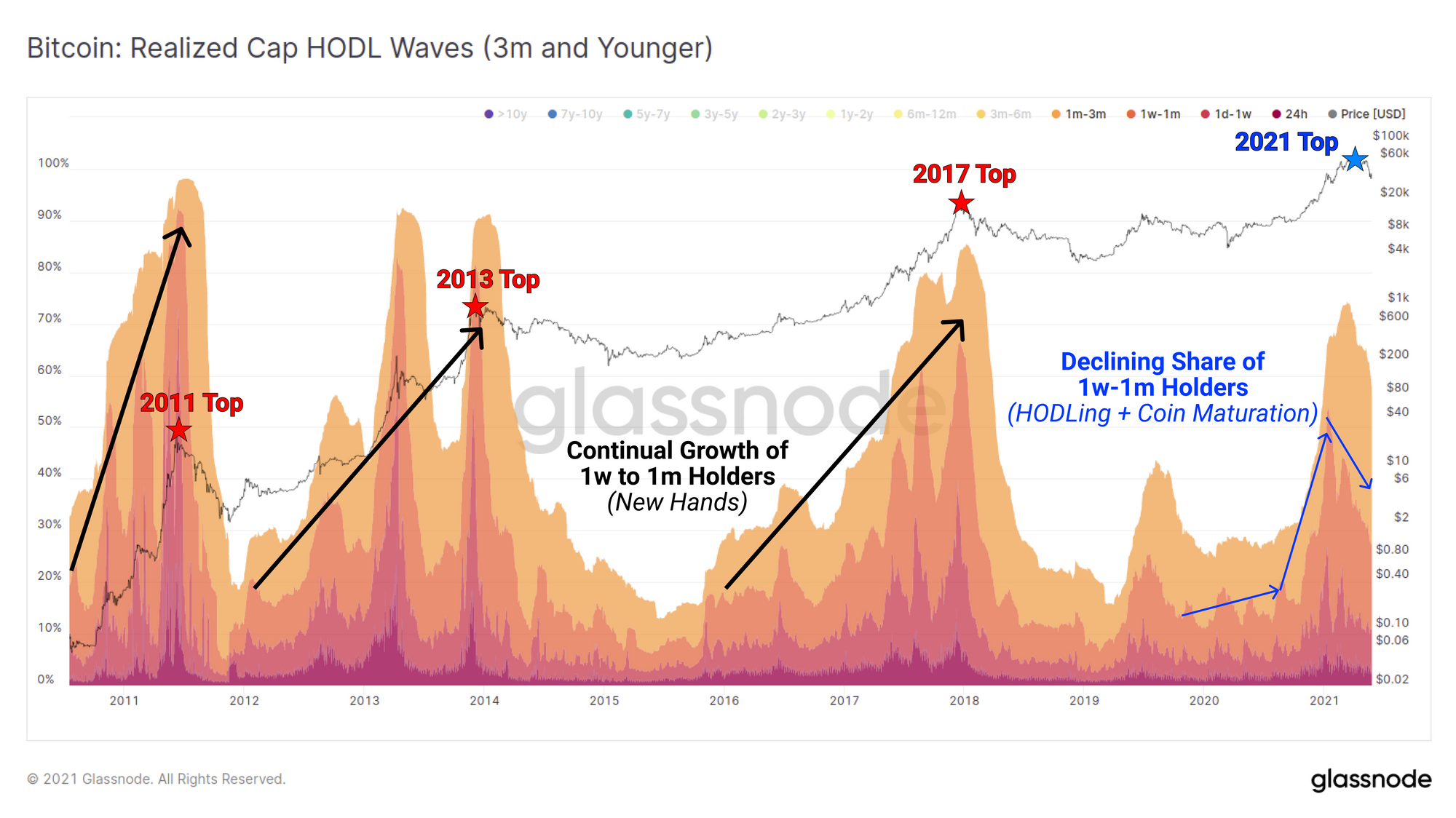
The Realised Cap HODL waves provide a view on what proportion of the active supply is held in coins of various age bands. A typical cycle pattern is:
- Old Coins swell during bear markets as accumulation recommences and wealth transfers from speculators to long term hodlers.
- Young Coins swell during bull markets as holders distribute expensive coins to new, weaker handed speculators.
In the current market structure, we have seen the first major impulse of coins younger than 3-months as new speculators entered the market. This aligns with the initial bull market rally where older coins were spent after the break-out from $10k to $42k. What is notably different this cycle is that we can see a declining share in new speculators. There are a few explanations for this phenomena:
- Increased access to derivatives and instruments to gain price exposure without interacting with the blockchain at all.
- Retail speculators preference and/or uni-bias for other crypto-assets besides Bitcoin and similar access to derivatives and leverage off-chain.
- Increased coin maturation and hodling behaviour by institutional buyers who accumulated early in the bull cycle and have not been shaken by the volatility leading to earlier expansion in older coin brackets (coin maturation).
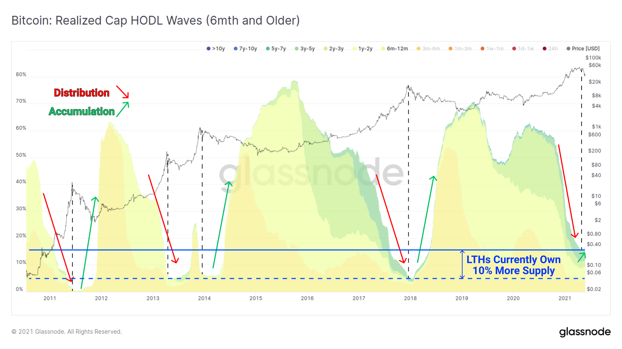
Taking the inverted view of this chart, we can see two observations with respect to the proportion of older coin holders:
- The supply held by LTHs has actually returned to accumulation which supports the thesis that coin maturation and institutional HODLing remains in play. Should this play out, it would be resemble the start of a bear market, but also promote an eventual supply squeeze.
- LTHs currently hold 10% more of the active supply than they have in all prior market cycles.
This second point may be interpreted as both bullish, in that it means fewer coins were distributed by HODlers. However, it may also be considered bearish as it indicates there was insufficient demand to absorb this relatively smaller supply of coins for sale.
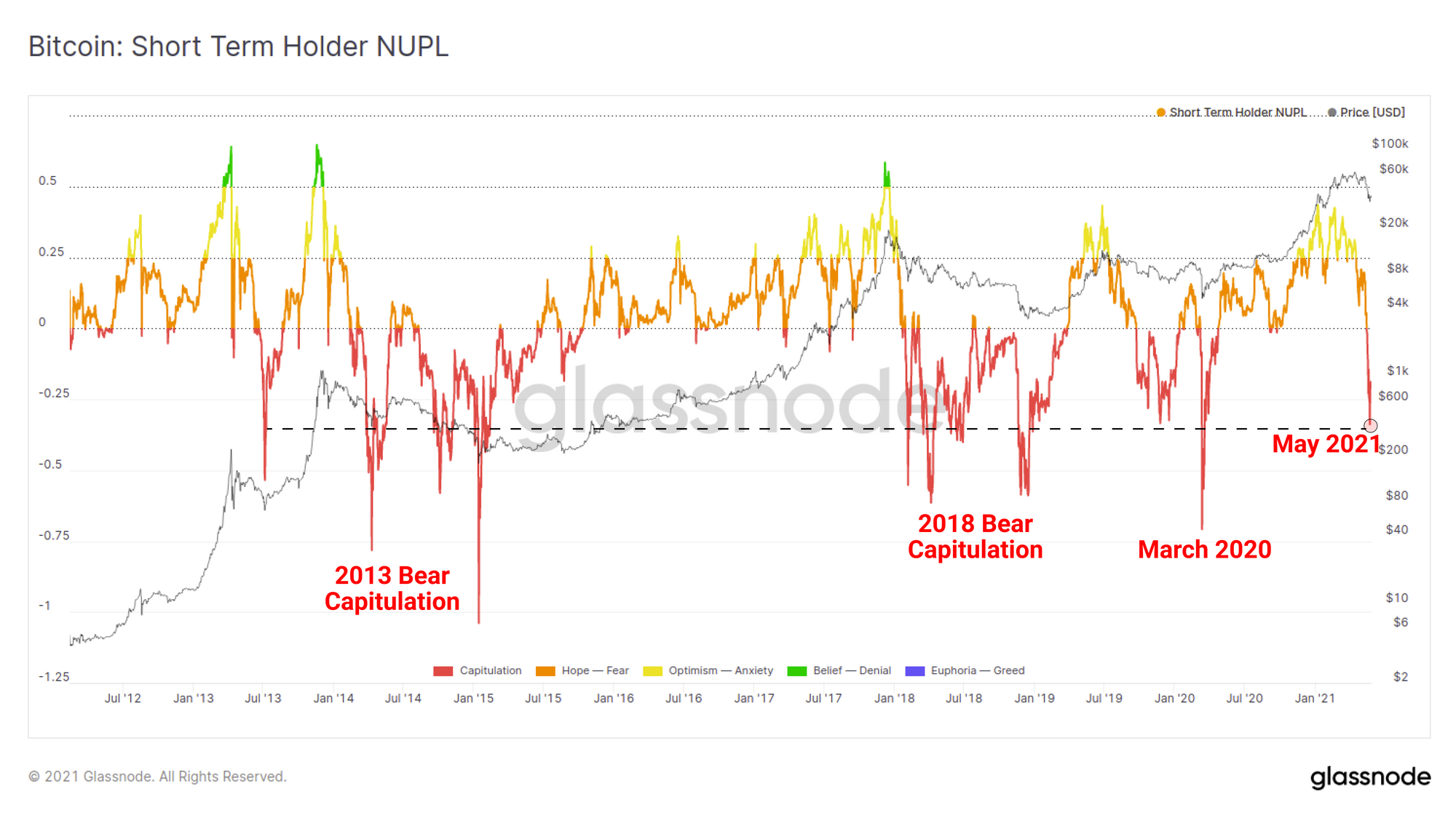
At the end of the day, the ultimate financial pain during a sell-off comes from investors watching an evaporation of unrealised gains, whether back to cost-basis, or in capitulation into unrealised losses. The Net Unrealised Profilt and Loss metric calculates the degree of aggregate profit or loss that is held by the unspent coin supply as a proportion of the market cap.
If we filter this metric by STHs (coins < 5-months old), we can see that the May sell-off competes in scale with bear markets and largest capitulations throughout Bitcoin history. An extraordinary volume of buyers in 2021 are currently holding underwater coins. This supply may yet become overhead supply as price attempts a recovery, providing headwinds for the bulls.
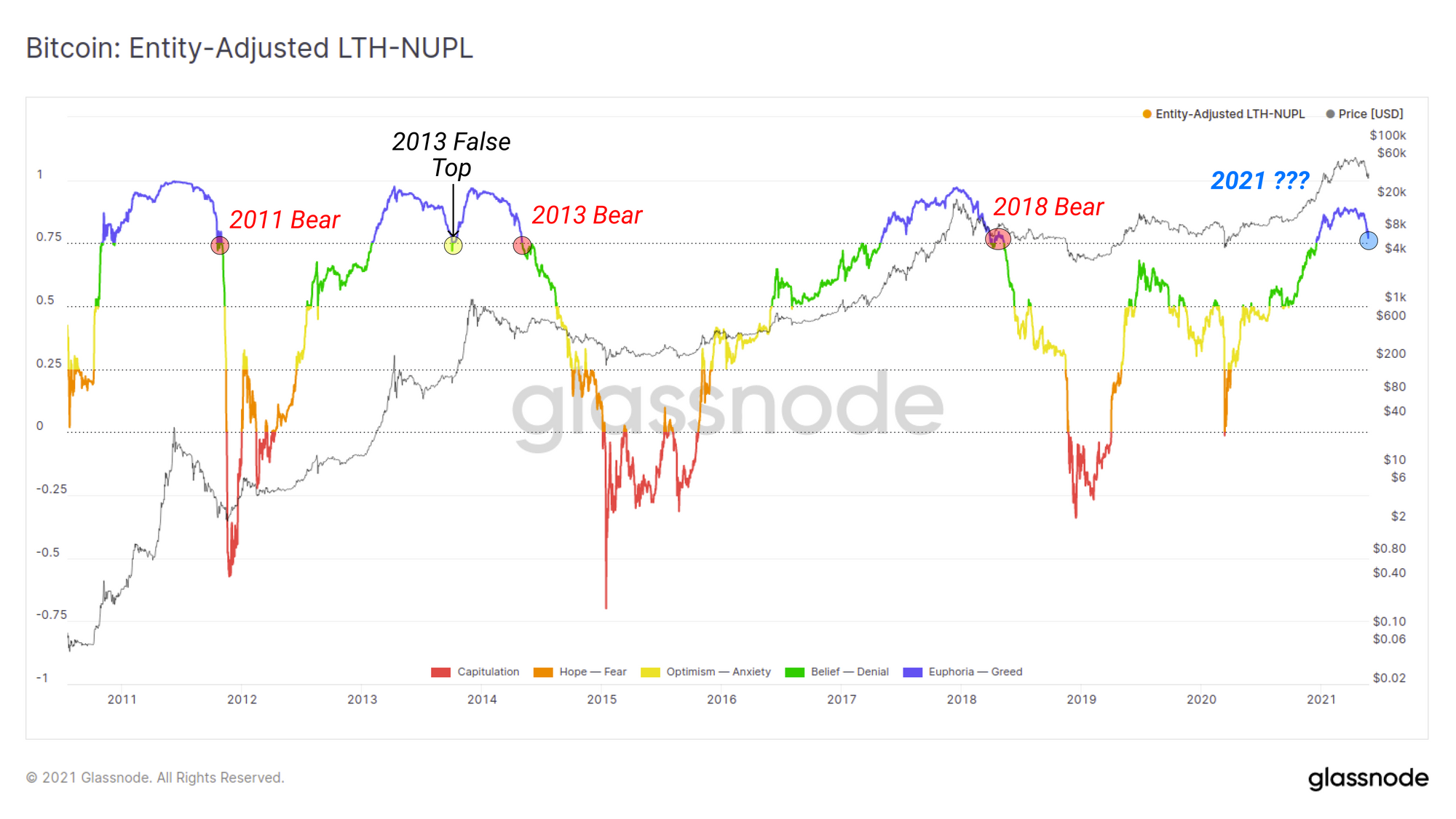
If we similarly filter by coins held by LTHs we get a chart that shows the market is standing on a historical knife edge. Unrealised PnL held by long term investors tends to be a less volatile and more cyclical as a result of Bitcoins tremendous long term price performance.
However, the current degree of net unrealised PnL held by LTHs is testing the 0.75 level which has been the make or break level between past bull and bear cycles. Only in the 2013 'double pump' scenario did this metric see a recovery. Should LTHs continue to see their paper gains fall, this too may create a new source of overhead supply. On the other hand, higher prices and a supply squeeze from buying the dip would begin to resemble the 'double pump' scenario from 2013.
Concluding Summary
In this piece we have explored a number of metrics and indicators that describe the market structure before, during and after one of Bitcoin's most spectacular (and terrifying) sell-offs. In summary, there are a number of bull and bear cases which may be interpreted from the available data:
For the Bears
- Institutional demand clearly softened from February and the resulting supply sink/squeeze was largely dissipated.
- The balance on exchanges has increased meaningfully resulting in large volumes of coins and overhead supply that must now be re-accumulated.
- Stablecoin prices leading into the Coinbase listing suggested distribution was underway and old hands were spending immediately prior to the sell-off.
- A huge volume of short term holders remain underwater, and long term holder unrealised gains are on a historical knifes edge coincident with past bear markets.
For the Bulls
- Institutional products GBTC and the Purpose ETF are showing signs of recovery despite collapsing prices providing early signs of renewed institutional interest.
- Whilst exchange balances have increased, a more nuanced view indicates a difference between US-regulated and offshore exchanges. There may be a jurisdictional bias at play.
- Stablecoin prints have expanded dramatically creating the largest crypto-native dollar buying power on the sidelines in history.
- The majority of selling appears to have been short term holders, whilst long term holders appear to have bought the dip with increasing conviction.
Few have made the claim that HODLing Bitcoin was easy, and for many, the volatility seen last week is all part of the ride. What is clear is that the sell-off was of a significant scale, and a large volume of buyers are currently underwater. How the market recovers from here will no doubt be a test of market conviction amidst what continues to be a favourable macro backdrop for digital scarcity.

- Follow us and reach out on Twitter
- Join our Telegram channel
- For on–chain metrics and activity graphs, visit Glassnode Studio
- For automated alerts on core on–chain metrics and activity on exchanges, visit our Glassnode Alerts Twitter