Levered Shorts vs Spot Demand
Bitcoin enters its 82nd day of the prevailing drawdown, as derivatives traders bet on further downside. Meanwhile, on-chain demand models suggest a more bullish undertone is in play.


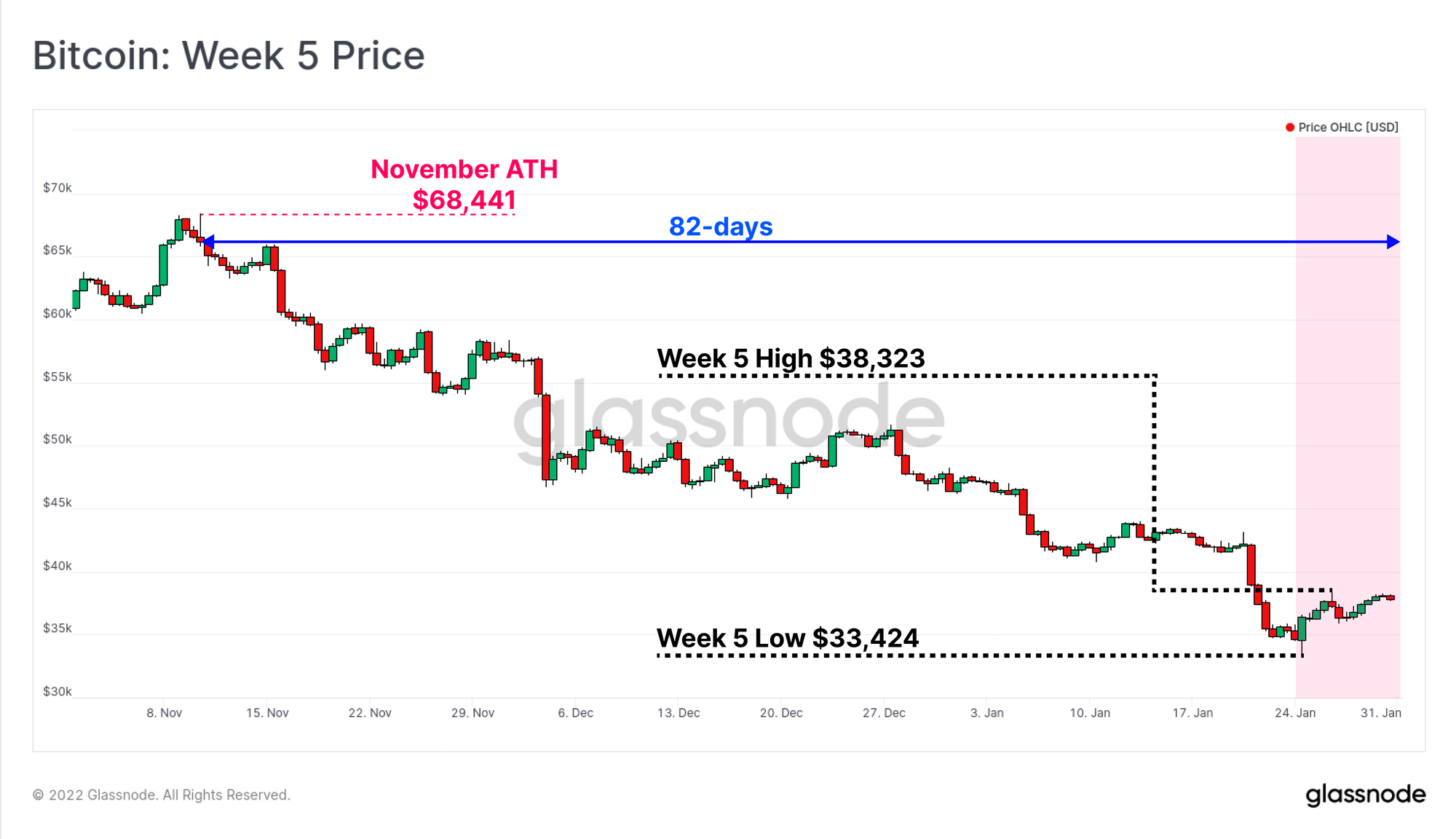
The Bitcoin market has continued to slide lower, reaching $33,424 on Monday, the lowest traded price since July 2021. Prices have now been in an established downtrend for 82-days, and negative sentiment has spiked higher, particularly across derivatives markets. Funding rates for perpetual swaps traded into negative territory, and we have seen a notable reversal in options markets, where put option volumes have increased markedly.
In our previous newsletter, we examined the prevailing supply dynamics and network profitability, which we argued resembles a classic Bitcoin bear. In this week's edition, we shift our focus to an assessment of demand, in order to capture the other side of the equation. On-chain tools can provide insight into both supply and demand, and with the established macro bearish outlook as a background, we now seek to identify whether the underlying demand profile is sufficient to start establishing a market bottom.
Translations
This Week On-chain is now being translated into Spanish, Italian, Chinese, and Japanese.
The Week Onchain Dashboard
The Week Onchain Newsletter has a live dashboard with all featured charts available here. This dashboard and all covered metrics are explored further in our Video Report which is released on Tuesdays each week. Visit and subscribe to our Youtube Channel, and visit our Video Portal for more video content and metric tutorials.
Negativity Enters Derivative Markets
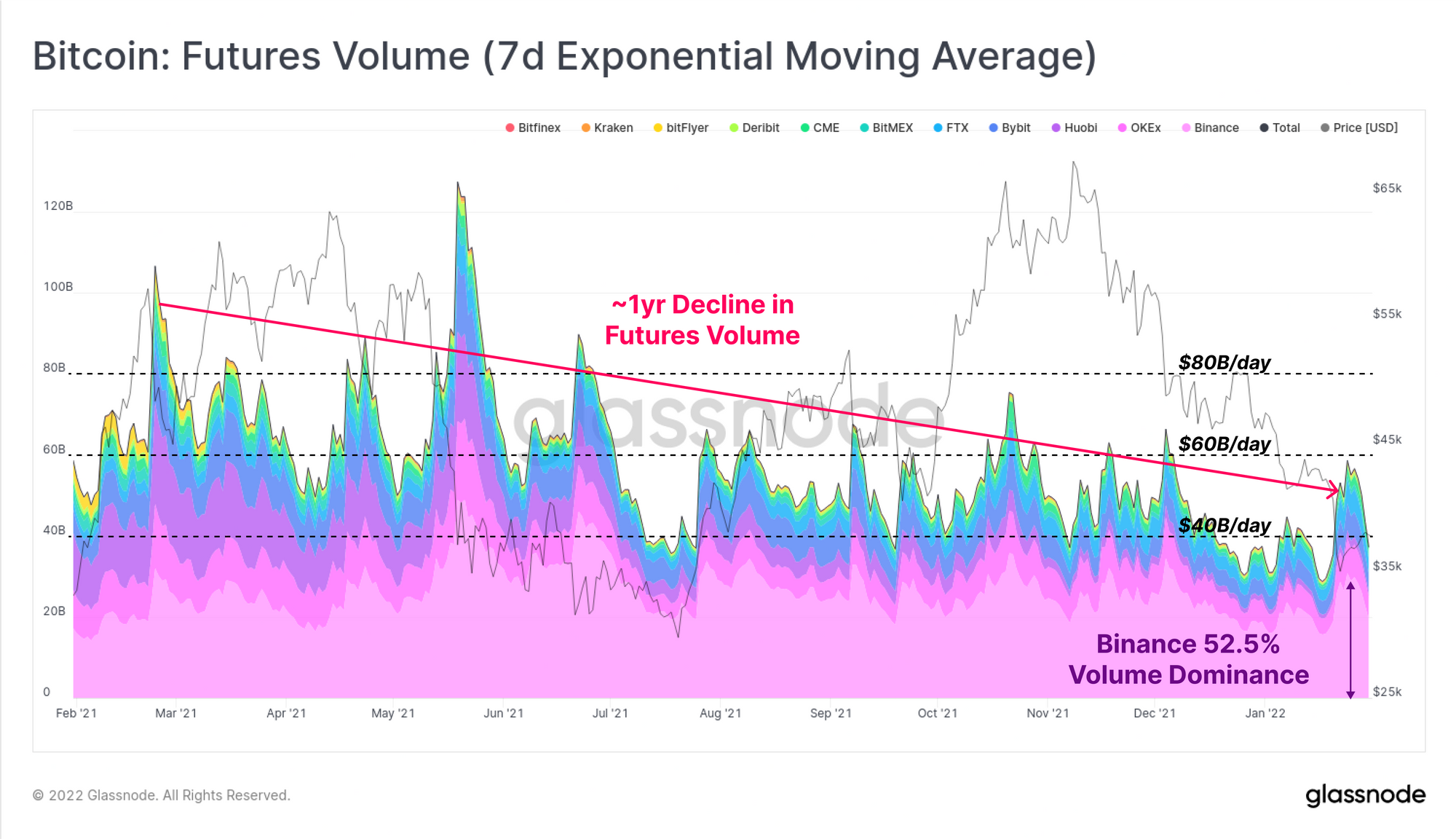
Over the course of 2021, trading volumes in futures markets have been in macro decline, falling over 50% from $80B/day in March 2021, to under $40B/day in January 2022. As is commonplace during high volatility events, this week's sell-off to $33k was met with a significant uplift in trading volume, hitting just under $60B/day.
Binance remains the dominant venue, hosting the lions share of futures trade volume, representing over 52.5% of all contracts this week.
Even with relatively low trading volumes, futures open interest remains remarkably elevated, particularly for perpetual swaps. As a percentage of the Bitcoin market cap, open interest in perpetual swaps (purple) is hovering around 1.3%, which is historically high, and often as precursor to a deleveraging event.
Open interest across all futures markets (including perpetual swaps) is elevated at 1.9% of market cap (orange), however this is closer to the middle of the range in typical values. This observation indicates that a great majority of current futures leverage is held by traders of perpetual contracts (heavily concentrated on Binance).
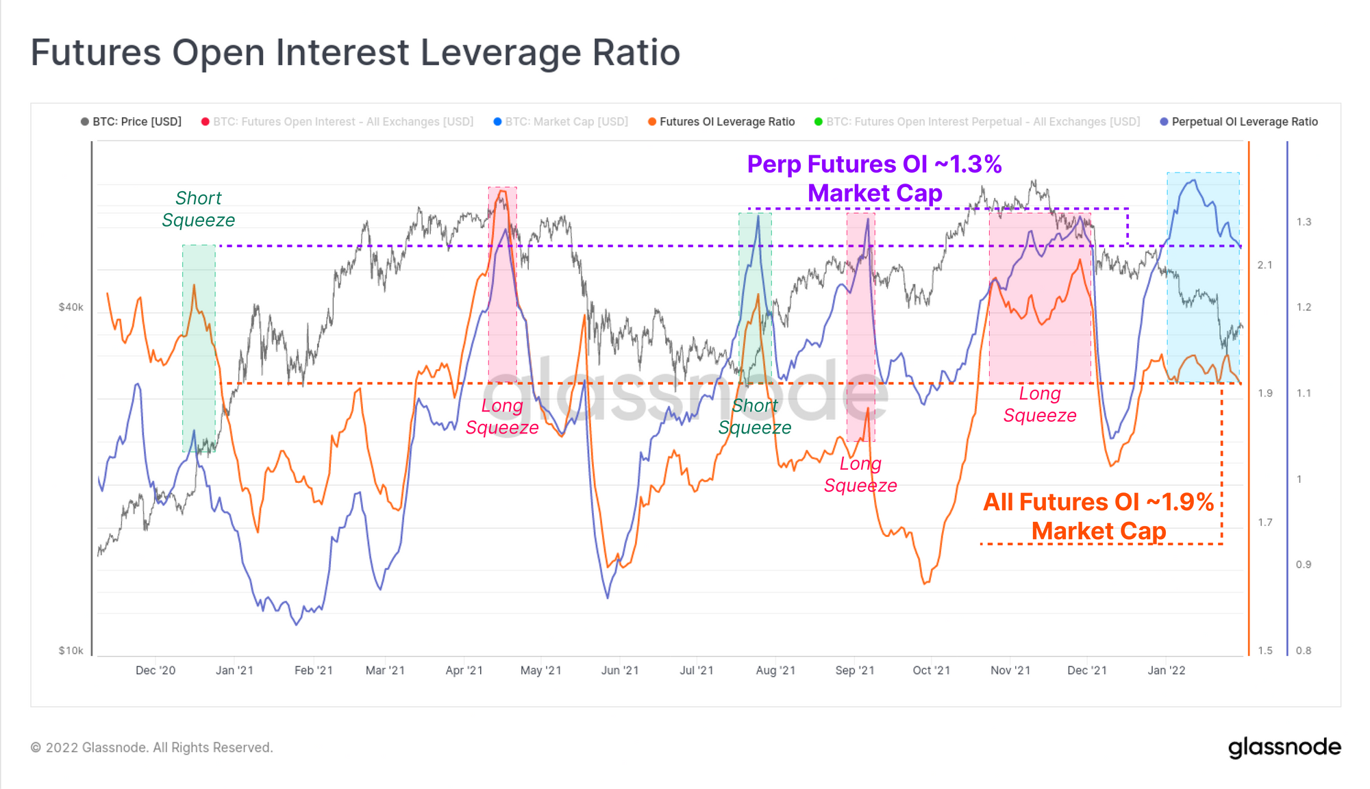
With this elevated leverage and relevance of perpetual swap markets, we can look to funding rates to get a sense of market bias and direction where leverage is most heavily applied. Funding rates have traded negative for much of January, indicating that a modest short bias exists in perpetual swap markets.
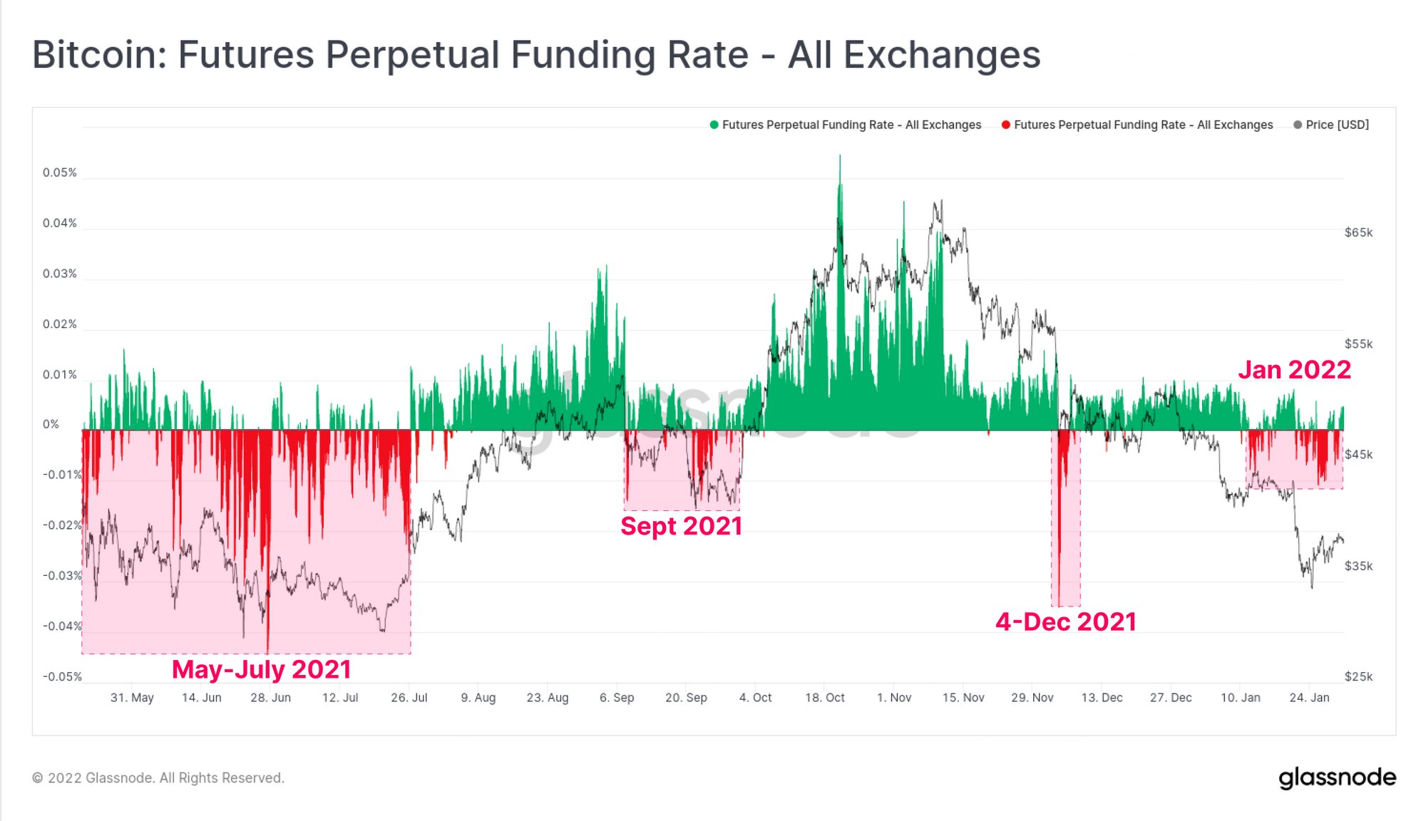
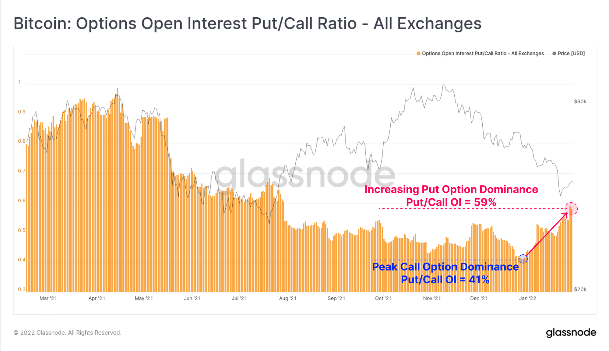
Similar negativity is seen in options markets, with the Put/Call ratio rising to 59%, a multi-month high. This indicates that traders have shifted their preference away from calls, and towards buying downside insurance, even as the market trades to 6-month lows.
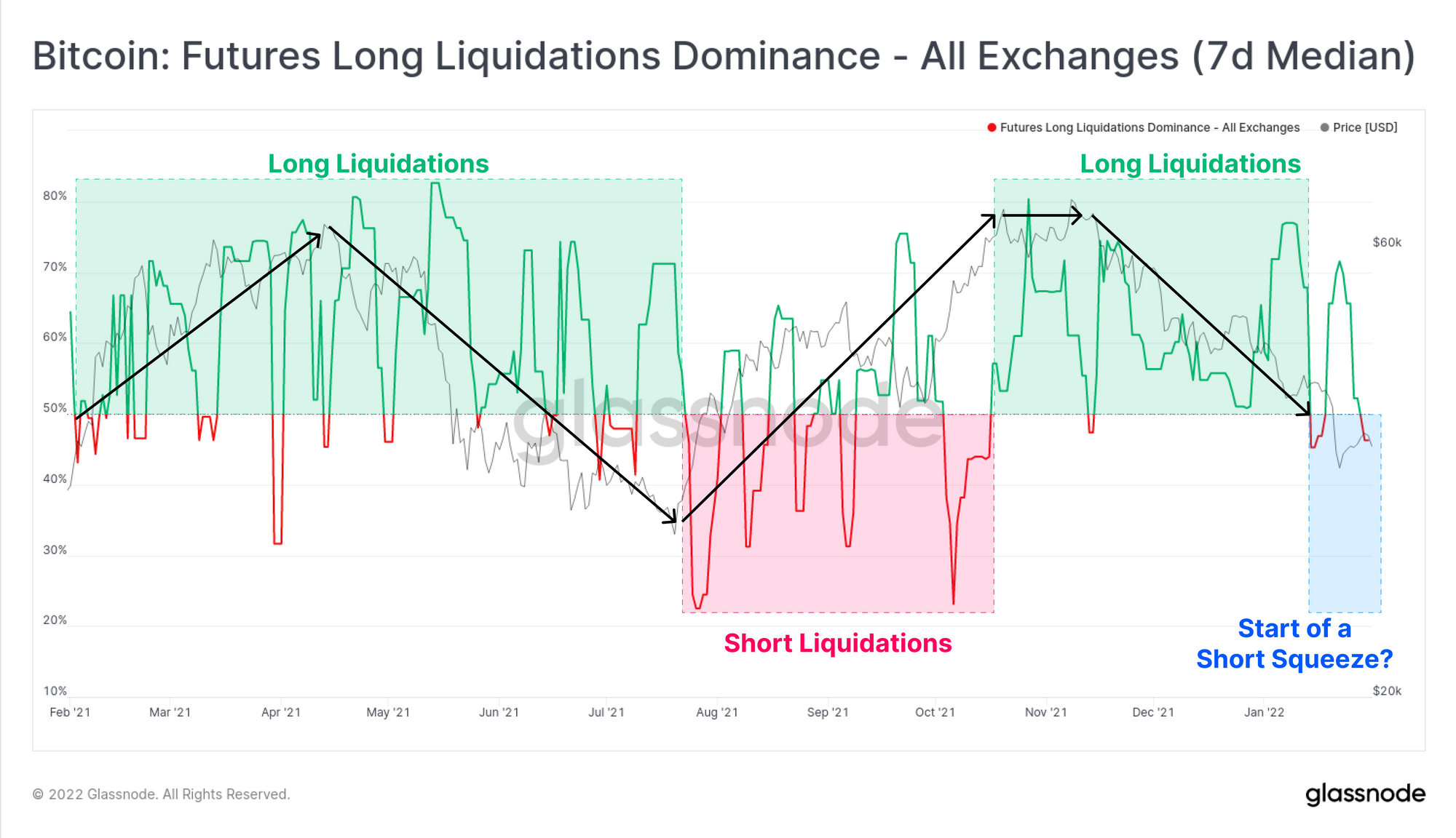
With this observable shift from long into short bias across derivatives markets, the dominance of futures liquidations has started to creep towards the short side. With high negativity, elevated leverage, and a overall short bias, a reasonable argument could be made for a potential counter-trend short squeeze in the near-term.
Assessing On-chain Demand
Assessing the demand of the market using on-chain tools is nuanced, and requires an understanding of market participants, and the destinations of spent coin volumes (i.e. in/out of exchanges, in/out of HODLer wallets etc). This week we will focus on demand from on three key areas:
- Wallet growth and accumulation/distribution trends.
- Flow of funds in/out of exchange reserves.
- Network utilisation as a settlement layer to gauge 'fair value'.
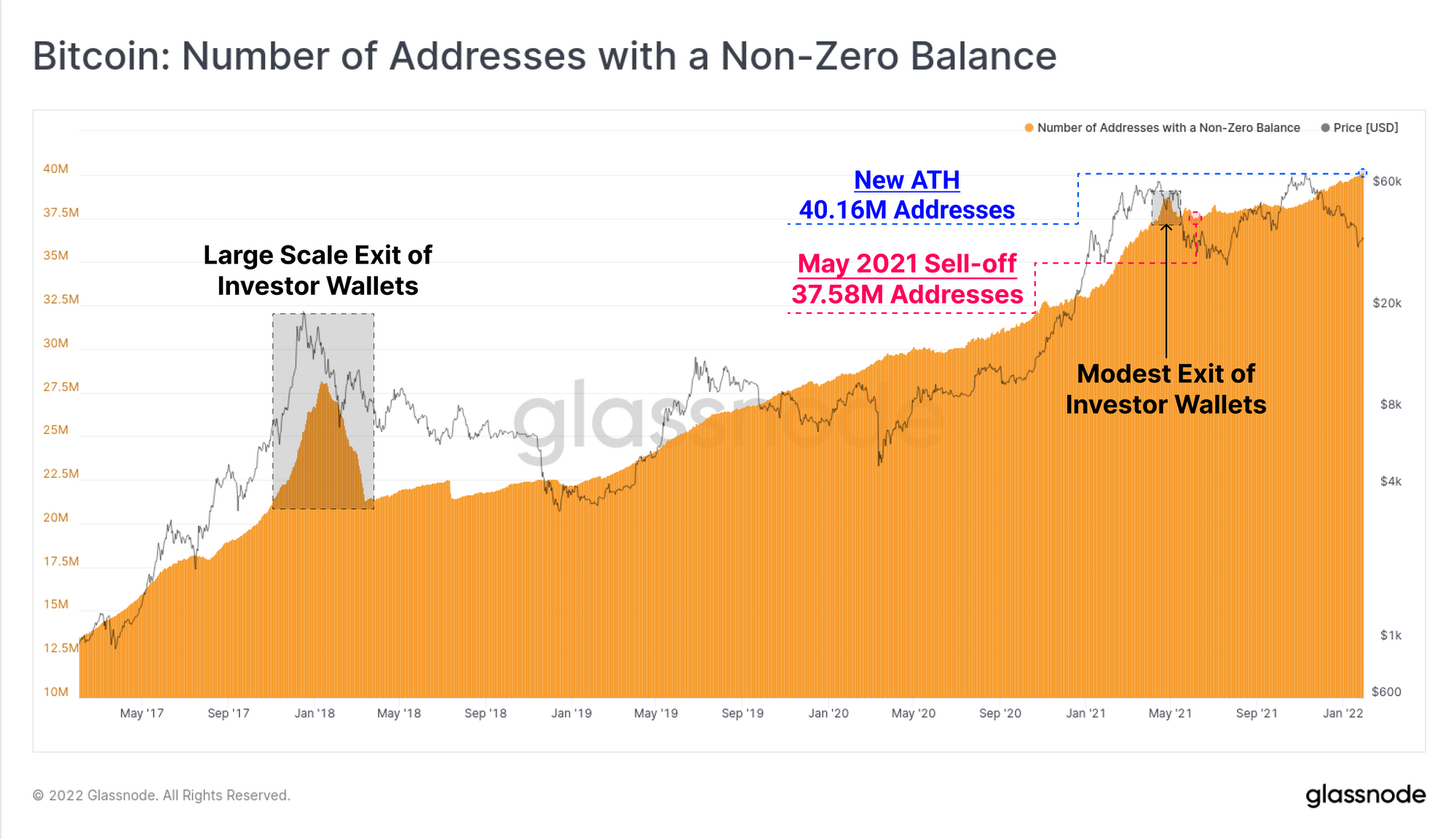
First, we look at a fairly foundational and simple metric, the number of non-zero wallet balances. Generally speaking, when the Bitcoin network experiences a large scale investor flush out (such as the 2017 blow-off top), investors spend many UTXOs from their wallets, deposit coins to exchanges, whom then consolidate that supply into a small set number of large balance wallets.
Such a wallet purge is quite obvious following the 2017 top, and a smaller flush out can be seen in May last year. In both instances, the number of non-zero address resumed an uptrend once the dust had settled, usually around the middle phase of the bear market that followed as buyers recommenced accumulation.
The current upwards trajectory of non-zero wallet counts appears to be largely unaffected by the last three months of depressed prices, sporting similarities to the mini-bear of 2019, and hitting a new ATH of 40.16M addresses.
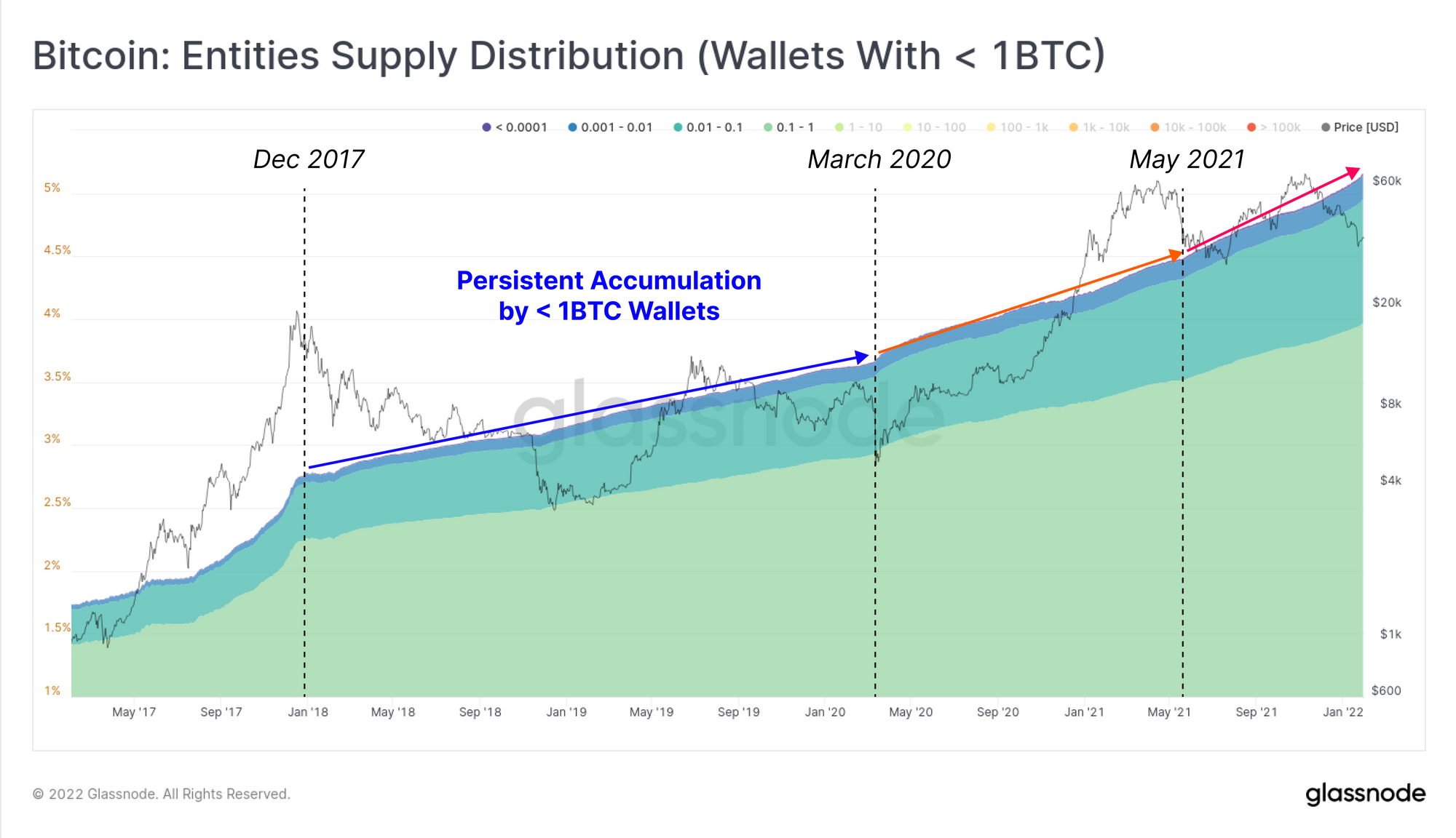
Retail size wallets, holding < 1BTC (shrimps), also appear unfazed by this correction, with supply held in these wallets continuing to climb. The rate of supply growth for this cohort has seen two macro increases, first after March 2020, and again after May 2021. Given Bitcoin's history as a grassroots phenomena, this speaks to a growing class of 'sat stackers' and HODLers who remain throughout all market conditions.
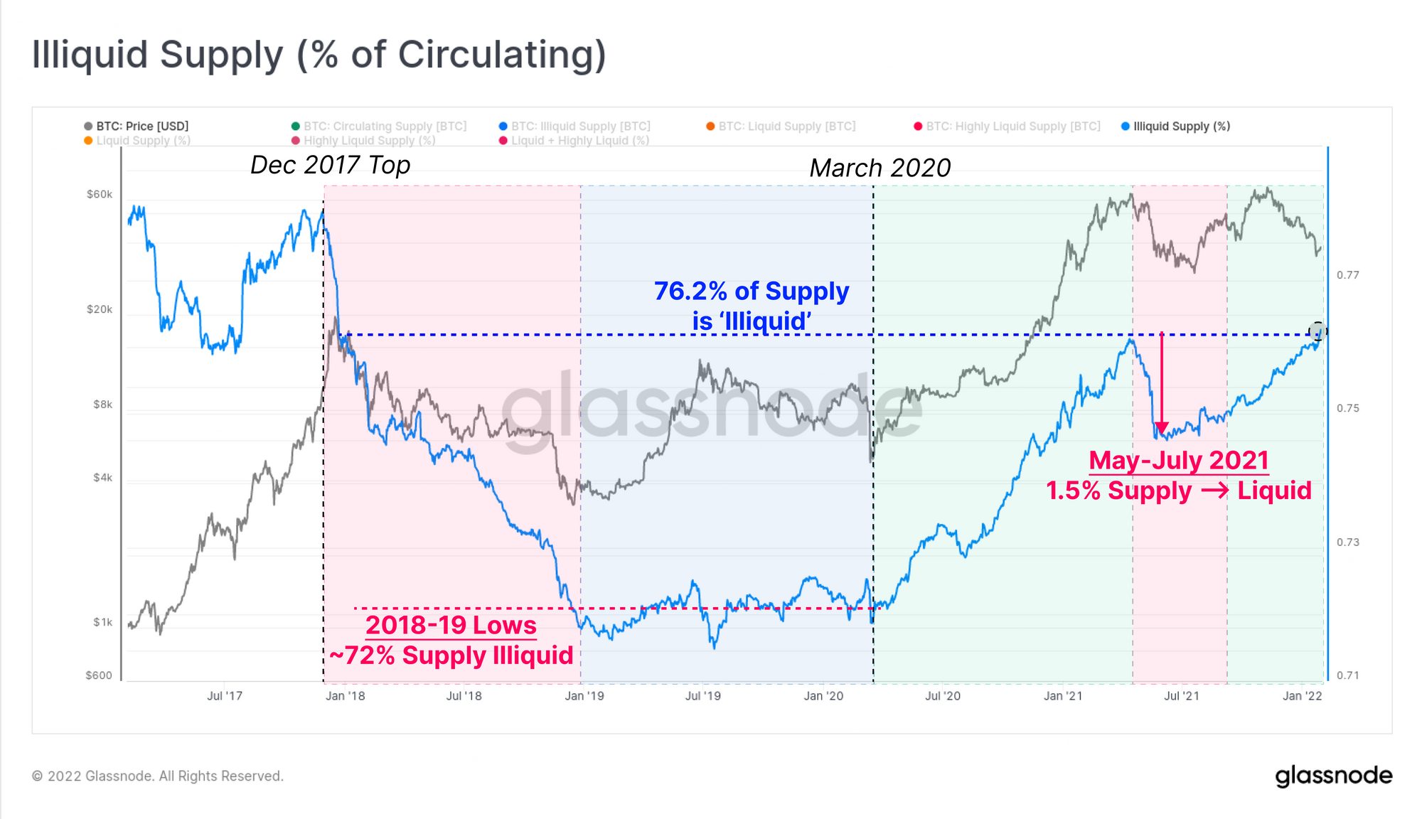
In order to further classify the coin supply, we use groupings termed Illiquid, Liquid and Highly Liquid supply, based on the spending patterns of wallets (methodology here). When mapped as a proportion of market cap, the percent of Illiquid supply (blue) has now reached 76.2% of circulating, returning to Dec 2017 levels. These coins are held in wallets with little-to-no history of spending, and thus reflect a cohort of wallets that are likely in accumulation mode.
- Bearish periods (red zones) such as 2018 and May-July 2021 are punctuated by large declines in Illiquid supply. This means an large volume of coins were spent out of cold storage, and must be subsequently absorbed by new buy side demand.
- Bullish periods (green zones) such as post-March 2020 typically see Illiquid supply increase, as accumulation takes place, and demand soaks up sold coins.
Interestingly, prices in the current market are declining (bearish), whilst Illiquid supply is in a marked uptick (bullish). This week alone, over 0.27% of the supply (~51k BTC) was moved from a Liquid to Illiquid state. Within a macro bearish backdrop, this does raise the question as to whether a bullish supply divergence, similar to May-July 2021, is in effect.
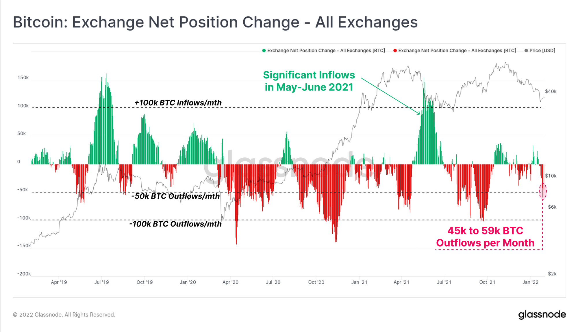
Exchange balances are one of the larger constituents of the Liquid and Highly Liquid supply metrics, and thus it makes sense to look at flows in and out to validate the observations made above. The exchange net position change is a metric showing this net monthly flow of coins in (green), and out (red) of the exchanges we track.
This week, we have seen net outflows of a reasonably high magnitude, with rates between 45k and 59k BTC per month. This has confluence with the increase in Illiquid supply (~51k BTC), indicating that some portion of the exchange withdrawn coins may have moved to colder storage.
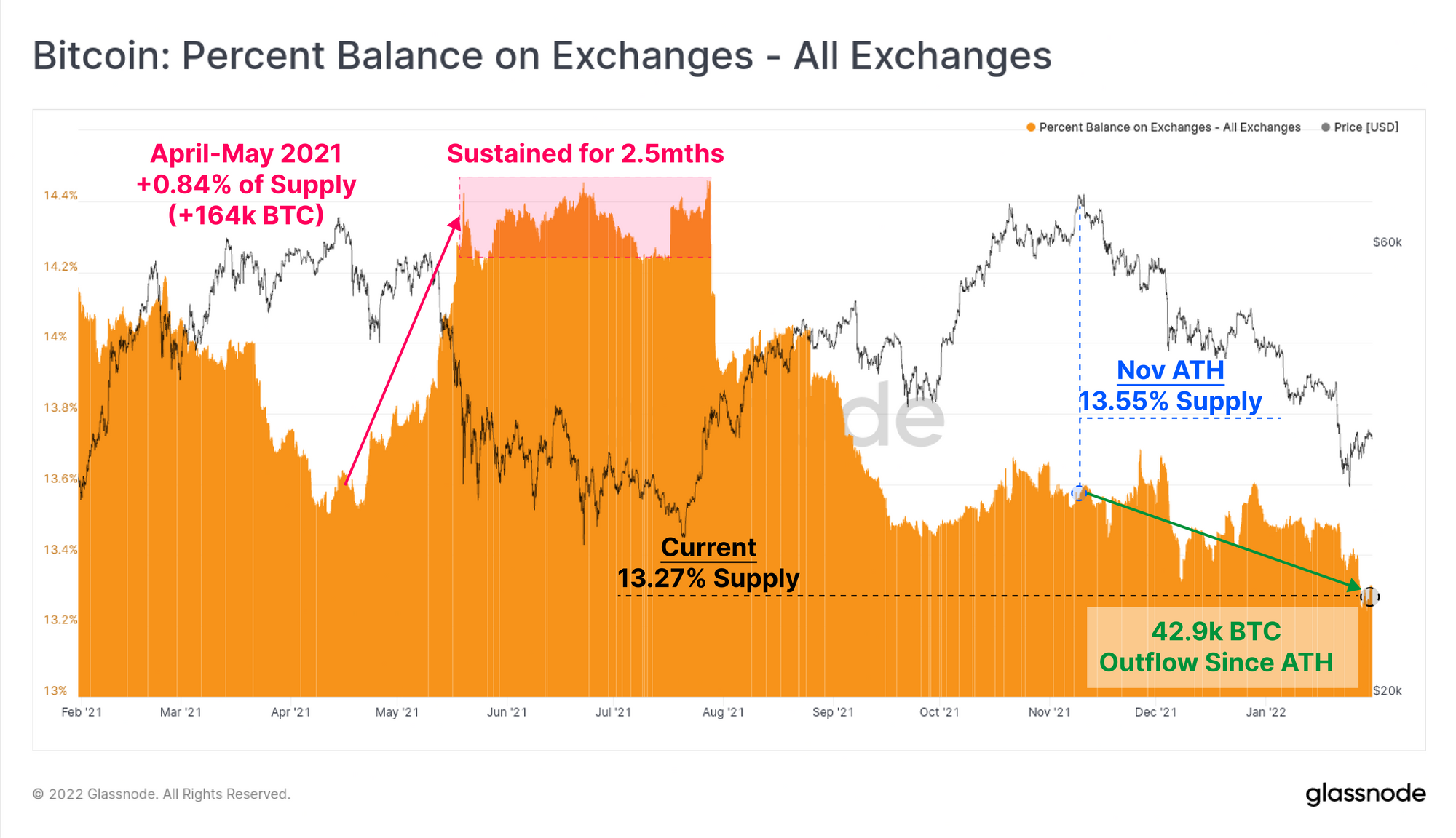
As a result, total exchange reserves have declined to multi-year lows, reaching 13.27% of the circulating supply. It is important to note that this is very different to the market reaction observed in the May-July 2021 drawdown:
- Both periods experienced over 50% price drawdowns from the ATH.
- May-July 2021 saw over 164k BTC (0.84% of circulating) in net inflows to exchanges, alongside a decline in Illiquid supply equal to of 1.5% circulating supply.
- The current drawdown has seen exchange balances decline by 42.9k BTC (0.28% of circulating) since the November ATH, whilst Illiquid supply has increased by 0.86% of circulating supply.
Despite equivalent scale drawdowns, the trends in exchange reserves and coin liquidity are trending in opposite directions. The current environment has a markedly more bullish undertone of supply absorption, and far fewer coins being spent and sold in fear.
Network Utility On the Rise
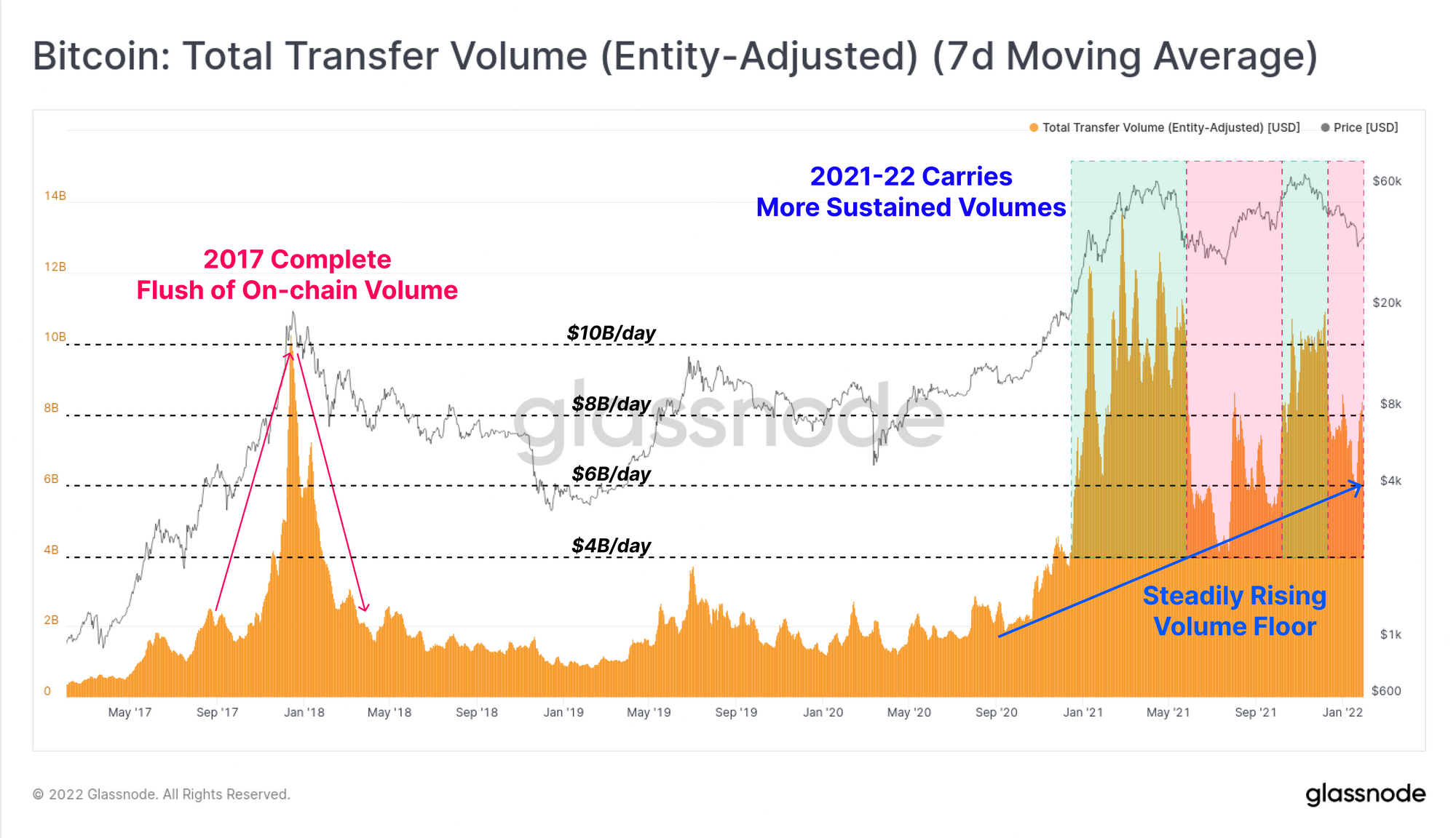
Bitcoin is many things to many people, and one of those things is a settlement layer for value. In theory, the more value Bitcoin settles as a network, the more utility is served, and the higher the network should be valued, and vice-versa.
The blow-off top in 2017 was marked by an explosion in settlement volumes, peaking above $10B/day. This was quickly followed by an equally incredible 80% decline back to $2B/day, all within just a few months. The mania phase came and went with gusto.
The market since Oct 2020 has been very different.
During both of the aforementioned 50%+ drawdowns, settlement volumes declined significantly from the peaks. However, the floor value has continued to grow, even during bearish trends (red zones). This speaks to a more sustained, and even growing utility of Bitcoin as the market cap, holder base, and value stored increases.
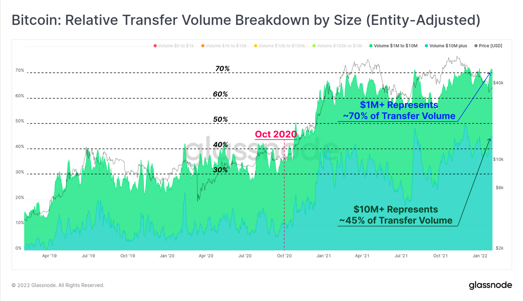
The make-up of these settlement volumes has also seen an undeniable shift since October 2020, away from retail sized transactions (<$100k), and towards high-net-worth and institutional sized values (>$1M).
Transactions $10M+ in size now dominate 45% of settled volume, whilst sizes > $1M dominate over 70% (on an entity-adjusted basis). Large size transactions have sustained this elevated dominance throughout 2021, and have actually peaked higher over the course of this correction.
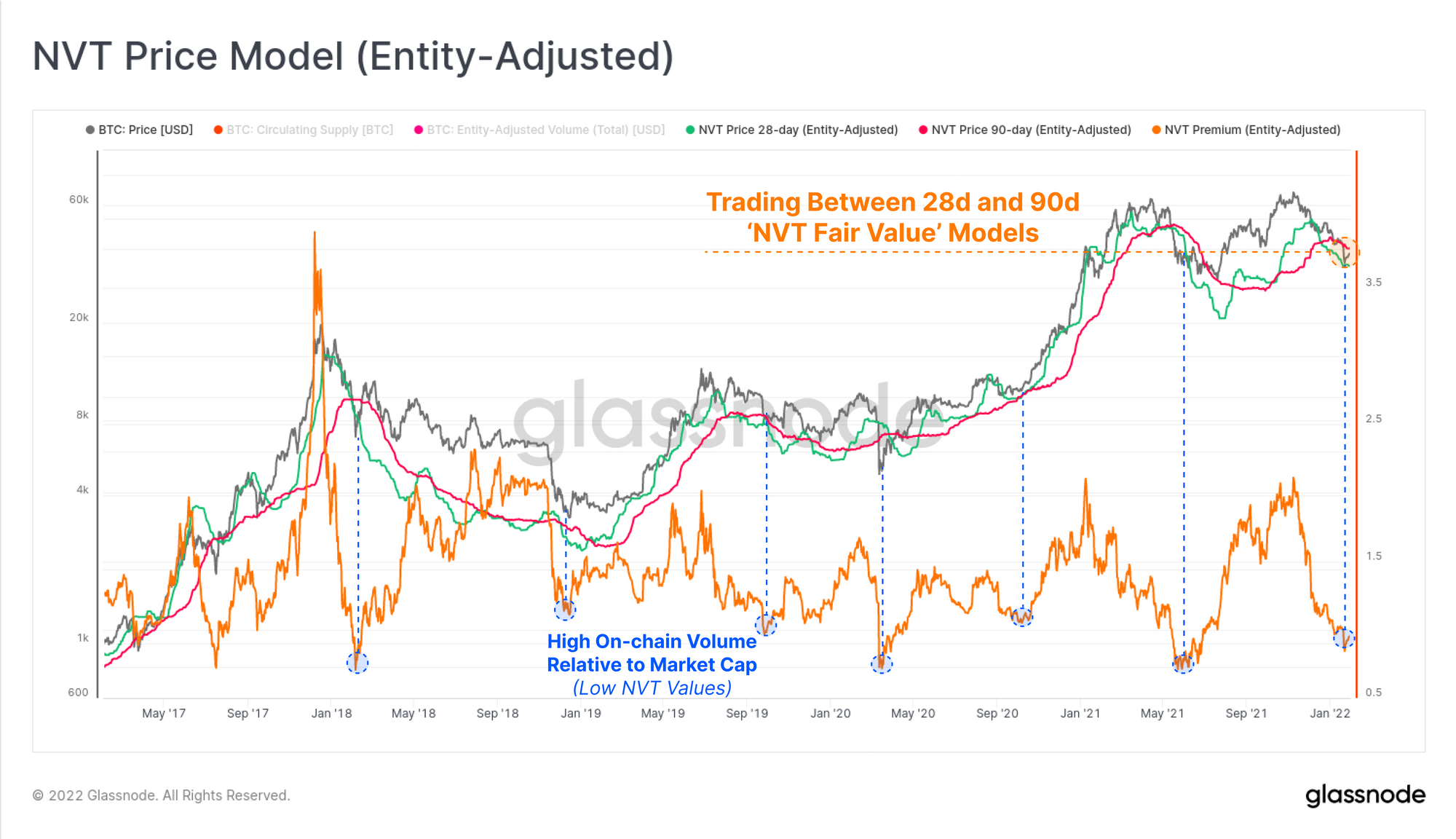
Finally, we can construct an implied pricing model using the NVT Ratio, which maps network settlement volume (utility), to an implied price (methodology by Willy Woo). The market price is currently trading between the faster 28-day (green) and slower 90-day (pink) NVT price models, arguably putting Bitcoin in a zone of 'fair value' right now.
Taking a ratio of price and the 90-day NVT price gives an 'NVT Premium', which is currently trading at lows that are historically considered undervalued. Previous instances where settlement volumes have been this high relative to the market cap have preceded strong bullish impulses in bear markets, or at macro market bottoms such as Dec 2018, and Mar 2020.
Summary
In our previous report, we explored the current supply dynamics, and determined they are characteristic of most historical Bitcoin bear markets. This week we shifted gears to look into the underlying demand side of the equation, which reveals a marked difference between current market structure, and the most recent bearish period in May-July 2021.
Whilst both experienced 50%+ drawdowns in price, the current market appears to have a resilient and persistent class of HODLers, whom appear to be accumulation mode through rain, hail or shine. On-chain settlement volumes are down from the highs, however are increasing relative to market valuation, suggesting Bitcoin is now closer to a 'fair value', than it is to a cycle top.
Meanwhile, derivatives markets appear to be betting on further downside. Within the context of a macro bear, this begs the question; is the market late to hedge out risk, or is it due for an upside correction to shake-out this peak in leveraged negativity?