A Delicate Equilibrium

The Bitcoin market is in a delicate equilibrium, with limited incoming demand, alongside a slowing sell-side. In this edition, we analyse exchange flows specifically to assess the characteristics of Bitcoin sales.

A Delicate Equilibrium

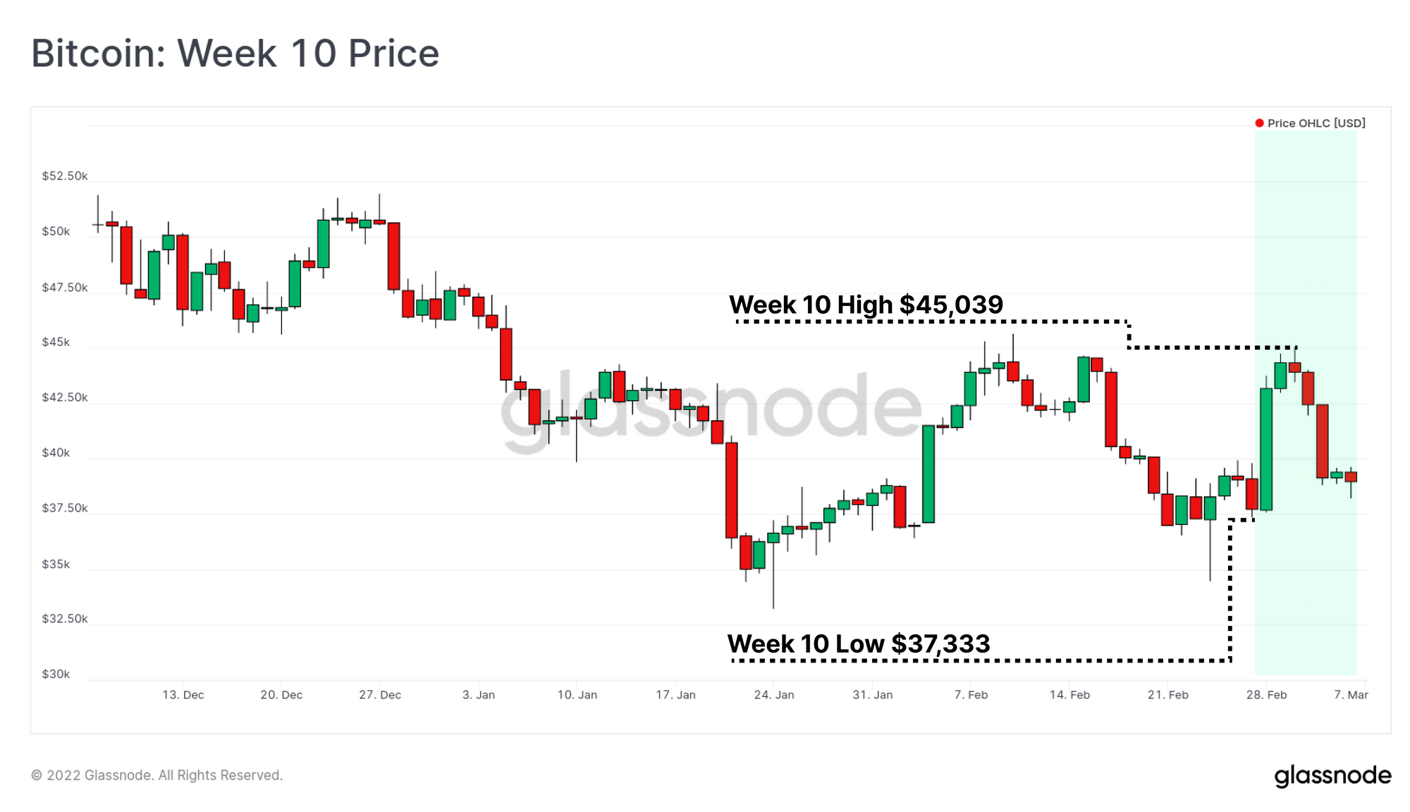
Bitcoin prices have traded within a volatile consolidation range this week, opening at weekly low of $37,333, rallying to a high of $45,039, and then giving back the majority of the gains, closing at $39,220. As the global macro and geopolitical stage continues to create uncertainty in markets, Bitcoin bulls attempt to set a price floor. The bulls have been absorbing a modest but persistent sell-side pressure for over two-months now, largely sourced from by short-term holder divestment.

With prices trading sideways in recent weeks, a relative equilibrium has been established. However, given the limited incoming fresh demand, this delicate balance can be disrupted by any significant degree of seller exhaustion, or conversely a re-invigoration of sellers.

Thus the question to be answered is whether the capital support being provided by the bulls will be sufficient to keep the bears at bay. As such, in this edition, we will assess the current on-chain volume space, with a specific focus on flows into exchanges. This aims to best reflect the magnitude of sell-side pressure and investor divestment.


Translations

This Week On-chain is now being translated into Spanish, Italian, Chinese, Japanese, Turkish, French, and Portuguese.

The Week Onchain Dashboard

The Week Onchain Newsletter has a live dashboard with all featured charts available here. This dashboard and all covered metrics are explored further in our Video Report which is released on Tuesdays each week. Visit and subscribe to our Youtube Channel, and visit our Video Portal for more video content and metric tutorials.


A Tale of Two Exchanges

Monitoring of exchange activity is a powerful strategy within on-chain analysis, although it does require an appreciation of data mutability (covered here). The tracking of aggregate exchange flows, especially over longer time periods (months), provides useful insight the balance of supply and demand.

To start, we will note of the following high level nuances for interpreting exchange balance metrics:

  • Bitcoin HODLers (of all wallet sizes) tend to be fairly religious regarding self-custody, and are thus the most likely cohort to withdraw their coins.
  • Newer retail level market entrants are the far less likely to withdraw coins, preferring the simplicity of custody solutions, and trading options provided by exchanges.
  • Institutional treasuries are similarly likely to take advantage of exchange custody solutions or similar), preferring the expertise and risk management offered by such firms. These coins are also more likely to be traded via OTC desks and held in specialised multi-signature arrangements.
  • With the proliferation of derivatives markets, Bitcoin units can also be used as collateral, and thus exchange inflows may also be a result of providing additional coin margin.

Note that 3-of-4 of the above characteristics have a skew towards exchange inflows. This is in part what makes the aggregate outflow of 575,876 BTC from exchanges (3.655% of supply) since the March 2020 sell-off so impressive. Note also how a relative equilibrium has been established since September 2021.

Live Chart

During the highly volatile macro and geopolitical events of the last few weeks, exchange net-flow volumes are also reasonably stable, despite a slight bias towards inflows this week. Around 1k BTC per day in net inflows deposited to exchanges this week, with Bitfinex and FTX receiving the lions share.

This magnitude of presumes sell-side supply remains fairly modest, particularly given the global macro context.

Live Chart

Over the last year in particular, exchanges have more-or-less fallen into two dominant camps based on their balance change: those with Net Inflows, and those with Stable Balances to Net Outflows.

Specifically, Binance, Bittrex, Bitfinex and FTX have seen non-trivial growth in their held Bitcoin reserves. In combination, these exchanges have seen combined BTC inflows of 207k BTC since the end of July 2021, a growth of 24.3%.

Live Chart

The other camp includes the remaining exchanges we monitor, and has seen a collective outflow of 253k BTC since late-July. Of these exchanges, Huobi (purple) represents by far the largest overall decline, having fallen from over 400k BTC in March 2020, to just 12.3k BTC today. More than half of this balance decline has occurred following the Chinese government ban on Bitcoin mining, and further restrictions placed on investor activity in May last year.

Live Chart

FTX and Binance in particular stand-out in this study, having seen extraordinary growth in market share dominance (measured by relative BTC balance held). Note that both Binance and FTX host a diverse range of spot and derivative products, and thus it is likely a reasonable proportion of BTC held is being used as margin collateral.

The total volume of BTC held by FTX is currently estimated to be 103.2k BTC, which is extraordinary growth from the mere 3k BTC held in March 2020. This represents a balance dominance increase from 0.8% in July 2021 to 4.0% today.

If we remove the BTC held by FTX from the total exchange balance metric (result in pink), we can see this measure of aggregate exchange balances is probing new multi-year lows, showing the sizeable footprint FTX now has.

Live Workbench Chart

Binance however takes the crown for most impressive growth in market share dominance, rising from a relatively stable 8% BTC balance dominance in 2018-20, to over 22.6% today. The total balance held on Binance has increased by 315k BTC since March 2020, an increase of 120% in just two years.

Live Workbench Chart

Alongside BTC balance growth, both Binance and FTX have seen their dominance over Futures markets more than double since Dec 2020. Binance's share of Future OI has increased from 15% to 30%, whilst FTX has risen from 6.7% to over 14.8% (a 2.2x increase).

Live Chart

The increase in Futures volume dominance is even more impressive, with Binance now representing half of all traded futures volume. FTX has seen a similarly impressive increase in volume dominance, rising by 2.5x since Dec-2020 to now capture 9.2% of traded futures volume.

Live Chart

Our high level conclusions from this study of exchange activity:

  • Net inflows remain relatively small given then scale of market uncertainty at present, and overall exchange balances appear to be in equilibrium.
  • There are two cohorts of exchanges with respect to BTC balance change over the last year.
  • Binance and FTX represent the stand-out exchanges in market share increase over the last two year, both of which have a corresponding increase in futures market dominance.
  • This suggests a preference of investors to use derivatives to hedge risk, rather than the sale of spot BTC, an observation which corroborates our report from Week 7.

Characterising Exchange Inflow Volumes

Having now explored the relative equilibrium of exchange balances, we can now look to explore the investor profile of coins being sent to exchanges. To start, we will analyse three estimates of investor cost basis (realized prices) to inform our interpretation of sentiment and the likelihood of a sale:

  • The Short-Term Holder realized price is currently trading at $46.4k, and thus holds an aggregate unrealized loss of 15%. This metric is a reflection of all coins that were moved within the last 155-days.
  • The HODLer Implied Price is currently at break-even ($39.2k), and reflects an estimate of 'fair value'. It is calculated by weighting the standard realized price by the degree of accumulation and HODLing behaviour.
  • The Realized Price is currently at $24.1k, and is the average price of all coins valued when they were last moved on-chain. Historically, this has been a very sound cycle support level, and suggests that the aggregate market is still holding an unrealized profit of 63% (heavily weighted by longer-term investors with a lower cost basis).
Live Chart

One obvious thesis from this is that:

  1. Short-Term Holders (STHs) are the most likely to sell since they are underwater on their position.
  2. Conversely, Long-Term holders (LTHs) are more likely to be in profit, and thus are less likely to sell.

The next chart shows the shows the degree of profit or loss realized by STHs on coins sent to exchanges. We can see that non-trivial daily losses have been sustained for over two months, equivalent to of around 0.5% of the Market Cap per day. Whilst significant, losses of this magnitude are nowhere near the extreme capitulation levels seen in the 2018 bear market, March 2020, or in May 2021.

This largely confirms our first observation that STHs are creating sell-side pressure, although it is of much lower magnitude than has been seen in previous bear cycles.

Unreleased Metric from the Glassnode Engine Room

Similarly, the chart below shows the profit or loss realized by LTHs sending to exchanges. We can see that the degree of spending has been in decline since Jan 2021, which confirms our second observation that LTHs comprise a small portion of sell-side activity. Note that we are yet to see a major LTH capitulation event as was seen at previous cyclical bottoms.

The historically low magnitude of both STH and LTH losses may be signalling increasing probabilities of aggregate seller exhaustion. However, the risk of a final, and complete capitulation of both STHs and LTHs should remain on the radar, and has numerous historical precedents.

Unreleased Metric from the Glassnode Engine Room

The proportion of on-chain volume that is in profit is also near historically low levels, reaching 47.5% this week. Flipping this observation around, we can deduce that over half (52.5%) of all transaction volume is currently spent at a loss. For context, final stages of previous bear cycles (marked in red) were punctuated by over 55% of all transfer volume being in loss (capitulation events).

Live Chart

To close out, we look to the 30-day change in the Realized Cap. This metric indicates the total magnitude of profit/loss across the network, mapped out as a statistical deviation from the long-term average (Z-Score).

What we see is that investor losses during this bear market are statistically significant, extending 1 standard deviation below the mean. Realized losses of this magnitude are coincident with all significant bear market lows (local and global) over the last 5-years.

Live Chart

Summary and Conclusions

The current drawdown is historically significant across a number of on-chain metrics and measures, despite being shallower (-50%) than past bear markets (-85%). This describes characteristics that are similar to previous late-stage bear market trends. However whilst the degree of on-chain 'panic selling' is significant on a statistical basis, it is notably lower relative to market size.

The investors who are divesting are preferring to sell coins that are held at a loss, an activity which has been dominated by Short-Term Holders. Meanwhile Long-Term Holder sell-side has continued to decline since Jan 2021 a signal of growing conviction in the face of high macro uncertainty.

With the introduction of derivative markets, FTX and Binance in particular have seen significant increases in market share. This adds another data-point to the market's utilisation of futures to hedge risk, rather than the sale of spot BTC to reduce exposure.


Product Updates

All product updates, improvements and manual updates to metrics and data are recorded in our changelog for your reference.


Disclaimer: This report does not provide any investment advice. All data is provided for information purposes only. No investment decision shall be based on the information provided here and you are solely responsible for your own investment decisions.