Sizing Up Diamond Hands
As Bitcoin struggles to reclaim the recent ATH, we investigate the Long and Short-Term cohorts contribution to the supply and demand side. We also leverage the new breakdown metrics to evaluate the spending behavior and market influence of differing subsets of Long-Term investors.


Executive Summary
- The market has effectively traded sideways since the $73k all-time-high which was set in March. By our estimates, demand momentum has turned negative since early May.
- We analyse the cost-basis of short-term investors as a method to inspect capital flows into the market.
- To analyze the supply side, we refer to long-term holders, and identify that the unrealized profit held by this cohort is statistically far from historical peaks.
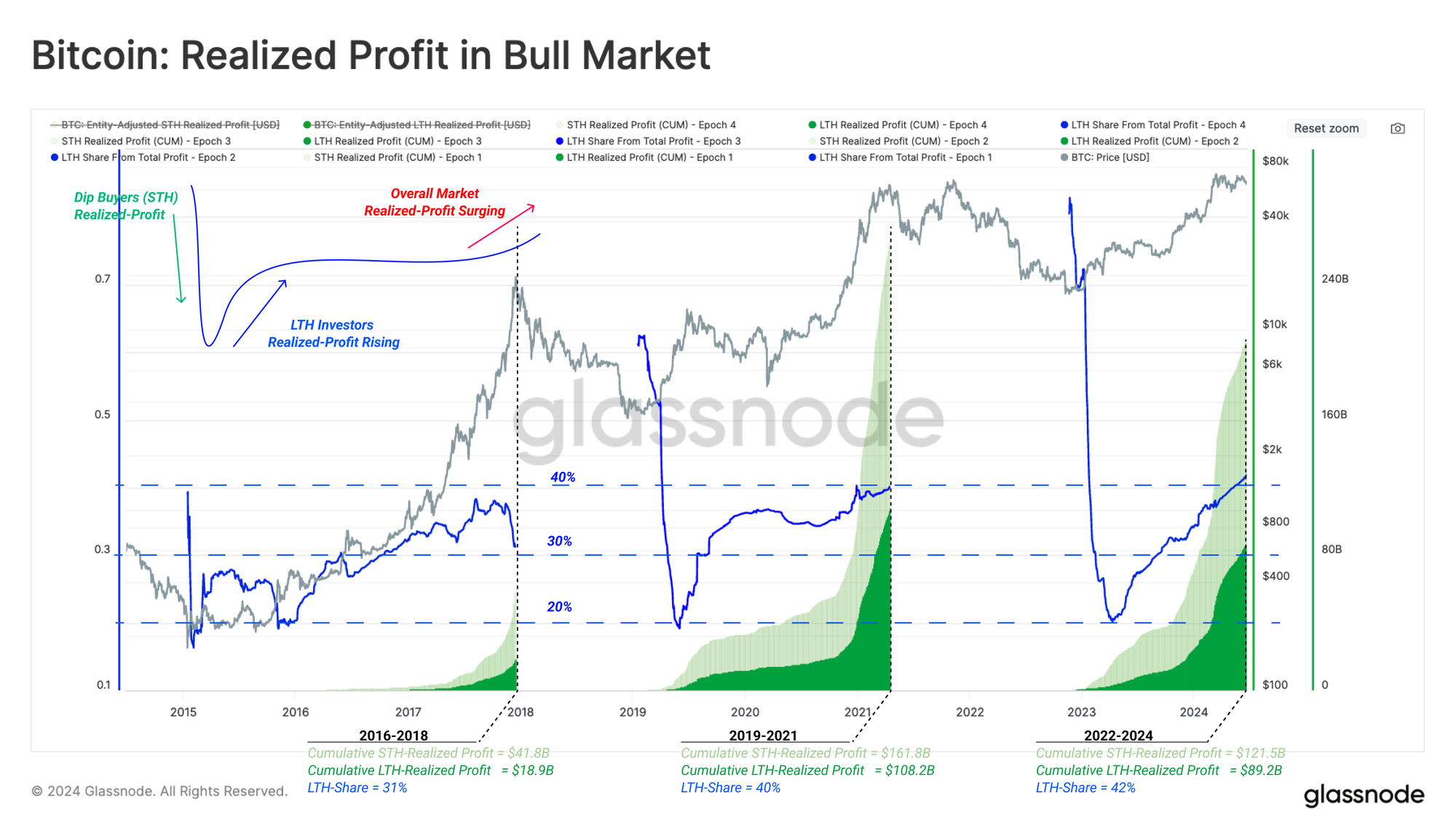
- Looking at the spending behaviour of long-term holders, it can be seen that although the spent volume by these players constitutes only 4%-8% of the total volume, the profits realized from this spending typically account for 30%-40% of cumulative profits realized over bull markets. This finding underlines the concentration of wealth in older coins gradually paying back the diamond hands over the bull market.
Tracking Demand
In WoC 18, we explored a methodology to identify the direction and intensity of capital flows in or out of the market. We consider a framework utilizing the average cost-basis of various age brackets within the short-term holder cohort:
- When the cost basis of these cohorts is in an uptrend, it suggests capital flows into the market as new buyers acquire coins at higher prices (and vice versa for downtrends).
- As spot prices deviate above or below the cost basis, we can approximate the degree of unrealized profit held by each group via the MVRV Ratio.
- We can consider MVRV values to be a gauge on the incentive for investors to take profits (high values), or an indicator of seller exhaustion (low values).
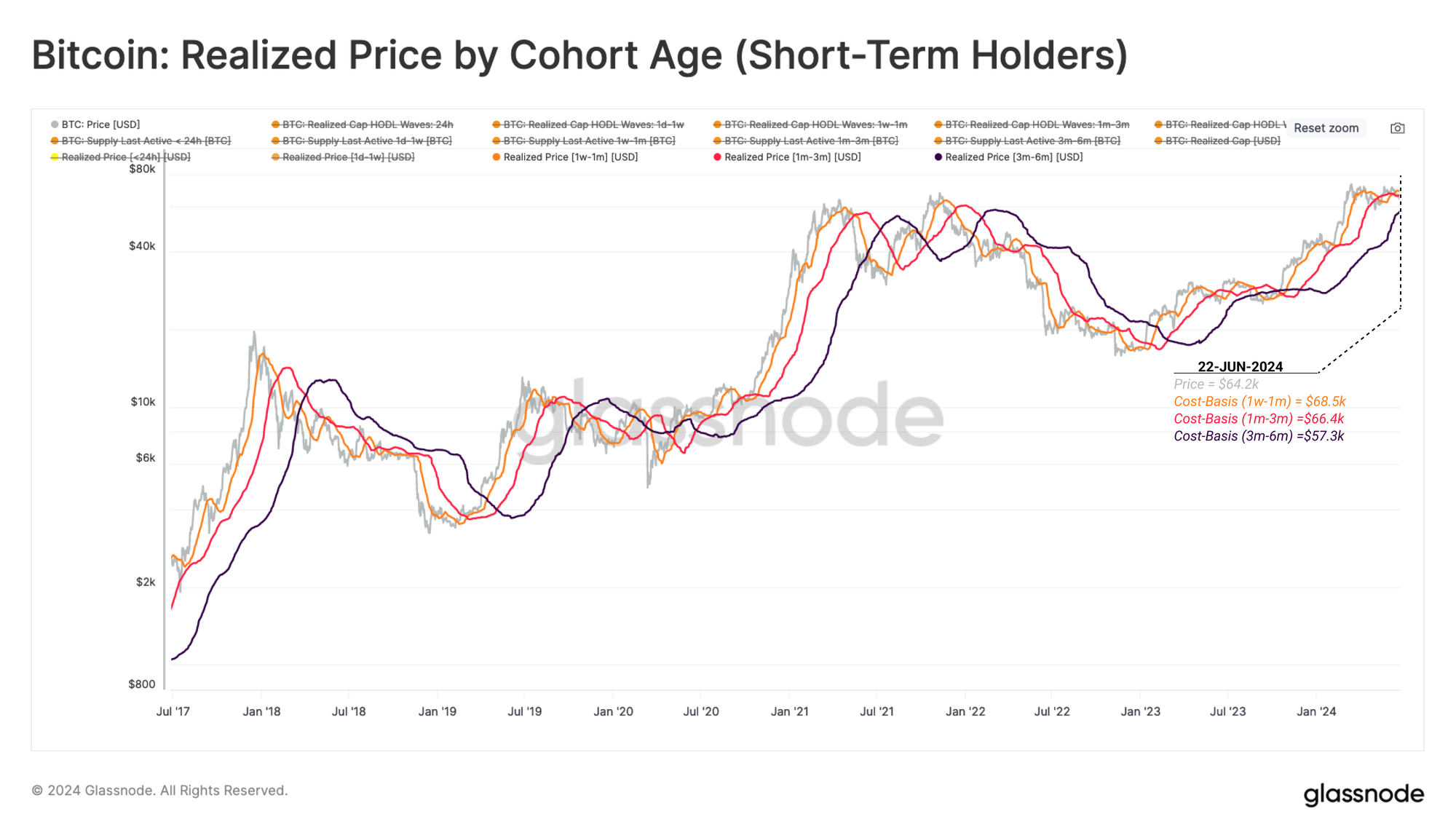
We will start by comparing the spot price in relation to the cost basis of two cohorts:
- 🟠 Holders with 1-week to 1-month old coins.
- 🔴 Holders with 1 to 3-month old coins.
From this, we can identify when macro tides change in capital flows during the early stages of the bull and bear phases. The chart below presents how these two price models have provided market support during the 2023-24 bull.
Since mid-June, the spot price has plunged below the cost basis of both the 1w-1m holders 🟠($68.5k) and 1m-3m holders 🔴 ($66.4k). If this structure persists, it has historically resulted in a deterioration of investor confidence, and risks this correction being deeper and taking longer to recover from.
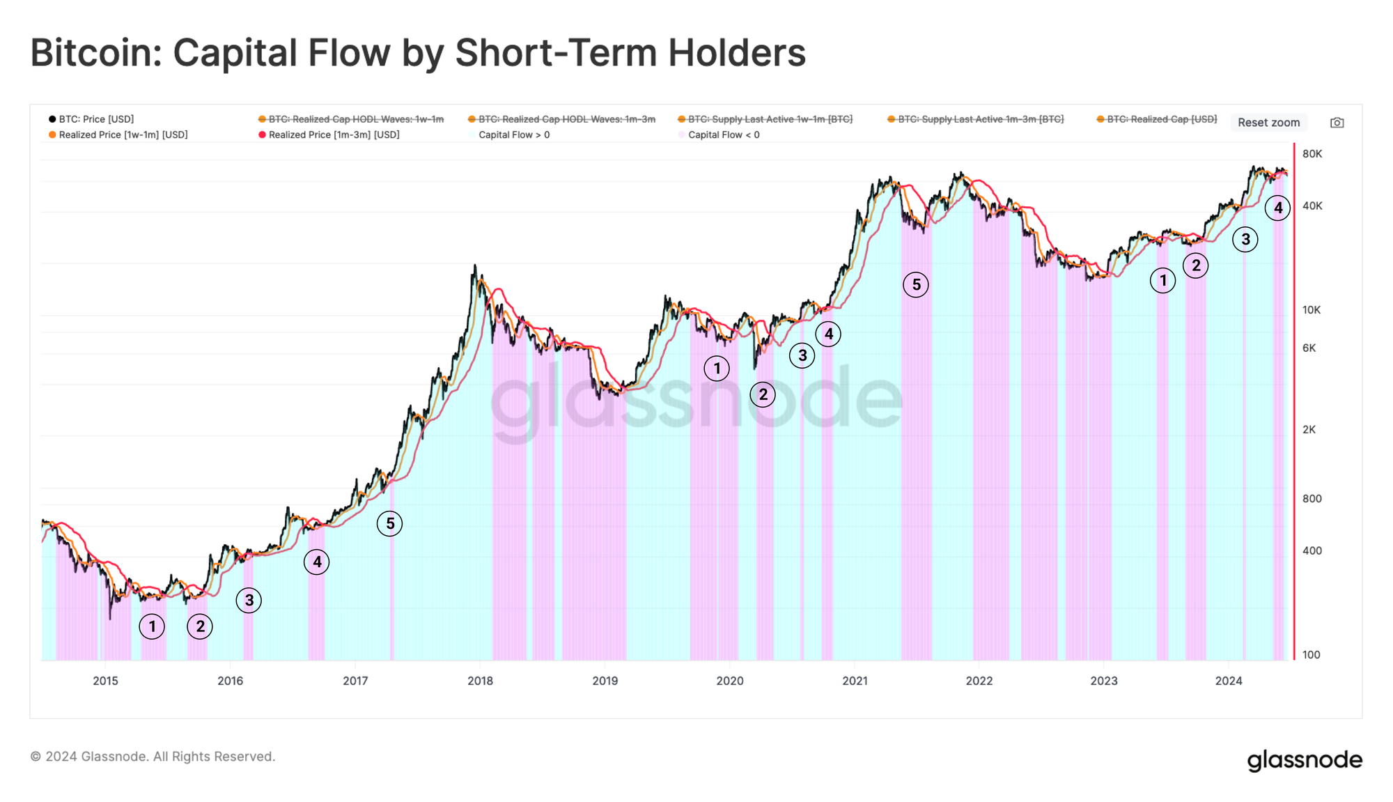
We can also characterise market momentum by comparing the cost basis of these cohorts to each other. The chart below highlights:
- Capital Inflows 🟦 when the cost basis of the 1w-1m holders trades above the 1m-3m cost basis. This underscores a positive momentum in demand, and, attracting new capital into the market
- Capital Outflows 🟪 when the cost basis of the 1w-1m holders plunges below the 1m-3m cost basis. This structure signals a diminishing momentum in the demand side, and a net capital outflow from the asset.
During previous bull markets, a negative capital flow structure has occurred up to five times. We can also see that this structure has been in play since May and into early June.
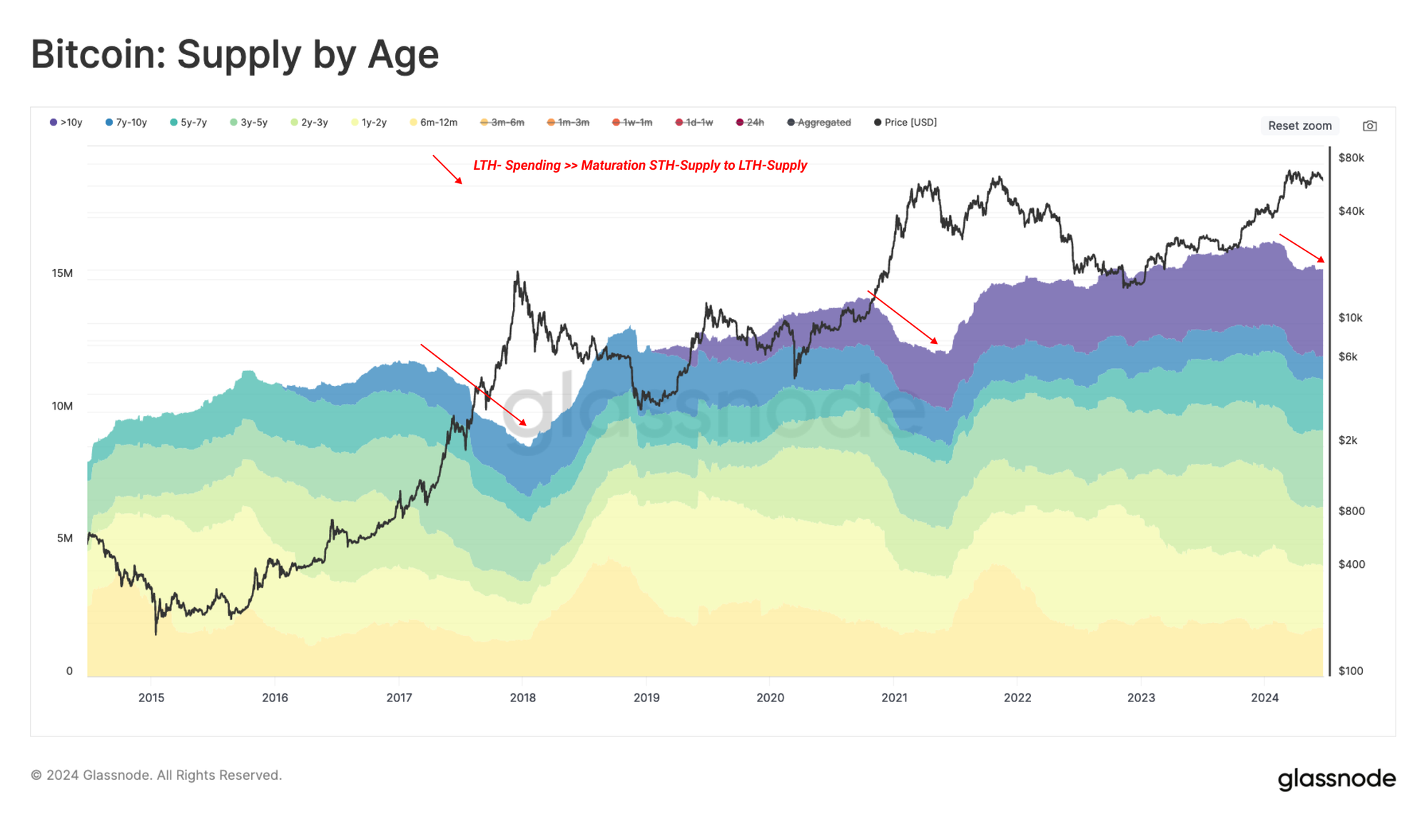
Navigating the Supply Side
To achieve a complete macro view of the current market, we can leverage metrics which describe the behavior of Long-term holders (LTHs). The LTH cohort is the primary actor on the supply side during bull markets as they distribute coins and take profits. Market cycle tops are established, in part, when LTHs ramp up their selling intensity until it overwhelms and exhausts demand.
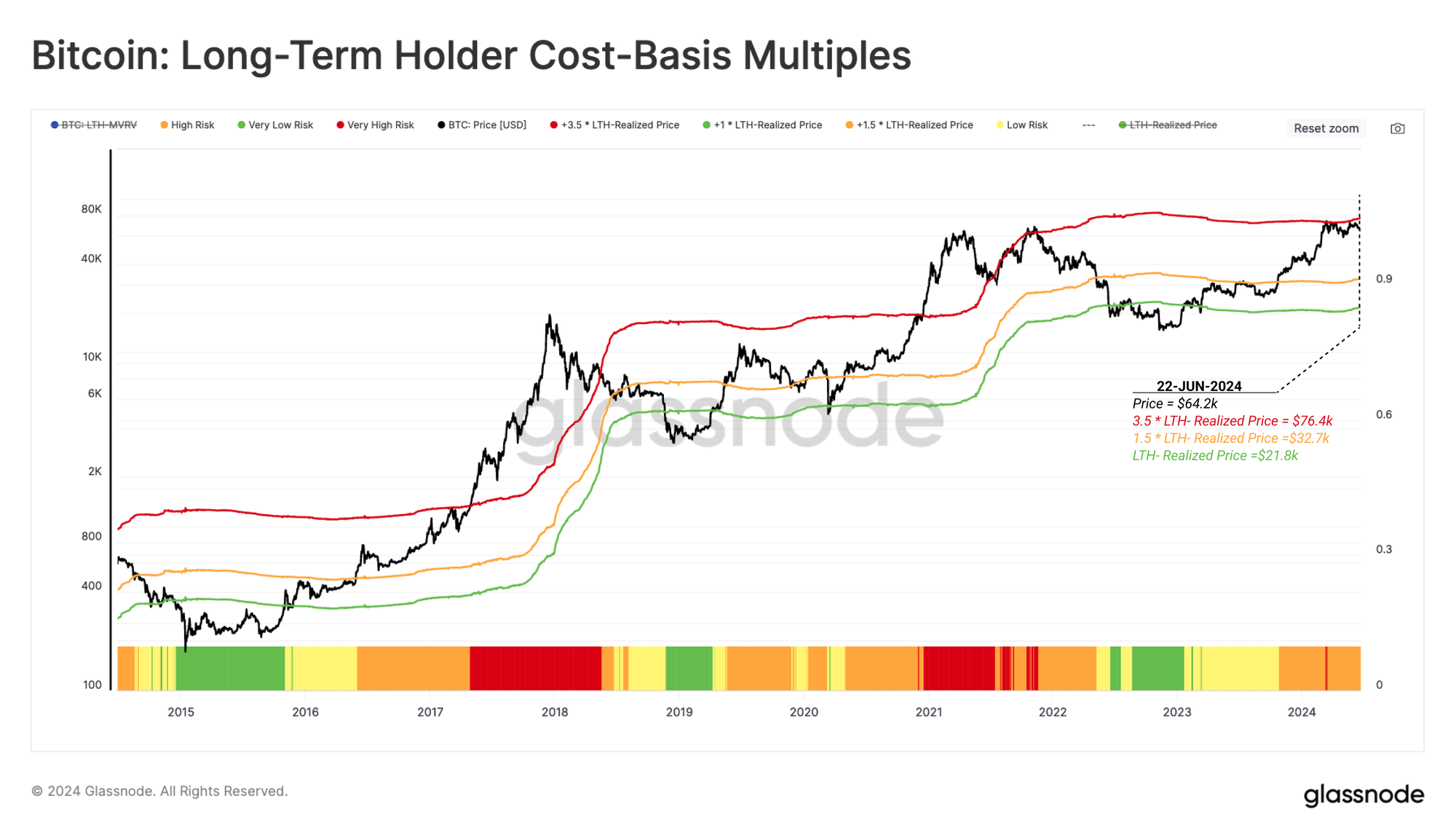
The following chart compares the spot price against significant multiples applied to the average cost basis of the LTH cohort (LTH Realized Price).
- 1.0 * LTH Realized Price 🟢 historically aligns with the bottom formation phase of the bear cycle and into the market recovery.
- 1.5 * LTH Realized Price 🟠 delineates the recovery phase from a longer-term equilibrium phase of the bull. Price tends to experience a slower rate of growth, and on average, LTHs are holding an unrealized profit is around +50%.
- 3.5 * LTH Realized Price 🔴 provides a distinguishing boundary between the equilibrium phase, and the euphoria phases of the bull market. This is a point where price tends to appreciate quickly, and LTHs tend to increase their distribution pressure due to being at an unrealized profit of 250% or more.
If we apply this framework to recent cycles, we can see that the ongoing bull has been very similar to the 2017 cycle from a macro perspective. In particular, the recent consolidation phase near the previous ATH aligns with the equilibrium to euphoria boundary described by the 3.5 multiple applied to the LTH-Realized Price 🔴.
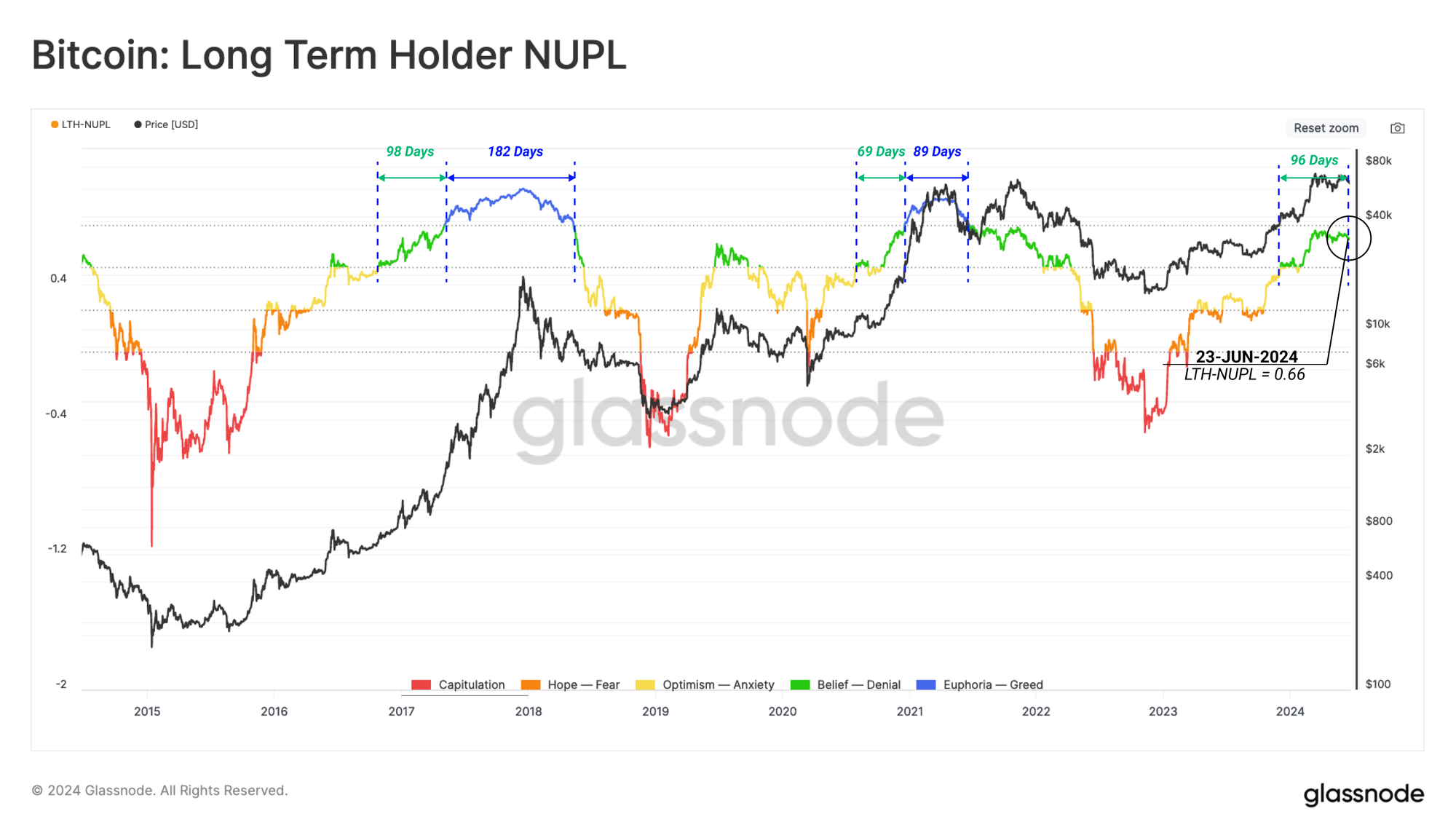
The magnitude of unrealized profit held by LTHs can be considered as a measurement of the incentive for this group to spend coins, and take chips off the table. We can visualise this psychological incentive using the LTH-NUPL metric.
At the time of writing, LTH-NUPL is at 0.66, which resides between levels associated with the pre-euphoria phase 🟢. This condition has been in play for 96-days, which is a very similar duration to the 2016-17 cycle.
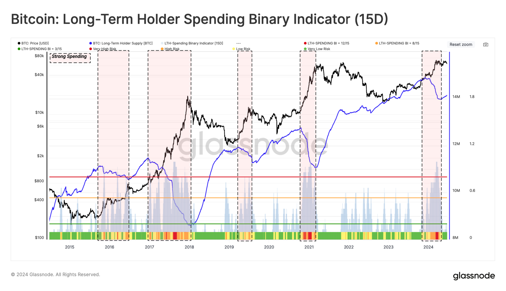
Using the Long-Term Holder Spending Binary Indicator, we can identify periods where strong spending by this cohort is underway. During these events, the aggregate balance held by LTHs declines consistently, and significantly.
From this, we can identify the following LTH-spending regimes:
- Weak Spending 🟩 where LTH supply declines for at least 3 of the last 15-days.
- Moderate Spending 🟧 where LTH supply declines for at least 8 of the last 15-days.
- Strong Spending 🟥 where LTH supply declines for more than 12 of the last 15-days.
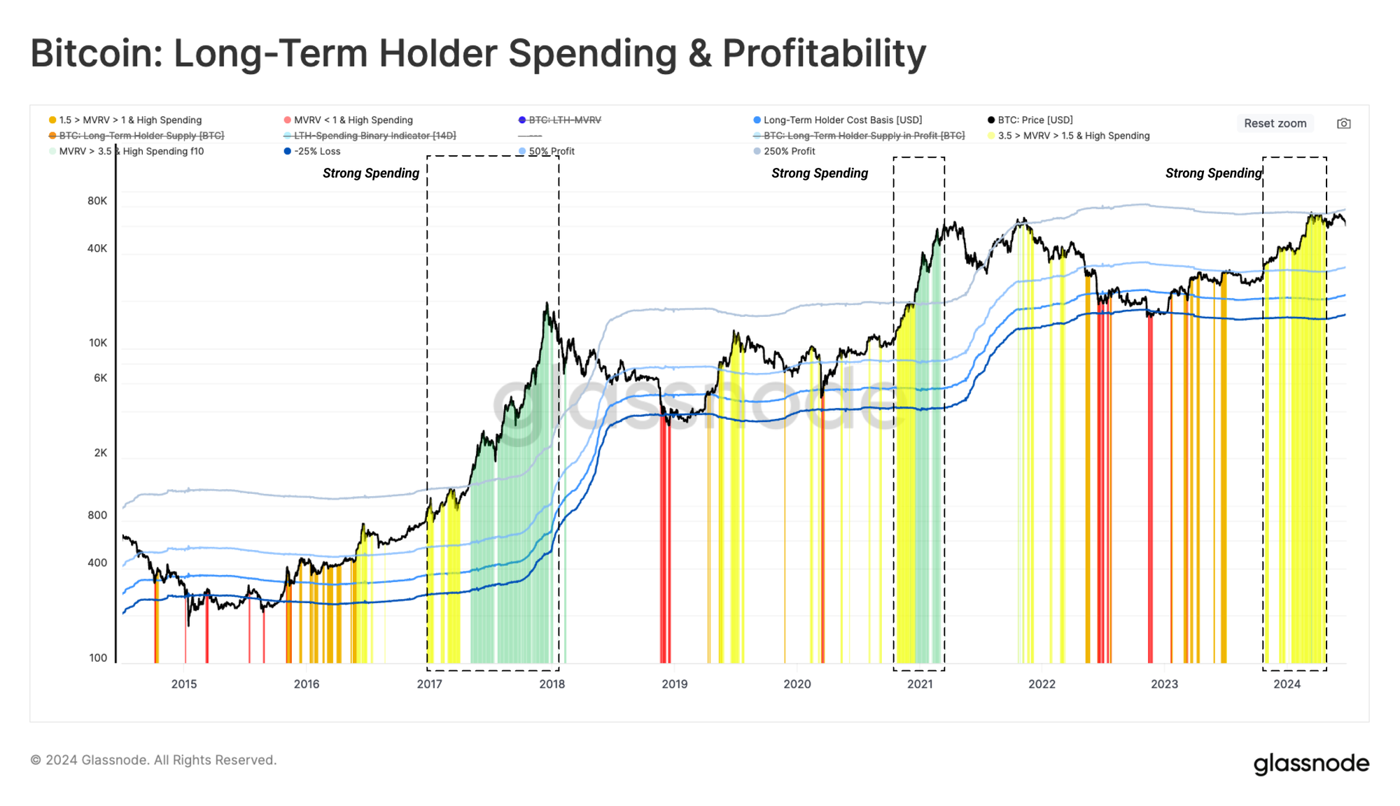
The next chart has been designed to combine both of the previous models to assess LTH sentiment and behavior. This combines the incentive for this cohort to take profits with their actual spending behaviour.
We consider four regimes describing shifts in LTH divestment and behavior patterns:
- Capitulation 🟥 where spot price is lower than the LTH cost basis, and therefore any strong spending is likely associated with fear and capitulation.
- Transition 🟧 where price trades slightly above the LTH cost basis, and with occasional light spending. This is considered to be associated with typical day-to-day activity.
- Equilibrium 🟨 after recovering from a prolonged bear, where the market seeks a new balance between a light inflow of new demand, lighter liquidity, and a gradual divestment by underwater holders from the previous cycle. Strong LTH spending during this stage is usually associated with sudden rallies or corrections.
- Euphoria 🟩 as LTH-MVRV trades above 3.5, and is historically aligned with the market hitting the prior cycle ATH. The LTH cohort holds upwards of +250% in unrealized profits on average. The market enters a euphoric rise, which motivates these investors to spend at very high and accelerating rates.
Using this stencil, we can see an elevated spending regime by LTHs throughout Q4 2023 and into 2024 Q1. This puts the market into the equilibrium regime over this period.
Dissecting the Spending By Strong Hands
The previous metric considers periods when the aggregate Long-Term Holder supply declines. Similarly, the Short-Term Holder cohort, we can also inspect which sub-age-groups are responsible for the sell-side pressure.
To assess the contribution of each sub-group of LTH spending, we have highlighted the days when their spending volume is at least one standard deviation above the yearly average.
Whilst there are occasional bursts of spending activity for each cohort, the frequency of high-spending days increases dramatically during the euphoria phase of a bull market. This highlights the relatively consistent behaviour pattern of long-term investors taking profits during periods of rapid price appreciation.
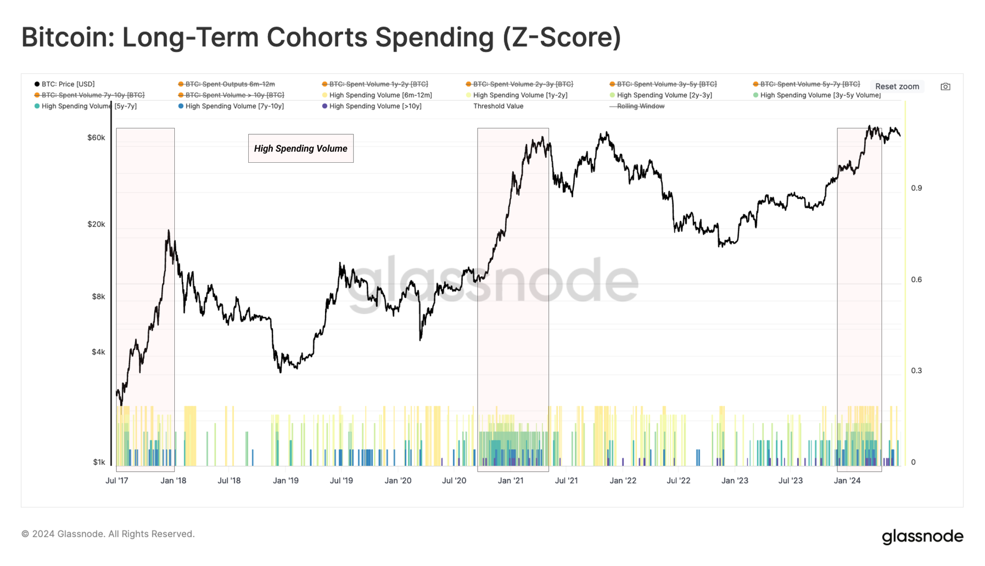
Given only 4%-8% of daily on-chain volume corresponds to LTHs, we can leverage another core on-chain metric to explain the relative weight of these investors on the supply side.
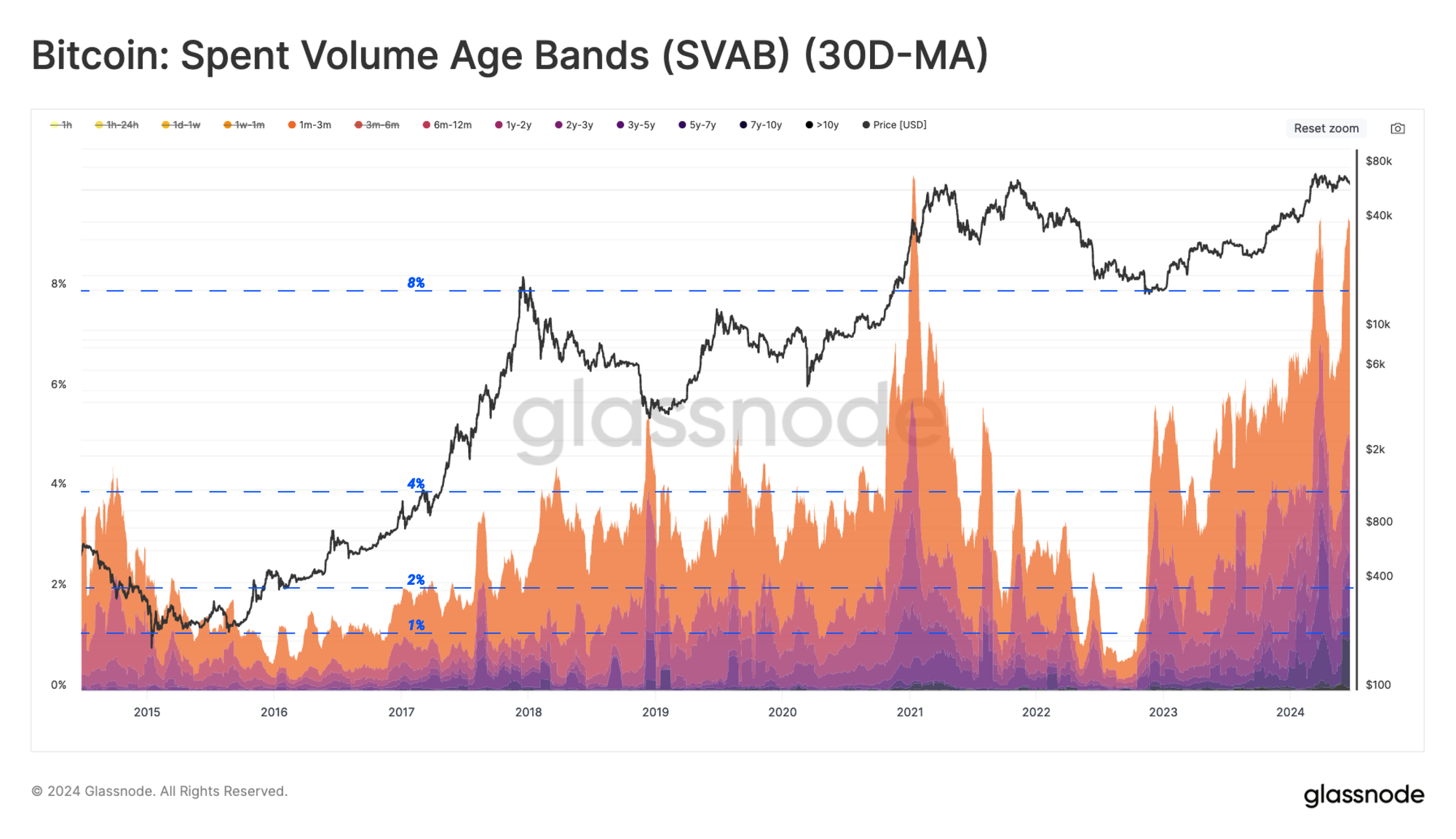
Despite their small share of spent volume, LTH coins are typically moving at significantly higher (or lower) prices than when they were initially acquired. Therefore, the magnitude of the realized profit or loss via spent coins provides a valuable lens into their behavior patterns.
The chart below captures the cumulative volume of realized profit locked in by long-term holders during bull markets. What we find is that LTHs typically account for between 20% and 40% of the total profit locked in over time.
Despite their volume being just 4% to 8% of the daily total, the LTH cohort accounts for up to 40% of the profit taking by investors.
Conclusion
With sideways price action dominating since early March, we leveraged the cost-basis of both long and short-term investors to assess the current degree of supply and demand in the market.
Utilizing the change in Short-Term investors' sub-cohorts’ cost basis, we constructed a toolbox that estimates the momentum of capital flow into the network. The results confirmed that the ATH in March was followed by an interval of capital outflow (negative momentum).
Following on, we dissected the Long-Term Holder spending into different age sub-cohorts. The conclusion indicated that the frequency of high-spending days increases dramatically during the euphoria phase of a bull market. Interestingly, the Long-Term Holders volume accounts for a only marginal 4% to 8% of the daily total, however, the cohort represents a substantial 40% of the profit taken by investors.
Disclaimer: This report does not provide any investment advice. All data is provided for information and educational purposes only. No investment decision shall be based on the information provided here and you are solely responsible for your own investment decisions.
Exchange balances presented are derived from Glassnode’s comprehensive database of address labels, which are amassed through both officially published exchange information and proprietary clustering algorithms. While we strive to ensure the utmost accuracy in representing exchange balances, it is important to note that these figures might not always encapsulate the entirety of an exchange’s reserves, particularly when exchanges refrain from disclosing their official addresses. We urge users to exercise caution and discretion when utilizing these metrics. Glassnode shall not be held responsible for any discrepancies or potential inaccuracies. Please read our Transparency Notice when using exchange data.
- Join our Telegram channel
- For on-chain metrics, dashboards, and alerts, visit Glassnode Studio
- For automated alerts on core on-chain metrics and activity on exchanges, visit our Glassnode Alerts Twitter