Surviving Bull Drawdowns
As Bitcoin continues consolidating, we investigate which cohort of investors are contributing the most to sell-side activity. We also use our new Breakdown metric suite to build a set of rules for tracking local market lows during corrections.


Executive Summary:
- Since the March ATH at $73k, the Bitcoin market has transitioned into widespread net distribution, with coins taking advantage of liquidity and inflowing demand.
- According to the NUPL metric, the Bitcoin cycle remains within the Euphoria phase, however it has cooled off since the correction started.
- We develop an example procedure for identifying potential inflection points and local lows, driven by various sub-sets of the Short-Term Holder cohort.
Distribution in Fear
The Bitcoin market is still consolidating in the mid-$60k range, where prices have been constrained since the $73k ATH was reached in mid-March. In this edition, we will assess whether the behavior of investors during this consolidation is more heavily weighted towards distribution, or accumulation patterns.
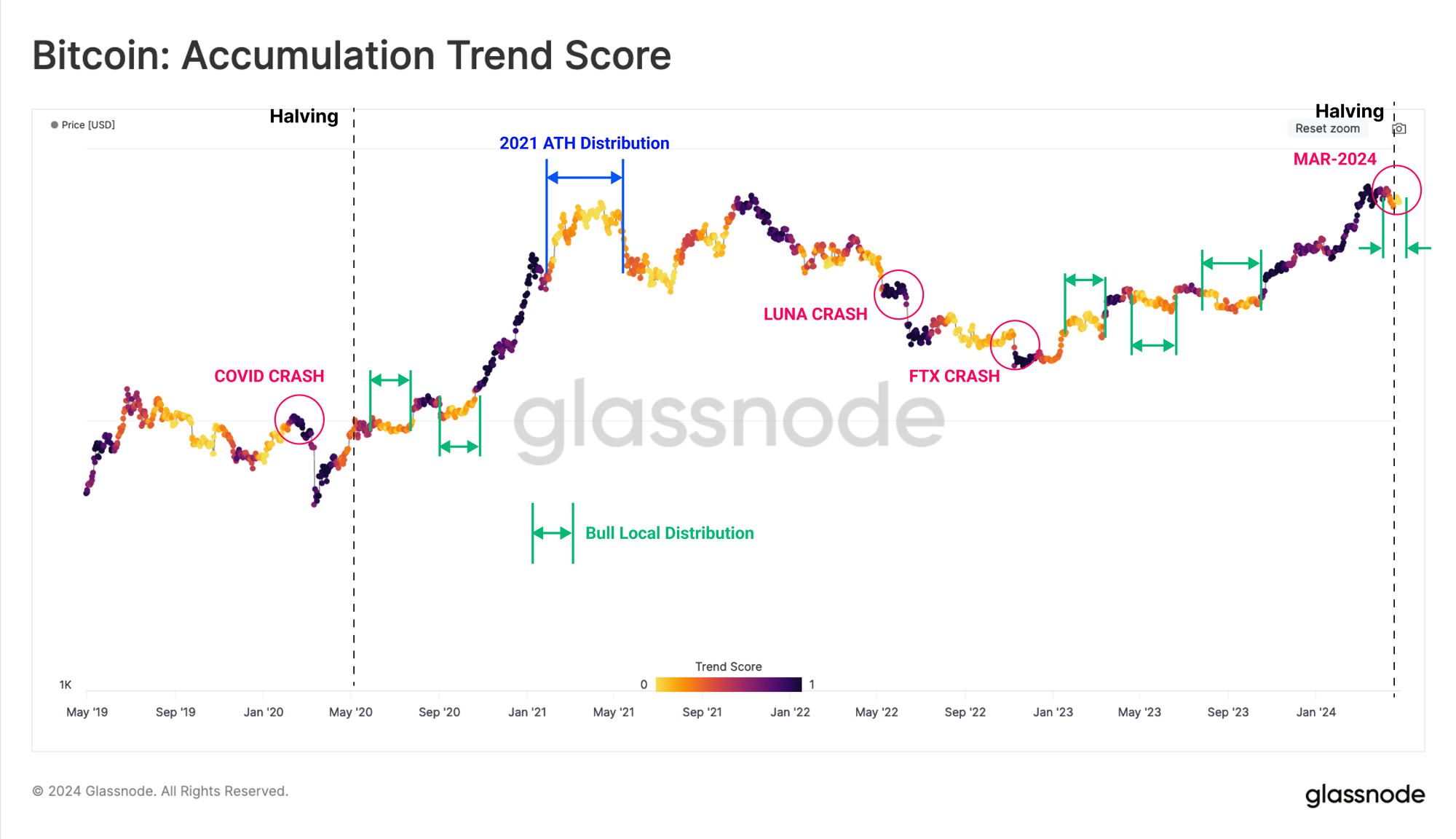
First, we will employ the Accumulation Trend Score to illustrate how investor accumulation patterns have shaped local tops and bottoms since the FTX crash.
During the early stages of both the 2020-21 and 2023-24 bull runs, we can see a confluence between local regimes of distribution (light colours) and intervals of price contraction. As the market rallies to new highs, sell pressure is re-activated, as investors bring dormant supply back into the market to satisfy the inflowing demand.
As spot price reached new ATHs in mid-March, the same pattern of local distribution occurred, which was intensified as news around the conflict in the Middle East broke, causing a correction to $60.3k.
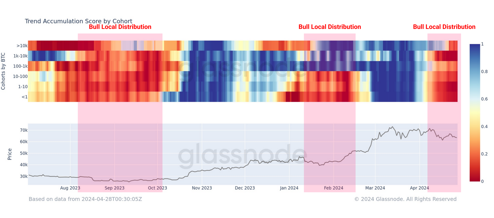
If we inspect the breakdown of this metric by wallet sizes, we can complete a more detailed assessment. Here we see a distinct uptick in net outflows 🟥 across all cohorts throughout April, suggesting a consistent sell-side pressure across the board.
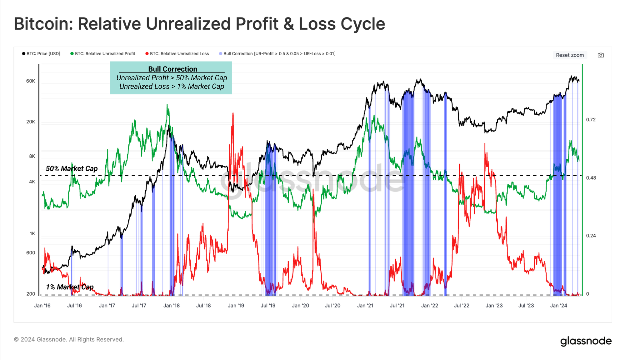
Unrealized Pain & Gain Cycles
A unique characteristic of the prevailing bull market has been the positive effect of US Spot ETF momentum on price action. The impact the ETFs have had on investor behavior can be explained via the Net Unrealized Profit & Loss (NUPL) metric, which measures the magnitude of net paper profits (or losses) held by the market (normalized by the market cap).
Using NUPL, we can identify the classic Euphoria phase of a bull market where unrealized profits surpass more than half the market capitalization size (NUPL > 0.5).
In the 2020-21 cycle, this phase was triggered 8.5 months after the Bitcoin halving, and saw sustained upside for almost 10.5 months afterwards. However, in this cycle, NUPL breached 0.5 approximately 6.5 months before the halving. This distinct shift highlights the significance of US ETF in shaping and accelerating price action by introducing powerful demand into the market.
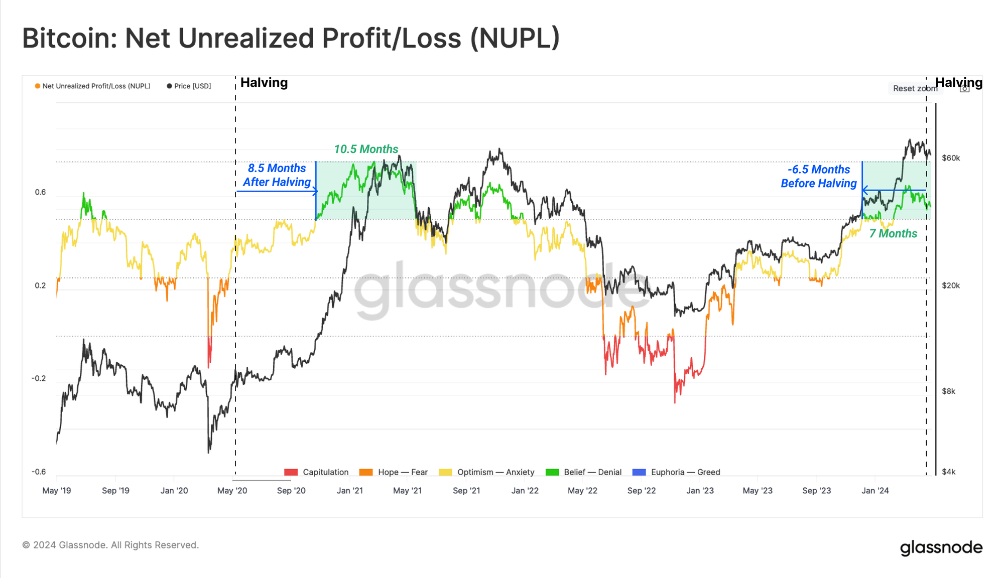
By this metric, the Euphoria phase (NUPL>0.5) of this bull market has been in effect for last 7 months. Even the mightiest up-trends experience corrections however, and these events offer valuable information about investor positioning and sentiment.
To dive into the dynamics of bull market corrections, we have used two conditions.
- Relative Unrealized Profit 🟢> 0.5, showing the market is broadly shouldering a large magnitude of paper gains.
- Relative Unrealized Loss 🔴 > 0.01, meaning investors are experiencing significant financial pressure, holding large unrealized losses during the market correction
As shown in the following charts, these correction events are common and expected during all bull markets. Since touching the ATH at $73.1k, this structure has appeared across three separate retraces down to ~$60k zone.
Navigating Local Bottoms
Having confirmed that we are within the Euphoria zone, and with an expectation of corrections, the next part of this report focuses on building a compass for navigating these contractions when they happen.
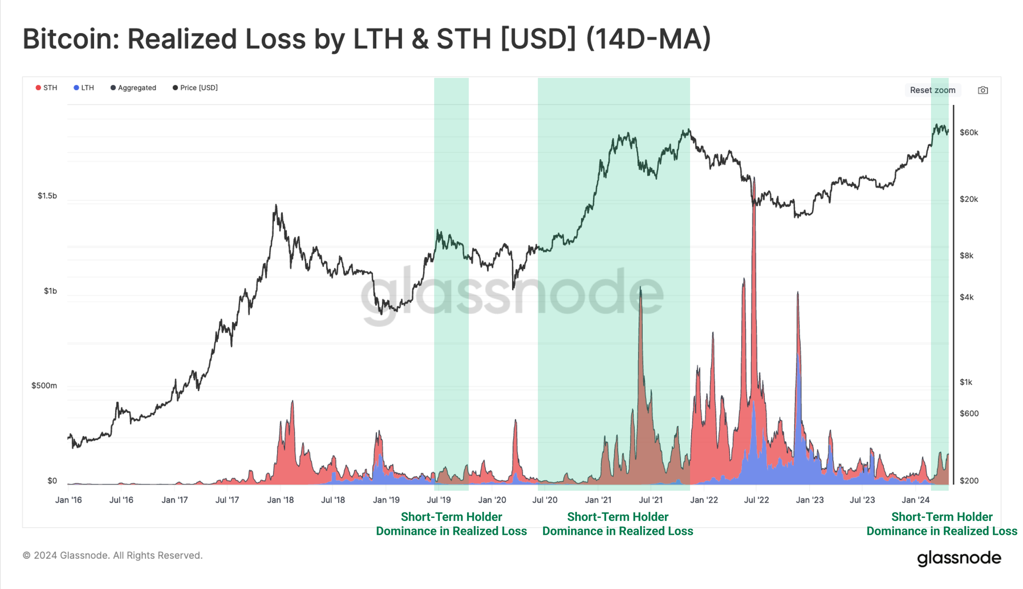
The first step is to identify the aggressive side of the market during a correction, which we define as the cohort contributing the most to the duration and depth of each pullback.
We can use the Realized Loss breakdown metric (denominated in USD) to identify that short-term holders (recent buyers) are displaying a marked dominance at the moment.
Having established that Short-Term Holders in Loss is a cohort of interest, we will use Glassnode’s new Breakdown metric suite to dissect the cost basis of these recent buyers.
Among these younger age bands, the cost basis of 1m-3m 🟠 and 3m-6m 🟡 cohorts emerge as valuable tools for distinguishing the bull and bear market structures. The 1w-1m 🔴 cost basis, however, has shown to correspond with market inflection points, helping us spot potential local bottoms (in bull markets) and local tops (in bear markets).
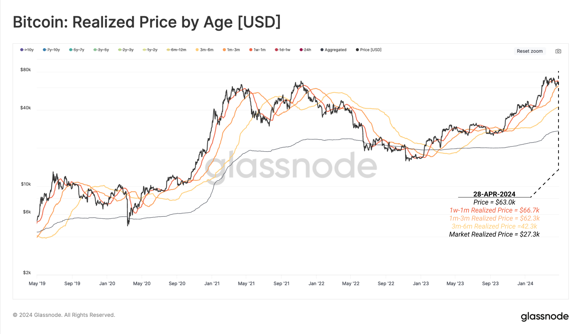
The spot Price frequently reacts to the 1w-1m cost basis, which is an idea we initially explored in our research article on short-term holder and long-term behavioural analysis. This is due to recent buyers being more price sensitive and having a higher probability of spending in the short term.
Therefore, during bull market corrections, short-term holders tend to ramp up their spending as the market starts to sell-off. As the market price approaches each sub-cohort's cost basis, their pace of spending can be anticipated to slow down (seller exhaustion).
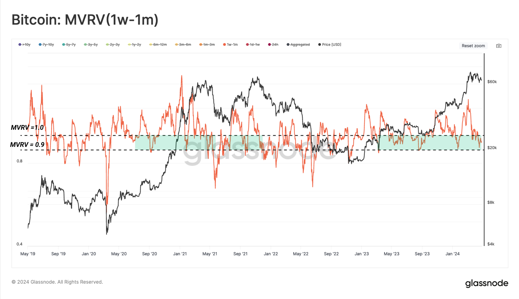
Here, we have chosen the 1w-1m realized price (cost-basis) as a compass for identifying points of potential seller exhaustion in the near-term.
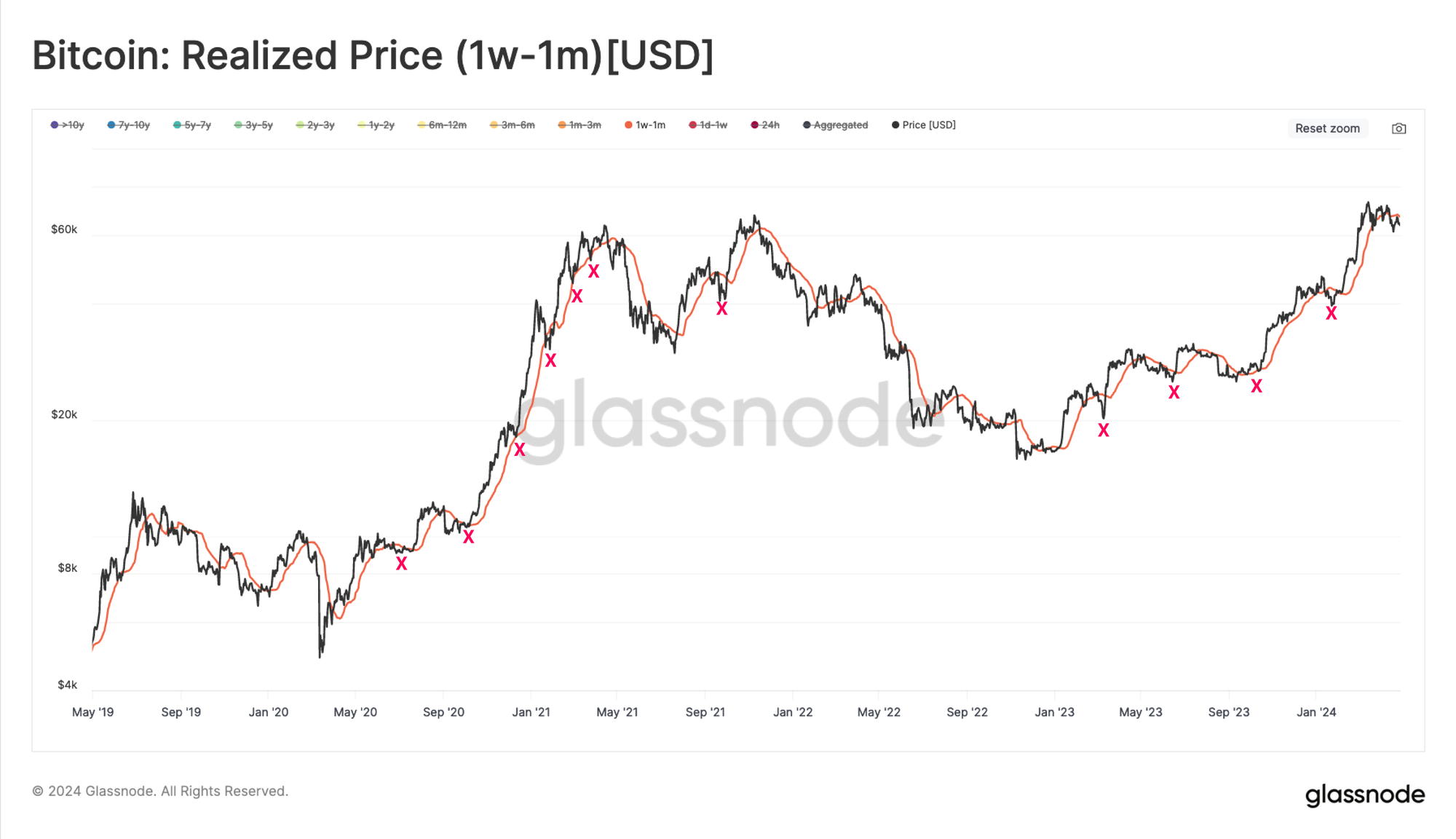
We can use the ratio between the spot price and each cohort cost basis via the MVRV ratio to gauge the typical deviations during corrections.
The following chart shows that the MVRV (1w-1m) ratio usually drops into the 0.9-1 range during the bull market pullbacks. This means the market typically falls 0% to -10% below the 1w-1m investors' average cost basis.
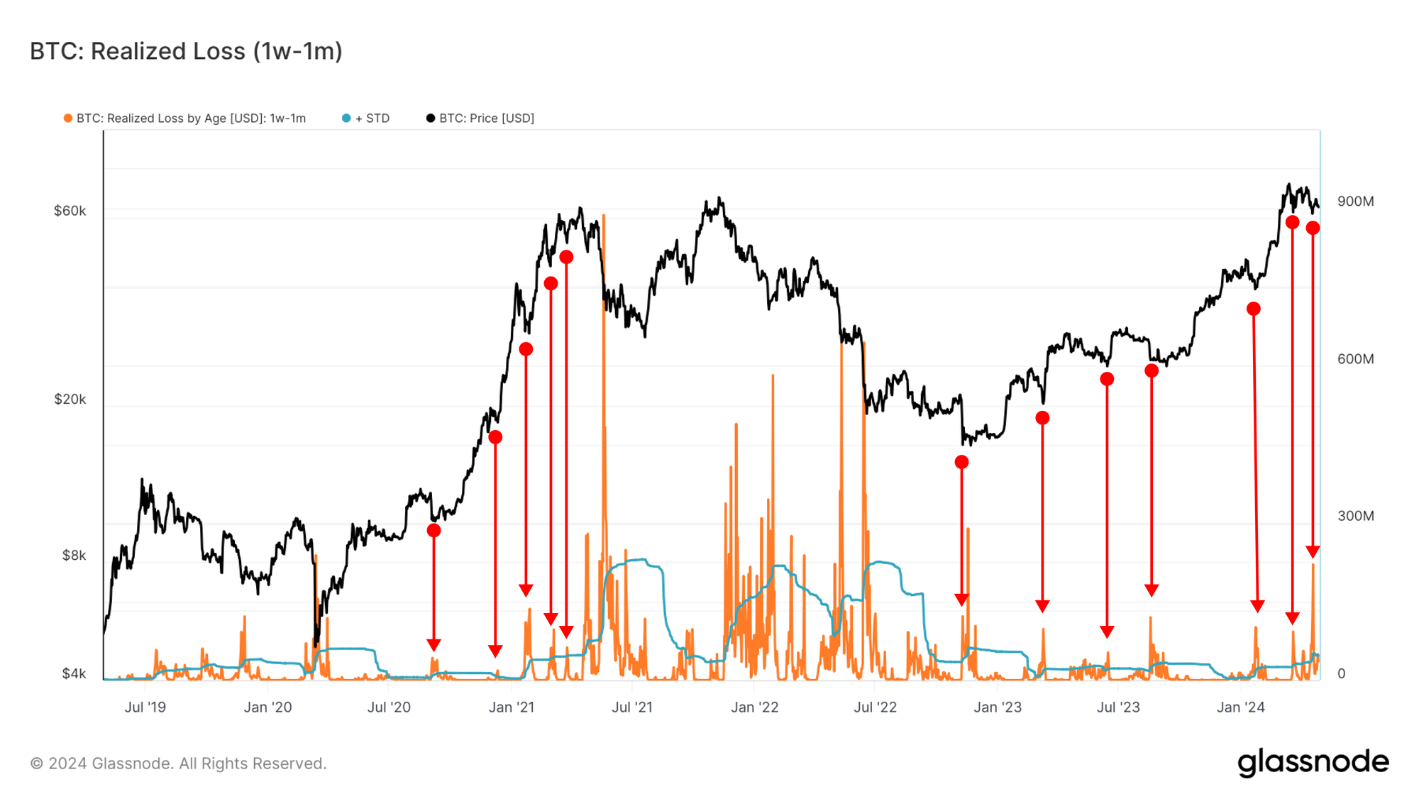
Having now sized up the implied pressure on 1w-1m investors, we can directly trace the intensity of their panic and fear (measured via realized loss). Our approach is to highlight regimes of aggressive selling pressure by the subgroup of investors in question.
Here, we have presented the realized loss by 1w-1m old entities, denominated in USD. Next, we have identified points of high-loss realization intervals using some simple statistical means ( > 1 standard deviation).
Note that realized loss for this group tends to peak near local market lows, as recent buyers panic sell their coins.
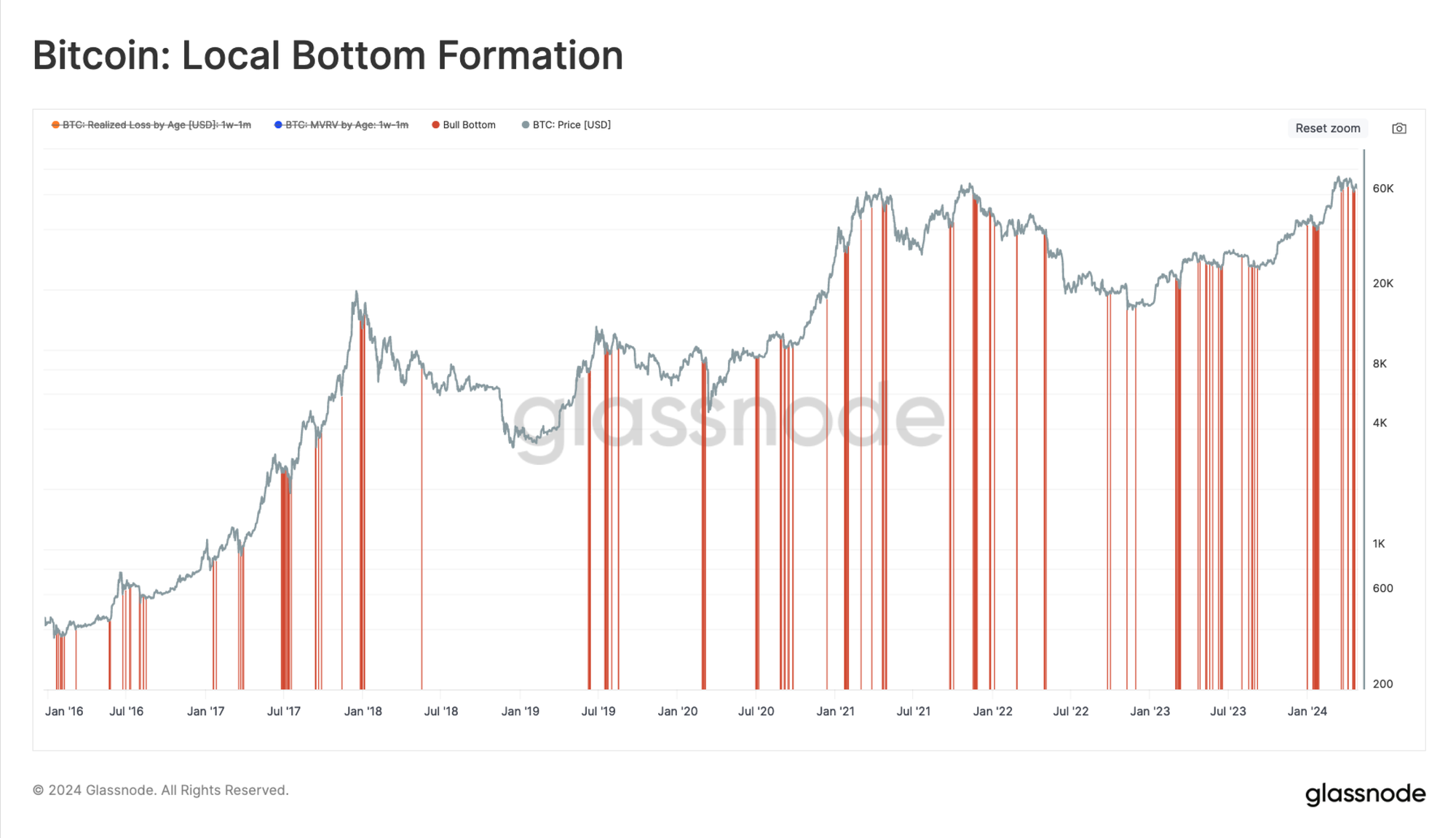
If we combine both of these conditions we described above, we can formulate a conditional toolkit for spotting potential local low inflection points:
- MVRV (1m-1w) is below 1, but above 0.9 and,
- Realized Loss (1w-1m) exceeds +1sd on a 90-day window
We now have a compass to uncover structures where the short-term holders potentially reach seller exhaustion.
At the time of writing, the cost basis of 1w-1m holders is $66.7k, while their realized loss has surpassed the 90-day +1sd level on multiple occasions since mid-March. Since the price resides within the $60k to $66.7k range, the MVRV condition is met, and it could be argued that the market is hammering out a local bottom formation. That said, a sustained break below that MVRV level could create a cascade of panic and force a new equilibrium to be found and established.
Conclusions and Summary
In this piece, we established that the Bitcoin market transitioned into a regime of widespread net distribution since the March ATH at $73k. The NUPL metric indicates we are within a Euphoria phase, however it has cooled off meaningfully since the correction started.
Corrections offer valuable information regarding the sentiment and sell-side activity of investors. We derived an example procedure for identifying a sub-set of Short-Term Holders who are influencing the market with the greatest sell-side activity. From this, we developed some simple rules using Glassnode’s new Breakdown metric suite, which may help in identifying that seller exhaustion within this cohort is becoming a factor at local lows.
Disclaimer: This report does not provide any investment advice. All data is provided for information and educational purposes only. No investment decision shall be based on the information provided here and you are solely responsible for your own investment decisions.
Exchange balances presented are derived from Glassnode’s comprehensive database of address labels, which are amassed through both officially published exchange information and proprietary clustering algorithms. While we strive to ensure the utmost accuracy in representing exchange balances, it is important to note that these figures might not always encapsulate the entirety of an exchange’s reserves, particularly when exchanges refrain from disclosing their official addresses. We urge users to exercise caution and discretion when utilizing these metrics. Glassnode shall not be held responsible for any discrepancies or potential inaccuracies. Please read our Transparency Notice when using exchange data.
- Join our Telegram channel
- For on-chain metrics, dashboards, and alerts, visit Glassnode Studio
- For automated alerts on core on-chain metrics and activity on exchanges, visit our Glassnode Alerts Twitter