The Week On-chain (Week 15, 2021)
Bitcoin strong hands hold on, stablecoin supply expands, and cyclical metrics remain elevated but not overheated...yet


Bitcoin Market Overview
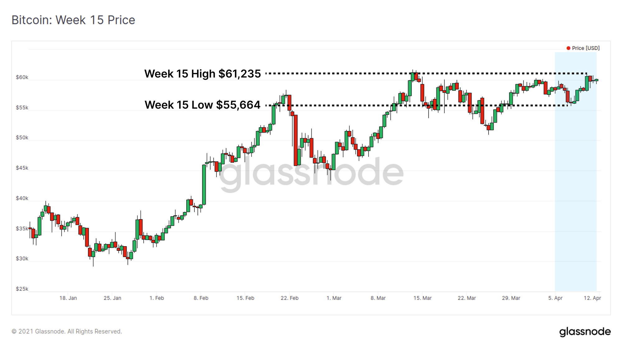
This week the Bitcoin market made another attempt at an ATH, with price rallying from a low of $55,664 to a weekly high of $61,235, just $448 off the peak set in mid-March. The market also saw growing excitement around the Coinbase direct listing, scheduled on April 14, as well as Grayscale's clarification around intent to convert the GBTC Trust into an EFT.
On-chain data continues to show resilience across many metrics with HODLed coins maturing to reach long term holder status, stablecoin supplies keep expanding, and cyclical metrics remain elevated but are not overheated...yet.
Rick Astley's Coins
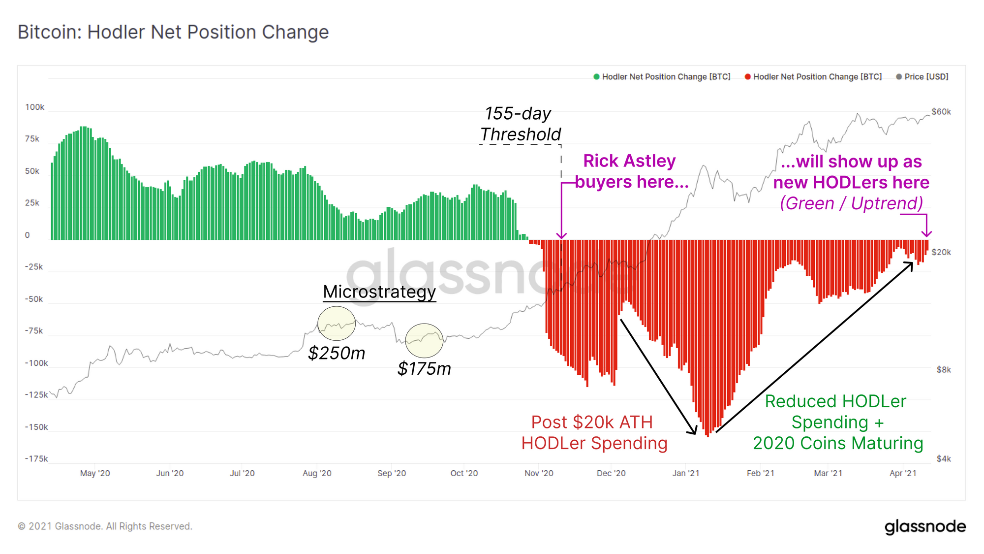
Willy Woo has expanded the Bitcoin market jargon with the introduction of the 'Rick Astley' buyer. These are strong hands who are never gonna give you up [read: hodling coins forever], nor let you down [read: never let their sat balance go down].
The Liquid position change metric Willy refers to indicates the rate at which coins are crossing the Liquid to Illiquid threshold. This metric considers coins in the last 30-days that either matured older than 155-days, or have been transferred into wallets where two or more coins have gone in, but have none have been spent.
Rick Astley loving this dip. He's the guy (marked in red) that buys and never sells.
— Willy Woo (@woonomic) April 7, 2021
Data: @glassnode pic.twitter.com/32PQzxCF6B
Another powerful metric is the Bitcoin HODLer Position Change which presents the overall change in the global Rick Astley balance. This metric will be:
- Red and trend down when more old coins are spent than are maturing across the 155-day age threshold.
- Green and trend up when more coins mature across the 155-day age threshold than old coins being spent.
155-days ago was around mid November 2020, and BTC prices were trading up from $16k to $18k. This followed Microstrategy's initial two BTC acquisitions ($250m in Aug and $175m in Sept) and was around the time Coinbase exchange balances began to deplete (see our Week 13 Newsletter). This suggested that real institutional demand had arrived.
As a result, it is likely that the coins purchased by institutions in late 2020 and early 2021 are starting to mature past the 155-day threshold (assuming they held on in true Rick Astley style). As such, the HODLer Position Change metric is currently trending higher and if these institutional buyers did HODL, it is likely to continue in this trajectory over the coming months (keep in mind there will be a time lag between purchase and coins ending up in their final custody/cold storage arrangement).
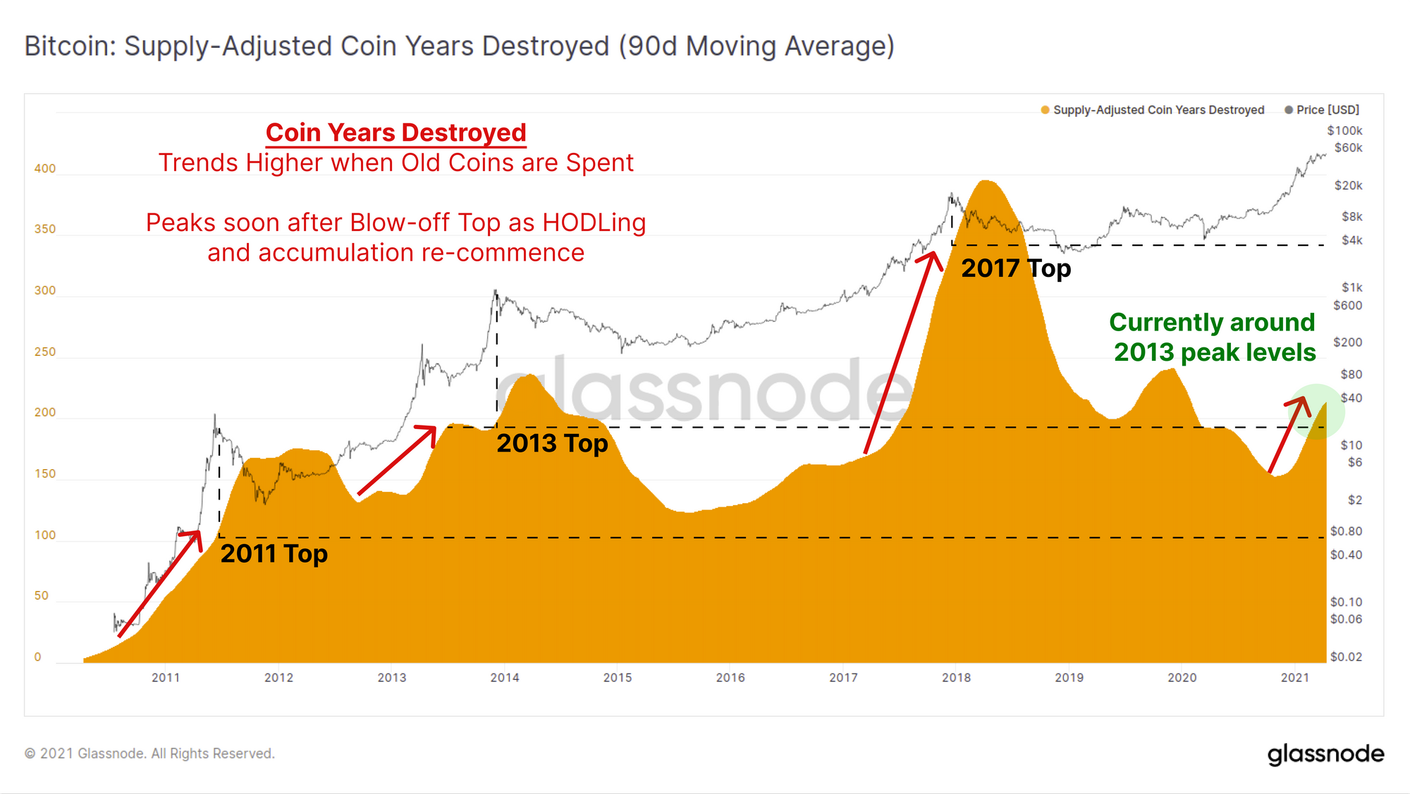
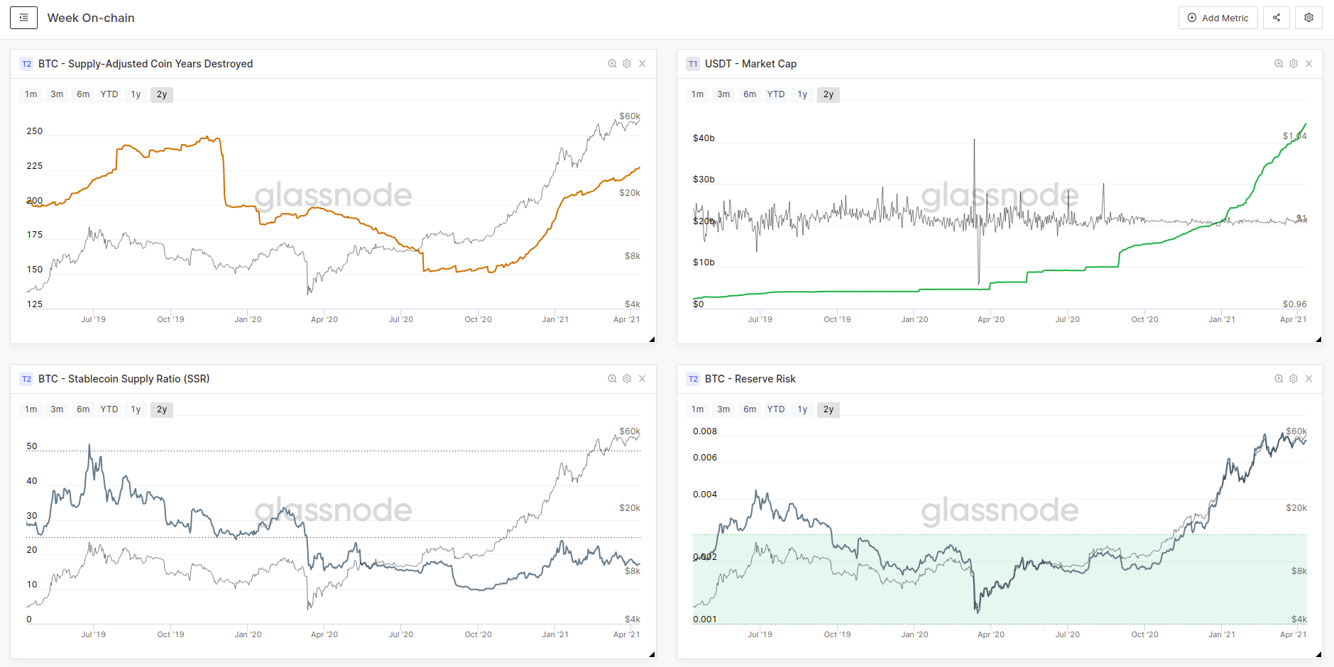
A new metric available on Glassnode Studio is Coin Years Destroyed (CYD). This metric tracks the number of coin-days destroyed over the last 365 days. It provides a cyclical indicator to see if Rick Astley has been spending or HODLing over the last year.
- High / Uptrend in CYD means Rick has spent many old coins in the last year and may be letting you down.
- Low / Downtrend in CYD means Rick has been accumulating/HODLing in the last year and is never going to give you up.
Whilst CYD is trending higher, it is notable that we are currently at a CYD level similar to the 2013 top, but are well below the 2017 top. Given the Bitcoin network is older, and coins in the supply have had more time to accumulate coin-days, if many HODLers were spending their coins, we would expect a relatively large CYD reading.
This suggests Rick Astley is still not ready to turn around and hurt you [read: in general, HODLers are still not spending their old coins].
Buyer and Seller Behaviour
Glassnode recently collaborated with Ark Invest and David Puell to produce part 2 of the Analyzing Bitcoin's Fundamentals research paper. This provides a framework for analysis via on-chain data and tools for Bitcoin network performance and for the spending behaviour of its users.
Check out Part 2: Buyer and Seller Behavior: Analyzing Bitcoin’s Fundamentals

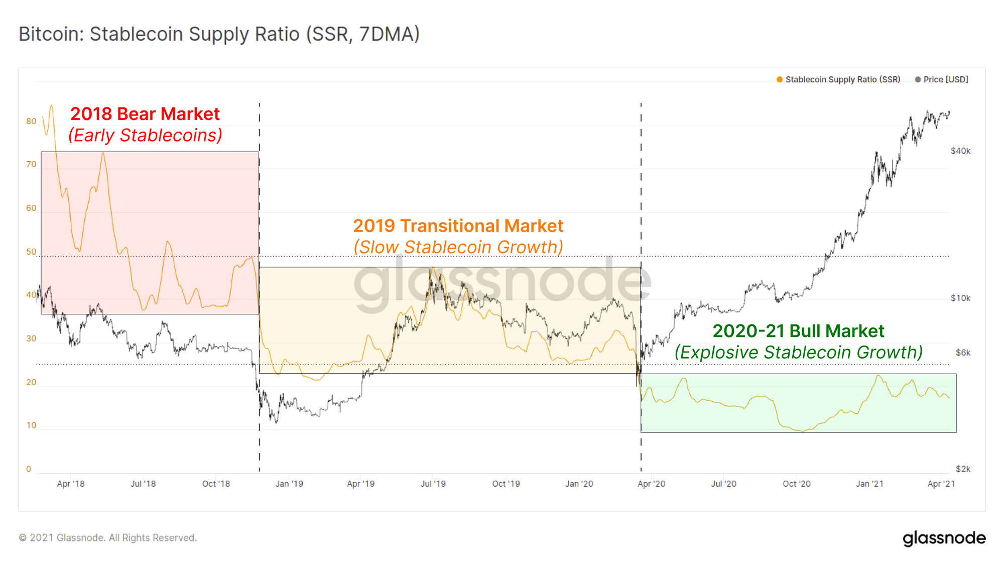
Stablecoin Supply Growth Continues
This market cycle has two significant structural changes relative to previous market cycles:
- Explosive growth in the availability of derivatives for speculation and hedging of risk.
- Proliferation of stablecoins as both a reference trading currency and as DeFi collateral.
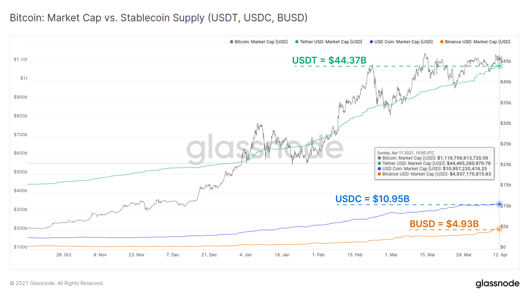
Growth in the three biggest stablecoins, USDT, USDC and BUSD, has been tremendous over the past 6 months reaching a combined market value of $60.25 Billion (these three represent 92.75% of the total stablecoin market).
The chart below presents the supply growth of these top stablecoins alongside the Bitcoin market cap, demonstrating a correlated growth in demand for both assets. USDT supply alone has increased by $3.36 Billion over the past two weeks even as BTC price has traded sideways.
As more value flows into stablecoins, it creates more native 'digital dollars' that are readily transferable throughout cryptocurrency markets. This enhances market liquidity and depth and has created opportunities for both centralised exchange and DeFi products.
The Stablecoin Supply Ratio (SSR) presents a ratio of the Bitcoin market cap to the total stablecoin supply. This metric can be used to estimate the global 'buying power' of stablecoins in the ecosystem.
If the price of Bitcoin is low, that [stablecoin] supply is able to buy a larger portion of the circulating BTC supply and therefore, push the price up — buying power is high [and SSR is Low].
As the price of BTC goes up, that supply of stablecoins is able to purchase less and less of the BTC on the market which reduces its ability to move the price upwards — buying power is low [and SSR is High].
The growth of stablecoin supplies throughout 2020-21 has held the SSR metric near historical lows suggesting a relatively high buying power of digitally native dollars. The demand for digital dollars appears to be keeping pace with demand for Bitcoin and cryptocurrencies as a whole.
Weekly Feature: Cyclical Indicators
Bitcoin is known for its programmatic halving cycles, and despite each cycle having a unique market structure, often market tops have historically had similar characteristics. Many readers naturally be seeking out metrics that indicate when speculation gets so hot that paint is peeling off the walls.
Glassnode has also recently released our 🚨Alerts Tool🚨 which allows you to set email and/or Telegram notifications for when specific values of our indicators are reached. This next section will present a handful of cyclical metrics and some key levels to watch and pair well with custom alerts.
Important Note: Remember, despite man-kinds greatest efforts, no metric can predict the future. Always consider metrics like the following within the context of the broader market and on-chain structure.
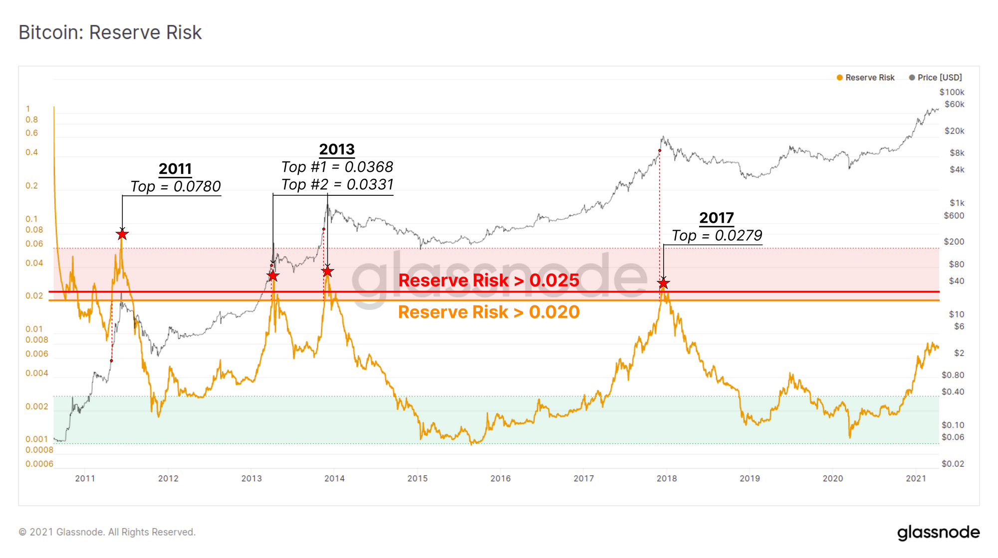
Reserve Risk
Reserve Risk is an oscillator that measures the cumulative 'opportunity cost' of coin holders deciding not to spend their coins. It will trend higher when price increases or when HODLers start spending their coins (realising profits).
Market tops have historically occurred at Reserve Risk values > 0.02 but often extend well beyond that with both 2013 reaching 65% higher for example.
Heating Up: Reserve Risk > 0.02
Boiling Over: Reserve Risk > 0.025
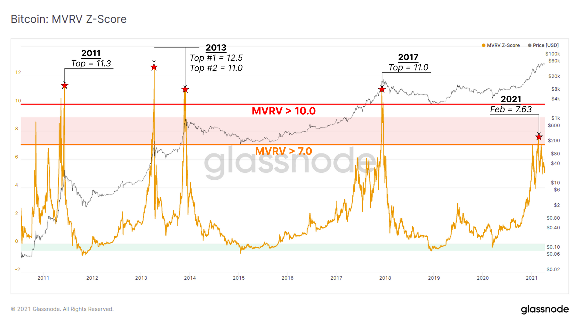
MVRV Z-Score
The standard MVRV Ratio takes the ratio of the Market cap to the Realised cap as an indicator of aggregate 'profit stored' within the on-chain network. The MVRV Z-Score then applies statistical normalisation to consider how many standard deviations the market cap is trading above or below the realised cap mean.
Market tops have historically occurred at MVRV Z-Score values > 7.0 however have consistently reached values greater than 11.0 in all previous cycles.
Heating up: MVRV-Z > 7.0
Paint isd P: MVRV-Z > 10.0
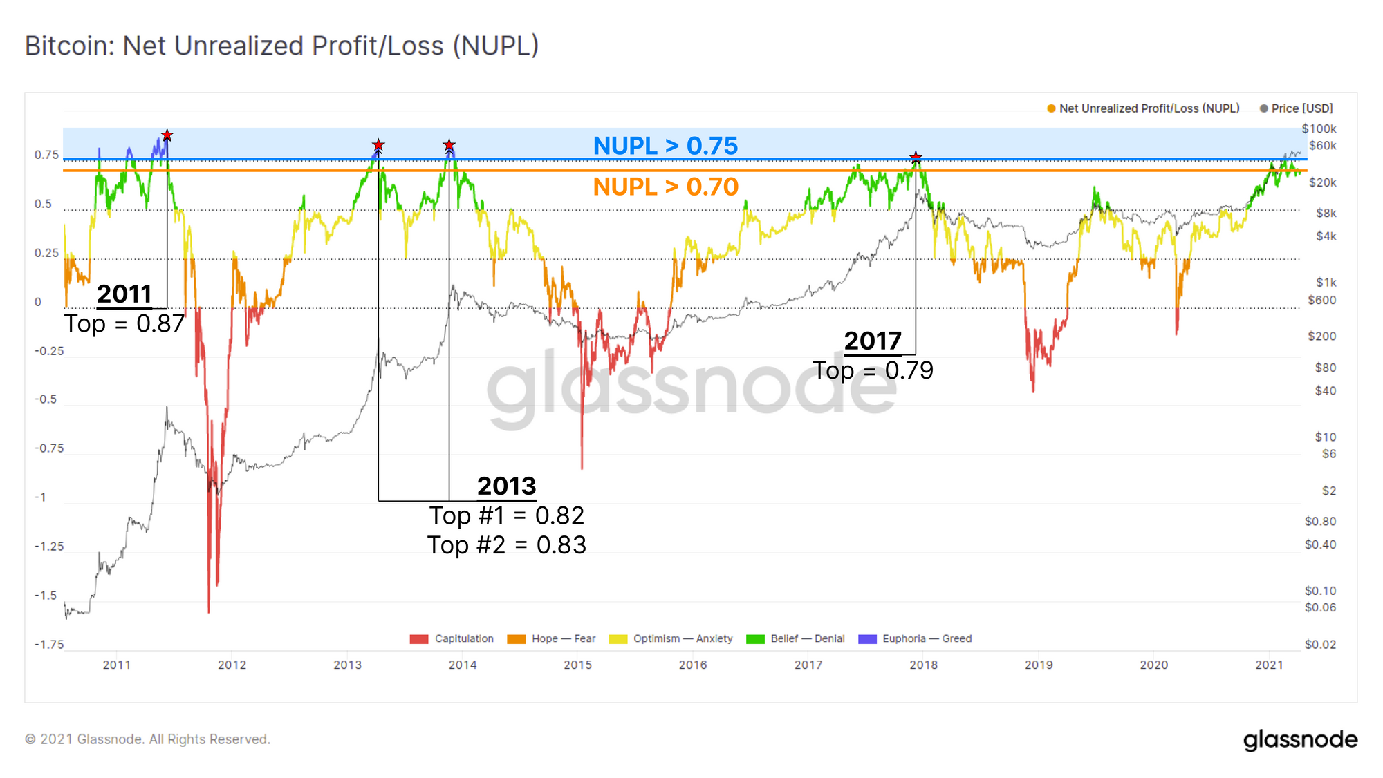
Net Unrealised Profit and Loss (NUPL)
The NUPL metric takes the difference between the market cap and the realised cap and then divides by the market cap. This presents an estimate of the amount of profit or loss in the system as a multiple of the Market cap.
In other words, a NUPL value of +0.5 indicates that the total profit held by unspent coins is a value equal to 50% of the market cap.
Market tops have historically occurred at NUPL values > 0.75 suggesting aggregate unrealised profit in the system is greater 75% of the market cap.
Heating Up: NUPL > 0.70
Overheated: NUPL > 0.75
The Week On-chain Newsletter now has its own Dashboard to help Glassnode users keep track of the metrics covered in each weeks analysis.
New Glassnode Content
Our Latest Newsletter: Uncharted
Check out out bi-weekly newsletter,