The Week On-chain (Week 18, 2021)
Bitcoin has bounced from the correction lows, as Tether supply hits ATH, coins mature and Ethereum on-chain activity spikes higher.


Market Overview
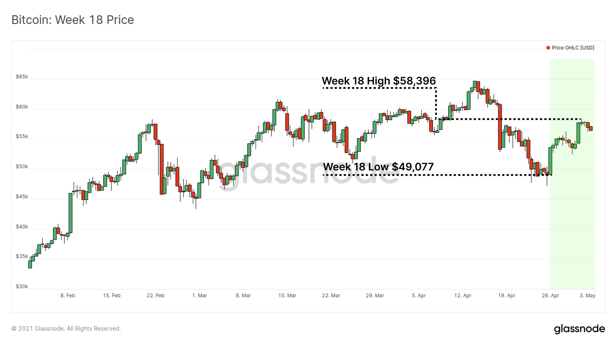
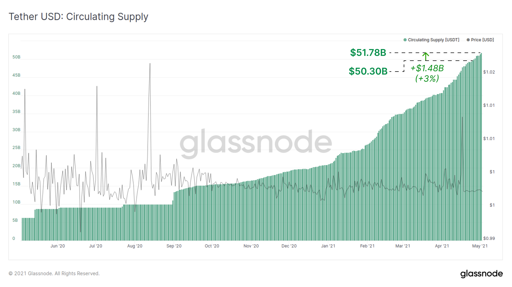
Bitcoin price has bounced from the correction lows this week, opening at $49,077 and trading up to a high of $58,396. The rise of stablecoins has continued with the largest stablecoin Tether minting a new ATH, with a weekly supply increase of $1.48 Billion. This reinforces the position and strong demand for crypto-native fiat.
On-chain data for both Bitcoin and Ethereum indicate strong conviction to hold both assets remains, as coin maturation becomes increasingly evident, and network activity trends higher. The Ethereum chain in particular has seen a notable boost in economic activity following the gas limit increase, as gas prices fall and transaction volumes increase in response.
Stablecoin Supply Mints New ATHs
Stablecoins have become a foundational asset and preferred base trading pair across the entire industry, providing globally accessible and crypto-native fiat rails. Demand for the largest and centrally issued stablecoin Tether (USDT) has minted a new supply all-time-highs this week.
Tether outstanding supply has increased by $1.48 Billion (+3%) this week to reach a total minted supply of over $51.78 Billion.
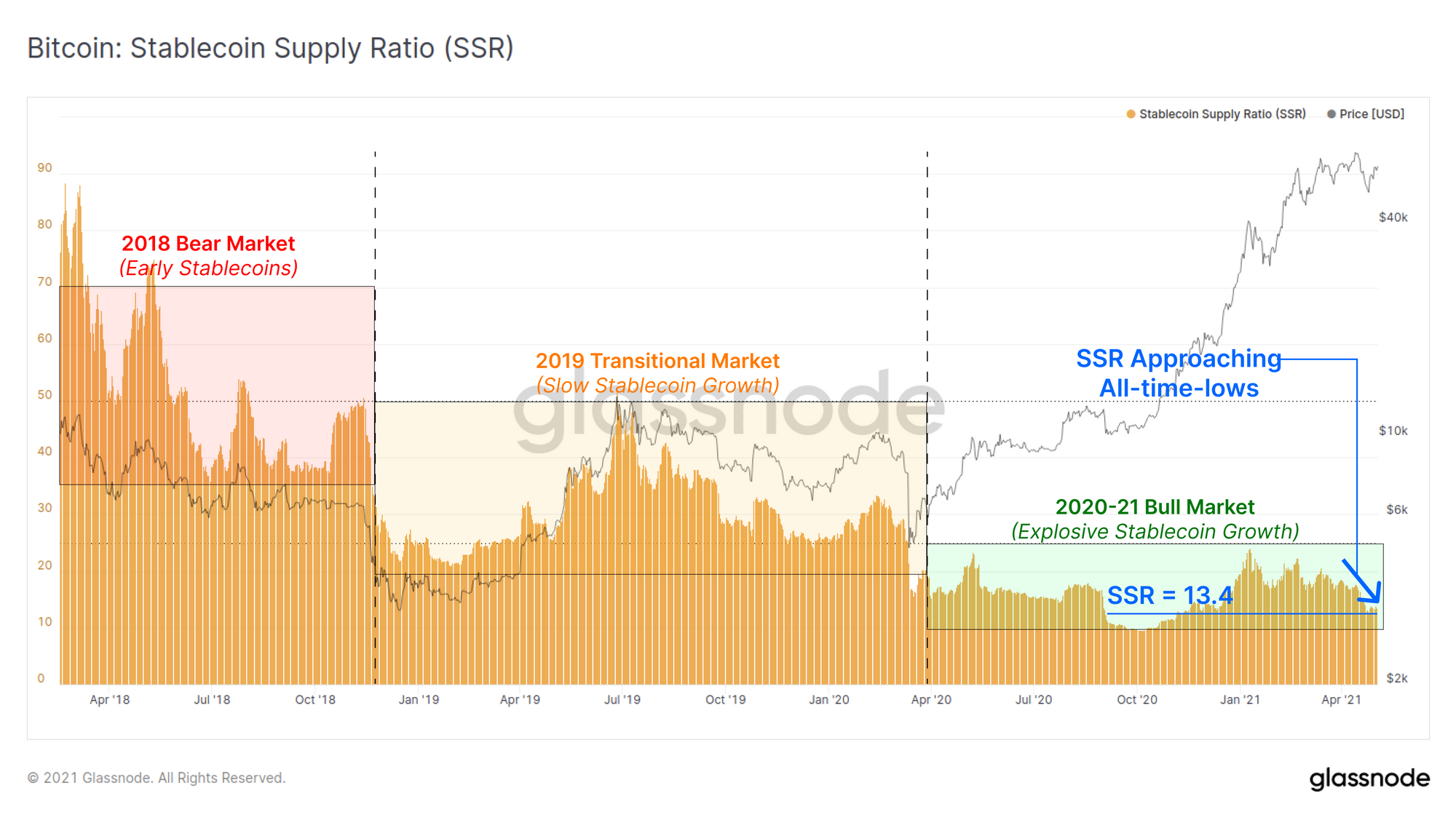
Recent stablecoin inflows have pushed the Stablecoin Supply Ratio (SSR) down to a value of 13.4, which is approaching the all-time-low of 9.6. SSR has been persistently low during 2020 and 2021 as stablecoin supplies have grown proportional to the growth in Bitcoin valuation.
Low and decreasing SSR values indicate that the global stablecoin supply is becoming larger relative to the Bitcoin market cap. As the total supply of stablecoins increase, it suggests an increased 'buying power' of crypto-native capital that can be quickly exchanged and traded into BTC and other crypto-assets.
Confirmation of Coin Maturation
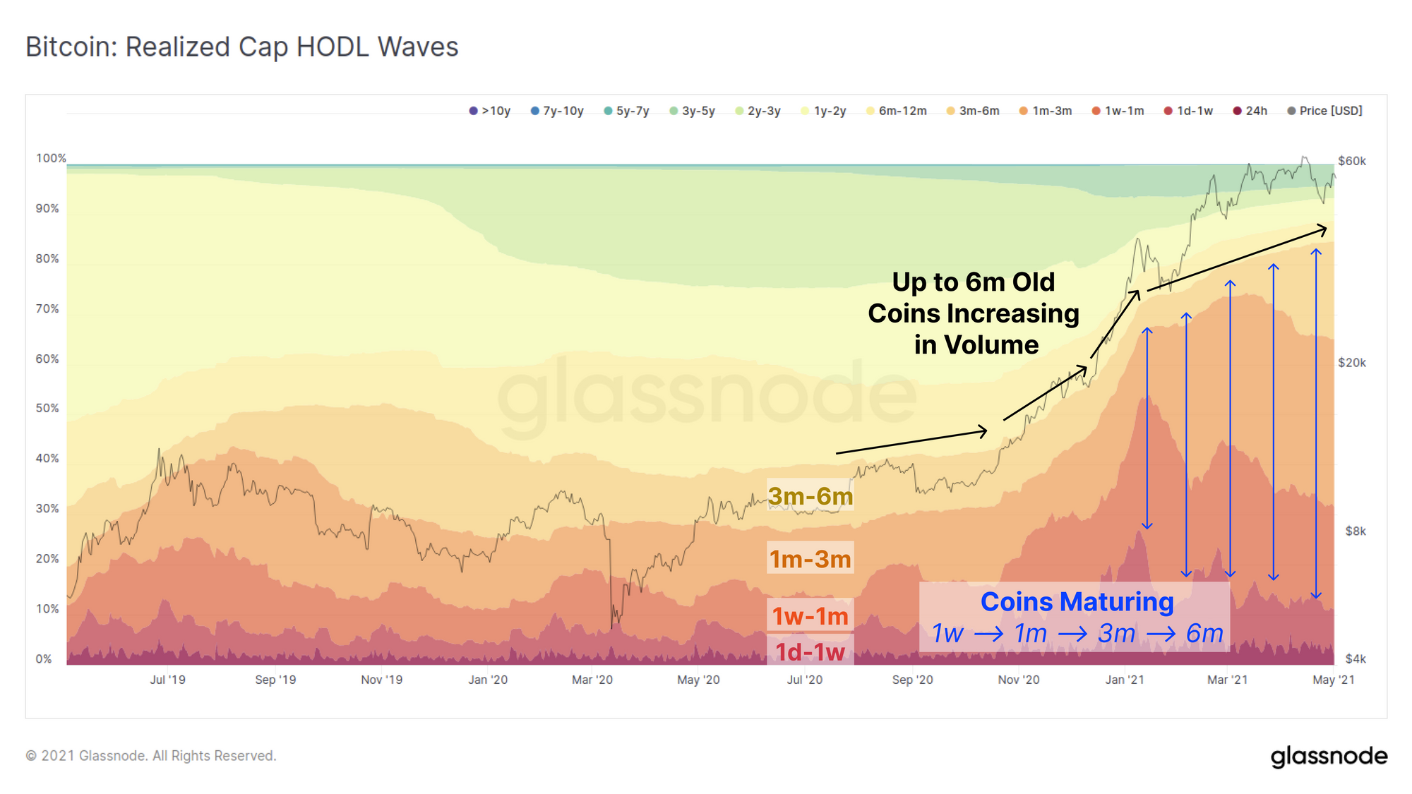
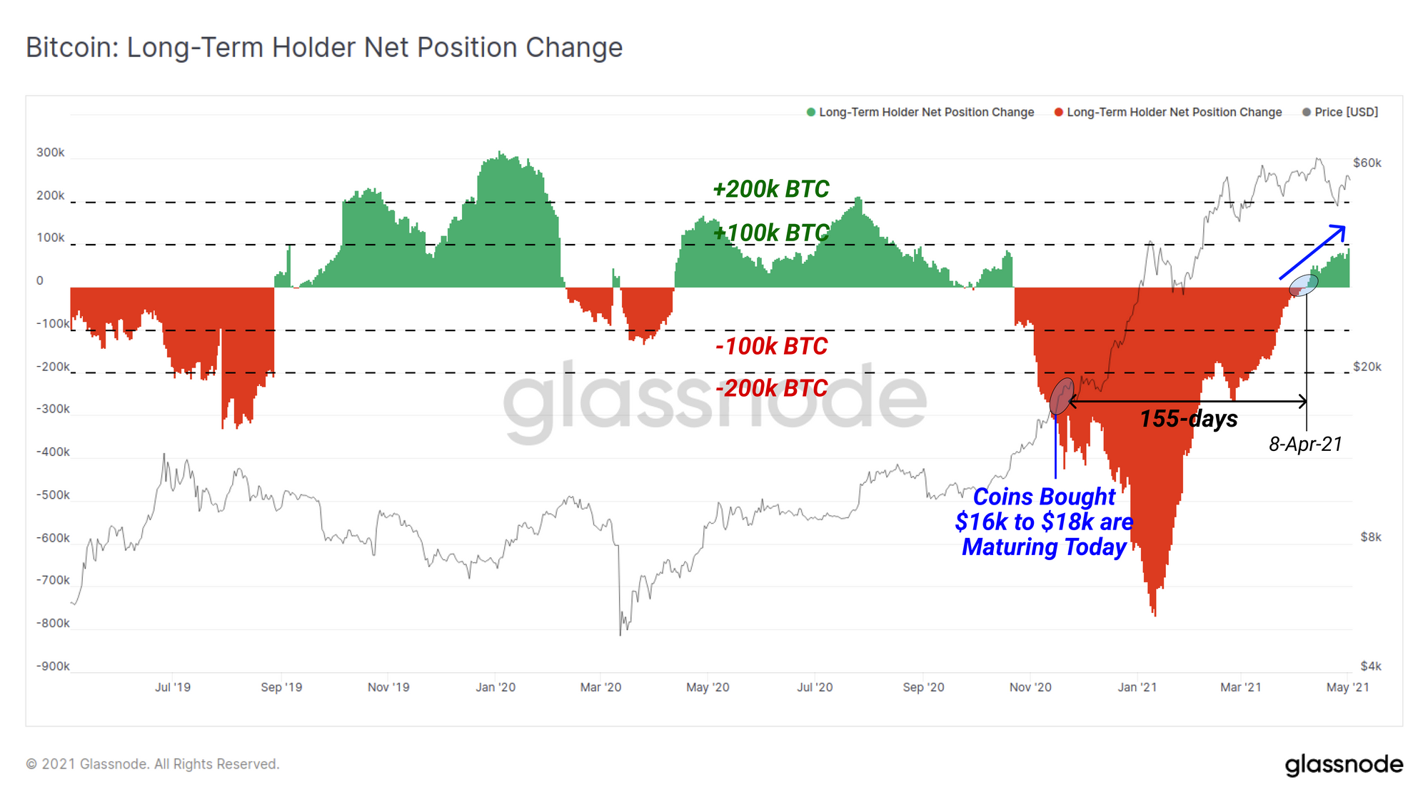
The phenomena of Bitcoin maturation (the ageing of HODLed coins) has been discussed in prior weeks where we noted that coins older than 155-days are reclassified to be Long Term Holder (LTH) coins.
Note: 155-days ago it was early November 2020, and price was rallying from $16k up to the $18k consolidation before breaking last cycles all-time-high.
We can observe these changes in coin proportions in various age brackets using the Realised Cap HODL waves. This metric will show colour bands increasing in thickness as coins mature or are spent into different age bands. We can see in the chart below that the proportion of coins maturing from 1-week to 6-months old has been growing since Nov-2020. These are coins accumulated in the early bull market that have remained dormant since (blue arrows).
Currently the age band for 3m-6m in particular is swelling suggesting many coins are approaching the 155-day Long Term Holder threshold indicating strong conviction to HODL.
We can confirm this observation looking at the LTH Net Position Change metric which presents the volume of coins crossing the 155-day age threshold over the past month. Since 8-April more coins have been maturing than were spent, and this metric hit a 6-month high this week of 96.5k/BTC maturing/month.
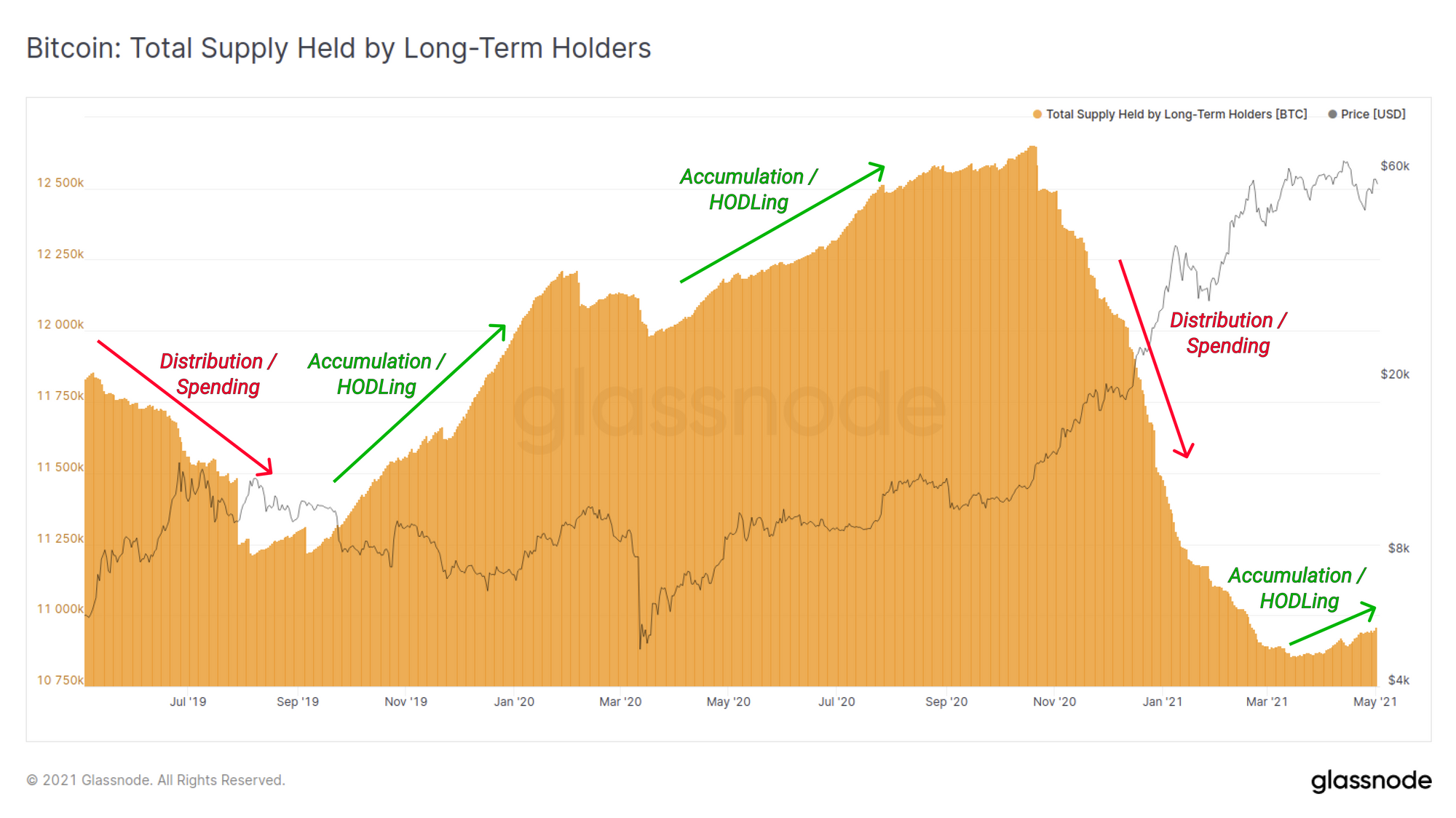
The total BTC supply held by LTHs has also started trending higher after a period of net distribution and spending. This metric further reinforces that on aggregate, more coins are remaining dormant and HODLed by strong hands, than are being spent by LTHs to realise profits.
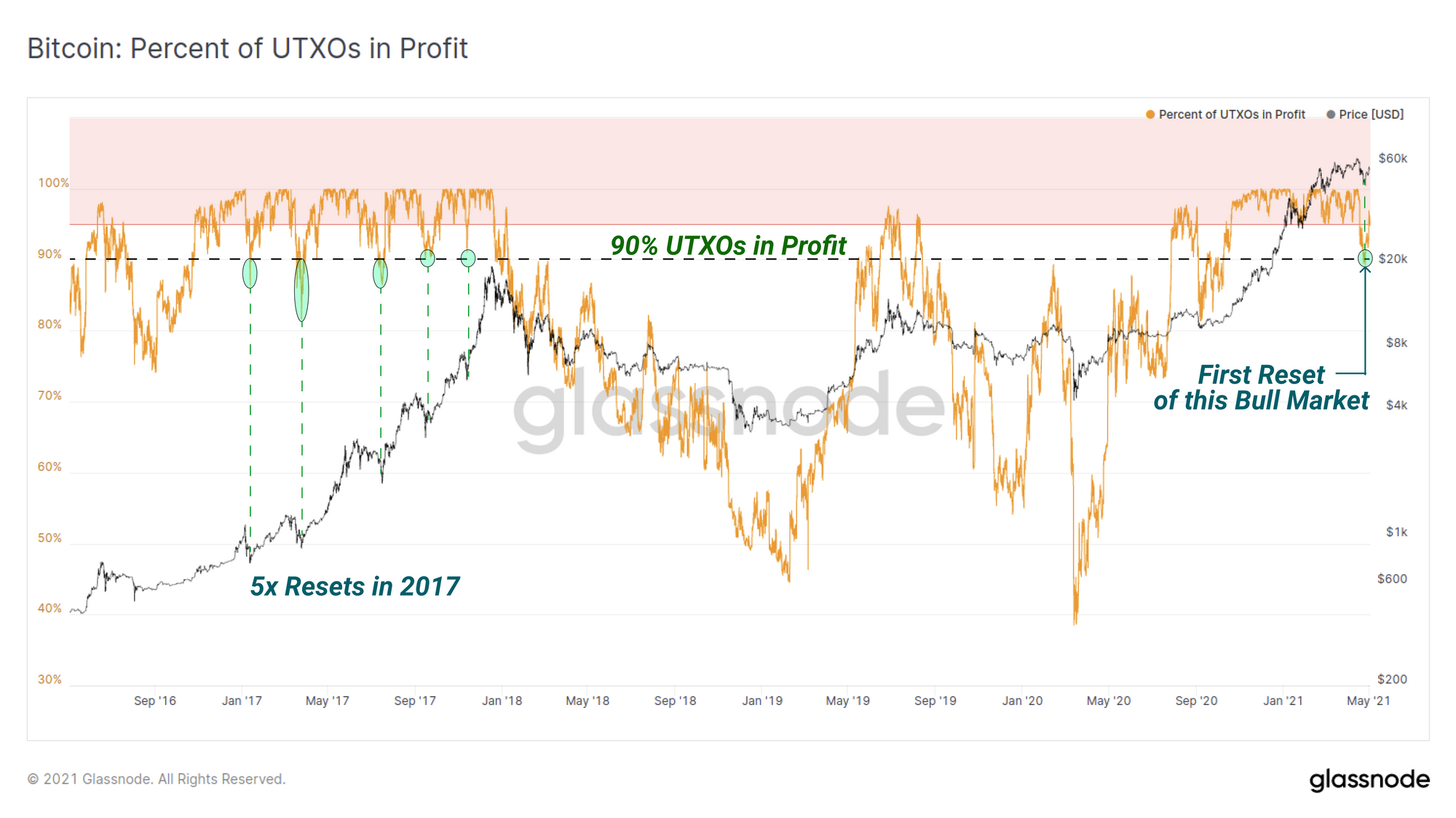
As a final note on the recent Bitcoin correction and HODLer conviction, the number of UTXOs in profit dipped to 90% in the last correction, the lowest value of this bull market. This indicates that at the bottom of the correction at $47k, over 10% of all UTXOs were at a loss. This is coincident with most of the major corrections in the 2017 bull market.
Despite this dip being the most significant in terms of overall coin supply being at a loss, Long Term Holders appear to be unshaken by the volatility.
Ethereum Supply Dynamics
On the Ethereum chain, we can assess the age of ETH coins using similar tools like the HODL waves, whilst also taking into account nuanced differences as they relate to the Ethereum network.
Bitcoin has a primary application as store of value, making coin dormancy a reasonable proxy for measuring HODLer conviction. Ethereum however represents a far more active financial ecosystem, where long term holders may also deploy their HODLed coins in and out of smart contracts and applications. As such, ETH dormancy and age is only part of the equation.
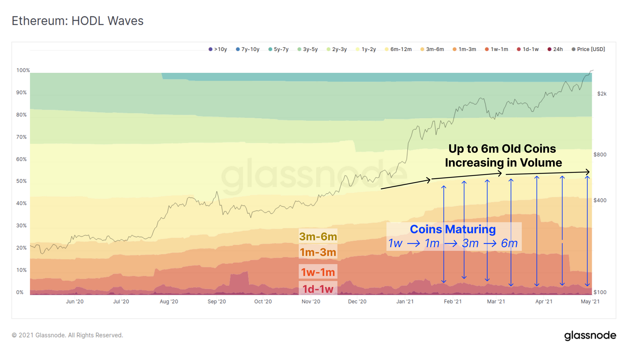
First we review the Ethereum HODL waves to observe dormant coin behaviour. We can see a very similar trend exists to Bitcoin whereby coins appear to be maturing from 1-week to over 6-months old since late 2020 (blue arrows). It can also be seen that the proportion of coins aged 1-month to 6-months are progressively increasing in thickness suggesting HODLing coins accumulated in the early bull market remains a favoured strategy.
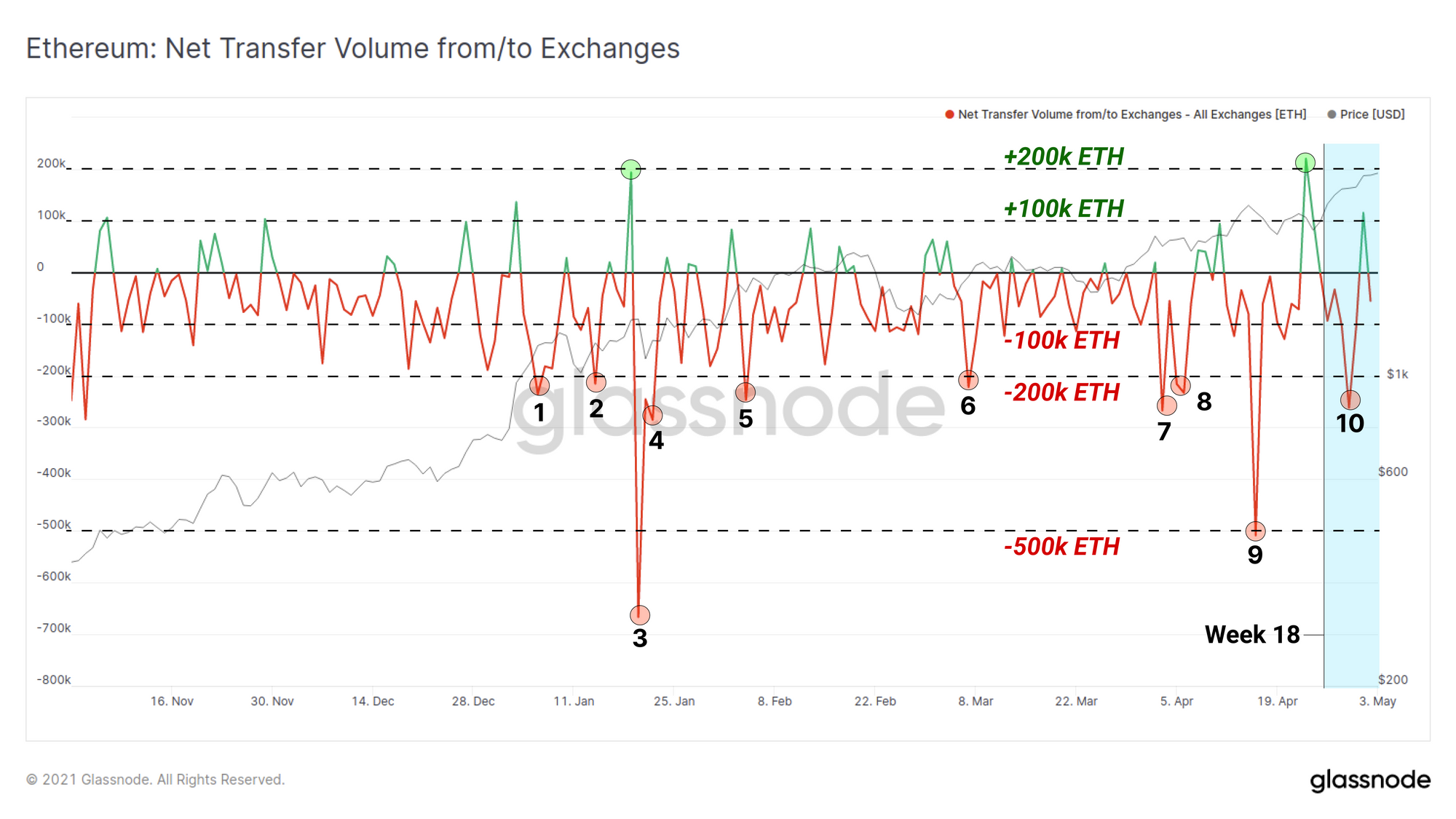
As noted, the use of ETH coins within the Ethereum ecosystem is a key to understanding the behaviour of the network. This week a relatively large volume of ETH was removed from known exchange wallets, spiking to over 200k ETH in a single day. The chart below demonstrates that in 2021, there have been 10 such occurrences with withdrawals of over 200k ETH/day. This compares to only two days with exchange inflows over 200k ETH per day indicating a general preference for self-custody of funds.
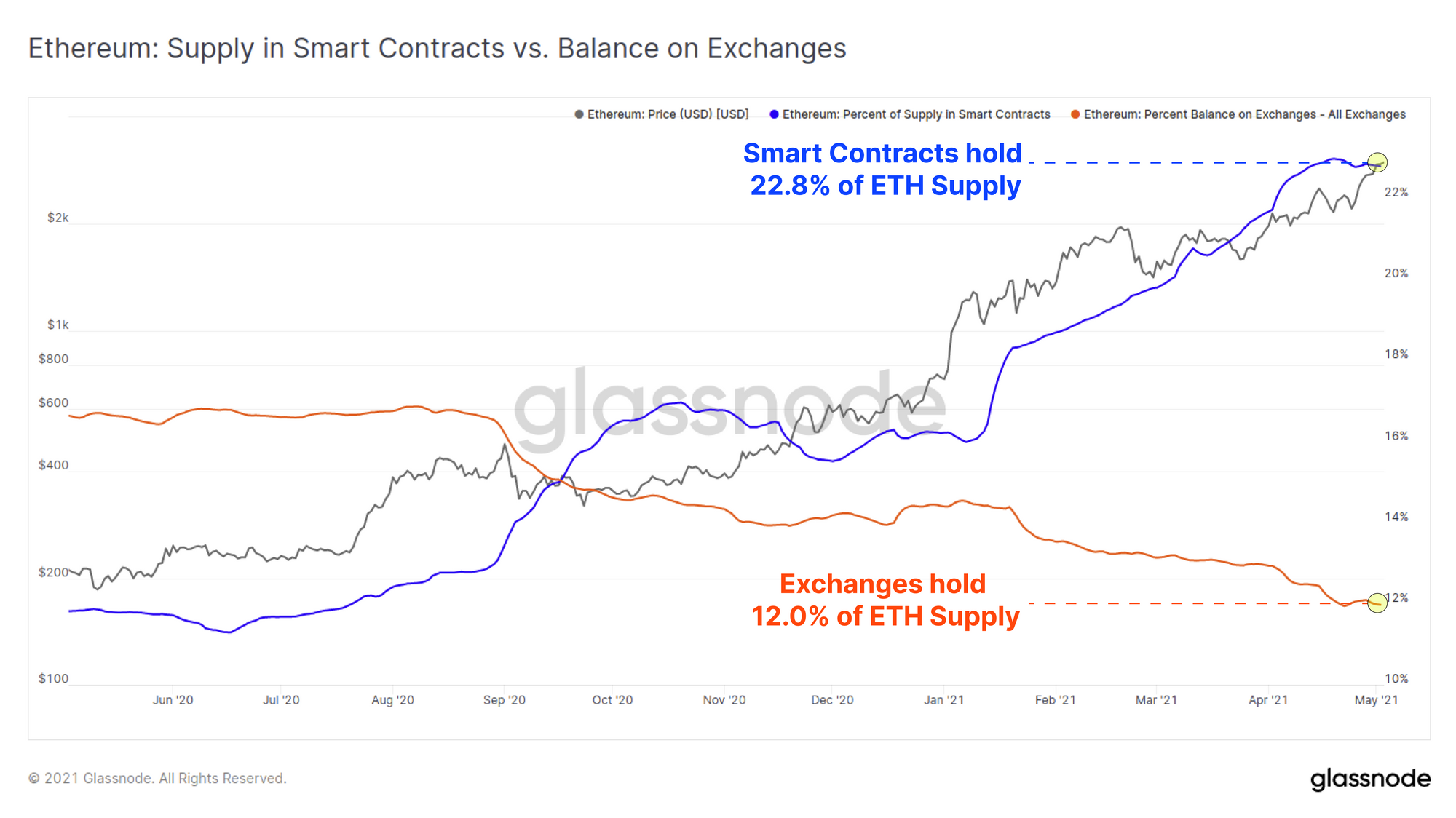
Not only are ETH coins being withdrawn from centralised exchanges, they are undoubtedly finding their way into smart contracts and DeFi applications. The chart below compares the percent of total ETH supply held by exchanges (orange, 12.0%) compared to deposited in smart contracts (blue, 22.8%). The almost equal and opposite trend for these curves demonstrates a clear product market fit and demand for DeFi by ETH holders.
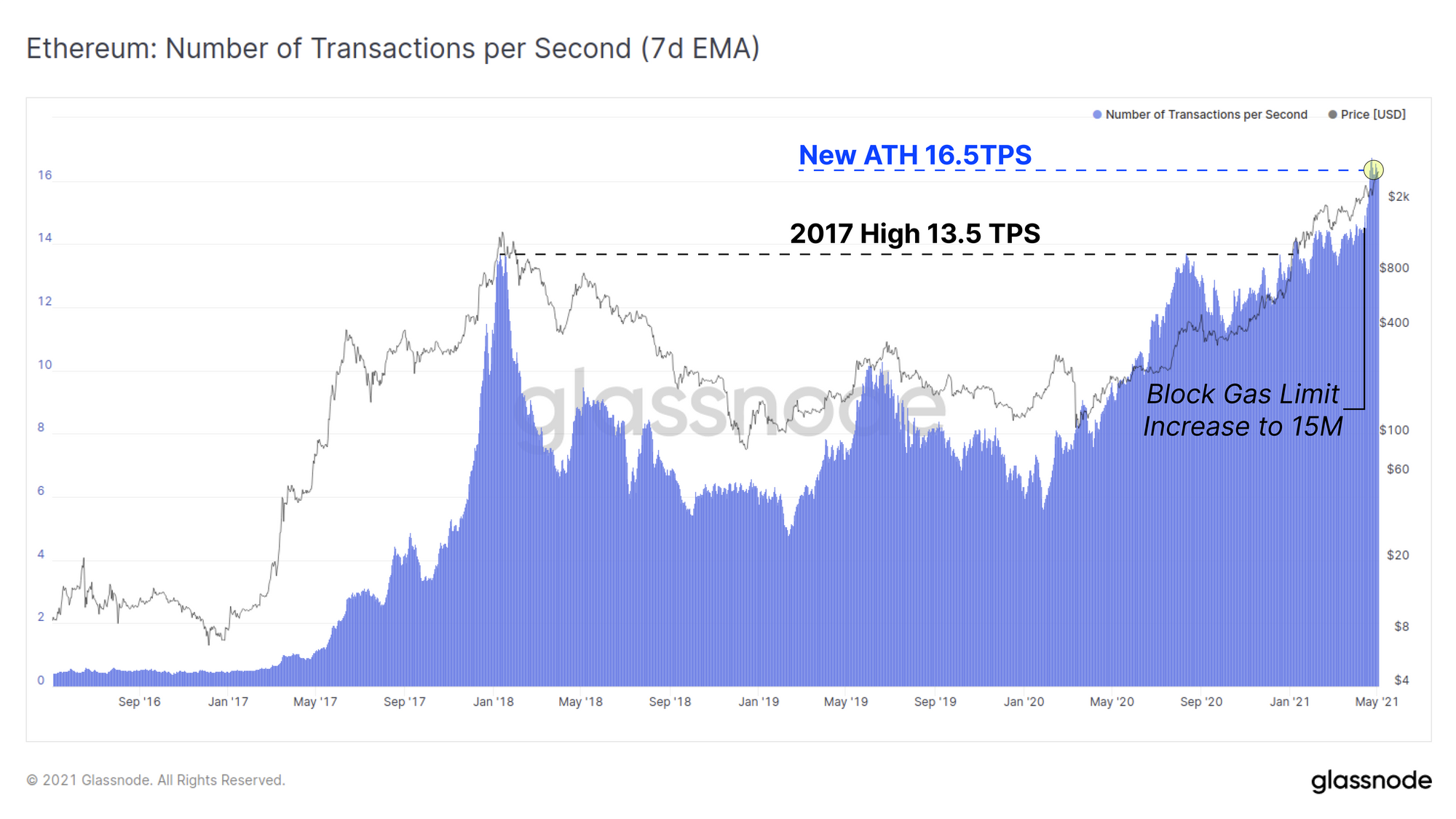
Following the Ethereum miners increasing the block gas limit to 15M, the overall throughput of the Ethereum chain has reached a new all-time-high this week of 16.5 transactions per second. The prior all-time-high of 13.5 TPS was set at the peak of the 2017 bull run which has since been eclipsed for the majority of 2021.
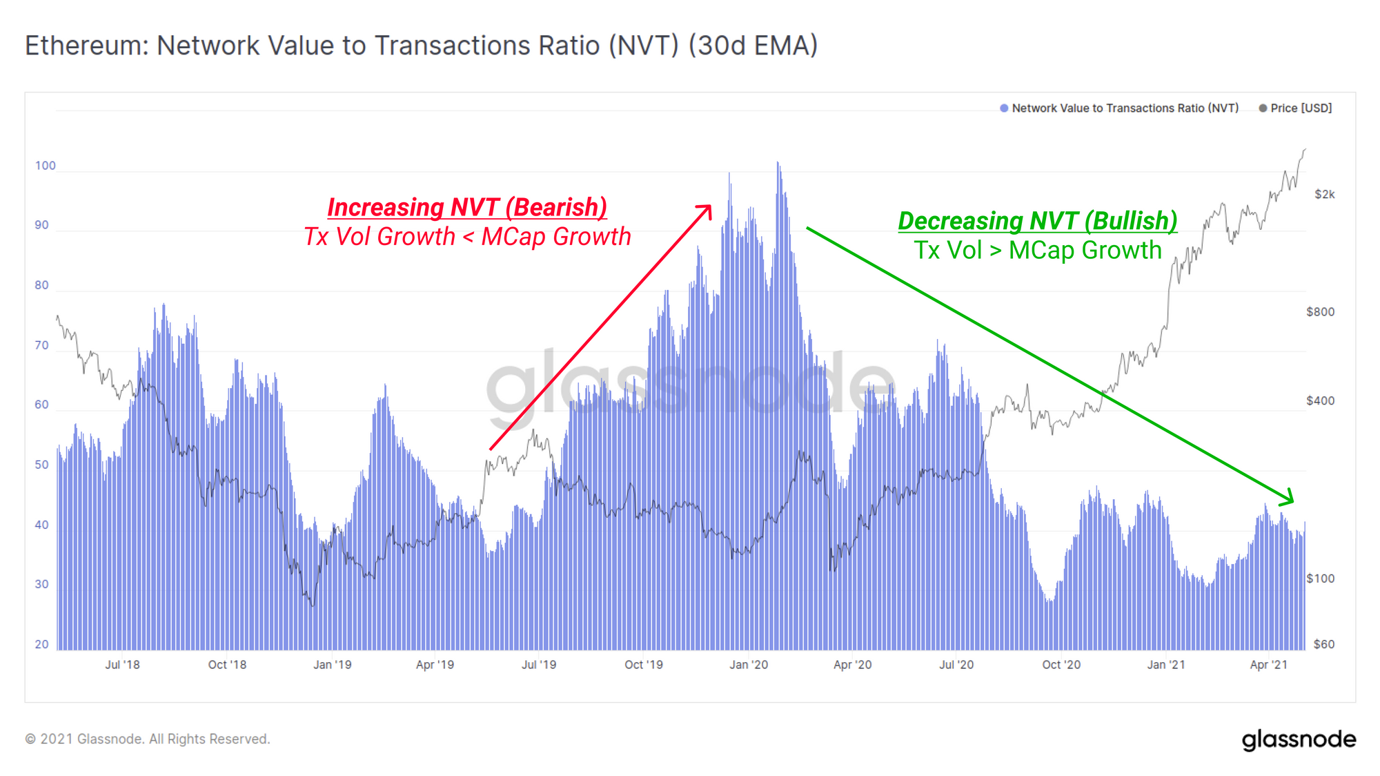
Finally we inspect the Ethereum NVT ratio, a metric that compares the network market cap to the USD value settled by the chain. Consider the following framework for interpretation of the NVT ratio:
- NVT Uptrends are more bearish, indicating transaction flows are getting smaller relative to market cap and the network may be over-valued.
- NVT Downtrends are more bullish, indicating transaction volumes are increasing relative to the market cap and the network may be under-valued.
- NVT Trading Sideways are supportive of the prevailing trend, indicating transaction volumes and market cap are growing equally and network may be fairly valued.
The chart below demonstrates an Ethereum NVT trending strongly downwards since Jan 2020, especially since the sell-off in March 2020. Recent high transaction throughput has also driven the NVT Ratio lower over the past few weeks suggesting support for the recent constructive price action.
Week On-chain Dashboard
The Week On-chain Newsletter now has a live dashboard for all featured charts here.
New Glassnode Content
Bitcoin's On-chain Market Cycles
Last week we released our second collaboration article with Bitcoin Magazine with a focus on the cyclical spending patterns of Hodlers, Speculators and miners. This article aims to provide a foundational roadmap with key metrics that help measure where we are in the Bitcoin market cycle.
All market cycles are unique, but the human response to profit, loss and incentives can be strangely predictable. The trick is knowing what to look for in the data, on-chain.
Be sure to check out the article here.

Our Latest Newsletter: Uncharted
Check out our bi-weekly newsletter,