Conviction Through Confluence

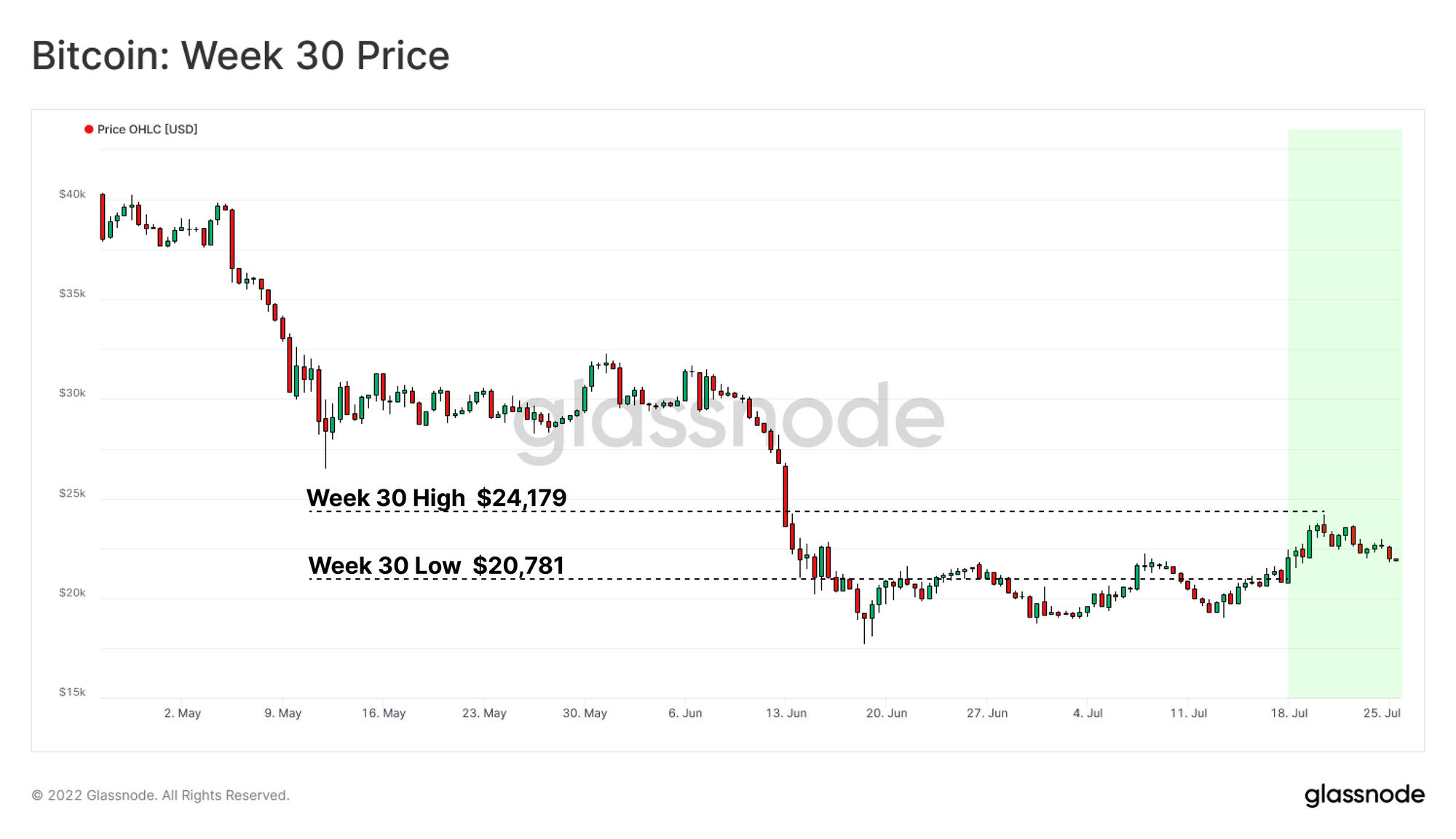
After a month of consolidation, Bitcoin prices experienced a long awaited relief rally, closing 9% above the weekly open. Price action opened at $20,781, rallied into a peak of $24.179, before pulling back towards the highs of the consolidation range over the weekend.

In this edition, we will assess the sustainability of the current market rally through the following concepts:

  • Assess price zones of interest from supply concentrations, technical, and on-chain pricing models.
  • Evaluate the market reaction to many metrics reaching statistically significant over-correction.
  • Gauge the strength of the upwards move by assessing confluence through momentum oscillators (MRGO and moving averages).
Translations

This Week On-chain is now being translated into Spanish, Italian, Chinese, Japanese, Turkish, French, Portuguese, Farsi, Polish, Russian, Arabic and Greek.

The Week Onchain Dashboard

The Week Onchain Newsletter has a live dashboard with all featured charts available here. This dashboard and all covered metrics are explored further in our Video Report, which is released on Tuesdays each week. Visit and subscribe to our Youtube Channel, and visit our Video Portal for more video content and metric tutorials.


HODLer Supply Concentrations

With the market valuation of Bitcoin falling over 75% in 2022, speculators have been largely expelled from the network (as discussed in WoC 27). During this process, a redistribution of coins from lower conviction to strong conviction holders takes place. This is a mechanism native to any market cycle where assets are transferred to more cost insensitive HODLers who invest with longer time frames, and allow their coins to mature in cold storage.

We can observe this phenomena via the Unspent Realized Price Distribution (URPD), separated by the Short Term and Long Term Holder cohorts. Note, that the Short-to-Long-Term Holder threshold (155-days) is back in mid-Feb when prices were trading around $40k.

  • The $20K region has attracted a large cluster of Short-Term Holder coin volume. This is a result of a significant transfer of ownership from capitulating sellers, to new and more optimistic buyers.
  • Short Term Holder demand nodes can also be seen at the psychological price levels of $40K, $30K and $20K. Notably, much of this supply (incl. the LTH supply above) has not capitulated, despite prices trading more than 50% below their acquisition level. This is likely indicative of ownership by relatively price insensitive buyers.

It would be constructive to see these STH held coins at the $40k-$50K level start to mature to LTH status over coming weeks, helping to bolster this argument.

Live Metric in the Glassnode Engine

Looking at the URPD by cohort age, we can observe the distribution of the Bitcoin Supply by time since the coins were last transacted. There are two fundamental points to takeaway:

  • Elevated demand can similarly be noted around the $20K region with a vast amount of recent transaction occurring in this zone. This area also contains the 2nd and 4th largest URPD nodes (around 900K BTC) further indicating there was a large transfer of ownership within this zone.
  • Maturity can be seen to decline from the ATH to current market value, reflective of the duration of the prevailing downtrend. Large volumes of coins accumulated over 6-months ago, which are holding heavy unrealized losses appear unwilling to sell.

Both URPD formats present a case that an increasingly large proportion of the supply is held by HODLers who are allowing coins to mature despite holding losses. Their demand inflows have centred around the psychological $20k, $30k and $40k consolidation zones.

However, it is important to note that during this process, many long-term holders have contributed to the sell-side, and the URPD charts essentially represent the ‘post-dust settling’ condition to date. Furthermore, it is possible that these high supply concentration nodes, may act as firm resistance when the market attempts to recover higher.

Live Metric in the Glassnode Engine Room

Rebounding Off An Over-extension

Prices have responded positively this week, breaking above the recent consolidation zone. This comes off the back of what may be considered a significant short-term over-correction, with many metrics reaching extreme statistical deviations.

This was driven heavily by a period of rapid deleveraging across the market, with many lenders, investors, and trading firms seeing collateral liquidated, either by discretion, or as forced sellers as seen in WoC25: Falling Dominoes: Capitulation Across the Board and WoC23: Miner Incomes Under Stress.

The Mayer Multiple can be used to assess deviations between spot prices and the 200DMA. The 200DMA is widely used within traditional technical analysis as a tool to distinguish between between macro bull and bear trends.

At the most extreme during this price correction, the Mayer Multiple had reached below 0.55, signalling the market was trading at a 45% discount to the 200DMA. Such events are extremely uncommon, and only account for 127 closes out 4186 days, a total of 3% of the trading history.

Live Advanced Workbench

The MVRV Metric is another powerful tool to assess these deviations between spot pricing, and the aggregate market cost basis. With BTC prices breaking above the Realized Price this week pushing the wider market back into aggregate profit, short term outlook has shifted upwards with participants eager for any form of relief rally.

Bitcoin as an asset is constantly maturing, in recent years it has garnered interest on both institutional and national levels. Therefore, to account for dynamic economical climates, a 4 Year Rolling Z-Score is used to normalize the data whilst also capturing the common halving cycle.

  • Standard Deviations below -1 have a strong history of helping to identify bottom formation. Thus far, it has signaled undervaluation for all bear cycle bottoms, including 2015, 2018, and the March 2020 flash crash.
  • The June leg down in price action has produced the lowest 4-yr rolling Z-Score value on record, suggesting a statistically extreme deviation was reached, adding fuel to the present upwards relief rally.
Live Advanced Workbench

We can now introduce the concept of Coin Days Destroyed (CDD), which we use as a gauge for periods where relatively old, or young coins are dominating the spending behavior. For each day a coin remains unspent, it accumulates one coin-day, equal to its BTC volume. When that coin is spent, it is considered to destroy that accumulated time, producing the CDD model. This tool effectively captures the time-weighted economic value of coins that are on the move each day.

Here we compare whether the Monthly average CDD value is higher, or lower than the Yearly average.

  • Blue Zones in the chart below show periods where recent expenditure of older coins is exceeding the yearly average. This is typical of bull markets (profit taking) but also capitulation events in bear markets (panic selling, capital preservation).

From this, we can deduce that longer-term investors with older coins have accelerated their spending of more mature UTXOs as prices traded down into the lows.

Lice Advanced Workbench

The MVRV Z-Score (blue) can then be used in combination with the Coin Days Destroyed (CDD) oscillator (orange). This produces a model which observes both both aggregate profitability (MVRV) and the coin age demographics dominating actualized spending behavior (CDD).

  • Elevated CDD oscillator values above 1 whilst the market is in aggregate loss (MVRV below 1) generally coincides with capitulation periods.
  • Elevated CDD oscillator values above 1 whilst the market is in aggregate profit (MVRV above 1) usually coincides with topping structures.

What this model signals is when longer-term investors are both spending a larger proportion of coins, at the same time as the market is on aggregate under-water on their position. What we can see is that longer-term investors have likely experienced an appreciable degree of capitulation between May and July.

Live Advanced Workbench

We can now formalize this observation by inspecting the actual spending behavior of Long-Term Holders. Long Term Holders (LTH) are often considered synonymous with the HODLer class and represent participants of statistically higher conviction. In the chart below, we compare the profitability of their more recent monthly spending, to their yearly average.

  • When monthly profitability exceeds yearly profitability (orange), the market is entering overheated conditions, as LTHs are spending more, and taking increasingly large profits.
  • When monthly profitability is less than yearly profitability (red), it generally suggests extended Bear Market momentum is in effect, and losses are being locked in by the LTH cohort.
Live Professional Workbench

In the current market, Long Term Holders have seen their recent profitability drift significantly below their yearly performance, for almost 400 consecutive days. The decline has reached similar duration and depth to the 2018 bear market lows, and provides added weight to the arguments made above.

With such severe statistical deviations from the mean punctuated with unprecedented forced selling from crypto-native institutions across the board, a wave of relief was of high probability. In the next section we will assess the conditions required for continuation of the current upwards momentum as well as the conditions that would lead to rejection.

Resistance to Recovery

With price action now experiencing its first relief rally since April, we can assess various models which have provided overhead resistance in previous bear cycles. We can compare resistance levels between both a macro technical view point, and then seek confluence with a suite of on-chain models.

The following simple moving averages have displayed relevance for Bitcoin price action through time:

  • The 200WMA is currently at $22K and has historically been an indicator for bottoming formation.
  • The 111DMA is a component of the Pi Cycle Top indicator, and currently resides at $30K, aligning with a psychological price level, and with supply concentrations detailed above.
  • The 200DMA is trading at $35K, and remains a key transitional boundary between macro bull and bear market momentum.
Live Advanced Workbench

Next, the on-chain cost basis of Short Term Holders, Long Term Holders, and finally the aggregate market Cost Basis can be used to assess relative price action strength. We can also consider the Realized Price to Liveliness Ratio (RPLR), which aims to describe a sort of HODLer implied fair value.

  • Price has recorded a breakout above both the Realized Price, and the LTH Realized Price, which are each trading at $22K. The channel between the two is a contested point of interest providing confluence with the 200 WMA.
  • The Short Term Holder (STH) Cost Basis is currently trading at $28.5K and is in a strong downtrend. This is a product of two mechanisms, STHs realized losses, lowering their average cost basis, and the transfer of coin wealth to a new cohort of STHs buying closer (or below) the current spot price.
  • The RPLR is trading at $35.8k, which provides confluence with the 200DMA. Given the wide view on the 200DMA, and the implied value imparted by HODLers in the RPLR, these models make for a structural level worth keeping an eye on.
Live Professional Workbench

An interesting interaction to observe is when the cost basis for LTH cohort trades back above the aggregate cost basis for the wider market (the Realized Price). For the LTH RP to increase, LTHs must either buy coins above their own cost basis, or coins with a higher cost basis must mature past the 155-day threshold. In a bear market, this is often a high bar, and rarely happens.

Instead, the Realized Price generally climbs as a result of profits being realized. As the market bottoms, strengthens, and sufficient demand flows in to absorb profit taking, the Realized Price can climb, above the LTH Realized Price.

The duration of previous bear market low divergences has ranged between 248-days and 575-days. In the current cycle, it has only been in effect for 17 days, a comparatively short duration.

Live Professional Workbench

Confluence in Momentum

The Market Realized Gradient Oscillator is a statistically normalized oscillator, designed to measure the relative change in momentum between speculative value, and true organic capital inflows. It does this by comparing the rate of change between the Market Price, and the Realized Price.

  • Positive Values indicate constructive upwards momentum over the considered period.
  • Negative Values indicate bearish momentum over the considered period.
  • Breaks above or below 1 indicate a changing momentum to the upside or downside, respectively.

Here, we assess for confluence between the 14, 28 and 140 days variants of the oscillator to identify connection across multiple timeframes.

Starting with the 14day MRGO, a positive breakout can be seen producing structural higher highs indicating increasing momentum. The 14 day oscillator is particularly sensitive due to its bi-weekly period and is thus a more responsive, but noisier variant.

  • Further continuation of this pattern to the upside would signify short term relief is a probability.
  • Rejection from positive regions would indicate a deterioration in short term momentum.
Live Advanced Workbench

The 28day MRGO is similarly producing higher highs suggesting that downside momentum is slowing over the longer term. It is currently signalling modest upside momentum is in effect. However, as seen immediately prior to the June sell off, the previous attempt at upside momentum failed to achieve escape velocity and was followed by a violent collapse in price.

Thus, the market momentum relative to measurable capital inflows is at a cross-roads in the short-term.

Live Advanced Workbench

The 140day MRGO is a much longer time frame momentum oscillator. Unlike the previously discussed variants, the 140day is less sensitive to short term price volatility and thus represents a proxy for long duration momentum, and macro trends.

  • The 140day MRGO has seen persistently lower peaks since March 2021 and has not recorded a positive value in 2022. This highlights a macro bearish market dynamic has likely been in effect for the last 15 months.
  • The current extended negative value regime is indicative of the persistently negative price performance in 2022, and remains in the favor of the bears at this stage.
  • The underlying trend continues to slowly grind higher indicating a potential longer term recovery is in effect, however suggests additional duration and recovery time may be required.

Though the lens of the 140 day MRGO, the sell-off back in May 2021 remains the most severe momentum shift in this cycle. However, as discussed in A Bear of Historic Proportions, the recent sell-offs in May (LUNA) and June 2022 can be considered some of the largest on record. This indicates on a macro scale, the degree of downside market momentum is diminishing over time, potentially signalling a degree of seller exhaustion, and stabilization is on the horizon.

Live Advanced Workbench

Conclusions and Summary:

With so little price relief year to date, profitability has been poor for all investor classes. The Long Term Holder cohort is no exception, and their spending patterns suggest a non-trivial flush out has occurred between May-June 2022.

However, long-term supply dynamics continue to improve, as redistribution takes place, gradually moving coins towards the HODLers. Notable supply concentrations are observable at $20K, $30K and $40K, which tend to align with both technical, and on-chain price models, making these regions significant zones of interest.

Momentum in the short-term suggests continuation of the upswing, provided the Realized Price and Long Term Holder Realized Price can hold as a support level. On the long-term, momentum suggests the worst of the capitulation could be over, however a longer recovery time may be required as foundational repair continues.


Product Updates

All product updates, improvements and manual updates to metrics and data are recorded in our changelog for your reference.

Disclaimer: This report does not provide any investment advice. All data is provided for information purposes only. No investment decision shall be based on the information provided here and you are solely responsible for your own investment decisions.