The Expulsion of Bitcoin Tourists

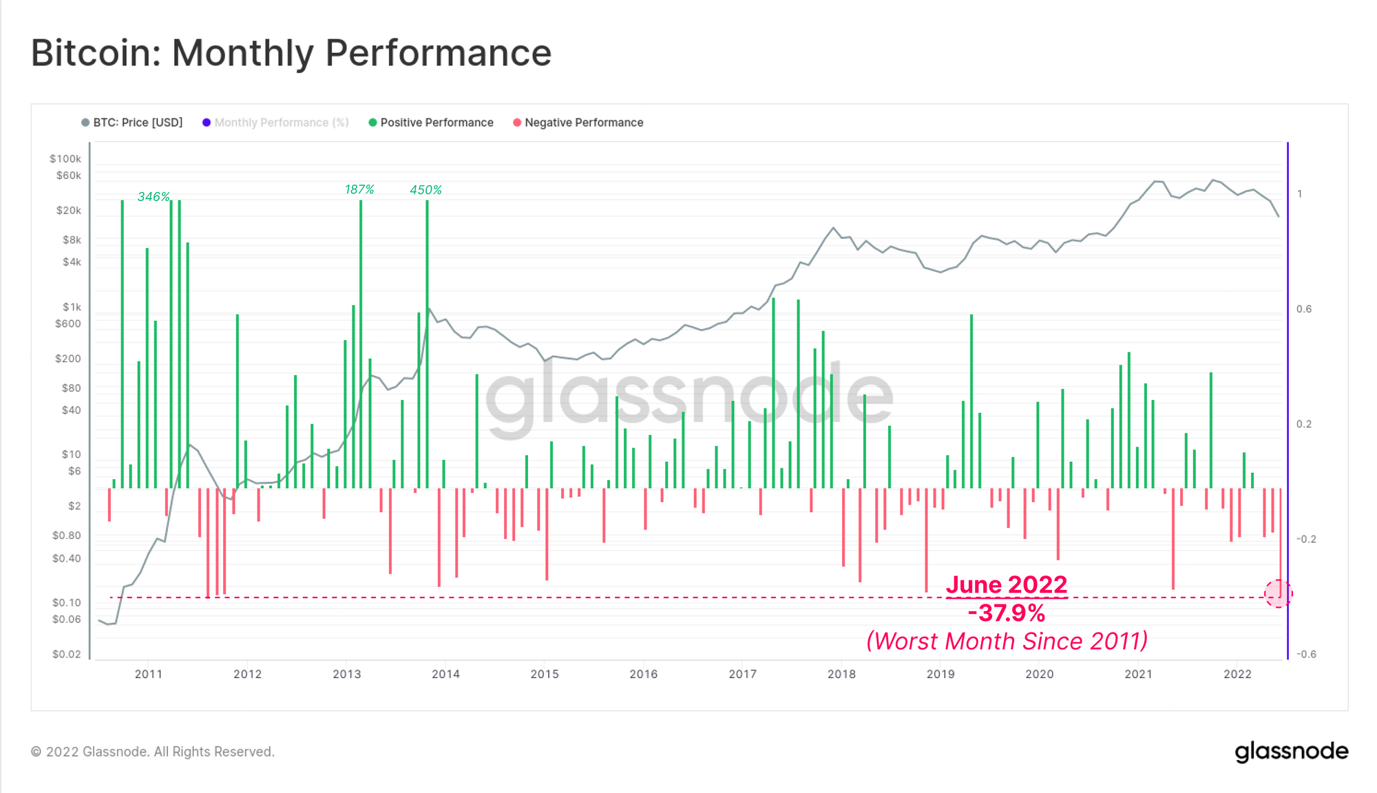
Bitcoin has locked in one of the worst monthly price performances in history, with prices trading down -37.9% in June. Bitcoin has seen a near complete expulsion of market tourists, leaving the resolve of HODLers as the last line standing.

The Expulsion of Bitcoin Tourists

As the first half of 2022 comes to a close, Bitcoin has locked in one of the worst monthly price performances in history. Prices traded down -37.9% over the last 30-days, competing only with the 2011 bear market, for the crown of worst month on record. For a sense of scale, BTC prices were sub $10 in 2011.

Bitcoin prices consolidated this week, digesting the losses of the month, and maintaining a steady trading range around the 2017 $20k all-time-high. The market opened at a high at $21,471, traded down to brief mid-week low of $18,741, before rallying to close at $19,139.

With US inflation estimates for June remaining elevated, and storm clouds of a potential recession looming, the market remains heavily risk off. This is evident in the on-chain performance and activity of Bitcoin, which has reduced modestly in recent weeks. With network activity now at levels coincident with the deepest bear phase in 2018 and 2019, it appears that a near complete purge of market tourism has taken place.

The activity that does remain however appears to align with a steadfast trend of high conviction accumulation and self-custody. Exchange balances are draining at historically high levels, and Shrimp and Whale balances are increasing meaningfully.

With such complex and arguably divergence market forces, in this edition, we will attempt to identify the key trends that are emerging in on-chain performance and supply distribution for Bitcoin.

Live Chart

Translations

This Week On-chain is now being translated into Spanish, Italian, Chinese, Japanese, Turkish, French, Portuguese, Farsi, Polish, Hebrew and Greek.

The Week Onchain Dashboard

The Week Onchain Newsletter has a live dashboard with all featured charts available here. This dashboard and all covered metrics are explored further in our Video Report, which is released on Tuesdays each week. Visit and subscribe to our Youtube Channel, and visit our Video Portal for more video content and metric tutorials.


The End of Bitcoin Tourism

One of the most fundamental concepts in Bitcoin analysis is the assessment of on-chain activity. The idea is to identify relative strength, or weakness in the user-base, especially to identify changes in macro network character.

  • High Activity is often synonymous with an influx of new demand, increased speculation, and is usually associated with bull markets (shown in green below).
  • Low Activity is often synonymous with greatly reduced demand, and waning interest from market tourists, and is typical of bear markets (shown in red below).

As we will shortly explore, almost the entire suite of on-chain activity metrics indicate that the number and activity of network users are approaching the deepest historical bear market territory. The Bitcoin network is approaching a state where almost all speculative entities, and market tourists have been completely purged from the asset.

Address activity for example has declined by 13% from over 1M/day in November, to just 870k/day today. This suggests little growth in new users, and even a struggle to retain existing ones.

Live Chart

A more advanced version of this metric is the Number of Active Entities, which benefits from our clustering algorithms. These methods collate multiple addresses and assign them to on-chain entities, providing a more accurate and clear reflection of the more probable active user-base.

Active Entities did experience a notable rise post-Nov 2021 ATH as participants speculated on a further price leg up. However, this expectation has since dissipated, and has now established the prevailing downtrend. There are around 244k Active Entities per day, which is languishing around the lower end of the Low Activity channel typical of bear markets (shown in red).

A retention of HODLers is more evident in this metric, as Active Entities is generally trending sideways, indicative of a stable base-load of users.

Live Chart

Participant capitulation can be clearly observed through the collapse of Entities Net Growth, which shows the difference between new, and leaving entities on-chain. With exception of two major spikes during the LUNA collapse, and the sell-off in late June, overall growth rates are lacklustre to say the least.

Most recently, the user-base growth rate has plunged to around 7k net new entities per day, which is similar to lows seen during the worst bear market levels in 2018, and 2019.

Live Chart

The HODLer Baseload

The number of settled transactions sheds further insight into the demand for blockspace and network utilization on any given day. Assessing transaction counts is slightly more nuanced than Active Addresses/Entities for two reasons.

  • Limits on available blockspace create a limit on transactional capacity with fees being the release valve (which are very low, indicating almost no observable congestion).
  • The increasing efficiency of transactional technology such as batching, and SegWit, both of which saw large-scale upticks in adoption through 2020.

Extremely sharp decreases in transactions counts can be seen to punctuate the end of the bull markets in Jan 2018 and again in May 2021. After a few months of recovery, transactional demand can be seen to move sideways throughout the main body of the bear. This indicates both a stagnation of new entering demand, but also a probable retention of a base-load of users (the HODLers).

Live Chart

To reinforce this point, the number of addresses with a non-zero balance continues to grind higher, hitting a new ATH of 42.2M, and only minimally influenced by the recent capitulation drawdown.

The Bitcoin network often sees a significant purge of wallets during major sell-off events and in early bear markets, as investors capitulate and spend everything.

  • Jan to Mar 2018 saw a flush of -7M addresses which initiated the bear market, and was equivalent to 24.4% of the total. This remains the largest reduction on record.
  • Apr to May 2021 saw a collapse of -1M Non-Zero addresses amidst the Great Miner Migration, a reduction of 2.8% and quite a mild reaction compared to 2018.
  • May 2022 saw a removal of -430k addresses, a reduction of 1%, and significantly less severe than Apr-May 21 despite a larger price collapse.

Post-2018, the severity of Non-Zero address capitulation can be seen to diminish, indicating there is an increasing level of resolve amongst the average Bitcoin participant.

Live Chart

On-chain activity remains severely muted, and convincingly in the bear market territory. Almost all of the marginal buyers and sellers appear to have finally capitulated and purged from the network over the last 12-months. This leaves only a baseload of HODLers with the highest resolve remaining. There are few reinforcements coming into the Bitcoin demand side, and thus prices are correcting until these HODLers can set the floor.

Exchanging Divergences

Exchanges remain a centrepiece of Bitcoin market infrastructure, with hundreds of millions, to billions of dollars in Bitcoin value flowing through on-chain each day. The number of exchange deposits and withdrawals, tend to show a high degree of sensitivity and correlation with spot prices.

Generally speaking, both deposits and withdrawal counts trend alongside price, peaking around bull market tops, when the inflow of speculative demand is highest. Withdrawals (green) are often fewer in number relative to deposits (pink). This is due to exchanges processing multiple customer withdrawals in a single transaction, where as deposits are processed on an individual basis.

Over recent weeks, renewed attention has been placed on self-custody of blockchain assets, with a number of lending services halting user deposits and withdrawals. Perhaps in response to this unfortunate occurrence, we are currently seeing exchange withdrawals increasing, whilst deposit counts continue to decline.

This is historically unusual, with few similar examples in the last 5-years.

Live Chart

We can also assess the dominance of exchange related activity as a ratio of all transactions across the network. From this we can identify peaks and troughs in investor activity, and identify changes in base-load market structure.

Exchange transaction dominance reached an apex almost immediately after both bull market peaks in 2017 and again in 2021, capturing 80% to 94% of all activity. This marks the last gasp and influx of market tourism, as new participants buy the top, right before price plunges, and they are subsequently flushed from the network.

Exchange transaction dominance has undergone a lengthy detox since the May 2021 high, and appears to be stabilising at around 50%. This supports our earlier observations that the market is approaching a HODLer led regime.

Live Chart

Exchange reserves continue to see large scale net withdrawals, with aggregate balances declining to levels last seen since July 2018. Overall balance on Exchanges have seen an aggregate outflow of -750k BTC since March 2020. The last three months alone have seen some 142.5k BTC in outflows alone, a remarkable 18.8% of the total.

Exchange outflows at this scale, especially in the face of such extreme downside price action are intriguing, and we will further break-down these flows in the next sections.

Live Chart

We can observe changes in these reserves by individual exchange, where we see an interesting divergence is underway:

  • Coinbase continues to see net outflows of coins, with an aggregate reduction of -450k BTC over the last two years. Coinbase balance has declined in a persistent 10k to 30k BTC step function. These coins are being transferred to new wallets which are not associated with the Coinbase entity. These may be custody solutions for institutions, given their holding size.
  • Binance on the other hand has seen a net balance increase of roughly +300k BTC over the same time. As a result, Binance has now flipped Coinbase as the exchange with the largest Bitcoin supply as was highlighted by TXMC this week.

Alongside a historically bad month of price performance, exchanges have seen the largest monthly decline on record, hitting an outflow rate of -150k BTC/month. This accounts for a typical balance reduction of 5.0% to 6.0% of the total through June. This is in stark contrast with the flood of coins into exchanges that occurred in May-June 2021.

Live Chart

Where Did All The Coins Go?

The largest Exchange Net Position Change on record is complemented by the largest Illiquid Supply Change since June 2017.  Illiquid supply has increased by 223k BTC in July, reflecting a large scale movement of coins towards wallets with little to no history of spending (generally speaking. these are not exchanges).

Again, this is in direct contrast to both May 2021, and during the LUNA collapse, which both saw a collapse in price reciprocated by a collapse in Illiquid Supply.

Live Chart

As Exchanges on aggregate continue to deplete, we can see aggressive accumulation taking place by both the largest (10k+ BTC) and smallest (<1 BTC) Bitcoin participants. Both Shrimps and Whales have seen near perfect scores (blue) on the Trend Accumulation Score metric since mid-May, indicating their on-chain balance has increased meaningfully, and consistently.

Cohorts holding 10 to 10k BTC are almost perfectly neutral, with no notable change to their aggregate holdings.

Live Metric in the Glassnode Engine Room

Diving deeper into this, we can see that Shrimps are adding to their balance at a rate of 60.46k BTC per month, the most aggressive rate in history. This is equivalent to 0.32% of the circulating supply per month. Interestingly, the rate of Shrimp balance expansion surpasses the previous record set at the Dec 2017 ATH, when prices were also at $20k.

The Shrimp cohort clearly see $20k as an attractive price, albeit this time with the market trending in the other direction.

Live Chart

Finally, the chart below is derived from our Whale to/from Exchange Volume metrics, where a Whale is defined as an entity with > 1k BTC (excluding miners and exchanges).

On net, whales have withdrawn 8.69M BTC from exchanges we track, and their accumulation and distribution cycles appear to be well correlated with market price performance. Since April 2022, whale exchange volume have been predominantly withdrawals, reaching a significant rate of 140k BTC/month in June. This is the second highest rate in the last 5-years, surpassed only by the correction in Jan 2021.

Live Chart

Conclusions

Bitcoin on-chain activity is firmly in bear market territory, and the most recent network utilization suggests an almost complete purge of all market tourists has occurred. Demand for blockspace is low, and the growth of network users is lacklustre at best.

However, below the surface, the market is experiencing a number of very intriguing divergences. Despite a historically bad year-to-date, and now the worst month of price performance since 2011, strong HODLer undertones persist.

Exchange reserves continue to drain, as participants find renewed momentum towards self custody. These coins appear to be flowing into wallets with no history of spending, and the balance growth and exchange withdrawal activity of both Shrimp and Whale cohorts are at historically aggressive levels.

The Bitcoin bear is in full swing, and in its wake, the HODLers of last resort are the last ones standing.


Product Updates

All product updates, improvements and manual updates to metrics and data are recorded in our changelog for your reference.

Disclaimer: This report does not provide any investment advice. All data is provided for information purposes only. No investment decision shall be based on the information provided here and you are solely responsible for your own investment decisions.