The Week Onchain (Week 47, 2021)

As Bitcoin's price breaks down from ATHs this week, we analyze the mechanics behind the drawdown, and its impact on the macro trend moving forwards.

The Week Onchain (Week 47, 2021)

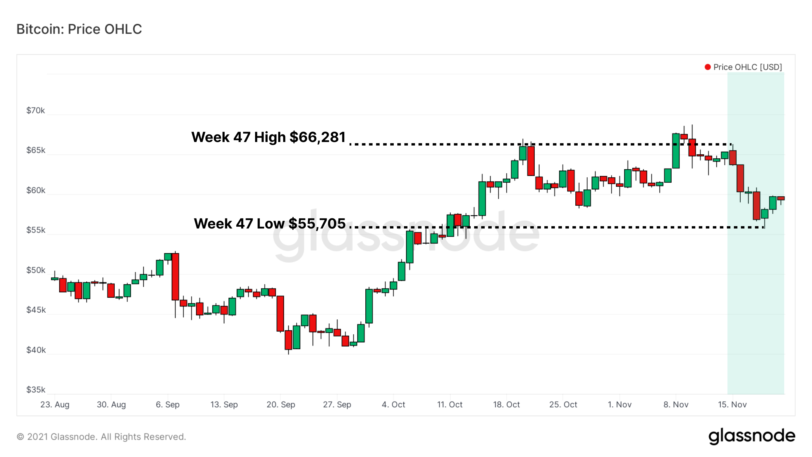
The Bitcoin price tumbled this week from a high of $66,281, to a low of $55,705, rattling a previously quiet and bullish run in price action. While price stays pinned below new highs and sentiment remains scattered, Bitcoin's stakeholders are actively adjusting to new market information.

This has shown up as a recent shifting of coin distribution amongst holders, which will likely impact the market's short-term response. This weeks newsletter will assess the balance in both the macro and micro changes in on-chain sentiment and coin holdings following this week's price volatility. Our analysis will address:

  1. The sharp move lower in price, the aftermath of overhead / unprofitable supply associated with it, and holders' spending behavior in response to volatility.
  2. The "big picture" market trends in play, which will aim to provide context on where things stand and considerations moving forward.
  3. Short term holders (STH), their active role in the market this week, and in aggregate.

Week On-chain Dashboard

The Week On-chain Newsletter now has a live dashboard for all featured charts here. We have also started production for Week On-chain video analysis to provide a deeper dive into the thesis and logic behind each weeks analysis. Visit and subscribe to our YouTube channel, and visit our Video Portal to see our video content.


Assessing Momentum, Supply & Spending

Last week's newsletter established the following:

  • Realized Profits have been increasing, and elevated since reaching $60k+.
  • Realized Losses have been flat for weeks, a natural byproduct of upwards trending price action.
  • As function of the two previous points, the Realized Cap has broken to new highs, establishing a higher plateau for the network-wide cost basis.

Generally speaking, spikes in on-chain profit-taking during bullish impulses are to be expected as price climbs to new highs, and are typical for any bull market. As the realisation of profits increase, so too does the probability of establishing a macro top.

As such, an increase in Realized Profits and Realized Cap generally indicates that:

  • Increased realization of profits is an estimate of sell pressure, which needs to be absorbed by an increasing inflow of demand in order to maintain sideways, or upwards price momentum.
  • The buyers of these coins (i.e. Short Term Holders) have an elevated cost-basis, making them more sensitive to shorter term moves in price.
Live Chart

The combination of these factors can cause a stall in market momentum, and establish a local top. One tool to identify this shift in momentum is the 28-day Market-Realised Gradient. This metric was recently released to Workbench as a pre-set, and measures the relative change in momentum between speculative value (price), and true organic capital inflows (realised price). Interpretation of the chart is as follows:

  • Positive Delta Gradient: uptrend is in play for time period in consideration.
  • Negative Delta Gradient: downtrend is in play for time period in consideration.
  • Increasing Delta Gradient: Momentum is to the upside as capital flows can support price (trend continuation).
  • Decreasing Delta Gradient: Momentum is to the downside as capital flows cannot support price (bearish divergence).

Prior to the price drop this week, the 28-day Market Realised Gradient displayed fading momentum with a sideways price. This same signature occurred before the steep price drop in May, and the initial rejection from $50k in September. As price made higher highs, the momentum behind each one was declining creating a bearish divergence.

Live Chart

As the market sell-off, the Percent Supply in Profit metric, can provide insight into the profitability and cost basis of market participants and the coin supply. Takeaways include:

  • 15% of the Bitcoin supply has an on-chain cost basis greater than $57k.
  • This is a relatively top heavy distribution among Bitcoin holders, which can be identified by comparing previous periods where Percent Supply in Profit was at 85%-90%.
  • Price currently sits in the bull / bear transition zone between 85%-90%. 15% of supply underwater has historically been sufficient to create reflexive downside if price cannot reclaim higher levels in a reasonable timeframe.
Live Chart

UTXO Realized Price Distribution (URPD) shows at which prices the current set of Bitcoin UTXOs were created, i.e. each bar shows the amount of existing BTC that last moved within that specified price bucket. There are various clusters of coins from key levels throughout 2021, with the largest being the 1.9 Million BTC moved between $60k and $68k. This overhead supply could provide resistance in the coming weeks should underwater holders look to cut their losses.

Live Chart

Short term holders (STH) are most responsive to price action due to a combination of having a higher relative cost-basis, a higher time preference, and potentially a lower degree of conviction in the asset. This week's price action was no exception, as STHs played a role in setting both the highs and the lows:

  • STH-SOPR spiked to 1.1 near the highs of the week, a historically high value and one that is associated with large amounts of profit-taking.
  • STH-SOPR dipped below 1 near the lows of the week, a value that has historically bounced price during bull runs as STHs cost-basis gets tested and top buyers capitulate.
  • STH-SOPR remaining below 1 for an extended period of time would be a signal to market participants to take caution, and increase probabilities of an extended downside.
  • STH-SOPR values on the macro scale remain relatively flat compared to the early 2021 price run up, possibly signalling that the market hasn't become overly saturated with profit-taking yet. This is a more constructive medium term observation.
Live Chart

Zooming Out: Recovery Considerations

We've established that price drew down, and that STHs actively participated in both sides of the action by taking large profits at the highs, and spending at break even near the lows.

Now we will look at the performance of STH holdings via STH MVRV Ratio and STH Realized Price. Similar to STH SOPR, these metrics have historically been high signal means for gauging market conditions and sentiment, by tracking price versus the cost basis of STHs. Application of these metrics provide the following information:

  • STH MVRV values = 1 represent a typical bull / bear line in the sand. It indicates price has returned to the STH on-chain cost basis, and they typically aim to defend that level in bull markets. Conversely, in a bear market, STHs will generally offload coins at their break even price, forming resistance.
  • STH Realized Price is currently at $53k, signalling any moves near that level will likely be a battle ground to reestablish bull dominance should price trade down for another leg. Should $53k be lost, it would signal a potential need for caution as the probabilities of a 'top heavy' market creating more sell-side are likely to have increased.
Live Chart

Spent Volume Age Bands identify the age of coins dominating the on-chain flows on any given day. This can help analysts determine when and where long term holders (i.e. those with the most conviction) are spending their BTC. While this tool doesn't necessarily provide precision for finding tops / bottoms in price, it demonstrates when the process of profit-taking or accumulation begins. It can also be used to track sentiment of various cohorts of investors.

With late 2020 / early 2021 as a case study, consistent spending of coins aged greater than 1 month (> 5% of daily BTC onchain volume) began November 2020, and ended in April-May 2021. Since bottoming around $30k, Bitcoin has had one SVAB spike at $40k in August, and another above $60k in October.

Since then, SVAB values have reverted back to 2.5% of daily volume, suggesting older coins are increasingly dormant, especially as prices pull-back. This can reasonably be interpreted as longer term holders reducing their spending, and thus are more likely to be adding to positions, not exiting them.

Live Chart

This trend of long term holder (LTH) HODLing can also be seen in the supply dynamics. The total supply held by STHs can only increase in three instances:

  1. When new coins being mined (which have zero coin days accumulated),
  2. When coins are withdrawn from exchanges, or
  3. When LTHs spend their holdings.

The chart below shows that total supply held by STHs is at multi-year lows (<3 Million BTC), which means LTH supply is at multi-year highs by contrast. Low STH supply is typical at the end of bear markets and in early bull markets, usually following long periods of accumulation. Seeing STH supply this low whilst price is near ATHs is a relatively unique case.

Live Chart

Product Updates


Disclaimer: This report does not provide any investment advice. All data is provided for information purposes only. No investment decision shall be based on the information provided here and you are solely responsible for your own investment decisions.