Navigating Post-ATH Trends
Bitcoin's rally to the $99.4k ATH moved investor holdings to extreme profit levels, resulting in a sharp redistribution of supply. Several risk metrics are elevated and signalling caution, while realized profits and funding rates are starting to cool down, hinting at a period of consolidation.
Executive Summary
- Bitcoin reached a new ATH of $99.4k after a prolonged period of trading within the range of $54k to $74k.
- Several risk metrics we monitor have entered the Very High Risk 🟥 zone, reflecting a state of elevated unrealized profits and an increased susceptibility of investor sentiment to corrections.
- The Realized Profit/Loss Ratio now shows intense profit-taking is underway, hinting at a potential period of near-term demand exhaustion.
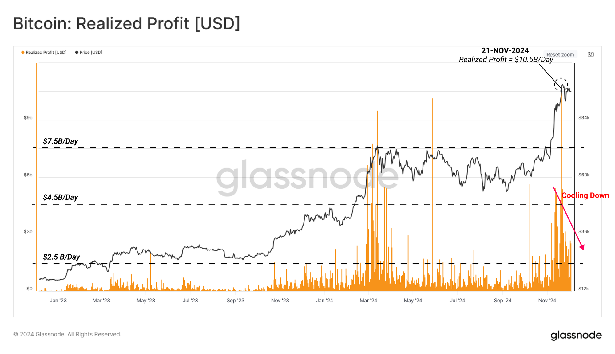
- With that said, realized profit volumes have declined by 76% from the ATH peak, and perpetual futures funding rates are also easing off, indicating the market is rapidly cooling off.
- Early supply redistribution patterns suggest key demand clusters are between $87k and $98k, with very little supply having changed hands during the rally from $74k to $87k.
Uncoiling To A Higher Range
After the market reached its first major peak in early March, Bitcoin traded between $54k to $74k for approximately eight months through to early November. Prolonged sideways price action within a narrow range allows a large proportion of the circulating supply to redistribute and concentrate at a relatively higher cost basis.
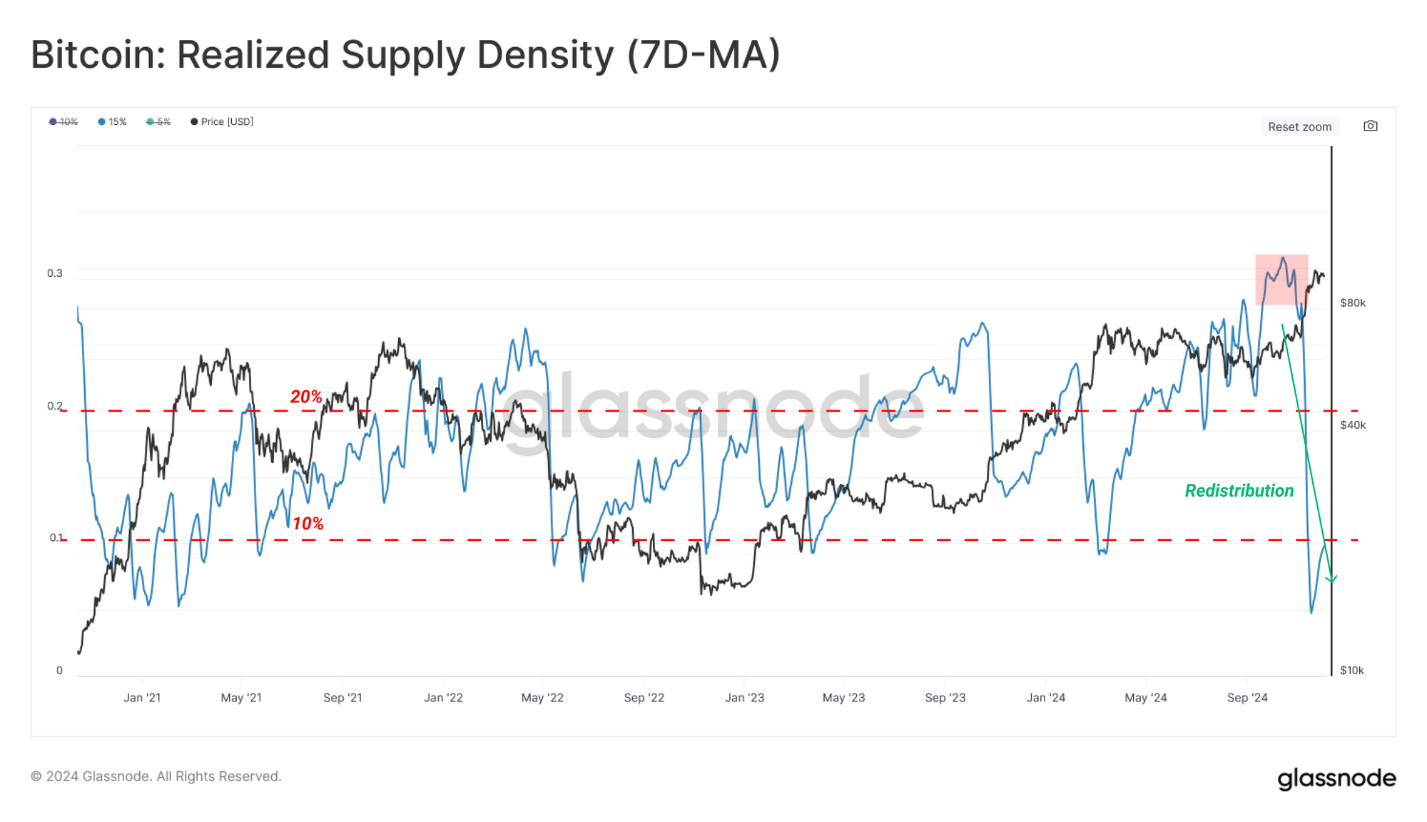
This concentration of supply can heighten the potential for investor panic when downside volatility returns. To track these dynamics, we introduce the Realized Supply Density metric, a tool that quantifies the supply concentration around the current spot price within a ±15% price move.
A high supply concentration suggests price fluctuations can significantly impact investor profitability, which in turn can amplify market volatility.
Revisiting the last five years of significant market moves reveals a common pattern:
- Periods of indecisiveness often see over 20% of the supply concentrated within ±15% of the mid-range price.
- This is usually followed by a sharp and volatile price move in either direction, which pushes this supply into a profit or loss.
Such volatility typically drives the Realized Supply Density metric below 10%, signalling that a large volume of coins now holds a meaningfully different unrealized profit or loss.
The recent breakout above $74k has triggered one of these cycles of redistribution, driving the Bitcoin price to a new ATH and pushing the realized supply density metric (±15%) to below 10%, in this case rewarding many investors with a healthy unrealized profit.
Mapping Post-ATH Range Bands
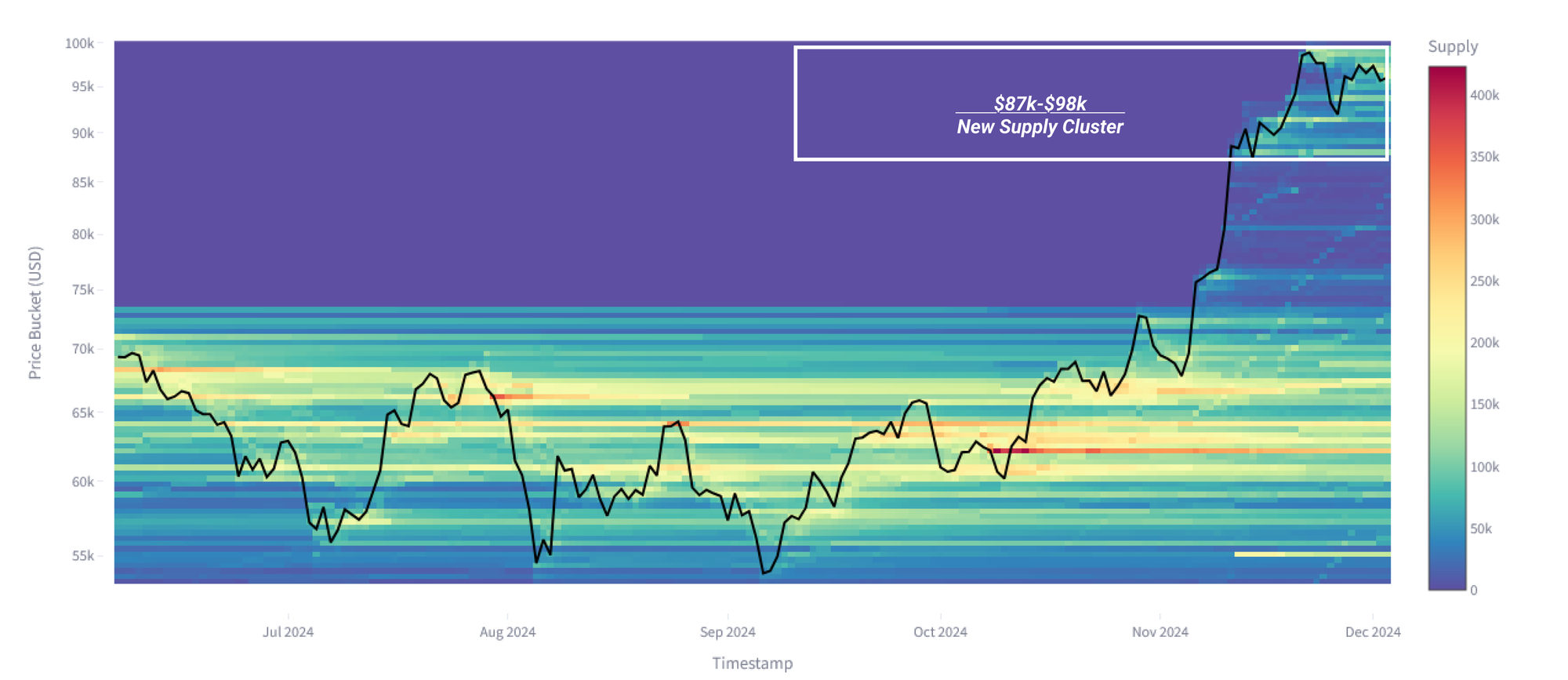
In order to explore the dynamics of supply changing hands during price discovery, we can leverage a new concept called the Bitcoin Cost Basis Distribution (CBD). This metric tracks the concentration of supply at various price points via a heatmap. The Bitcoin CBD provides insights into how the supply is re-distributed over time across various price levels, helping to identify key zones of demand and investor interest.
As we enter the early stages of price discovery, the upper and lower range bands have not yet been fully formed. The most significant supply cluster is developing between $87k and $98k, with very little changing hands on the rally up to $87k.
This suggests that the current trading range is still finding equilibrium between buyers and sellers, but the risk remains that the ‘air-pocket’ below may offer little support if tested.
Assessing Elevated Market Risks
In this next section, we will consult a set of metrics designed to categorize different risk thresholds using on-chain data.
1-Gauging Supply Profitability
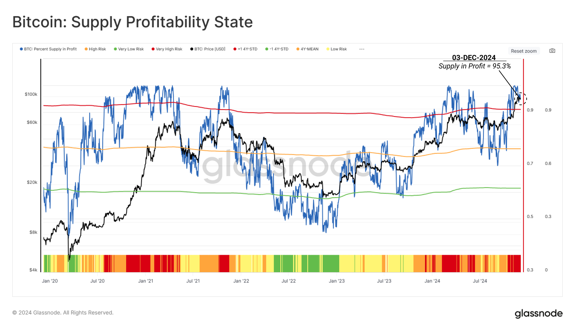
The Percent of Supply in Profit (PSIP) metric helps us characterize market cycles, utilizing the proportion of supply holding an unrealized profit. This provides insights into the potential risk of selling pressure, as investors with unrealized profits tend to be incentivized to lock in their gains.
💡 The PSIP metric is categorized into four risk levels:
• 🟥 Very High Risk: PSIP > 90%, more than one standard deviation above its historical mean.
• 🟧 High Risk: 75% < PSIP < 90%, slightly above its historical mean.
• 🟨 Low Risk: 58% < PSIP < 75%, below its mean but above the lower band.
• 🟩 Very Low Risk: PSIP < 58%, more than one standard deviation below its historical mean.
Periods where PSIP trades above the upper band typically align with the euphoric phase of bull markets. The recent price breakout has pushed the PSIP metric into this Euphoric Phase, which counter-intuitively marks a Very High Risk 🟥 zone. Historically, such levels are associated with heightened vulnerability to downside corrections, as investors are incentivized to realize profits, creating overhead supply.
This signals caution for market participants as the probability of increased selling pressure is rising accordingly.
2-Sizing Fear and Greed
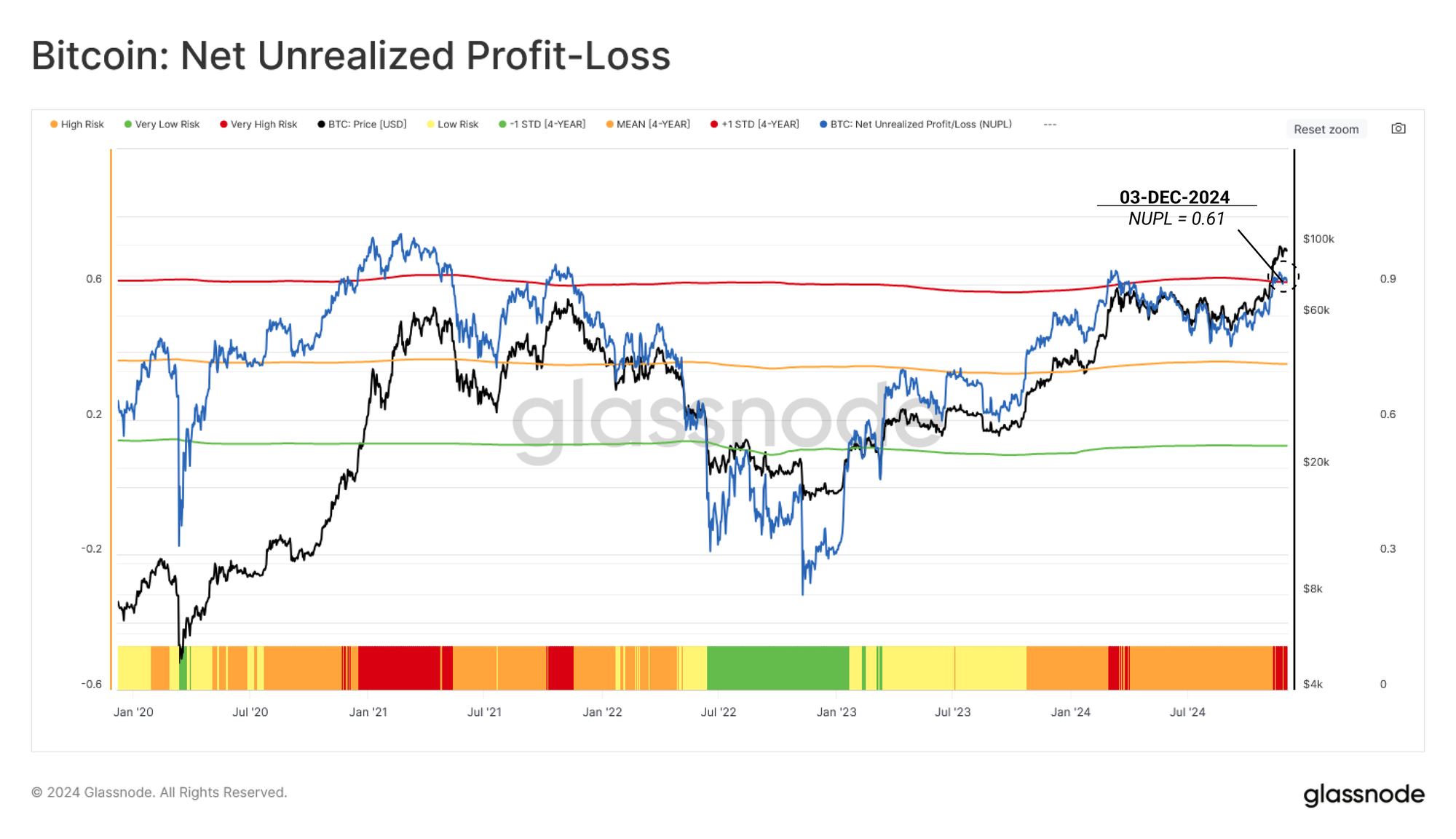
The Net Unrealized Profit/Loss (NUPL) metric quantifies the total profit or loss held by the market as a percentage of the market cap. This provides insights into the psychological state of the market, considering the magnitude of unrealized profit or loss.
Building upon the Percent of Supply in Profit metric above, NUPL offers a deeper understanding of the magnitude of profitability, which drives the emotional sentiment of investors—ranging from optimism to euphoria and fear.
💡 NUPL is categorized into four risk levels:
• Very High Risk 🟥: NUPL exceeds 0.59, surpassing one standard deviation above the 4-year average. This phase, marked by extreme unrealized profit, reflects market euphoria and heightened correction risks.
• High Risk 🟧: NUPL lies between 0.35 and 0.59, indicating the market is in profit but not yet at euphoric levels.
• Low Risk 🟨: NUPL ranges between 0.12 and 0.35, suggesting moderate profitability, typically observed in stable or early recovery phases.
• Very Low Risk 🟩: NUPL drops below 0.12, coinciding with market capitulation and Bottom Discovery phases in bear markets.
As the price broke above $88k, NUPL also entered the Very High Risk 🟥 zone, signalling the market is now holding an extreme magnitude of unrealized profit. This elevated level suggests there is a greater risk of investors starting to ramp up their sell-side pressure, capitalizing on higher prices and the strength of new demand.
3-Gauging Investor Spending Patterns
Given the elevated levels of unrealized profit in the system, we can now turn to the Realized Profit and Loss Ratio (RPLR) to gauge how investors adjusted their spending patterns as Bitcoin approached the $100k level.
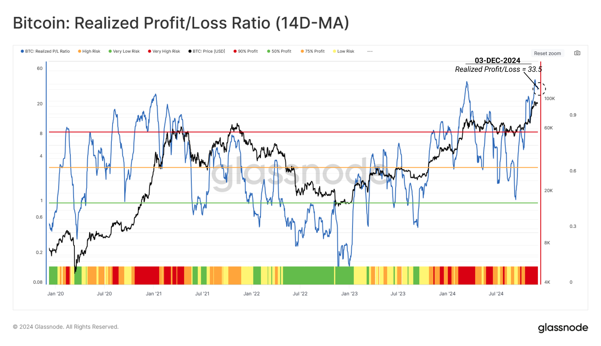
RPLR tracks the ratio of profit-taking to loss-taking events occurring on-chain. It, therefore, offers insights into the behavioural shifts of investors. Daily noise can be filtered by applying a 14-day moving average (14D-MA), providing a clearer view of macro trends.
💡 The RPLR framework categorizes market risk into four tiers:
• Very High Risk 🟥: RPLR exceeds 9, signaling over 90% of coins moving on-chain are being spent in profit—a common sign of demand exhaustion.
• High Risk 🟧: RPLR ranges between 3 and 9, where 75%-90% of coins are spent in profit, often seen around market peaks.
• Low Risk 🟨: RPLR drops below 3, indicating a transition phase with a balance of profit and loss spending (1 < RPLR < 3).
• Very Low Risk 🟩: RPLR falls below 1, dominated by coins moving at a loss, typically observed during market capitulations.
The RPLR metric has similarly entered the Very High Risk zone 🟥, highlighting that the intensity of profit-taking activity throughout this price discovery rally is significant and likely to create overhead supply for the market to work through.
Cooling Down
While all three of these metrics are in the very high-risk zone, it is important to note that these conditions are typical of explosive rallies during price discovery.
We can now support this assessment by looking at the rate at which these metrics have cooled down over the last week. In particular, we will focus on realized profit and futures funding rates as key measures of sell-side pressure and excessive leveraged demand, respectively.
Realized Profit, which tracks the USD gains from moved coins, peaked at $10.5B daily on the run-up towards $100k. It has since declined to around $2.5B per day, representing a 76% drop. This sharp reduction hints towards a marked cool down, suggesting the profit-taking may have been more impulsive than sustained.
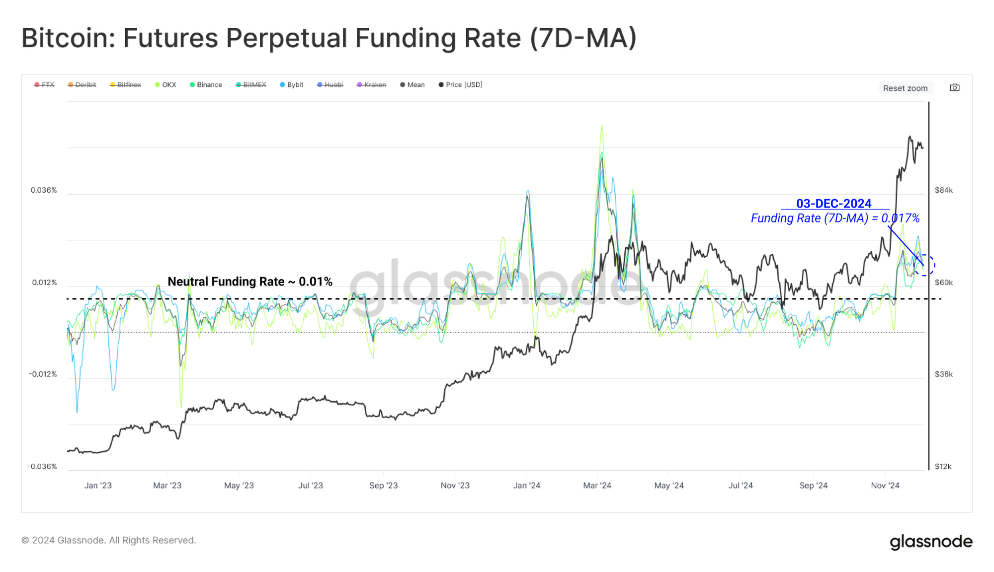
The perpetual futures markets also provide a similar insight, with funding rates starting to plateau as speculative demand starts to stabilize.
Funding Rates measure the interest cost of holding an open perpetual futures contracts, where, in this case, long traders must pay those on the short side. Funding costs spiked during the rally, but not to the same magnitude as in March this year.
If funding rates start to decline, that would signal that excessive long leverage is starting to ease out of the market, while a re-acceleration could signal additional risk is being added to the long side.
Summary and Conclusion
Bitcoin’s recent rally to a new all-time high of $99.4k marked a pivotal moment in this cycle, moving the market well into price discovery. The breakout from the long-standing $54k to $74k price range has pushed a significant volume of supply into an unrealized profit and also triggered several high indicators we use to track near-term risks of overheating.
At the same time, several indicators are starting to cool off, such as a rapid decline in realized profit volumes and a moderation in perpetual futures funding rates. This suggests there is a net slowdown in excessive speculative interest, as well as a net reduction in spot sell-side activity. The Bitcoin market is attempting to re-find equilibrium, with the $88k level at the base of the current supply density cluster.
Disclaimer: This report does not provide any investment advice. All data is provided for information and educational purposes only. No investment decision shall be based on the information provided here and you are solely responsible for your own investment decisions.
Exchange balances presented are derived from Glassnode’s comprehensive database of address labels, which are amassed through both officially published exchange information and proprietary clustering algorithms. While we strive to ensure the utmost accuracy in representing exchange balances, it is important to note that these figures might not always encapsulate the entirety of an exchange’s reserves, particularly when exchanges refrain from disclosing their official addresses. We urge users to exercise caution and discretion when utilizing these metrics. Glassnode shall not be held responsible for any discrepancies or potential inaccuracies. Please read our Transparency Notice when using exchange data.
- Join our Telegram channel.
- For on-chain metrics, dashboards, and alerts, visit Glassnode Studio


