Tracking Volatility Regimes: Gamma Exposure Heatmap
Our new GEX Heatmap tracks how gamma exposure shifts across strikes over time. Spot where volatility may be dampen or accelerate.


As crypto options markets continue to grow, dealer hedging flows are becoming an increasingly relevant driver of short-term price behavior. Knowing where those flows may absorb price movement or reinforce it helps traders anticipate whether volatility is likely to compress or expand.
Building on our foundational work in gamma exposure, Glassnode is proud to introduce a sophisticated new metric: the Gamma Exposure (GEX) Strike Heatmap.
Unlike a single snapshot view, this feature tracks the distribution of gamma exposure across strike levels over time, showing how dealer positioning shifts as the market moves.
This is a proprietary visualization methodology available exclusively on Glassnode, and designed to give systematic traders and volatility professionals a temporal edge in understanding how options positioning influences price action.
Explore the live metrics in Glassnode Studio. Now available for BTC, ETH, XRP, and SOL to all Professional plan users.
What is Gamma Exposure and Why it Matters
Gamma Exposure (GEX) measures how options dealers' hedging flows respond to price movements. When markets move, option deltas shift (this is gamma), forcing dealers to rebalance their positions by trading futures or spot. These flows create structural feedback loops that either dampen or amplify price action.
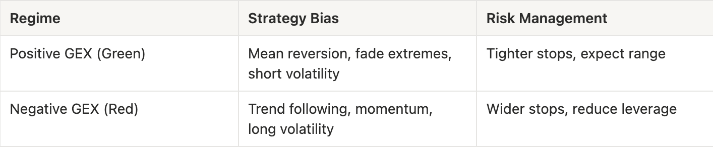
- Long Gamma (Positive GEX): When dealers are net long options, they act as volatility dampeners. To stay neutral, they must sell as prices rise and buy as prices fall. This counter-cyclical trading creates resistance to large moves, often resulting in a "rangy" or stable price action.
- Short Gamma (Negative GEX): When dealers are net short options, they act as volatility accelerators. To stay neutral, they must buy as prices rise and sell as prices fall. This pro-cyclical trading adds fuel to the fire, turning small moves into liquidity cascades.
We have developed an internal methodology to estimate dealer gamma exposure using a taker-flow approach. For a detailed explanation, refer to this article.
Why the Gamma Exposure Heatmap?
Most gamma dashboards in the industry show only a single snapshot in time. A current GEX snapshot tells you where dealer hedging pressure exists right now, but it doesn’t show how that pressure shifts. And markets are dynamic.
As price moves:
- Strikes that are heavily gamma-positive today can fall out of the money tomorrow
- New gamma concentrations emerge
- Gamma “walls” strengthen or weaken as open interest builds or decays.
As time passes:
- Expirations cause GEX to collapse or redistribute.
The GEX Strike Heatmap captures these changes by showing how GEX evolves.
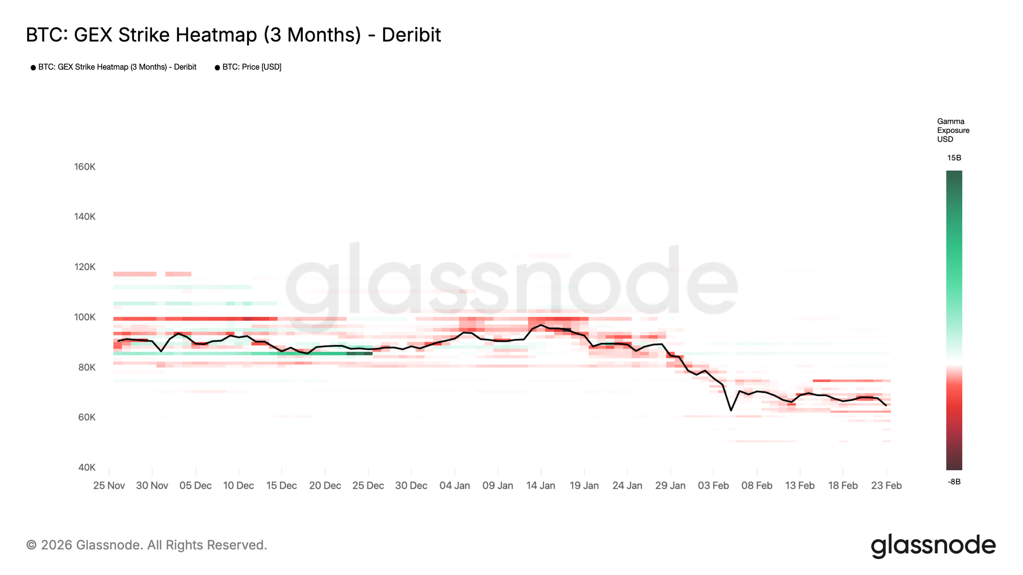
Gamma Exposure Heatmap Case Study
The GEX Heatmap provides a clear narrative of market sentiment that spot price alone cannot convey.
Persistent positive bands (green):
In the heatmap above, distinct green horizontal bands around 85k in mid-December 2025 acted as gamma “walls”. These are price levels where dealers are heavily incentivized to suppress volatility. As long as price remains pinned here, we expect choppy, range-bound conditions.
What to look for:
- Width of the band: Wider bands suggest a broader range of strikes with positive GEX, indicating a larger stabilization zone;
- Duration: Bands that persist over days/weeks are more structurally significant than fleeting concentrations;
- Proximity to spot: When price trades within a positive band, expect choppy, range-bound conditions.
Trading implications: Mean-reversion strategies tend to work well. Fading rallies and buying dips into these zones aligns with dealer hedging flows. Breakout attempts often fail or produce false breaks.
Expanding negative zones (red):
In the recent down-leg (January-February 2026), the heatmap shifts toward stronger red bands around and below spot, while aggregate GEX turns more negative. This is consistent with a short-gamma environment, where hedging flows can reinforce downside pressure and volatility expansion.
What to look for:
- Negative zones approaching spot: This is a warning sign for volatility expansion;
- Increasing intensity (darker red): Growing short gamma concentration amplifies the potential for acceleration;
- Negative zone below support levels: If price breaks into these zones, hedging flows will reinforce downside.
Trading implications: Reduce leverage, widen stops, or position for momentum trades. Mean-reversion becomes riskier. This environment favors trend-following and volatility-long positions.
Total GEX Over Time: A Volatility Lens
While the strike heatmap reveals where GEX concentrates, a natural question emerges: What is the net positioning across all strikes? Is the market, on aggregate, in a long-gamma or short-gamma regime? This is where Total GEX Over Time completes the picture.
Total GEX Over Time shows whether market makers are net long or short gamma, serving as a critical regime indicator. In the chart below, we can clearly observe Bitcoin's aggregate gamma exposure evolution. Green bars represent positive total GEX (market makers net long gamma), red bars represent negative total GEX (market makers net short gamma), with spot price overlaid.
This gives a high-level regime read:
- Positive regime (green): When total GEX is strongly positive, dealer hedging flows are net stabilizing. The market tends toward lower realized volatility, with hedging flows absorbing shocks. This often coincides with consolidation phases or range-bound trading.
- Negative regime (red): When total GEX is negative, dealer flows amplify moves. Realized volatility tends to expand, breakouts become more decisive, and price can "gap" through levels more easily.
- Regime transitions: The moments when total GEX crosses zero, flipping from positive to negative or vice versa, often mark inflection points in volatility behavior. These transitions can precede breakouts, sudden volatility expansions, or the establishment of new trading ranges.
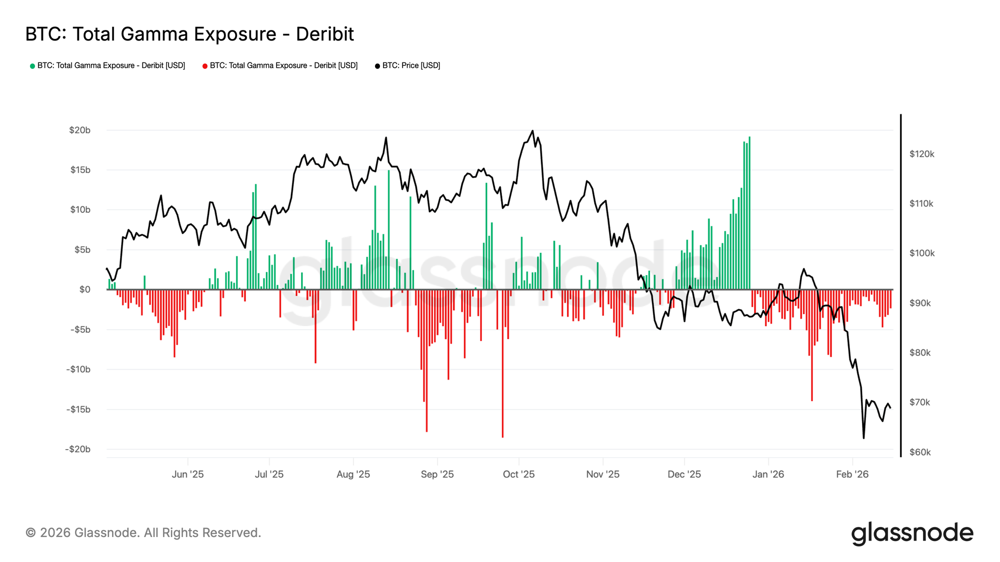
Interpreting the Chart
Looking at the example above, we see:
- August-November 2025: Predominantly negative GEX (red) corresponds with the price decline from 120k to ~80k, indicating amplifying dealer flows that reinforced downward momentum.
- December 2025-January 2026: Shift toward positive GEX (green) as price bottomed and consolidated, showing stabilizing flows that supported range formation.
- Late January 2026: Return to negative GEX during renewed weakness, suggesting the market remained structurally positioned for volatility expansion.
Conclusion
Whether you are a discretionary trader looking for sticky support levels, or a systematic fund utilizing our API to detect volatility regimes, the GEX Strike Heatmap provides a new dimension of market clarity. By visualizing the changing landscape of dealer incentives, you can better identify when the market is primed to consolidate, and when it is ready to explode.
If you want to learn more about our options data and metric offering, or gain access to these metrics, contact our dedicated team today.
- Follow us on X for timely market updates and analysis
- Join our Telegram channel for regular market insights
- For on-chain metrics, dashboards, and alerts, visit Glassnode Studio
Disclaimer: This report is for informational and educational purposes only. The analysis represents a limited case study with significant constraints and should not be interpreted as investment advice or definitive trading signals. Past performance patterns do not guarantee future results. Always conduct thorough due diligence and consider multiple factors before making investment decisions.