Pressure Points: Liquidation Heatmaps & Market Bias
We introduce a two-part framework for BTC perpetual futures, integrating liquidation mapping with long/short bias to inform risk management and positioning.


In spot markets, price reflects the direct balance of supply and demand for the underlying asset. Traders buy or sell Bitcoin itself, and positions are limited to the capital deployed.
Perpetual Futures markets, by contrast, introduce leverage and margin. Traders can take exposures many times larger than their collateral, making risk concentrate around specific price levels. When price approaches these thresholds, forced liquidations can occur, amplifying volatility.
Understanding these markets therefore requires more than tracking price action. It demands a framework for analyzing how traders are positioned and where risk clusters form.
We present a set of metrics that combine two complementary perspectives, one focused on risk (Liquidations) and the other on directional bias (Long/Short Bias), to provide a clear view of positioning risk and how it can affect Bitcoin's price.
Methodology
Our metric set is built on top of Hyperliquid, a decentralized on-chain exchange that accounts for roughly 16% of the global open interest share. For each observation, we track the largest open Bitcoin positions, which together correspond to the majority of liquidable BTC open interest on the platform (~90% at the time of writing). This exchange operates entirely on-chain, providing transparent access to granular position data that centralized exchanges never disclose. This visibility, combined with the exchange's size, provides a solid proxy for BTC perpetual futures positioning.
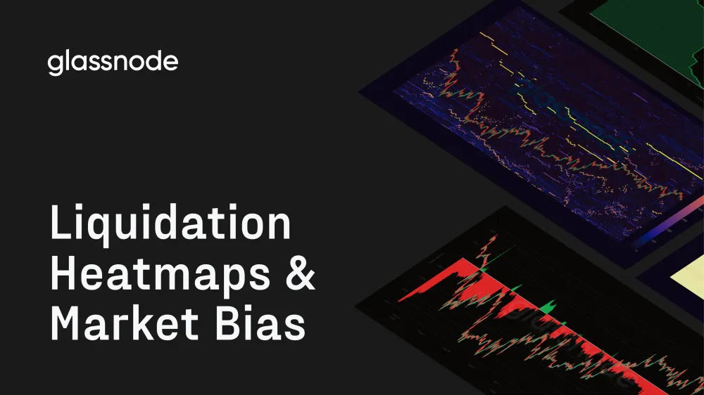
In this section we focus on the market's pressure points, or those price levels where leveraged positions are most exposed. When many traders share similar liquidation thresholds, these areas become structurally fragile: once price moves into them, position unwinds can cascade and accelerate volatility.
On our liquidation heatmap (Figure 1), brighter yellow-orange bands indicate heavier concentrations of positions at risk, while the candlestick line tracks the spot price. As price approaches these clusters, market stress intensifies, making them key zones for anticipating sharp moves.
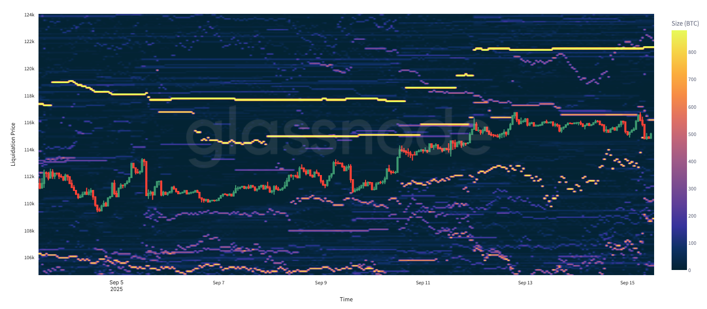
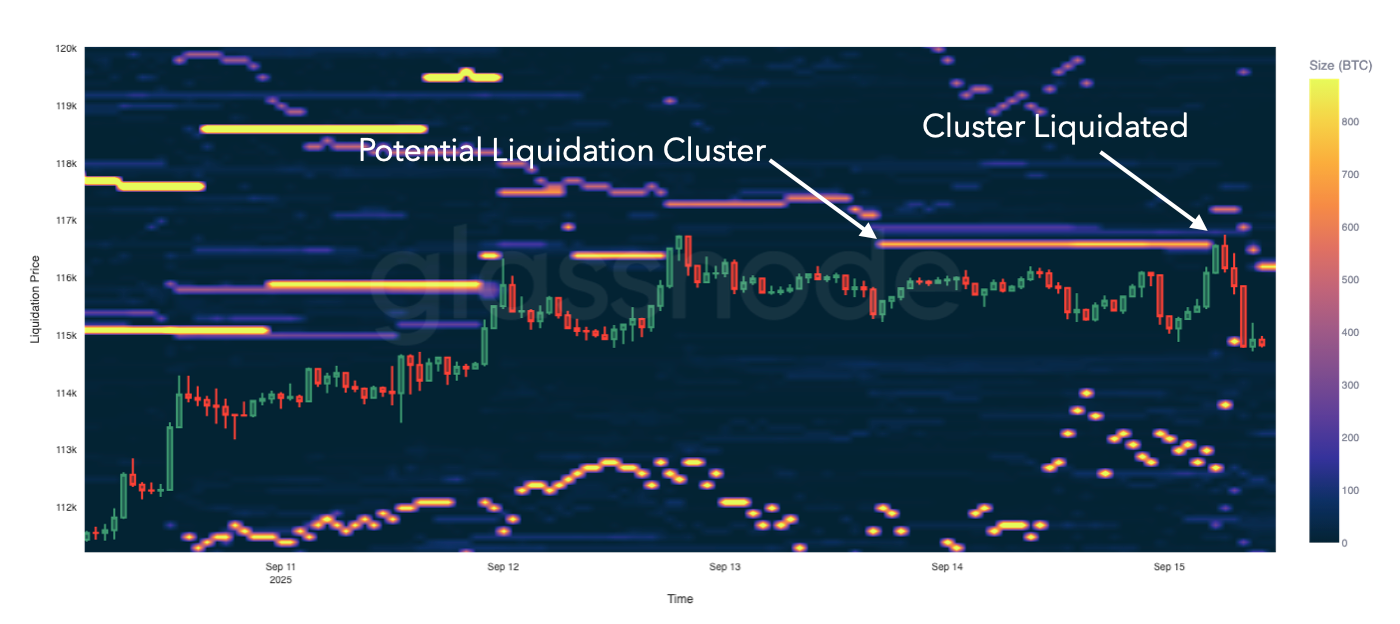
Figure 2 illustrates how clusters of open positions at risk can develop into real liquidation cascades.
- On the right, we highlight a liquidation cluster (yellow band), representing a dense concentration of shorts vulnerable if BTC price moves higher.
- Later, as BTC rallies into this zone, the cluster is liquidated, triggering a sharp squeeze visible in the price.
This sequence suggests that monitoring these clusters in advance may help anticipate volatility spikes and cascade events across the broader market.
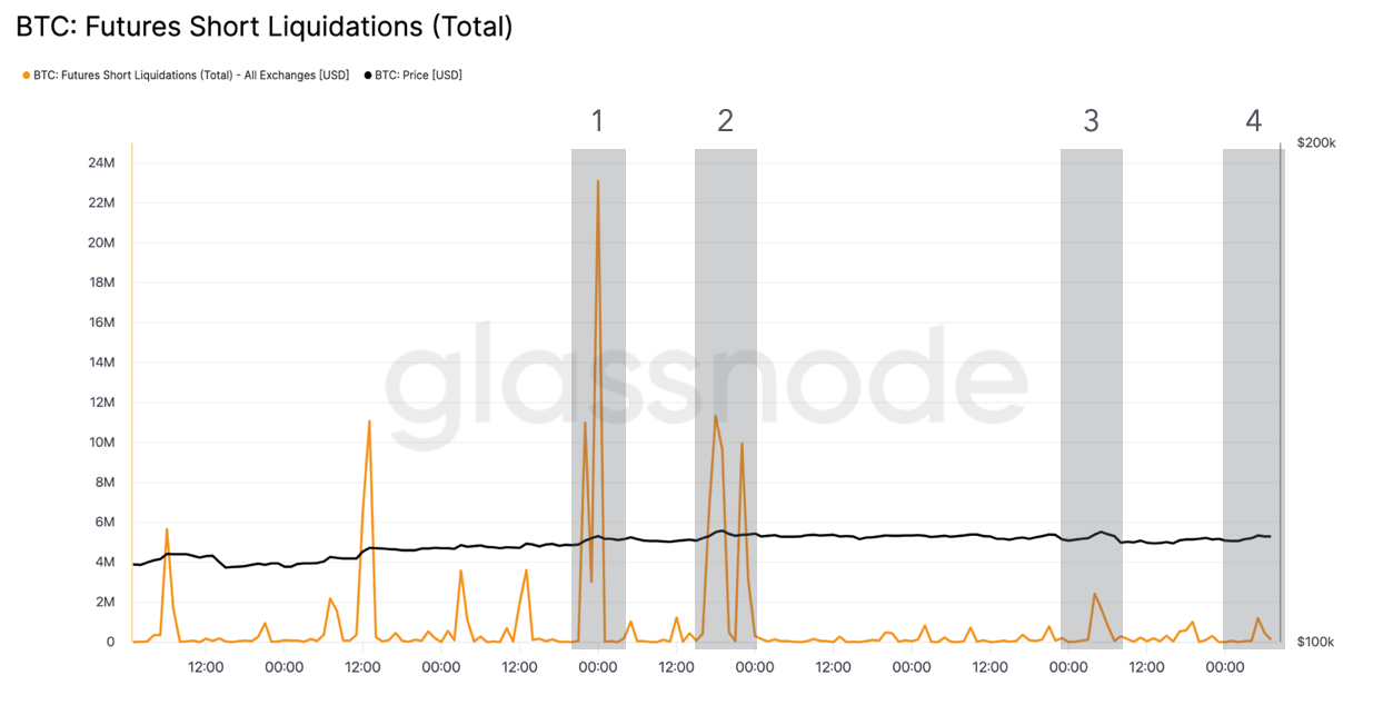
Correlation to other exchanges
We next turn to the question of whether the liquidation zones identified on Hyperliquid exhibit a measurable correlation with actual liquidations occurring on other major exchanges.
Figure 3 illustrates again those liquidation zones, highlighting clusters of large positions concentrated around specific price levels. The shaded periods mark moments when these clusters came close to the price.
Figure 4 shows realized short liquidations aggregated from Binance, BitMEX, Bybit, and OKX. When comparing the two, we observe that the liquidation clusters in Figure 3 tend to align closely with the spikes in aggregate market liquidations in Figure 4. The correlation also extends to the size dimension of the heatmap: in the first two shaded areas, where large concentrations of liquidable positions are visible, we see correspondingly higher liquidation spikes across exchanges. Conversely, in shaded areas 3 and 4, where the concentration of liquidable positions is smaller, the associated liquidation activity is also more muted.
This alignment suggests a possible correlation, indicating that Hyperliquid's liquidation bands may serve as a useful proxy for anticipating where broader market liquidations are likely to occur.
Further Applications
Beyond visualization, the liquidation heatmap has direct applications for risk management and trading strategy.
- For risk managers, it highlights the price zones where leverage is most concentrated, helping to anticipate points of structural fragility in the market.
- For traders, it provides a complementary lens to on-chain data: identifying liquidation clusters can inform where to place stop-loss levels, when to hedge with options, or how to prepare for potential volatility cascades.
Importantly, shifts in the heatmap over time carry information as well. When the liquidation bands move higher or lower, this may reflect participants deleveraging (reducing risk and showing less conviction) or, conversely, adding margin (increasing confidence in their positions). These dynamics turn the heatmap into a proxy for market confidence and positioning behavior.
The Liquidation Walls chart (Figure 5) builds on the liquidation heatmap by presenting the latest snapshot of potential liquidations, referred to as the liquidation walls. While the Heatmap provides a temporal view of how risk clusters evolve, the liquidation walls define the immediate pressure points where price movements are most likely to trigger forced liquidations.
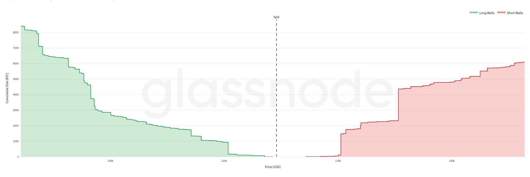
Prices below spot (to the left of the dashed spot price line, shown in green) correspond to potential long liquidations, while prices above spot (to the right, shown in red) correspond to short liquidations. The step height reflects the additional BTC that would be liquidated at each price bucket, creating a cumulative depth profile of potential forced selling or buying.
Long/Short Bias
This section focuses on the directional bias of positioning. By measuring how many traders are long versus short, where they entered, and how exposures evolve, it reveals the balance of conviction between bulls and bears.
As a reminder, our dataset is sourced from Hyperliquid, which provides access to granular position-level data from individual traders. This transparency allows us to explicitly reconstruct both the long and short sides of the market.
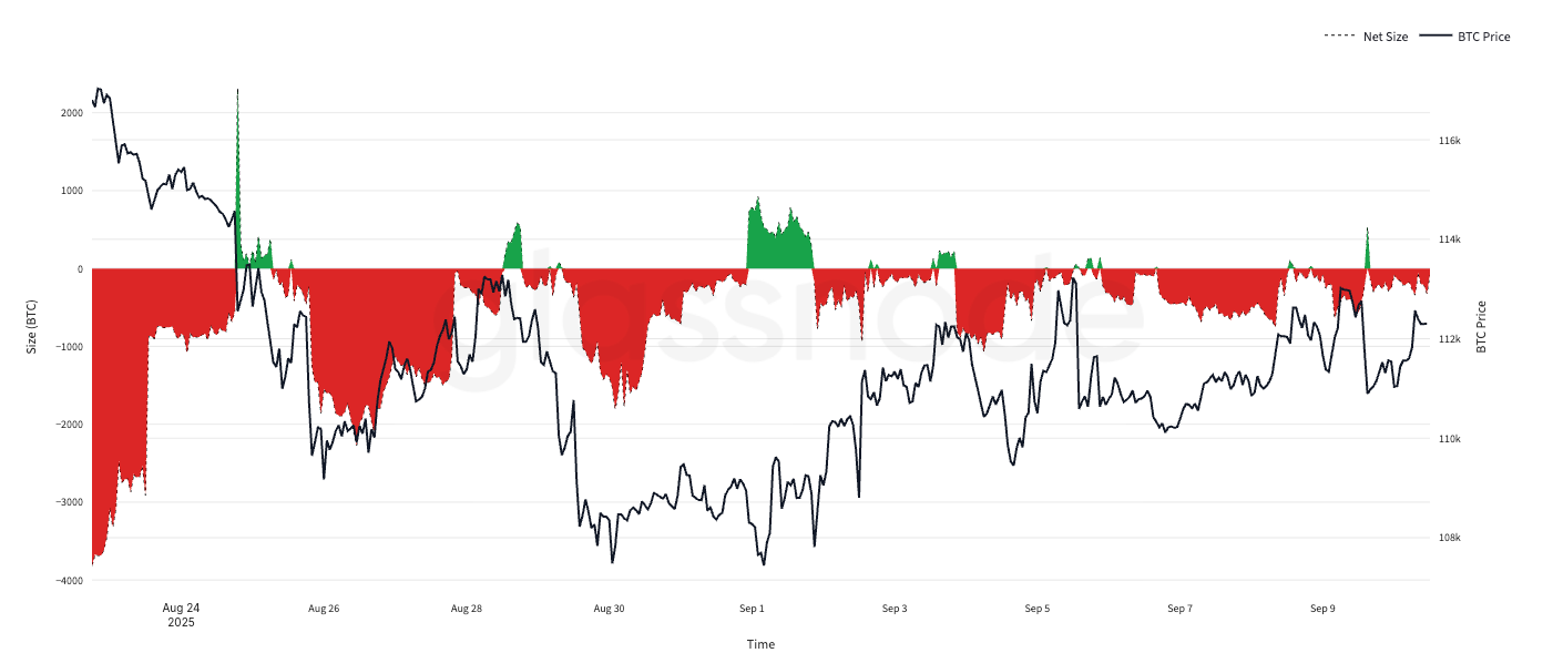
The Long-Short Bias chart (Figure 6) shows the aggregate net positioning of large BTC traders. Green areas represent periods when they are net long, red areas when they are net short. The vertical size of the bands reflects the magnitude of net exposure, while the black line overlays the BTC spot price.
Tracking these shifts directly measures positioning dynamics, showing whether large traders are net long or short and how that bias changes with price.
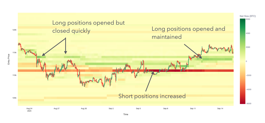
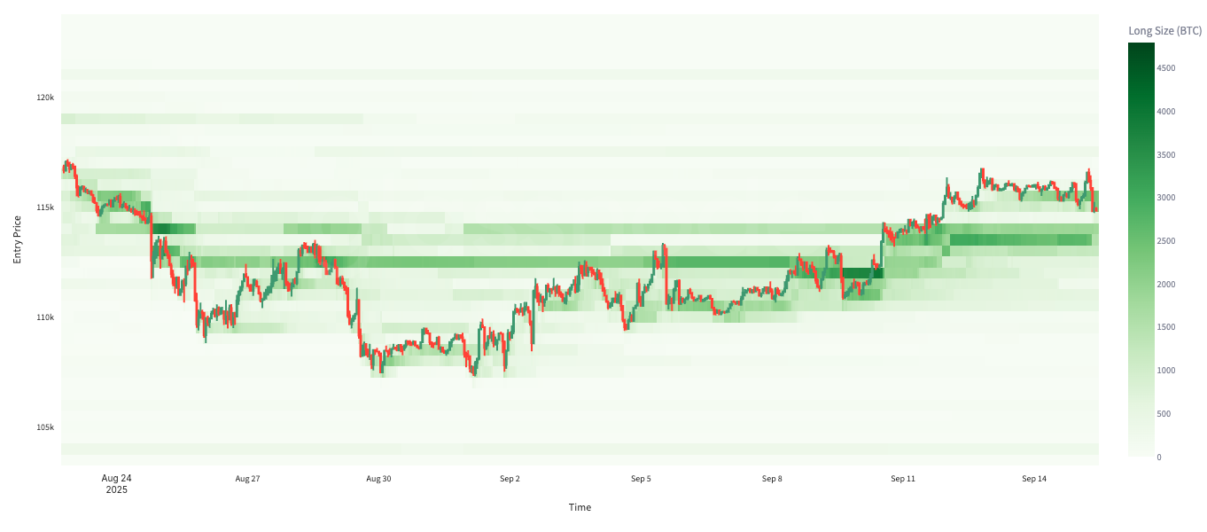
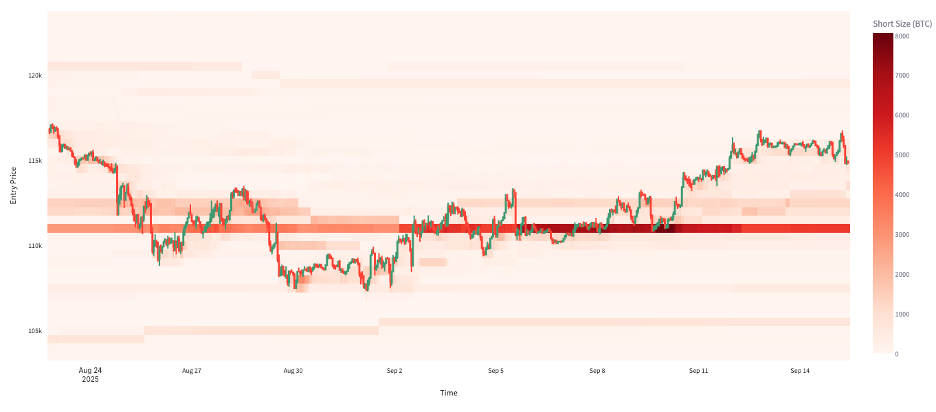
Another lens on positioning is to analyze traders' cost basis, the price levels where positions were established. It's not only important to know whether traders are long or short, but also at what price those positions were taken. The following heatmaps group currently open positions by average entry price, with color intensity reflecting position size in BTC. They are presented across three complementary views: longs, shorts, and the net balance between the two.
In the Net Heatmap (Figure 7), green zones highlight price levels where the market holds a net long bias, while red zones indicate net short exposure. By aggregating positioning across entry levels, this view provides insight into the market’s directional tilt and how sentiment is distributed relative to participants' cost basis.
The length of the bands across the x-axis shows how long positions are maintained. Persistent bands indicate conviction and sustained exposure, while shorter ones reflect quick unwinding. Color intensity reflects the size of positioning at each level, shifting from lighter to deeper tones as exposure grows. This makes it possible to see not only where positions are held, but also how their magnitude evolves, helping anticipate shifts in overall market sentiment.
In the Longs Heatmap (Figure 8), darker greens mark clusters of long positions concentrated at specific entry levels. These zones reveal where bullish exposure is most significant, effectively showing the cost basis of committed buyers. The persistence and intensity of these clusters are useful to gauge the strength of bullish conviction and to identify potential support levels if price revisits those areas.
In the Shorts Heatmap (Figure 9), darker reds indicate heavy concentrations of short entries. These zones highlight where bearish exposure is most pronounced, reflecting the levels where sellers are positioned. While these clusters benefit bears if price declines, they also represent points of vulnerability where pressure can build rapidly if price moves higher.
Analyzed together, these heatmaps provide a detailed map of positioning on both sides of the market. They reveal not only whether traders are leaning long or short, but also the specific price levels where that conviction is concentrated.
Conclusion
This work demonstrates how on-chain transparency can elevate our understanding of perpetual futures markets. By leveraging Hyperliquid's position-level data, we can map liquidation risk and directional bias with a granularity that centralized venues cannot provide. Importantly, these views do not exist in isolation: Liquidation zones observed on Hyperliquid show meaningful correlations with realized liquidations on larger exchanges, reinforcing its value as a proxy for broader market dynamics.
Together, the two perspectives presented - liquidation mapping and long/short bias - offer a coherent framework for analyzing BTC perps. They make it possible to locate where the market is most vulnerable and where sentiment is concentrated, providing a practical tool for monitoring risk and positioning across the market.
Disclaimer: This report does not provide any investment advice. All data is provided for information and educational purposes only. No investment decision shall be based on the information provided here and you are solely responsible for your own investment decisions. We urge users to exercise caution and discretion when utilizing these metrics. Glassnode shall not be held responsible for any discrepancies or potential inaccuracies.
- Follow us on X for timely market updates and analysis
- Join our Telegram channel
- For on-chain metrics, dashboards, and alerts, visit Glassnode Studio