Cycle Top/Bottom Detection: Utilizing Drilling Concepts in On-chain Analysis
In this Market Pulse, we leverage principles used in Bitcoin behavioural analysis to develop a framework analogous to Measurement While Drilling (MWD) methods. The goal of this framework is to measure investors' resilience to price volatility, and develop a cycle extreme detection model.


The Market Pulse
Market Pulses are a suite of premium glassnode content, released weekly for Advanced and Professional members on Glassnode Forum. This piece has been released for free to support the release of a new Workbench Pre-set, which we develop in the analysis below.
The Market Pulse series seeks to demonstrate unique concepts and methodologies of analysing Bitcoin and cryptocurrency markets, with an emphasis on step-by-step guides to utilising Workbench and Glassnode tooling.
- Join the discussion on Glassnode Forum.
- Check out the live Workbench Pre-set associated with this Market Pulse.
Introduction
Estimating rock hardness/strength at an arbitrary depth during drilling operations is a prominent challenge among Geoscientists and Petroleum engineers, also known as Measurement While Drilling (MWD). The core concept in MWD is to monitor the irregularities in the implied force (pressure) during the drilling process and then associate the pressure fluctuation with the rock hardness/strength variation at the current drilling depth.
The Analogy Between Market and Drilling
In this Market Pulse, we leverage principles used in Bitcoin behavioural analysis to develop a framework analogous to MWD. The goal is to assess investors' resilience to price volatility.
The goal of this piece is to develop a similar analogy in assessing the investors’ resilience against price volatility. In other words, by matching the following variables;
- Price Change ≡ Pressure Change
- Percent of Supply in Profit Change ≡ Penetration Rate Variation
- Sellers Exhaustion ≡ Rock Hardness/Strength
We can track the correlation between the Price change and the change in % Supply in Profit in an attempt to estimate the according to Seller Exhaustion experienced throughout the market bottoming formation phase.
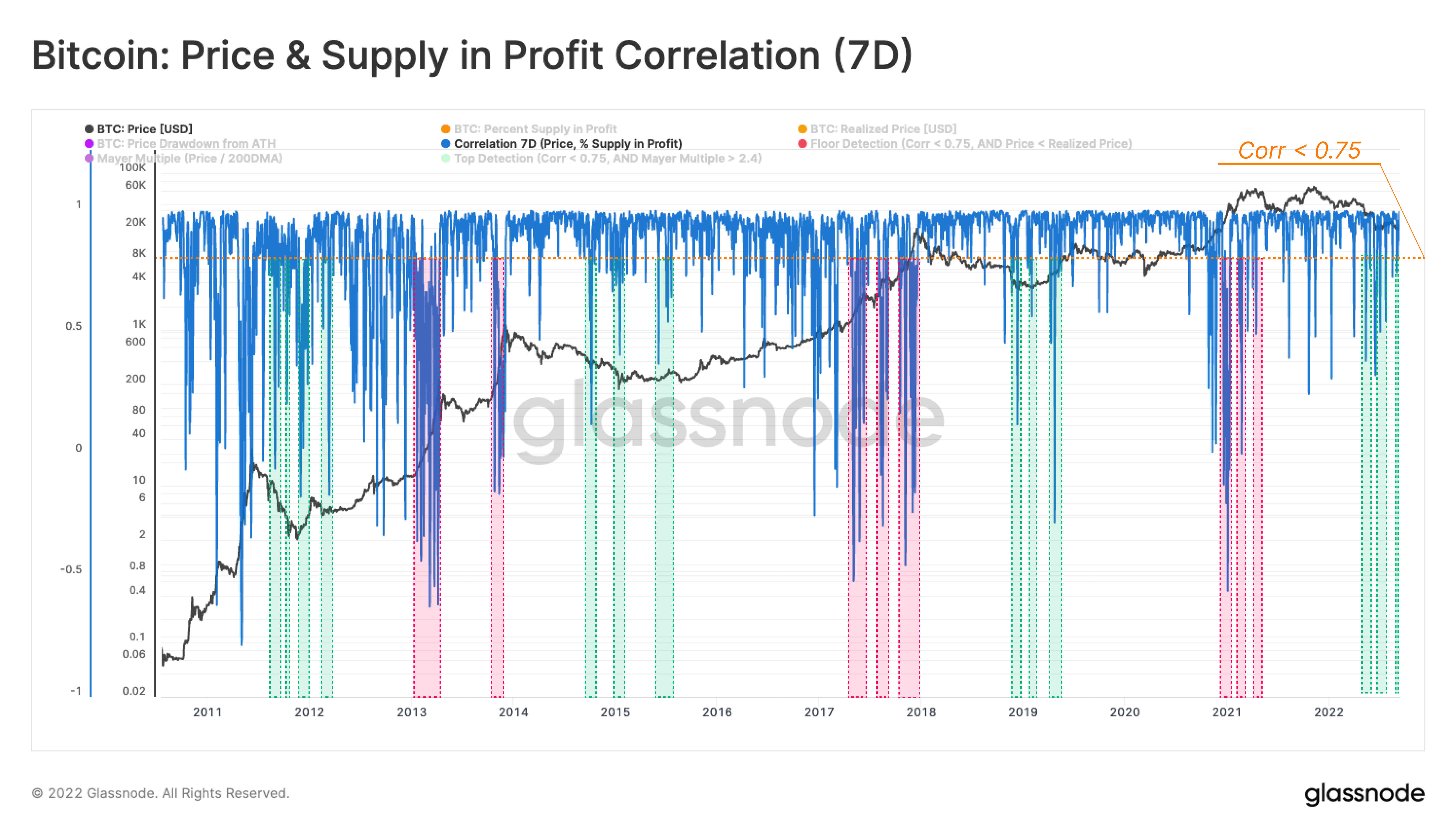
The logic behind this metaphor is founded on the occasional interruption of the convergence between the price and supply profitability change. The following chart confirms the confluence between supply profitability 🟠 and spot price change 🟣 with respect to the latest ATH.
Despite the prominent correlation between these two metrics in the long term, on the micro-scale, there are many transient intervals where the supply profitability does not track the price change trend.
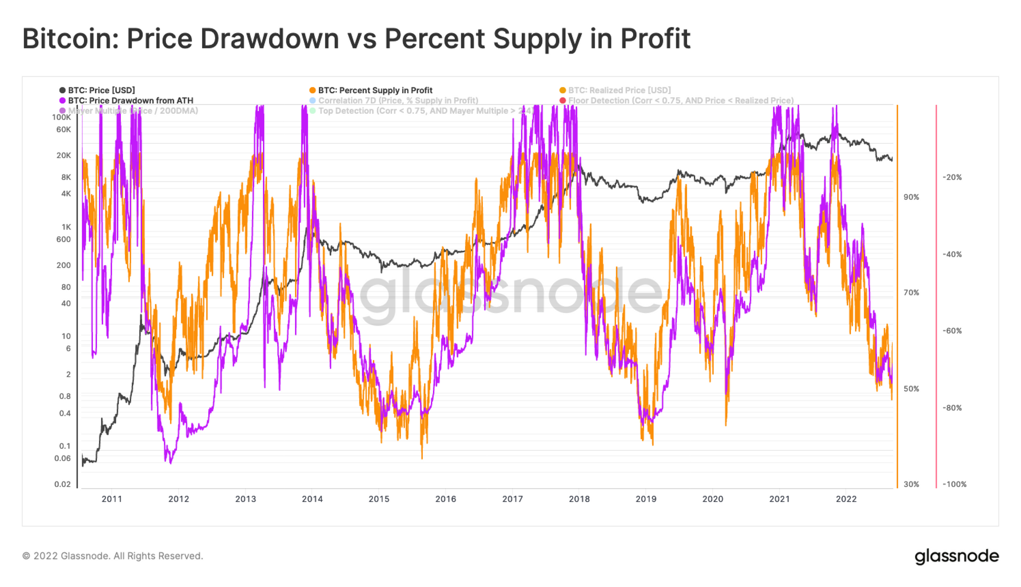
In other words, when the market goes through an extended bear market (or bull market), sellers’ (or buyers’) exhaustion causes the short-term price correlation with the percent of supply in profit to deviate from its typical range (~0.9 to 1).
A Curious Correlation
The following figure presents the 7-day correlation between price and Percent Supply in Profit and the high 🟩 (0.9<corr<1.0) and moderate 🟧 (corr<0.75) correlation ranges.
💡 Workbench functions:
m1 = Price
m2 = Percent Supply in Profit
f1 = 7-day Correlation =corr(m1, m2, 7)
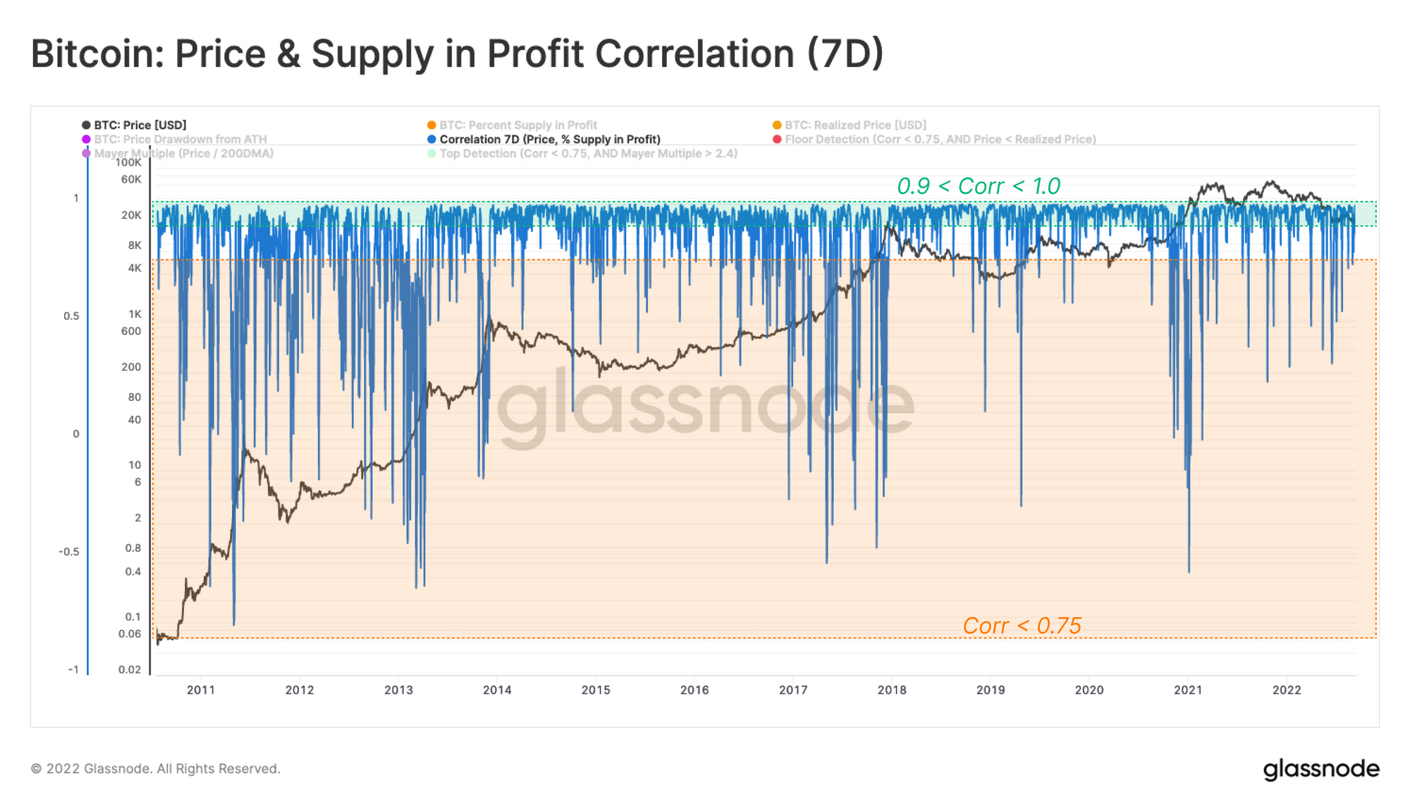
As shown in the graph above, the discussed correlation consistently remains in the range of 0.9 to 1 during a considerable fraction of a typical market cycle. However, when the macro trend is experiencing a transitional phase between a bull and bear market (or vice-versa), this correlation experiences multiple drops to values below 0.75.
This behavior can be represented in one of the following scenarios:
- Transition from Bear to Bull Market 🟩, where the bear market is at its later stages and sellers are exhausted. This frustration makes the remaining participant reluctant to move their funds, thus the correlation between price and supply profitability deviates from the 0.9-1 range.
- Transition from Bull to Bear Market 🟥,where the bull market is parabolic, and nearly 100 percent of the supply is in profit due to price trading above the previous ATH. Therefore, the correlation between price and profitability diminishes in this phase until the market enters the post-ATH bearish stage.
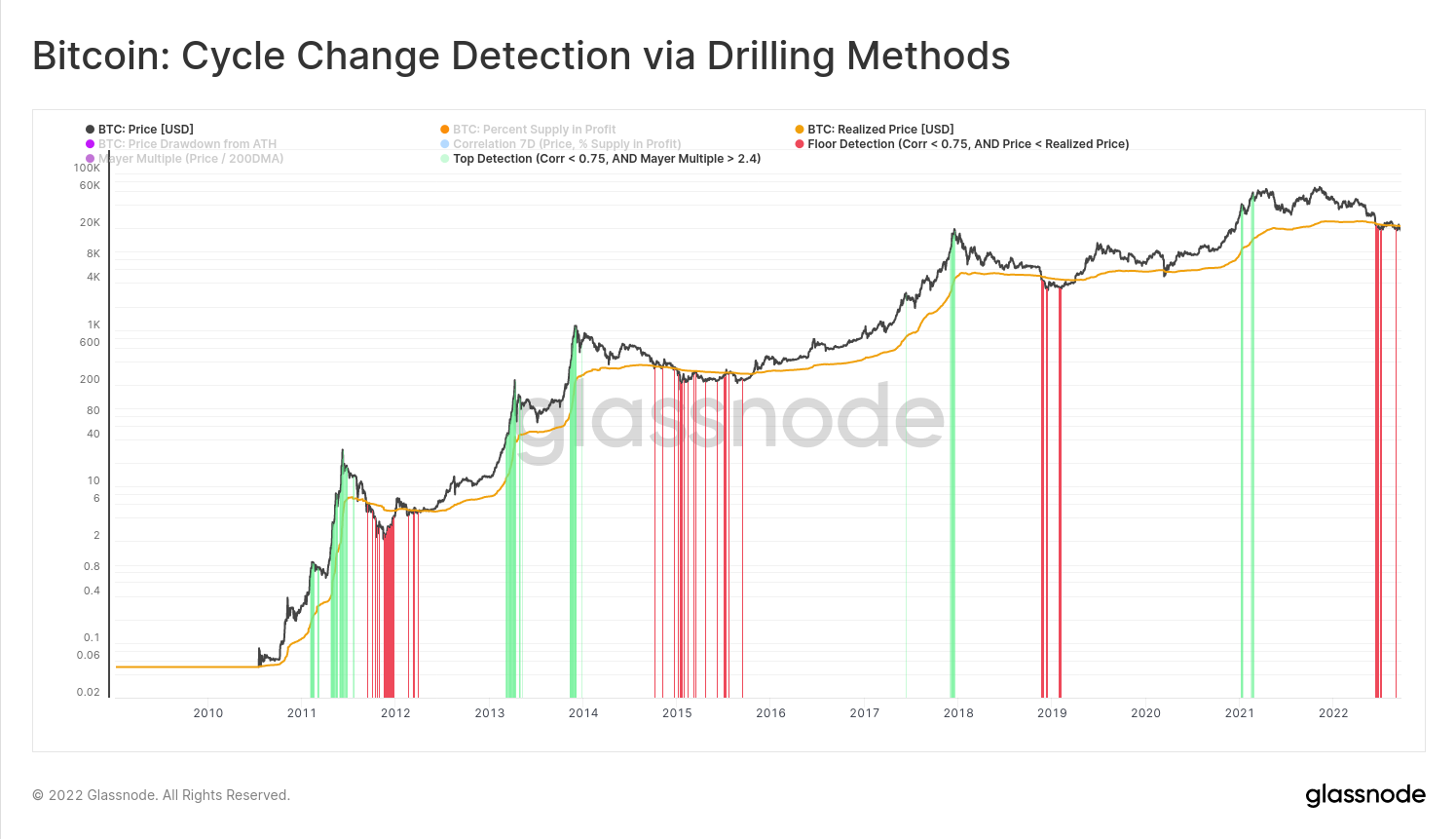
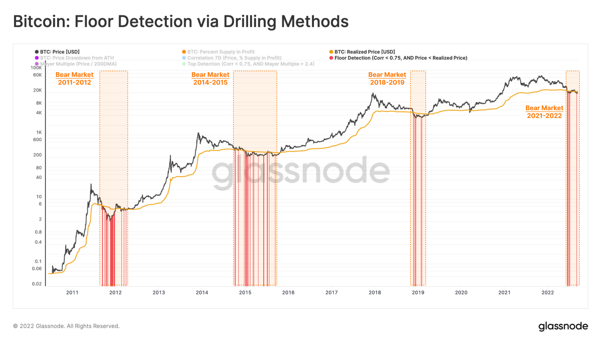
Application: Bear Markets
Presently, the market has many hallmarks of a bottom discovery phase. Therefore, the Transition from Bear to Bull Market is the period of interest. To highlight the correlation irregularities, we have highlighted only the days where this correlation is less than 0.75.
Next, we can account for irregularities contained solely within the bear market trend. For this, we are only considering entries whilst the market price is below the realized price. i.e whilst the wider market is in an aggregate, unrealized loss. Another more broad option could be to filter for prices below the 200-day moving average.
💡 Workbench functions:
m1 = Price
m2 = Percent Supply in Profit
m3: Bear Market Indicator = Realized Price (or 200DMA)
f1: 7-day Correlation = corr(m1, m2, 7)
--------------------------------------------------
To construct the floor model indicator shown in ⚫, we will be multiplying a combination of twoif-thenstatements to produce anANDstatement.
First If: If Correlation is < 0.75, return 1, Else return 0.
A)if(f1, "<", 0.75, 1, 0)
Second If: If Price is < Realized Price, return 1, Else return 0.
B)if(m1, "<=", m3, 1, 0)
Combined if:
A * B * m1 —> this will return 1*1*Price when the conditions are True. Be sure to set Y axis to the price chart, and Chart Style to Bar.
Final Output
f2=if(f1, "<", 0.75, 1, 0) * if(m1, "<=", m3, 1, 0) * m1
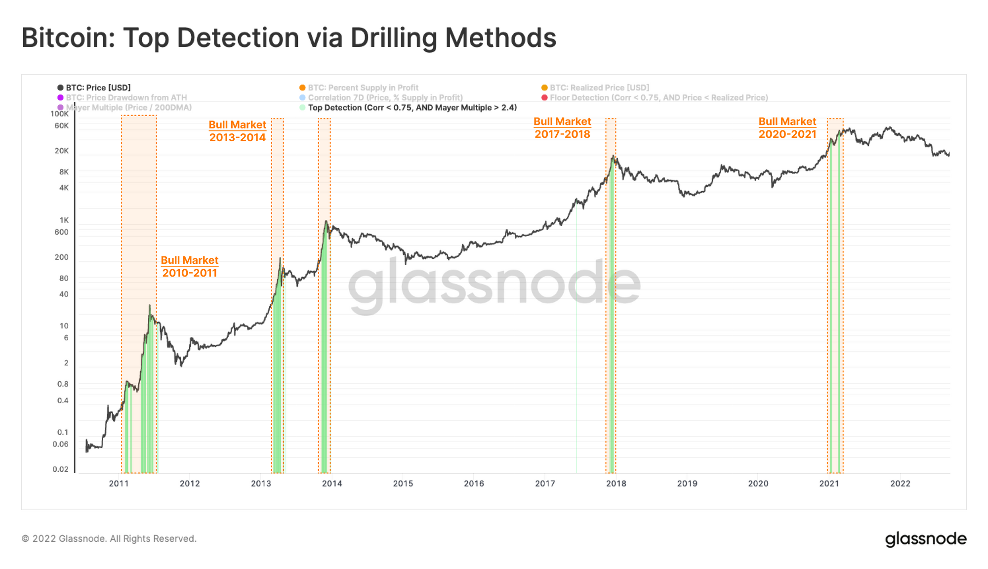
Application: Bull Markets
We may also use this same technique to identify cycle top formation, using the well-known 200-day moving average and derivative oscillator Mayer Multiple as our bull cycle extreme. Historically, Mayer Multiple values above 2.4 have signalled a relatively overheated Bitcoin market, with price trading at a 240% premium to the 200-day MA.
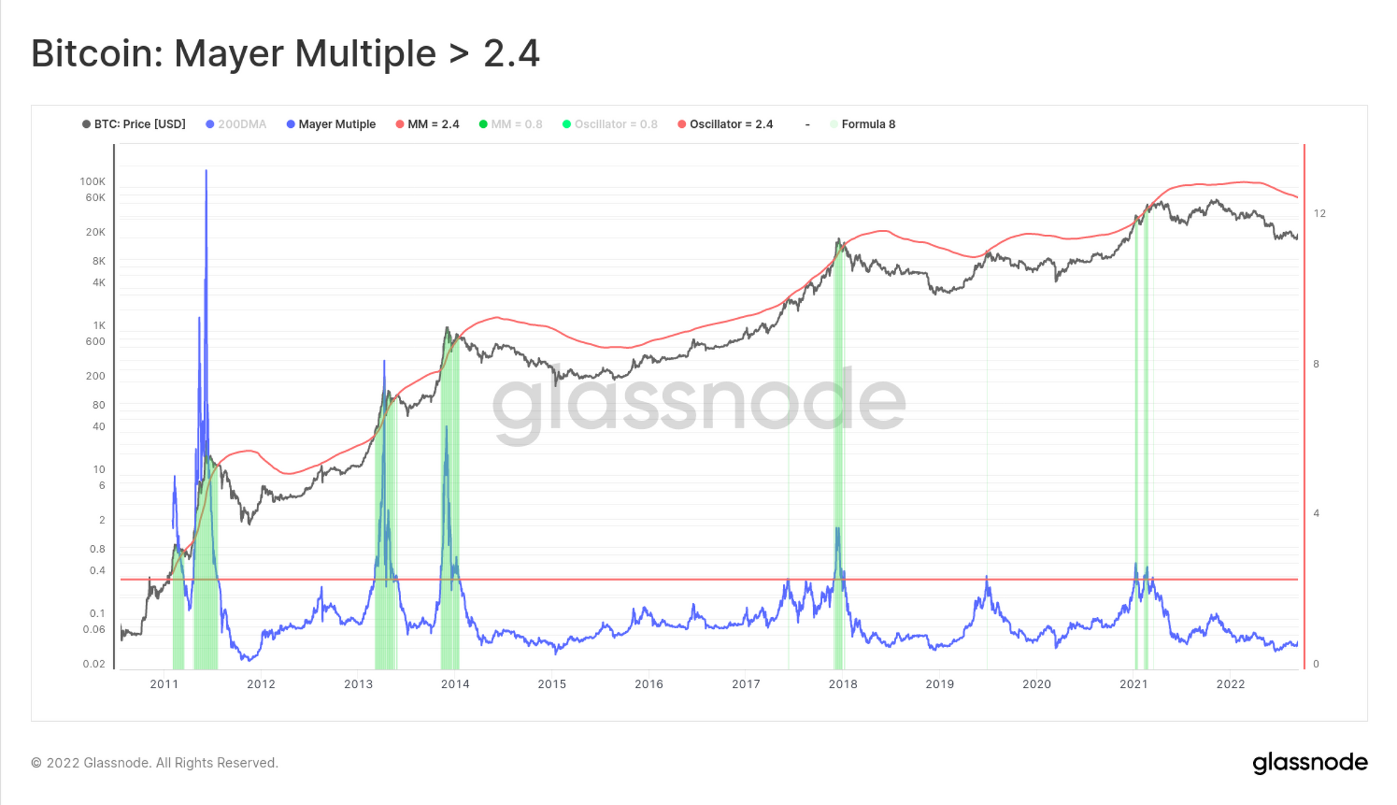
We can now establish an equivalent bull-to-bear cycle transition, by swapping out the conditional test related to the Realized Price, for a minimum value of the Mayer Multiple.
💡 Workbench functions:
m1 = Price
m2= Percent Supply in Profit
m3: Bear Market Indicator = Realized Price (or 200DMA)
f1: 7-day Correlation = corr(m1, m2, 7)
f2: Floor Detection Model =if(f1, "<", 0.75, 1, 0)*if(m1, "<=", m3, 1, 0)*m1
f3: Mayer Multiple =m1/sma(m1,200)
—————————————————-
The construction is identical to f2, however we will swap the condition in pat B) with a test of whether the Mayer Multiple is ≥ 2.4
Final Output
f4 =if(f1, "<", 0.75, 1, 0) * if(**f3, ">=", 2.4**, 1, 0) * m1
Conclusion
Employing analogues to methodologies from the rock drilling industry in on-chain analysis, we have introduced a method to track the potential transitional periods between bear and bull markets.
The correlation between profitability and price was examined to determine the transition phases in a cycle. The result showed that price and market profitability are highly correlated when macro trends are fully established (correlation ~ 0.9 to 1).
However, during a transitional stage, the correlation between these two metrics drops to levels below 0.75. This means supply profitability is close to its extreme inflection points, a shift in investor behaviour, and that price change is not leading to an associated profitability change. This structure is ideal for macro trend reversal.
The final Floor Detection model essentially captures the following events using an If-then-and statement construction:
- Price is below the Realized Price, signalling a likely late-stage bear market structure.
- The correlation between Price and the Percent Supply in Profit is below 0.75
- Deterioration of the correlation signifies the increased likelihood that HODLers are not moving their funds.

- Follow us and reach out on Twitter
- Join our Telegram channel
- Visit Glassnode Forum for long-form discussions and analysis.
- For on-chain metrics and activity graphs, visit Glassnode Studio
- For automated alerts on core on-chain metrics and activity on exchanges, visit our Glassnode Alerts Twitter