The Week On-chain (Week 11, 2021)
Bitcoin has a strong week as it rallies to a new all-time-high over $61k and long-term holders slow their spending.


Bitcoin Market Overview
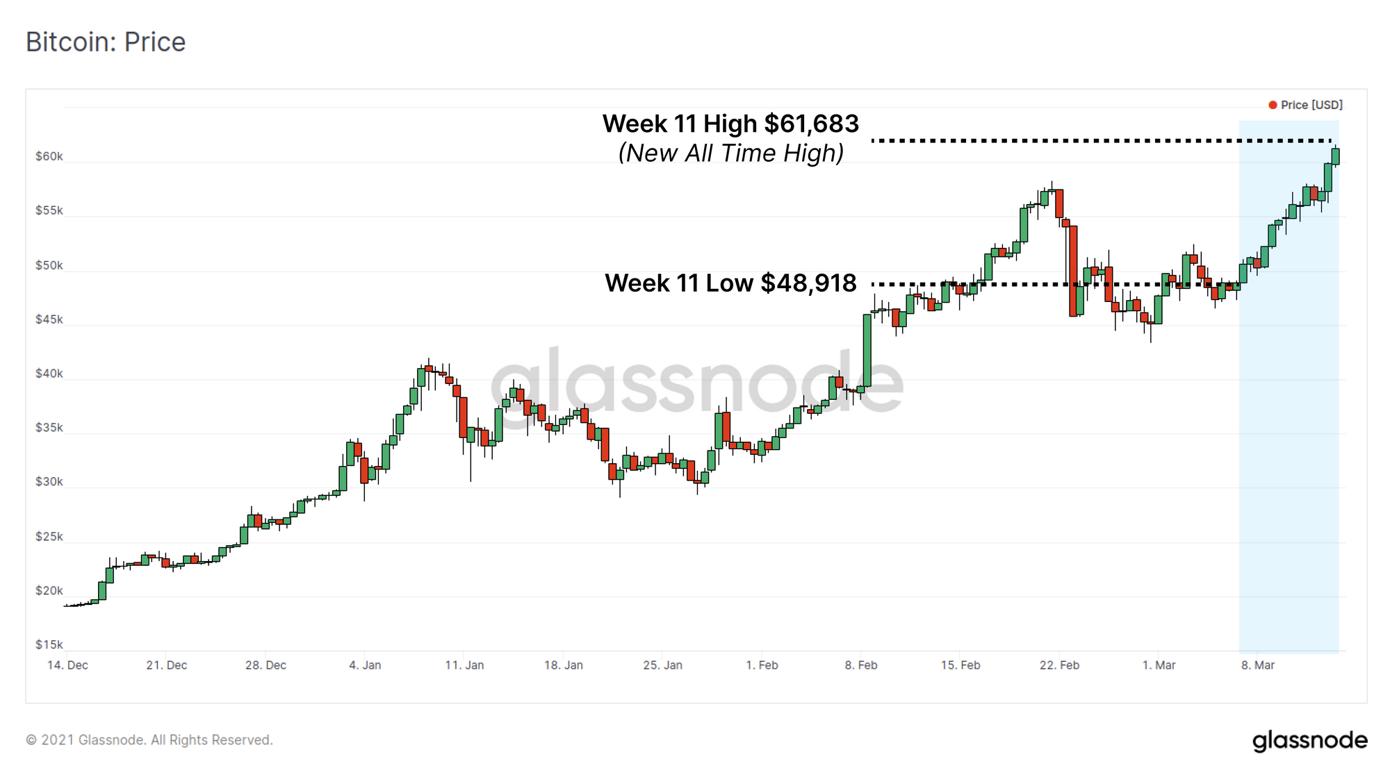
Bitcoin has had a very strong week coming out of its second major bull market correction. Price opened at the weekly low of $48,918 and rallied to a new all time high of $61,683 over the weekend.
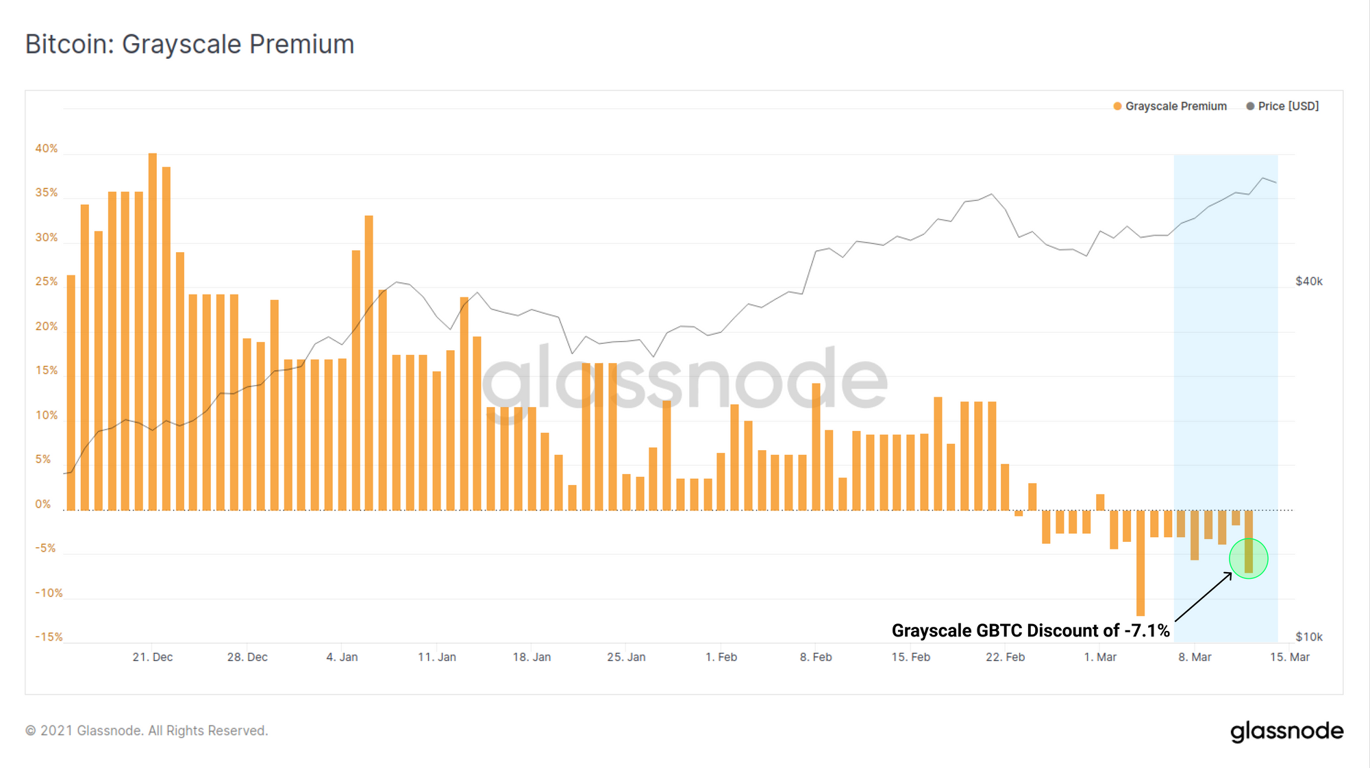
Despite strong spot market performance, the Grayscale GBTC product has traded at a consistent discount this week closing on Friday at a discount of -7.1% to NAV. This reflects not only the influence of the correction but also the steady rise in new competition in the Bitcoin ETF-like space (e.g. the Purpose ETF). Meanwhile, MicroStrategy has announced the purchase of an additional 262 BTC for $15M as part of their relentless bitcoin accumulation strategy.
Bitcoin Spending Behaviour
As bitcoin price performance continues to impress, it becomes increasingly important to assess how different market participants are reacting to elevated prices. In general, we make a distinction between Long Term Holders (LTH), those who own coins older than 155 days, and Short Term Holders (STH) owning coins younger than 155 days.
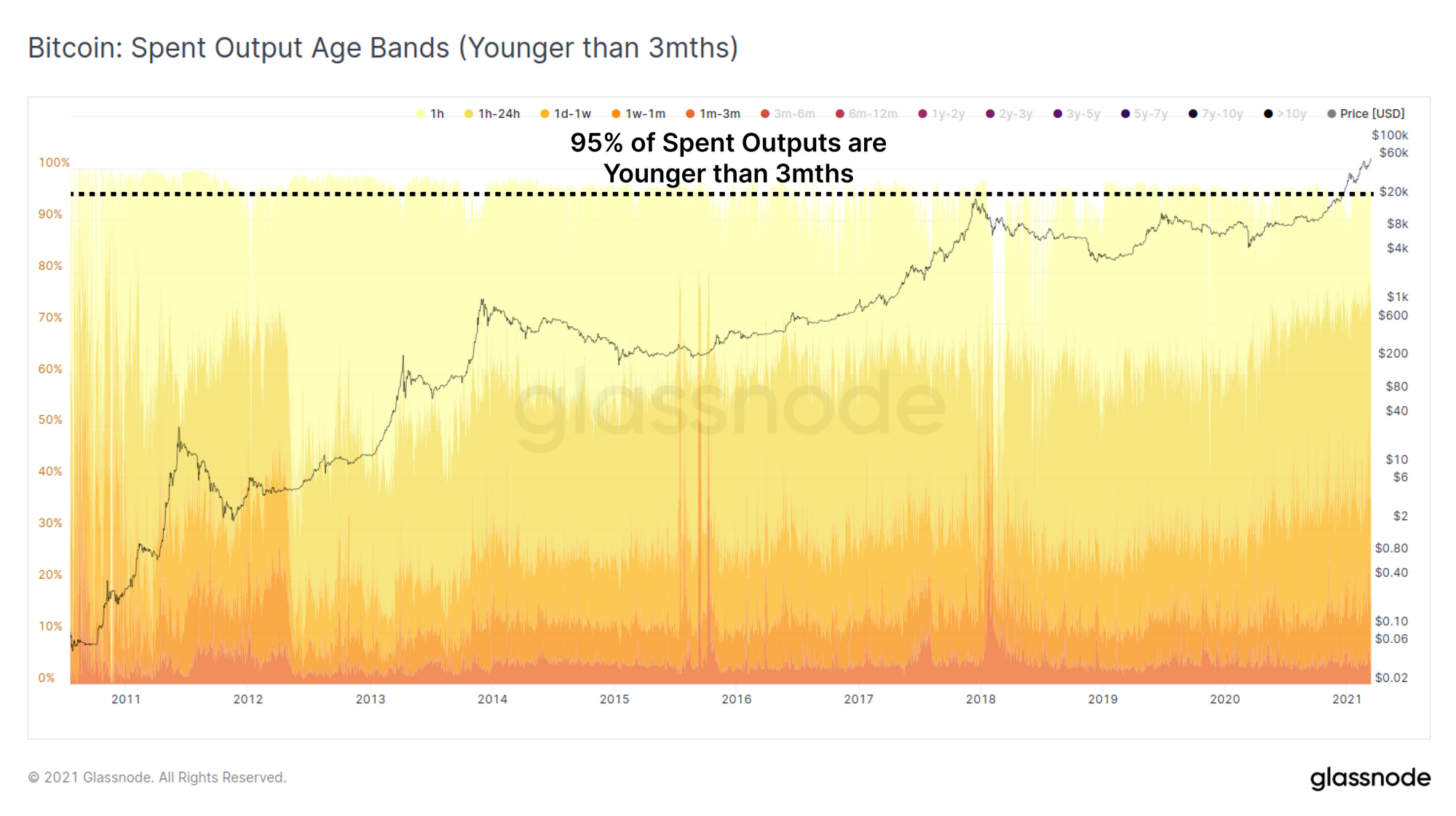
We base this off the observation that most liquid supply transacted daily consists of young coins that were last moved in the past few months. The chart below shows the age of spent outputs demonstrating that in most instances, more than 95% of spent outputs are younger than 3 months old (white space at the top are coins older that 3 months).
Conversely, once a coin passes our 155 day threshold to become a LTH held coin, it is increasingly unlikely to be spent on a statistical basis, often only coming back to life during volatility and at higher prices in bullish markets.
For more details on classification of STH and LTH, check out our research piece here.
We often need to make assumptions regarding the different spending behaviours of LTHs vs. STHs to accurately interpret on-chain transaction data:
- LTH we assume are reasonably knowledgeable about the Bitcoin protocol and have high conviction in the asset. They tend to accumulate cheap coins in bear markets and realise profits on expensive coins in bull markets.
- STH we assume are more likely to be newer market participants and traders moving value between exchanges. This group are thus more sensitive to price volatility and thus more likely to spend coins soon after their last transaction.
- As bull markets carry on, LTHs will transfer some portion of their BTC wealth to STH whilst some STH will 'stack sats' and hodl their coins to eventually mature into LTHs.
The chart below shows the number of coins in profit held by each of these entities. Given BTC price is effectively at all time highs, this accounts for almost the entire supply (after filtering out exchange balances and other known entities).
We can see that since late November 2020 ($17.8k), LTHs have gradually sold around 1.4M BTC (blue, smooth downtrend) whilst STH have accumulated these coins and taken on the volatility (red, volatile uptrend). This is typical for bull markets.
Compared to the 2016-17 cycle, both LTHs and STHs currently hold an equivalent volume of coins as they did around mid 2017. This cycle LTHs are actually coming from a higher base (hodling more coins) than in previous cycles, a result of increased coin issuance by miners, and a lengthy accumulation period through the bear since 2018.
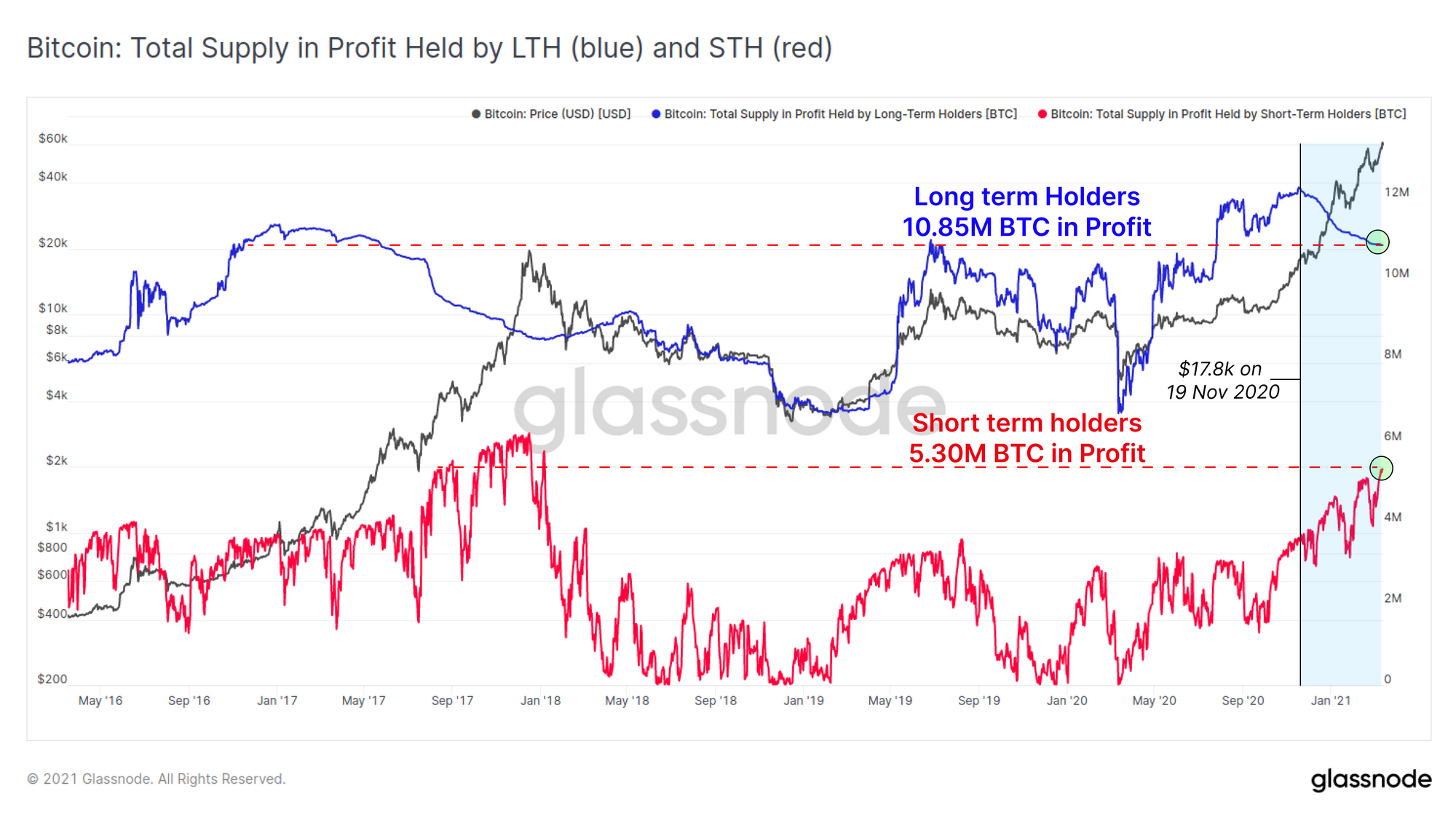
This paints a picture where current STH demand remains strong and LTH are releasing coins gradually and at a slowing rate. However, it is important to keep in mind that LTHs also have a much larger supply still in hand which is both bullish for HODLed supply, but may also become overhead resistance as prices rise further or if a more sustained correction ensues.
Cycle Supply Dynamics
In terms of global supply, the HODL waves present a view on the proportion of supply that is held by UTXOs of different lifespans. As old coins are spent to realise profits, they convert from old to young, and their lifespan is reset to zero.
The HODL wave chart below presents the proportion of circulating supply that is younger than 6 months old. The height of these bands will increase as a larger proportion of old coins are spent (old --> young), and decrease as more coins are HODLed and mature (young --> old).
Following all significant blow-off top peaks (including both pumps in 2013), the amount of circulating supply younger than 6 months continued to increase, peaking at 50% or more. In the current bull market, around 35.9% of circulating supply is younger than 6 months demonstrating that a substantial portion of coins remain firmly held by LTHs in comparison.

Returning to the Spent Output Age Bands (SOAB), this time we turn off all young coins and look only at the spending behaviour of LTH coins with lifespans older than 6 months. This chart shows us clusters where LTH increased their spending and are typically associated with bull market rallies or extreme volatility in bear markets.
If we look to the late 2017 bull market, there are three unique clusters of LTH spending:
- Sell the Rally: Price rallies beyond previous ATH and LTHs begin realising profits into market strength. SOAB demonstrates an increase in spending as price rises out of major corrections (yellow).
- New Paradigm!: The final blow-off top was actually characterised by reduced LTH spending compared to the previous two rallies, indicating a prevailing 'New Paradigm! This time it is different!' narrative (green). This sounds somewhat familiar.
- Ouch...: Following the first bear market crash from $20k down to $6k, LTH spending hit an ATH as reality came back into perspective and profits were taken as price rallied to $10k, a 50% discount to the peak.
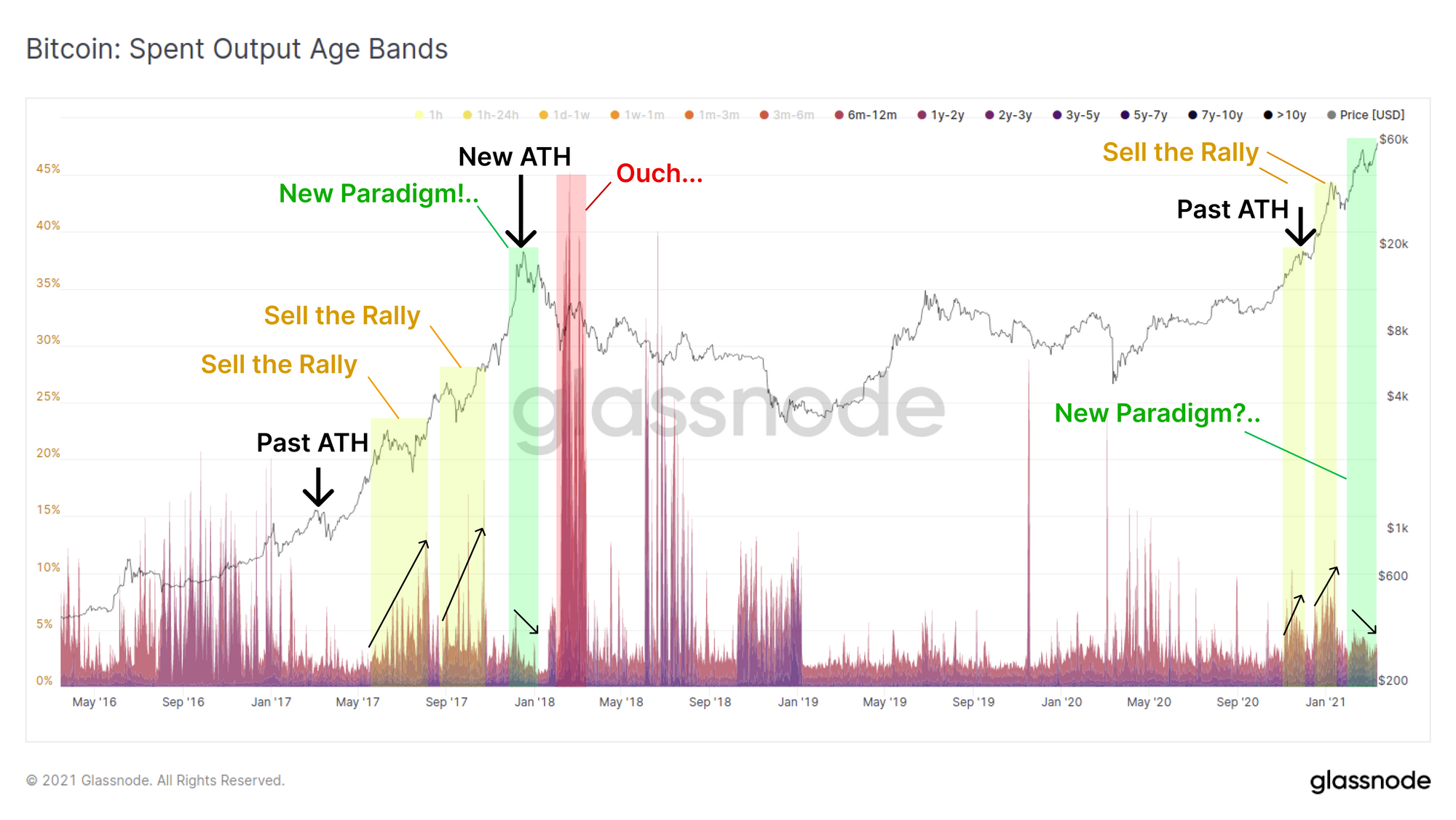
For the 2020-21 bull market, the initial 'Sell the Rally' phase actually started comparatively earlier as price approached the previous $20k ATH. The second phase of similar spending behaviour occurred as price rallied to $42k before correcting to $29k in January.
In this most recent correction, dipping from $58k down to $43k and now up to a $61.3k ATH, LTH spending behaviour is actually reminiscent of the New Paradigm phase from 2017. We can see reducing sales over time and at a lower magnitude. In fact the LTH spending over this entire bull market is markedly less than the 2017 bull.
Spending behaviour of LTHs certainly has similarities to that seen in the late stage bull market of 2017. However keep in mind that historical and new fractals must be contextualised within the market dynamics of the time. For example, a development which is unique to this cycle is the explosive growth in crypto-finance, lending services and derivatives markets for hedging risk (both centralised and decentralised formats).
Alongside the major introduction of institutions to the market, it is very plausible that spending behaviour this cycle will have a unique character and fractals as holders find new ways to access liquidity and risk management tools without disposing of their coins.
Weekly Feature: Miner Revenue hits ATH
This week, Bitcoin miner incomes have hit a new USD all time high of $52.3M per day. This is despite the block subsidy halving in May 2020. Since miner costs (CAPEX and OPEX) are generally denominated in fiat currency, this is positive for the assurance of continued security for the Bitcoin protocol.
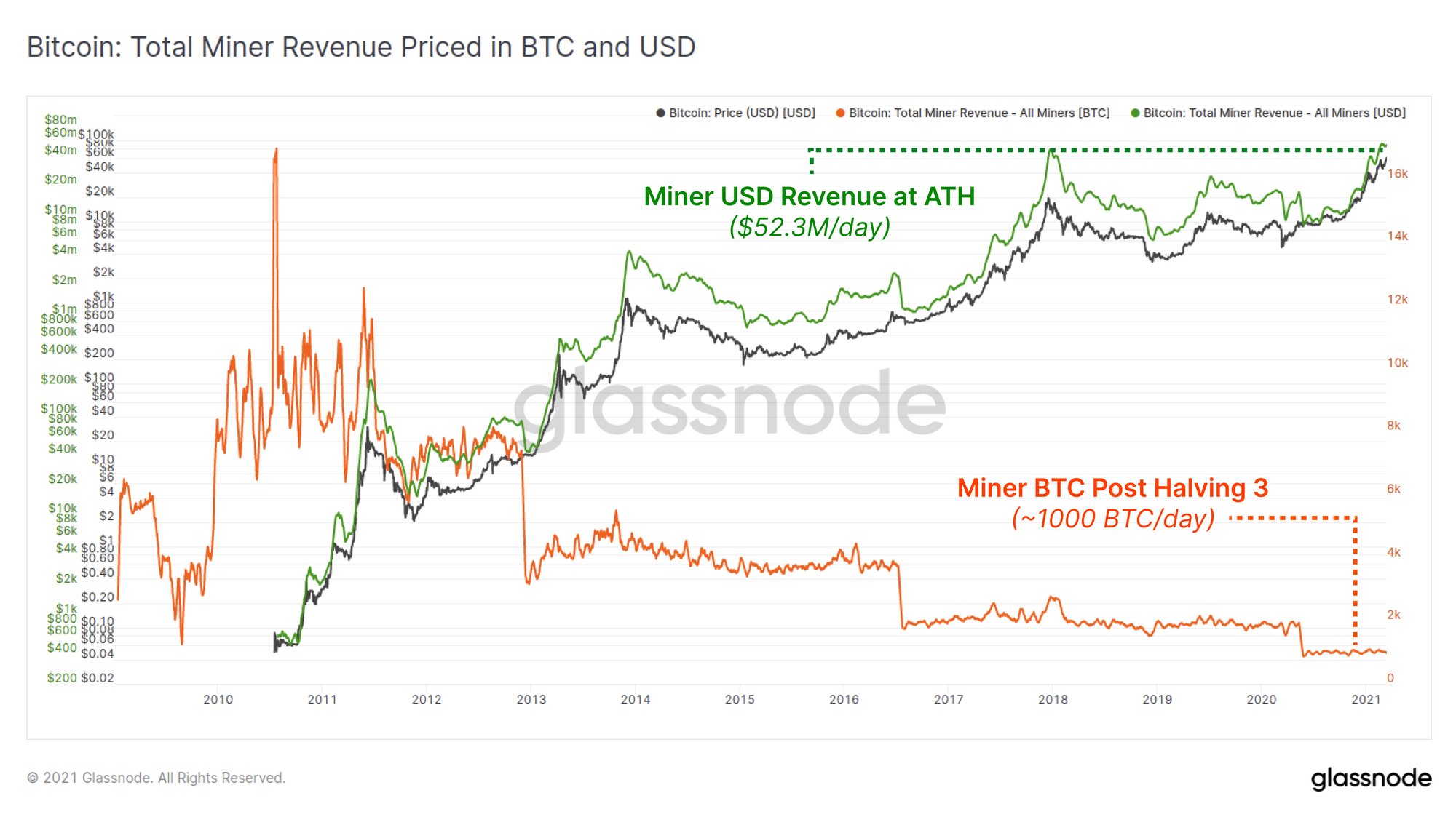
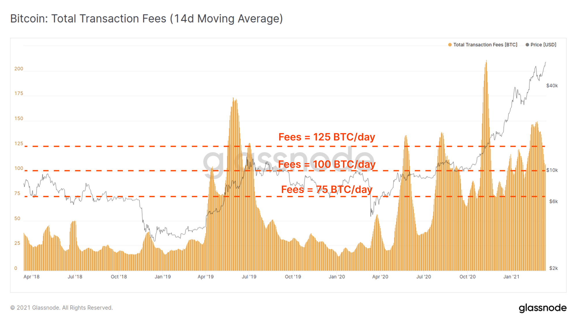
In the post halving #3 era, aggregate miner income has typically been ~1,000 BTC/day, comprised of the block subsidy (~900 BTC/day) and transaction fees which have consistently fluctuated between 75 to 125 BTC/day.
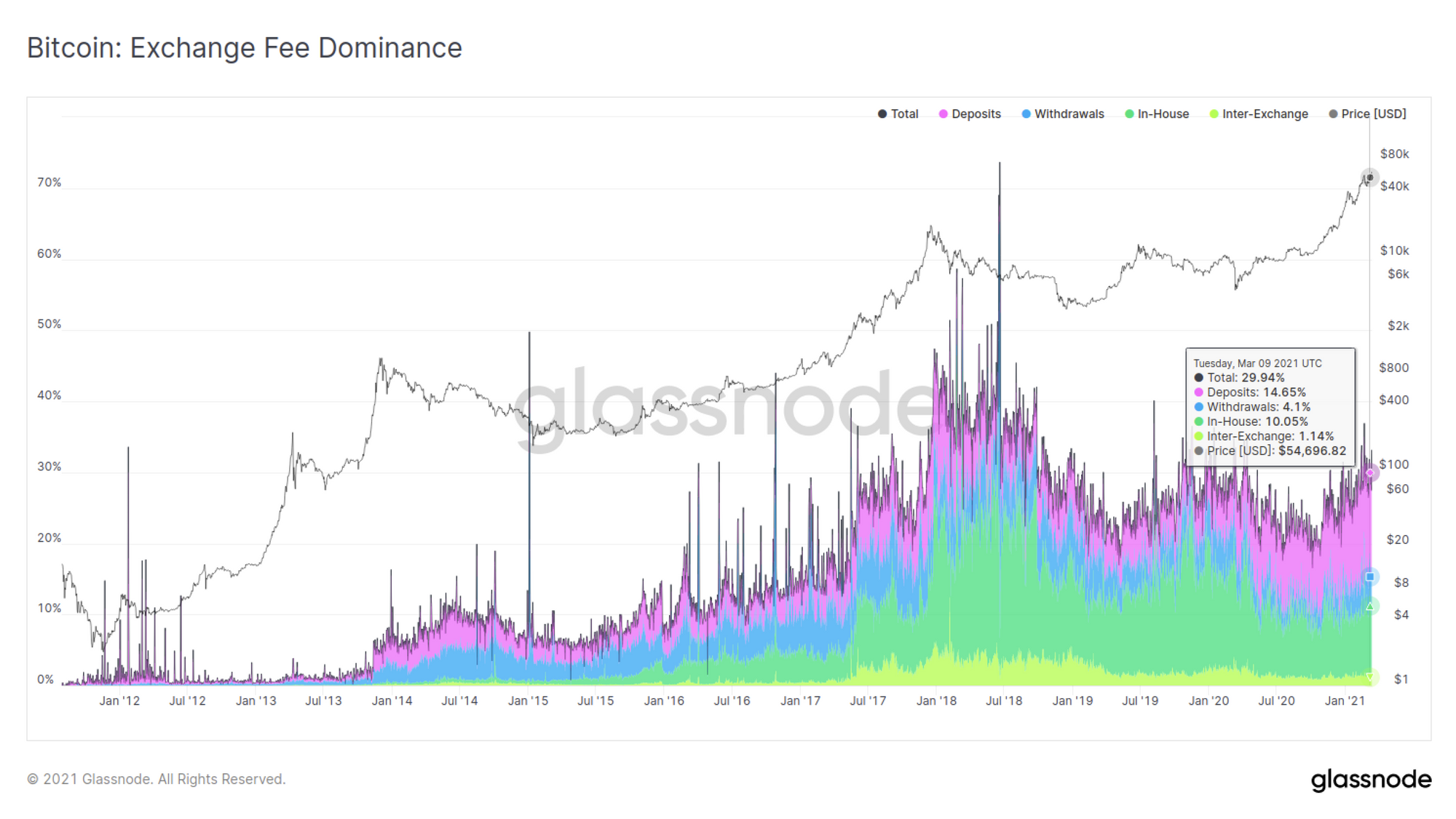
On-chain transaction fees paid in relation to exchange activity is also an interesting metric to track the movement and priorities of the market. At present, global transaction fees related to exchanges account for around 30% of on-chain transaction fees with deposits representing around half of that at 14.65%.
Note also that most exchanges utilise transaction batching which makes for more efficient transaction costs. So whilst withdrawal transactions represent around 4.1% of the overall fee market, they are likely to account for many more individuals, especially when compared to the 14.65% of fees spent on deposits which are more likely to be one transaction = one user.
Check out Our Latest Newsletter: Uncharted
We have recently started a bi-weekly newsletter, Uncharted. This newsletter covers BTC from both an on-chain and off-chain data perspective, and uses beautiful charts and brief commentaries to give readers an intuitive snapshot of what is happening in the markets.