The Week On-chain (Week 20, 2021)
As Elon Musk reverses his Bitcoin sentiment, new entrants panic sell and long term holders step in to hold the line.


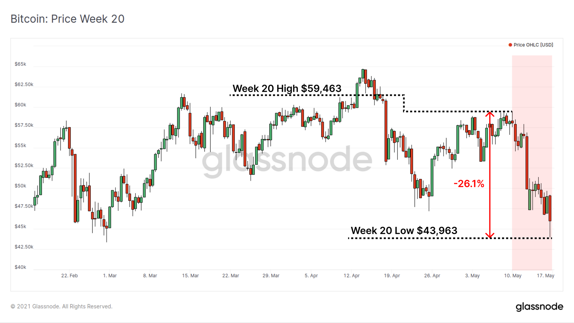
Bitcoin price has traded down over 26.1% this week as the market reacts to a series of tweets released by Elon Musk expressing concerns over the power consumption of Proof-of-Work mining. The market opened the week at high of $59,463 before trading down to $43,963 as the twitter saga unfolded.
Elon's tweets range from claims of negative externalities from energy consumption, to claims that 10x faster and larger blocks on Dogecoin are a viable alternative. Unfortunately, this has lead to widespread confusion in markets, although for many Bitcoin HODLers, this is just another day in the office.
On-chain we can observe a notable bifurcation of reactions, with newer market entrants panic selling and realising losses, whilst long term hodlers appear relatively un-phased by the news. There are many supply and demand dynamics that resemble the 2017 macro top however with unique differences that will challenge the conviction of both bulls and bears.
Sizing up the Correction
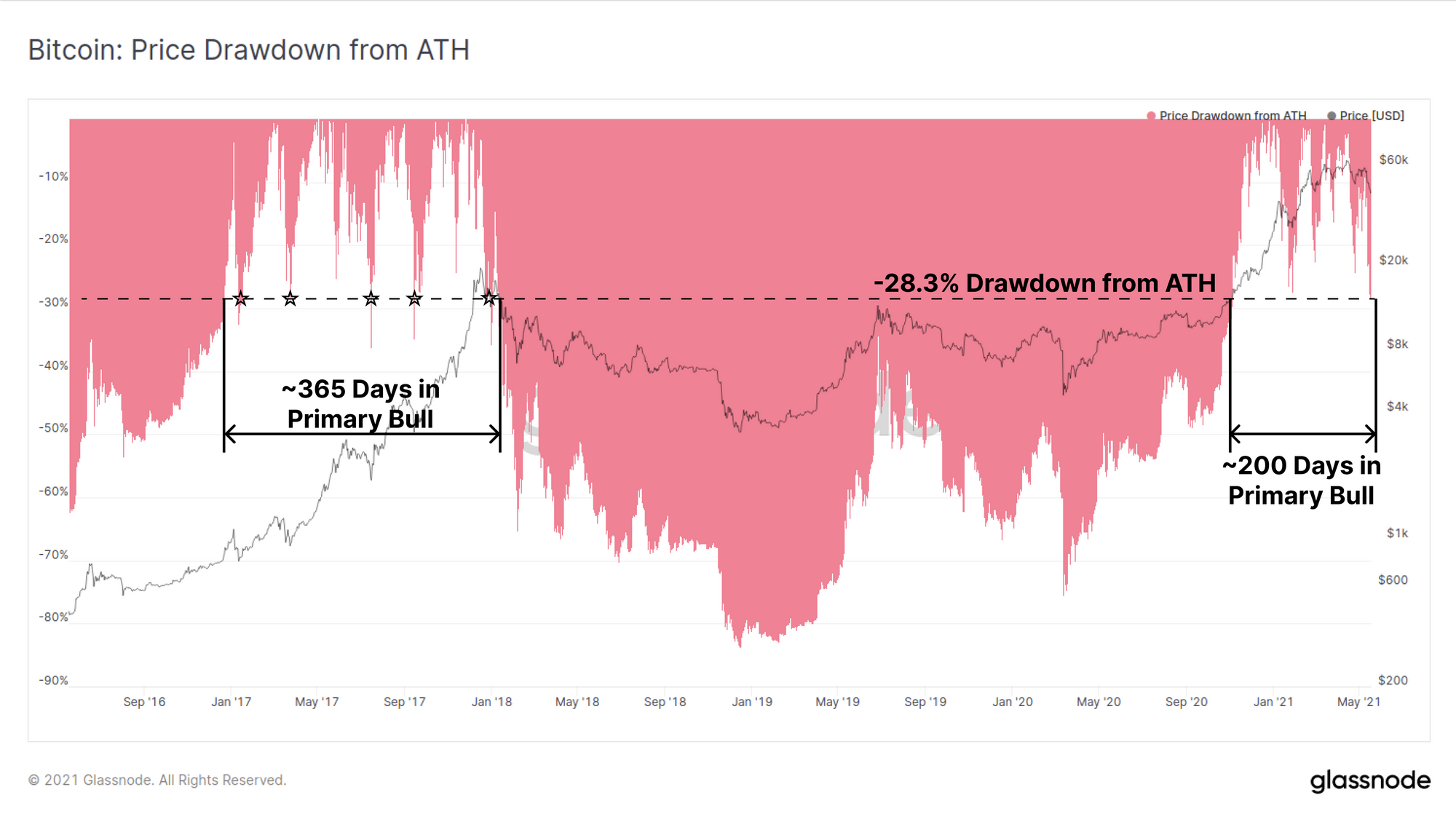
First up, we will assess the scale of this correction compared to the 2017 and 2021 Bull markets. The current correction is now over 28% below the $63.6k ATH set on 13-April. This is the deepest correction of the current bull market, however is consistent with five major pull-backs during the 2017 bull.
In terms of bull market duration, the 2021 primary bull (where new ATHs are set frequently) has run for around 200-days, which is relatively short compared to the year long bull run in 2017.
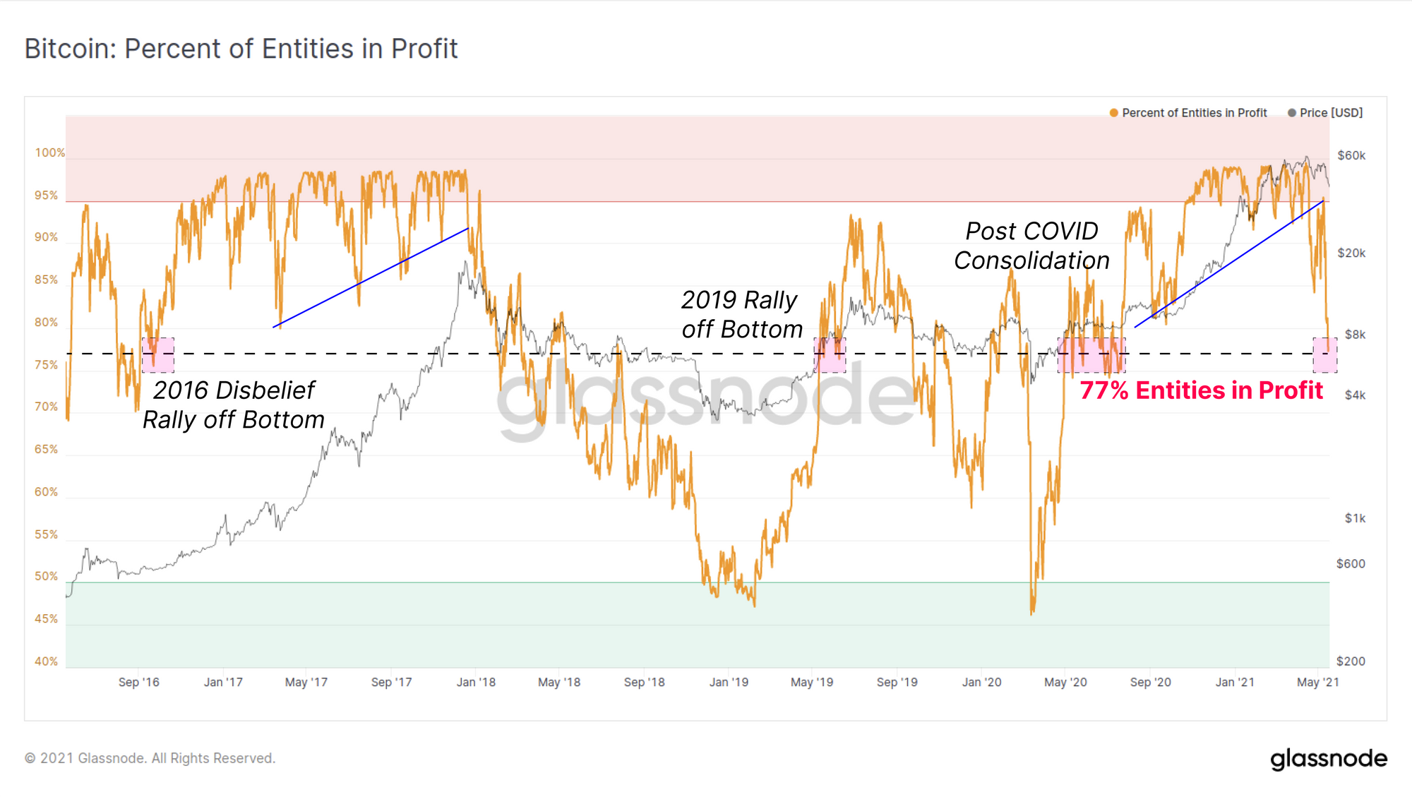
The number of entities that are currently in profit provides insight into the cross section of the market that is underwater. We can observe that this correction has lead to over 23% of on-chain entities (unique, separate wallets) being at a loss, which compares to only three up-trending periods since 2016. Note that all of these comparative pullbacks were associated relatively extreme events:
- 2016 first pullback of the disbelief rally off the bottom, following 2yr bear market.
- 2019 first pullback of the disbelief rally out of a 1.5yr bear market, driven mostly by leveraged short sellers getting squeezed.
- 2020 Consolidation following global uncertainty after the 12-March COVID sell-off.
New Entrants Panic Sell
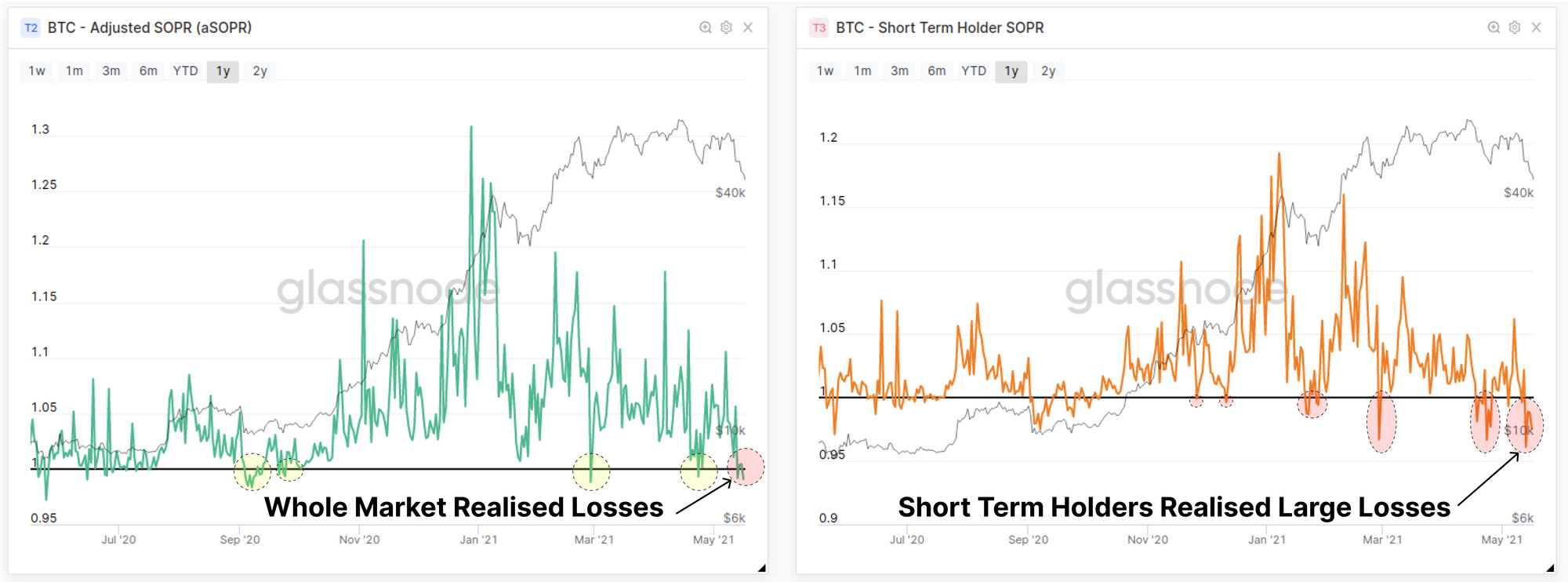
Newer market entrants have panic sold and realised significant loses on their coins, with both the aSOPR and STH-SOPR dipping below 1.0 once again. Both of these metrics consider the degree of profit realised by coins moving on-chain, with higher values indicating profitable coins were on the move, and values below 1.0 indicating most coins were last moved at higher prices.
The aSOPR metric considers the entire market, whilst also filtering out all coins with a lifespan less than 1hr (which are generally temporary hops and thus economically unimportant). The STH-SOPR filters for only coins younger than 155-days and is therefore representative of entities who bought coins during the current bull market cycle.
Both metrics have fallen below 1.0 indicating aggregate losses have been realised on-chain, an effect most pronounced in the STH-SOPR. This is the second major dip below 1.0 for STH-SOPR during this correction, suggesting widespread panic selling by new holders.
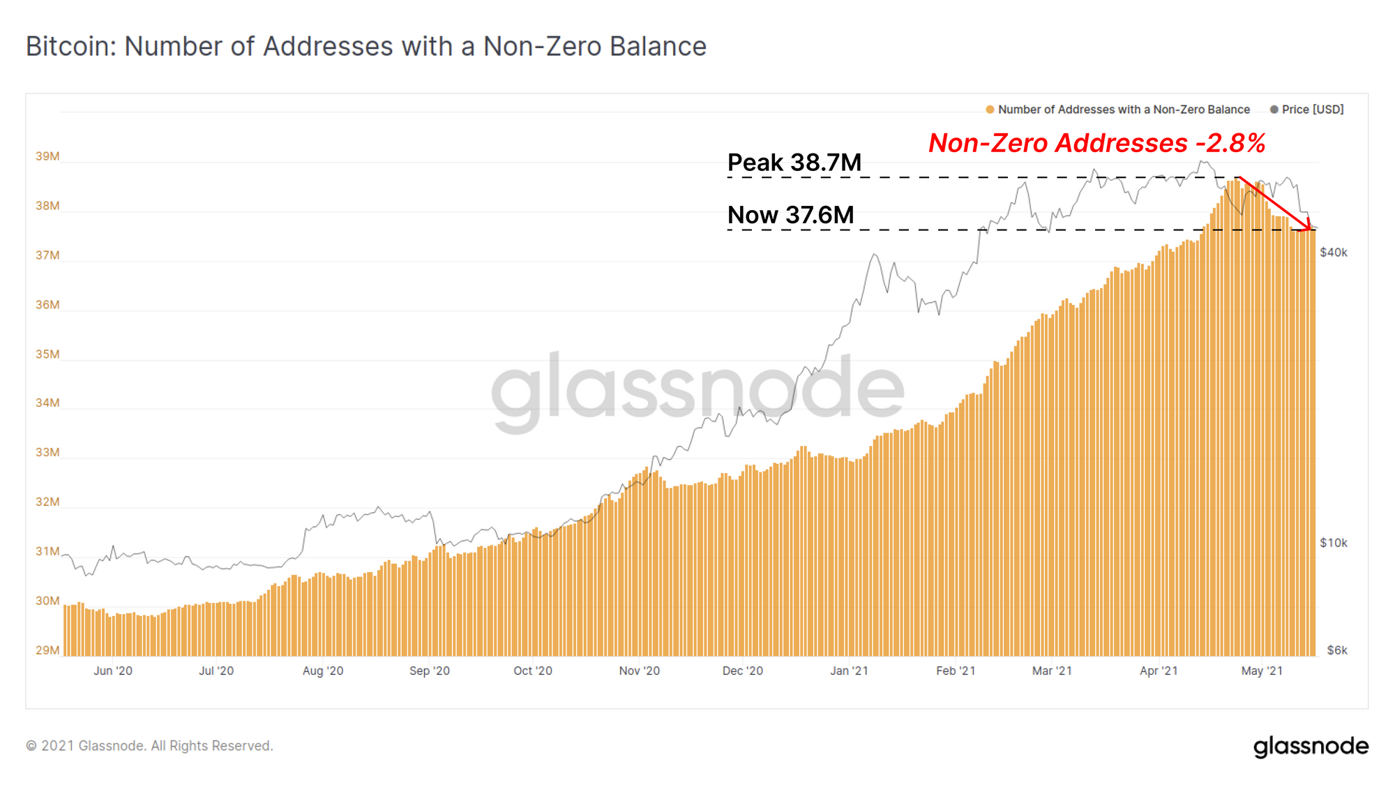
The total count of addresses holding a non-zero BTC balance has also pulled back by -2.8% from the recent all time high of 38.7M addresses. A total of 1.1M addresses have spent all coins they held during this correction, again providing evidence that panic selling is currently underway.
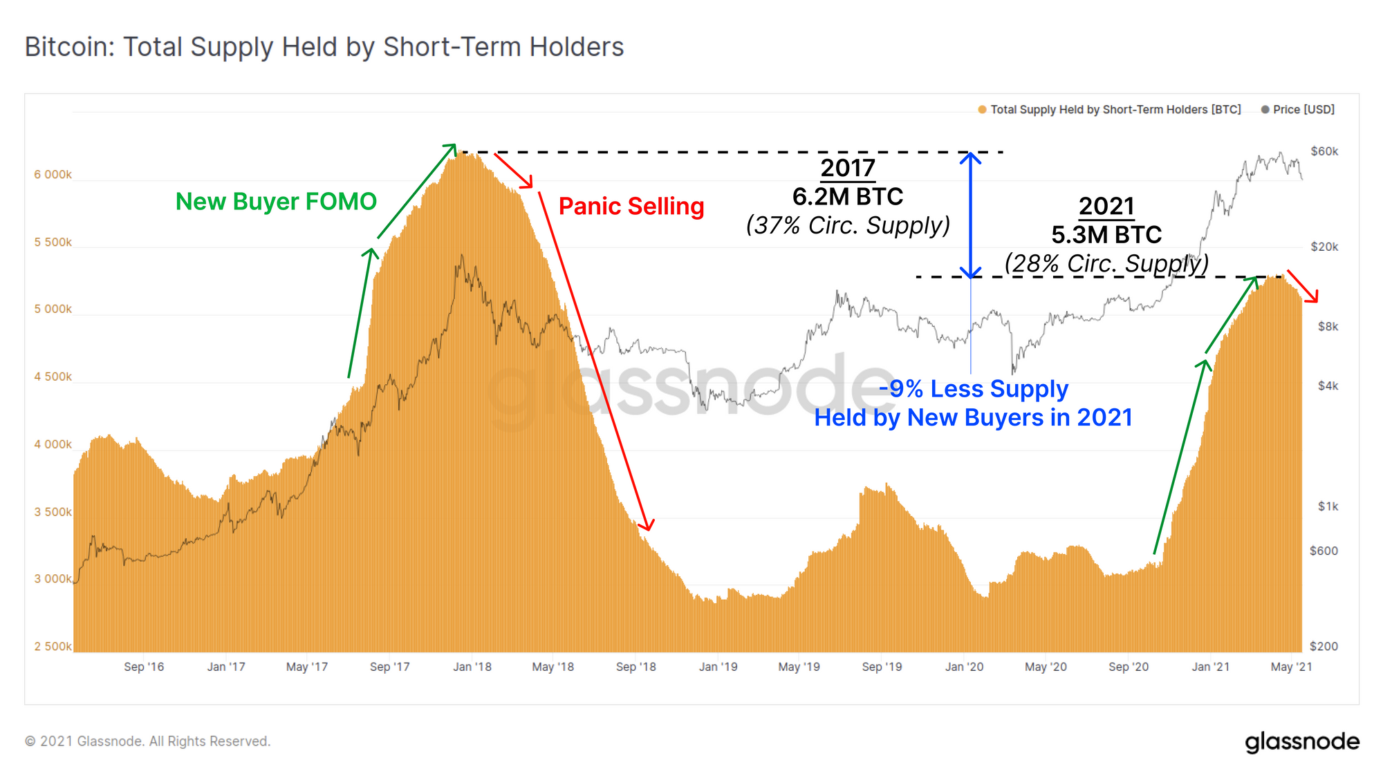
If we observe the cyclical pattern of total supply held by short term holders (STH), we can also see that a pattern of panic selling is playing out, similar to that observed at the 2017 macro peak. What this chart shows is that the Bitcoin market tends to find a local or macro peak at a time when new holders own a relatively large proportion of the total supply (i.e maximum coin supply held by newer weaker hands).
However, it is important to note that the current peak in STH owned coins is substantially lower than 2017 in both coin volume and as a percentage of circulating supply. New holder coins recently reached 28% of circulating supply (5.3M BTC) which is 9% less than at the 2017 top.
Given Bitcoin trades at much larger market valuation this may be a reflection of the larger capital inflows that are required to gain ground in market cap size. It may also provide an indication that this may be a larger time-frame pull-back in a bull cycle, as weak hands capitulate, and stronger hands recommence their accumulation of cheaper coins.
Exchange Flow Dynamics
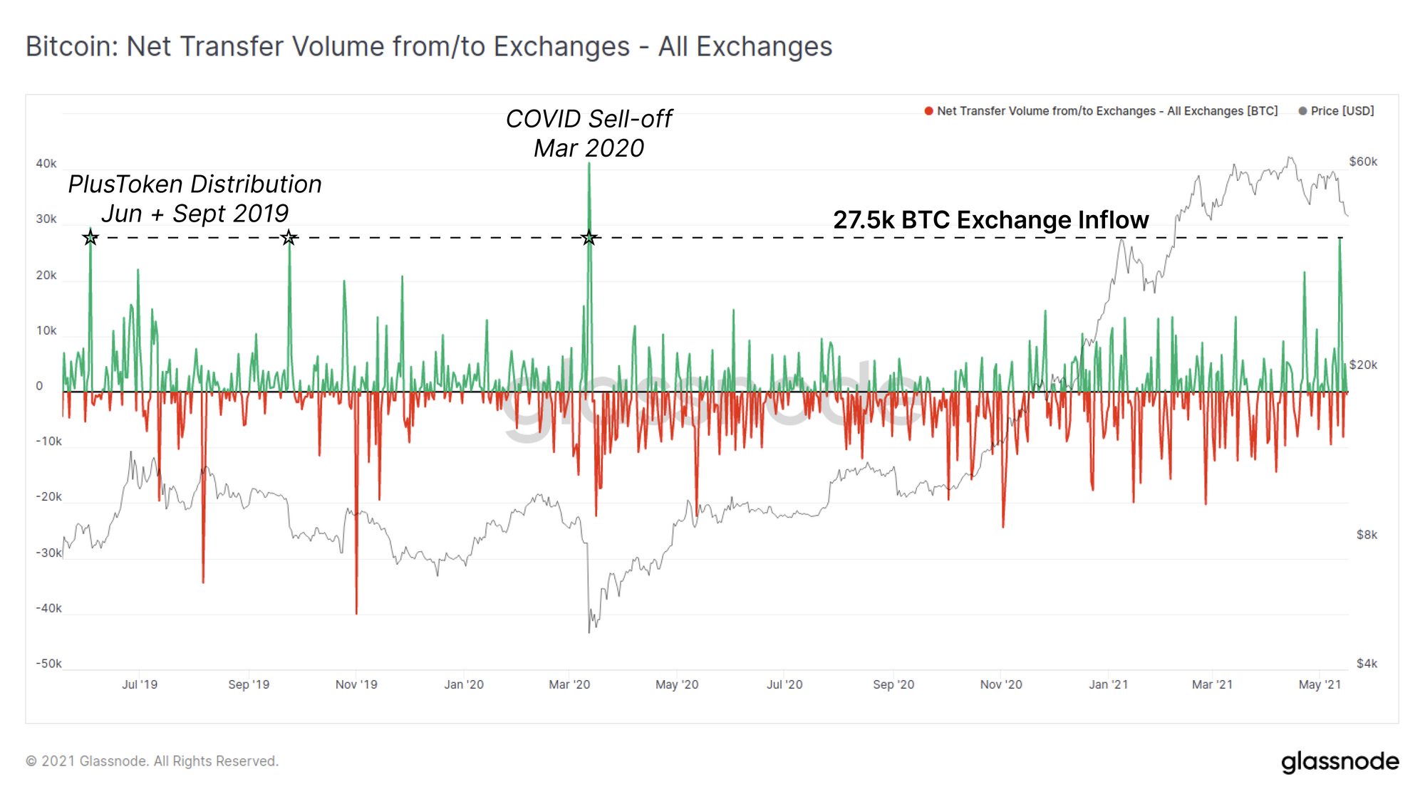
Supporting our observation of panic selling, aggregate exchange BTC inflows hit a significant high, with a net inflow of 27.5k BTC observed at the start of this latest leg down of the correction. This compares in scale only to the March 2020 sell-off and the distribution by the PlusToken ponzi scheme in 2019.
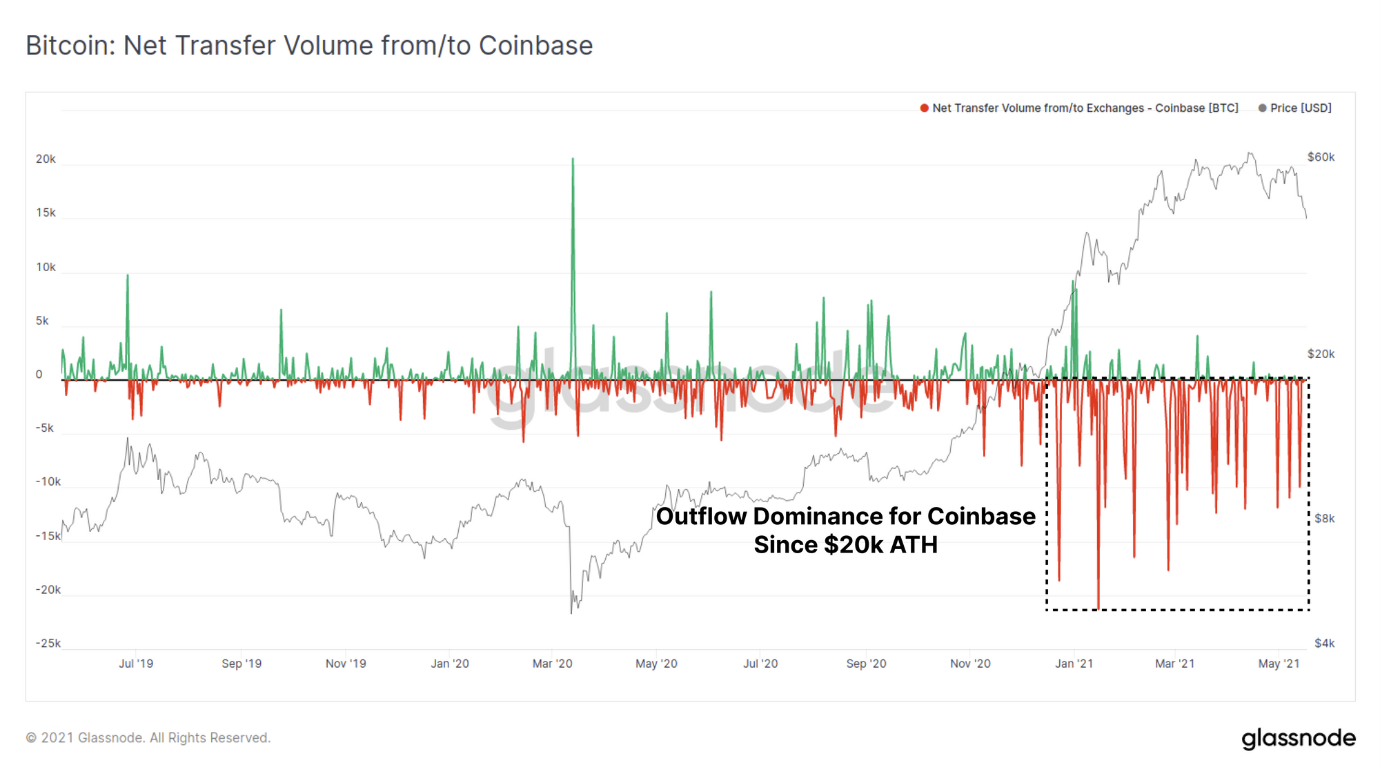
However, if we break down this observation into the two largest exchanges, Binance and Coinbase, we can see two different realities.
Binance largely captures non-US entities and is a preferred venue for retail speculators and investors and was the receiver for the lions share of this net inflow. It can also be seen that the magnitude of both inflows and outflows has increased over the past few months suggesting volatility in Binance user macro sentiment. This provides further indication that the recent inflows are likely to be driven by both new market entrants (panic sellers) and potentially due to capital rotation into other crypto-assets.

Conversely, Coinbase has seen almost entirely net outflows of BTC since breaking last cycles $20k ATH, a trend that has continued this week. Coinbase is the preferred venue for US institutional accumulation, and given the scale of typical daily of withdrawals (10k to 20k BTC/day), it suggests that larger buyers remain in active accumulation during this correction.
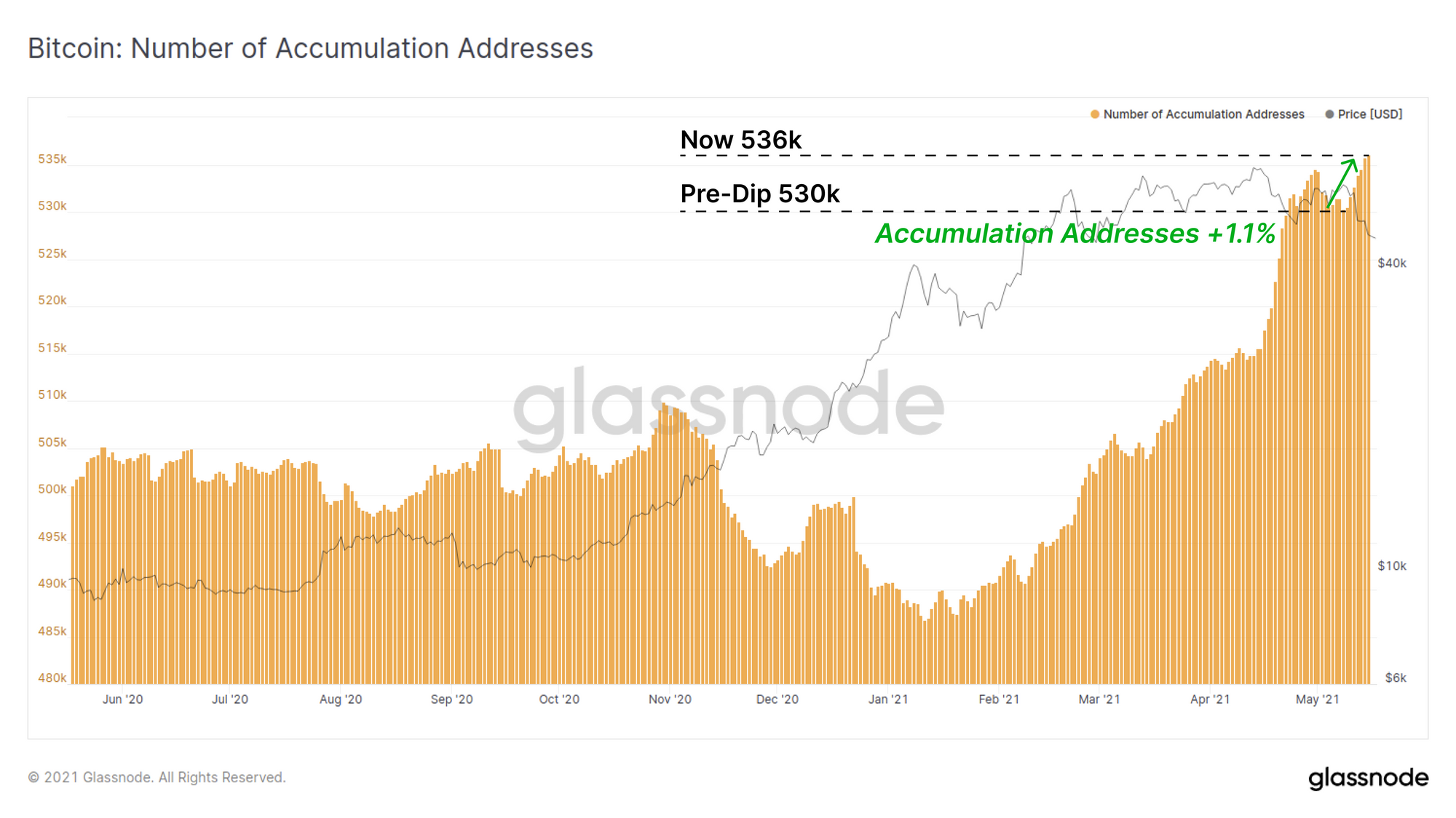
Long Term Holders are Buying this Dip
In almost perfect opposition to new entrants panic selling, long term holders appear to be buying the dip and accumulating cheaper coins. Whilst the count of non-zero addresses has fallen during this correction, the number of addresses that are in accumulation have increased by 1.1% since the recent low. Accumulation addresses are defined as those which have at least two incoming transactions but have never spent any coins.
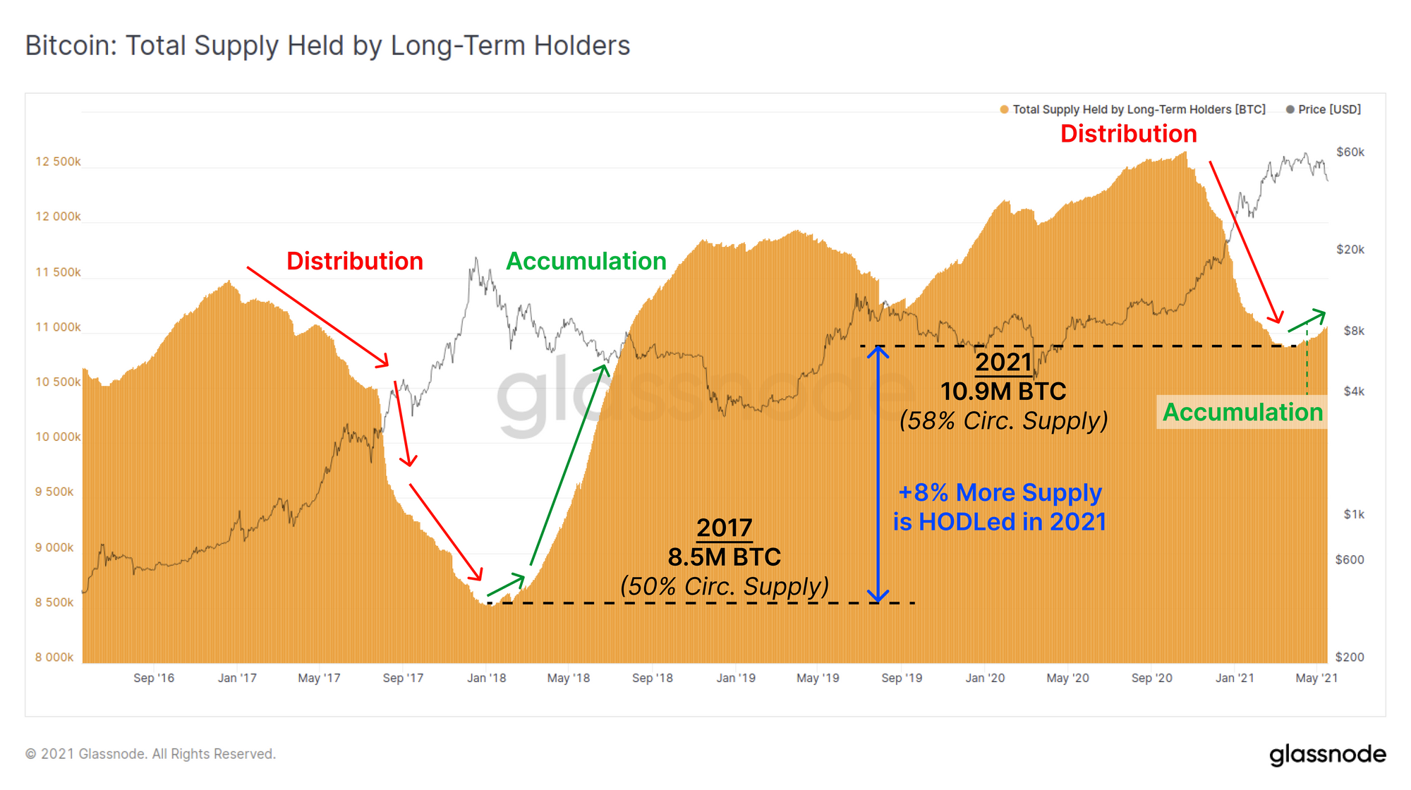
Similarly, the supply held by long term holders (LTH) has returned to accumulation mode, a pattern that again resembles the 2017 macro top. What this chart is largely reflective of are buyers who purchased coins in late 2020/Jan 2021 and have not spent their coins. As the supply of LTHs starts to rise, it indicates that the volume of coins maturing beyond 5 months of dormancy, exceeds the volume old coins that are spent to realise profits.
The current LTH owned supply is over 2.4M BTC (8% a proportion of circ. supply) more than it was at the 2017 peak. This indicates that a large volume of coins have moved to and remain in illiquid cold storage and this trend is continuing.
Overall, the Bitcoin market is in a historically significant correction. There are strong signals that short term holders are leading with panic selling, however long term holders are stepping in to buy the dip and their confidence is largely unshaken. The PoW energy consumption narrative is nuanced to say the least, and what follows will be a test for the whole Bitcoin market's conviction.
Week On-chain Dashboard
The Week On-chain Newsletter now has a live dashboard for all featured charts here.
New Glassnode Content
DeFi Uncovered: The State of DeFi
We have released a new content series focused on insights and analysis pertaining to the rapidly expanding DeFi sector. Our latest piece analyses and explores the on-chain metrics that describe both the explosive growth of DeFi and the stickiness of some of the leading protocols in each category.
Check out the article below and to sign-up for more DeFi insights here.

Product Updates
Metrics and Assets
- Update for Bittrex exchange cluster labels.
- Release new Options Open Interest by Strike Price metric
- Added description box when creating/editing alerts.
- SOPR Academy Entry updated.

- Lesen Sie diesen Artikel jetzt auf Deutsch bei unserem offiziellen Partner Bitcoin2Go
- Follow us and reach out on Twitter
- Join our Telegram channel
- For on–chain metrics and activity graphs, visit Glassnode Studio
- For automated alerts on core on–chain metrics and activity on exchanges, visit our Glassnode Alerts Twitter