The Week On-chain (Week 23, 2021)
The market remains uncertain about bullish or bearish conditions govern, as on-chain activity and value settlement falls dramatically.


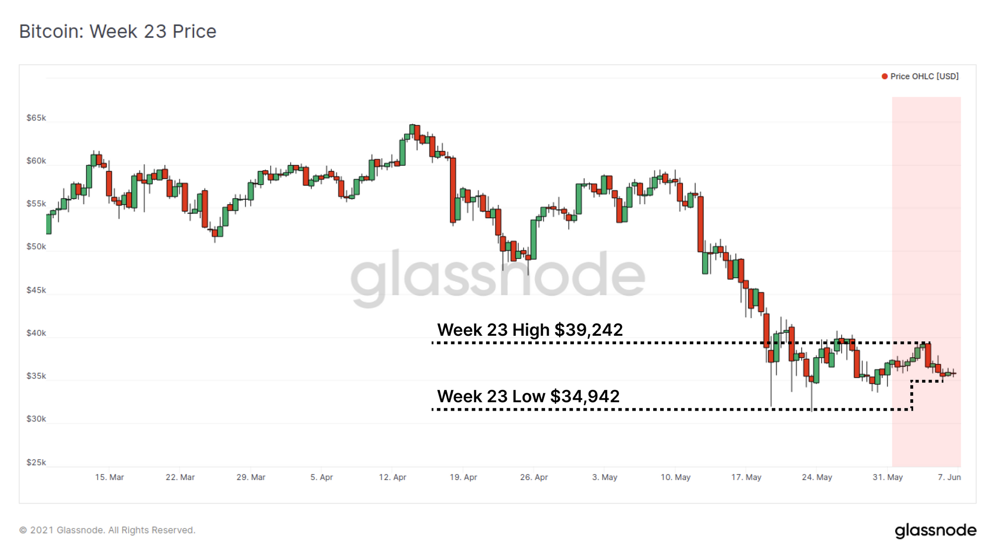
The Bitcoin market has seen a relatively quiet week, both in price action, and in demand for on-chain transactions and value settlement. Prices have traded within a narrow range between a high of $39,242, and down to a weekly low of $34,942.
Meanwhile, on-chain activity in active users, settled volume and transaction fees, across both the Bitcoin and Ethereum protocols, have fallen back to levels observed in 2020 and early 2021. Mempool congestion has largely cleared as the market remains uncertain around the bullish or bearish bias of the current market structure.
Congestion Clears Completely
A characteristic of bull markets is a strengthening demand for on-chain transactions, value settlement, and urgency for inclusion in an upcoming block. The net result is that activity, transaction volumes and priority fees spike higher. This is a result of both increased demand from investors, and the incentive for older hands to spend their coins into strength at higher prices. This week in particular, the growth in on-chain demand has slowed markedly, with a number of on-chain metrics showing significant pull-backs.
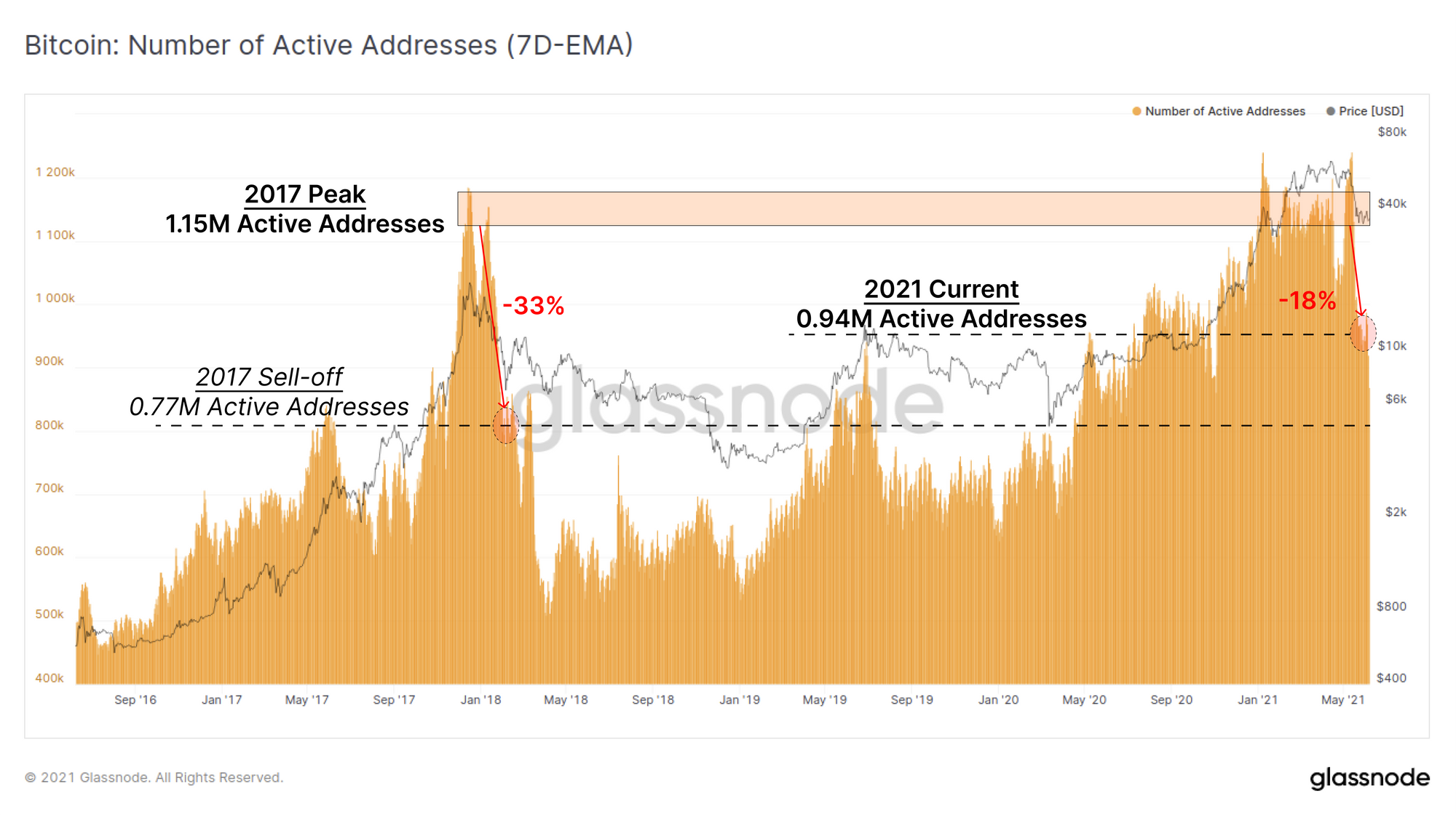
Since January 2021, the number of active Bitcoin addresses has sustained a level around 1.15M addresses per day, coincident with the 2017 peak. It should be noted that in 2017, this level was reached for only a few days, before collapsing over 33% during the first sell-off. The present cycle sustained this high on-chain activity for 5-months.
During the recent sell-off, the Bitcoin network experienced a reduction in active addresses, down 18% from the recent highs to around 0.94M. This fall is around half the reduction seen in 2017, indicating that whilst activity has slowed, more demand exists than after previous cycle macro tops (or perhaps there is further to go...).
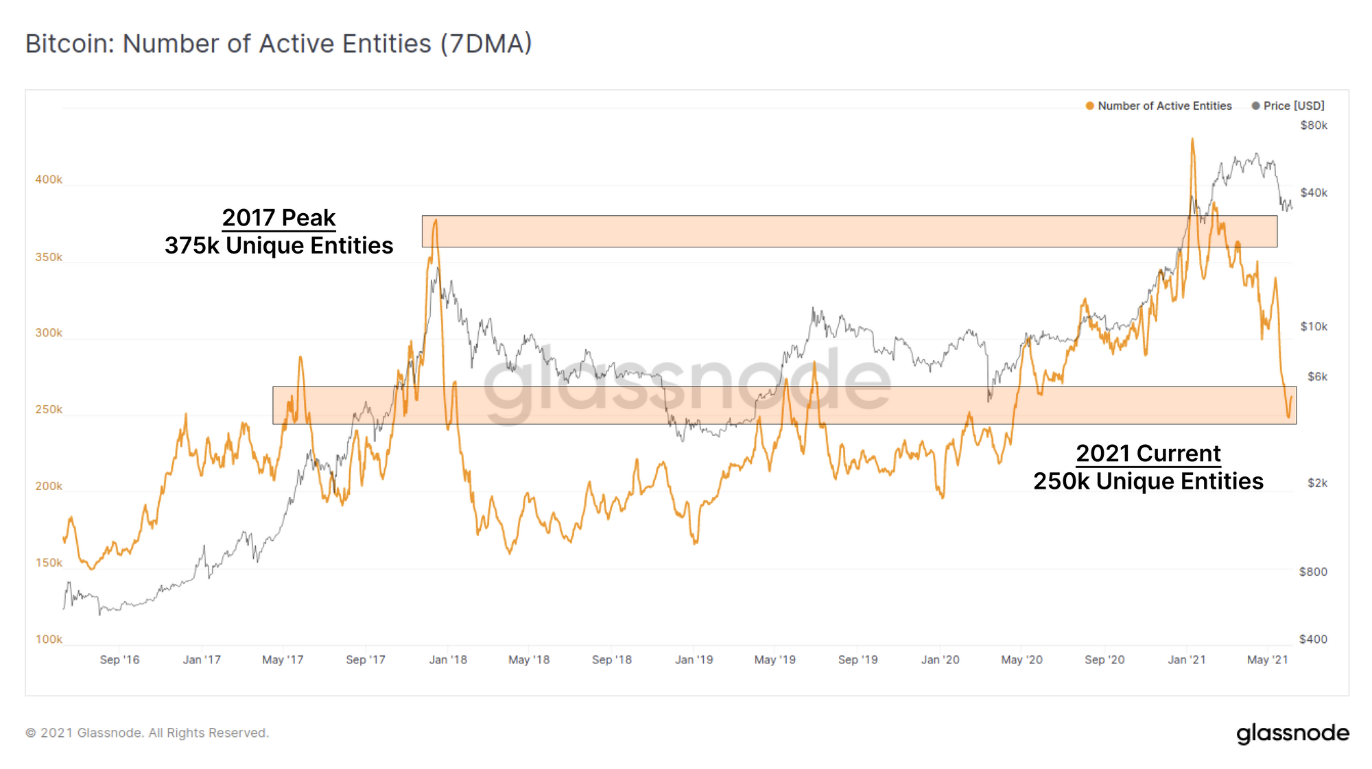
The number of active entities has similarly pulled back, retracing from a high of 375k to around 250k unique on-chain entities. This is again coincident with values observed in late-2017 to early 2018 as interest in the asset wanes with falling prices.
The key difference between 'entities' and 'addresses' is our use of clustering algorithms to establish when a single entity (such as an exchange, miner or a regular accumulator) may own multiple addresses, thus providing a more accurate view of unique 'users'.
The total USD denominated transfer volume settled by the Bitcoin network has pulled back by a whopping 65% in the last two weeks. Change-adjusted transfer volume fell from over $43B/day down to $15B/day. Again, the 2017 aftershock is the only event of comparable scale where on-chain settled volume fell by 80% over a period of around 3 months.
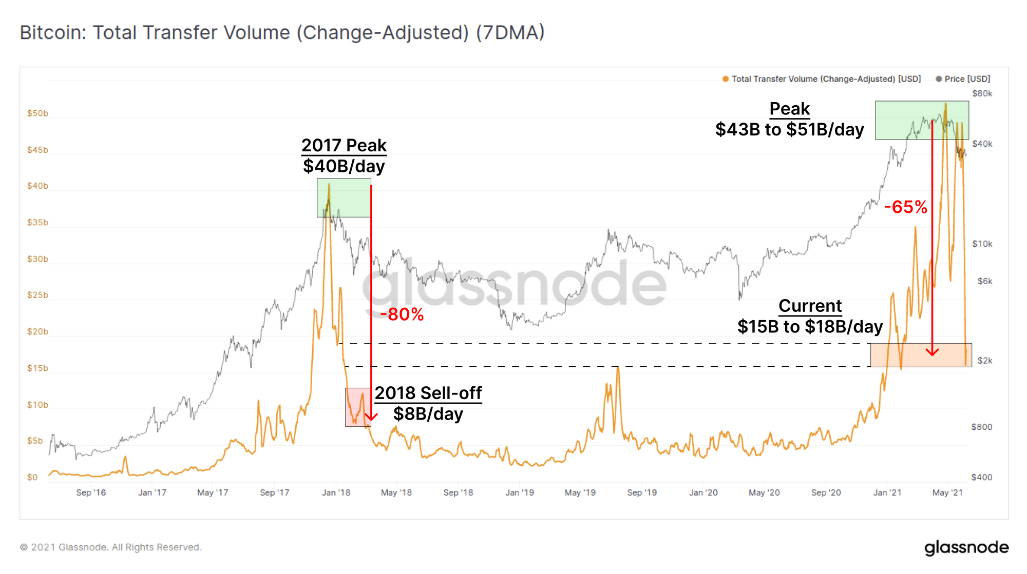
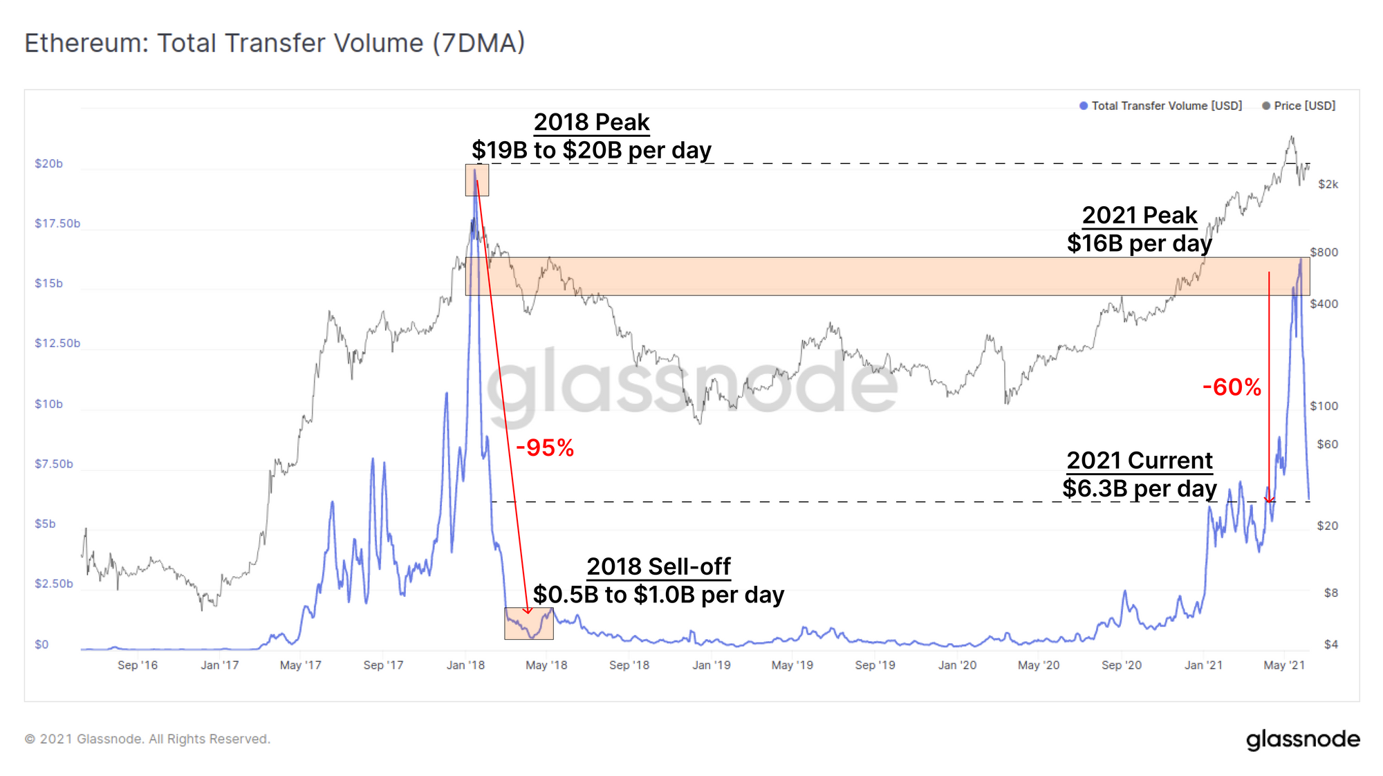
Bitcoin is not alone in seeing this decline in on-chain activity. Ethereum USD denominated transfer volume dropped by over 60% in the last two weeks. The comparable decline in 2018 was far more extreme at -95%, however it remains to be seen whether this lull in demand is temporary, or a sign of things to come.
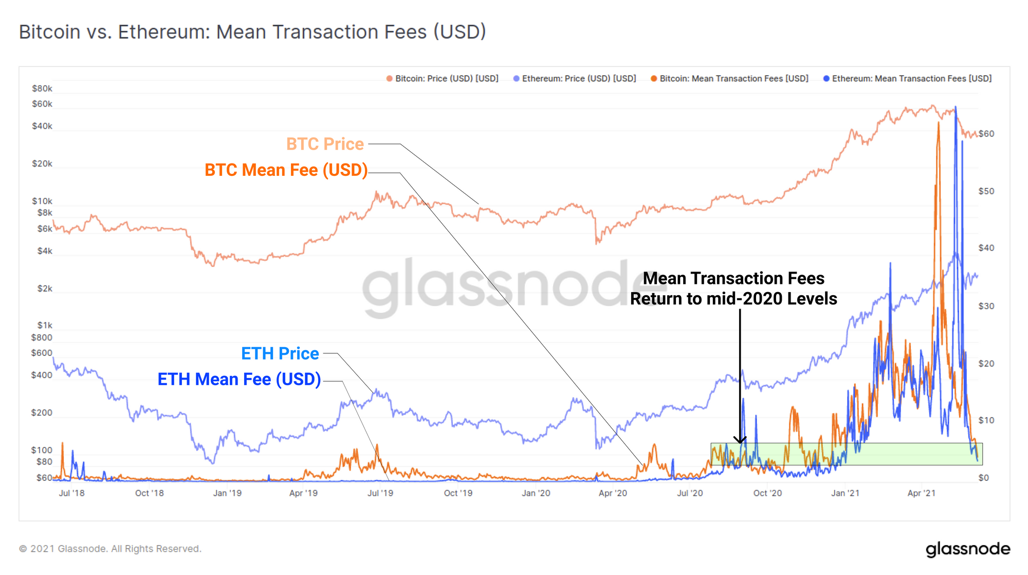
As demand for on-chain transactions fall, the average transaction fee paid has similarly reduced for both networks. All time high mean transaction fees were reached in April and May, with short term spikes reaching over $60 for both protocols. Mean fees for both networks have now returned to mid-2020 levels of of around $3.50 to $4.50.
By almost all on-chain activity metrics, the recent month has been a historically large decline, transitioning rapidly from booming on-chain economies at ATH prices, to almost completely clear mempools and waning demand for transactions and settlement.
Supply Dynamics
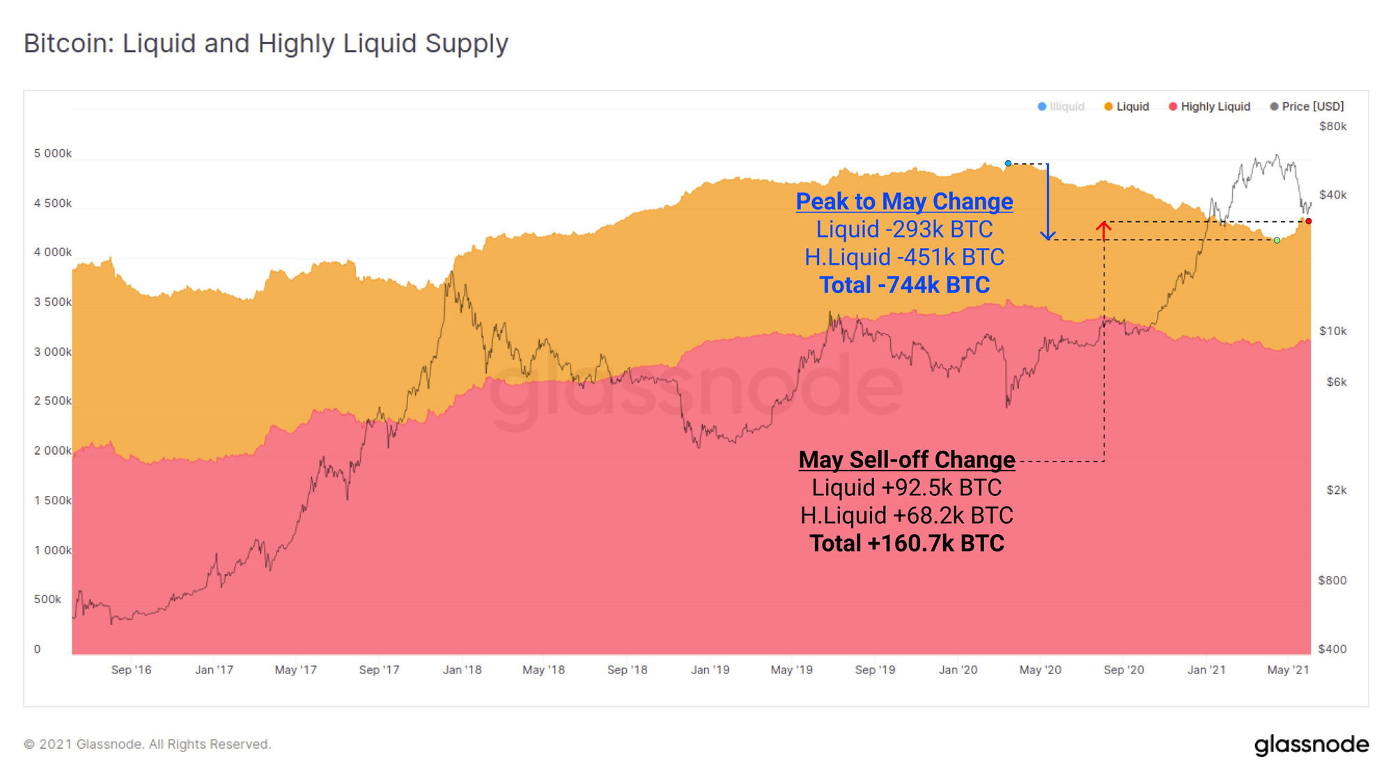
Over the last month, a total volume of 160.7k BTC has been spent from an illiquid state back into liquid circulation. This provides a gauge of the amount of overhead supply that has re-entered the market after being classified as illiquid by our analytics and heuristics (see more detail in this article).
What is important to node is that this 160.7k BTC represents just 22% of the supply that moved the other direction, from liquid to illiquid, since March 2020. This means that of the 744k BTC that were withdrawn to cold storage (or equivalent) over the last 14-months, 78% of them have remained unspent despite this recent volatility.
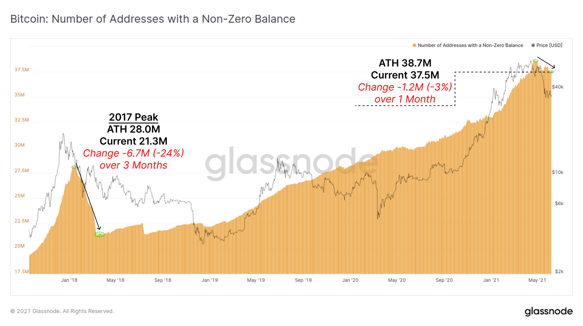
The total number of addresses with a non-zero BTC balance has declined throughout May, dropping by a total of 1.2M addresses. Unlike transaction demand and other activity metrics, which fell 60%+, the decline in non-zero addresses (which are effectively spending all owned coins) has only declined by 3% from ATH. Compared to the 2017 peak, where we saw almost a quarter of addresses spend their coins, this is a relatively small net change.
What it does suggest is that some portion of the market is spending their full balance from owned addresses suggesting a shift in conviction for that portion of the market.
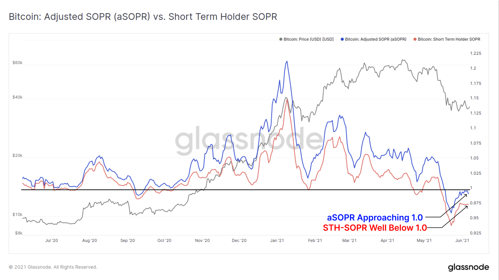
We can compare two versions of the Spent Output Profit Ratio (SOPR) metric to see that a majority of those spending their coins are a) realising losses and b) are spent by Short-Term Holders. Some initial points on SOPR to interpret the next chart:
- SOPR values indicate the magnitude of profit (>1.0) or loss (<1.0) realised by the market. Larger peaks/troughs mean larger profits/losses realised.
- aSOPR variant considers the entire market. It does improve signal by filtering out relay transactions with a lifespan <1hr which are not economically meaningful.
- STH-SOPR variant filters only for coins spent that are younger than 155-days capturing new entrants to the market, and filtering out long-term holders.
The chart below compares aSOPR (whole market minus relay transactions) to STH-SOPR (new market entrants only). What we can see is that both are below 1.0 and thus spenders are realising losses in aggregate across the whole market. However, note that the STH-SOPR is well below aSOPR. This indicates that the magnitude of losses realised by newer market entrants are much larger than the market on average. The aSOPR metric being close to 1.0 indicates that any long term holders who are realising a profits are more or less offset by short-term holders realising losses.
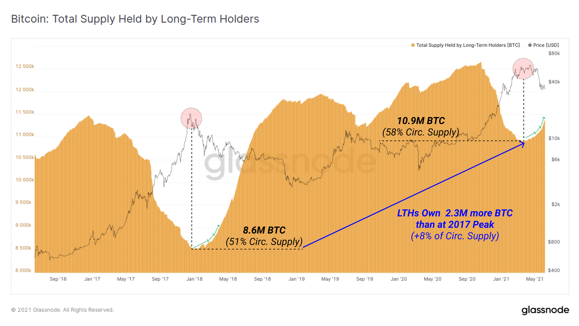
The supply held by Long-term holders (LTHs) has started to accelerate upwards. The threshold for LTH status is UTXOs that are dormant for 155-days. As such, the next charts are largely describing investors who purchased between late 2020 and 3 January 2021, and have not spent their coins.
After a period of LTHs distributing coins, as the market rallied from $10k to the $64k ATH, the net change in LTH supply is now in a firm uptrend (HODLing behaviour). Yet again, we can see this fractal is similar to the late 2017 bull and early 2018 bear. This fractal describes the inflection point where LTHs stop spending, start re-accumulating and hodling what are now considered cheap coins.
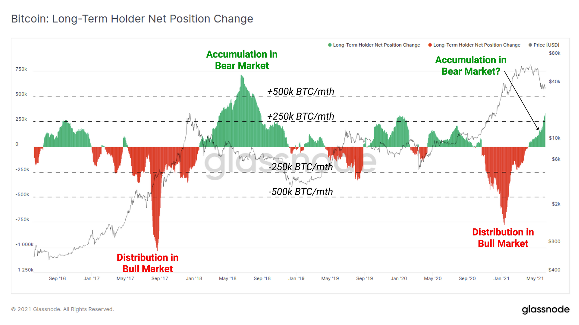
LTHs now own 10.9M BTC which represents over 58% of the circulating supply. It is worth noting that LTHs today own 2.3M more BTC (+8% of circulating supply) compared to the LTHs at the 2017 peak.
This does highlight an intuitive reality; higher coin prices require larger capital inflows to sustain bull market trends. It also shows that the distribution of fewer coins can put in local/macro market tops if the capital inflow demand is not there.
DeFi Activity Slows On-chain
The slow down in on-chain activity is, naturally, not limited to Bitcoin and Ethereum. Aggregate on-chain activity such as transfer counts (top) and USD value transferred (bottom) for COMP, AAVE, UNI and YFI tokens has dropped significantly in the last month. These metrics are simple yet reasonably effective as a high level gauge for mass investor sentiment and can be seen to map reasonably well to trends in price.
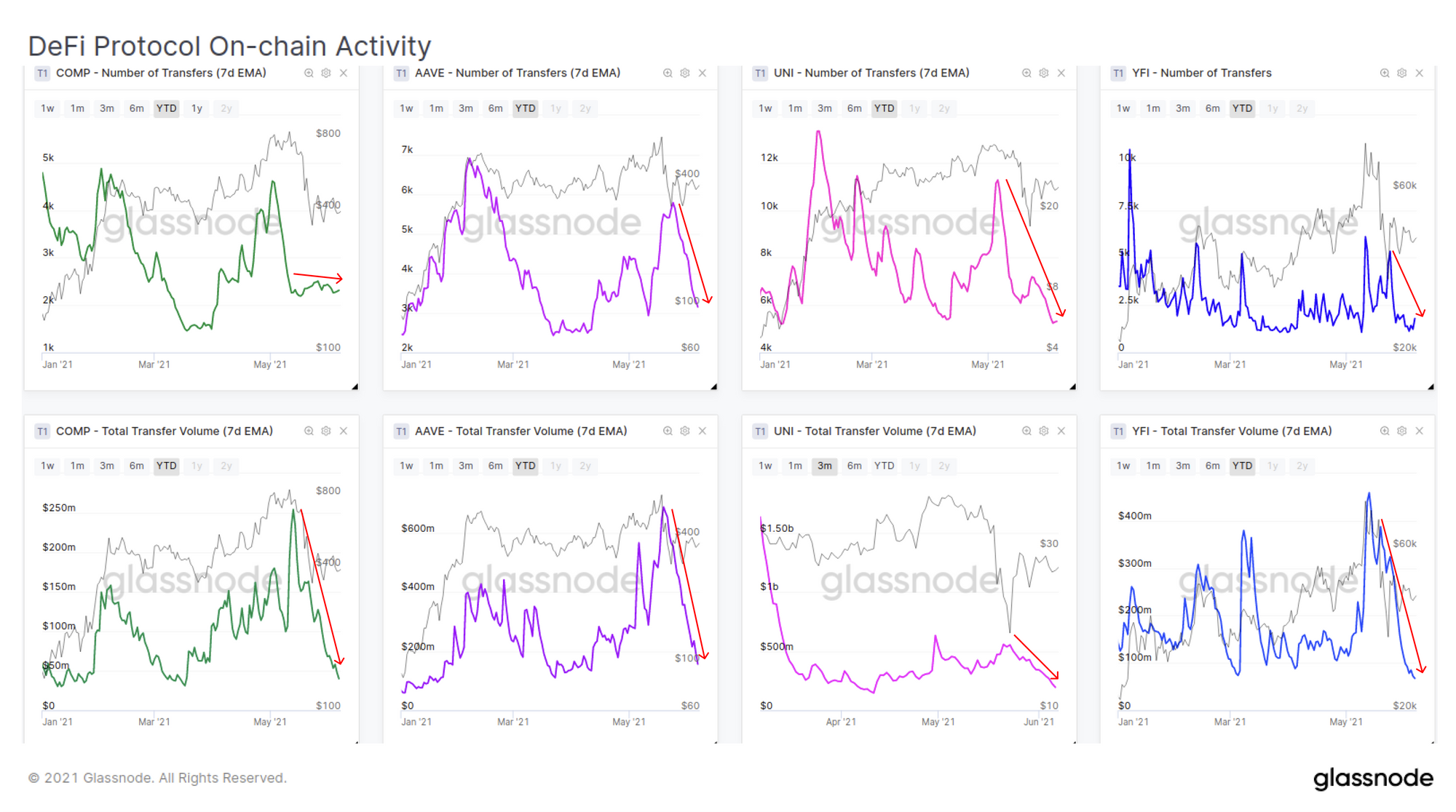
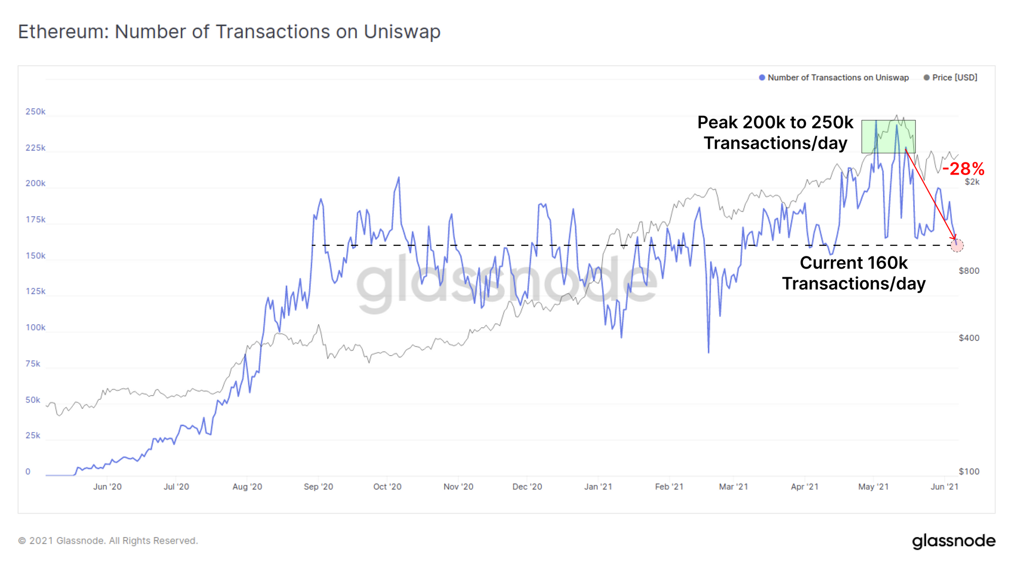
Finally, we can see in the number of daily Uniswap trade transactions has fallen by 28% since peaking in mid-May suggesting a slowing of demand for tokens. The daily transaction count for Uniswap has returned to its long term baseline of around 160k trades/day which has held since September 2020 amidst 'DeFi Summer'.
Week On-chain Dashboard
The Week On-chain Newsletter now has a live dashboard for all featured charts here.
New Glassnode Content
DeFi Uncovered: Experimental
We have released a new content series focused on insights and analysis pertaining to the rapidly expanding DeFi sector. Our latest piece analyses and explores a suite of new, innovative and experimental lending protocols with a focus on incentive design, risks and opportunities.
Check out the article here and to sign-up for more DeFi insights here.

Product Updates
Metrics and Assets
- Released new metrics: Delta Cap and Balanced Price
- TradingView extended symbols with exchanges and currencies
- Academy entries updated for SOPR, aSOPR and STH-SOPR
New video tutorials released inside Glassnode Studio for:

- Lesen Sie diesen Artikel jetzt auf Deutsch bei unserem offiziellen Partner Bitcoin2Go
- Follow us and reach out on Twitter
- Join our Telegram channel
- For on–chain metrics and activity graphs, visit Glassnode Studio
- For automated alerts on core on–chain metrics and activity on exchanges, visit our Glassnode Alerts Twitter