The Week On-chain (Week 31, 2021)
As the Bitcoin market rallies over $42k, we analyse the spending and accumulation behaviour of entities on-chain.


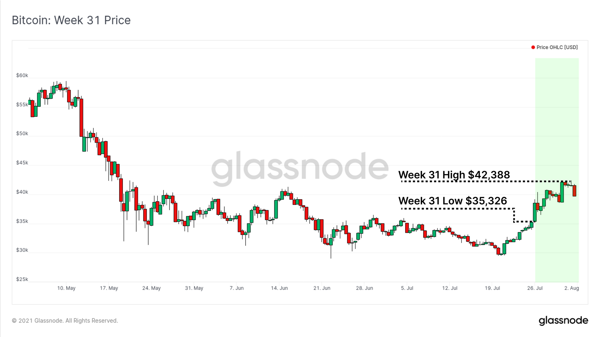
The Bitcoin market has rallied strongly this week, adding to the gains of the short squeeze started on Monday morning. The market opened at the weekly lows of $35,326 and reached an intra-day high of $42,388. This provided some welcomed positive price action after months of consolidation, and multiple retests of the $29k floor.
In this edition, we assess how the market has reacted to this first set of strong green candles for some time. We analyse the magnitude of profit taking, and how accumulation and spending behaviour is manifesting on-chain.
Disbelief or Bear Relief Rally?
After an extended period of very negative sentiment, and sustained downwards price action, Bitcoin has traded high with gusto this week. A key question is whether this is a Disbelief Rally (where everyone doubts the new bull trend), or simply a Bearish Relief Rally in a larger time-frame downtrend.
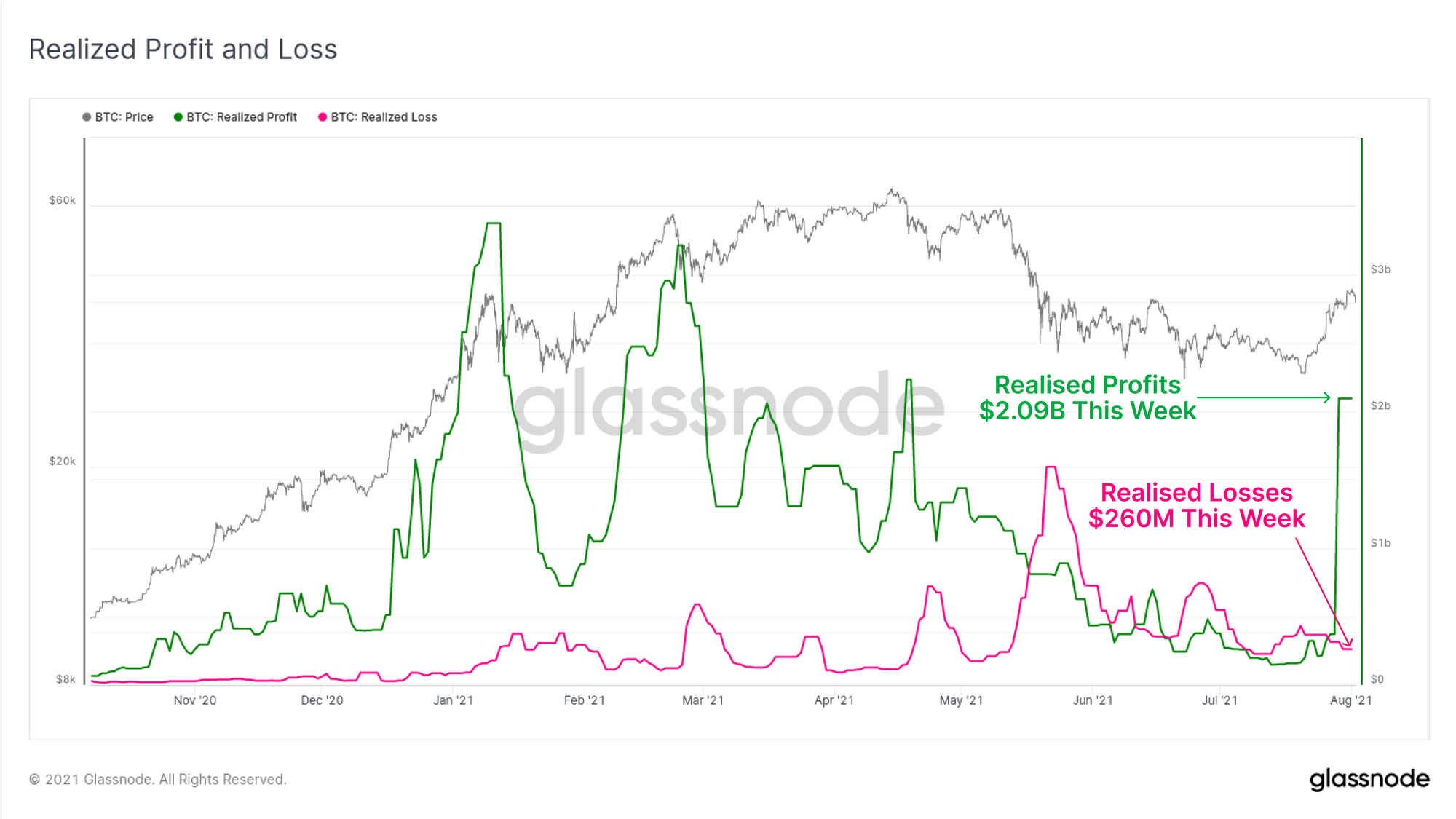
To start our assessment, we look to the realised profit and loss on-chain. We can see that after a long period of elevated losses being realised in May to July (pink), over $2B in profits were realised on-chain this week (7-day median). This suggests there is some portion of the market who spent their profitable coins, potentially taking exit liquidity.
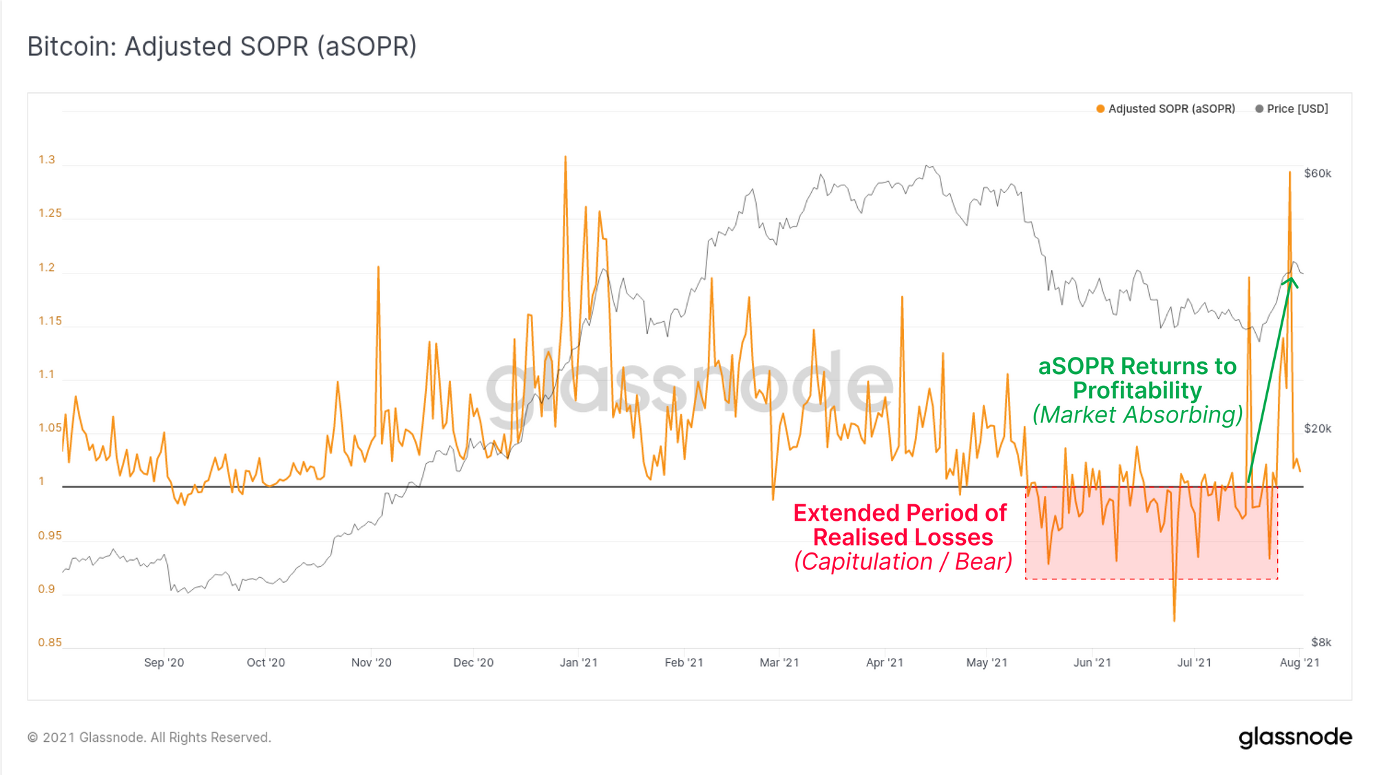
The aSOPR metric provides a view of realised profit/loss by the aggregate market, ignoring coins younger than 1hr. We can see that on net, the majority of on-chain spending have realised losses since the sell-off in May. Each time price rallied, traders spent their coins, making an aSOPR value of 1.0 act as resistance.
This week aSOPR has rallied significantly higher as profits were realised on-chain. Key observations to keep an eye on from here are:
- aSOPR resets to 1 and then bounces higher: This indicates the market has stopped realising profits (holding conviction remains) and absorbed the sell pressure (Disbelief).
- aSOPR falls back below 1 and stays there: This indicates the market is again realising losses and was unable to absorb the sell-side pressure (Bearish Relief).
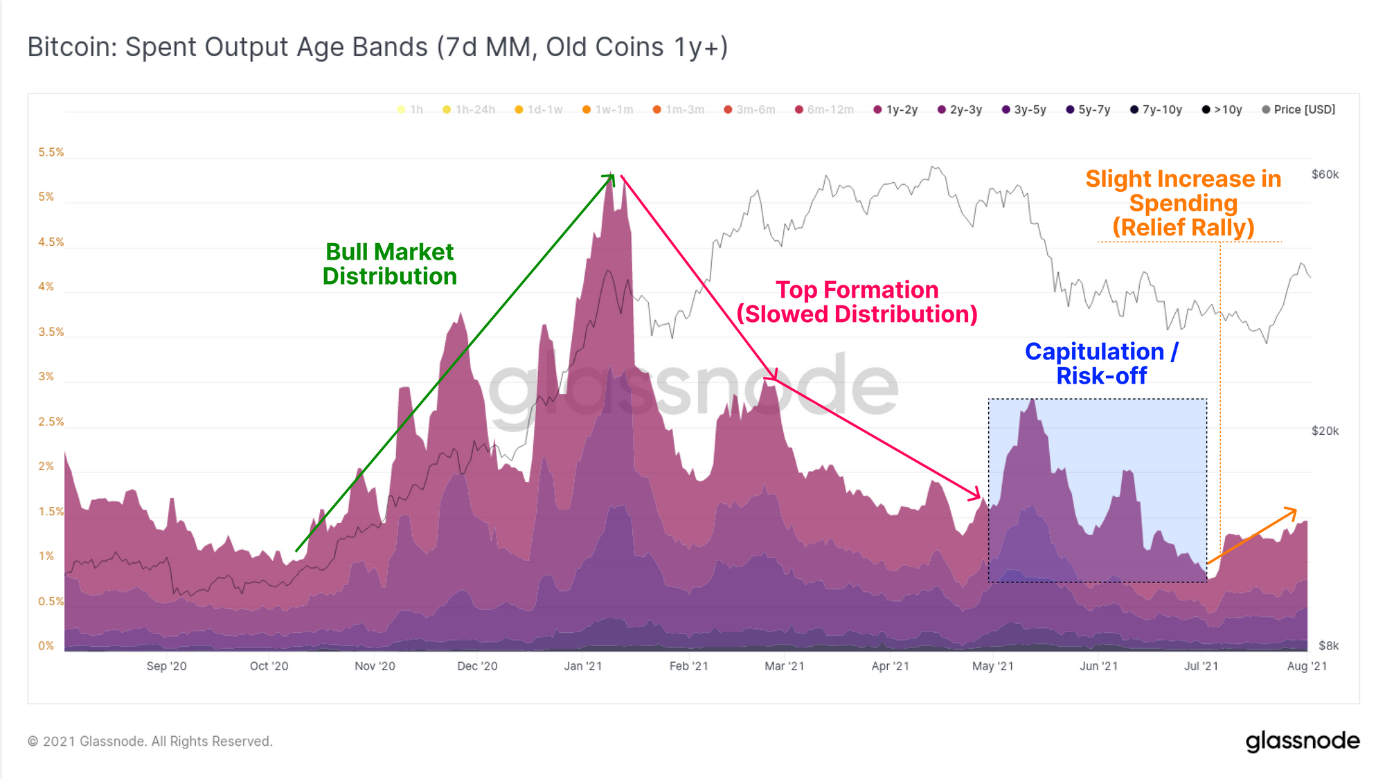
We have established that some volume of profitable coins were spent on-chain. We can look to assess which cohorts of holders these coins may have been sourced from. If we assess old coins (>1y) in the Spent Output Age Bands, we can see that there have been four distinct phases of this market cycle:
- Bull Market Distribution in late 2020 to Q1 2021 as older coins were spent at an accelerating rate.
- Top Formation with slowing distribution from Feb to May 2021.
- Capitulation and Risk-off in May and June as the market reacted to the unprecedented FUD, and a 50% sell-off to $29k.
- Disbelief or Bearish relief through late-July as the market traded down to $29k and then strongly up to $42k this week.
In an ideal bullish scenario, older coins will remain fairly dormant, spending will remain low or decline, and conviction to hold stays strong. If older coins do start spending, but prices continue to rally, this would indicate a bullish disbelief rally may be in play, and the market is absorbing the spent supply.
Conversely, sharp upticks in older coin spending, especially alongside weakening prices, might start to lean closer to a resumption of the bearish trend. It would suggest the market is struggling to absorb the spent supply.
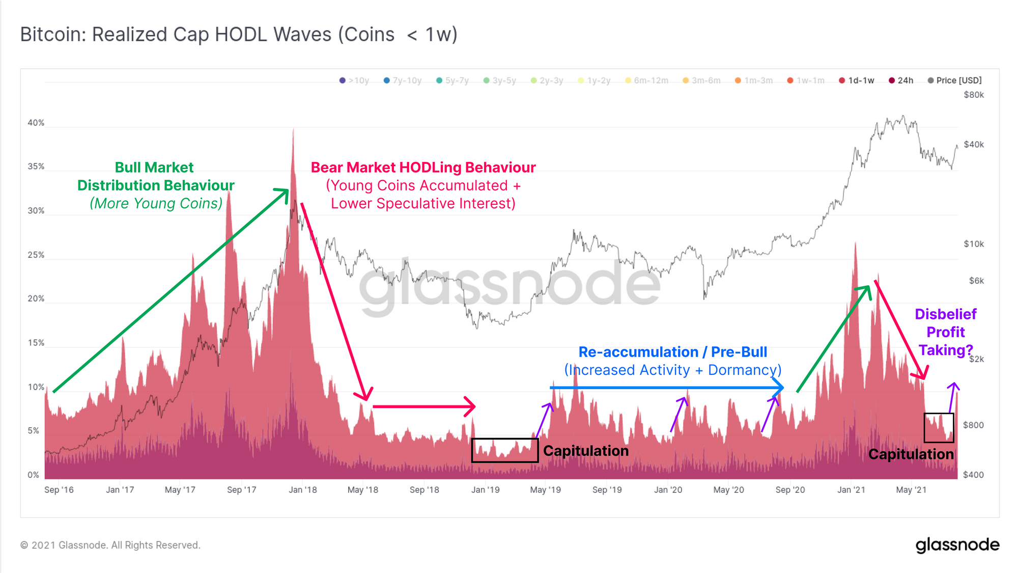
The Realised Cap HODL waves, filtered for young coins (<1 week) provides us with the other side of this equation. Typical behaviour of a bull market is older coins are spent to take profits, new investors buy them, and the 'young coin supply' increases. Eventually, the market cannot absorb more supply and rolls over into a bear market. As speculators leave and smart money accumulate, the population of young coins decline as more move into cold storage.
Eventually, young coin supply collapses after a capitulation event, and massive accumulation takes hold. Very often, as the market rallies out of this capitulation bottom, or starts a bull market, with a series of Disbelief/Relief rallies (purple). Older coins are spent into the rally to take exit liquidity, increasing the young coin supply again.
This week, we have seen a notable spike in these younger coins out of what resembles a capitulation bottom. In a bullish scenario, this would subside (HODLing dominates) and/or price continues higher in spite of it (disbelief, absorbing the sell-side). In a more bearish scenario, this starts an uptrend of 'new young coin supply' suggesting weakened conviction to hold the asset by old hands, and increasing liquid supply.
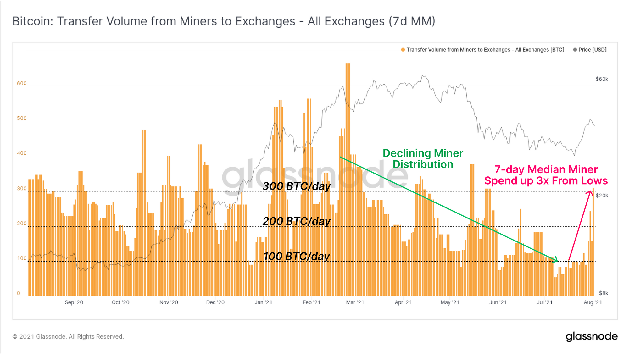
Lastly on the spending front, we revisit miners who fall into two groups:
- Offline Miners impacted by the migration out of China and incurring large costs.
- Online Miners who are operating at high profitability due to around half the competition being offline.
The net transfer volume from miners to exchanges bottomed out at less than 100 BTC/day in mid to late July. This week however, we have seen an increase to around 300 BTC/day, which is a 3x increase from the July lows. Keep in mind that this is still in line with typical behaviour throughout 2020 and 2021. It does reflect the resilience of the Bitcoin mining market whereby half of the miners may add to sell-pressure out of necessity, whilst the other half can accumulate at twice the rate.
Exchange Supply Falls
So far we have looked at spending behaviour in response to positive price action. Now we will build up a thesis around the flow of supply out of exchanges, and into on-chain wallets.
The exchange net position change metric maps out the monthly rate of coins flowing in (green) or out (red) of all exchanges. This week we have seen an extremely large volume of coins flow out of exchanges, comparable to the peak outflows seen in November 2020. The rate hit over 100k BTC per month in outflows this week.
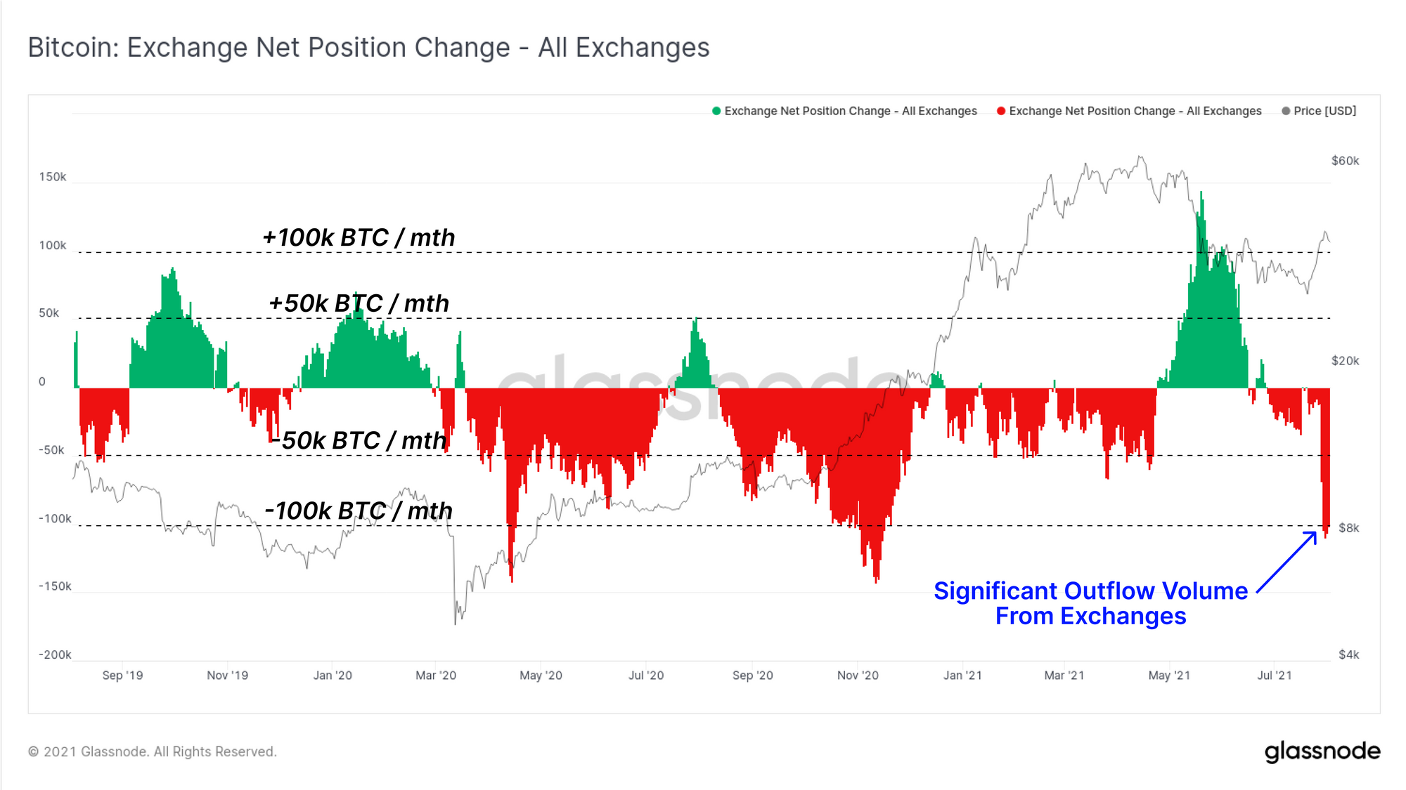
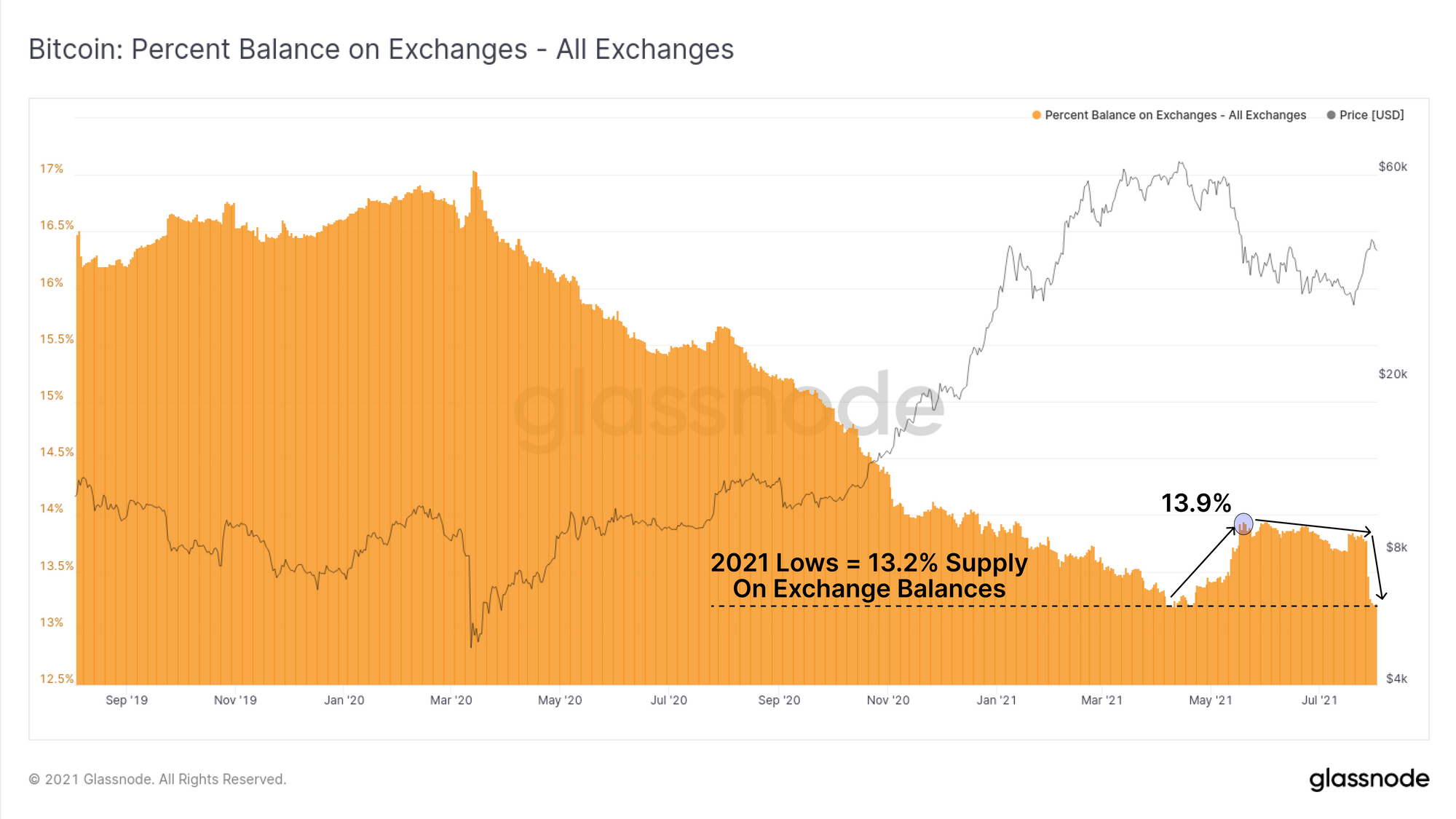
In terms of the aggregate balance still held on exchanges, holdings have now returned to the 2021 lows of 13.2% of circulating supply. This represents a near full retracement of the significant inflow volume observed during the May sell-off.
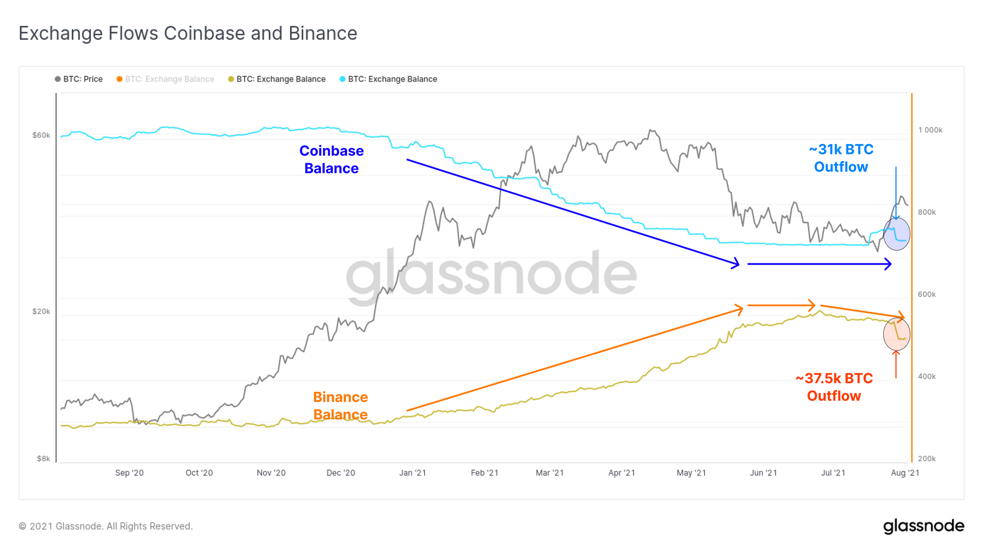
Another interesting dynamic this week is the interplay between coins held on Coinbase and Binance, the two largest exchanges by balance. Coinbase saw significant outflows throughout most of 2021, whilst Binance was the largest recipient.
The trend for Binance appears to have stalled and started to reverse, with a total outflow of approximately 37.5k BTC this week. Coinbase balances plateaued in June, saw a large deposit of around 30k BTC in mid-July, and this week an outflow of 31k BTC. This has largely unwound all inflows since mid-May. Overall, this may well be the start of another era of net exchange outflows and is a trend to watch.
Macro Sentiment
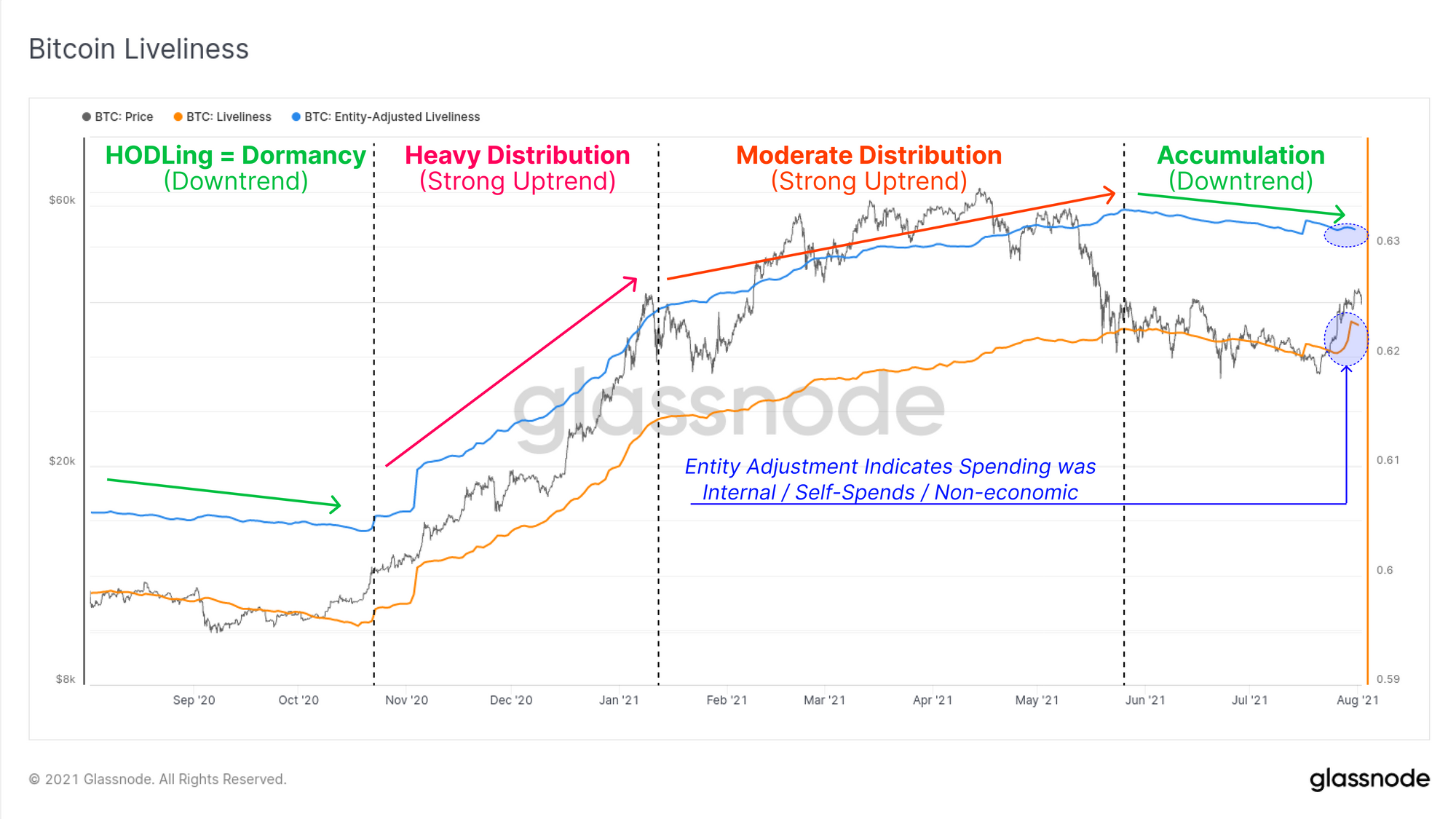
To provide a macro overview of supply dynamics on-chain, we can consult the Liveliness metric in both standard and entity-adjusted forms. Liveliness has the following properties:
- Uptrends when more coin-days are destroyed than created (old coin spending)
- Downtrends when accumulation and dormancy dominate (HODLing)
- Entity Adjustment corrects for internal, self spends or non-economic transactions
We can see in the chart below that the market has returned to macro accumulation almost immediately after the May sell-off. Recently the standard liveliness metric jumped significantly higher, suggesting that a potentially large volume of old coins were spent. However, the entity adjusted version does not see the same event, which indicates these coins are classified as 'internal' and likely to be reshuffling of an exchange cold wallet.
As such, it seems that HODLing and accumulation is the most likely dominant trend in the on-chain market.
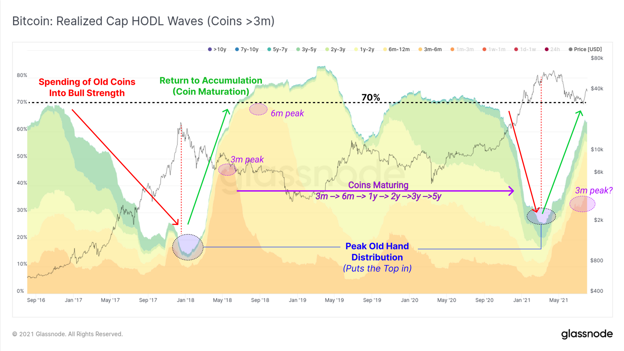
The Realised Cap HODL waves tell a similar story with a distinctive uptrend in coin maturation for coins older than 3-months. This has similar hallmarks to accumulation after a blow-off top, although 2021 is coming from a higher HODLed base (~25%) than 2018 (~15%). Progressive peaks of these bands would provide an indication of the volume of coins that are maturing (higher peaks are more bullish, and vice-versa).
Keep in mind that whilst accumulation and coin maturation is bullish, as was seen in the 2018-20 market, a full scale bullish impulse can take some time to develop.
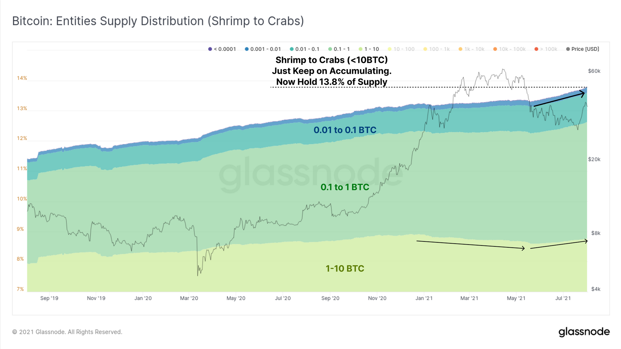
We can also look to the holdings of on-chain entities, defined as clusters of addresses with the same owner. One of the most aggressive accumulators since May are the Shrimp to Crab cohorts holding < 10 BTC. These small holders now own an all time high of 13.8% of the total coin supply with the trend of accumulation clearly accelerating from May onwards. Of particular note are the 1 to 10 BTC cohort (bottom light green) which distributed since Jan and have returned to accumulation.
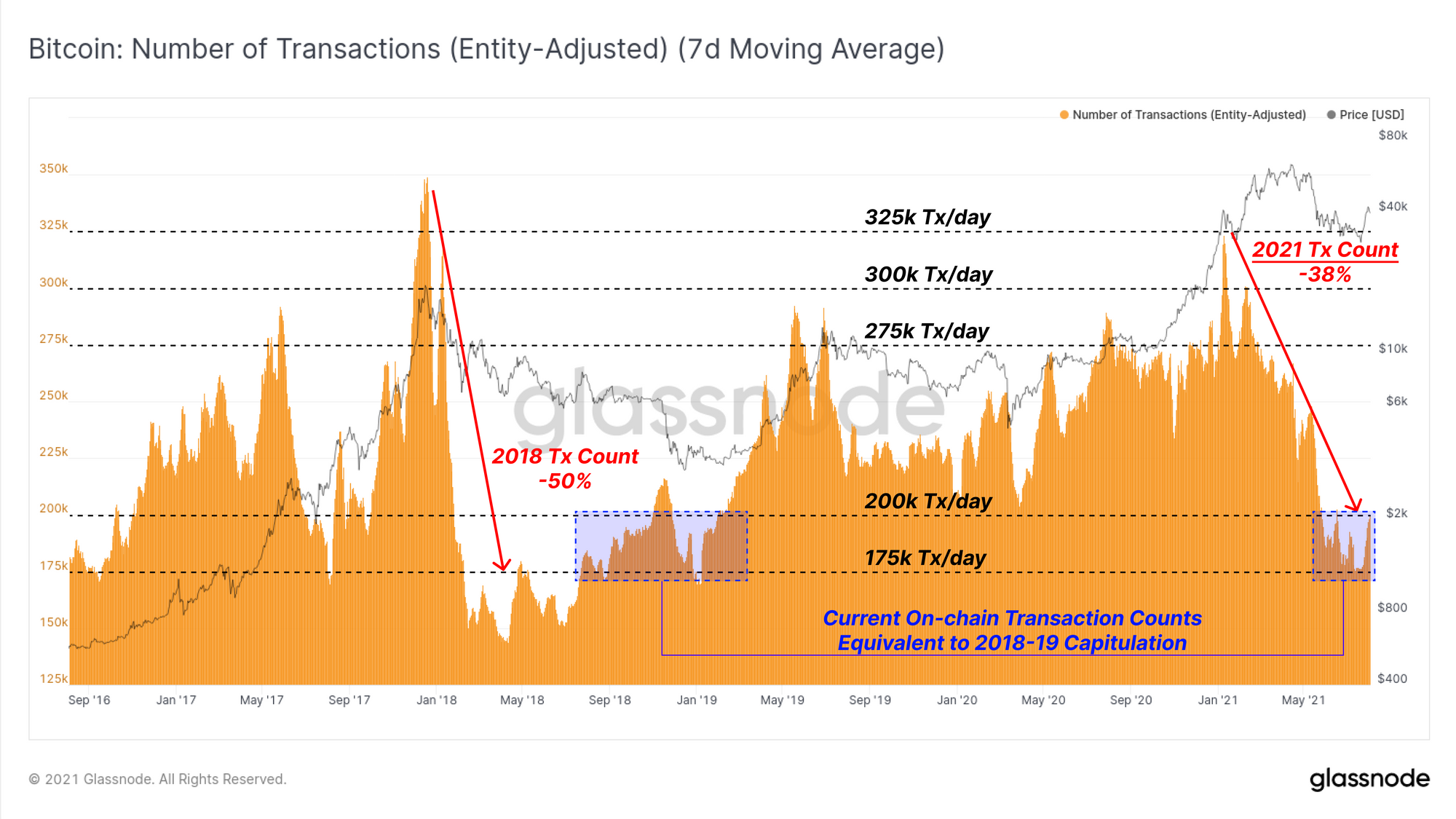
As a final closing note, there continues to be historically low activity on-chain. The current entity adjusted transaction count remains down 38% from the peak set in February, currently clocking 200k transactions daily. Whilst on-chain activity can often follow positive price action, current levels are equivalent to the 2018-19 capitulation bottom.
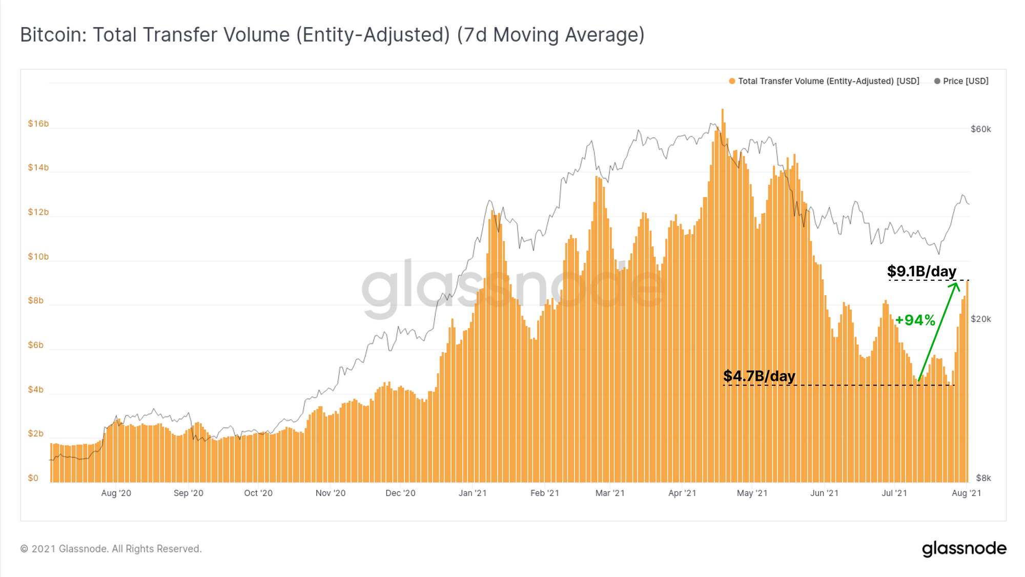
That said, transaction volumes are spiking higher, up 94% from the lows of $4.7B/day, to around $9.1B/day this week. This suggests a that demand for on-chain block-space is likely dominated by fewer, but larger size transactions at present and is an interesting combination of indicators worth keeping an eye on.
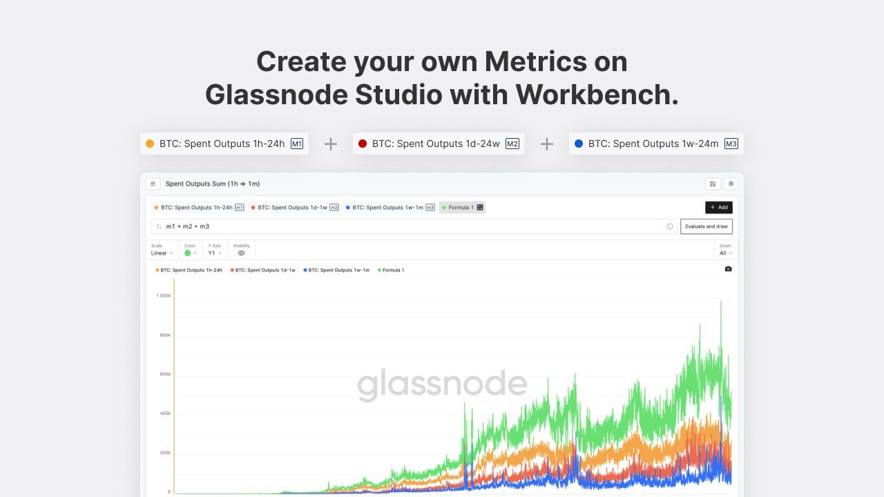
Major Feature Release: Workbench
We are pleased to release Workbench, a new tool available in Glassnode Studio to generate custom, multi-line charts and use our formula editor. This allows analysts to easily combine our metrics, create and save your own, and take on-chain analysis in new and unique directions.
Week On-chain Dashboard
The Week On-chain Newsletter now has a live dashboard for all featured charts