New Investors Pain Cycle
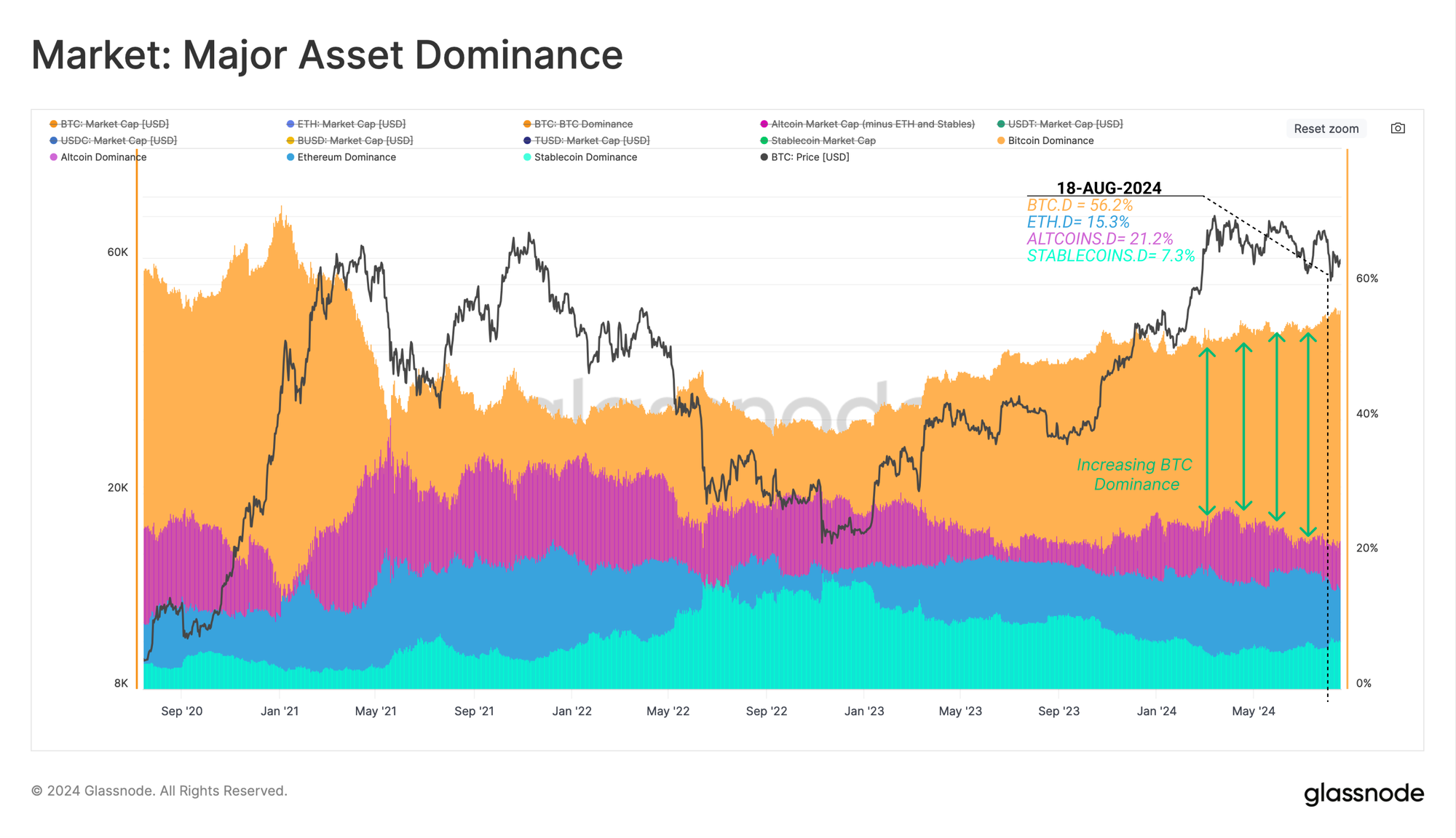
Bitcoin, as the leading digital asset, continues to see its dominance expand, now commanding a staggering 56% of the total market capitalization. Supporting this, Bitcoin Long-Term Holders remain steadfast in their conviction, with significant accumulation pressure below the surface.


Executive Summary
- Since the cycle low established in Nov 2022, Bitcoin Dominance has continued to climb, now commanding 56% of the total crypto market capitalization.
- Despite tumultuous and choppy price action, the conviction of Long-Term Holders remains steadfast and unfazed, with a clear preference to accumulate and HODL coins.
- Short-Term Holders have carried the brunt of the losses during the recent downturn. However, the degree of locked-in losses suggests a possible overreaction towards the event.
Market Overview
Since the cycle low established in Nov 2022, capital continues to accrue towards the major asset end of the digital asset risk curve. Bitcoin Dominance has risen from non-trivial 38% in Nov-2022 to a staggering 56% of the total digital asset market today.
As the second largest asset in the ecosystem, Ethereum has recorded a dominance decline of 1.5%, remaining relatively flat over the past two years. Stablecoins and the wider Altcoin sector have experienced a more pronounced decline of 9.9% and 5.9%, respectively.
- 🟠 Bitcoin Dominance: 38.7% (Nov 2022) —> 56.2% (Current)
- 🔵 Ethereum Dominance 16.8% —> 15.2%
- 🟢 Stablecoin Dominance 17.3% —> 7.4%
- 🟣 Altcoin Dominance 27.2% —> 21.3%
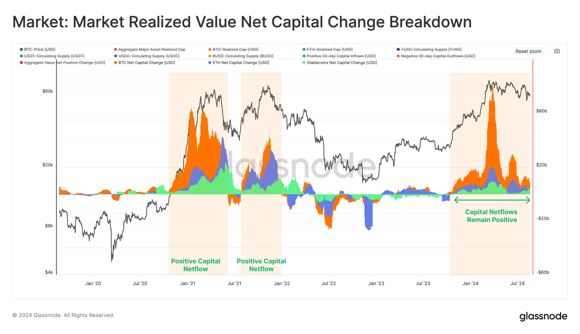
However, when we assess the Net Capital Change across the major assets, Bitcoin, Ethereum and Stablecoins exhibit a net positive capital inflow. Only 34% of trading days have seen a larger 30-day USD inflow, even though the market has generally contracted since the March ATH.
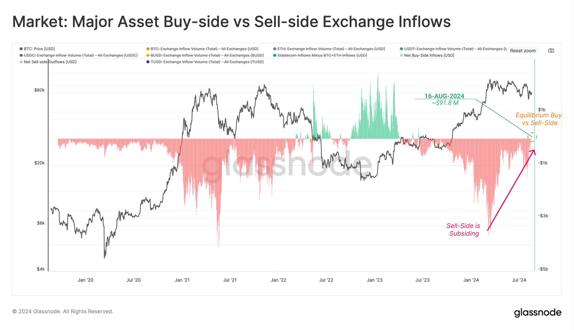
Next, we can utilize the Major Asset Buy-Side vs Sell-Side metric, which seeks to identify shifts in capital depending on the preference of exchange inflow volumes. This can be considered under the following framework:
- Values near zero suggest a neutral regime, where buy-side inflows are the same magnitude as BTC+ETH sell-side inflows.
- 🟢 Positive values suggest a net buy-side regime, where buy-side inflows of stablecoins exceed BTC+ETH sell-side inflows.
- 🔴 Negative values suggest a net sell-side regime, where buy-side inflows of stablecoins are less than BTC+ETH sell-side inflows.
Since the new ATH creation in March 2024, sell-side pressure has subsided and is now recording the first positive data point since June 2023 ($91.8M/day).
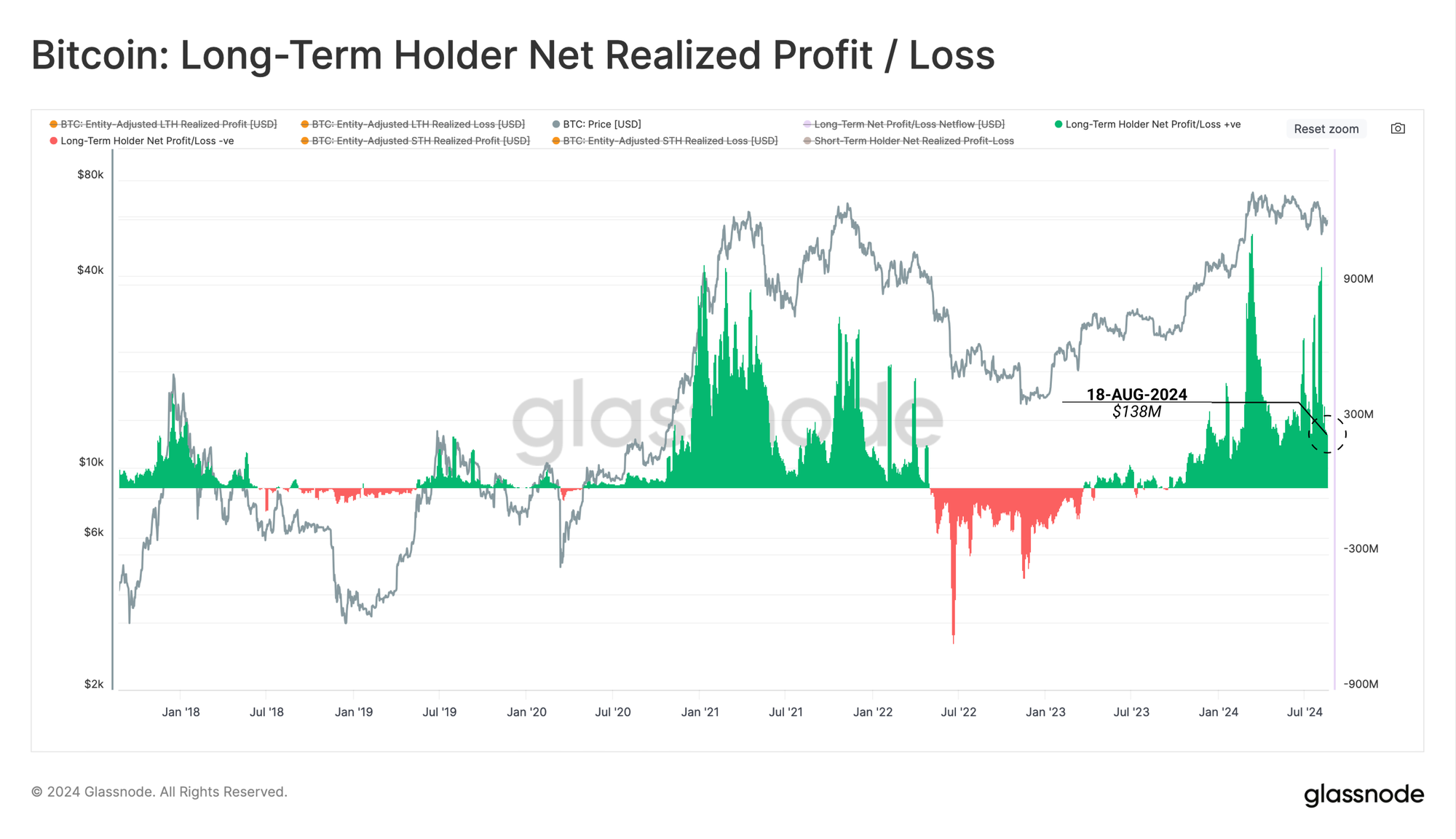
Long-Term Holders
Amidst tumultuous market conditions as of late, Long-Term Holders have been locking in a reasonably consistent $138M in profit per day. With each transaction, a buyer and a seller are matched, with supply and demand imbalances resolved via price changes.
Therefore, we can infer that this ~$138M/day in LTH sell-side pressure is a read for the daily capital inflows required to absorb supply and keep prices steady. While market conditions have been choppy, prices are generally flat over the last few months, suggesting a form of equilibrium is being reached.
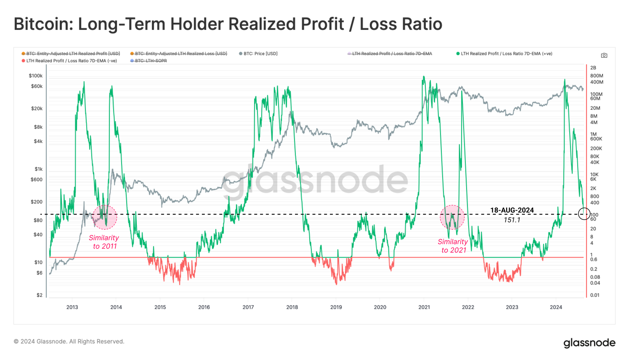
The Realized Profit / Loss Ratio for Long-Term Holders is a metric we can use to assess cyclical behavior of this cohort. We note that this metric remains elevated, although is experiencing a substantial decline from the peak. This indicates that long-term investors are in the process of cooling off profit-taking activities.
Notably, during the March 2024 ATH, this metric reached a similar altitude to prior market tops. In both the 2013 and 2021 cycles, the metric declined to similar levels prior to resuming an uptrend in price. In 2017-18, however, this decline was one way, as the market entered a loss-dominant bear market.
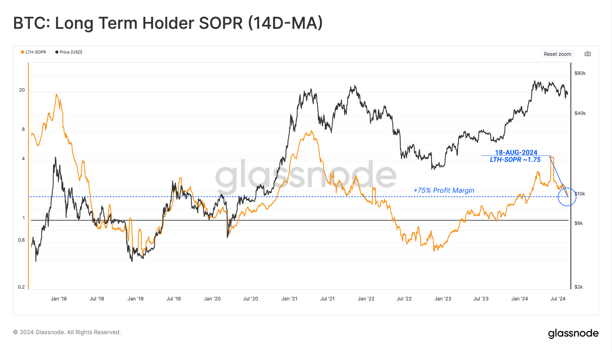
From the perspective of Long-Term Holder SOPR, we can see that coins are locking in an average profit margin of +75%, and LTH-SOPR remains elevated at this time.
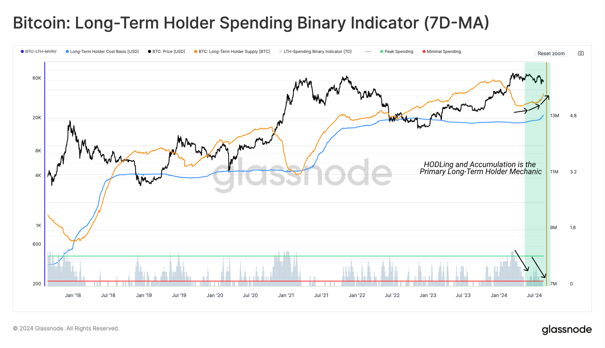
Utilizing our Binary Spending Indicator for LTHs, the aforementioned slowdown in Long-Term Holder spending can be seen.
LTH supply is rapidly increasing at present. When we consider that the 155-day threshold for LTH status is near the March ATH, this provides an indication of the volume of supply acquired during the ATH run-up, which remains held. This highlights that HODLing behavior is significantly outpacing spending behavior.
A Psychological Correlation
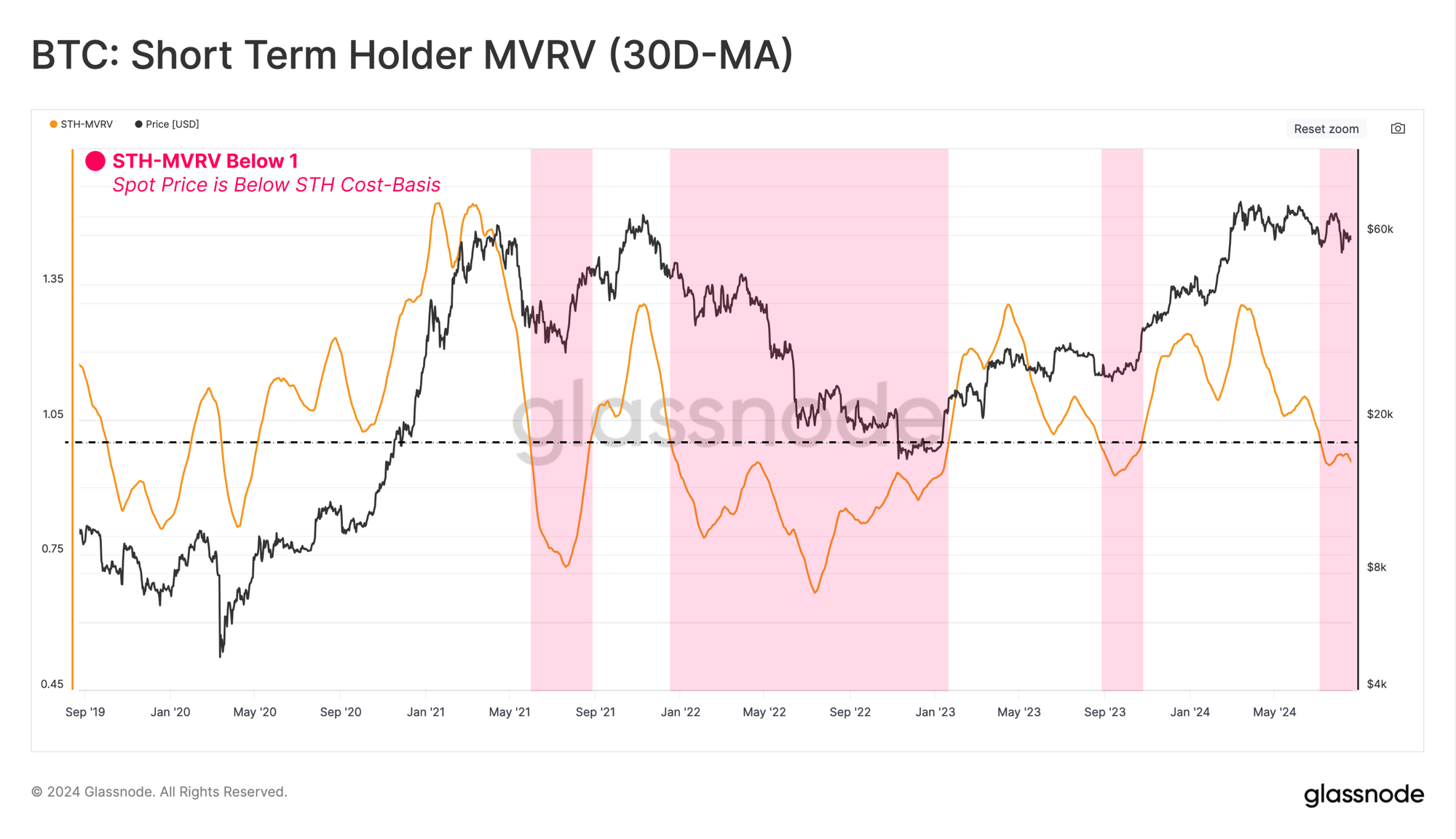
Moving toward the inverse cohort, the Short-Term Holders, we can measure the intensity of unrealized financial stress experienced by recent buyers. We can observe this dynamic using the STH-MVRV Ratio metric, with a 30-day average applied.
STH-MVRV has recently contracted below the equilibrium value of 1.0, suggesting that the average new investors now hold an unrealized loss.
Periods of brief unrealized loss pressure are common during bull markets. However, sustained periods where STH-MVRV trades below 1.0 can lead to a higher likelihood of investor panic and precede a more severe bearish market trend.
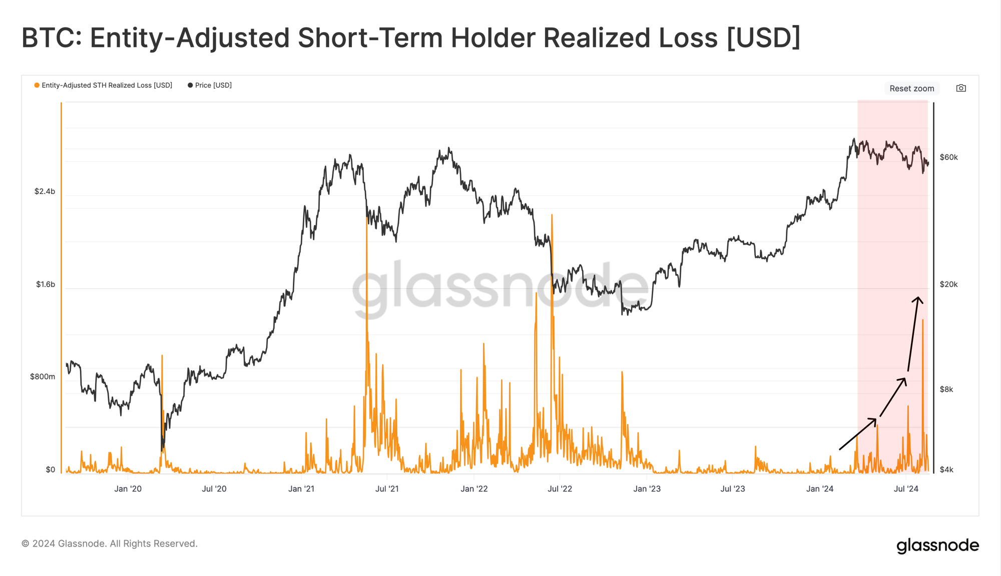
With unrealized losses increasing, an expectation of an eventual investor capitulation grows. Such events are characterized by significant losses being locked in via spent coins.
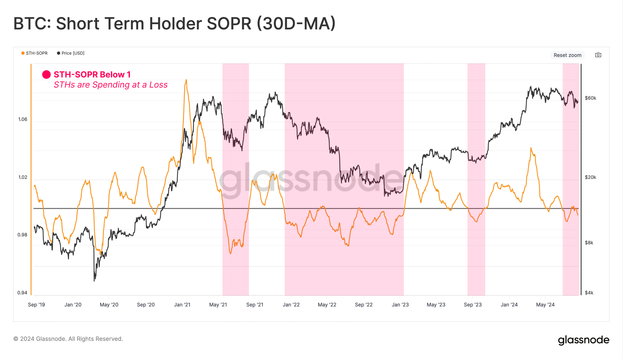
Evaluating the periods of high-loss realization in the market by new investors can be seen when STH-SOPR trades below 1.0.
From this lens, we can also see that STH-SOPR trades below 1.0, indicating a degree of realized loss-taking activities by new investors. This adds weight to the case that the market is at a decision point, and the price is marginally below the comfort point of STHs.
Despite the correlation between unrealized and realized activities, new investors can overreact to their portfolio being held at a relatively high unrealized profit (or loss). Such over-reactions are a key feature of markets, where the emotional response of investors results in their realizing an excessive profit (or loss) at inflection points, forming both local and macro tops (or bottoms).
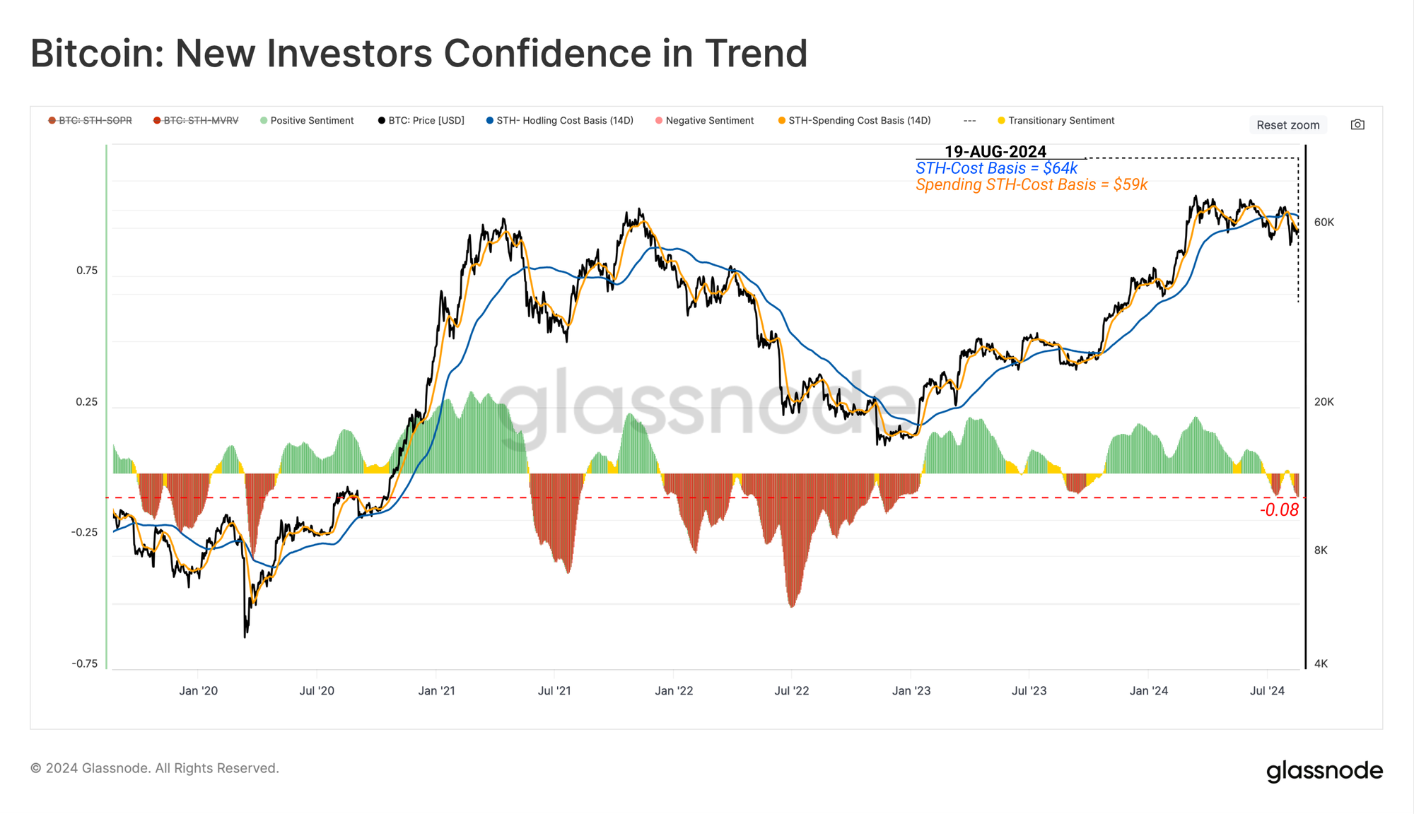
The chart below compares the spent cost-basis of new investors who decided to transact against the average cost-basis of all investors who still hold. The deviation between these two metrics provides insight into the magnitude of potential overreactions.
The bull market corrections seen throughout our current cycle have experienced only a slight deviation between the spent and holding cost basis. From this, it could be argued a modest overreaction may have occurred as the market sold off below $50k.
Navigating Investor Cycles
In the above section, we utilized the MVRV and SOPR metrics, which consider investors' general profit and loss positioning. This section will isolate solely for coins held and transacted in a loss.
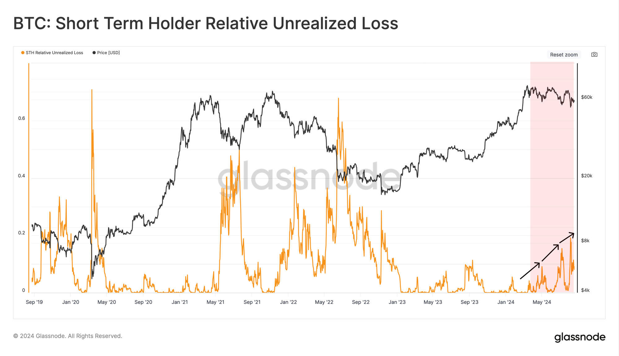
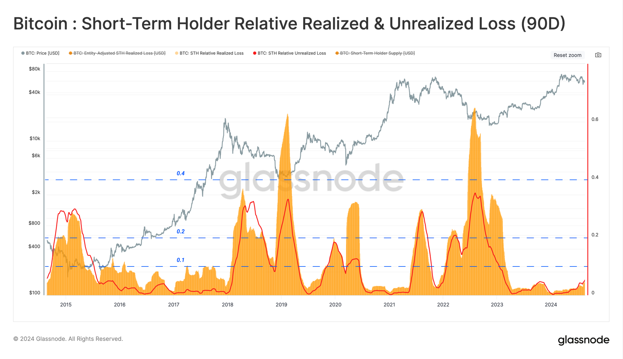
By evaluating the Relative Unrealized Loss metric for new investors, we can directly measure the unrealized financial stress that new investors are shouldering.
Presently, the magnitude of Unrealized Loss relative to the STH Market Cap remains relatively low compared to historic capitulation events. The magnitude of loss held by the market is arguably similar to prior bull market corrections.
However, we can see a divergence in this correlation when we compare the build-up of Unrealized Losses to those locked in by spent coins (Realized Losses). Realized Losses tricking notably higher highlights the moderate overreaction we described above.
Assessing the cumulative 90-day realized loss and the average unrealized loss for STHs, we can visually highlight the confluence and correlation between these two measures.
During cyclical price lows, the magnitude of realized and unrealized loss tends to spike between 10% and 60% of total STH holdings. By this measure, the magnitude of both unrealized and realized losses remains relatively small compared to previous major bottom-forming events.
One constructive analogue would be the similarity between the current structure and the 2016-2017 cycle, where the described relative metrics traded below a consistent ceiling of ~10%.
From this, we could argue that the hit taken to investor sentiment may not be as severe as it may seem at face value.
Summary and Conclusions
With a degree of uncertainty rife amongst market investors, capital continues to flow down the risk curve, leading to a significant expansion in Bitcoin dominance, with the leading asset now commanding a staggering 56% of the total market capitalization.
In spite of the tempestuous and choppy price action, the resolve of Long-Term Holders remains resolute, with a clear preference for HODL and acquiring coins. Alternatively, Short-Term Holders have carried the vast majority of the losses across the recent downturn. Nonetheless, the degree of locked-in losses suggests a possible overreaction towards the event.
Disclaimer: This report does not provide any investment advice. All data is provided for information and educational purposes only. No investment decision shall be based on the information provided here and you are solely responsible for your own investment decisions.
Exchange balances presented are derived from Glassnode’s comprehensive database of address labels, which are amassed through both officially published exchange information and proprietary clustering algorithms. While we strive to ensure the utmost accuracy in representing exchange balances, it is important to note that these figures might not always encapsulate the entirety of an exchange’s reserves, particularly when exchanges refrain from disclosing their official addresses. We urge users to exercise caution and discretion when utilizing these metrics. Glassnode shall not be held responsible for any discrepancies or potential inaccuracies. Please read our Transparency Notice when using exchange data.
- Join our Telegram channel
- For on-chain metrics, dashboards, and alerts, visit Glassnode Studio
- For automated alerts on core on-chain metrics and activity on exchanges, visit our Glassnode Alerts Twitter