The Week Onchain (Week 44, 2021)

As Bitcoin consolidates after the recent all-time-high, constructive developments in both derivatives, and spot markets indicate that further upside is the most probable outcome.

The Week Onchain (Week 44, 2021)

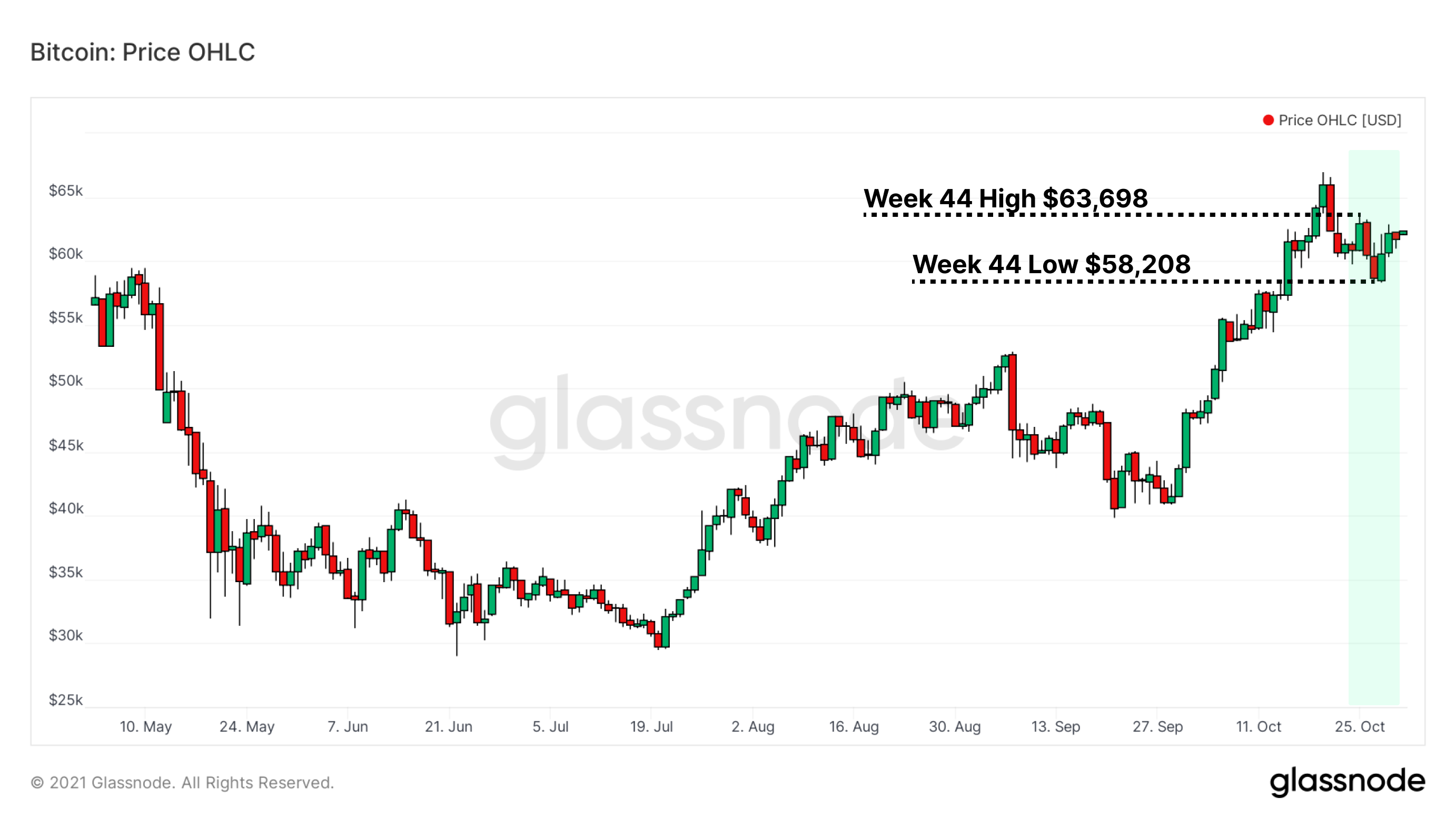
Following an exciting week that set a new all-time high for Bitcoin, the closing days of October have seen price pull back and consolidate, with a weekly low of $58,208 and a high of $63,698.

Despite the market softening from the highs and price dipping briefly below $60k, Bitcoin is still up a sweltering 40% in the month of October, motivated in part by excitement over the launch of the ProShares Bitcoin Strategy ETF ($BITO). That mark of +40% is the highest single month of gains for BTC since December 2020. In fact, the total price range of Octobers monthly price candle (including wicks) was $23,205, larger in USD value than Bitcoin's entire price range from genesis to December 2020.

Live chart

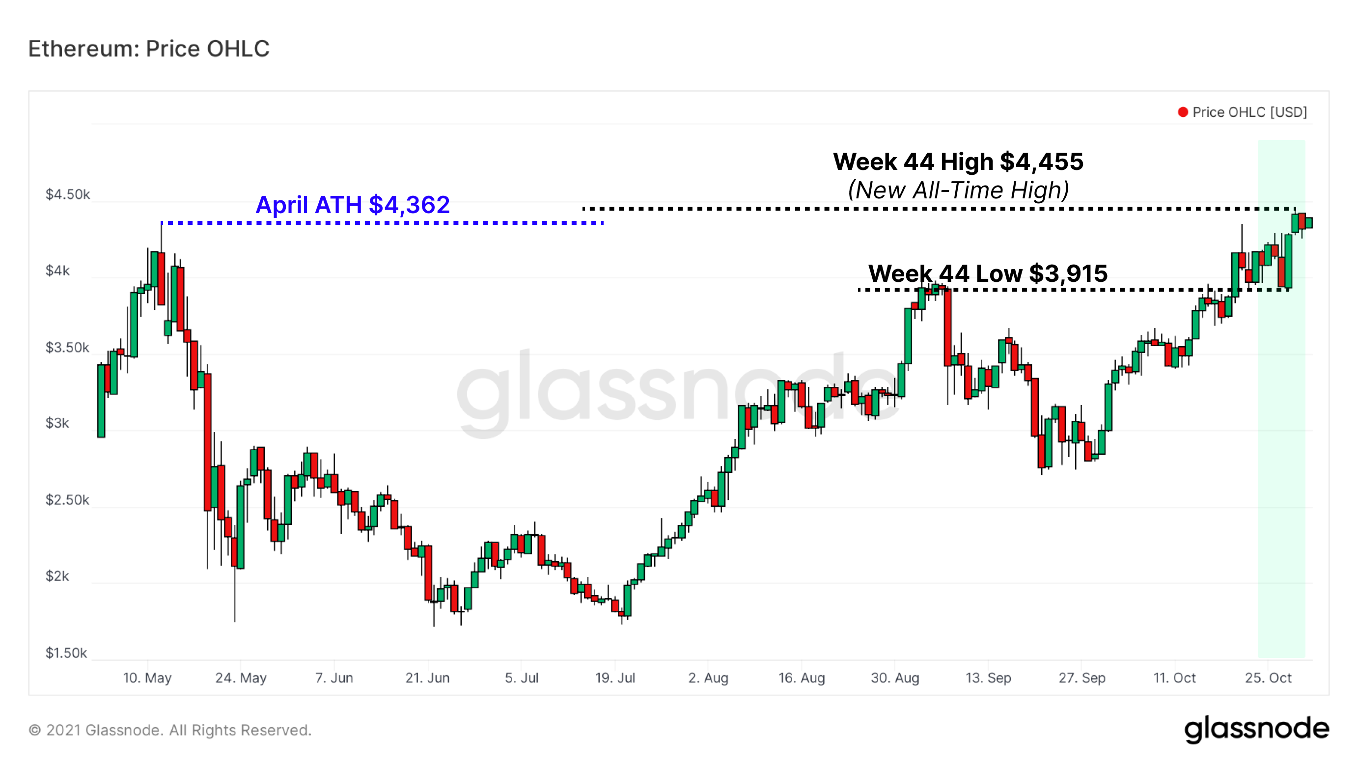
Bitcoin hasn't been the only performer— Ethereum also made a new all-time high this week of $4,455, eclipsing the previous high water mark of $4,362 set on May 12.

Live Chart

Week On-chain Dashboard

The Week On-chain Newsletter now has a live dashboard for all featured charts here. We have also started production for Week On-chain video analysis to provide a deeper dive into the thesis and logic behind each weeks analysis. Visit and subscribe to our YouTube channel, and visit our Video Portal to see our video content.


Profit and Spending Levels Are Muted

When new highs are made, the behavior of holders and the profit-taking activity of investors can inform us about the health, and sentiment of the market. SOPR (Spent Output Profit Ratio) is the profitability of spent Bitcoin relative to the realised value on a daily basis. Here we ignore coins younger than 1-hour by employing Adjusted SOPR (aSOPR), to filter out day trading noise and relay transactions.

The current levels of spent profit taking on-chain are mild considering the all-time high was broken ten days ago, and resemble the activity of an early bull market. It appears that current holders are by and large unwilling to move their coins here, and are waiting for higher prices. Positive aSOPR during consolidation or upwards price action is constructive as it suggests the market can absorb the sell-side whilst maintaining price support levels.

Live chart

A lot of attention is paid to the Long-Term Holders, but their high time preference counterparts (the Short-Term Holders) can also inform us about market conditions. The standing profit level of Short-Term Holders (STH) over time is a reliable bellwether for bull/bear sentiment as STH often represent the marginal buyer/seller.

In the chart below:

  • Values over 1 (green zones) indicate that Short-Term Holders are stepping in to buy when price nears their cost basis, observed by a bounce off the black line. Sellers are finding liquidity and newer holders are holding coins at break-even or in profit.
  • Values below 1 (red zones) show periods where Short-Term Holders in the aggregate are holding coins at a loss. When the black line acts as overhead resistance, it means the Short-Term Holder group is unable to pull themselves into a state of profit.
Live chart

Another perspective of on-chain profitability is via the Net Unrealized Profit/Loss metric (NUPL), filtered below to include only Long-Term Holders (LTH). This is the total standing profit level of all entities that have been holding coins for at least 155 days.

The NUPL zone between 0.50 and 0.75 (meaning LTH are sitting on 50-75% net profit) has historically been a pivot spot for the market. When LTH test this zone and stand firm by not selling, price tends to rally higher in the following weeks and months.

This dynamic played out in the 2013-14 double run bull market, and also in 2017. In 2019, Long-Term Holders failed to hold and capitulated. Here again in 2021, Long-Term Holder NUPL is looking for support out of this key zone. In each previous instance where LTH-NUPL exited this zone higher, price was breaking the all-time high.

Live chart

Leveraged Long Traders Take Losses

With the launch of the ProShares Bitcoin Strategy ETF in the same week as all-time highs, activity in the futures market has been heavy and bustling. Although the ETF exists in the traditional expiring contracts market, activity has also been volatile in perpetual swaps where the funding rate governs premium rates.

A positive funding rate means that longs (betting on price to rise) have an imbalance of leverage to their side, and those traders pay a premium to shorts for the privilege of keeping their positions open. Divergences between funding bias and price can highlight risks for traders taking the other side, especially when open interest is elevated.

  • If funding is positive and price continues to rise, then the premium is aligned with sentiment, and is the cost of doing business.
  • If funding is positive and price goes sideways/down, leveraged long traders betting against price are uniquely vulnerable to liquidations.

The chart below shows moments of price weakness (red arrows) following rises in funding (blue arrows), and the subsequent de-leveraging (orange arrows) that occurs when losing positions are closed out. At the moment, funding rates are declining alongside price, suggesting that leveraged traders are taking a more cautious approach, which is a healthier position for the market by and large.

Live chart

Larger amounts of long liquidations tend to follow moments of high positive funding that are met with sideways or declining price. In turn, cascading short liquidations can occur when negative funding rates (indicating an abundance of short leverage) meet rising price.

In the chart below, the red arrows from the funding rate chart above have been carried over, demonstrating the liquidation waves that follow divergences between funding and price. Of note are the $3.5 million in long liquidations that occurred hourly after the ATH break on October 21-22. Some traders went long immediately upon reaching price discovery and were quickly swatted down.

Coincident with our funding rate observation above, liquidations have slowed down in the last few days, suggesting leveraged traders are taking more care with their positions and exposure.

Live chart

The last futures related chart we'll peek at today is the percentage of crypto-margined futures, declining precipitously since the spring 2021 highs. Futures contracts can be collateralized in two ways: crypto or cash.

  • Cash-margined futures are placed with cash or cash equivalents, like stablecoins pegged to the US dollar. These tend to be more stable collateral assets than their crypto counterparts.
  • Crypto-margined futures are placed with crypto assets like Bitcoin. In these contracts, a trader's risk and collateral are based on the same asset, thus the same volatility (i.e. BTC). If both the position and hedge are losing value, a trader has little wiggle room before liquidations set in, compounding risk but multiplying the potential reward.

Since the fervour of the spring 2021 bull run, crypto-margined futures contracts have been on the decline, falling from an average around 66-69% down to 46% today. This means that over half (54%) of futures contracts presently are margined with cash or cash equivalents, reducing the effects of compounded volatility.

Live chart

Supply and Network Dynamics Look Bullish

The RVT Ratio, initially presented by Glassnode's own Checkmate, aims to compare the dollar value transferred on the network to its relative valuation. As an on-chain to on-chain ratio, RVT offers a consistent and reliable oscillator for bull/bear cycles. We look at it here as one of our recently released Community Workbench charts.

  • Lower RVT values mean transfer volume USD, and thus network usage, is growing relative to Realized Cap (the network's on-chain cost basis). This can be interpreted as a bullish signal.
  • Higher RVT values means that network transfer volume is lower in relation to Bitcoin's realized value (Realized Cap), suggesting that network valuation is outpacing its demand utility. This is typically a bearish signal.

The RVT Ratio is currently trading at relatively historic lows, which indicates that the transaction volume throughput of the network is quite high relative to the value 'stored' in Bitcoin, and is a macro bullish signal.

Live chart

Supply dynamics are frequently a leading indicator of shifting HODLer sentiment. As prices pushes to new highs, older coins come back to life, seeking exit liquidity to realize profits. The Spent Volume Age Bands (SVAB), filtered below to show only spent coins older than 1-month, have ticked up recently into bullish territory (>6% of daily volume). This follows a September which saw some of the quietest activity for this cohort in recent history (<2% of daily volume).

Live chart

To corroborate the increased daily spent volume of coins older than 1-month, we look to Average Spent Output Lifespan (ASOL)— the average age of all spent outputs over time, ignoring volume. Likewise to the bullish spike in SVAB we just mentioned, ASOL has seen an uptick over the 40-day average line, which typically aligns with price volatility in either direction.

Live chart

When combining the observations of increased old coin activity with the muted levels of profit-taking covered earlier, a bullish on-chain portrait is being painted. If Bitcoin can maintain an environment of low selling, price may find itself back in price discovery before long.


Product Updates

  • Added cummean & cumstd functions to Workbench
  • Added community charts as Workbench pre-sets.
  • Improvements to Binance exchange data.

Disclaimer: This report does not provide any investment advice. All data is provided for information purposes only. No investment decision shall be based on the information provided here and you are solely responsible for your own investment decisions.