The Week Onchain (Week 46, 2021)

Bitcoin breaks to new all-time-highs as the on-chain dynamics reach an inflection point. We analyse changes in spending patterns, and identify tools for navigating bull market tops.

The Week Onchain (Week 46, 2021)

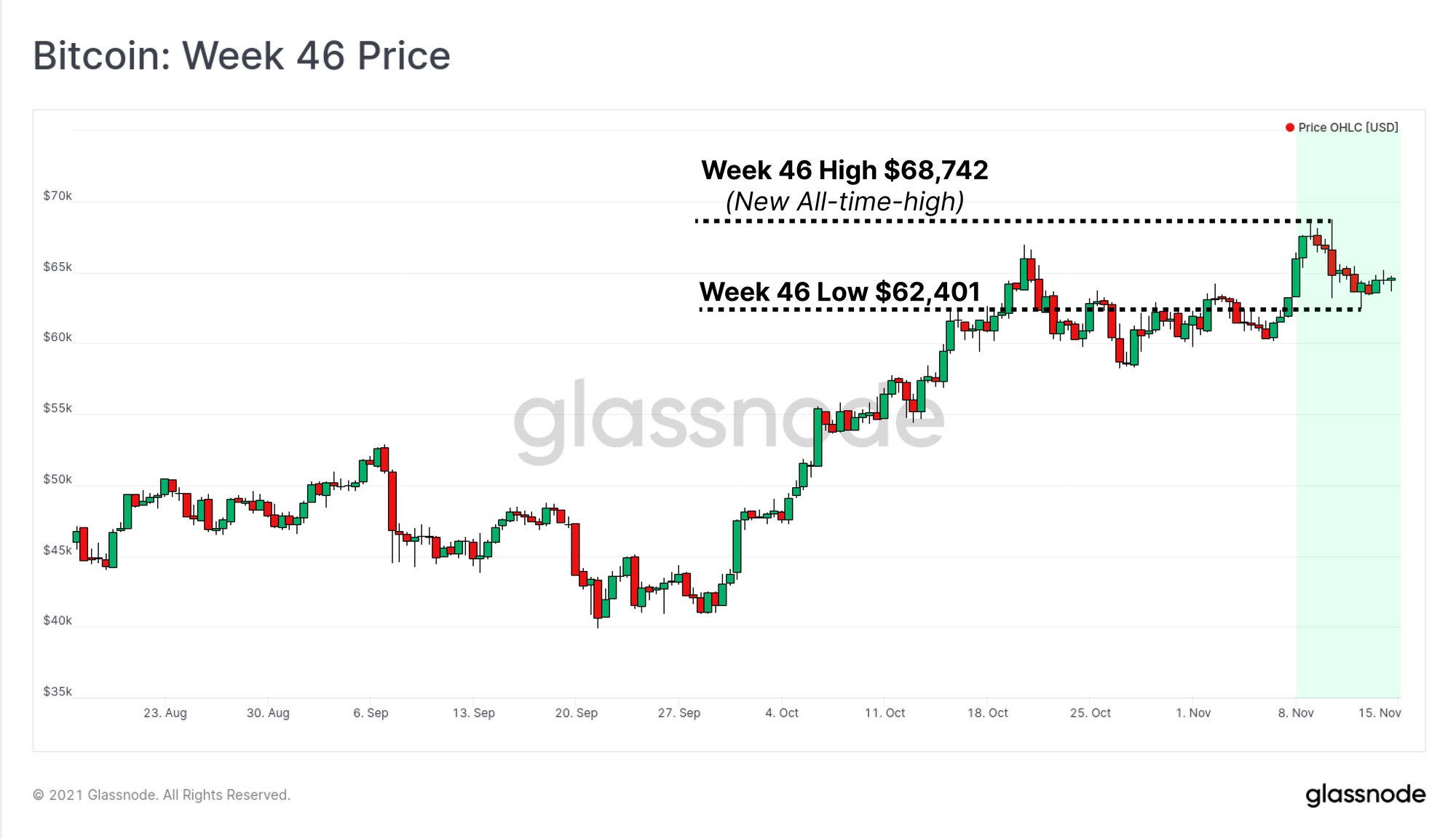
The Bitcoin market pushed to a yet another ATH this week, peaking at $68,742, before pulling back to a low of $62,401. The market is currently consolidating, having held onto the majority of the gains, and finding support at this new altitude. This week also saw the activation of the Bitcoin Taproot upgrade, a remarkable achievement for the network, contributors, and BTC holders. Congratulations.

This week, we will analyse three core concepts within on-chain analytics; describing an inflection point in capital inflows, spending patterns, and tools to help navigate the next phase of the bull market. We assess:

  1. Increasing spending by long-term holders and the macro impact on coin-days destroyed.
  2. Estimating the magnitude of capital inflows as new investors buy distributed coins.
  3. Models for identifying market cycle tops, using both historical mean reversion methods, and observations of on-chain spending.

Week On-chain Dashboard

The Week On-chain Newsletter now has a live dashboard for all featured charts here. We have also started production for Week On-chain video analysis to provide a deeper dive into the thesis and logic behind each weeks analysis. Visit and subscribe to our YouTube channel, and visit our Video Portal to see our video content.


Spending Inflection Point

In last weeks newsletter, we described two typical phases of a bull market, and how market structure transitions from smart money accumulation, into distribution.

One of the most powerful on-chain tools to track this inflection point is the concept of lifespan, measured by coin-days destroyed (CDD). Each unit of BTC accumulates one coin-day, per day (i.e. 0.5BTC accumulates half a coin-day per day). When the coin is spent, the accumulated lifespan is destroyed, reset to zero, and begins re-accumulating again.

When old coins with large accumulated lifespans are spent, it will destroy a greater number of coin-days, and is often associated with long-term investors exiting positions. Bull markets can usually absorb many months of this distribution, but as selling continues, the probability of establishing a local or global top increases.

The chart below shows the 30d moving average of CDD, and demonstrates the transition from heavy accumulation in July to Nov, into a recent uptrend, signifying increased spending. Note also how the magnitude of CDD in H1 2021 was significantly higher, and was sustained for months. This highlights how an abundance of demand through a bull is capable of soaking up newly distributed supply.

Live Chart

Binary CDD, with a 7-day moving average applied, shows these trends in a more responsive format. This metric will trend higher when CDD is higher than the long term average for extended periods. We can see that whilst it is currently elevated, Binary CDD is barely above a value of 0.2, which has parallels to Sept-Nov 2020 before the primary bullish impulse. Spending of older coins is happening, although remains small in relative magnitude.

Live Chart

On a macro scale, we look to Liveliness which takes the ratio between cumulative coin-day destruction, and cumulative coin-day creation. The simple interpretation is:

  • Liveliness trends lower when more coin dormancy and HODLing is in play.
  • Liveliness trends higher when more coin-day destruction and spending is in play.
  • Steeper curves mean greater HODLing/Distribution as appropriate.

Here we can see that after 6-months of HODLing (downtrend, green), Liveliness has plateaued and started a very slight uptrend. Similar to CDD and Binary CDD, this uptrend is only just being established, and far shallower than was seen in H1 2021. It again speaks to this inflection point in spending behaviour by older hands.

Live Chart

A new metric introduced to Workbench as a pre-set this week is Binary Liveliness. Borrowing concepts from Binary CDD, this metric establishes a similar oscillator to identify trends of accumulation (0) and distribution (1) using two methods:

  1. Green: When Liveliness is higher than the 30DMA, return 1, else return 0.
  2. Blue: When Liveliness is higher than the prior day, return 1, else return 0 (with a 7-day moving average applied)

Again, we can observe an uptick over recent weeks confirming an appreciable increase in coin-day destruction. However, like our previous charts, it remains modest in magnitude. If the next phase of the bull market is indeed in place, this metric can be expected to reach and maintain higher levels for weeks to months.

Live Chart

Estimating Capital Inflows

We have established that spending behaviour by more experienced investors has increased of late. The next step is to estimate the magnitude of sell-side pressure, and thus the capital inflows needed to absorb it. Whilst a large amount of trading occurs off-chain on spot and derivatives exchanges, we can layer in on-chain datasets to establish a lower-bound of capital inflows and outflows to the network.

One of the most intuitive examples of this is the Realised Cap (entity-adjusted in this case to filter out internal transfers). This metric values every coin in the supply at the price it last moved on-chain, reflecting the accumulation of net realised profits minus losses. Each time a coin is moved at a profit it will add value to the realised cap. Conversely, realised losses will subtract from it, reflecting capital outflows.

The Realised Cap has resumed an uptrend and reached an ATH of $450B, as coins are distributed, and revalued higher. This represents a net capital inflow of $50B since the previous peak in May, set during the sell-off.

Live Chart

On a daily basis, the total value of coins sold at either a profit or a loss require a buyer with capital to absorb it. The chart below shows that Between $1.5B and $2.1B in total value daily is being realised by spent coins this month. Given price has largely consolidated sideways through November, we can thus estimate this as a lower bound for total capital inflow into Bitcoin.

Live Chart

On a relative basis, we can then compare this total realised value to the Market Cap or the Realised Cap to normalise by market size. This establishes a simple oscillator for total capital inflow vs network valuation.

Previous market tops (namely 2017 and 2021) occurred when total value realised by spending exceeded 0.3% of the market cap, and 1.0% of the Realised Cap (often reaching much higher). In the current market, spending accounts for less than 50% of these thresholds. This provides additional evidence that a healthy bull market demand should be capable of absorbing significantly more coin distribution.

Live Chart

Finding Market Tops

Identifying Bitcoin market tops is no easy feat. However, with over a decade of on-chain and market data at our disposal, we can use tools to identify behaviours and cyclical patterns that signalled market tops in the past.

The first tool is the Mayer Multiple, calculated as a simple yet effective ratio between price, and the 200DMA. Using statistical methods, we can establish that a Mayer Multiple value of 2.4 reflects an unlikely extreme, where price has rallied to 2.4x the long-term, and well observed 200DMA. This provides an upper pricing band, currently sitting at $110k, although it will trend higher (or lower) as the 200DMA price changes.

Live Chart

The Top Price model was originally created by Willy Woo and is an empirically fitted model, multiplying the all time Average price ($6.1k) by a factor of 35. This gives a current cycle top value of $214k. Note that the all-time-average price is much slower to change than the 200DMA, and thus the Top Price will be a less volatile top model.

Live Chart

Next is the battle tested MVRV Z-Score metric. Using statistical normalisation, this metric measures how many standard deviations the spot price is away from the realised price.

Another way to think about this metric is that very high values mean the market is holding large unrealised profits, and thus the incentive to sell is at a maximum. Conversely, bottoms can be found when the market is heavily underwater and investor capitulation is most likely underway. The current market is around 'half-way', after cooling off dramatically following the peak in April.

Live Chart

As bull markets progress, older hands continue to sell, and newer, less experienced buyers absorb the supply. Market bottoms are established when the smart money buys and HODLs a maximum of supply, and conversely, tops occur when large coin volumes have has transferred to mostly weak hand speculators.

The RHODL ratio captures this phenomena by taking the ratio between 1-week and 1-year old Realised Cap HODL wave bands. Simply put, it will peak when the number of very young coins is high relative to older coins. RHODL is consolidating at the moment, strangely similar to 2013, which suggests a stable equilibrium between 1-wk and 1-yr old coins.

Live Chart

Lastly we have the Reserve Risk metric, a tool that is packed full of on-chain wisdom. It can be considered as follows:

  • Higher prices increase the incentive to sell.
  • Every day a HODLer chooses not to sell, they sacrifice opportunity cost, with the expectation that prices will be higher in the future.
  • When more HODLers choose not to sell, fewer coin-days are destroyed, and Reserve Risk will trend lower.
  • As prices rise, more HODLers will eventually reach their target sell price. As a result, more coins are sold, opportunity cost is realised, and Reserve Risk will trend higher and peak at blow-off tops.

Given the remarkable accumulation that occurred over the last 6-months, Reserve Risk is impressively low at the moment. However recently elevated CDD is starting to resume the uptrend, although with plenty of gas left in the tank.

Live Chart

Product Updates


Disclaimer: This report does not provide any investment advice. All data is provided for information purposes only. No investment decision shall be based on the information provided here and you are solely responsible for your own investment decisions.