Mastering the MVRV Ratio
The MVRV Ratio is one of the most popular and widely used on-chain metrics, however, much of the power of MVRV is rarely put to use. In this paper, we will explore how MVRV can be supercharged to find cycle extremes, identify market trends, and get advanced warning of sell-side distribution.
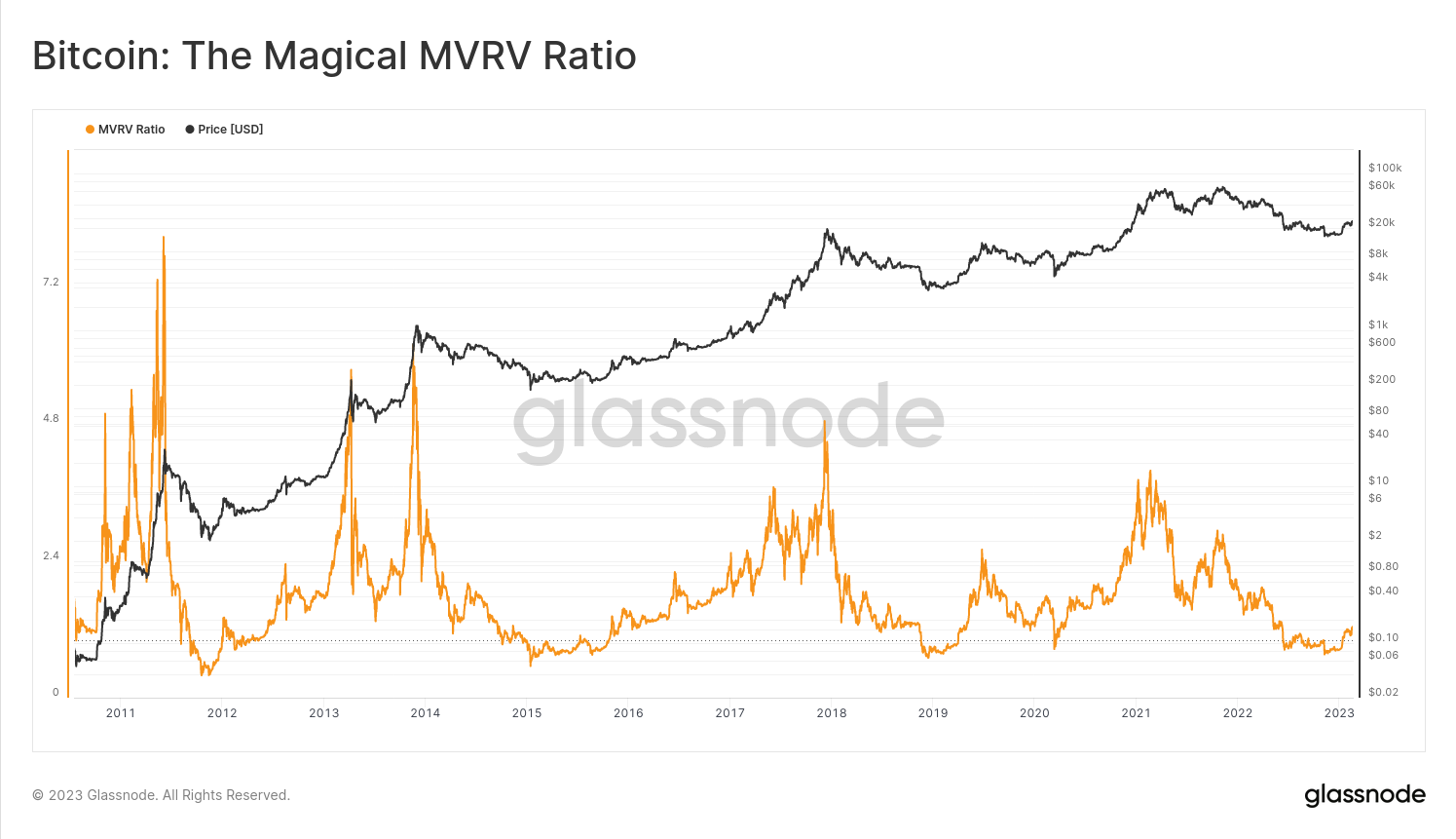
The MVRV Ratio is one of the most popular and widely used on-chain metrics. It was first conceived by on-chain pioneers Murad Mahmudov and David Puell, in a paper released in October 2018, and has become a staple Bitcoin analysis tool ever since.
The MVRV Ratio is often viewed as a macro oscillator, useful for exploring Bitcoin market cycles, and particularly for spotting tops and bottoms. Whilst this is true, the MVRV is actually a far more nuanced, and information dense metric than many analysts realize.
In this piece, we explore the MVRV Ratio, starting at the foundations, but travelling right through to more advanced insights. Our goal is to demonstrate the mechanics that make MVRV tick, and explore what makes this indicator such a powerful tool in our belt. We will cover three topics:
- Exploring Extreme Values of the MVRV for spotting cycle tops and bottoms.
- MVRV Momentum and how to use the indicator to track macro bull/bear trends.
- Distribution Divergences showing how MVRV often gives advanced warning of cycle tops that are experiencing heavy distribution (sell-side pressure).
🪟 All charts covered in this article are available for Advanced and Professional members in a live Dashboard.
Re-introducing MVRV
MVRV is shorthand for Market Value (MV) to Realized Value (RV), and is the ratio between Price, and the Realized Price. Since the Realized Price is the average price at which every coin last moved on-chain, MVRV can be thought of as a measure of 'Unrealized Pofit' held within the supply.
- A MVRV of 2.2 means Price is 2.2x the Realized Price (120% Profit)
- A MVRV of 1.0 means Price is equal to the Realized (Break-Even)
- A MVRV of 0.8 means Price is 0.8x the Realized Price (-20% Loss)
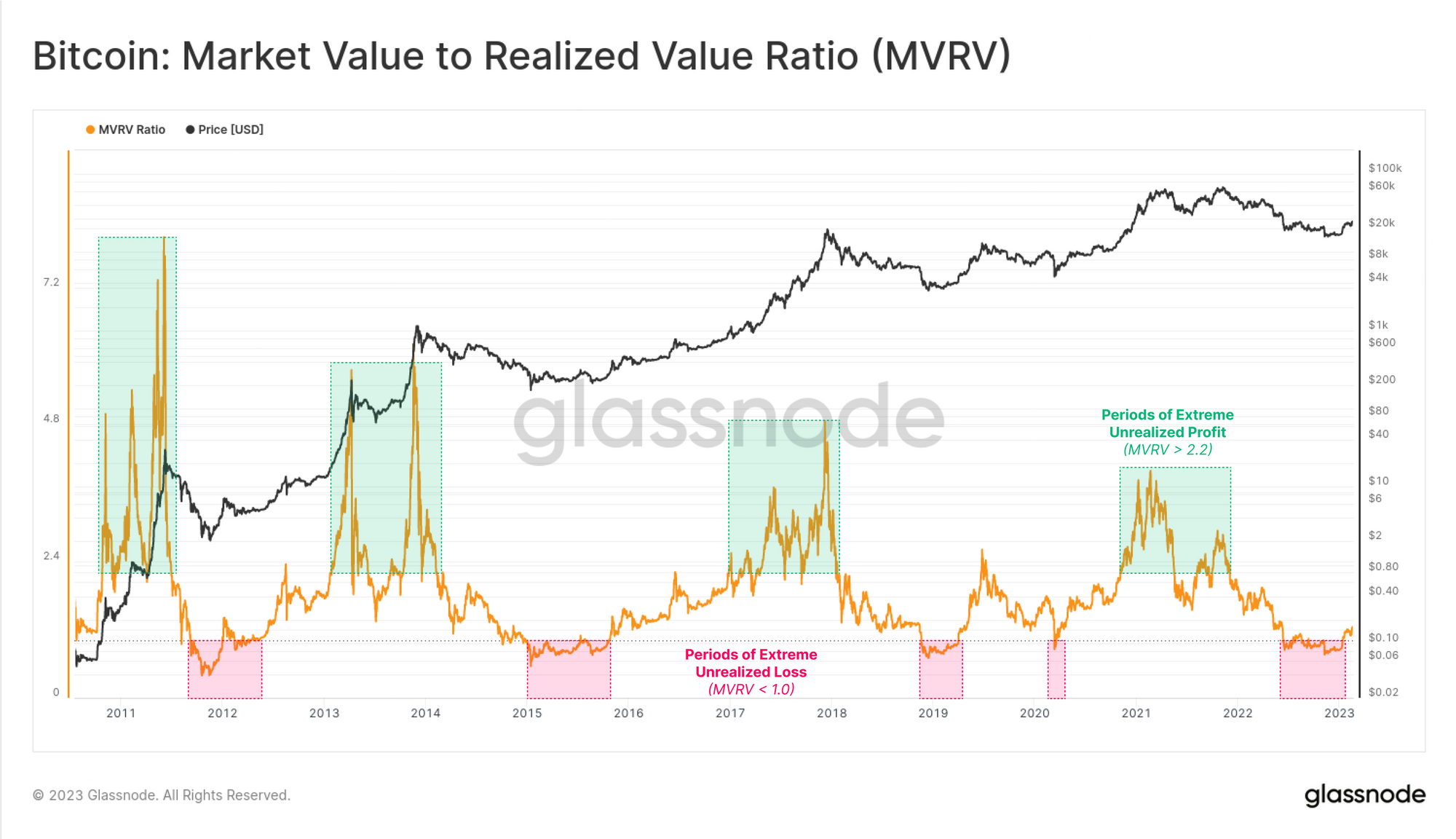
The chart below shows the MVRV ratio, and roughly shows the euphoric periods of extreme unrealized profit in bulls 🟩, and the painful periods of extreme unrealized loss in bears 🟥.
- High MVRV Values (> 2.4) ↗️ indicate the market holds large unrealized profits.
- Low MVRV Values (< 1.0) ↘️ indicate the market holds unrealized losses.
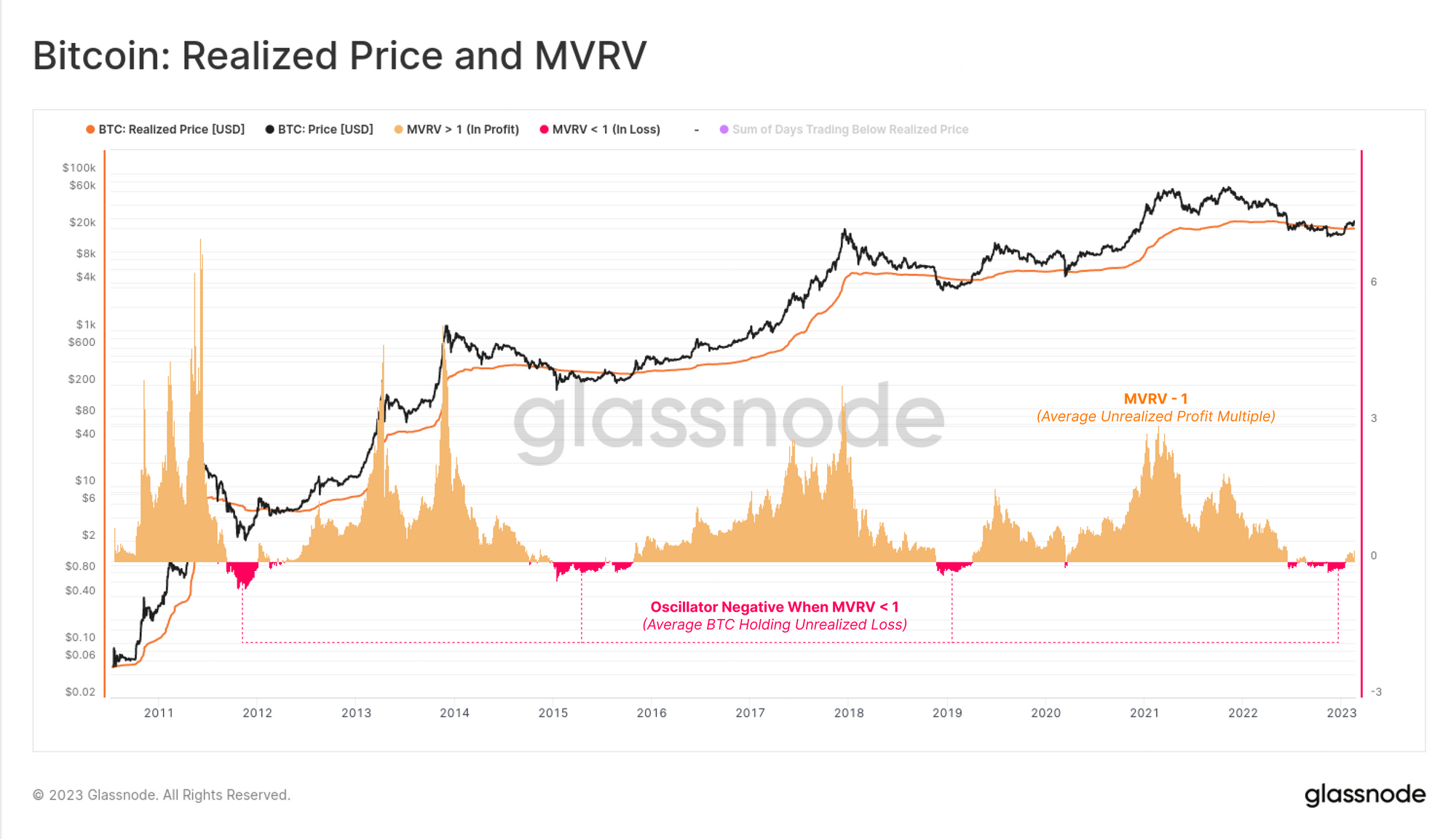
An average profit percentage held by the market can be calculated as MVRV - 1.
The chart below shows the oscillator in this format, and in particular highlights periods when MVRV is below 1, and the average Bitcoin holder is underwater 🟥, and the average coin was acquired above the current spot price.
Such events are relatively uncommon, and typically occur during the later stages of prolonged bear markets. These large unrealized losses often precipitate widescale capitulation events, and are historically associated with the formation of cycle lows.
Exploring Extreme Values
The next question is, what classifies as a high, and a low value of MVRV? How can we measure extreme deviations associated with cycle tops and bottoms?
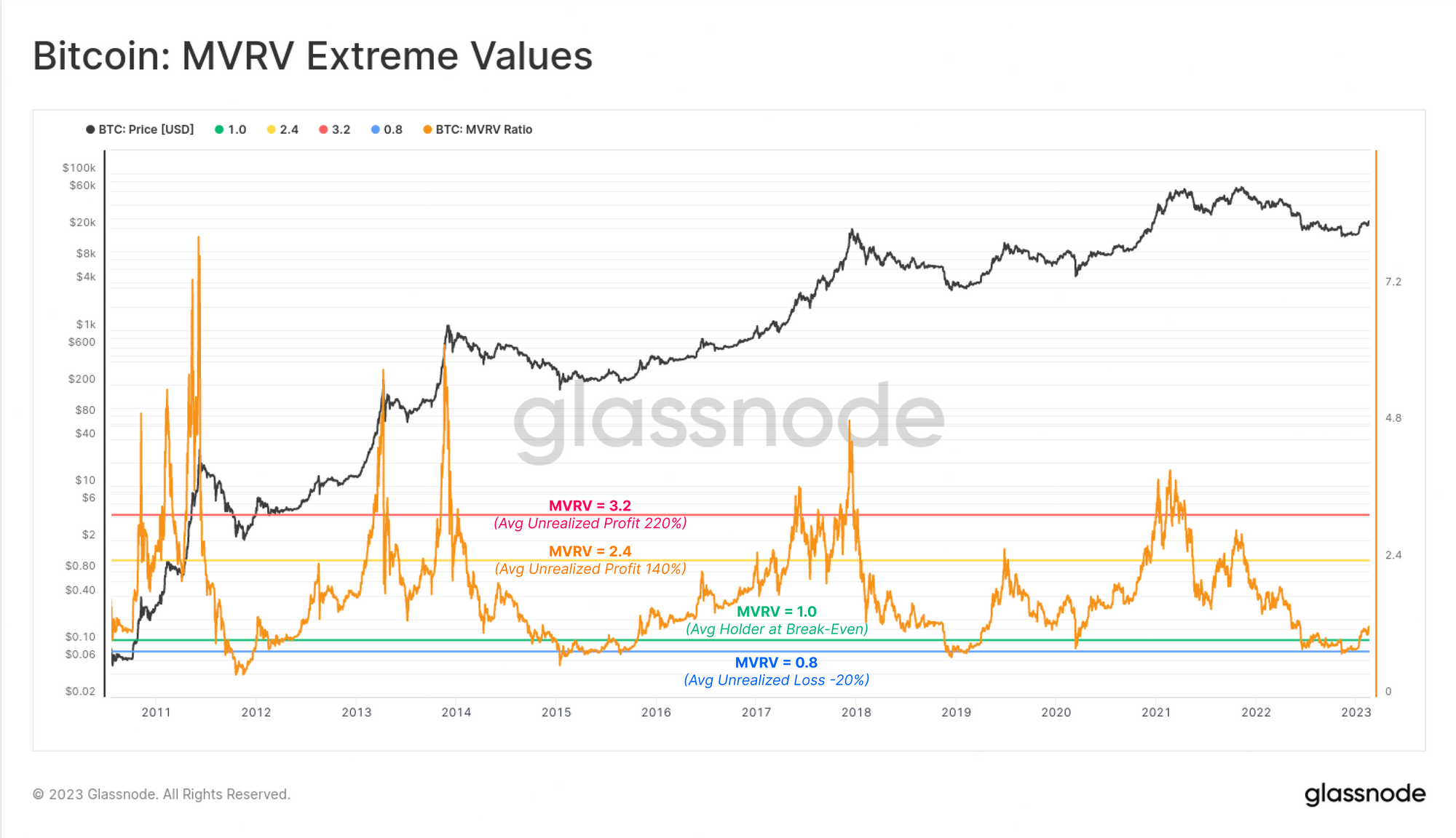
First we will start visually, where we have marked out MVRV levels at 0.8 🔵, 1.0 🟢, 2.4🟠, and 3.2 🔴. These appear, at least initially, to align well with tops and bottoms. However, we will need to make this analysis a little more robust than eyeballing levels in if we want to properly master the MVRV.
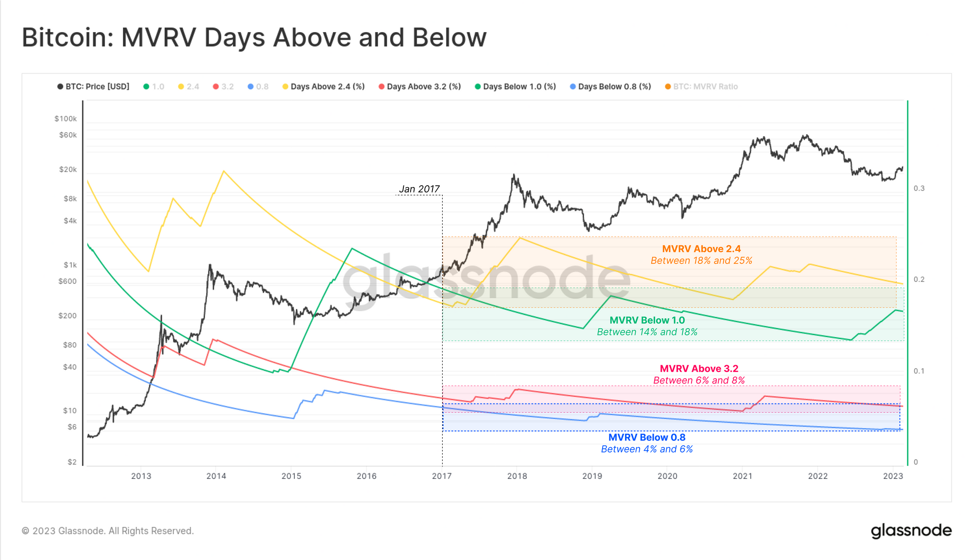
A simple approach is to calculate the proportion of days through history where MVRV has traded below, or above these levels. We can calculate and show this using Workbench, and will consider only dates since 2017, aligned with a more mature Bitcoin market. If MVRV has only been below a particular level for 10% of trading days, that means it has been above it for the other 90%, making that scenario more likely.
Now we can better quantify how likely it is for these MVRV levels to be breached:
- 🔵 Extreme Lows: MVRV has been Below 0.8 for around 5% of trading days.
- 🟢 Getting Low: MVRV has been Below 1.0 for around 15% of trading days.
- 🟠 Getting High: MVRV has been Above 2.4 for around 20% of trading days.
- 🔴 Extremely High: MVRV has been Above 3.2 for around 6% of trading days.
🗜️ Workbench Tip: These charts are developed using using a combination of an IF-THEN conditional, and a cumulative sum function in Workbench.
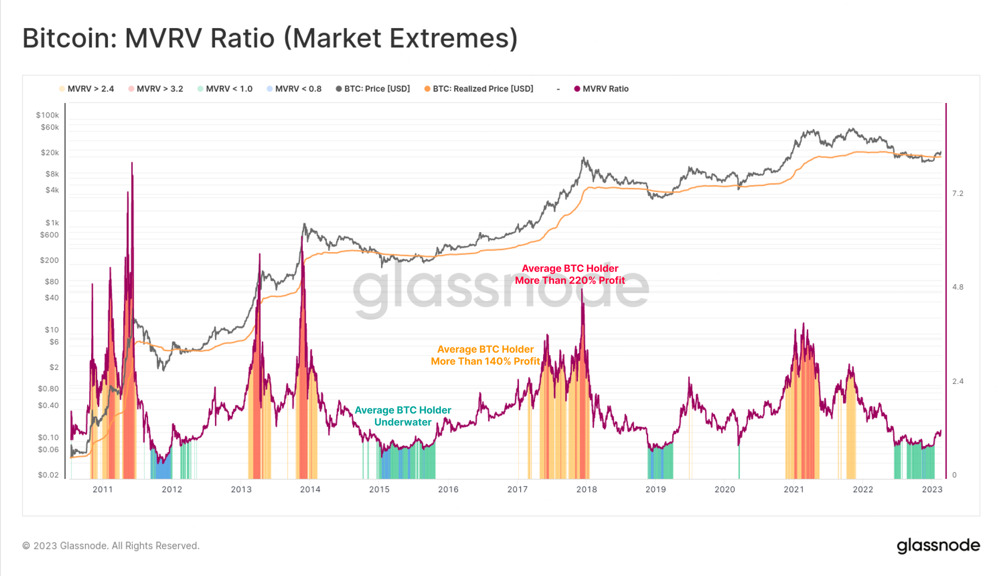
If we chart out periods when MVRV is above/below these key levels, we can start to spot cycle tops and bottoms.
- 🔵 Cycle Lows typically form if MVRV is below 0.8 (~5% of trading days below)
- 🟢 Capitulation Starts when MVRV is below 1.0 (~15% of trading days below)
- 🟡 Euphoria Starts when MVRV is above 2.4 (~20% of trading days above)
- 🔴 Cycle Peaks typically form if MVRV is above 3.2 (~6% of trading days above)
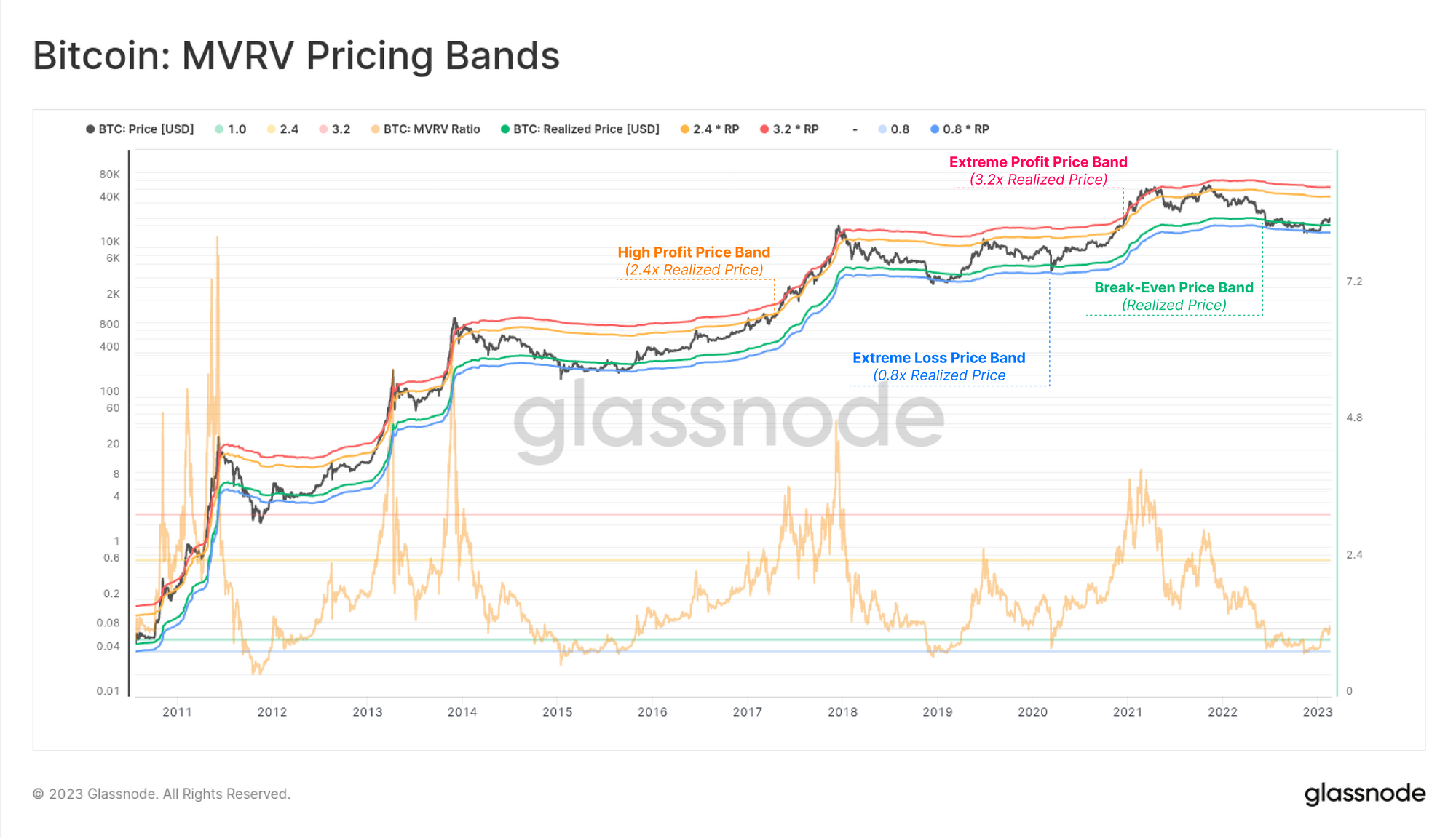
Now that we have defined a set of 'extreme levels' for MVRV, we can visualize these as pricing bands. If the MVRV Ratio equals 2.4, that means the corresponding pricing band is 2.4x the Realized Price.
This tool now allows us to estimate price levels where the market would reach an extreme unrealized profit (high values), or unrealized loss (low values). Reaching these prices may increase the likelihood that investor behavior is triggered (like profit taking, or capitulation), which ultimately is what establishes the cycle top/bottom we are looking for.
For a more advanced, but statistically robust approach, we could also calculate the all-time-average MVRV, and use +/− 1 standard deviation bands to spot extremes. This provides an even more robust and statistically significant approach.
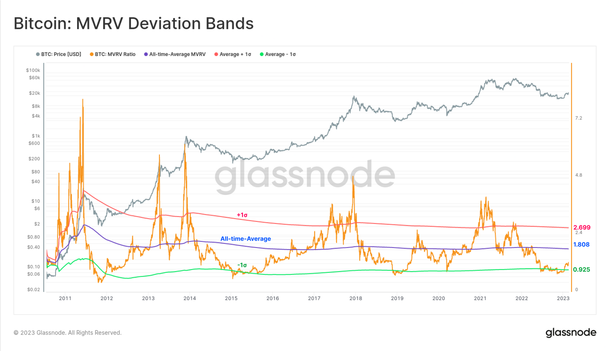
MVRV Momentum
The previous section explored using MVRV to identify cycle extremes. Next we will use MVRV as a tool for identifying macro market trends.
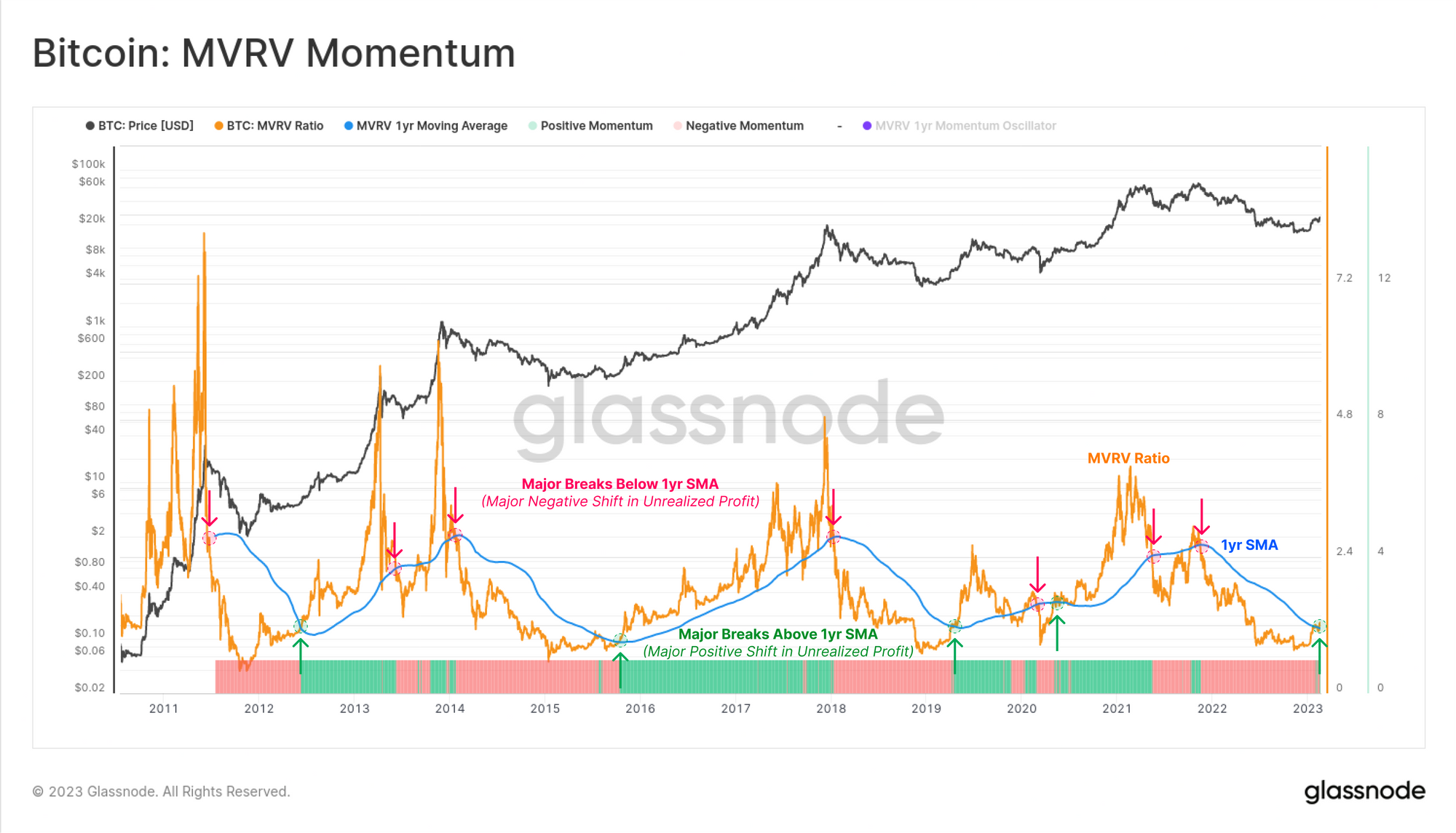
The chart below shows the MVRV Ratio 🟠 alongside the 1yr simple moving average 🔵. Note how periods where MVRV trades above the 1yr SMA typically describe bull markets, and periods below describe bears. Cycle transition points are often characterised by the MVRV breaking strongly across the 1yr SMA threshold:
- ⬆️ Strong Breaks Above 🟩 indicate large volumes of BTC was acquired below the current price, and is now in profit (describing heavy accumulation near the lows).
- ⬇️ Strong Breaks Below 🟥 indicate large volumes of BTC was acquired above the current price, and is now in loss (describing heavy distribution near the top).
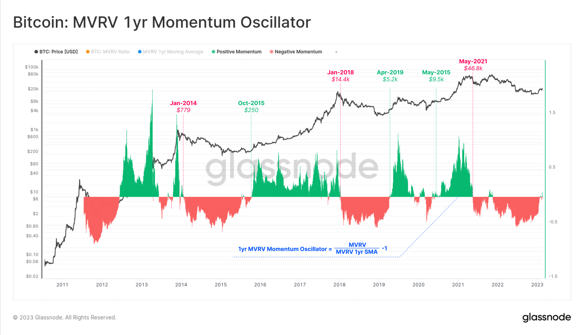
We can convert this observation into an oscillator by taking the ratio between MVRV, and the 1yr SMA. This tool is particularly useful at spotting these very sharp transitions that occur at cycle turning points.
- 🐻 Start of the Bear: Sharp declines (and negative values 🟥) mean lots of coin volume was acquired at higher prices and has fallen into a loss. This suggests a 'top heavy' market which may be sensitive to price declines.
- 🐂 Start of the Bull: Sharp increases (and positive values 🟩) mean lots of coin volume was acquired at lower prices and is back in profit. This suggests a 'bottom heavy' market following heavy capitulation, into accumulation.
Key transition points in past cycles are shown as a gauge for how responsive the MVRV Momentum Oscillator can be to macro cycle changes.
Distribution Divergences
In this last section, we will explore how the MVRV can be used to provide advanced warning when heavy distribution is taking place, often seen near market cycle tops. This occurs at both macro, and micro scales.
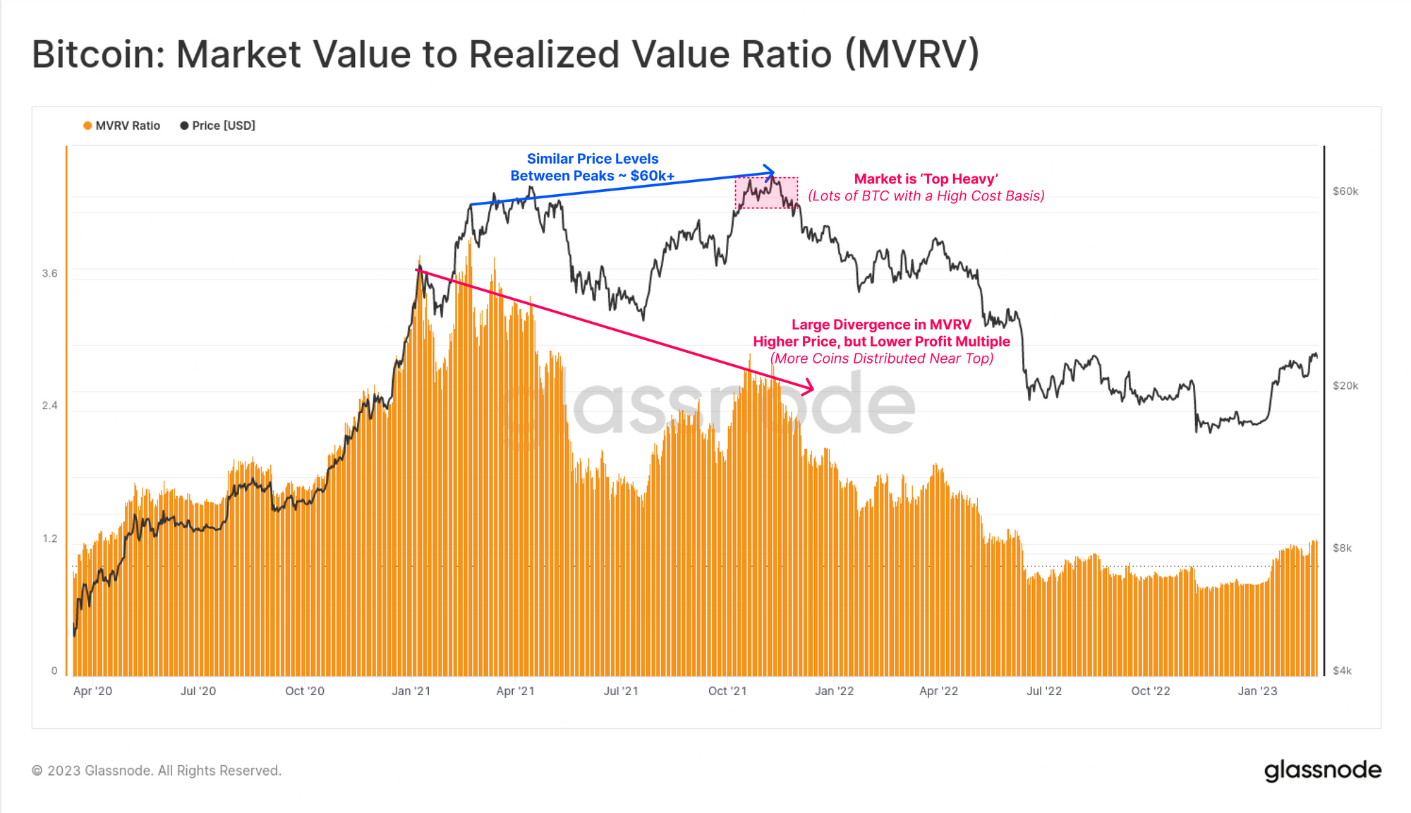
The chart below shows the MVRV ratio throughout 2020-23 cycle. We can clearly see how prices in Oct-Nov 2021 reached a higher ATH compared to Apr, but set a significantly lower MVRV peak.
How can price be higher, but the aggregate unrealized profit multiple be lower? The answer is that the average coin had higher average acquisition price in November when compared to April.
This created a macro scale negative divergence in the MVRV Ratio.
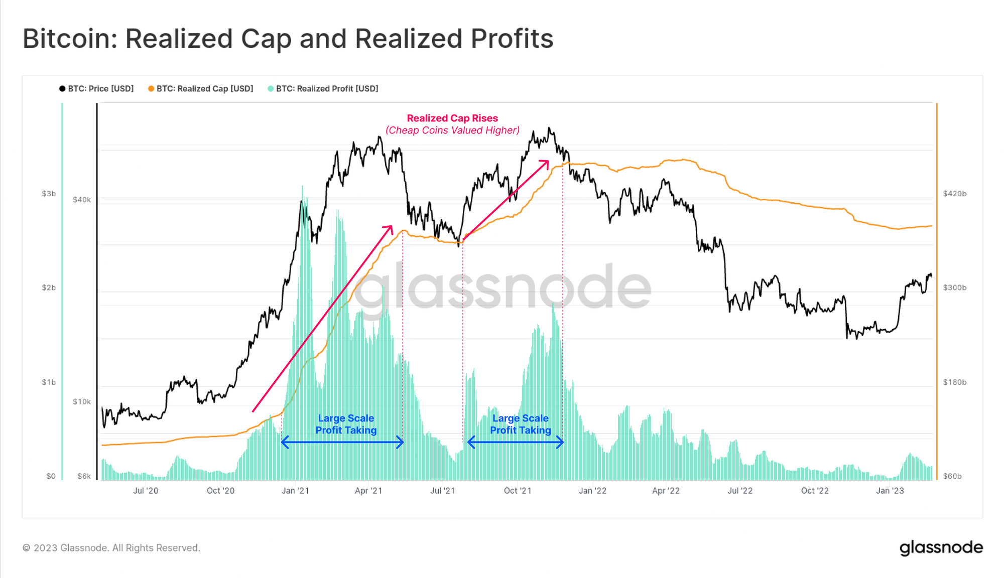
During this second July-Nov rally, a large volume of coins which were previously acquired at cheap prices (e.g during the May-July sell-off), took the opportunity for exit liquidity and transferred them to newer, and less experienced 'top buyers'. Coins were revalued from cheap realized prices, and transferred to speculators and price sensitive buyers, who now had a much higher cost basis (closer to the ATH).
The chart below shows this phenomena playing out in two metrics:
- 🟩 Realized Profits which reached levels of around $1.5B in profits taken per day in Oct-Nov, as coins acquired at cheaper prices were transferred to new buyers at more expensive prices.
- 🟠 The Realized Cap which experienced a second leg higher as a result of this profit taking behavior.
We can see that the 2022 bear market created a downtrend in the Realized Cap, as losses were locked in, and the metric returned to July levels. This represented a flushing out of all the speculative premium added between July and Nov 2021.
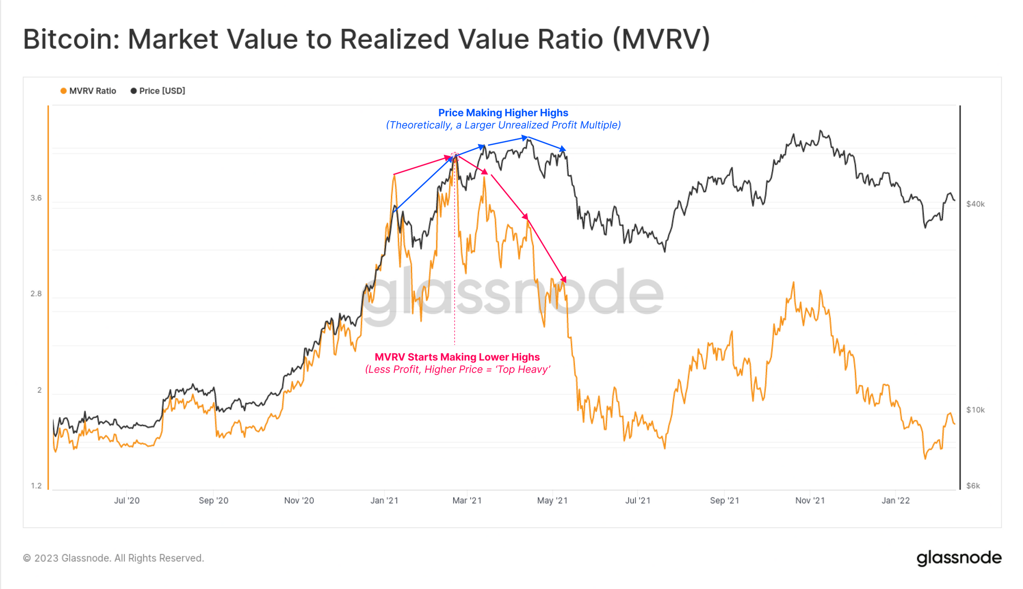
If we zoom into the Jan to May 2021 peak, we can actually see a similar negative divergence forming in the MVRV Ratio at a smaller scale. Price set sequential new highs, but MVRV was rapidly decaying to lower highs.
The aggregate profit held within the supply was diminishing, a result of large scale distribution, and profits being converted from unrealized (paper gains), to realized (locked-in).
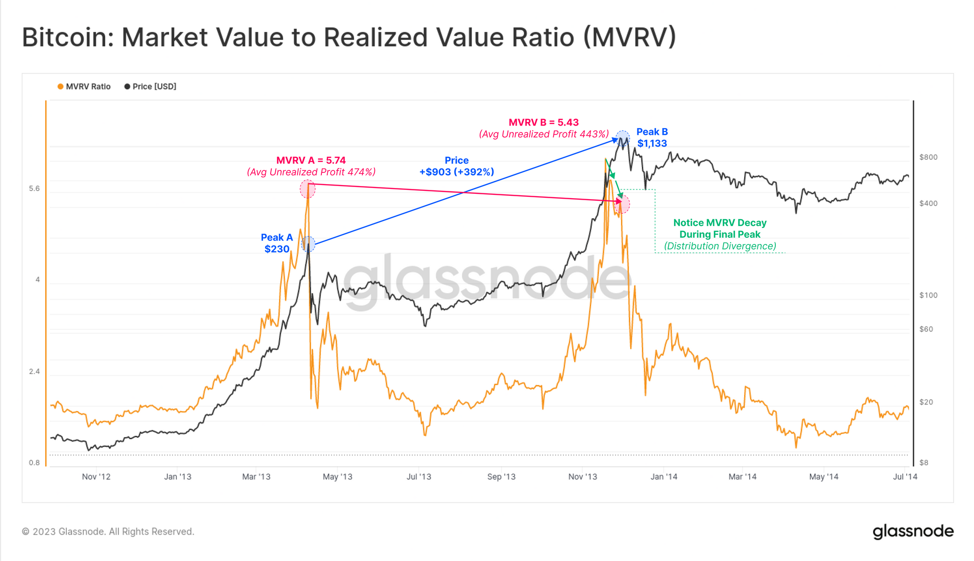
We can see a similar event between the double peaks in 2013, where prices rallied an additional 392%, yet the MVRV ratio was actually lower, falling from 5.74 to 5.43. We can see in green that there was a similar micro scale decay taking place right before the ultimate peak at $1,133.
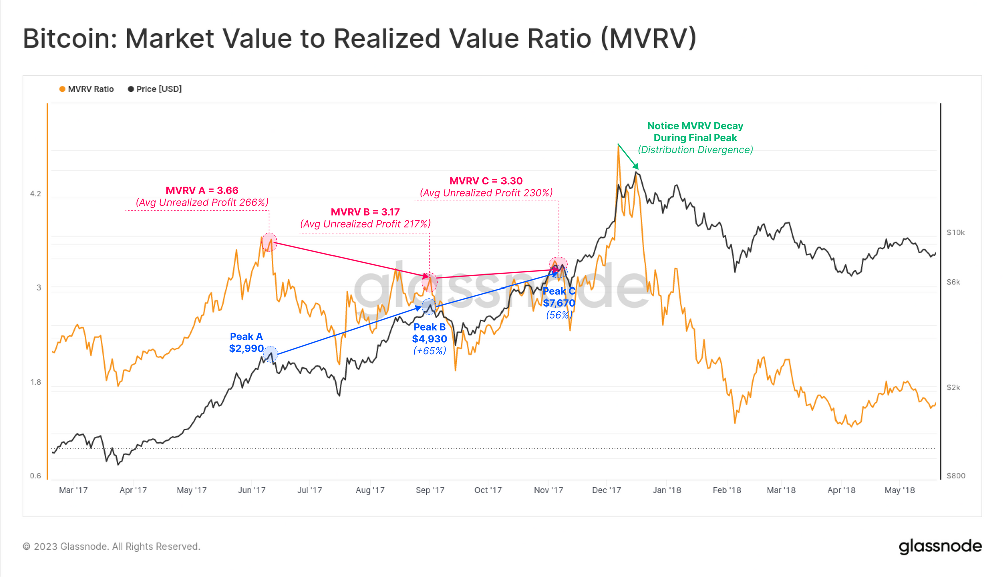
This structure was also present within the 2017 late bull cycle. As MVRV passed above our defined extreme level of 2.4, we started seeing much higher price peaks, but progressively weaker increases in the MVRV Ratio.
Note that in August 2017, the SegWit upgrade was soft-forked into Bitcoin, and many dormant BTC coins were moved to take advantage of the BCH hard-fork, which will partially influence this cycle observation.
What About Lost Coins?
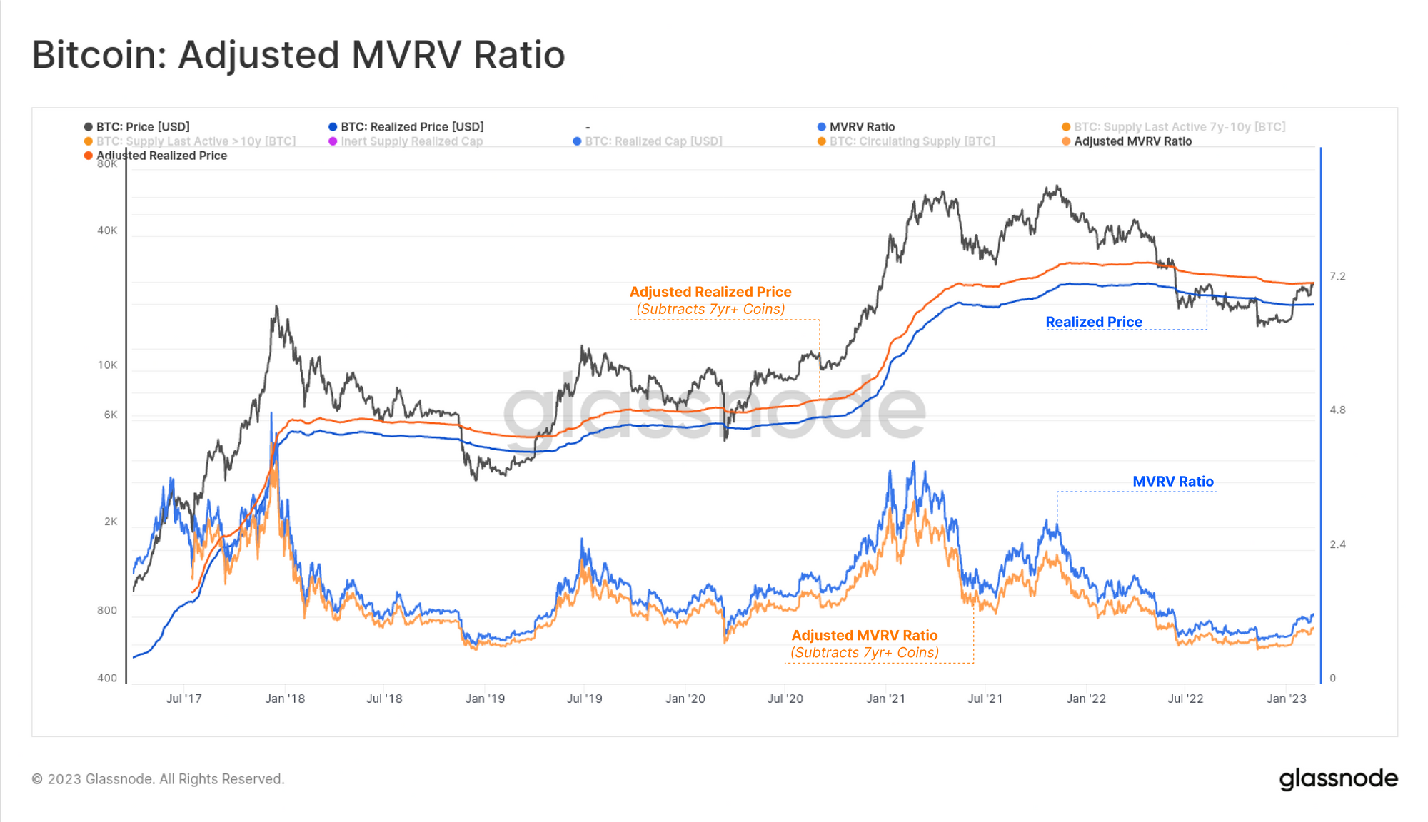
One final thought we will leave readers with, is that MVRV does carry a net bias to the upside due to the tremendous unrealized profits held by Satoshi, early miners, and lost coins. There are several methods to account for lost coins, but a simple approach is to discount coins that have remained unspent for at least 7yrs.
The chart below calculates this Adjusted-MVRV, subtracting the unrealized profits held by long dormant coins, all of which last moved at very cheap prices. The result is that we have a higher Adjusted-Realized Price that more accurately reflects the average acquisition price of 'alive supply'. This in turn results in a lower MVRV Ratio (smaller profit multiple), and provides a superior view into the liquid and mobile coin supply.
The savvy analyst can now integrate this Adjusted-MVRV Ratio with the suite of tools explored above!
Summary and Conclusions
The MVRV Ratio is a metric that is exceptionally rich with information about Bitcoin market dynamics, and investor behavior patters. MVRV is much more than a long-term cyclical oscillator, and the suite of derivatives and methods above are only scratching the surface of what is possible from such a simple construction.
Mastering the MVRV Ratio is an essential step for on-chain analysts, and once understood, opens several doors of opportunity for new iterations, derivatives, and variants.
Disclaimer: This report does not provide any investment advice. All data is provided for information and educational purposes only. No investment decision shall be based on the information provided here and you are solely responsible for your own investment decisions.
- Join our Telegram channel
- Follow us and reach out on Twitter
- Visit Glassnode Forum for long-form discussions and analysis.
- For on-chain metrics, dashboards, and alerts, visit Glassnode Studio
- For automated alerts on core on-chain metrics and activity on exchanges, visit our Glassnode Alerts Twitter


