The Week On-Chain (Week 21, 2021)
The Bitcoin market has experienced a tremendous deleveraging, with prices falling over 50%, and on-chain entities taking historical losses.


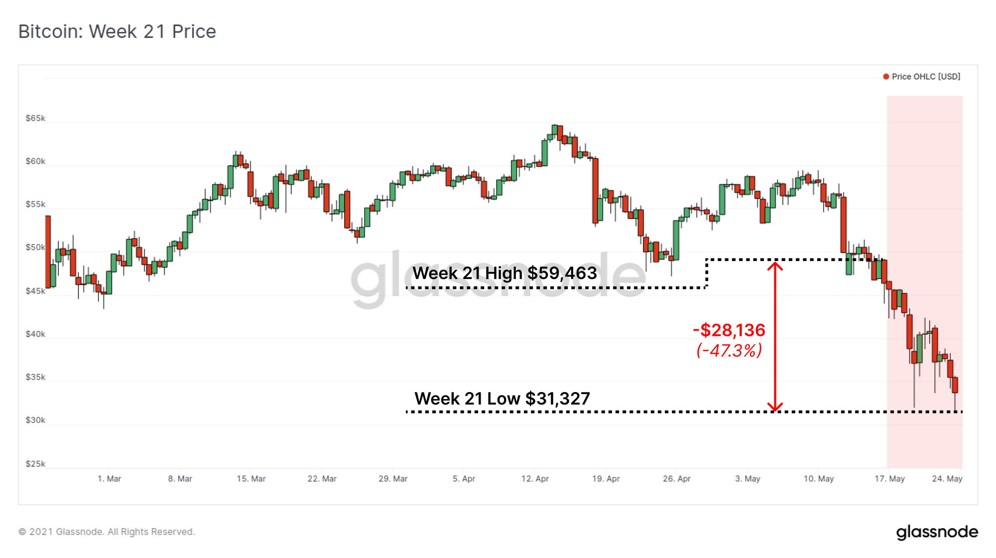
The Bitcoin market has just experienced the largest deleveraging event since the March 2020 sell-off. The market traded down by over 47% from the weekly high of $59,463, to lows of $31,327. This weekly candle is now the single largest in total price range in history, a whopping $28,136 candle.
Price action was heavily driven by what can only be described as a FUD-bath, with topics pulled form every chapter in the Bitcoin critics textbook as @nlw summarises. This sell-off has been so severe that it has raised the question in many minds as to whether the 2021 Bull Market remains in play. This week we will review the scale of the correction and the response from various entities observable on-chain.
Elon energy FUD.
— Nathaniel Whittemore (@nlw) May 19, 2021
Resurgent Tether FUD.
China ban FUD.
Used for crime FUD.
Regulatory FUD.
Welcome to "and then they fight you"...🤷♂️
A Capitulation for the History Books
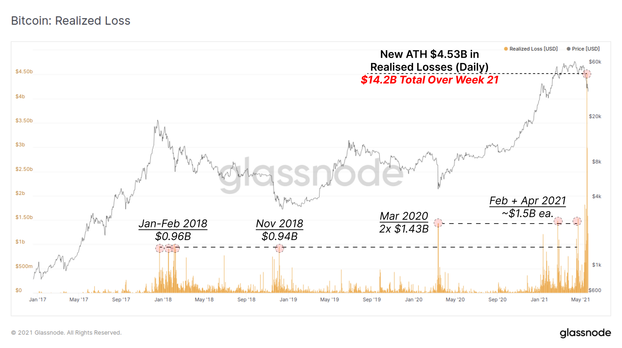
The magnitude of realised losses on-chain this week has, eclipsed all previous capitulation events, including March 2020, Nov 2018 and the sell-off that ended the last bull market in Jan-Feb 2018.
The chart below presents the USD value of losses realised by spent coins and shows that a new ATH of $4.53B in losses was hit on 19-May. This is higher than the previous spikes in Mar 2020 and Feb/Apr 2021 by over 300% and is the peak from a total weekly realised loss of $14.2B.
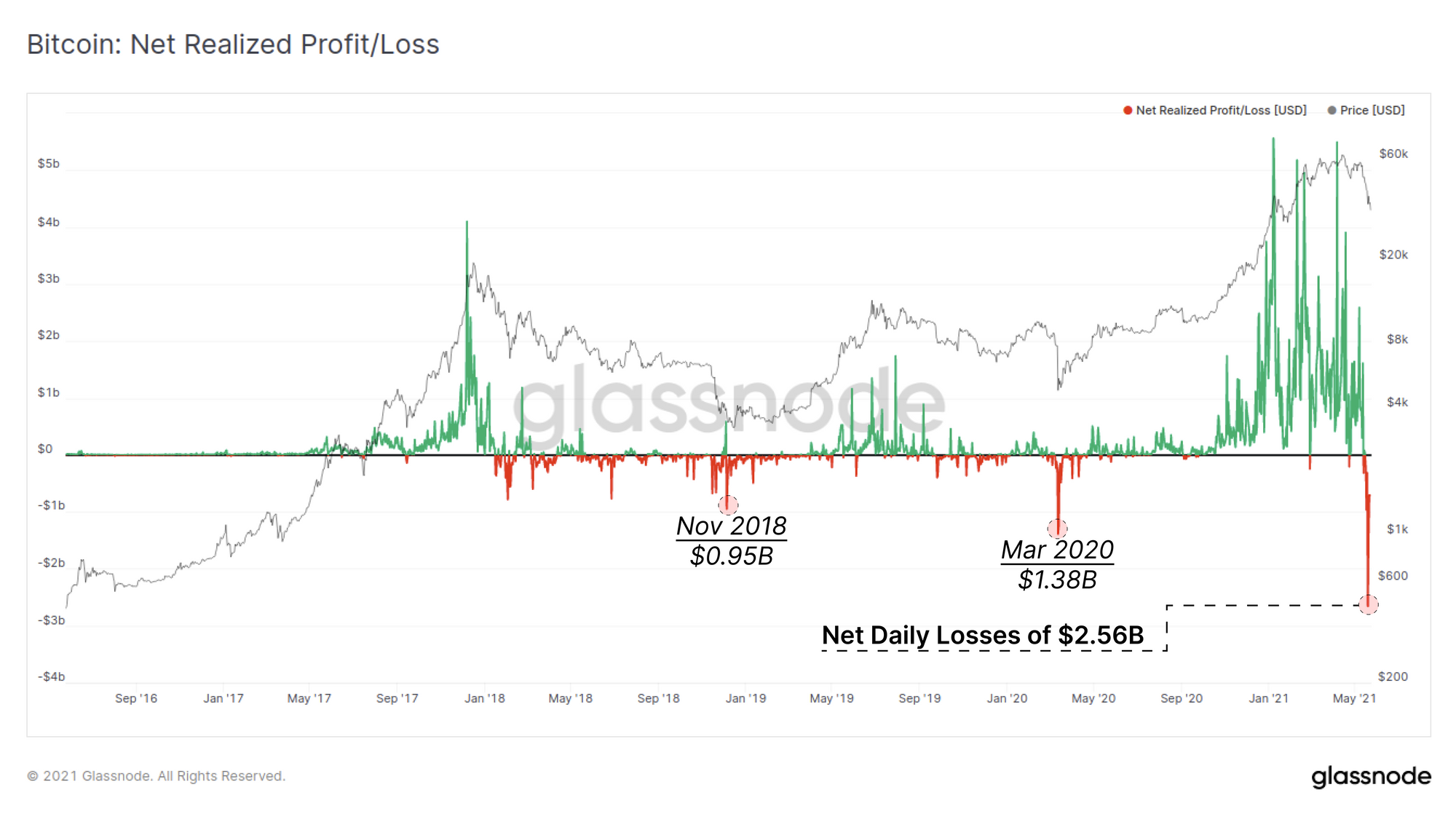
Accounting for profitable coins that were spent, this capitulation event is still the largest net realised loss by a significant margin. Over $2.56B in net losses were taken on-chain on 19-May, a sum that is 185% larger than the March 2020 COVID sell-off. The chart below shows that this capitulation follows a strong period of net profit taking (green spikes) so could be considered an equal an opposite reaction to the downside.
What this indicates is that a very large cross section of the market was taken by surprise by this event.
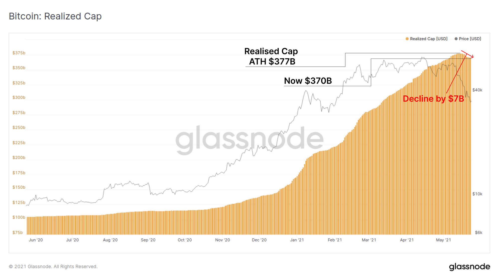
These net losses on-chain have resulted in a decline in the Realised Cap, as coins purchased higher are revalued to lower prices. The Realised Cap has declined by $7B (-1.8%) this week from its all time high of $377B.
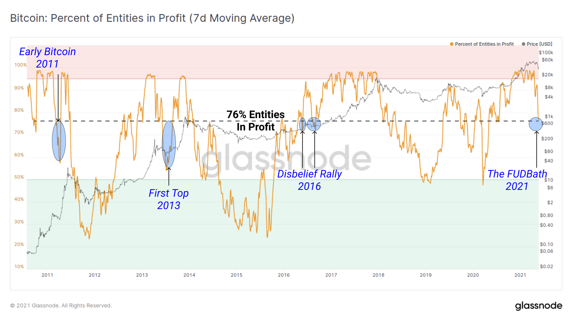
Looking at the number of unique entities on-chain who are now in profit, we can see that the current FUD-bath has reduced profitable entities to 76%. This means that 24% of all on-chain entities are currently holding UTXOs that are underwater. In a bull market context, this compares to three periods in 2011, 2013 and 2016. This metric also highlights the proportion of the market who purchased coins higher and thus who may become panic sellers.
Analysis of the Sellers
There are three primary groups of entities that are likely to generate sell-side supply:
- Coin holders at a Loss who are largely buyers from the last 3-4months.
- Coin holders in Profit who may believe the macro top is in.
- Miners who need to sell to cover costs or are forced due to new Chinese regulations.
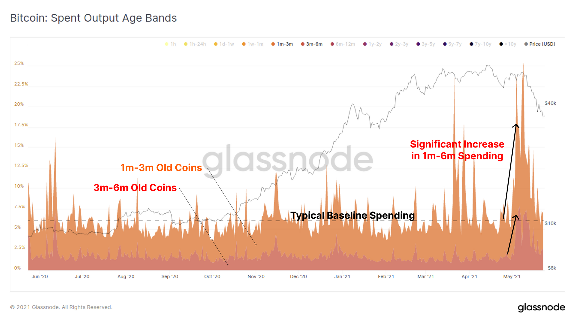
There is no question that a large portion of the recent spending activity was driven by short term holders, those owning coins purchased within the last 6-months. The spent output age bands shows that the 1m-3m and 3m-6m age brackets in particular spiked substantially higher than the typical baseline leading into, and during the sell-off.
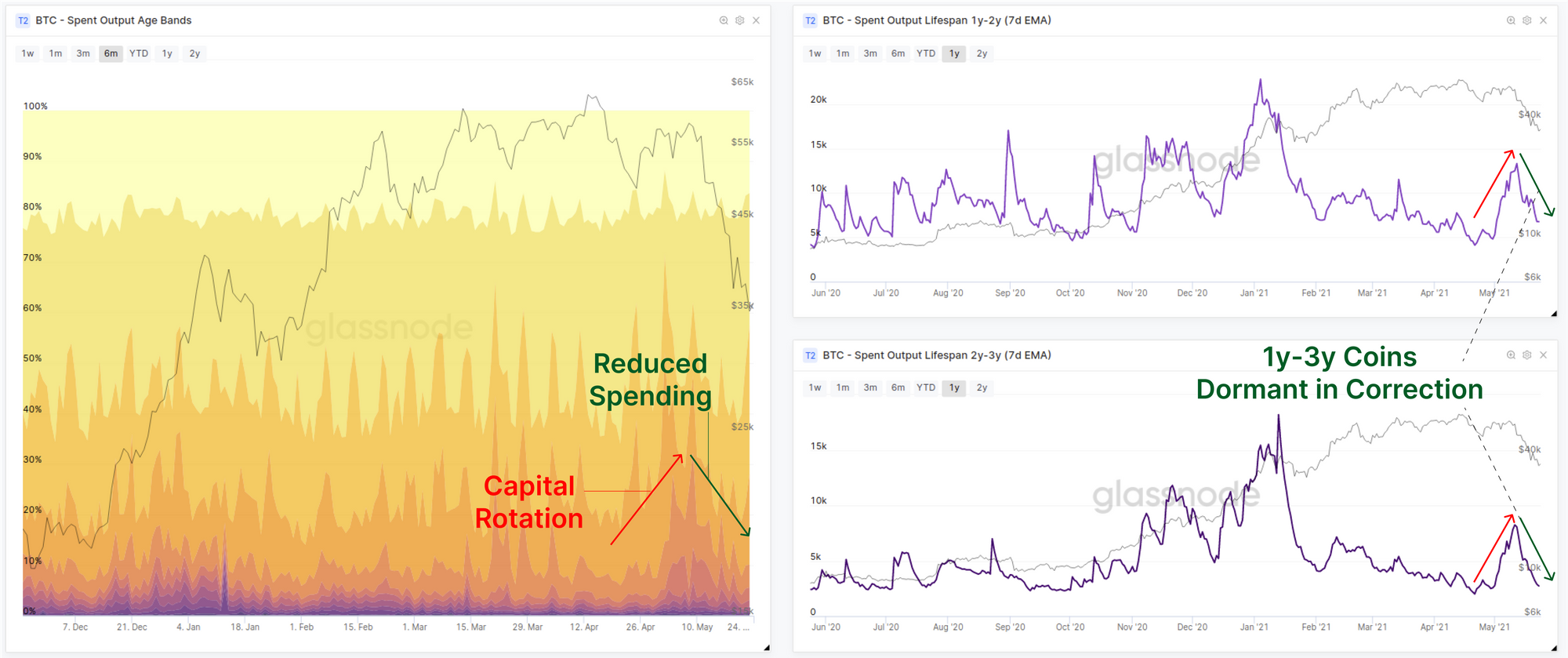
If we compare this to the equivalent spending by longer term investors, particularly those with coins 1y-3y old (last cycles buyers) we see the opposite picture. Holders of coins aged 1y-3y were actually spending their coins much earlier, likely rotating capital to capture the price out-performance of ETH at that time.
During this capitulation sell-off however, the spending of 1y-3y old coins was actually significantly less and declining as a proportion of total activity. This suggests that old hands did not panic sell nor rush for the exits.
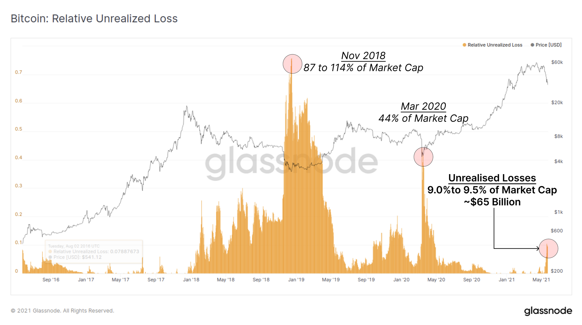
A major question that remains is what is the magnitude of unrealised losses, or in other words, how many underwater coins could still panic sell out? We inspect the Relative Unrealised Losses metric which presents the ratio between total underwater value and the current market cap.
Using this metric, we can see that around 9.0% to 9.5% of the current market cap ($700B) exists as unrealised losses, equal to around $65B in underwater value. Despite this being a historical capitulation event, relative to the market size, the value of underwater positions on-chain is actually relatively small. We can compare this to relative unrealised losses of 44% in March 2020 and over 114% in Nov 2018.
Note that prior to a major sell-off, coins that were purchased higher have essentially 'stored value' at a higher market cap. After the sell-off, the new market cap is lower and thus it is possible to achieve > 100% relative unrealised losses.
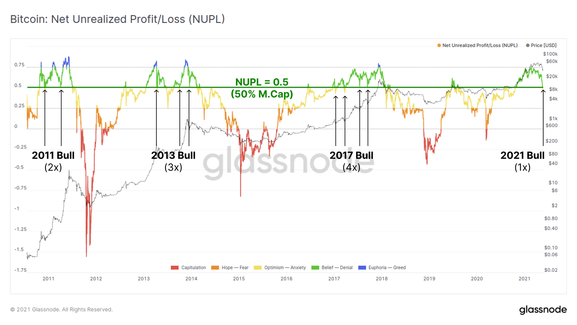
Across the aggregate market, the Net Unrealised Profit and Loss metric has pulled back to just below 0.5 indicating that the market currently holds an aggregate of 50% of the Bitcoin market cap in profitable coins. This level has acted as a support in all three of the prior bull cycles and this is actually the first touch in the 2021 market.
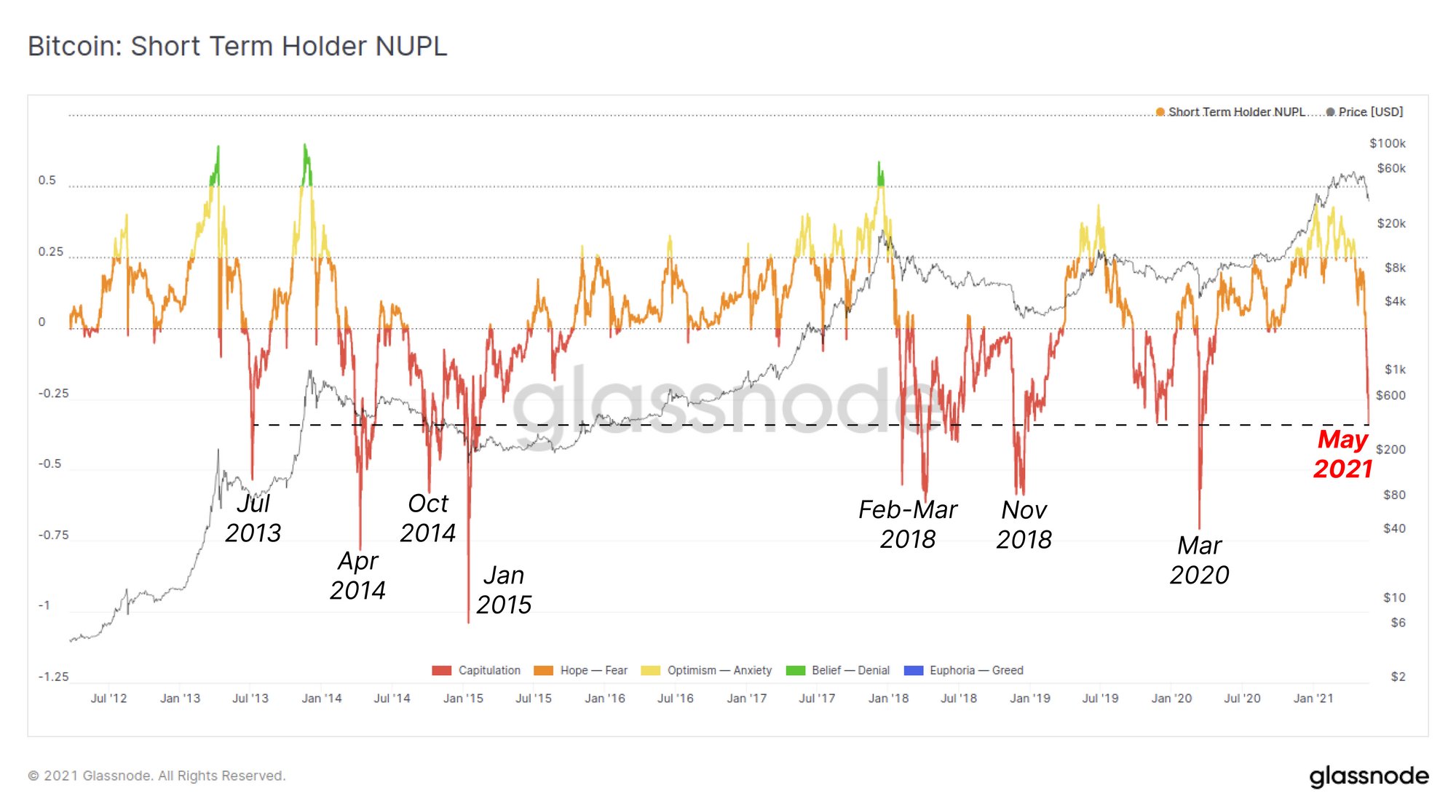
If we filter out for short term holders however, we can see that a major capitulation has occurred. Short term holders currently hold an aggregate unrealised loss of -33.8% of the Market Cap on their coins. This compares only to the most extreme draw-downs in Bitcoin history including:
- The first Bull top in 2013
- Three events in the 2014-15 bear
- Four events in the 2018 bear
- March 2020 capitulation
On the miner front, there are anecdotal indicators that miner sell pressure may increase in the short term as a result of changes to the mining industry in China.
4, Were miners selling Bitcoin? Some already panic sold, others had no choice. Not everyone have access to western hosting sites. There are also added level of uncertainty on current RMB OTC trading channels. Need fiat to cover operational costs at end of the day.
— Mustafa Yilham (@MustafaYilham) May 23, 2021
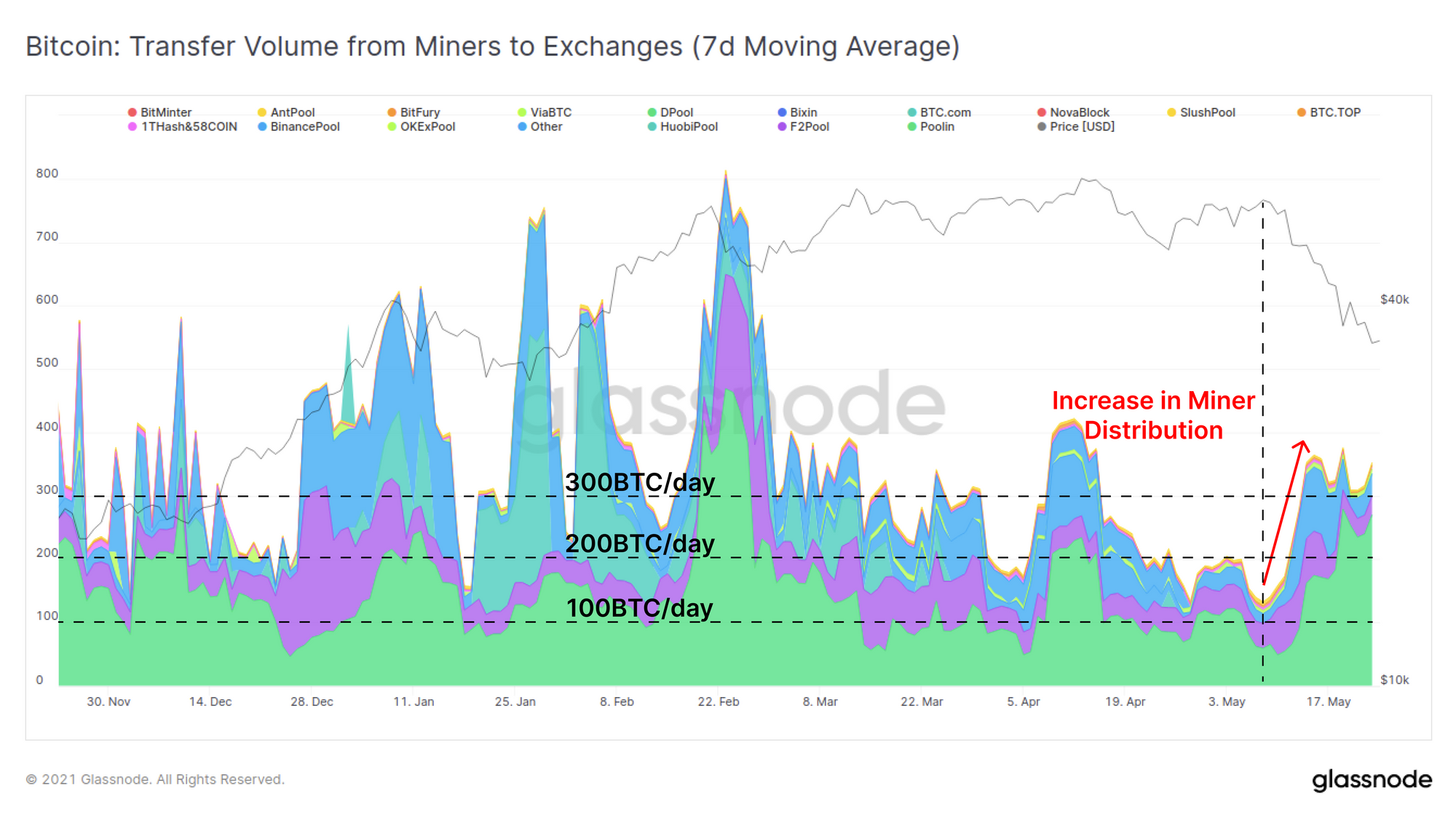
Observing the spending of miner coins demonstrates that whilst there is an uptick in miner-to-exchange flows, up from 100 BTC/day to 300BTC/day, this still represents a relatively small portion of the ~900BTC/day issuance.
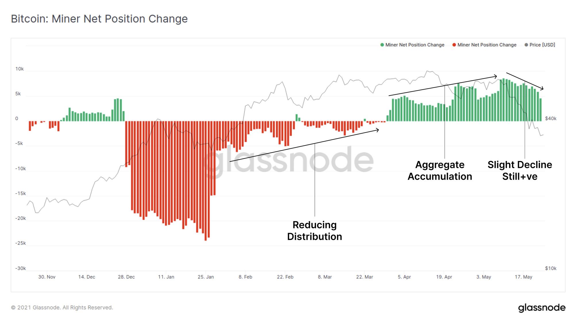
The Miner Net Position Change metric confirms this is the case. We can see a slight decline in aggregate accumulation this week, however the rate of 'mined and held' coins remains a larger share relative to those that are 'mined and sold'. It remains to be seen if miners begin spending more of their coins as these changes roll out.
Exchanges and Derivatives
Finally, we investigate the impact this week has had on exchange flows, balances and the leveraged derivatives markets.
There was a distinct increase in net deposits to exchanges, both in the weeks leading into, and during the sell-off. Peak net inflows spiked above +30k BTC/day on 17-May. At the same time, the magnitude of outflows has been increasing steadily the lower price falls, suggesting that there remain buyers of last resort even as the wider market capitulates.
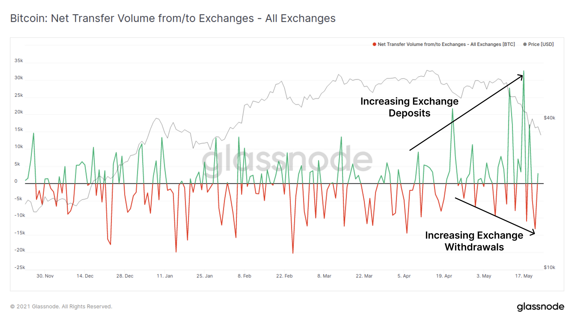
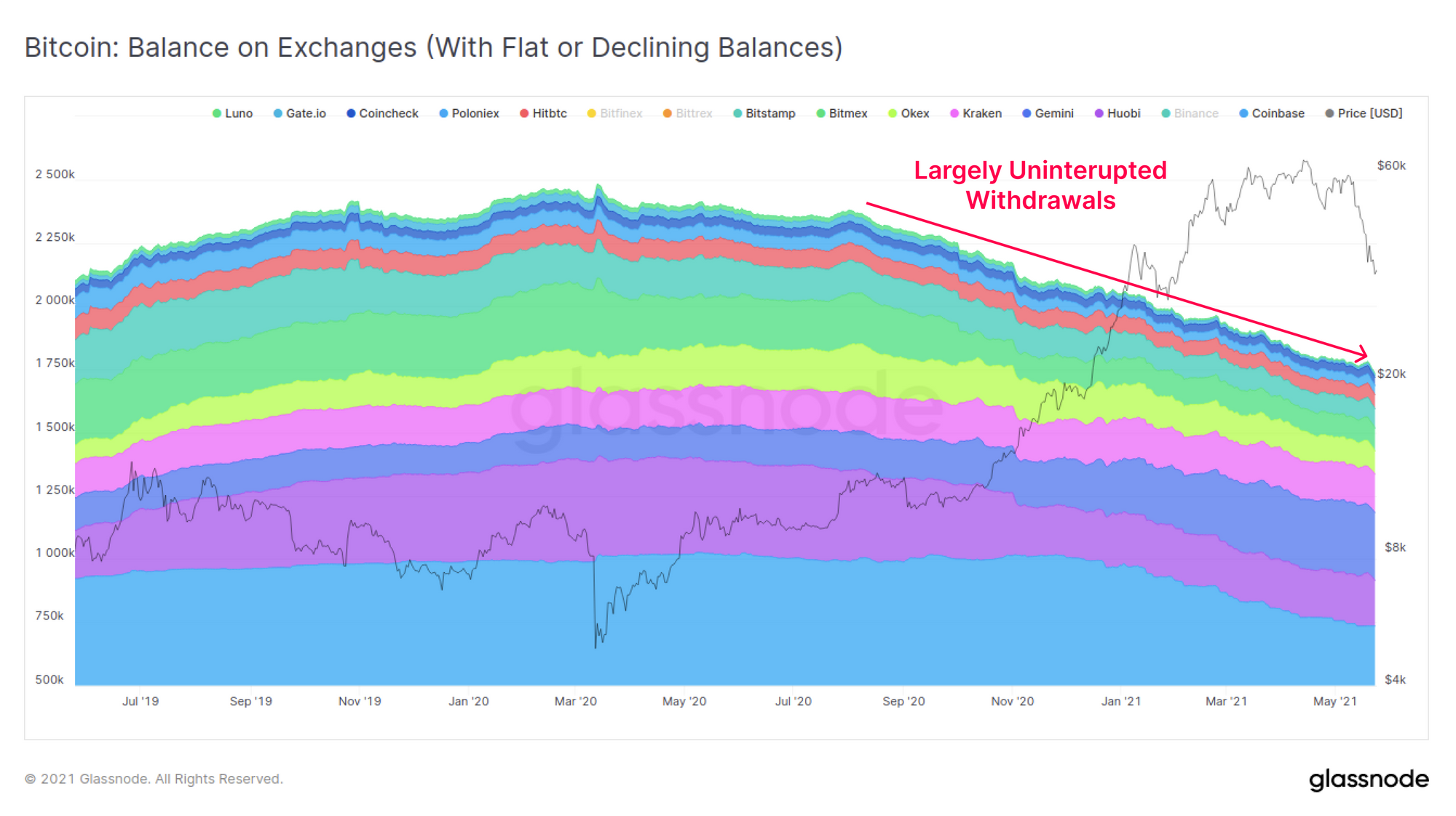
An interesting observation is that a bifurcation of the exchange market is underway in terms of which exchanges are increasing their BTC balances. The majority of exchanges have actually seen relatively flat to declining balances over the past weeks. Aside from a small increase during this weeks sell-off, these exchanges have effectively maintained an uninterrupted balance downtrend since March 2020.
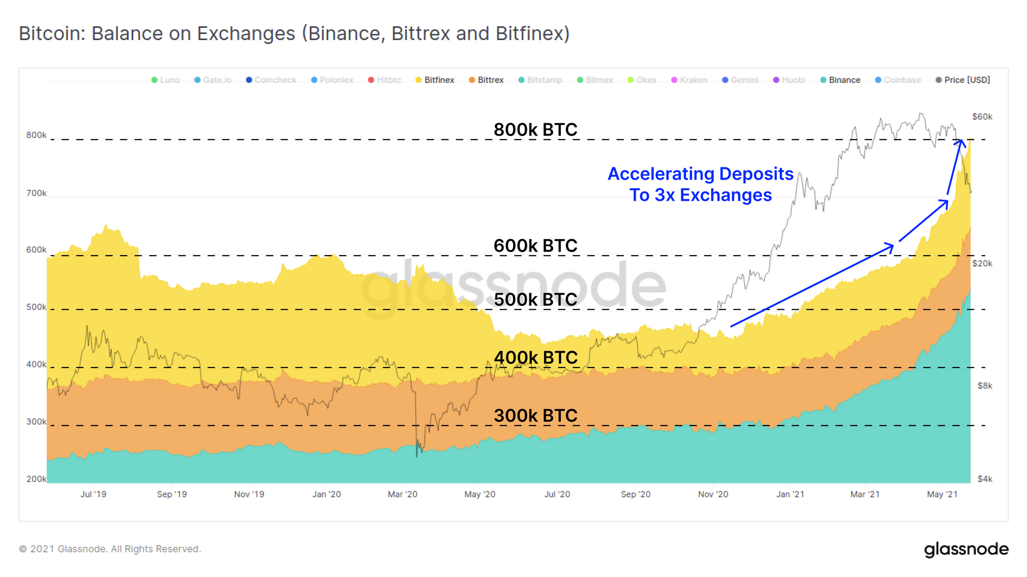
There are however three exchanges that have received almost all of the net inflows observed: Binance, Bittrex and Bitfinex. The balance on these three exchanges has been increasing throughout 2021, although Binance leads with the lions share of inflows. During this sell-off however, all three exchanges saw significant increases to their held BTC balance.
Given all three of these exchanges service clients outside the US, this may suggest a difference in response between markets in different jurisdictions. Another explanation is that Binance in particular hosts a large catalogue of trading markets, derivatives, and is the gateway to Binance Smart Chain, a preferred venue for recent retail speculation.
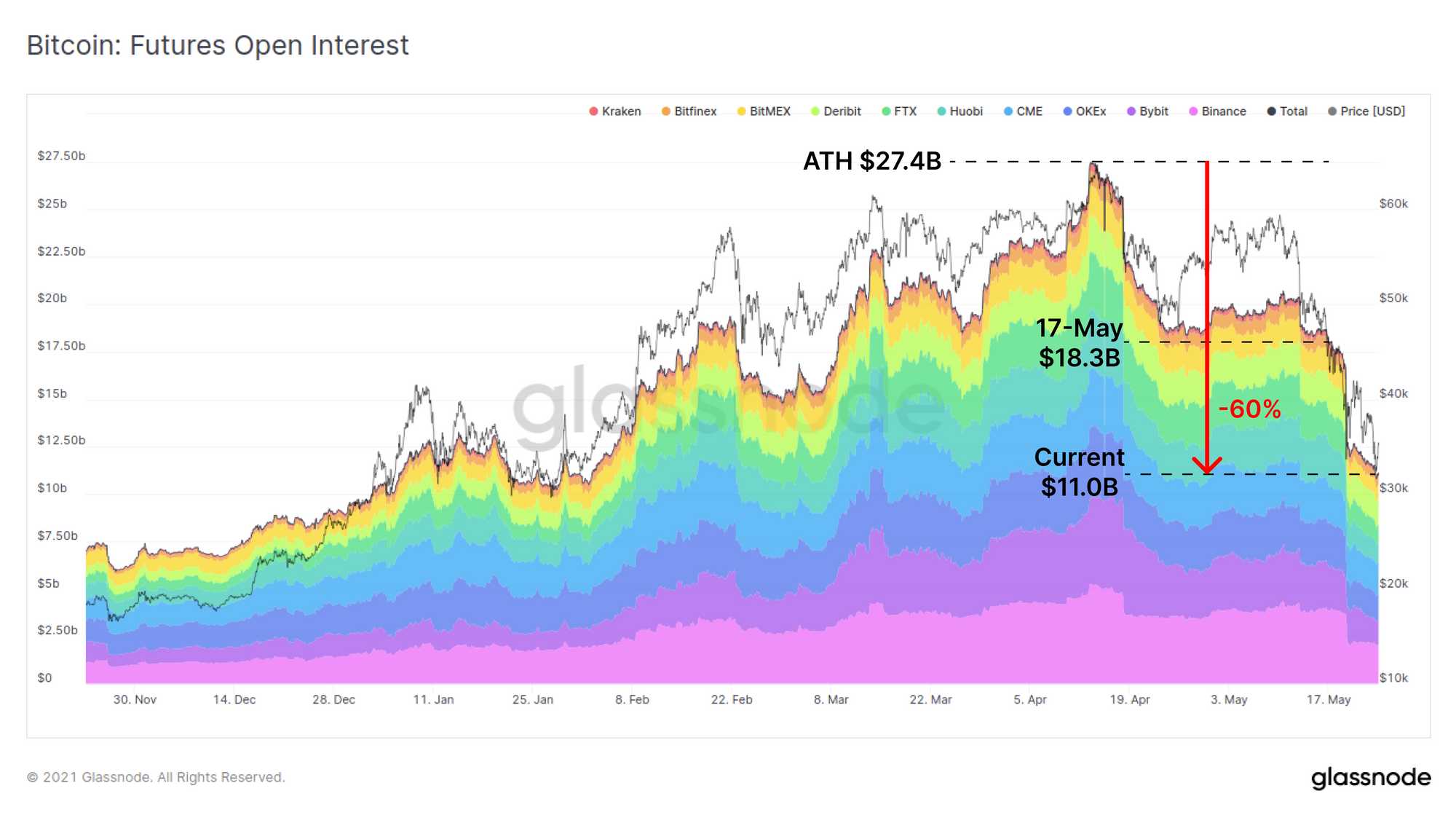
Finally, on derivatives markets, open interest on Bitcoin futures has seen a tremendous decline from the ATH set in April. Open Interest across all futures markets has declined by over $16.4B (down 60%) from the peak and now returned to levels last seen in February 2021.
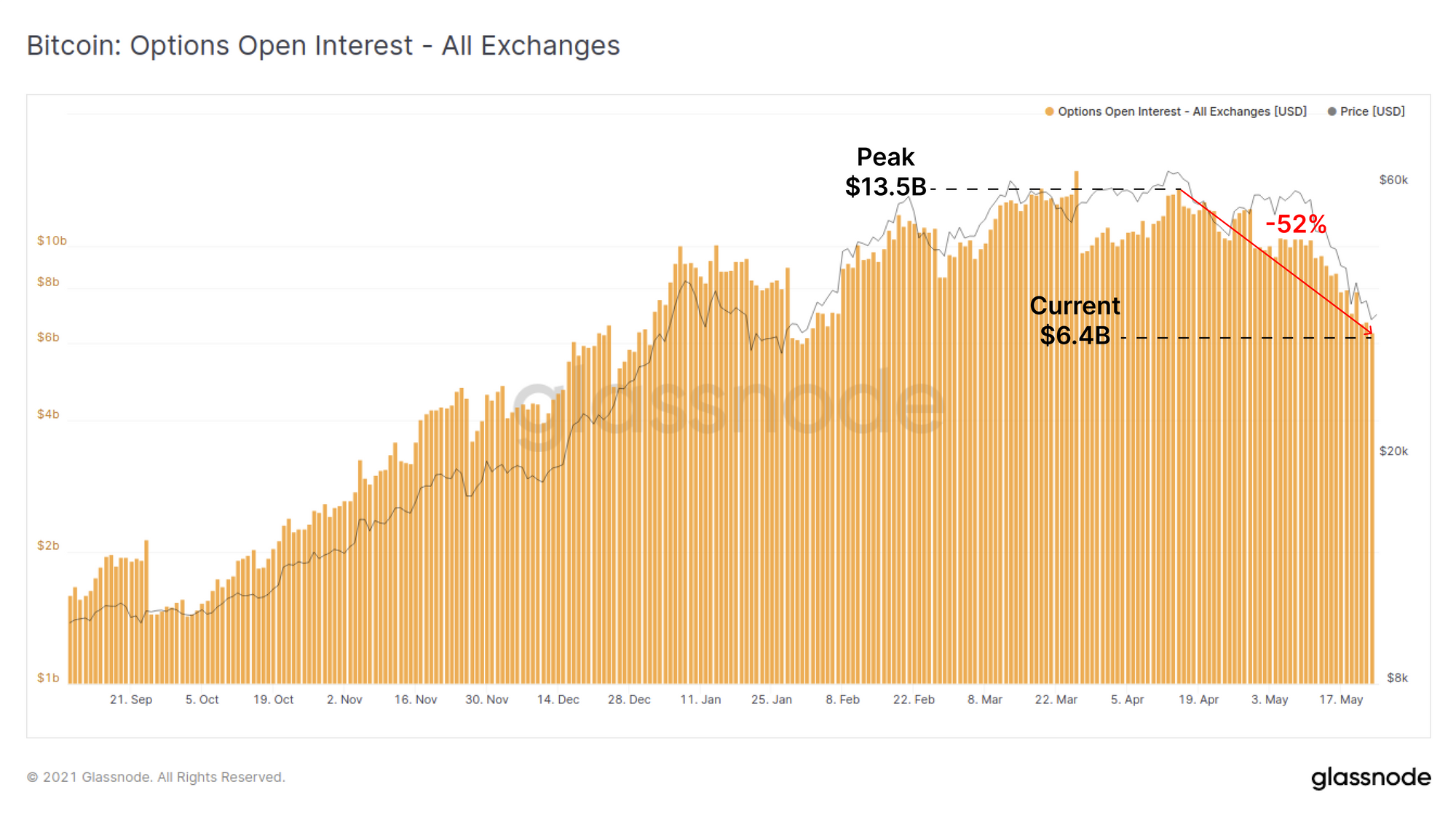
Options markets have seen a similar significant decline with total outstanding contracts down 52% from the peak to $6.4B, returning again to levels last seen in February.
Overall, this flush of speculation and leverage is a healthy and necessary process, as it removes excessive speculation and forced sellers to allow more organic price action to return down the road.
Week On-chain Dashboard
The Week On-chain Newsletter now has a live dashboard for all featured charts here.
New Glassnode Content
DeFi Uncovered: Farming with Stablecoins
We have released a new content series focused on insights and analysis pertaining to the rapidly expanding DeFi sector. Our latest piece analyses and explores a series of strategies and DeFi products available to earn a yield using stablecoin collateral.
Check out the article below and to sign-up for more DeFi insights here.

Product Updates
Metrics and Assets
- Update for Bittrex exchange cluster labels.
- Release new Options Open Interest by Strike Price metric
- Added description box when creating/editing alerts.
- SOPR Academy Entry updated.

- Lesen Sie diesen Artikel jetzt auf Deutsch bei unserem offiziellen Partner Bitcoin2Go
- Follow us and reach out on Twitter
- Join our Telegram channel
- For on–chain metrics and activity graphs, visit Glassnode Studio
- For automated alerts on core on–chain metrics and activity on exchanges, visit our Glassnode Alerts Twitter