The Week on-chain (Week 29, 2021)
As the probability for high Bitcoin market volatility increases, we analyse the Bull and Bear cases using market and on-chain metrics.


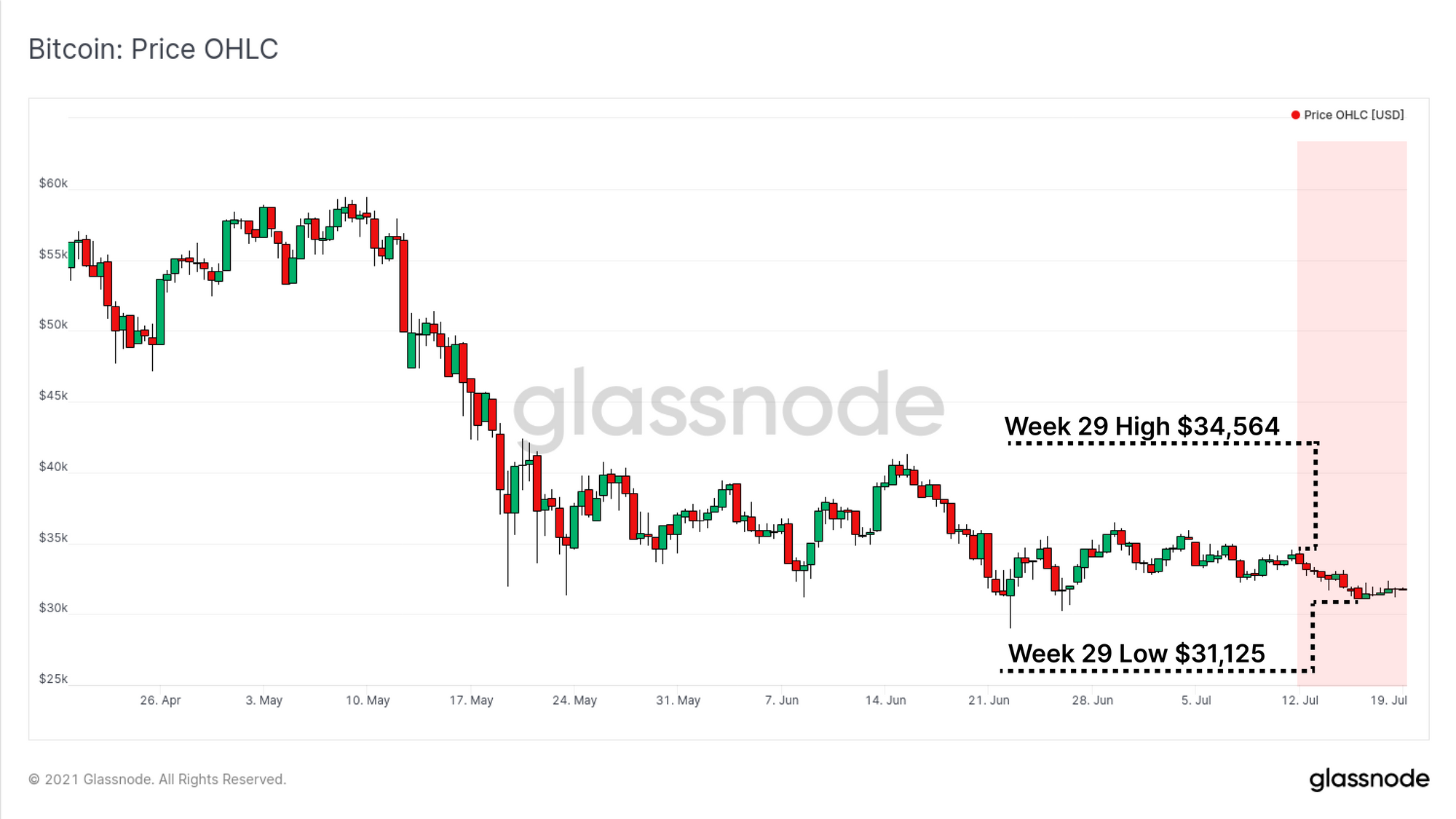
The Bitcoin market continues its low volatility consolidation this week, with prices trading between a high of $34,564 and a low of $31,125. As the market tests the lows of a significant on-chain support zone, transaction activity remains depressed and HODLing behaviour shows remarkable resilience.
We have an extremely divided market, and one with a likely expansion of volatility just around the corner. As such, in this weeks edition, we explore both the Bull and Bear cases using a combination of market and on-chain metrics.
Setting the stage
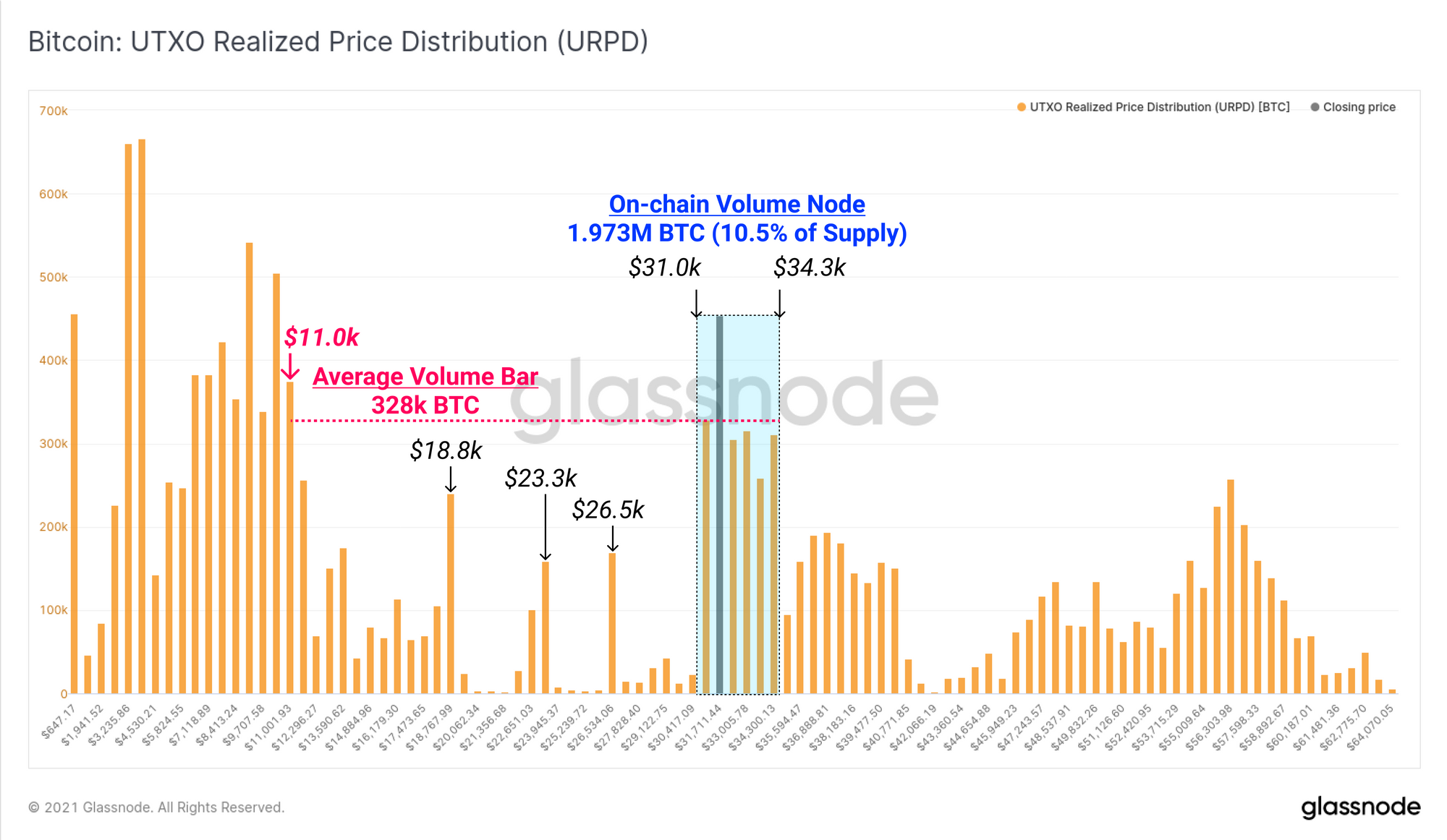
To start our analysis, we will begin with the UTXO Realised Price Distribution metric, which presents an on-chain volume profile across pricing buckets. Zones where significant clusters of volume arise, can indicate that a large number of coins changed hands at those prices, and thus represents a concentration of cost basis.
Between $31.0k and $34.3k, coin volume equivalent to 10.5% of the circulating supply (1.973M BTC) have transacted, outsizing the previous high volume node established in the $50k-$60k range. However, the market is trading at the lower end of this support node and there are few comparatively few on-chain support levels below until $18.8k.
The Bearish Case for Bitcoin
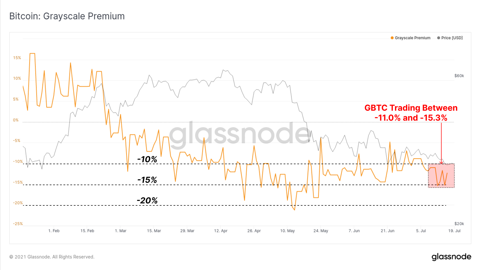
We will start our bearish case by considering institutional demand flows which continue to be a necessary source of capital inflows to reach and sustain higher valuations. In the limelight this week will be the performance of the Grayscale GBTC product with around 31.9k GBTC shares unlocking through the remainder of July.
The GBTC market price continued to trade at a notable discount last week, ranging between -11.0% and down to -15.3%. Whilst the discount has recovered from the absolute lows of -21.3% to NAV, any significant and persistent discount suggests lacklustre demand, and can also attract capital away from spot BTC markets.
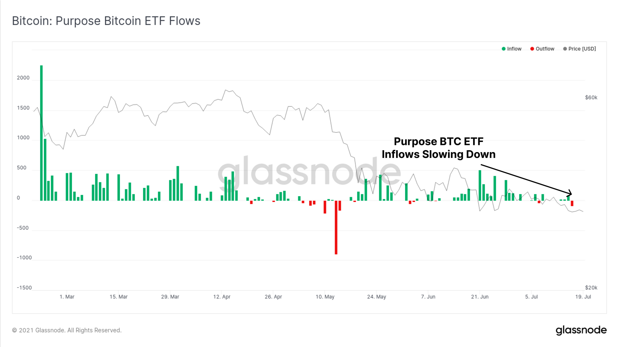
The Purpose ETF has also seen a slow-down in net inflows this week, after a period of relatively strong demand through May and June. The week closed with the largest net outflow of -90.76 BTC since mid-May. Similar to the GBTC product, this indicates institutional demand remains relatively weak across these regulated products.
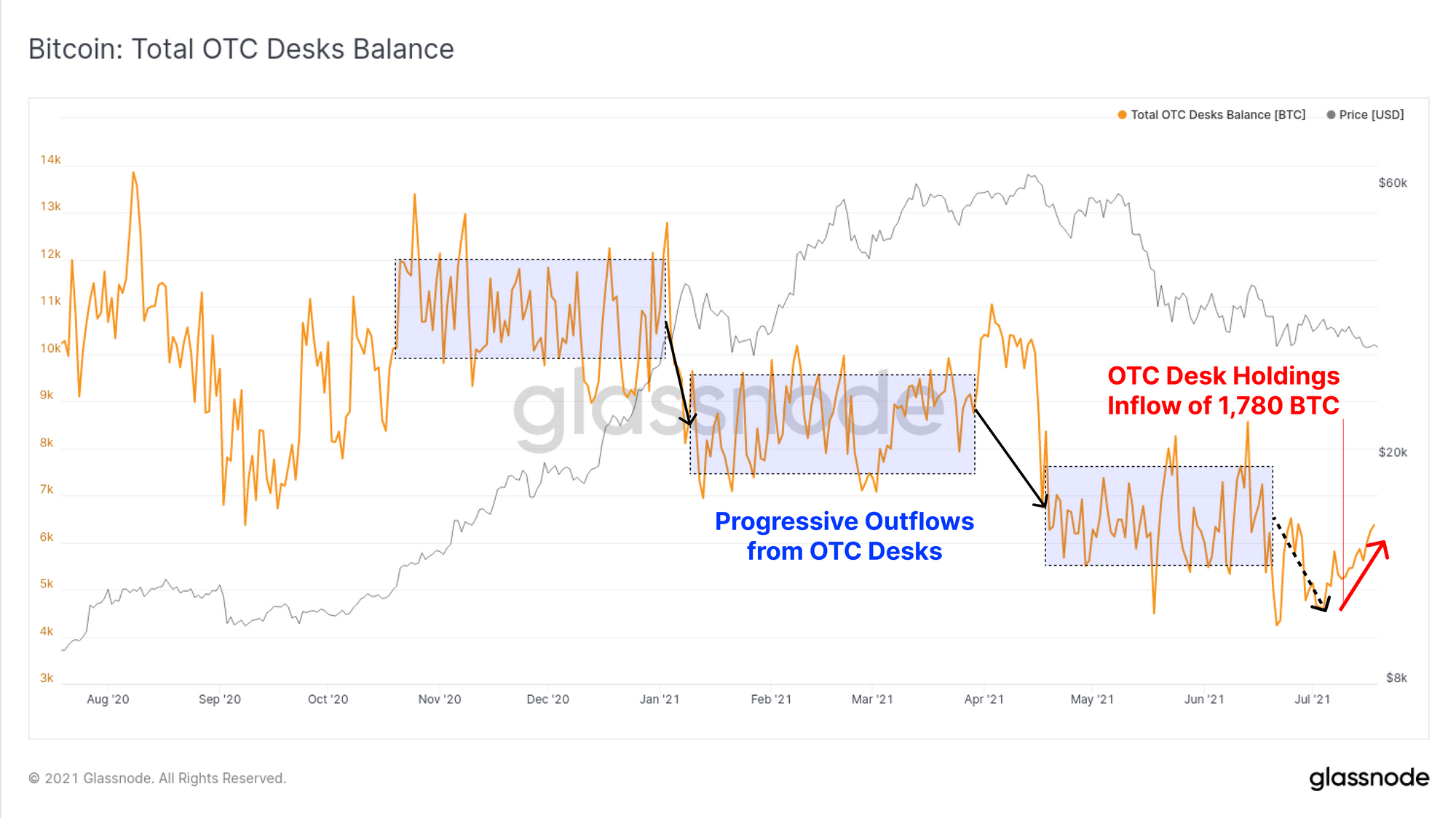
Last on the institutional demand side, OTC desk holdings have seen a net inflow of around 1,780 BTC over the last two weeks, moving against the structural trend of outflows in place since November 2020. It remains to be seen whether this net inflow is just a short-term impact, or the early signs of a reversal in the balance of supply and demand.
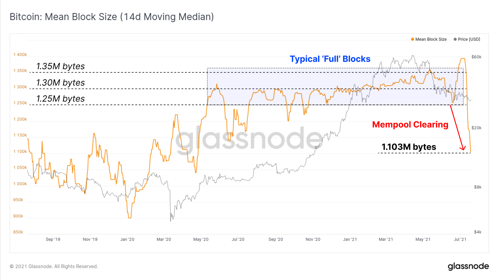
On-chain activity remains extremely muted this week with mempools clearing, and transaction volumes continuing to fall. As the mempool empties, the average block size has fallen by 15% to 20%, down to 1.103M bytes.
This indicates that demand for Bitcoin block-space and on-chain settlement is low, mined blocks are not full, and the utilisation of the network is relatively low.
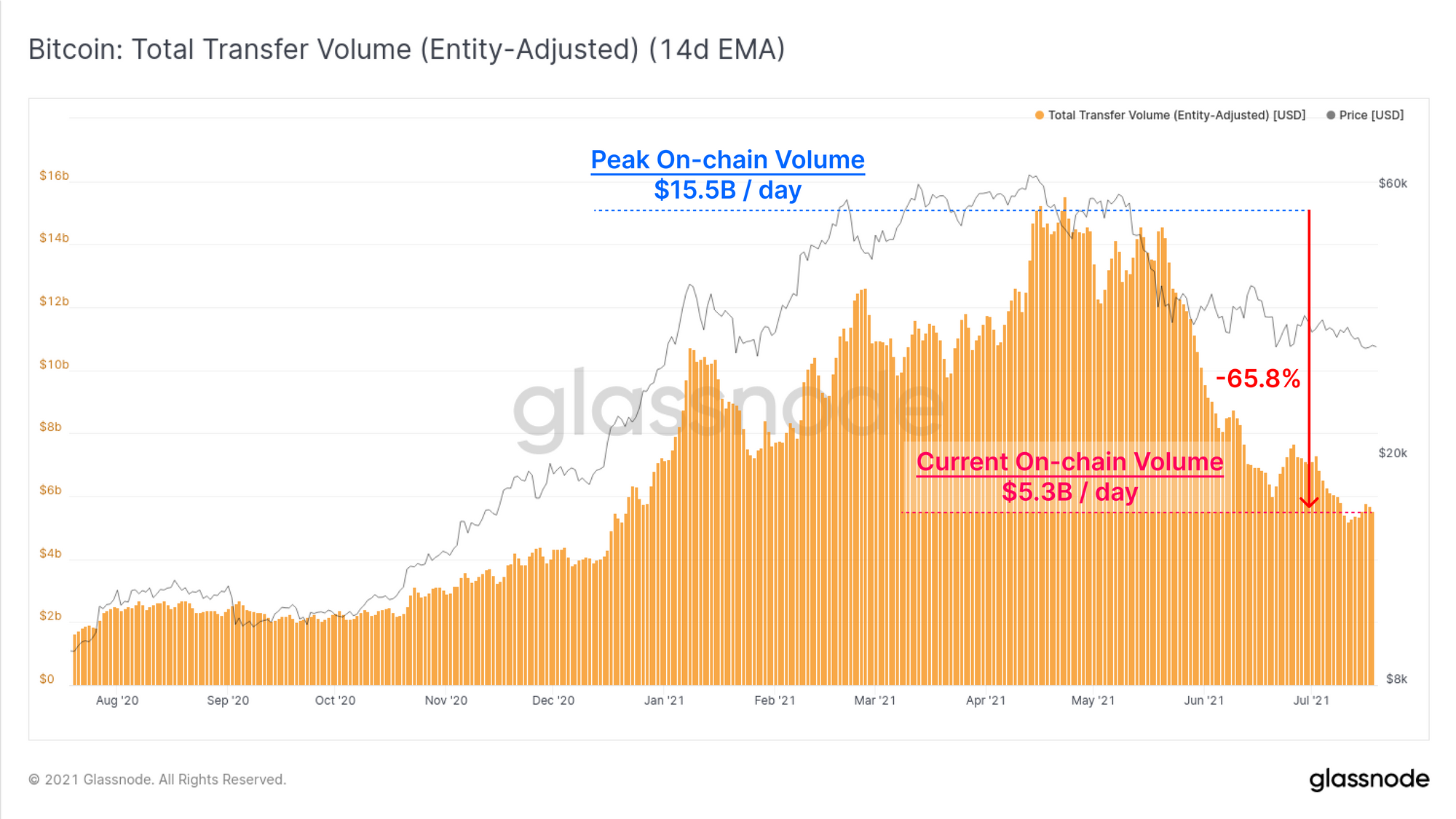
Entity-adjusted on-chain volume (14-day EMA basis) remains down 65.8% from the highs in April. The Bitcoin network is currently settling $5.3B/day compared to the $15.5B in daily volume settled at the 2021 peak. This demonstrates relatively low demand for value settlement remains in place.
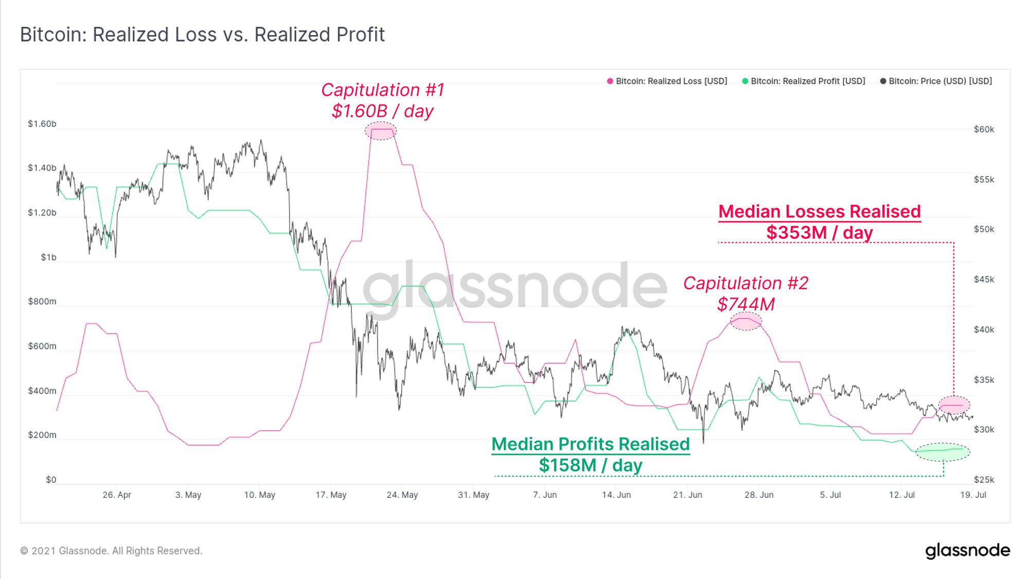
Of the transaction volume that is being settled, a dominant majority appear to be coins realising losses. If we compare the total value of realised losses and profits, we see losses (pink) have consistently been larger than profits (green) since the sell-off in May.
Median losses this week were around $353M per day, more than 2.2x greater than the $158M/day in realised profits. Whilst these volumes are much lower than the two capitulation events ($1.60B and $744M respectively), this demonstrates that investors holding underwater positions continue to spend and sell their coins.
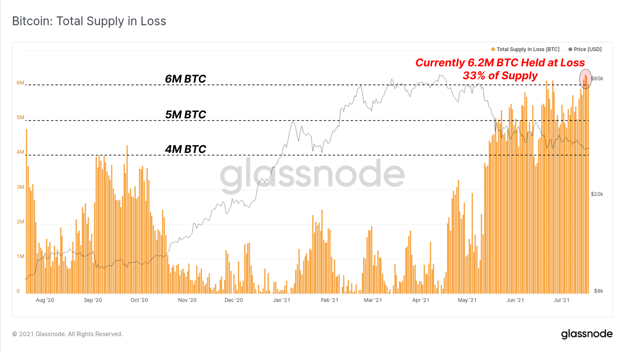
We can also assess how much of the coin supply remains underwater to gauge how much supply may become additional sell-side pressure.
The chart below shows that approximately 6.2M BTC, equivalent to 33% of the circulating supply is currently holding an unrealized loss.
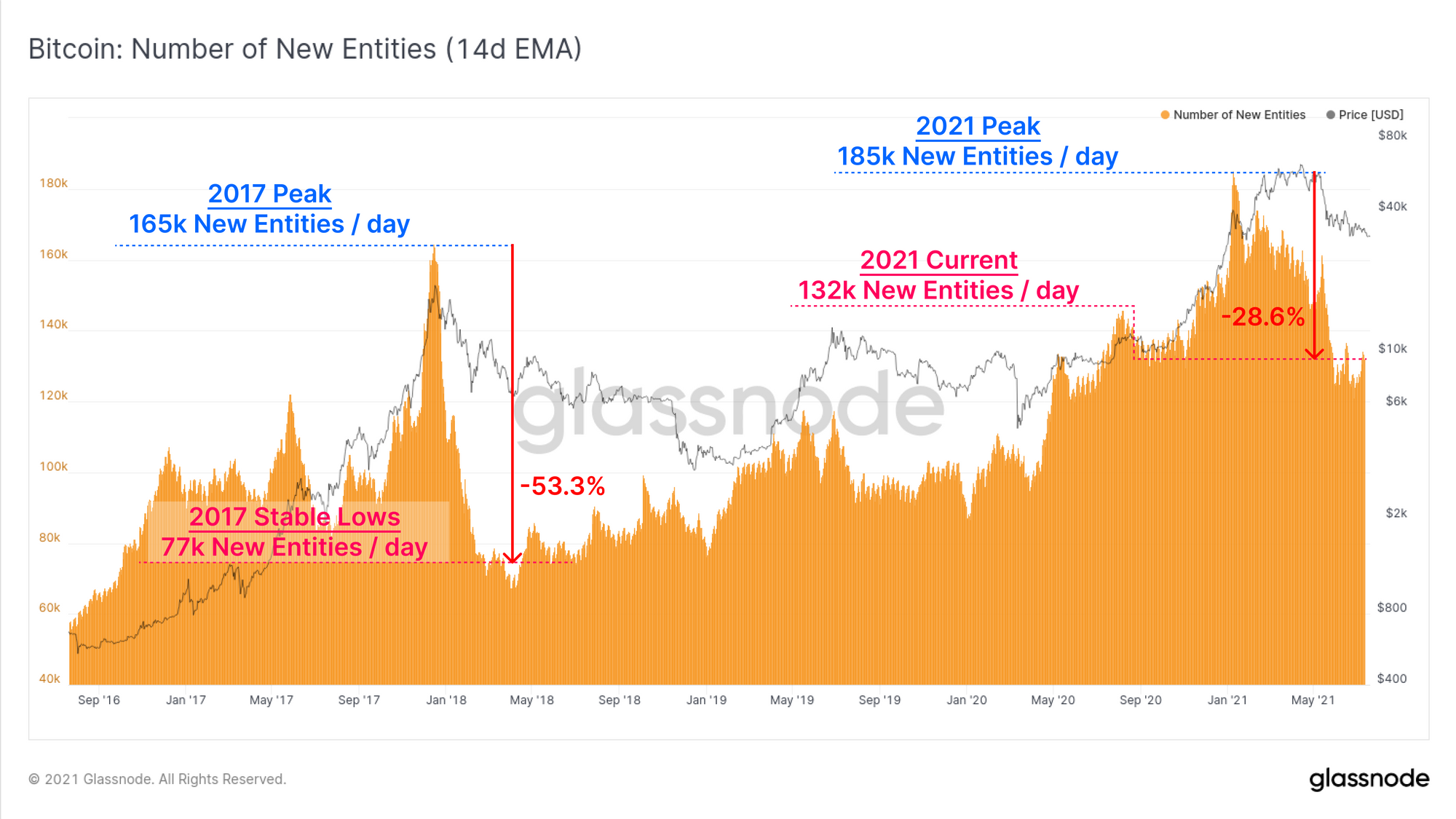
Finally, to close out our bearish case, we can see that the number of new on-chain entities is still down 28.6% from the highs set in February 2021. The decline is not yet as severe as it was after the 2017 blow-off top, however it remains to be seen if this metric stabilises, or declines further.
Summary of Bear Case
- Market is trading at the low end of a high on-chain volume cluster with very little cost basis support between $31.0k and $18.8k.
- GBTC discount persists, declining Purpose ETF inflows and OTC desk inflows suggest lacklustre institutional demand.
- On-chain activity (volume and entities) remains significantly down from the highs. Utilisation of the Bitcoin network for value transfer suggests low demand.
- Losses continue to be realised on-chain and a total of 6.2M are currently held at an unrealised loss. These coins may well form overhead resistance and sell-pressure.
The Bull Case for Bitcoin
After painting a relatively bleak picture with respect to immediate demand and network utilisation, there remain positive signs across many on-chain metrics, particularly longer range indicators and supply metrics.
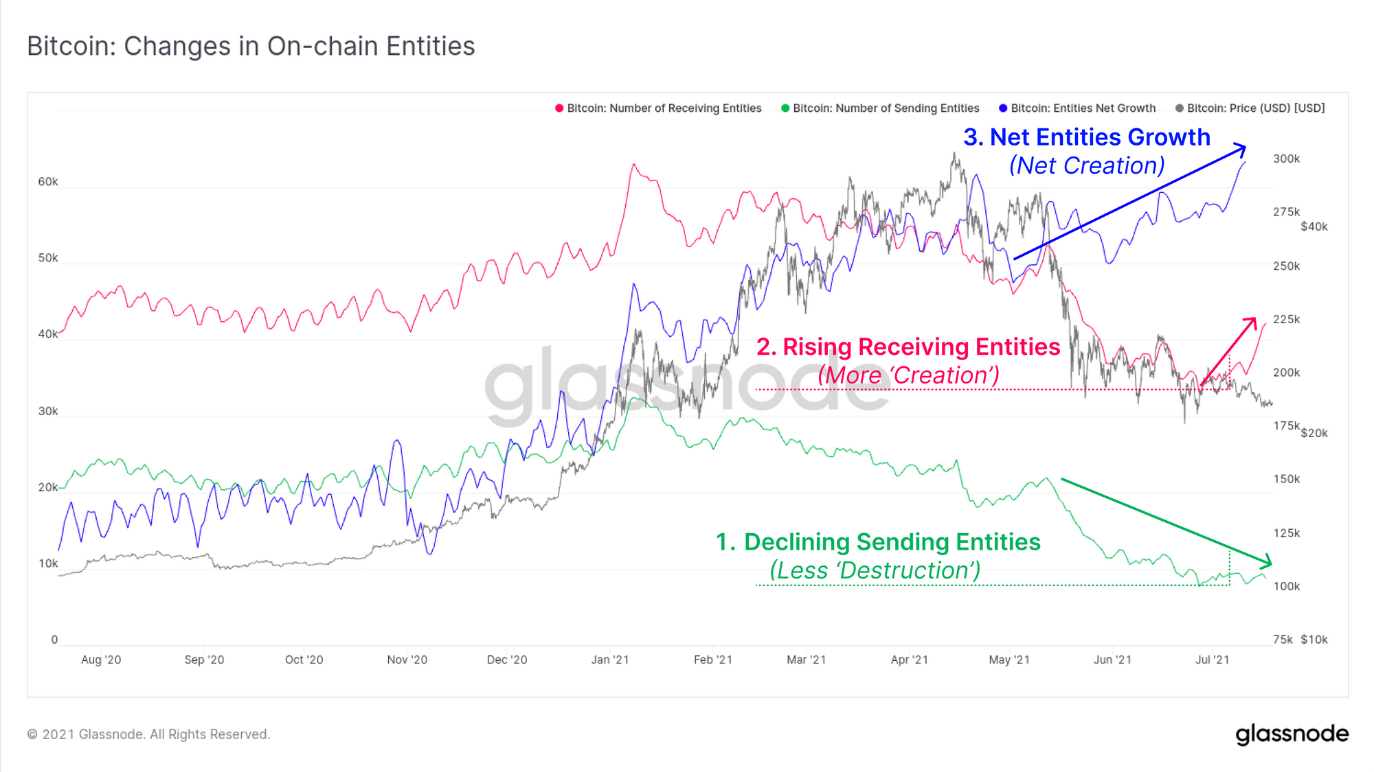
To start, lets return to the idea of on-chain entities, a topic which has been the source of some confusion of late. We define:
An Entity as a unique on-chain cluster of associated addresses. If a cluster of addresses interact and demonstrate heuristics to suggest a single owner, they will be classified as a single entity.
The chart below presents three metrics telling a holistic picture for on-chain entities:
- Sending Entities (green) are often associated with UTXO destruction. Most wallets enforce single-use addresses when spending, which typically reduces the entity count. At present, we see fewer spending entities indicating less spending of UTXOs and a preference for HODLing.
- Receiving Entities (pink) are the converse, associated with UTXO creation, new owners, and new accumulation. June and July have seen strong growth in receiving entities.
- Net Entities Growth (blue) takes the difference between 'destroyed' and 'created' entities. Given 'destroyed entities' is declining and 'created entities' are increasing, we have a positive aggregate Net Growth.
To summarise: more HODLing and less spending; likely reflecting an environment similar to dollar cost average style accumulation.
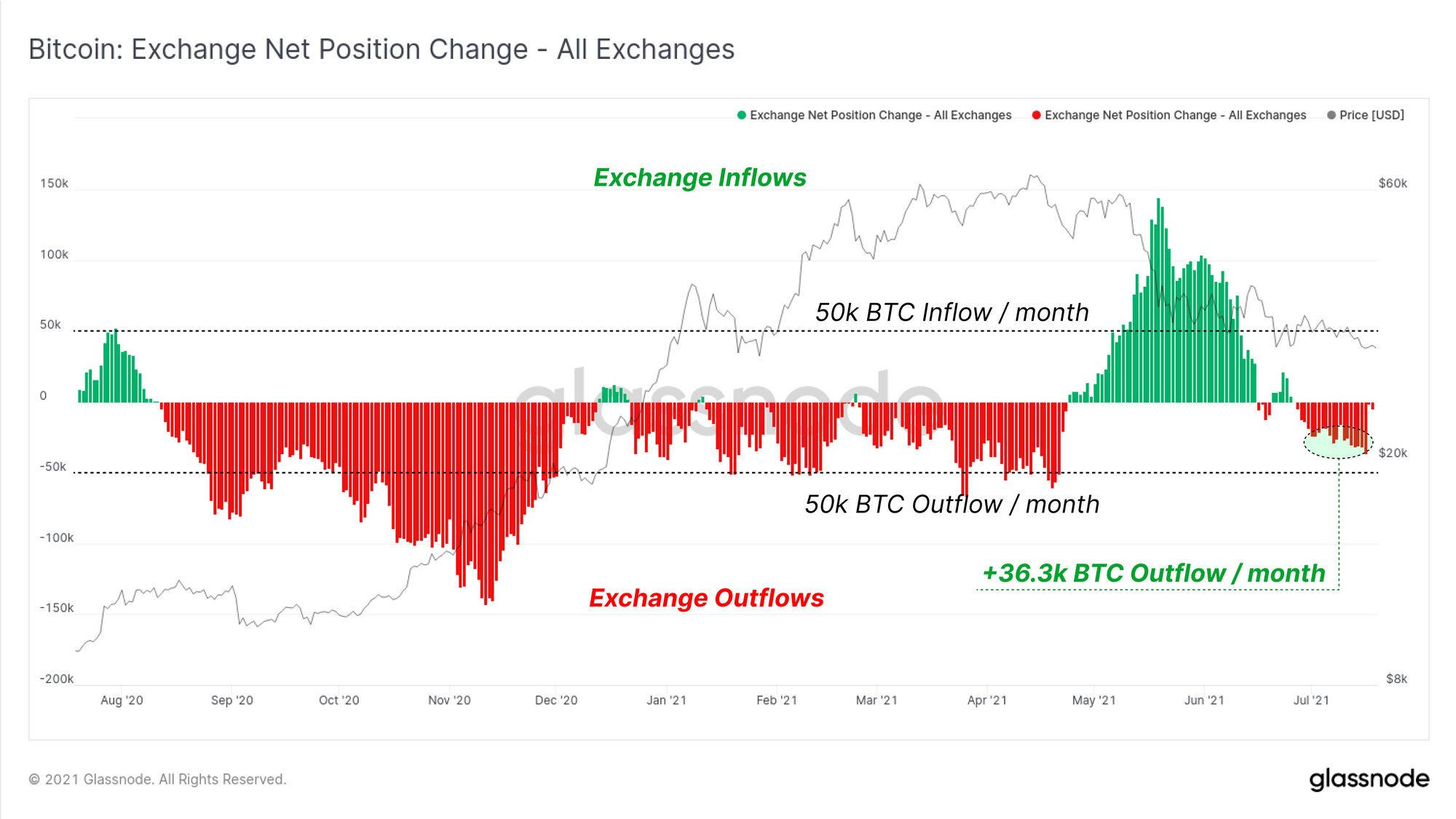
To support this observation, we can see that the exchange net position change has reverted back to a net outflow after a significant period of net inflows. Exchanges are currently seeing a rate of net outflows of around 36.3k BTC per month.
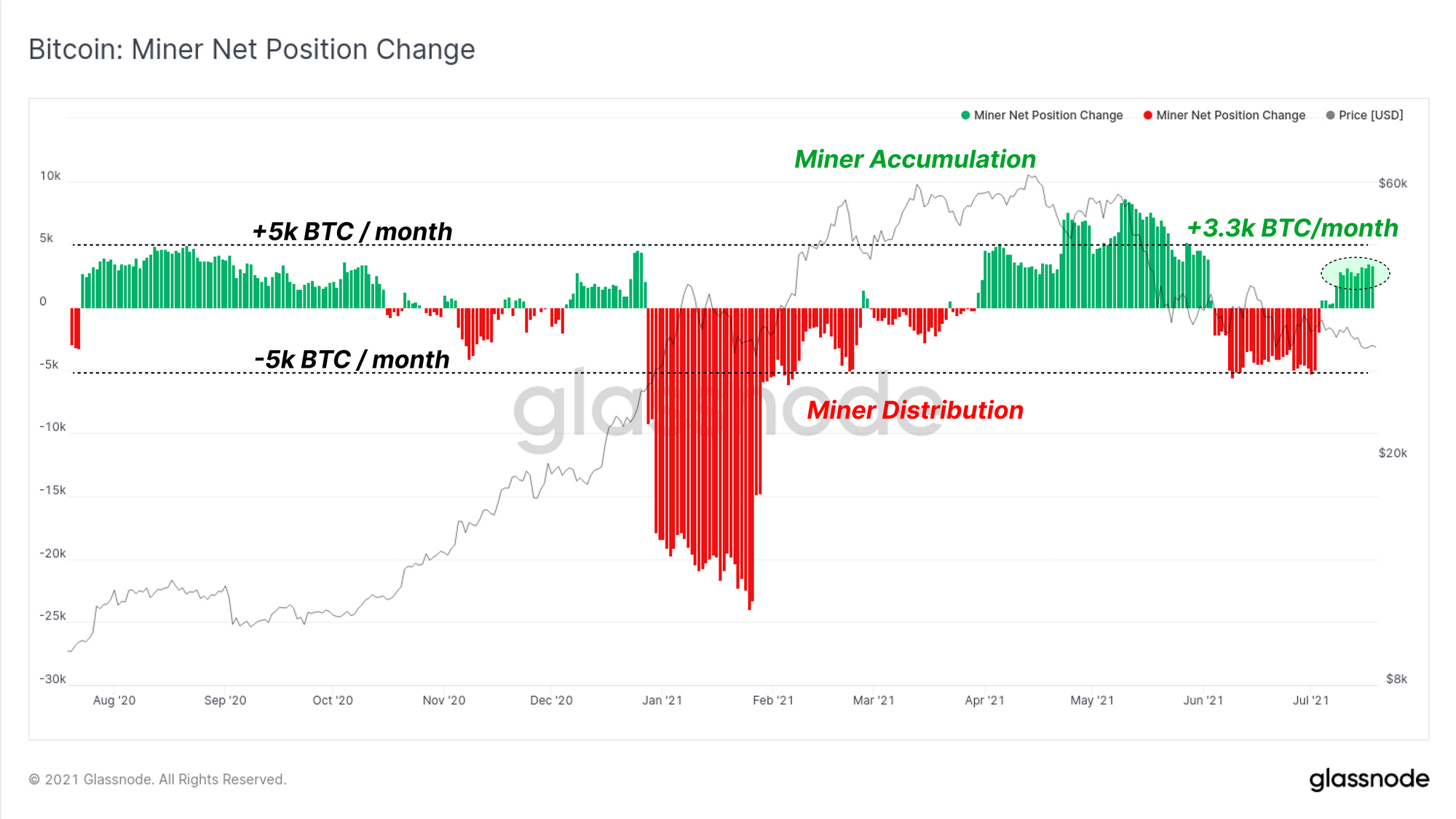
Miners are also demonstrating extreme resilience and desire to accumulate, despite the extraordinary costs incurred as the Great Migration carries on. It is possible that additional sell-side pressure from offline distressed miners is being more than offset by the extraordinary profitability by remaining operational miners.
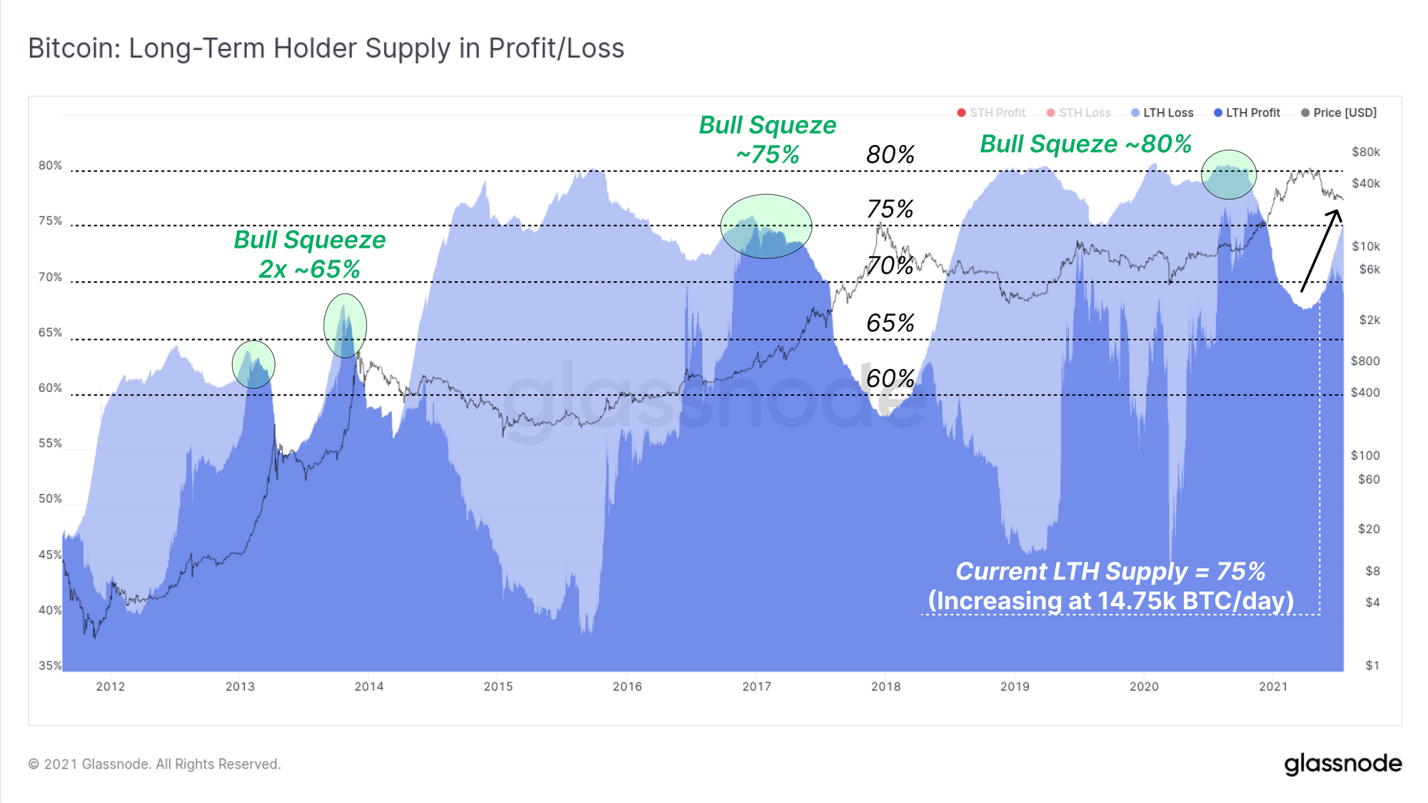
If we observe the volume of supply held by 'strong hands', we can see that HODLing appears to be the preferred strategy. Long-Term Holders currently hold 75% of the circulating supply (6% at a loss, 69% in profit).
The bullish squeeze that started past bull markets has historically been triggered by LTHs holding 65% (2x 2013), 75% (2017), and 80% (2020) of the circulating supply.
If the current rate of coin maturation (14.75k BTC/day) persists, LTHs would hold 80% of the coin supply in around 2-months (although this is not likely to play quite so cleanly, since we know many coins from Mar-May were spent and sold).
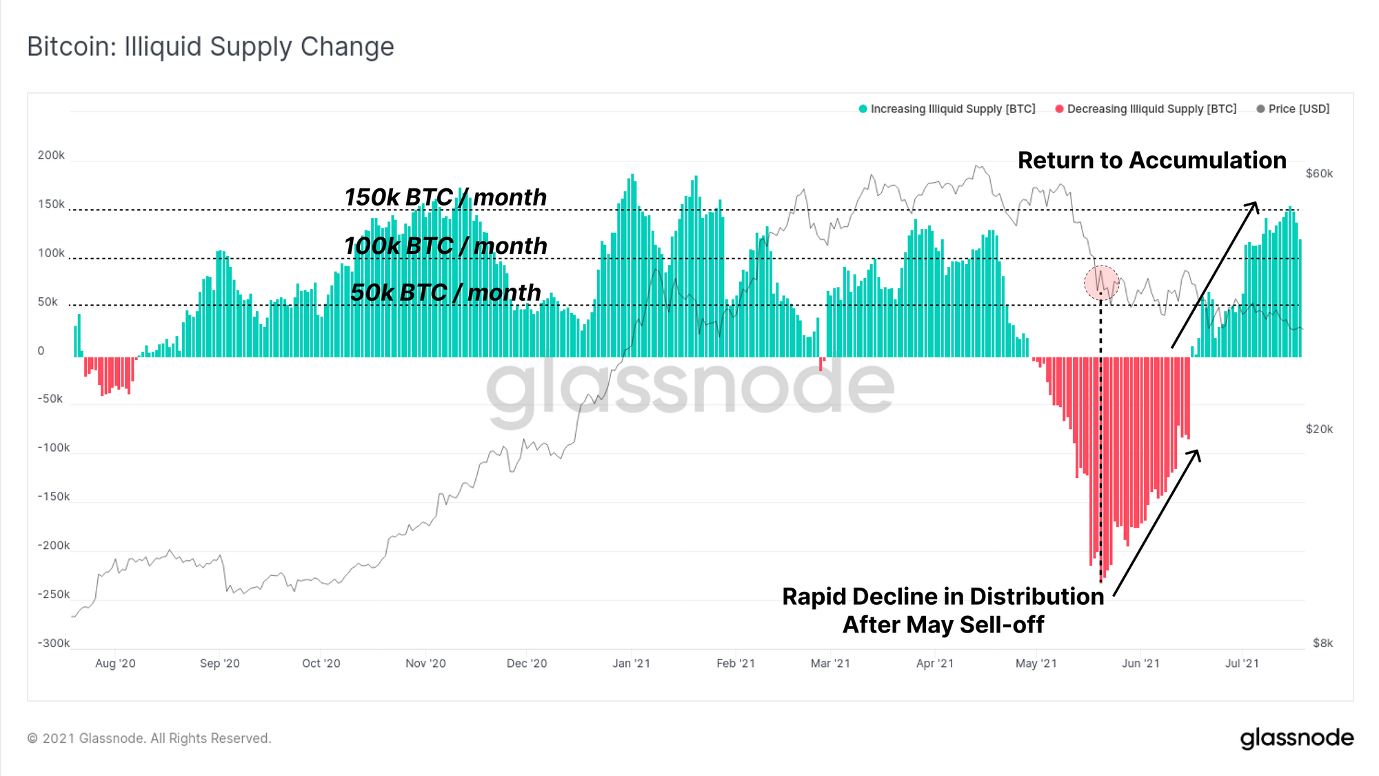
The Illiquid Supply Change metric supports this observation following a dramatic reversal from distribution in May, to HODLing and accumulation in June-July.
Note, positive values (green) of this metric are a result of widespread coin dormancy (more illiquid coins) with limited spending. Conversely, negative values occur when illiquid coins are spent back into liquid circulation.
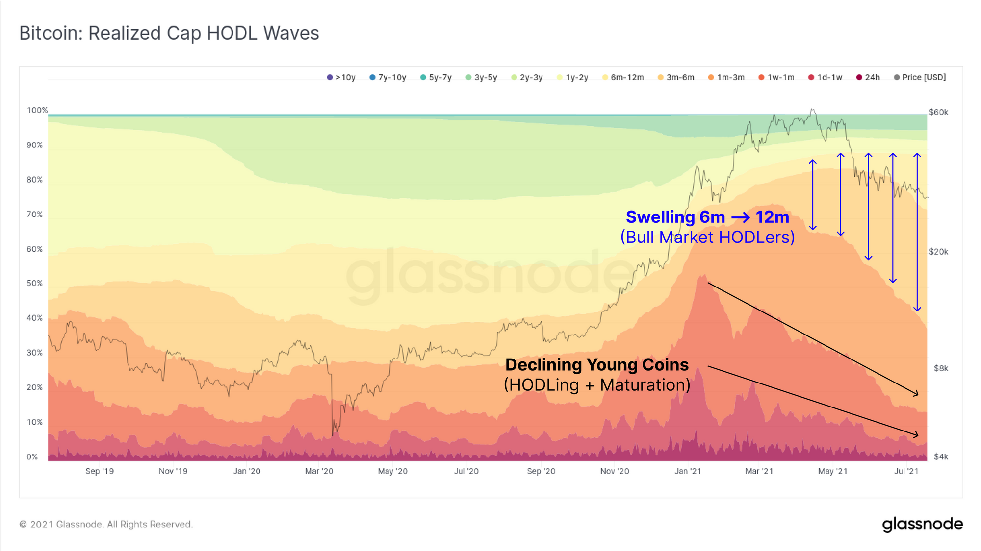
Finally, to round out the Bullish case for Bitcoin, we turn to the Realised Cap HODL waves which shows unmistakable indicators of HODLing, coin maturation, and further evidence to the probability of an potential supply squeeze in the works. There are two primary observations:
- Structural, multi-month declines in younger coin bands (red-orange) which can only occur when young coins make up a smaller proportion of 'realised value'. This occurs when young coins mature and age to become older coins, which creates;
- Swelling of older coin bands (yellow, 3m-12m) as the volume of coins held at these stronger hand, LTH classified age brackets grows. A decline in these bands without corresponding growth of the next oldest band would start to invalidate this thesis.
Summary of Bull Case
- Net Entity growth remains positive as fewer entities are destroyed, and more are created. This resembles a 'dollar cost average' style accumulation environment.
- Exchanges have seen net outflows after an extended period of inflows since mid-May.
- Miners are in net accumulation suggesting sell pressure due to the Great migration is being mitigated or offset by accumulation by profitable miners.
- Long-term holders and bull market HODLers appear unshaken by volatility and lower prices. The volume of coins held in illiquid state continues to grow, and the potential supply squeeze is coming from a much higher base than the 2018-19 bear. This demonstrates the remarkable conviction of BTC holders to weather extreme volatility.
Week On-chain Dashboard
The Week On-chain Newsletter now has a live dashboard for all featured charts