The Week On-chain (Week 33, 2021)
The Bitcoin market powers higher, supported by a growing body of evidence on-chain that a bullish disbelief rally is in effect.


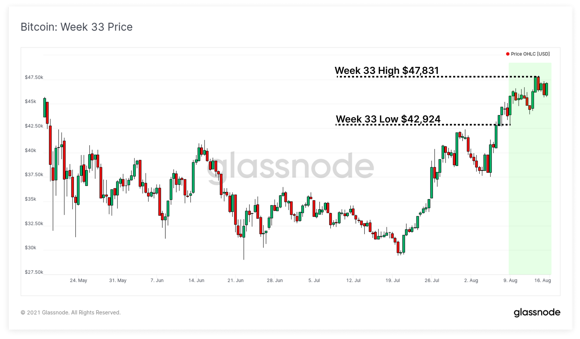
The uptrend in Bitcoins price has continued this week, rallying from a low of $42,924 into a daily high of $47,831. The market has shown remarkable strength since the local bottom of $29.7k set in July, suggesting strong fundamental spot demand underlies the rally.
This week, we analyse the on-chain metrics related to the mining market, capital inflows, coin accumulation, and net unrealised profit and loss. Through a complete assessment of the on-chain market structure, we can establish whether the probabilities favour the current market strength as a prelude to a bear, or whether a bull market disbelief rally is in full swing.
Miner Revenues Increase
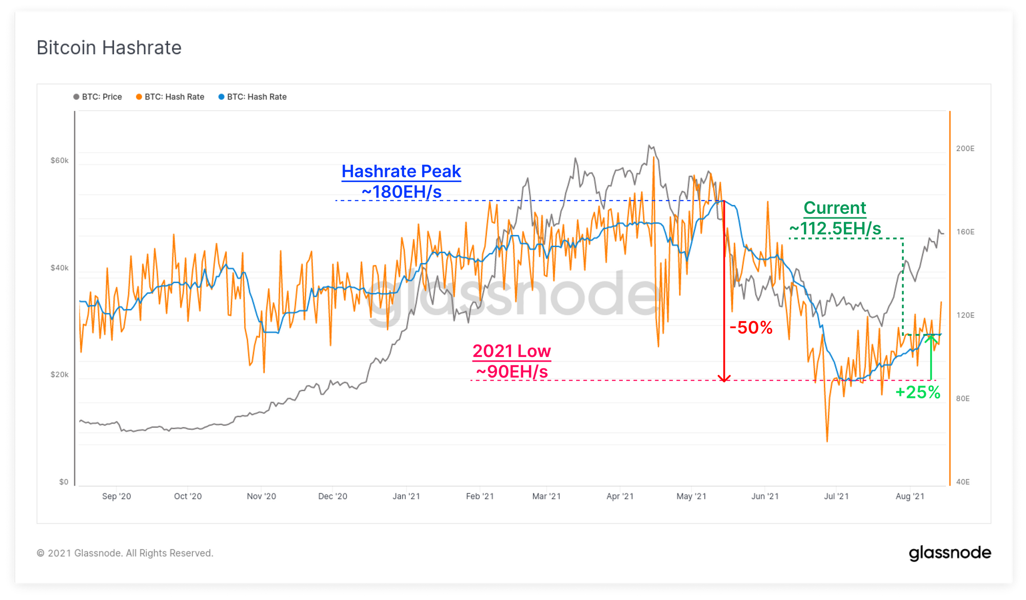
As the Bitcoin mining Great Migration continues, and miners transition out of China, we have started to see a recovery in hash-rate from the lows set in July. Hash-rate peaked out at around 180 EH/s in May before falling by 50%. This provides insight into the magnitude of affected miners as being roughly half the network.
Over the course of the last two months, hash-rate has increased by around 25% from the lows, suggesting hash-rate equivalent to around 12.5% of the affected miners have come back online. The network is currently mining at a rate of 112.5 EH/s.
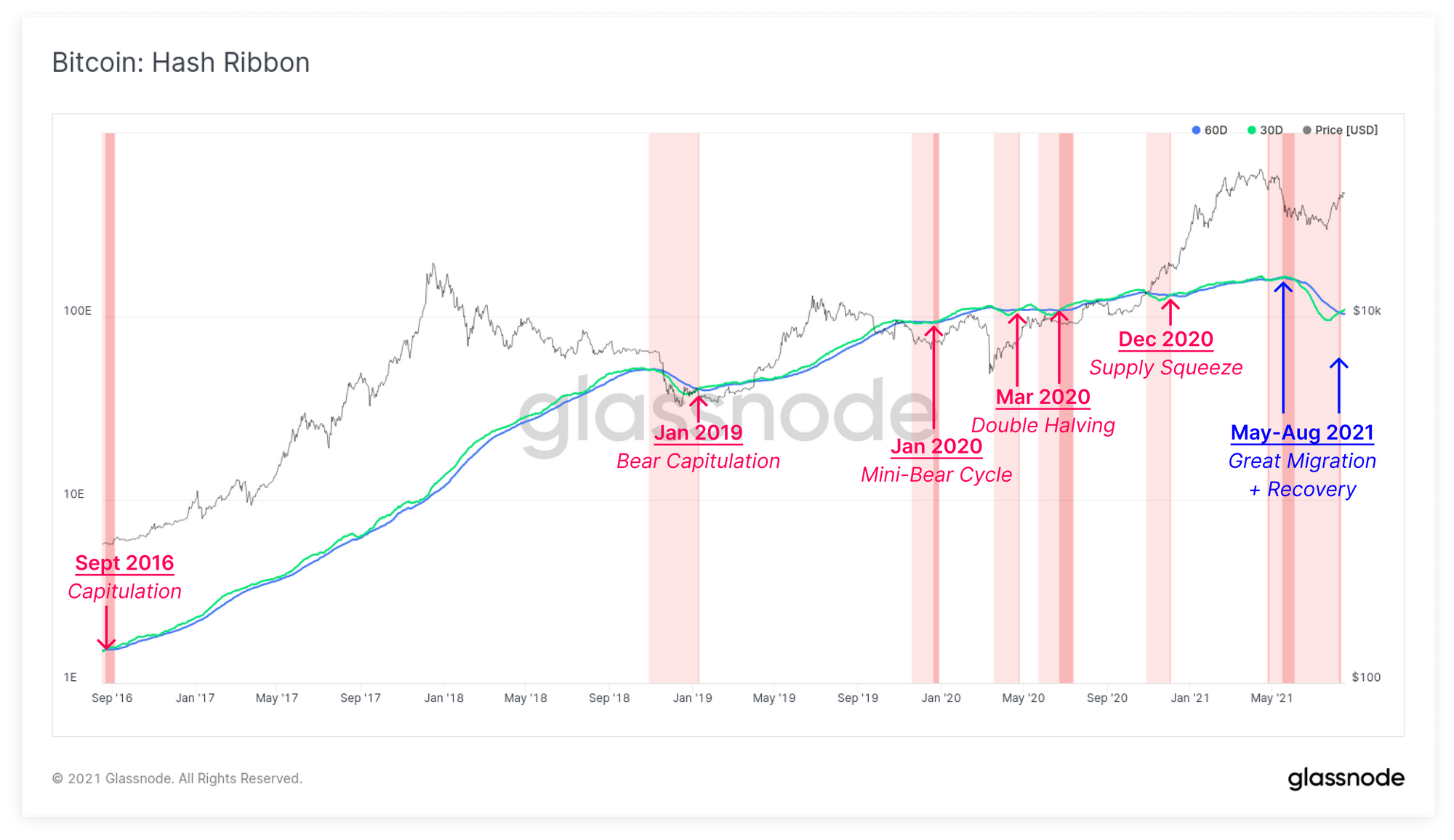
In response, the Hash-Ribbons, which attempt to model where stress enters the mining market, have commenced another positive cross-over. The Hash-Ribbons are formed by taking the 30D and 60D moving average of hash-rate with the following signals:
- 30D Crossing Below 60D is generally a signal of income stress entering the mining market as hash-rate comes offline rapidly. This can create additional sell pressure as miners are generating less income to cover their CAPEX and OPEX costs.
- 30D Crossing Above 60D is generally a sign of hash-rate recovery and miner capitulation. After this, the remaining miners have grown their share of the market and thus earn more BTC per hash.
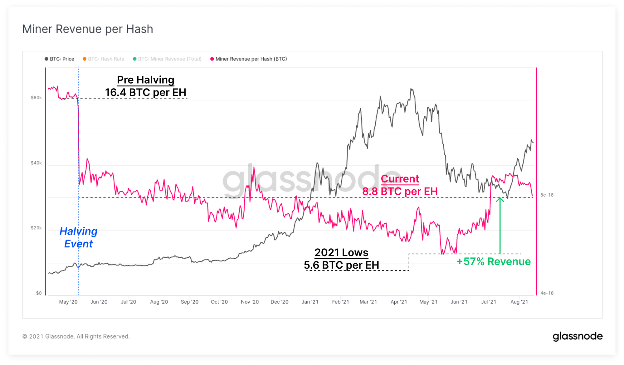
We can confirm this is the case using the Workbench Tool, and taking the ratio between total miner revenue (in BTC), and the active hash-rate. This presents the average BTC earned per hash of mining power.
Since the halving in May 2020, aggregate miner income has declined from around 9.5 BTC/EH to a low of 5.6 BTC/EH in May. As protocol difficulty adjusted in response to the Great Migration, miners who remained online have now seen their BTC income grow by 57% per hash to around 8.8 BTC/EH.
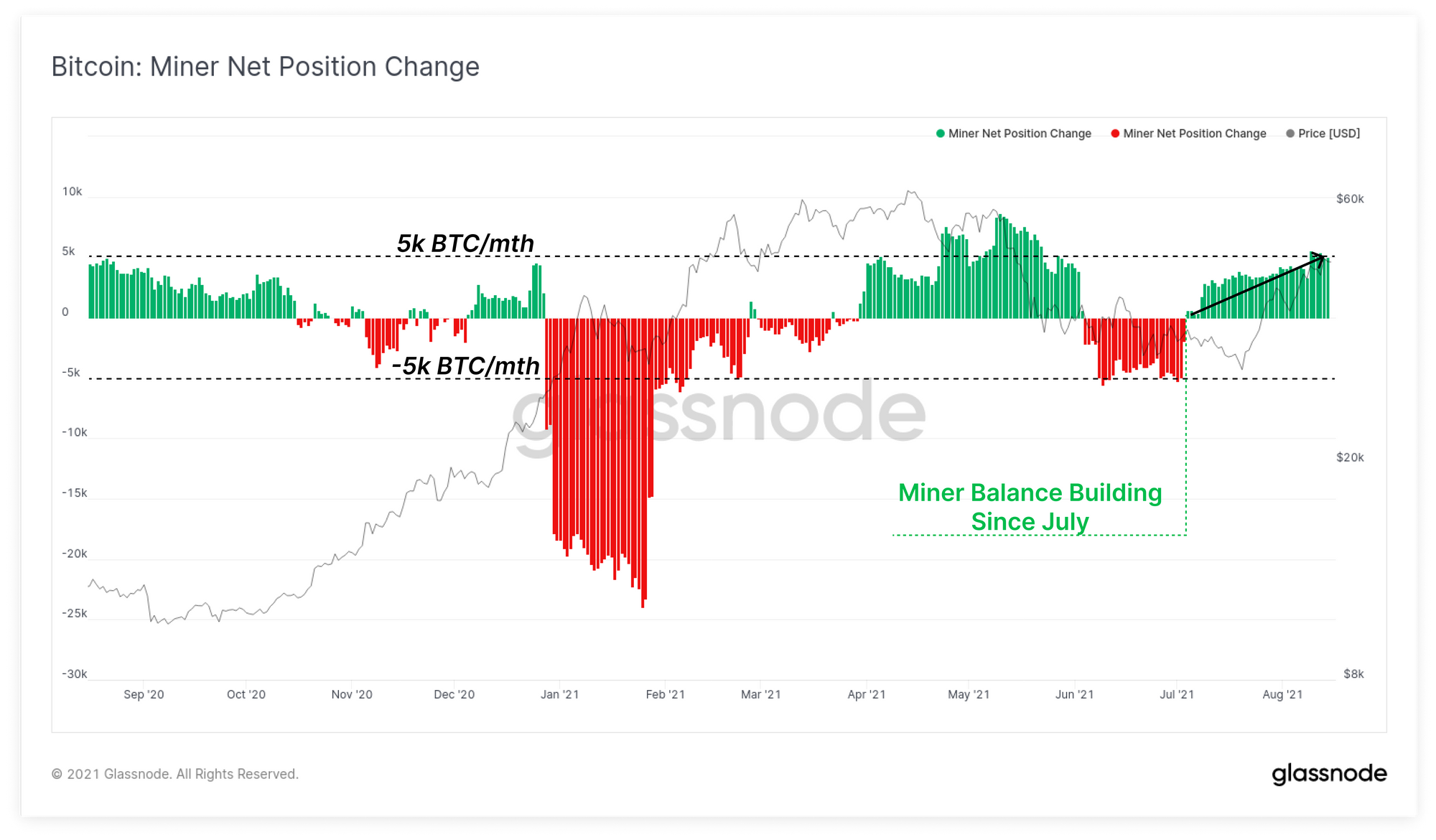
As a result of this, we have seen the net balance position of miners continue to increase over the last two months. The net growth of miner balances has now hit +5k BTC/month which demonstrates a net reduction in compulsory sell-side pressure sourced from miners.
Absorbing Capital Inflows
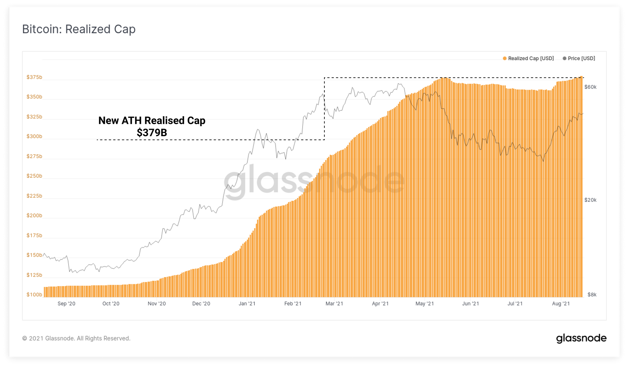
One of the most important on-chain metrics for Bitcoin is the Realised Cap, which is the on-chain equivalent to the market cap. It is calculated by valuing each coin at the price when it was last spent, representing an aggregate cost basis for the market. The Realised cap can be considered as follows:
- Uptrends indicate that coins accumulated at cheaper prices, are being spent, likely sold, and the market must absorb that sell-side pressure to trend higher.
- Downtrends indicate that coins accumulated at higher prices are being sold for a net realised loss and is typical of bearish markets.
The Realised Cap started trending higher in late-July and has just reached a new all-time-high of $379B. Given spot prices have continued to rally, this indicates that new capital is flowing into Bitcoin, and the market is capable of absorbing that sell-side pressure.
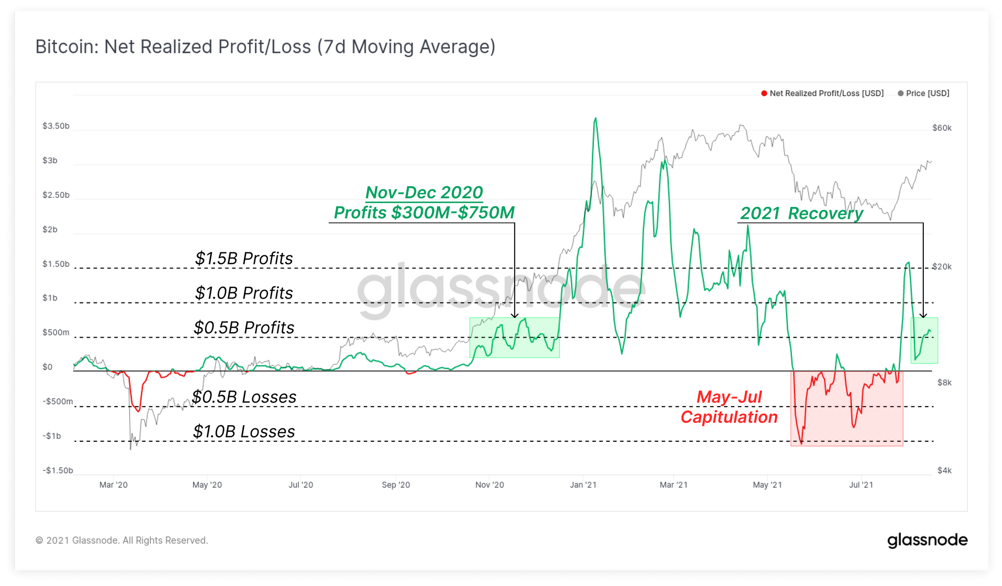
The net realised Profit and Loss metric demonstrates that since the recent local low of around $29k, the market has realised profits of between $0.5B and $1.5B per day. This follows and extended period of net realised losses through May to July that represented a likely capitulation event.
Market demand is currently absorbing coins sold at realised profits of a similar magnitude to the period in Nov-Dec 2020, prior to the main bull run. If the market can continue to sustain capital inflows at this level, it sets up a strong base and justification for continued market strength.
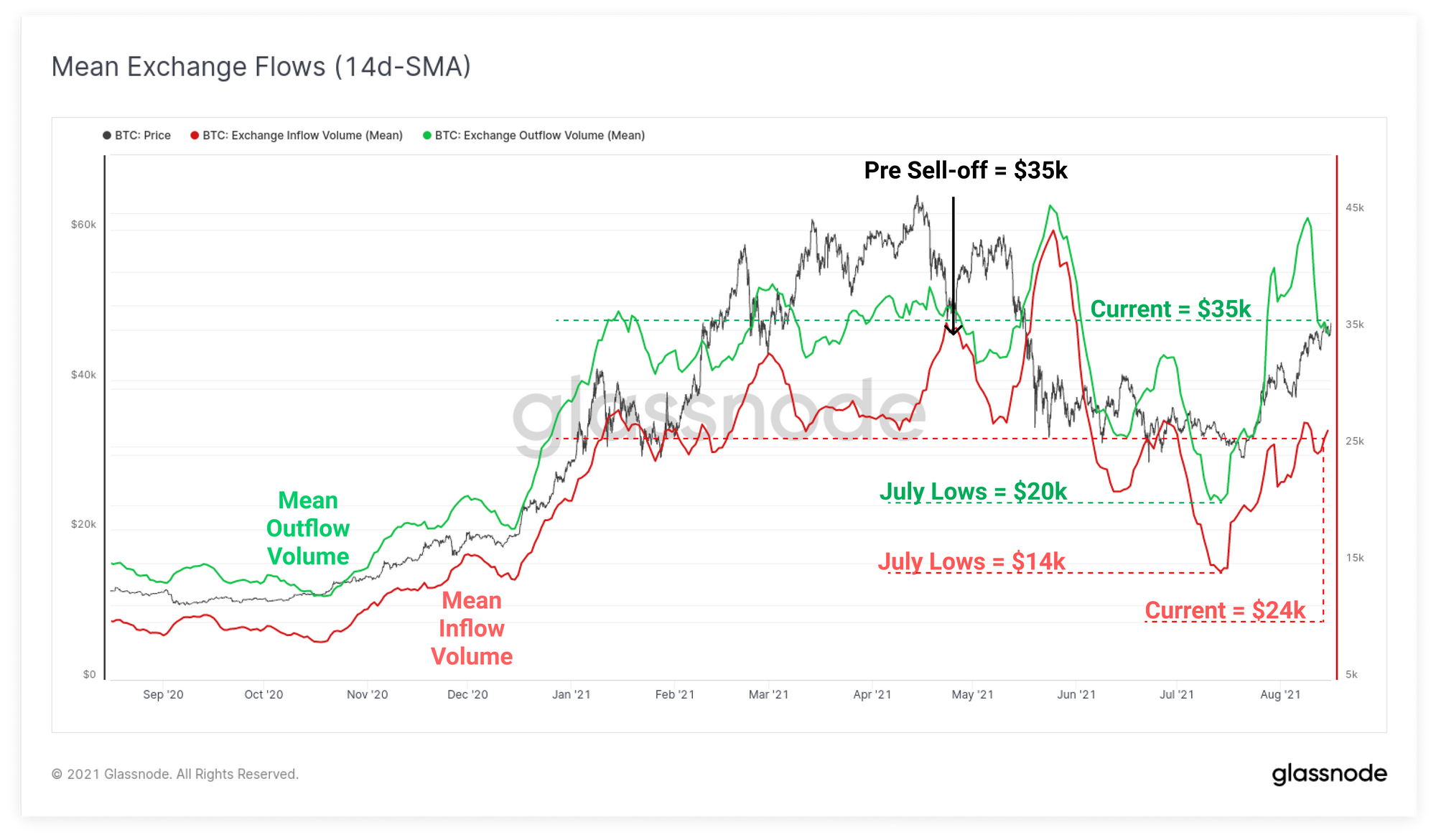
If we take a look at the average value of transactions flowing in and out of exchanges, we get a gauge of the net buy and sell-side action. Prior to the sell-off in May, both inflows and outflows converged around an average transaction value of ~$35k. This level was largely representative of the average exchange flows in Q1 and Q2 2021.
Following the May sell-off, both inflows and outflows dropped to $14k and $20k, respectively. These smaller average transaction sizes generally suggest an influx of smaller traders were both shaken out, and stepping in to buy the dip.
Since the recent $29k low, average outflow value has risen back to $35k which is a substantially higher divergence from than the average inflow value of $24k. Overall, this suggests larger size buyers are accumulating and smaller size traders are on the distribution side.
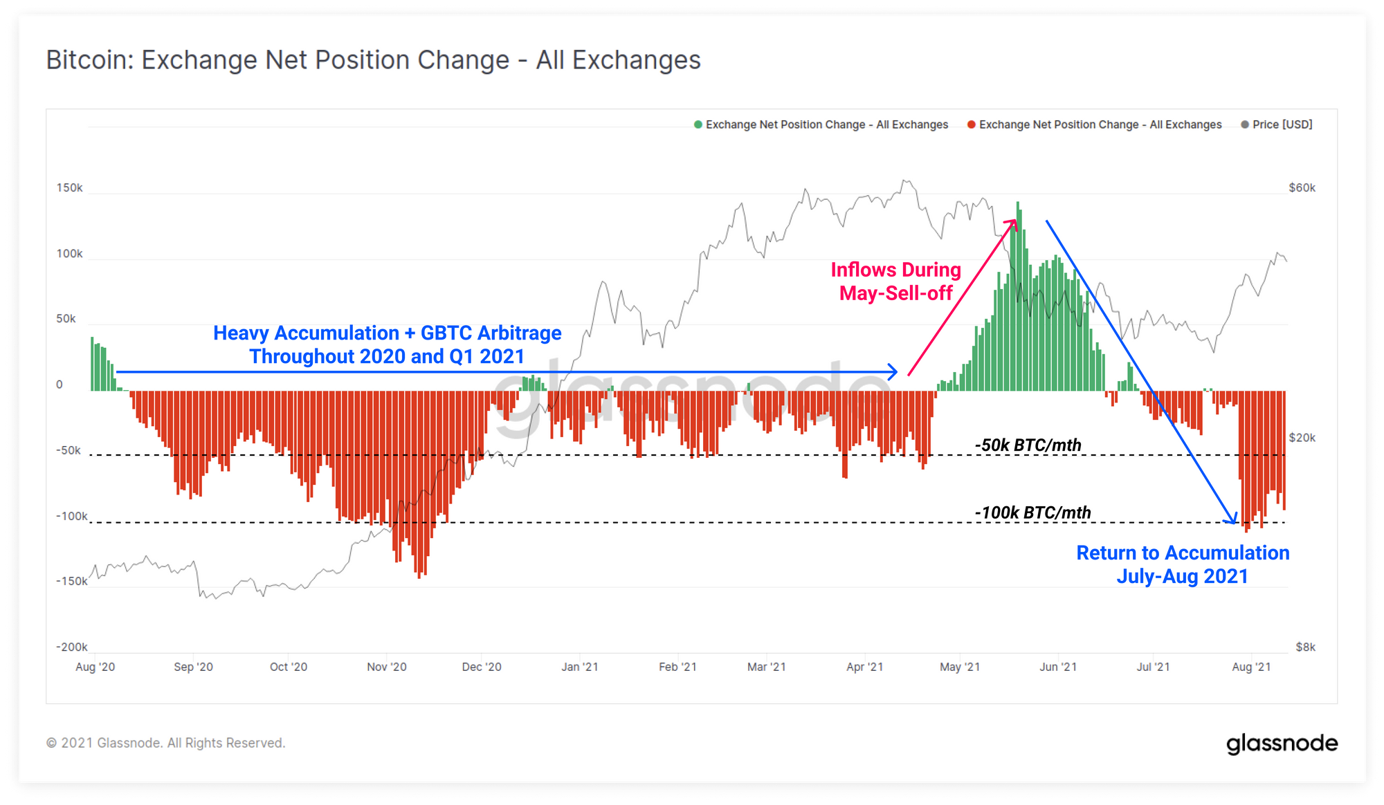
This aligns well with the Exchange net position change metric which demonstrates a net outflow has persisted since the start of July. Net outflows from exchange balances is currently occurring at a rate of between 50k and 100k BTC per month. This compares to the approximately 140k BTC in net exchange inflows through May-June we highlighted in our Week 31 edition of the newsletter.
Holders Return to Profit
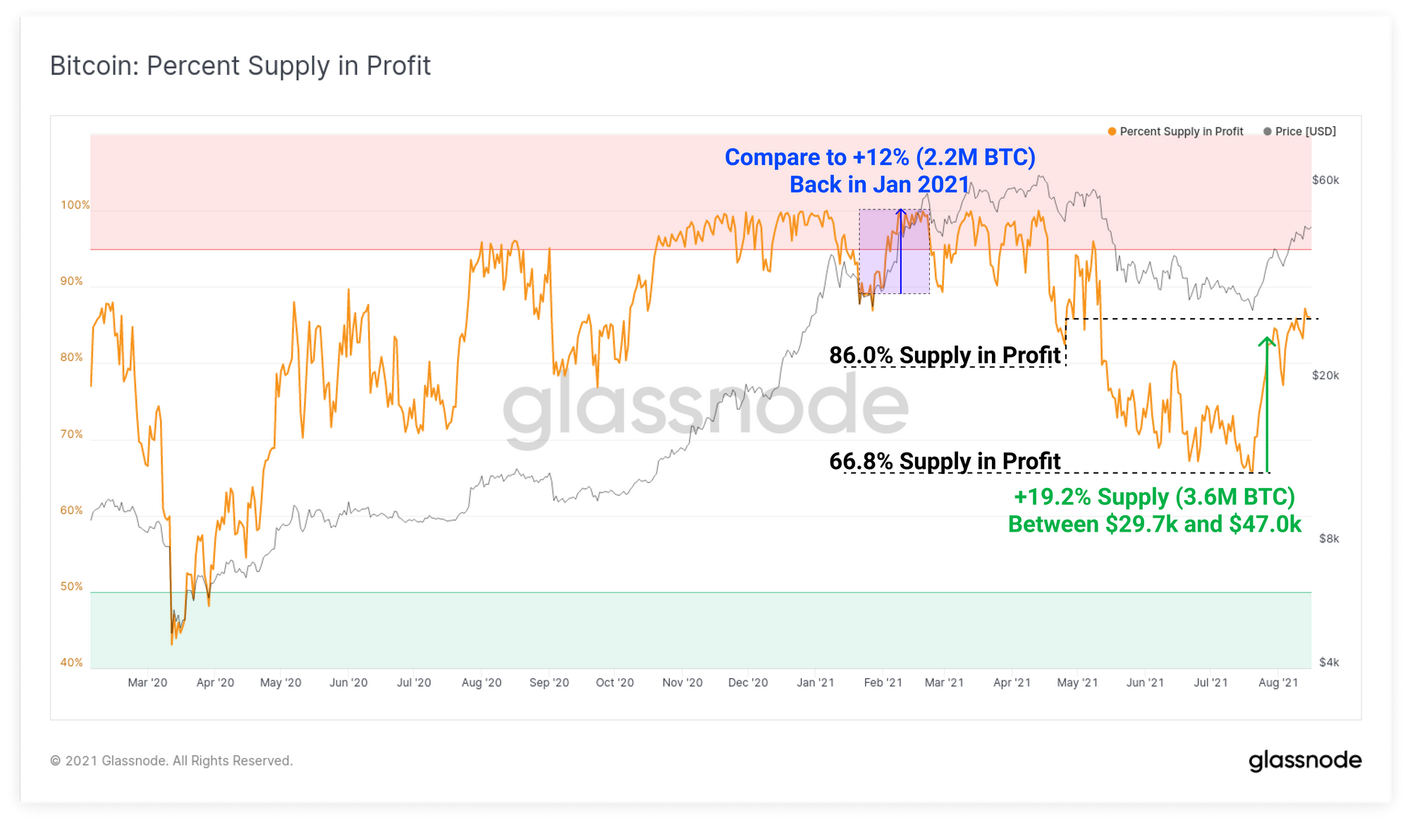
As prices rally, a larger portion of the coin supply returns to profit. This provides us with an opportunity to assess both how many coins were accumulated in particular price ranges, and also assess the aggregate market incentive to sell and realise gains.
Since the low of $29.7k set in July and the current price of $47.0k, a total of 19.2% of the circulating coin supply has returned to profit. This means that around 3.6M BTC were last spent, and thus have an on-chain cost basis in this price range.
From this we can deduce that a very significant volume of BTC has been accumulated in this price range. Note also how much larger this jump in profitable supply change is when compared to January where prices were in the same $30k-$40k range. This indicates that on net, approximately 1.4M additional BTC have been revalued within this price range since then.
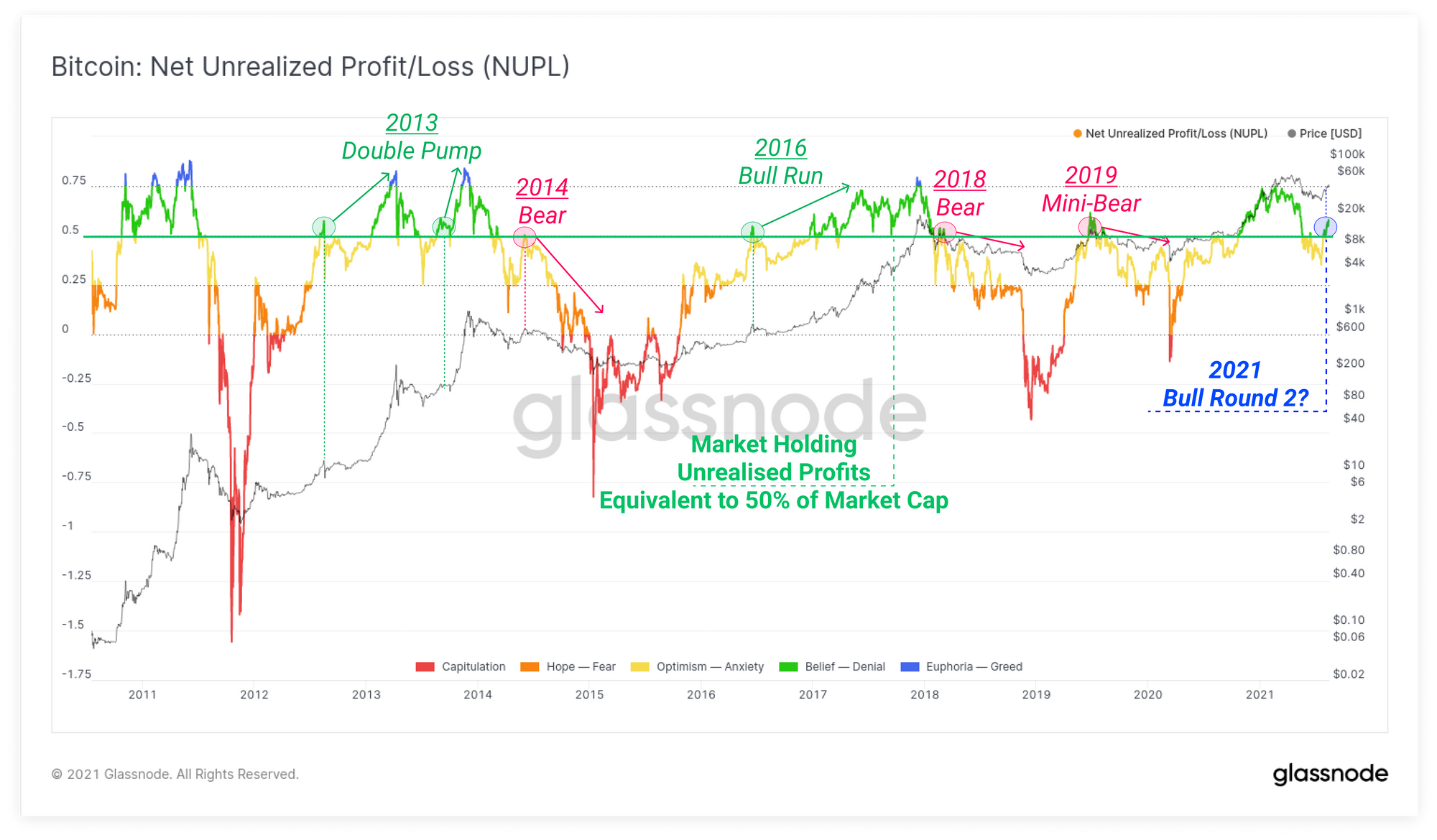
The Net Unrealised Profit/Loss metric provides a cyclical oscillator mapping the magnitude of unrealised gains/losses as a ratio of total market cap value. The NUPL metric has just broken above 0.5 indicating that the total coin supply is currently holding unrealised profits equivalent to 50% of the market cap.
Historically, a NUPL value of 0.5 is reached following a deep correction in two instances:
- Bear Market Relief Rallies as was the case in 2014, 2018 and at the end of the mini-bull in 2019. Coin holders take exit liquidity, their profitable sell coins and prices roll over.
- Bull Market Disbelief Rallies at which point a modest correction usually follows a NUPL value of 0.5 before the bull run continues. Similar spending behaviour governs as in bearish relief rallies, with investors taking profits into strength. The difference is that the market carries on upwards afterwards, creating additional FOMO buy pressure.
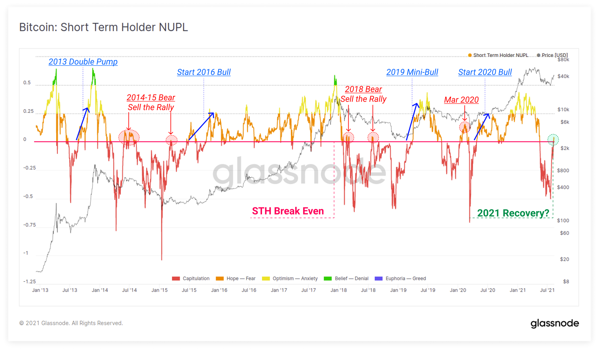
Finally, the STH-NUPL, which filters only for short-term Holders has returned to profitability. This means that coins moved within the last ~5 months are on net, slightly above their aggregate cost basis. Similar to the standard NUPL metric, these events are uncommon, but tend to precede explosive moves into a bear, or a bull market.
With the body of evidence we have outlined above across miner recovery, strong exchange ouflows, and relatively large accumulation below, the scales have most likely now tipped in favour of the current market conditions being a bull market disbelief rally.
Major Feature Release: Workbench
We are pleased to release Workbench, a new tool available in Glassnode Studio to generate custom, multi-line charts and use our formula editor. This allows analysts to easily combine our metrics, create and save your own, and take on-chain analysis in new and unique directions.

Week On-chain Dashboard
The Week On-chain Newsletter now has a live dashboard for all featured charts