The Week On-chain (Week 37, 2021)

We assess the market response of Bitcoin traders and investors following a week of volatility lead by derivatives markets.

The Week On-chain (Week 37, 2021)

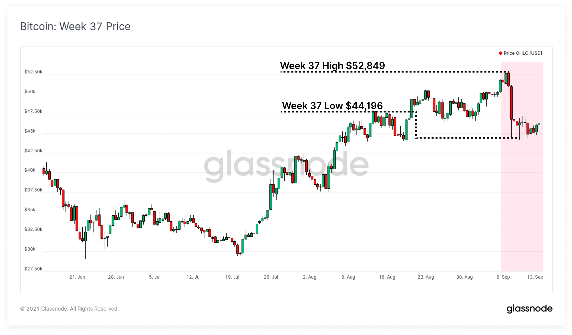
The Bitcoin market experienced a high volatility sell-off early in the week, with prices initially breaking up to a new local high of $52,849, before selling down to a low of $44,196. What appeared to be the main driver on the sell-side, was a flushing out of excessive leverage in futures markets.

Meanwhile, in spot and on-chain markets, the historically significant trend of investor accumulation and long term holding remains well and truly intact. Despite a 50%+ sell-off experienced in May, a strong rally from the $29k lows, and now another sharp sell-off this week, HODLers appear unphased.

This week, we will explore both the leverage flush that initiated the price mark down, and deep dive into the observable dynamics in the on-chain Bitcoin supply.

Derivatives Lead Downside Volatility

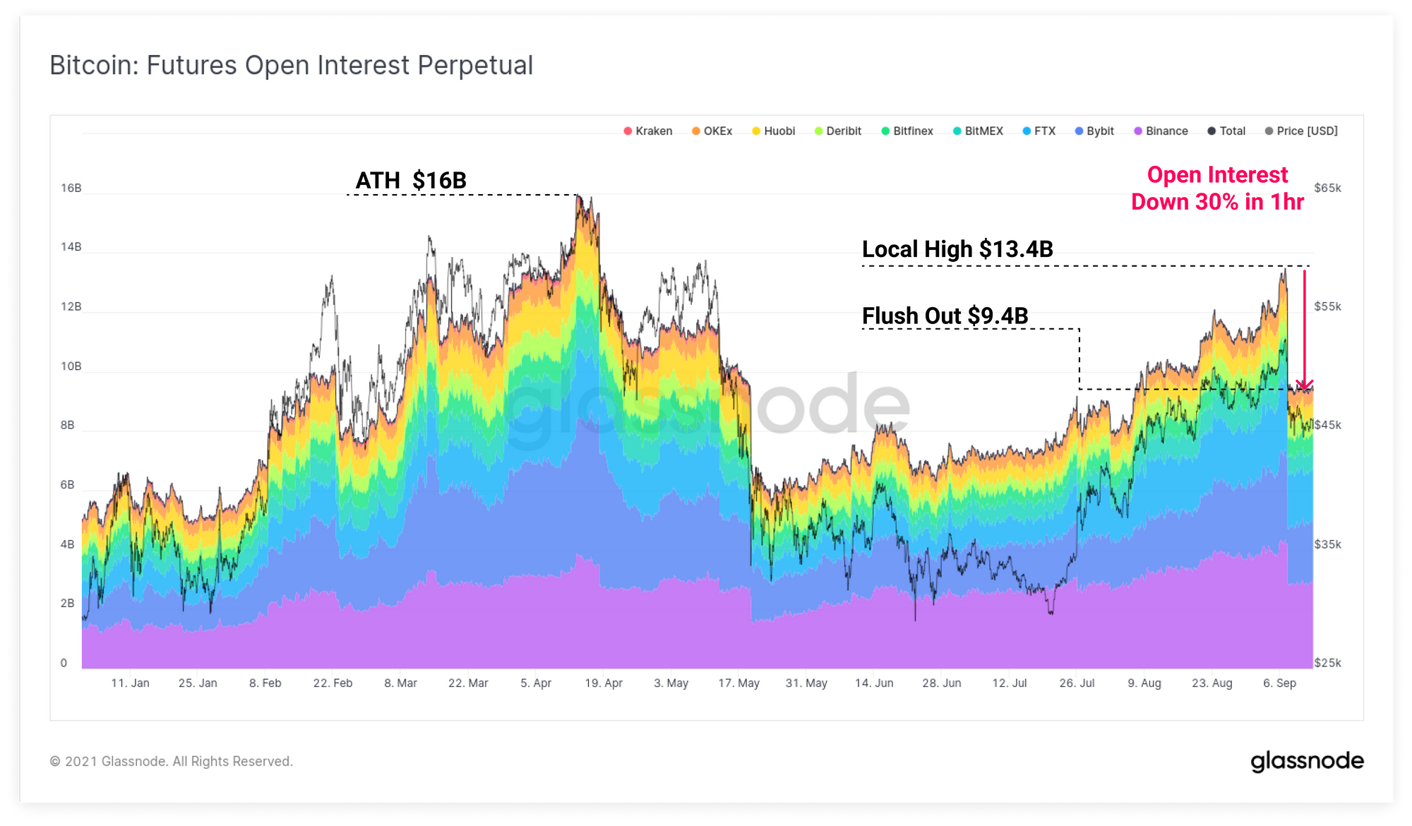
In last weeks newsletter and video report, we covered how the growth in futures contracts open interest, and increasingly positive perpetual swap funding rates in Bitcoin and Ethereum markets.

This highlighted a growing risk that excess leverage, with a long directional bias, could create a downside price squeeze. On Tuesday, both markets indeed saw a significant sell-off, with Bitcoin trading down more than $10k in one hour. This event acted to clear out much of the accumulated leverage, with the market consolidating for the rest of the week.

From the local high of $13.4B in open perpetual futures interest, a total of $4B worth of contracts (30%) were closed out and cleared within the hour. Leverage has remained fairly steady at around $9.4B for the remainder of the week.

Perpetual Open Interest Live Chart

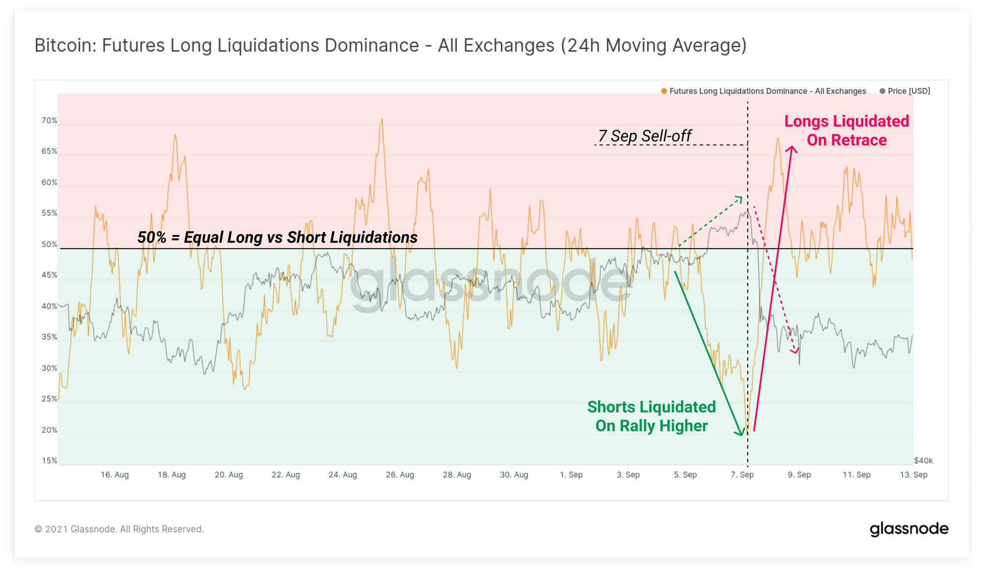
Using the Long Liquidation Dominance metric, we can see that just prior to this sell-off, futures markets actually experienced a brief short liquidation squeeze, that aided in pushing prices up to the local high of $52.8k. Short liquidations represented 80% of all liquidations during this time.

Immediately following this peak, the opposite occurred, with the proportion of long contract liquidations spiking to 68%, as BTC prices fell over $10k from the highs.

Futures Long Dominance Live Chart

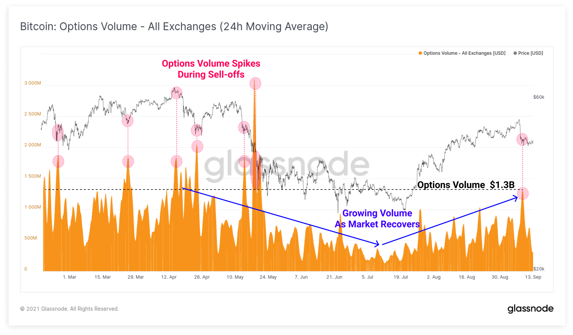
Options markets also saw a spike in volume, as traders rushed to hedge their positions, and capture volatility premium. This has become fairly typical behaviour this year where options markets consistently see elevated activity during market sell-offs.

The total volume traded in options markets has been in recovery mode since a relative lull in activity through May to July. During the hours around Tuesday's sell-off, traded option volumes reached a multi-month high of $1.3B.

Options Volume Live Chart

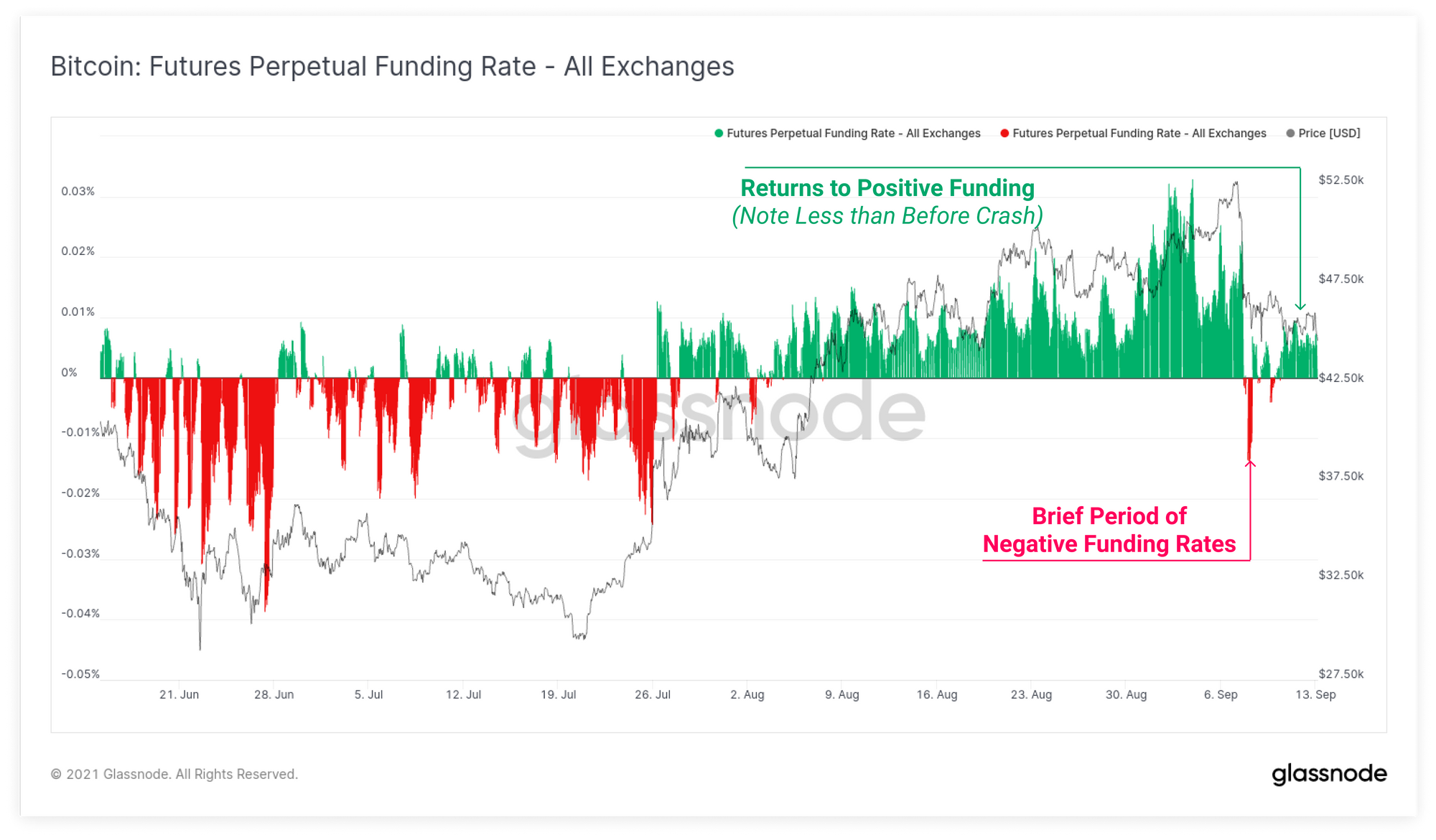
After a very brief period of negative funding rates during the sell-off, perpetual markets have returned to slightly positive funding rate suggesting that traders are still expecting upside price momentum. Note however that the magnitude of funding is much lower than it was prior to the crash, suggesting that at least a partial deleveraging has occurred.

Futures Funding Rates Live Chart

Week On-chain Dashboard

The Week On-chain Newsletter now has a live dashboard for all featured charts here. We have also started production for Week On-chain video analysis to provide a deeper dive into the thesis and logic behind each weeks analysis. Visit and subscribe to our YouTube channel, and visit our Video Portal to see our video content.


Coin Dormancy Dominates

Next we will review how spot and on-chain markets reacted to this sell-off. We start by looking at Average Coin Dormancy which presents the average age of the coins spent that day, adjusted per unit of BTC spent with two key takeaway observations:

  1. Dormancy did not spike during the sell-off which indicates the average age of coins spent at that time were relatively young, and older hands were not shaken out.
  2. Dormancy has continued to fall this week returning to the lower bound of the 2020 pre-bull period, suggesting the market has a strong preference for longer term holding.
Entity Adjusted Dormancy Live Chart

Revived supply is a metric that presents how much BTC volume was spent that was older than a particular age. We can use this tool to assess whether there is an influx of previously illiquid and HODLed coins coming back into liquid circulation, or if old coins remain dormant. High levels of revived supply could suggesting a negative shift in investor confidence, whereas low values suggest HODLer conviction remains intact.

During this week, 1yr+ revived supply has fallen to remarkably low levels, coincident with that seen in the 2020 pre-bull period. On a 7-day moving median basis, less than 2.5k BTC aged 1yr+ are being spent per day. This is 9x fewer old coins being spent when compared to the 2021 bull market peak in Jan 2021, where over 22.5k BTC were spent as prices reached $42k for the first time.

1yr+ Revived Supply Live Chart

This observation is confirmed by assessing the proportion of supply in the Young HODL waves, those less than 3 months old. Here we can see that coins younger than 3 months have reached an all time low of 15.9% of the circulating supply. The converse of this is that coins older than 3 months now represent an all time high of 84.1% of supply.

Historically, periods where young coins reach a minima tend to correlate with late stage bear markets (blue) after significant smart money accumulation has taken place. This is where hype and interest in the asset is at its lowest, whilst accumulation demand by smart money investors is at a relative high. It describes young coins being taken out of liquid circulation and begin to mature in investor wallets.

The opposite is typically true in late stage bull markets (red) and cycle tops, where the maximum number of old coins are spent and transferred to new investors, attracted by hype, media coverage and price appreciation.

HODL Waves Live Chart

Macro Accumulation Continues

HODLers are often described as Bitcoins buyers of last resort, who step in during volatile downswings in price, and place their bids when the markets look the worst. These high conviction buyers are best appreciated on-chain using coin ages, with our research suggesting that lifespans of around 155-days is a suitable threshold between Long- and Short-term holders.

155-days ago, in mid-April, the Bitcoin market was trading at $60k, trading up to towards the current all time high. Thus, any coins purchased after the ATH are generally going to be classified as Short-Term Holder coins (STH).

The chart below shows that at this weeks high of $52.8k, over 16.8% of the coin supply was owned by STHs and in profit. What this reflects is the very large accumulation that occurred between the recent low of $29k, and up to the lower bound of the Q2 topping range.

Relative LTH-STH Profit and Loss Live Chart

We can also see that LTH owned supply has reached 79.5% of all BTC coins this week, which is equivalent to the level reached in October, prior to the bull market kicking off. In fact, on an absolute coin volume basis, LTHs currently own the most coins in history, hitting 12.97M BTC this week. Peaks in LTH owned supply typically correlate with late stage bear markets which are historically followed by a supply squeeze and initiation of cyclical bull runs.

LTH Supply Live Chart

It is quite impressive to see the volume of BTC crossing the 155-day STH-to-LTH threshold has maintained a very positive rate since May. One could have reasonably expected it to slow dramatically as many coins that were initially purchased in Q2 2021, in the $50k to $64k range, were sold at a loss in May and June.

However, the charts above, and the Long-Term Holder Net Position change actually demonstrates that a very large portion of the supply accumulated in that topping range, remain unspent, and tightly held to this day.

At the moment, coins are crossing the LTH age threshold at a strong rate of 421k BTC per month. Given we have already established that more than 16.8% of the supply was accumulated in the recent $29k to $40k range, there is a good case to be made this trend will continue into October-December (155-days after the May-July consolidation).

LTH Net Position Change Live Chart

Finally, we review the Liquid and Highly Liquid coin supply (see our methodology) on a macro scale which highlights just how unique position the current market cycle is. For the vast majority of bitcoins life, there has been an expansion in the volume of coins that freely circulated and were spent frequently on-chain. After the final capitulation sell-off for the 2018 bear market, liquid supply started to plateau, a trend that persisted until March 2020.

Following the sell-off in March, a structural trend of increasing coin illiquidity has dominated the on-chain supply dynamics, as more coins transitioned out of exchange balances, and into long term investor wallets.

After the moderate exchange inflows in May 2021, this downtrend in liquid coin supply (increasing HODLing behaviour) has resumed, suggesting macro conviction to hold BTC remains a dominant force in the market. It appears that despite significant volatility through 2021, long term Bitcoin investors continue to accumulate and keep coins in cold storage.

Liquid and Illiquid Supply Live Chart

Product Updates

Metrics and Assets


Disclaimer: This report does not provide any investment advice. All data is provided for information purposes only. No investment decision shall be based on the information provided here and you are solely responsible for your own investment decisions.