Is a Bitcoin Bottom in?
As Bitcoin prices bounce from multi-month lows, we investigate the likely driving mechanisms, and evaluate the quality of support provided in the $30k-$40k range.


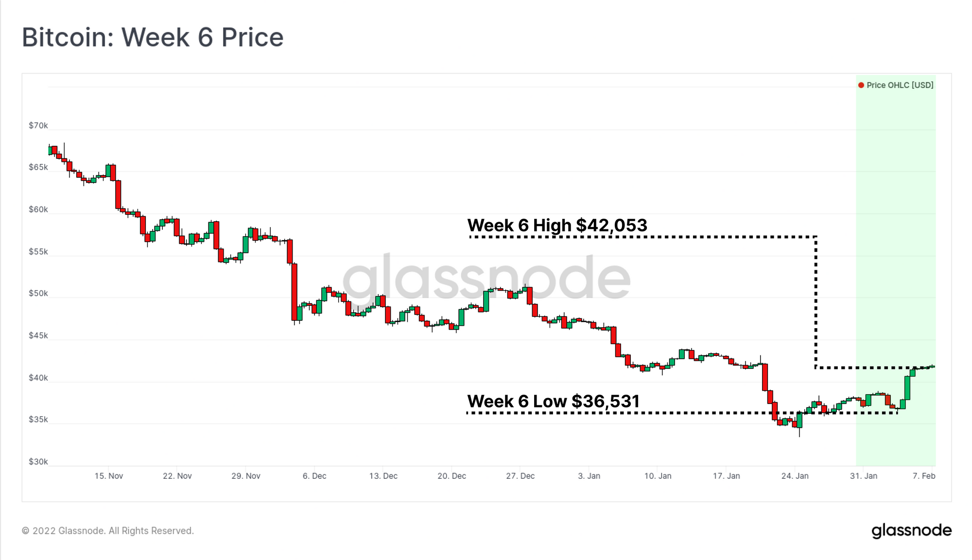
After three months in a persistent downtrend, the Bitcoin market has caught a bid, with the market trading above and holding the psychological $40k level. However, with numerous macro and market headwinds in play, the question is whether this is THE bottom, or just A local bottom within a longer time-frame bear.
In this week's edition, we will assess the underlying support that established the recent price lows, as well as the various mechanisms that are driving the market higher. Prices have bounced off a number of fundamental levels that have historically signalled undervaluation or a 'fair value' price. We also discuss whether the short squeeze discussed in the previous edition has played out, and the spending patterns of short-term holders in response to market upside.
We also provide some commentary on the recent spend of 96.4k BTC associated with the Bitfinex hack in 2016, and how this was detected in various on-chain metrics.
Translations
This Week On-chain is now being translated into Spanish, Italian, Chinese, Japanese, and Turkish.
The Week Onchain Dashboard
The Week Onchain Newsletter has a live dashboard with all featured charts available here. This dashboard and all covered metrics are explored further in our Video Report which is released on Tuesdays each week. Visit and subscribe to our Youtube Channel, and visit our Video Portal for more video content and metric tutorials.
Fundamental Support
Throughout 2021 and 2022, the $30k to $40k price range has proven to be a sturdy support level for the Bitcoin bulls. In 2021, this range was defended after the 50%+ drawdown in May-July, provided support in the September correction, and has once again been a source of bid support in Jan-Feb this year.
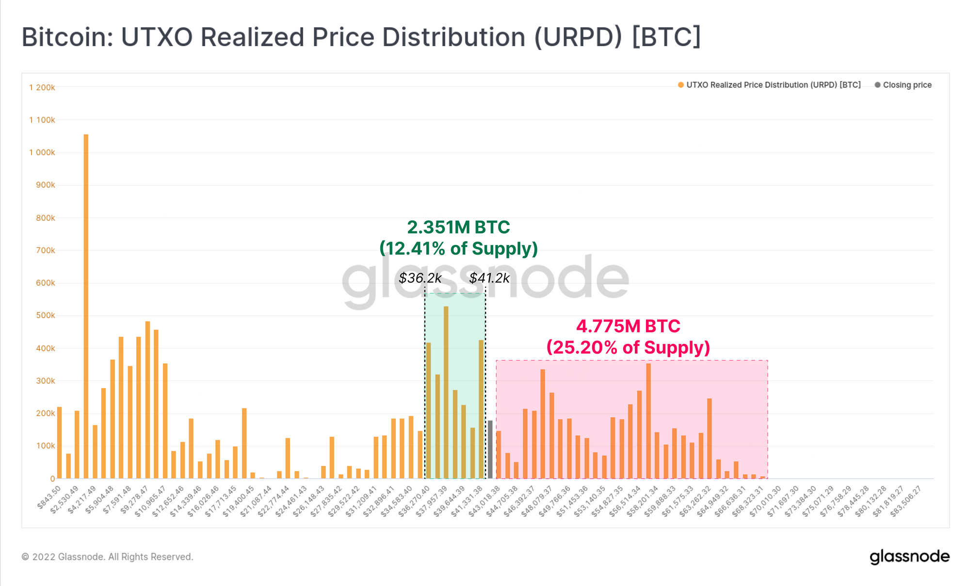
The URPD metric shows the distribution of realised prices for the current Bitcoin UTXO set. Here we can see that 2.351M BTC (12.41% of supply) have last transacted between $36.2k and $41.2k. Even with these coins being redistributed to lower realised values, the market remains top-heavy, with more than 25% of the circulating supply having last transacted at higher prices.
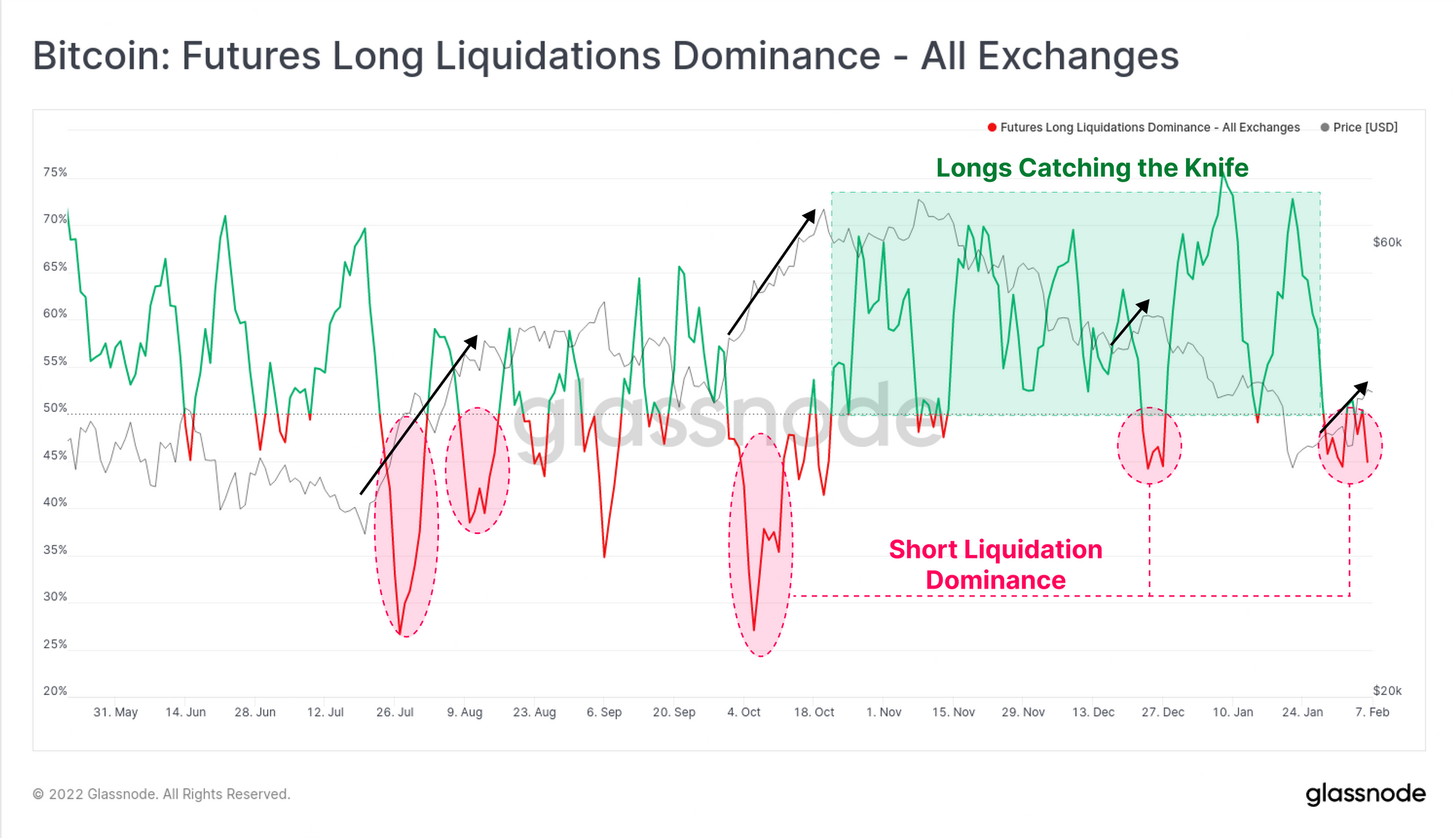
As the market pushes higher, one mechanism driving it may be the squeezing of late entry shorts as discussed in last week's edition. Inspecting the Long Liquidation Dominance charts shows that shorts have been on the back-foot this week, with a minor skew towards short side liquidations.
However, the magnitude of this metric remains fairly lacklustre, indicating that it is unlikely that price upside is being primarily driven by a short squeeze.
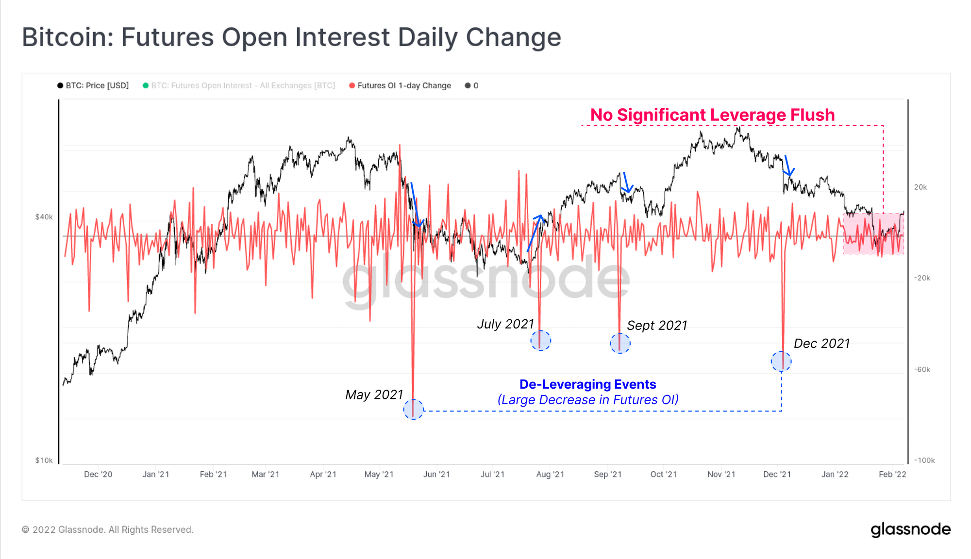
This is largely confirmed by the 1-day change in Futures Open Interest, where we have not yet seen the characteristic de-leveraging event, where a large volume of open contracts are forced closed. Futures Open Interest does however remain elevated at around 1.91% of the Bitcoin Market cap (~$15Billion).
This may indicate the probability of a short squeeze is lower than first estimated, or that such an event remains possible should the market continue higher, reaching clusters of short seller stop-loss/liquidation levels.
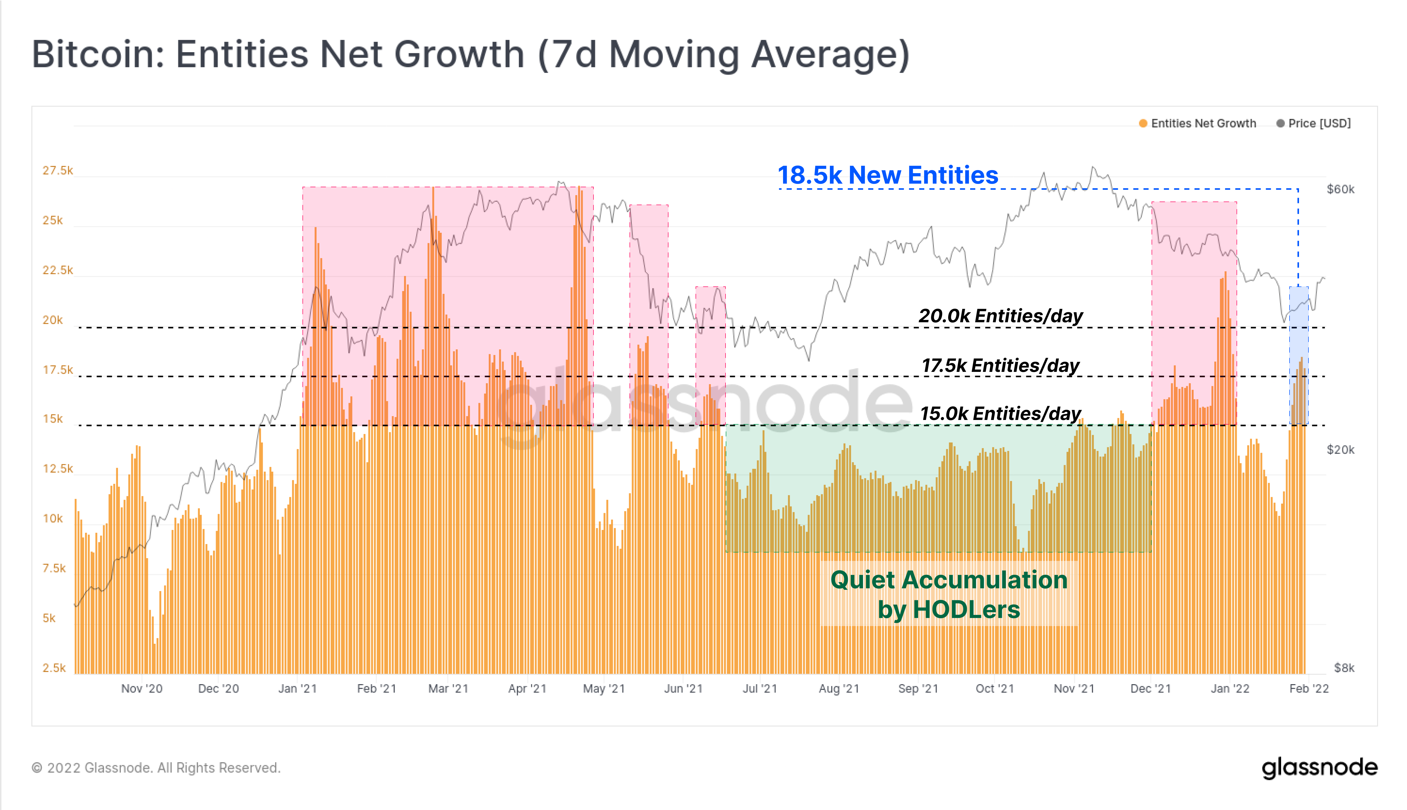
Looking to the spot/onchain markets, we can see that the Bitcoin network saw an impulse of new net entities this week, pushing up to a net growth of 18.5k entities per day. Through 2021, large impulses of net entities have occurred around volatile periods such as bull market corrections in Q1-Q2, and during the 50%+ sell-off in May.
June to Dec 2021 was a period of quiet accumulation with a stable baseline of 12.5k net entities entering the network per day. As such, the recent spikes in Jan and Feb may suggest a tentative transition out of HODLer dominated accumulation, or at least a renewed interest in Bitcoin after trading down to more attractive entry prices.
New Glassnode Content
We are pleased to release our latest research report and metrics on Segwit adoption by exchanges. In this piece we introduce a new metric called SegWit Utilisation, as well as critically evaluate SegWit adoption rates by the largest consumers of Bitcoin blockspace.
We have also released three new metrics associated with this research:
 Johannes Hofmann
Short Term Momentum Swings Upwards
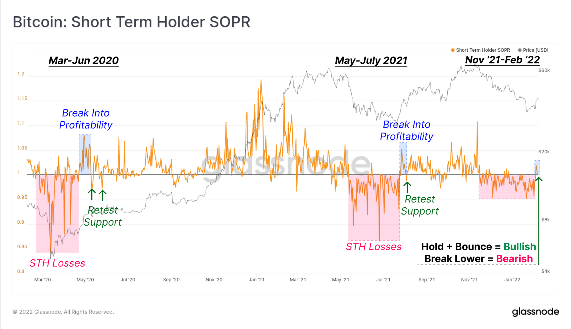
For the first time since late November, Short-Term holders (STHs) have seen a profitable day, with STH-SOPR breaking above 1.0. This indicates that coins that were spent, and younger than 155-days, realised profits on aggregate this week. This follows more than two months realising losses every day as STHs who bought the top, were shaken out of their coins at lower prices.
A similar STH-SOPR pattern can be seen in two instances since March 2020. After a long period of losses, the market managed to break into a bullish uptrend, with a STH-SOPR retest of 1.0 to confirm. Should we see STH-SOPR break higher again, it indicates renewed profitability and demand inflows are absorbing coins. Conversely, a break back below 1.0 would be a bearish indicator, and suggests there is insufficient demand to support sell-pressure from STHs.
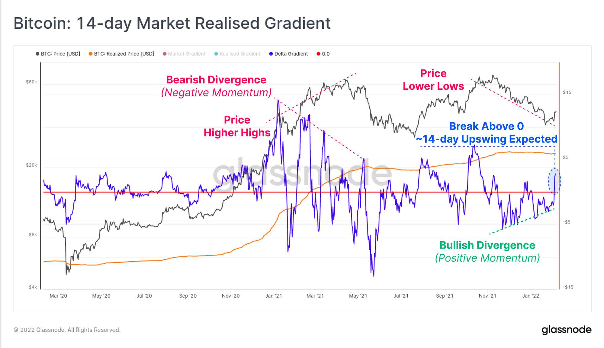
We can also see a fairly dramatic bullish divergence playing out on the 14-day Market-Realised Gradient (MRG) oscillator. This metric models the degree of momentum in market pricing relative to the natural capital inflows, captured in the Realised cap. General interpretation is as follows:
- Successive Higher/Lower peaks indicate increasing momentum to the Upside/Downside, respectively.
- Breaks above/below 0 indicate that a new uptrend/downtrend is in play, with an anticipated swing duration of ~14-days.
Where the market top in Mar-Apr 2021 showed a bearish divergence (declining market momentum with higher highs in price), the current period reflects a bullish divergence. With each new price low set, there is reducing momentum to the downside, and the 14-day MRG has now convincingly broken above 0. The 28-day MRG actually shows similar market structure, providing confluence and magnitude to the argument for at least a local market low being established.
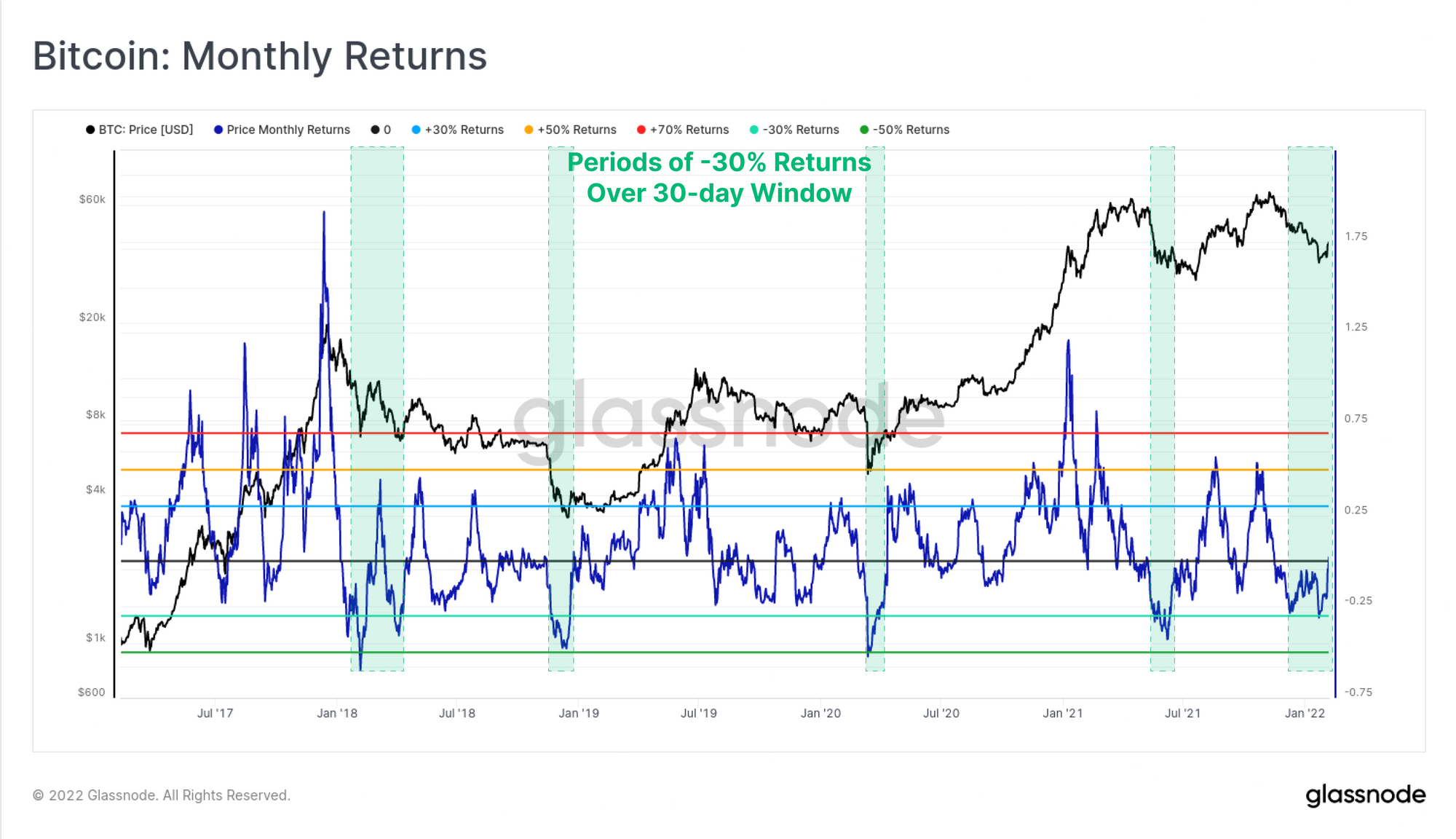
This upswing follows a fairly persistent three month downtrend, which pushed the monthly return profile for Bitcoin well into negative territory. The chart below shows Bitcoin returns (as %) over a rolling 30-day window, with negative returns of -30% historically signalling oversold conditions. Monthly returns have only been this poor in five periods in the last 5-years:
- The corrections in Jan-Apr 2018 which started the bear market.
- The November 2018 bear market capitulation event.
- The March 2020 market wide sell-off as COVID locked down global economies.
- The May 2021 sell-off and de-leveraging event.
- The YTD performance in 2022.
Estimates of Bitcoin's Fair Value
There have been many approaches and models proposed to valuing Bitcoin over the years, and the assessment of any set should be accompanied by confluence between numerous metrics and indicators.
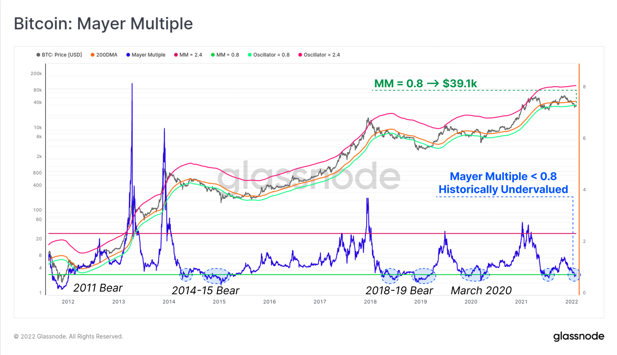
One of the simplest, but still very powerful tools for this is the Mayer Multiple, calculated as a ratio between price and the 200-day moving average. The 200DMA is widely observed as a long-term bull/bear indicator in technical analysis, and as such steep deviations below it can indicate a degree of undervaluation relative to a long-term mean. The Mayer Multiple traded below 0.8 this week, representing a 20%+ discount relative to the 200DMA. The price level representing a Mayer Multiple of 0.8 is $39.1k, which the market has now reclaimed (calculated as 0.8 x 200DMA).
Similar to the Monthly Returns metric, previous instances of a Mayer Multiple trading below 0.8 typically correlate with severe drawdowns in bear markets, and particularly during market-wide capitulation events (e.g. Jan 2015, Nov 2018 and Mar 2020).
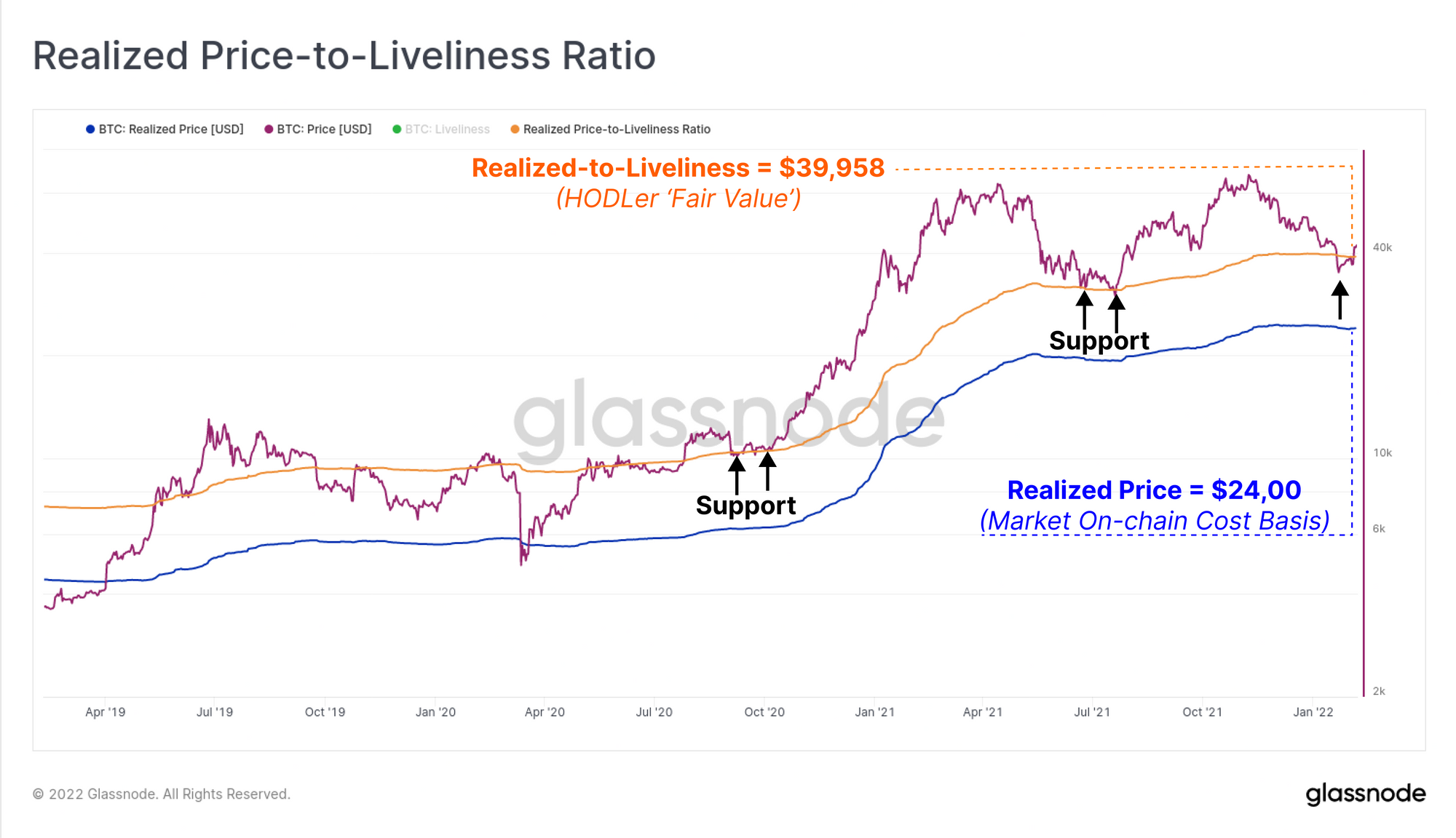
Another metric that reflects a 'fair value' is the Realised-to-Liveliness Ratio (RTLR) which is proposed to estimate the 'fair value' of Bitcoin as priced by the HODLer cohort. During periods of heavy coin dormancy, Liveliness declines, and the realised price is thus amplified when Liveliness is placed in the denominator (and vice-versa).
This metric has provided support in late 2020 prior to the main bull market impulse, and again in June and July 2021. The market traded below this level last week, but has since reclaimed the RTLR level of $39,958, which is reasonably consistent with the support level with a Mayer Multiple of 0.8.
On the 2016 Bitfinex Hack Wallet
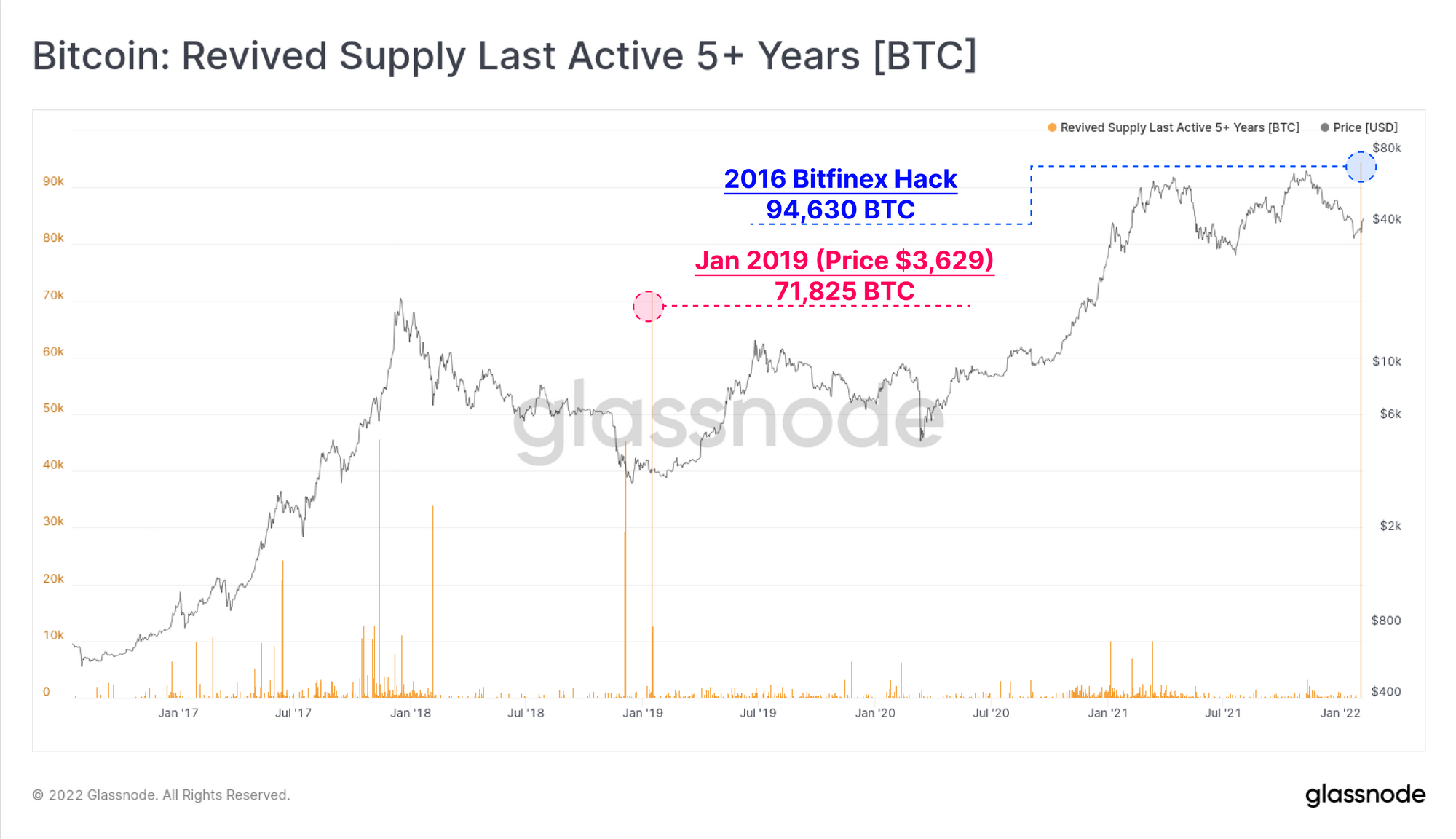
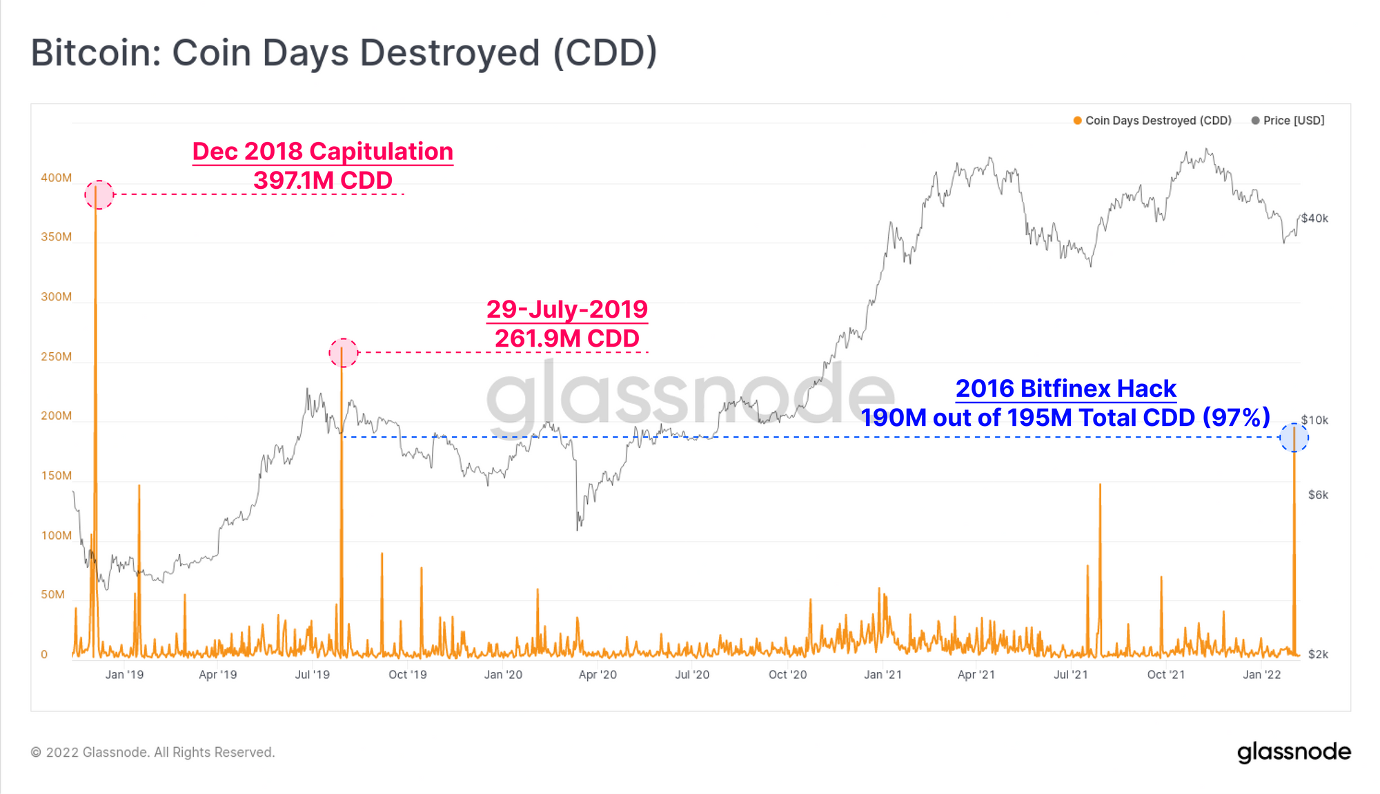
This week a number of on-chain metrics detected a very large spend of 94,643 BTC associated with wallets from the 2016 Bitfinex hack, with a market value of $3.67 Billion. Given the large size, both in coin volume, USD value, profit realised, and lifespan destroyed, this makes for an interesting case study in assessing how anomalous on-chain events affect metric interpretation.
We can see in 5yr+ revived supply that this spend is the largest 5yr+ old spend in history, eclipsing the previous high of 71.825k in Jan 2019 when prices were $3,629.
Coin-days destroyed also spiked to multi-year highs with a total of 195M coin-days destroyed, of which 190M (97%) are associated with the Bitfinex wallets.
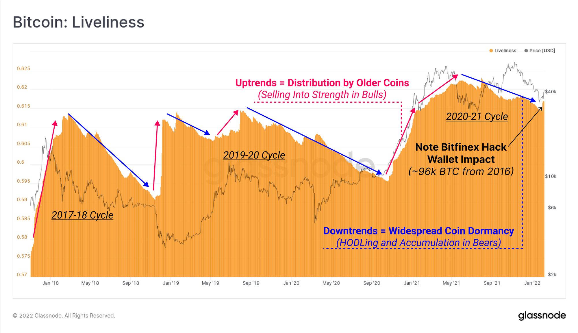
As noted above, a declining Liveliness metric indicates that across the entire coin supply, a greater volume of coins are dormant and accumulating lifespan (coin-days), compared to those being spent, destroying coin-days. This is typical of periods of HODLer accumulation, and is often synonymous with bear markets.
Liveliness is in an established downtrend, with the notable exception of a vertical increase this week in response to the Bitfinex spend, which lifted this macro scale metric by 0.38% on the day.
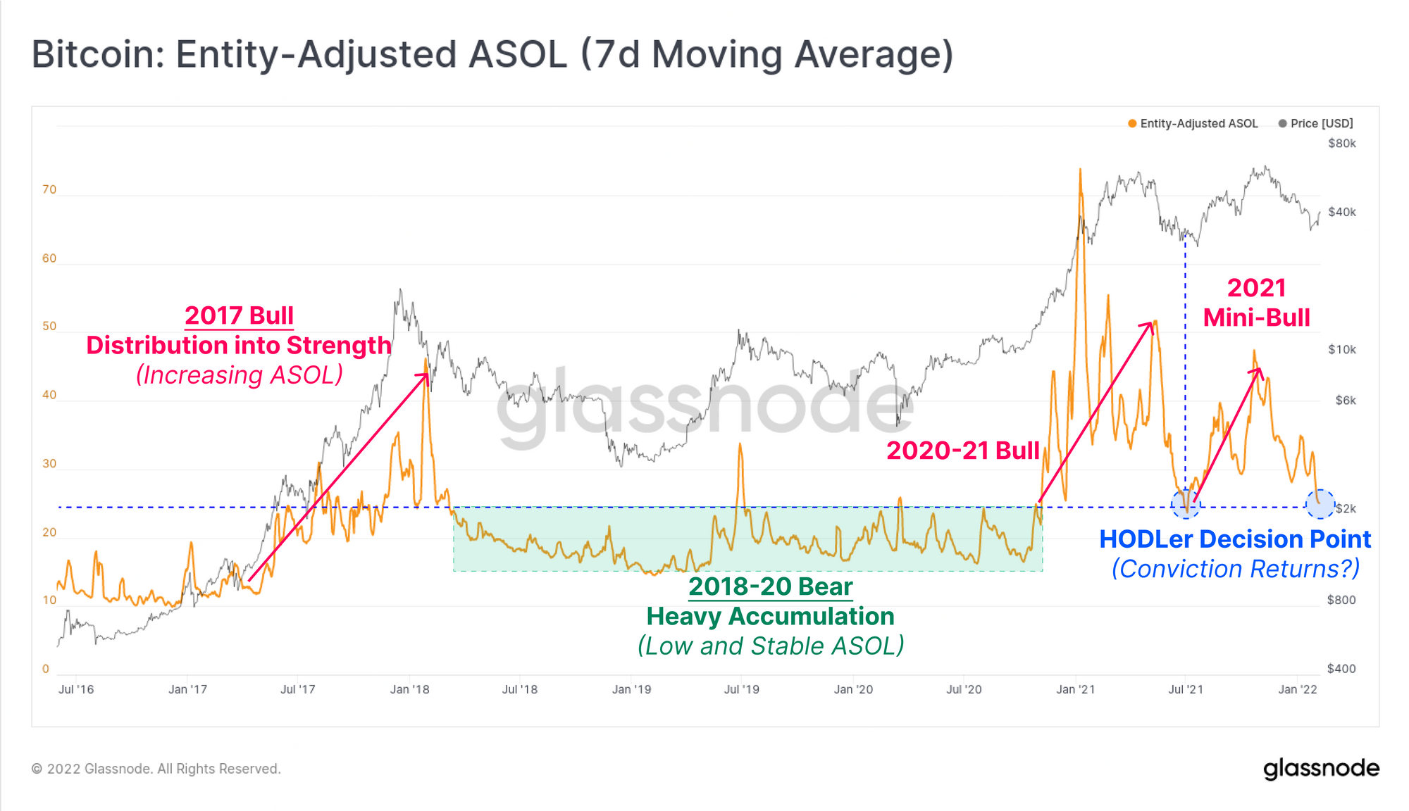
One lifespan metric that can be deployed to cut through anomalies such as this one, where a small number of wallets spend very large/old coins, is ASOL. Average Spent Output Lifespan measures the average lifespan of spent coins on a per UTXO basis, ignoring coin volume completely (which is measured by CDD and Dormancy for example).
ASOL did not respond meaningfully to the Bitfinex wallet and is actually breaking down to lows last visited in June 2021. Uptrends in ASOL are typical when there is widespread distribution by older coins, usually in bull markets. By contrast, downtrends such as the one in play suggest HODLing is the preferred behaviour, which is consistent with the macro scale downtrend in Liveliness.
Summary
As the Bitcoin prices bounce from multi-month lows, we investigated the potential driving mechanisms, and evaluated the support provided by investors in the $30k-$40k range. The market lows of $33.5k set last week were associated with historical undervaluation across a range of metrics including the Mayer Multiple, RTLR, and the monthly return profile.
The market remains top-heavy in supply distribution, with over 25% of all BTC holding unrealised losses. However, there is a reasonable degree of momentum behind this rally, with STHs returning to profitability, and the short-range MRG oscillators flipping positive. Key to watch moving forward is whether Long-term holders and older coins take exit liquidity, and whether the rally can be supported by renewed demand which has been lacking in general since the May sell-off.