The Price of Time
After several weeks of out-performance by Bitcoin prices, the market is taking a breather. Within this consolidation, we will gauge investor confidence in the uptrend using a suite of on-chain tools, ranging from exchange flows, to profit taking, and coin holding times.


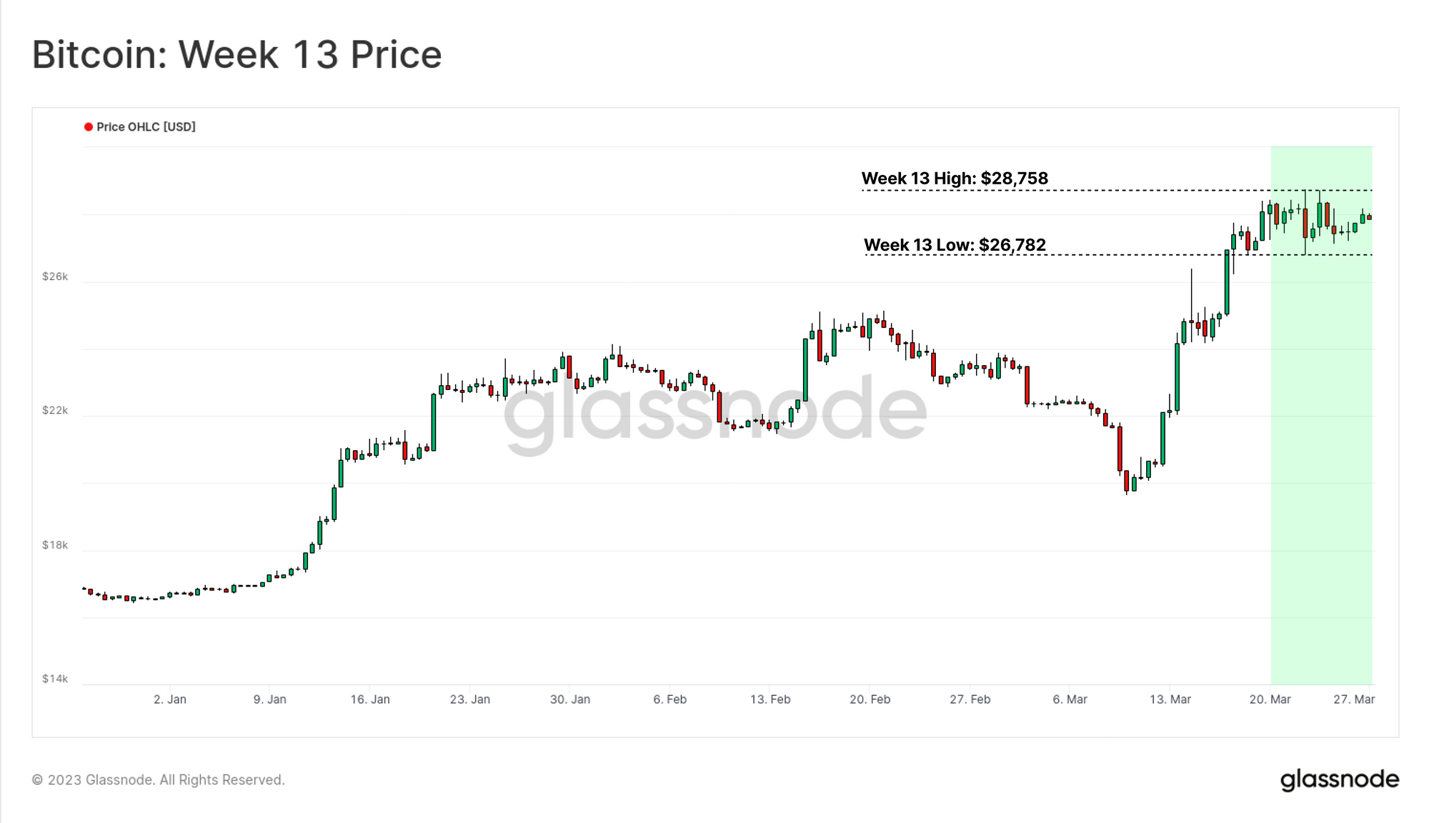
The market has taken a pause this week, with BTC prices consolidating in a tight range between $26.7k and $28.7k. After the historically significant out-performance we covered in last weeks edition, the market is taking a breather.
As this consolidation takes place, we will focus in on better classifying investor profit taking behavior utilizing a variety of on-chain tools:
- Exchange inflows, including a breakdown into Long and Short-Term holders.
- Realized profits locked in by investors accumulating coins near the recent lows.
- Lifespan metrics describing the amount of holding time destruction, to better gauge the confidence investors have in the prevailing uptrend.
🪟 View all charts covered in this report in The Week On-chain Dashboard.
🔔 Alert Ideas presented in this edition can be set within Glassnode Studio.
Taking Chips Off the Table
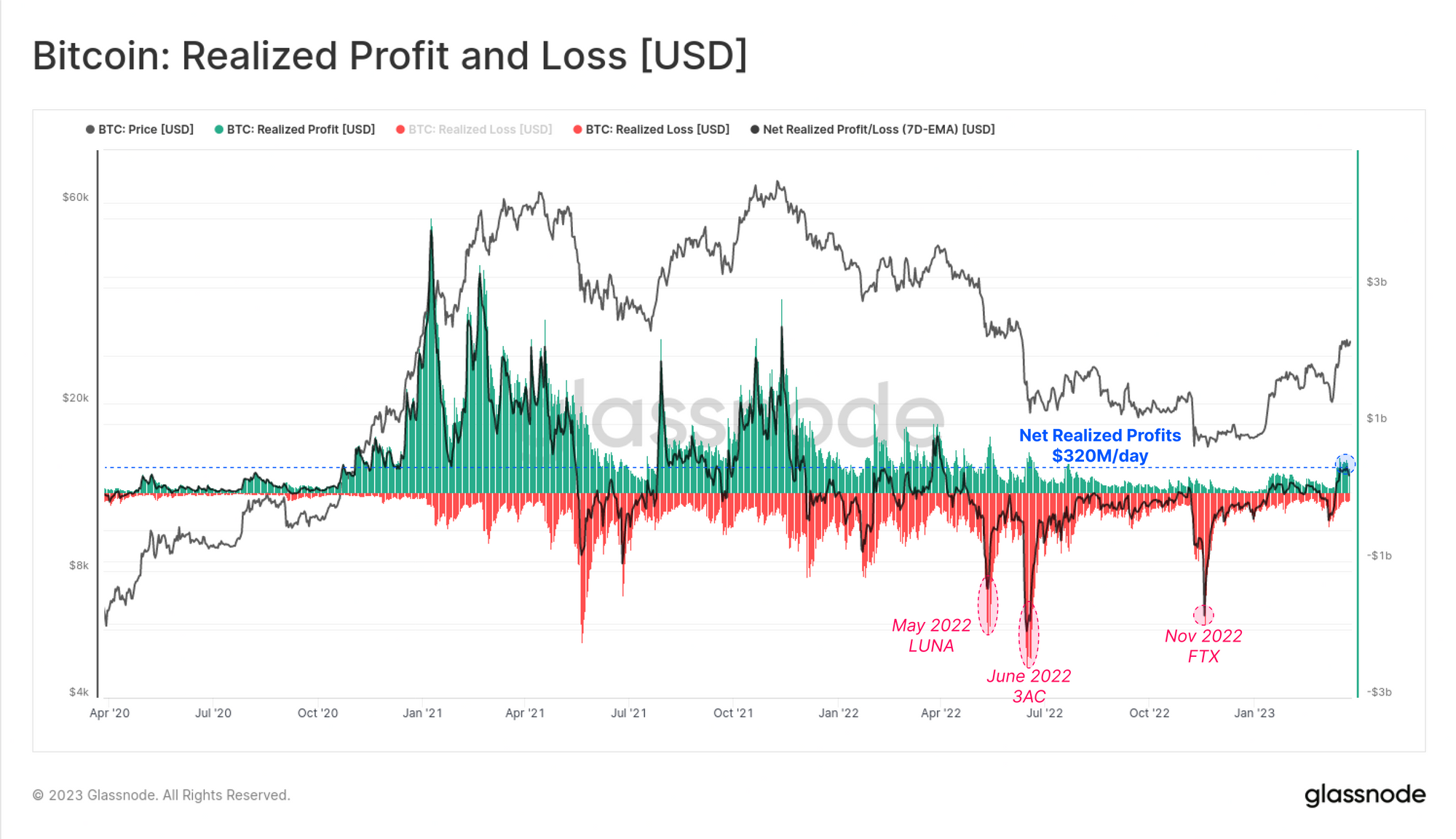
In response to the strong price appreciation over recent weeks, investors have increased the volume of coins deposited to exchanges. Net exchange flows ticked higher by approximately 4.18k BTC this week, the largest net increase since LUNA collapsed in May 2022.
This suggests a degree of profit taking is underway, as investors take chips off the table. Prior instances with similar or larger net inflows over the last cycle, have all aligned with major market volatility events, usually to the downside.
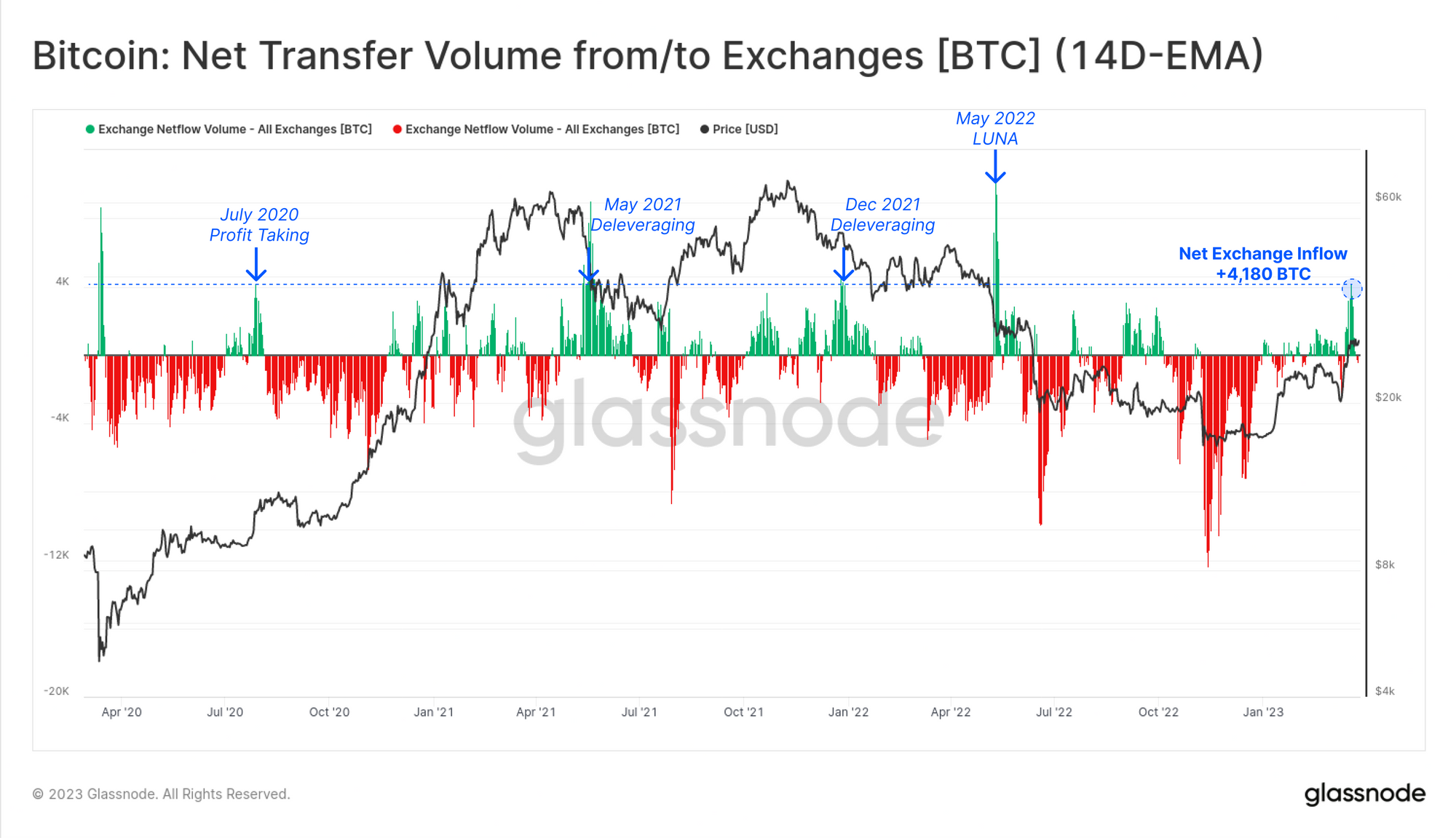
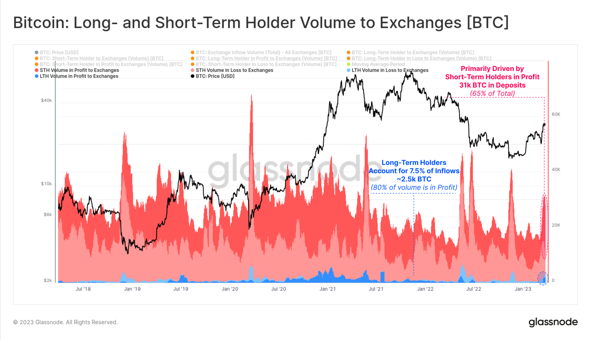
We can also assess the breakdown of coins sent exchanges by either Long-Term or Short-Term holders, allowing us to explore which cohorts are taking profits. Both groups have seen an uptick in coins sent to exchanges, peaking at a total of 31k BTC this week.
- Short-Term Holders in dominate 92.5% of total inflow volumes, with 65% of the total being STH coins in profit.
- Long-Term Holders account for just 7.5% of the total deposit volume, however 80% of their volume is in profit, the largest uptick since mid-2021.
In aggregate, a total of $320M/day in net profits have been locked in by the market on spent coins. This is the largest net profit taking since May 2022, right before the LUNA-UST project collapsed. We note that the magnitude of realized profits still remains well below typical bull market levels.
It is also apparent that the severity of net losses has also been decaying since July 2022. This reinforces our observations from last week (WoC 12) that the market appears to have returned to a more neutral gear, and resembles a more transitional market structure.
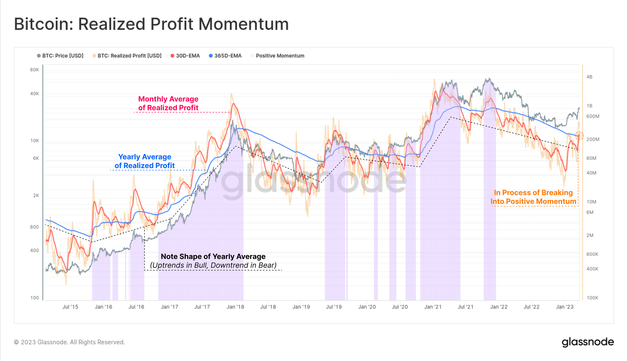
Measuring realized profit/loss is a powerful technique in on-chain analysis, enabled by Pricestamping coins when they move on-chain. From this, we can compare the magnitude of profit locked in over the last month, to the yearly average. Here, we can see that we have the first positive momentum cross-over since the Oct-Nov 2021 ATH.
This tool intuitively indicates periods of heavy, or light profit taking in bullish, or bearish markets, respectively. In particular, note the overall shape of the yearly moving average for Realized Profits, which trends up in bulls, and down in bears.
We will take this observation into our next related and similarly powerful topic of Lifespan.
Tracking Time
In the prior section, we observed how exchange flows can be related to the degree of profit realized by various on-chain cohorts. We can also supplement this with another suite of tools under the category of Lifespan. Rather than measuring the change in value change of a coin to obtain profit/loss, we instead measure how much holding time is spent between coin acquisition, and disposal.
When we observe heavy Lifespan destruction, it usually means a large volume of older coins are on the move, helping us identify periods where longer-term, and more experienced investors are exiting.
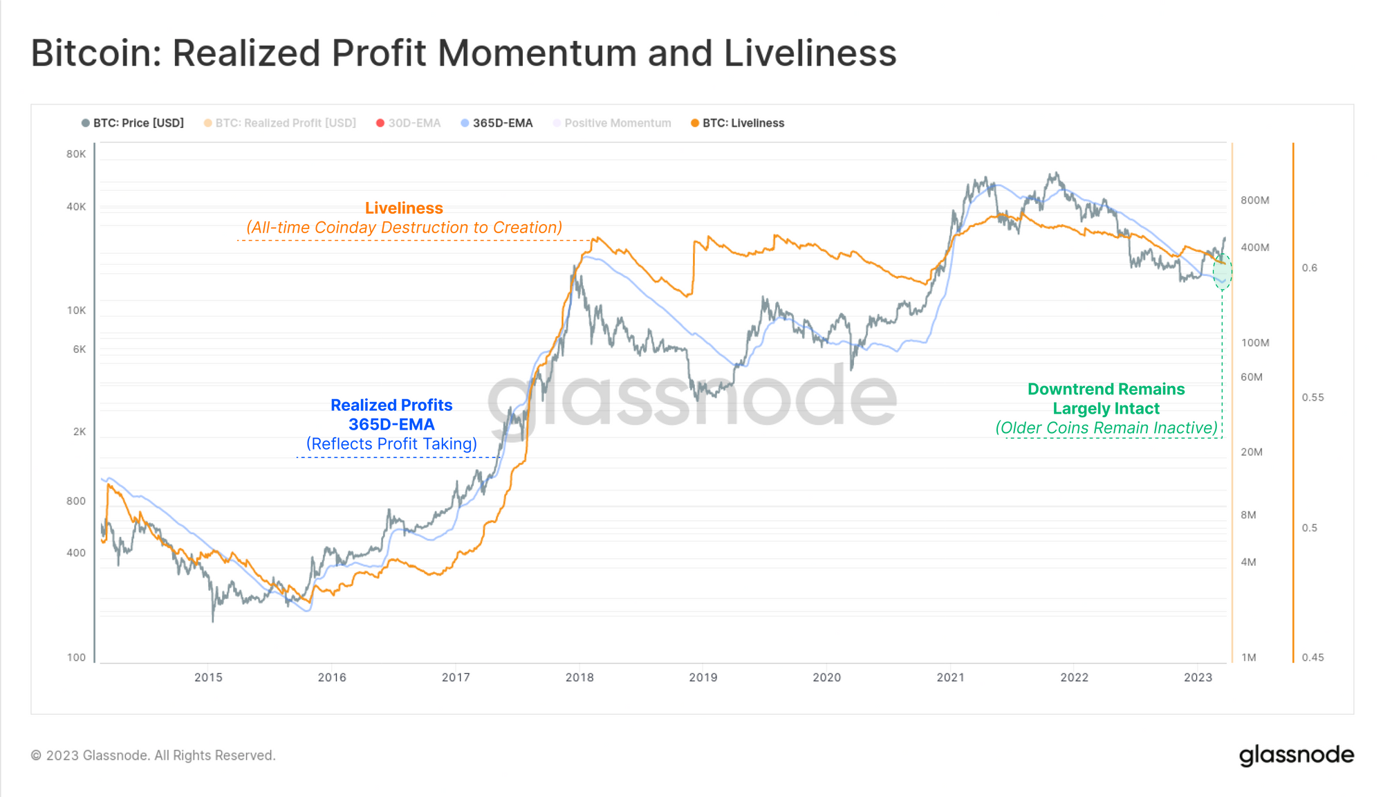
Our first port of call is to assess the macro landscape via the Liveliness metric. This metric elegantly defines the ratio between all-time Lifespan Destruction, and Creation.
- Liveliness will trend down when the market prefers to accumulate and HODL coins, building a reservoir of Lifespan, and suggesting confidence in the asset.
- Liveliness will trend higher when the market prefers to distribute old coins, and expend the reservoir of Lifespan, suggesting the asset is considered expensive.
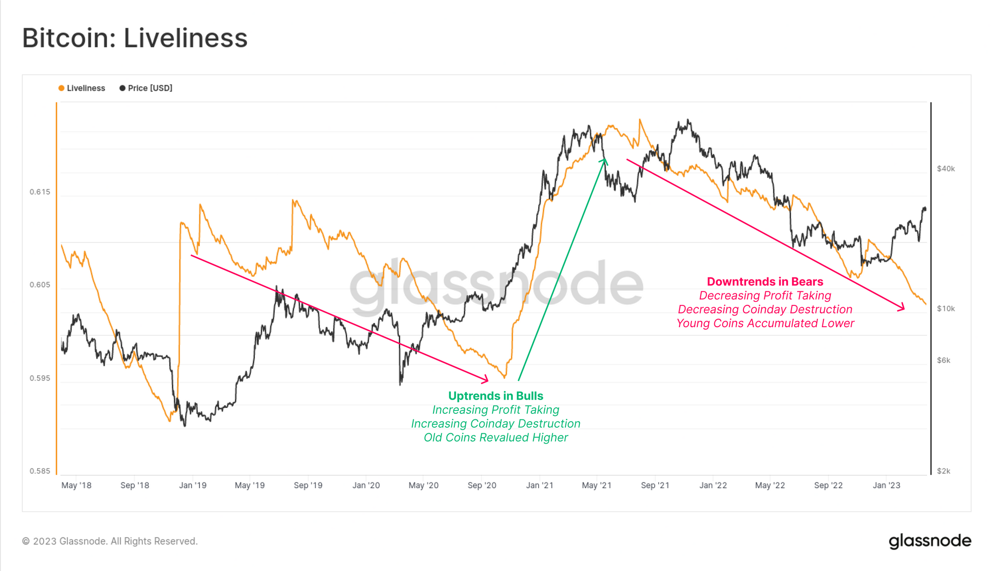
Recalling the shape of the Yearly average of Realized Profits, we can see a very similar shape and relationship exists with Liveliness, largely since they describe similar market behaviors:
- During bull markets, longer-term investors spend long dormant coins and realized large profits. This eventually leads to an oversupply and setting a macro market top.
- During bear markets, longer-term investors return to a slow accumulation strategy, and there are fewer profits taken day to day. This eventually establishes a cycle floor.
At present, we can see both metrics remain in macro downtrends, suggesting the majority of coins remains inactive on-chain.
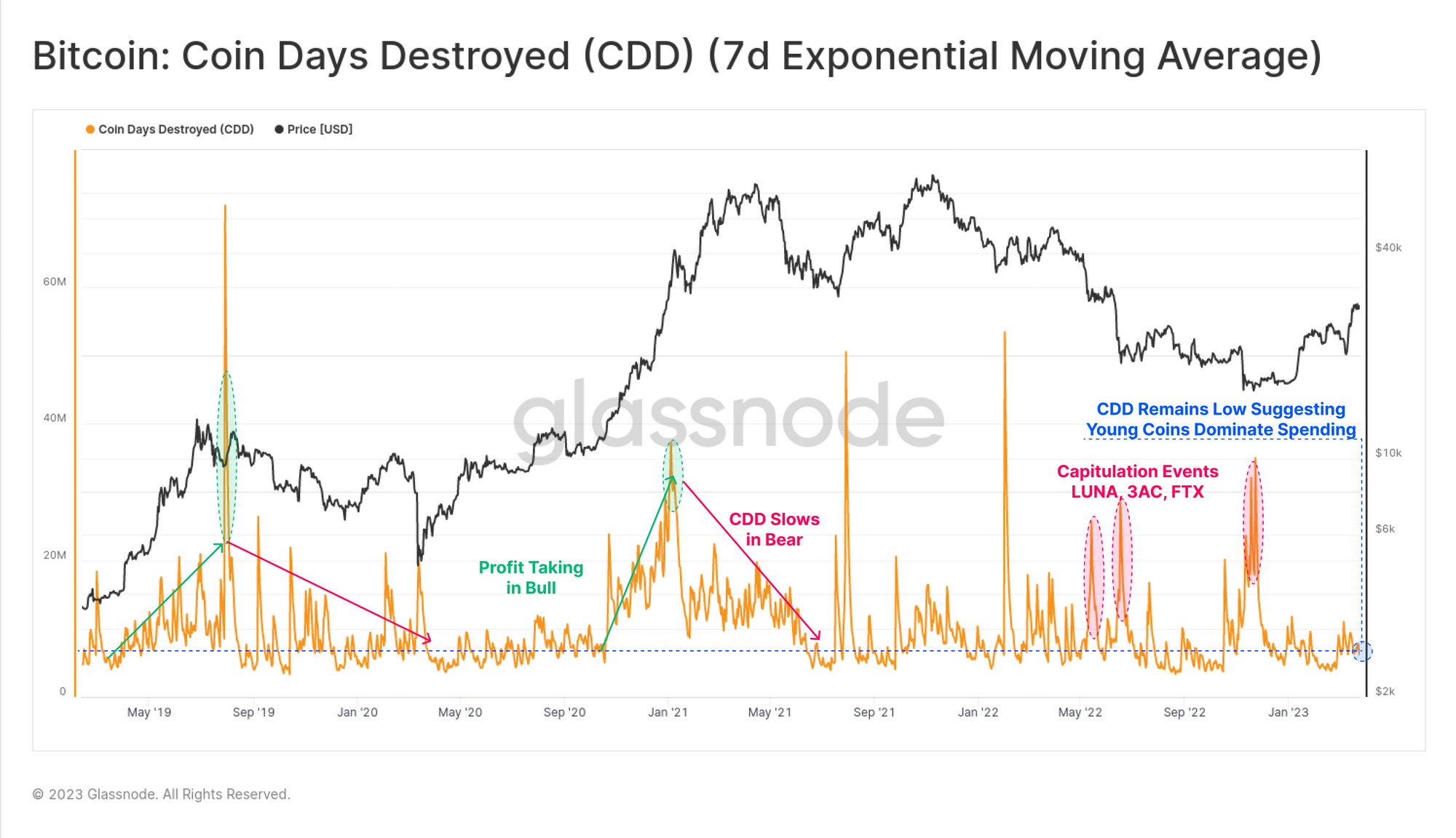
The principle metric for measuring Lifespan is Coindays Destroyed (CDD), which reflects the volume of 'investor holding time' that is spent each day. Over the last cycle, we can generally describe upticks in CDD in two categories:
- Sustained uptrends during bull markets reflecting a consistent distribution pressure as long-term holders take profits.
- Sharp peaks during high volatility events, typically observed in bear market sell-offs. These reflect periods of widespread panic, as investors spend coins in the face of high volatility.
In recent weeks, a modest uptick in CDD can be observed, however, the magnitude of destruction remains well below typical bull market levels. This indicates that the average spent coin is still relatively young, aligning with our observation that Short-Term Holders dominate profit taking at present.
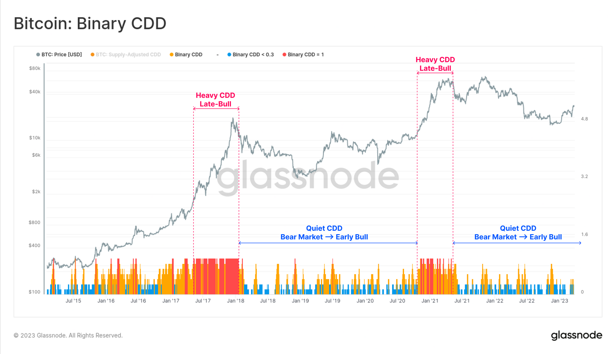
A useful tool to compare this across cycles is Binary CDD, which converts the CDD metric into a result of one if the magnitude exceeds a long-term average (returns zero if not). Here we have also smoothed the trace with a 7-day average to create an oscillator.
From this perspective, profit taking by long-term holders in bull markets becomes extremely apparent, highlighted as sustained periods of red and orange. In our current market however, we remain firmly within a quiet patch, typical of bearish markets, early bulls, and the transitional period in between.
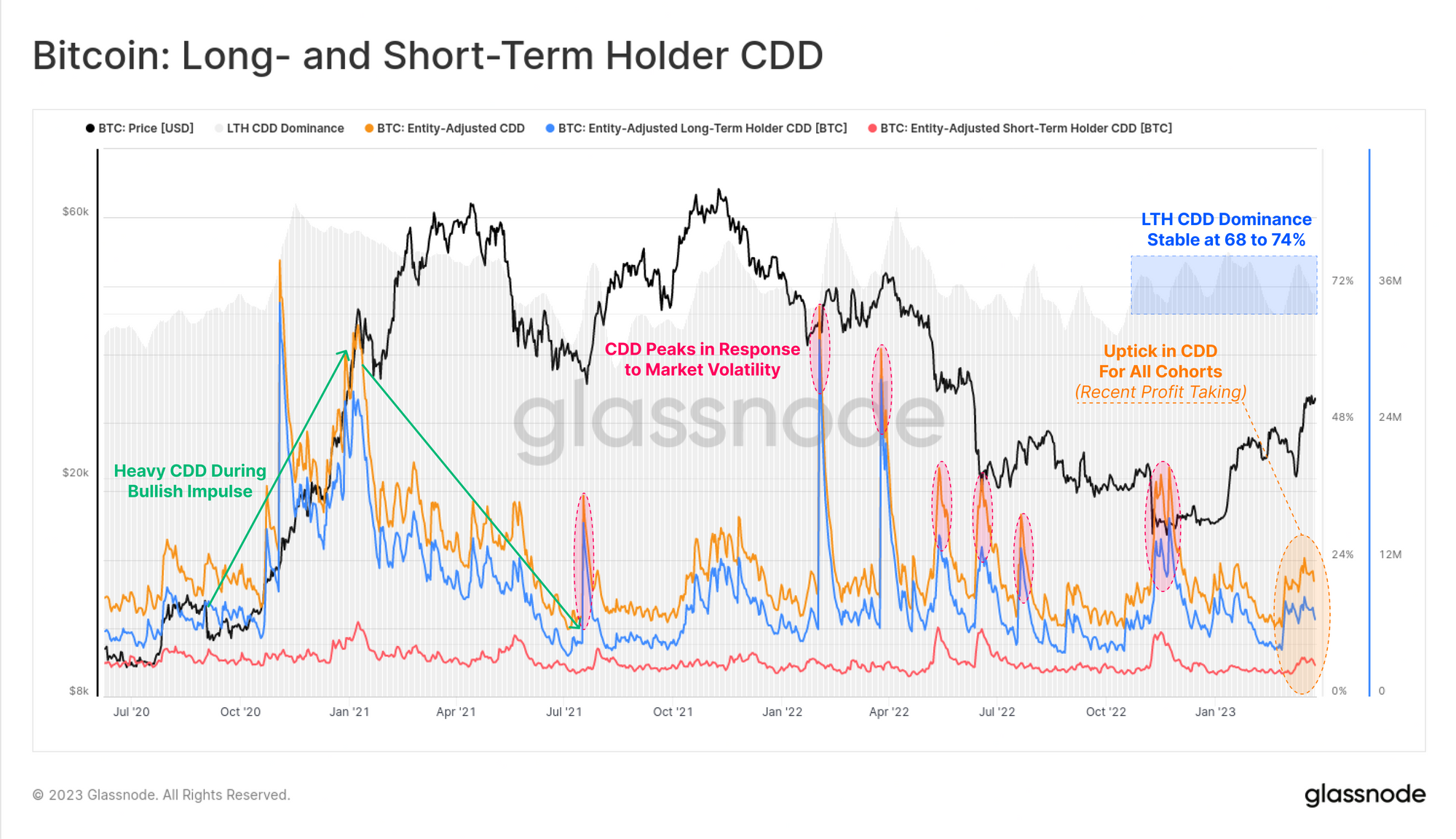
The recent uptick in CDD is quite visible when broken down across the LTH and STH cohorts. Despite Long-Term Holders contributing the least to spent coin volume, their holding time is much longer, and thus they tend to have an outsized influence on Lifespan metrics.
By this measure, the recent profit taking is also fairly modest, and has not yet established a sustained uptrend in CDD.
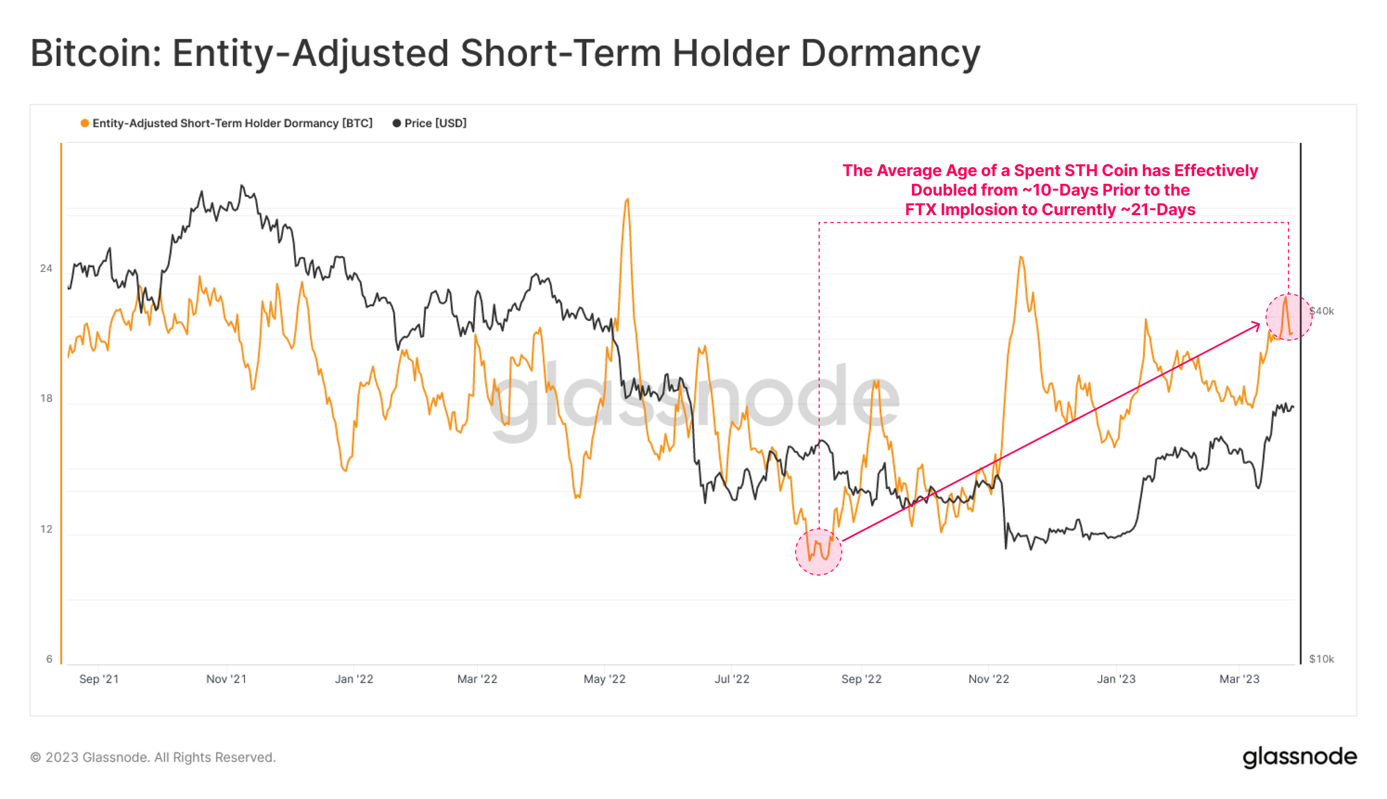
Zooming into Short-Term Holders, the average age of a spent STH coin has also increased, effectively doubling from ~10-days in the months leading up to the FTX failure, up to 21-days today. This adds further evidence to the argument that the Short-Term Holder cohort, who accumulated BTC near the cycle lows, are the primary participants behind recent profit taking.
It also suggests that STHs are increasingly willing to wait for longer periods, suggesting a degree of confidence in the prevailing market trend.
The Value of Time
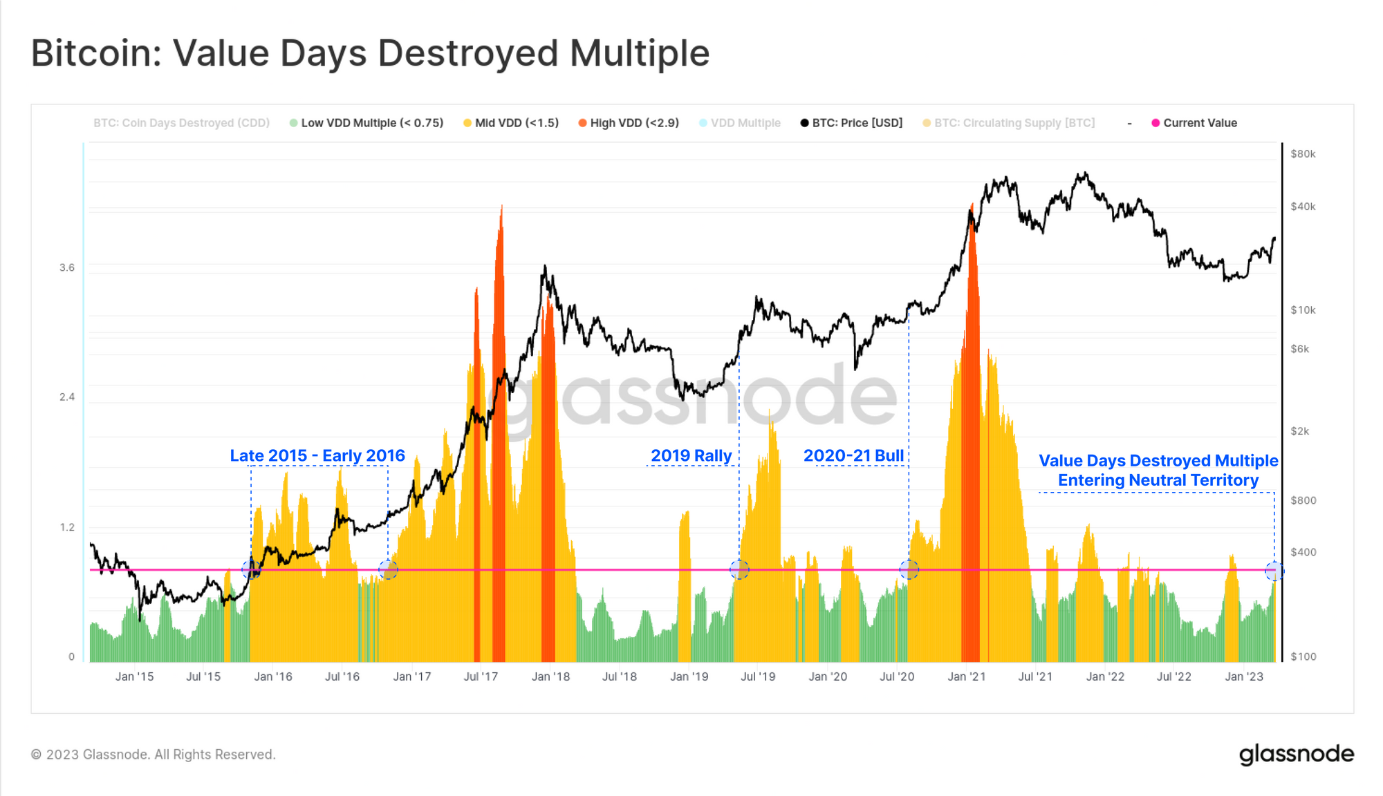
Finally, we can bring Lifespan into the price domain, drawing on our prior research developing the Value Days Destroyed Multiple (VDDM). This metric compares the monthly dollar value of CDD to its yearly average.
Currently, we can see that the VDDM value is accelerating out of a long period trading around cycle lows. This indicates that the CDD value destruction in response to recent price action is leaving typical bear market territory, and suggests sufficient demand is flowing into the market to absorb the profits taken.
This again bares many similarities to the late 2015, 2019, and 2020 eras, which turned out to be market cycle transition points.
Summary and Conclusions
As the Bitcoin market takes a break, profit taking by investors is starting to warm up. Short-Term Holders who accumulated near the cycle lows dominate the majority of spending behavior, although their willingness to hold coins for longer periods is evident.
Overall, the majority of BTC appears to be quite inactive on-chain, suggesting investors continue to have confidence in the prevailing uptrend. Similar to our article last week, through the lens of coin Lifespan, Bitcoin again appears to be entering a transitional market period.
Disclaimer: This report does not provide any investment advice. All data is provided for information and educational purposes only. No investment decision shall be based on the information provided here and you are solely responsible for your own investment decisions.