Peering Into the Abyss

Bitcoin investors are hanging onto the edge of profitability, with short-term price action threatening to put them back into the red. Meanwhile, a constructive confluence of macro indicators are developing into a clearer picture of a potential bear market floor.

Peering Into the Abyss

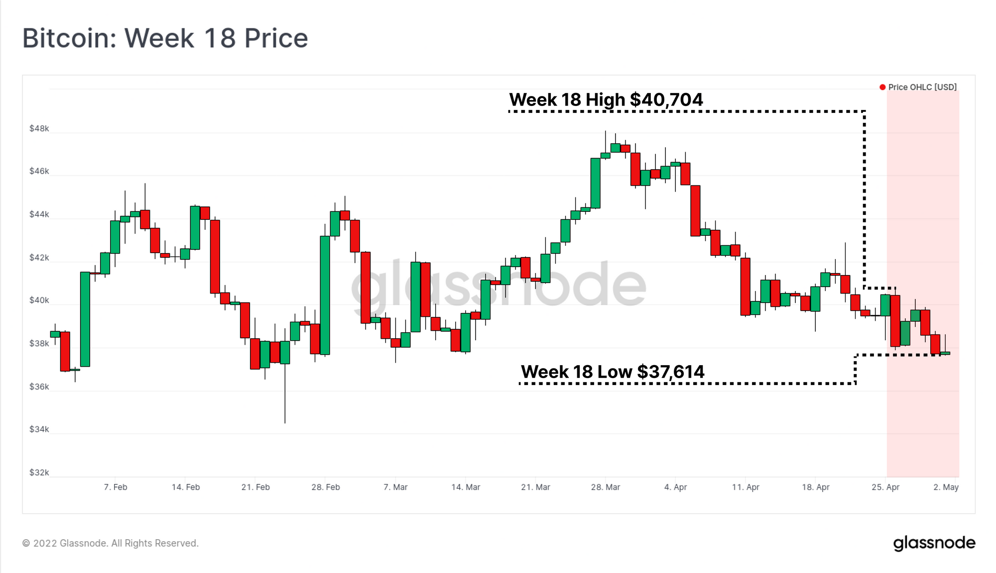
Markets worldwide continue to recoil in the face of inflationary pressures, tightening monetary conditions, and compounding uncertainties and risks. This week saw significant weakness across equities, bonds, and cryptocurrency markets, with Bitcoin trading down to a new monthly low of $37,614.

Despite trading down this week, Bitcoin markets have actually remained surprisingly robust, on a relative basis. Whilst the S&P500 and NASDAQ indexes traded to new local lows of the prevailing bearish trend, Bitcoin prices remain range-bound, and continue to lack any definitive macro momentum in either direction. With that said, correlations between Bitcoin and traditional markets remain near all-time-highs, and a broader perception of Bitcoin as a risk asset remains a significant headwind.

A very large proportion of Bitcoin investors are peering into the abyss of holding unprofitable positions, creating the potential tinder for a much discussed capitulation event. Simultaneously however, numerous long term macro indicators are signalling historical undervaluation levels are in play, reaching values rarely seen outside late stage bear market floors. In this edition, we will explore this notable divergence between the drivers of bearish short-term price action, and the medium-to-long term fundamental trends for Bitcoin.

Translations

This Week On-chain is now being translated into Spanish, Italian, Chinese, Japanese, Turkish, French, Portuguese, and Farsi.

The Week Onchain Dashboard

The Week Onchain Newsletter has a live dashboard with all featured charts available here. This dashboard and all covered metrics are explored further n our Video Report which is released on Tuesdays each week. Visit and subscribe to our Youtube Channel, and visit our Video Portal for more video content and metric tutorials.


Looking Over The Edge of Profitability

Over recent weeks, we have explored how a significant proportion of the BTC supply has been redistributed and sold to new owners entering in the $33k and $42k price range. However, with global markets continuing to slip lower, the risk that these new investors will also fall into an unrealized loss is growing.

At present, the proportion of both Addresses, Entities, and Supply held in profit is hovering around 70% (meaning 30% are held at a loss). Previous bear market lows set in 2018-19, and March 2020 saw far more severe declines in market profitability, with between 45% and 57% of the market in profit.

From this, we can establish a case study to analyse further; what would happen should an additional 10% of the market fell into an unrealised loss (the result being 60% of the market is in profit)? This provides us with an example gauge on the price that the market would need to hit before a similar 'pain threshold' is reached to past cycle lows. This '60% in profit threshold' also accounts for the observable uptrend in these floor values over time (an artefact of lost coins, HODLers from past cycles etc).

Live Workbench Chart

The URPD metric provides us a view on which prices the current Bitcoin supply was last moved at.

With prices trading at $38.5k at the time of writing, the market would need to fall to $33.6k in order to plunge an additional 1.9M BTC into an unrealized loss (10% of supply). This would reach our example 'pain threshold' of 60% supply in profit and put almost all buyers from the last 16-month cycle into the red (with buyers of the May-July 2021 lows being the only exceptions).

Live Chart

The cohort that is most at risk of selling in a panic are the Short-Term Holders (STHs), a cohort that we identified (in Week 16) have accumulated an extraordinary volume of coins over the last three months. If we look to the STH-MVRV Ratio (Z-Score), we can observe the magnitude of their current unrealized profitability.

In the chart below, we can see the following:

  • The on-chain cost basis of STHs is at $46,910, putting the average coin held by a STH at an unrealized loss of -17.9%.
  • The STH-MVRV oscillator is currently at -0.75 standard deviations from the mean, which shows that the this is a statistically significant magnitude of financial pain for the STH cohort.
  • More severe profitability for STHs is not uncommon, but is typical only during the worst sell-offs in bear markets (where oscillator is below the below blue line).
Live Workbench Chart

On the other side of the equation are the Long-Term Holders (LTHs), whom we also established were capitulating at the greatest extent in history. This trend appears to continue with an incredible deviation developing between two metrics taking place, identified first by TXMC:

  1. Long-Term Holder Reazlied Price (blue): This metric shows the average purchase price of all coins in the LTH cohort, and it is currently declining at the most significant rate in Bitcoin history. This indicates that LTHs from the 2021-22 cycle are capitulating, spending, and redistributing their coins, specifically during the last 3 months.
  2. Long-Term Holder Spent Price (pink): This metric shows the average purchase price of coins being spent by LTHs that day. It is breaking notably higher this week, meeting with the spot price, and signalling that LTHs are panic selling at break-even on average.

Both of these metrics add significant substance to the argument that the newest entrants to the LTH cohort from 2021-22 are capitulating, and fearful of further downside.

Live Workbench Chart

Characterizing Long-Term Holder Spending

We can further characterize these LTH spenders, and narrow in the typical age range of their coins using a variety of on-chain tools. First we will review a new metric that is under construction in the Glassnode engine room that presents two traces:

  1. Oscillator (grey, 30DMA) showing the proportion of BTC volume sent to exchanges by Long-Term Holders that is in profit. We can see it has declined significantly since September 2021, and is now hovering around 60% (adding weight to our previous pain threshold estimate).
  2. Price chart coloured by raw profitability relative to the last year, with red signalling high relative losses, and green/blue signalling heavy relative profits. The bear markets of 2014-15, 2018-19, and 2021-22 become quite apparent, with heavy LTH losses realized for many months.

The only LTHs whom could realize losses and trigger this result are those from the 2021-22 cycle with a higher cost basis, suggesting they dominate LTH spending behaviour into exchange at present.

Unreleased metric from the Glassnode Engine Room

Next we look at Revived Supply 1yr+ which captures all BTC on-chain volume that was purchased prior to the mid-May 2021 sell-off. What we can see is that this metric is actually declining and is near relative lows. Usually very low readings of revived supply occur in deep bear markets where accumulation is the preferred behaviour of LTHs.

Live Chart

Binary Coin-days Destroyed largely corroborates this observation, with a near identical trend and notable markers. On a 7-day average basis (at hourly resolution), this metric is indicating than 18.5 hours out of each week are seeing greater than average lifespan destruction. In other words, 89% of the time, owners of older coins are choosing to keep them dormant, and are not contributing to spending sell-side pressure.

Both of these metrics further supports the notion that LTH sell-side pressure at the moment is primarily driven by owners of coins between 155-days, and ~12-months (aka 2021-22 buyers).

Live Chart

Fundamentals of a Bear Market Floor

On-chain tools can provide us with both an assessment of current investor behaviour (above), but also with fundamental valuation tools to help us map out and navigate various market cycles.

The chart below is a variant of Realized Profit (green) and Loss (pink), calculated by dividing each by the Realized Cap. This effectively normalises the USD value investors bring in/out of the market, to the relative market size, enabling us to compare cycles. From this we can broadly identify three market phases:

  1. Bull Markets (green zone), where sufficient inflow of demand exists to allow investors to realize significant profits, right into the market cycle top (net capital inflows).
  2. Bear Markets (red zone), where the converse is true, and declining prices result in a dominance of losses being realised by investors (net capital outflows). In 2019 and arguably late 2021, we saw profits taken into a brief bullish relief rally, that was ultimately sold into.
  3. Disbelief Recovery to Early Bull (orange zone), where the market trades sideways to upwards, typical of a re-accumulation period or disbelief phase, and realized profits start to exceed losses on a consistent basis.

In the current market, we remain within the Bear Market phase, where the market is yet to provide sufficient demand and price appreciation to enable sustainable profit taking and capital inflow. Should realized profits begin to outpace losses on a sustained basis, alongside stable prices, it may suggest a transition to Phase 3 is underway.

Live Chart

One of the most well known Bitcoin indicators, and a crowd favourite, is the Mayer Multiple. This oscillator is calculated as a simple ratio between price and the 200DMA. Despite its simplicity, it has provided a robust and reliable long-term bottom and top formation indicator for Bitcoin cycles.

Here, we have mapped out a Mayer Multiple of 0.8 (green trace) as a historical 'undervaluation' level. The basis for this is that less than ~15% of Bitcoins trading life has been at, or below this level, providing a more probabilistic view. With the 200DMA trading at $47,275, this 20% discount level is currently trading at $37,820.

Bear market floors of past cycles are typically hammered out in two phases relative to the 0.8xMM level, first in the early stage of the bear (#1), and then again following a major capitulation event (#2). The market is currently hovering just above this key level in what could be argued to be a part of the 2021-22 cycle Phase #2.

Live Chart

The Reserve Risk metric provides another macro view on bear market bottoms, and is an oscillator that is heavily weighed down by when accumulation and HODLing is preferred (see our video guide). Historically, Reserve Risk has dipped below the 0.0025 threshold (green) in late stage bear markets (pre-bottom formation), and resurfaced part way through the subsequent bull market.

This indicator suggests that we have passed the initial late-bear-market entry point and could be well into the second half. However, based on prior cycles, it also suggests that the road ahead may still have some time, and/or downside to go.

Live Chart

In support of the notion that longer-term HODLers remain unfazed, the Value Days Destroyed (VDD) Multiple is oscillating around relative lows. This indicates that the value and magnitude of coin-days destroyed right now is small relative to the last year. This provides confluence to the Binary CDD, 1yr+ Revived supply, and Reserve Risk metrics that the dominant behaviour by long-term investors (1yr+ holding) is HODLing.

By this metric, the bear market commenced around May 2021, and is approaching a similar duration to those seen in previous cycles.

Live Chart

Finally, we will assess the RVT Ratio, which divides the Realized Cap by the network transaction volume (both in USD, and with a 28DMA applied). This oscillator is a slow, but higher conviction variant of the NVT Ratio, and has the following properties:

  • Uptrends and High values are historically bearish, signalling that transaction volumes (and thus network utilisation) are declining relative to on-chain valuation (over-valued). Bear market bottoms are typically set at RVT values > 30, and confirmed by a reversal into a downtrend.
  • Downtrends and Low values are historically bullish, conversely signalling that network utilisation is increasing relative to on-chain valuation (under-valued).
  • Sideways sustained trends signal a relative equilibrium, and typically suggest the prevailing market trend is sustainable.

This oscillator has now set a lower high relative to that in July 2021, and is reversing into a downtrend. Should this trend be maintained, it indicates that there is a potential influx of on-chain settlement volume, and growing network utilisation. This has historically been constructive for market prices.

Live Chart

Summary and Conclusions

The current market structure for Bitcoin remains in an extremely delicate equilibrium, with short-term price action and network profitability leaning bearish, whilst long-term trends remain constructive. The capitulation of Long-Term Holders appears to be continuing, with further evidence and analytical colour added to this concept this week.

Whether macro forces and correlations with traditional markets drag Bitcoin lower remains to be seen, however numerous fundamental indicators at at or approaching noteworthy points of undervaluation. There is a constructive confluence across numerous macro indicators, ranging from technical analysis (Mayer Multiple), to coin lifespan analysis (Reserve Risk, VDD Multiple), and even fundamental network health and utilisation (RVT Ratio).

A capitulation event, alongside developing divergences in short- and long-term trends continues to make Bitcoin one of the most fascinating assets to monitor within this macroeconomic environment.


Product Updates

All product updates, improvements and manual updates to metrics and data are recorded in our changelog for your reference.


Disclaimer: This report does not provide any investment advice. All data is provided for information purposes only. No investment decision shall be based on the information provided here and you are solely responsible for your own investment decisions.