Whale Watching
Whale entities for Bitcoin are often cited as key parties that can have an outsized influence on price performance. In this edition, we isolate out Whale activity, which has seen a dramatic uptick over recent months, and develop a suite of tools to track their behavior.
Executive Summary
- Through observations of the balance change of various on-chain entities, we isolate whales (1k+ BTC) as one of the primary cohorts interacting with exchanges in recent weeks.
- The dominance of whale inflow volumes to exchanges is significant, accounting for 41% of the total. Of this, over 82% of whale inflows are destined for Binance, the largest exchange in the industry.
- We can also identify that many of these active whale entities are classified as Short-Term Holders, with notable activity around local market peaks/troughs.
- From this, we develop a set of indicators to help monitor their on-chain behavior, seeking to spot periods of outsized profit or loss-taking events.
🪟 View all charts covered in this report in The Week On-chain Dashboard.
Whale Watching
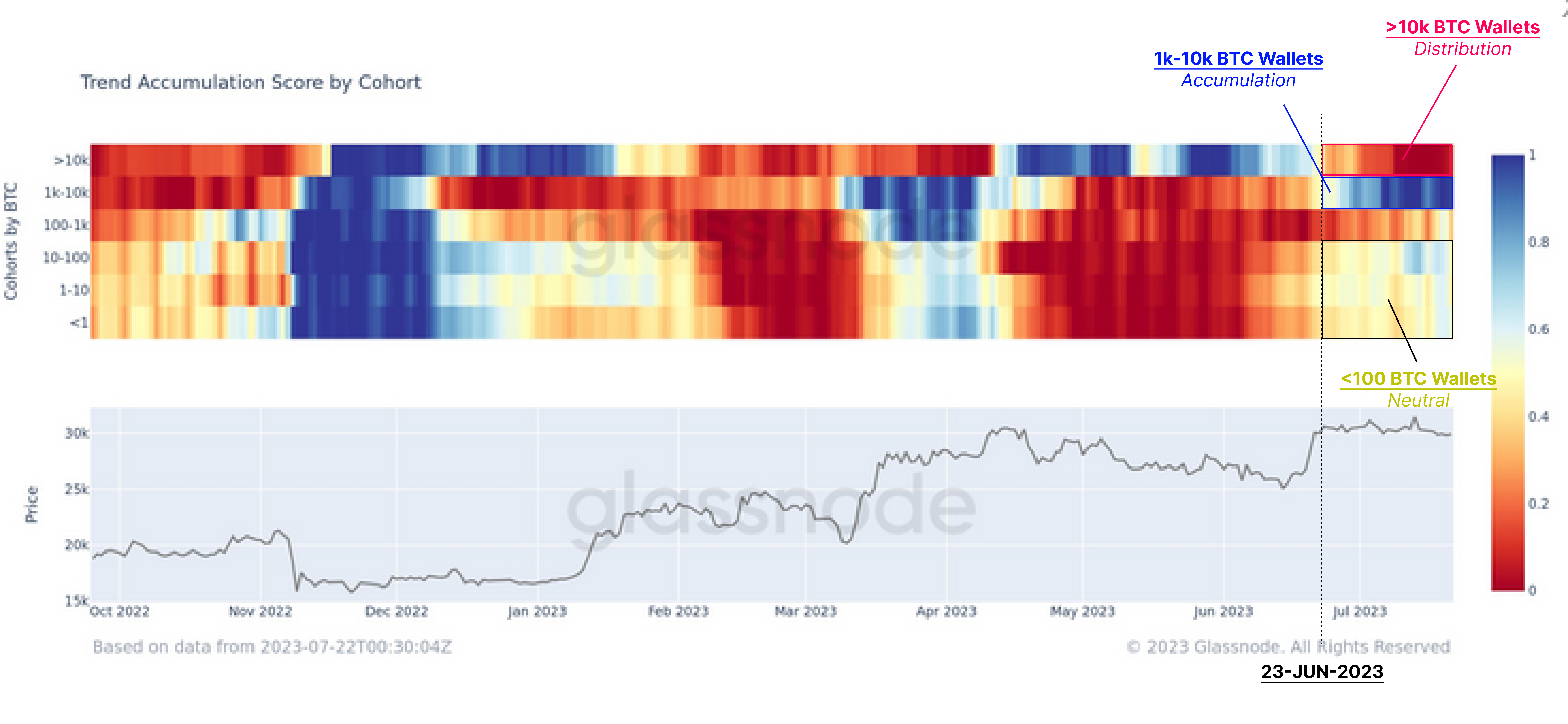
As the market first attempted to break above $30k in mid-April, the balance of most wallet size cohorts entered a regime of distribution which lasted through mid-June. This pattern began to shift during the second rally to $30k in late June.
The Trend Accumulation Score by Cohort below shows that the smallest entities (<100 BTC) have slowed down their spending over the last month. On the other hand, the whale subdivisions (>1k BTC) demonstrated divergent behaviour, with >10k BTC whales distributing and 1k-10k accumulating at a significantly higher rate.
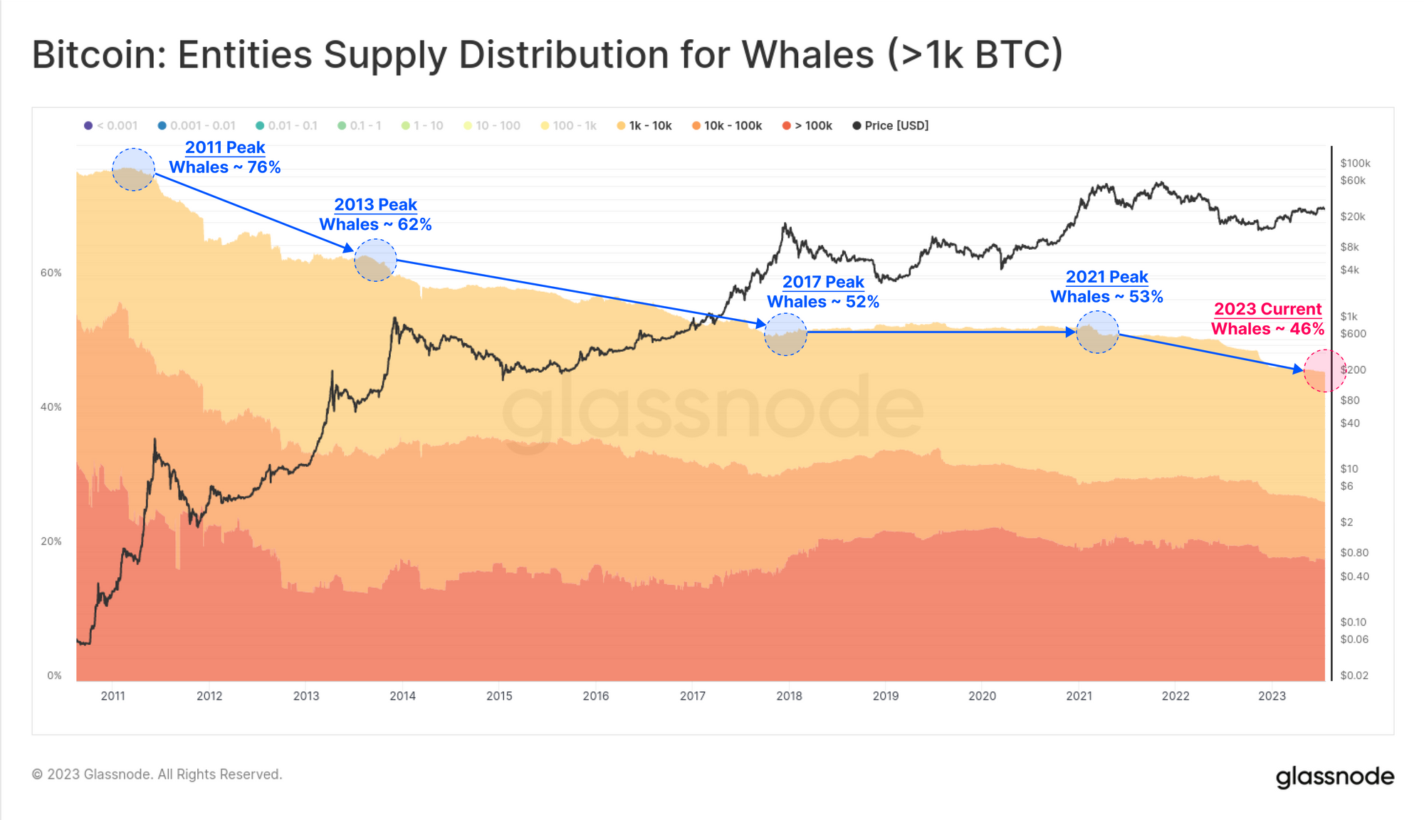
We explored the long-term behavior of whales in our recent report titled The Shrimp Supply Sink. In this piece, we demonstrated that Whale entities have seen their aggregate balance decline throughout Bitcoins history. The chart below reinforces this, with Whale entities accounting for 46% of the total supply, down from 63% in early 2021.
It is important to note that here, Whale entities will include exchanges, as well as large centralized holdings such as ETF products, GBTC, WBTC, and corporate holdings like Microstrategy.
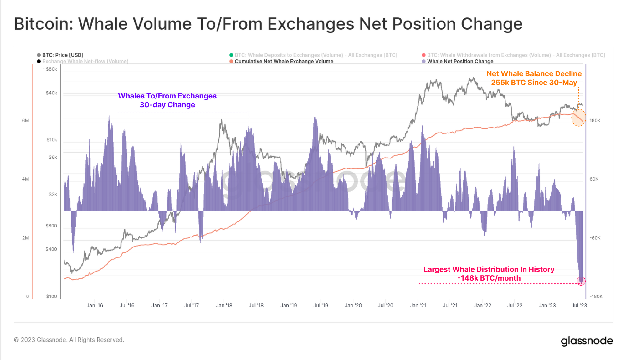
To remove Exchanges from the dataset, we can isolate only coins flowing between Whale entities and exchanges. The chart below shows that the aggregate Whale balance has declined by 255k BTC since 30 May.
This is the largest monthly balance decline in history, hitting -148k BTC/month. This indicates that there are noteworthy shifts happening within the Bitcoin Whale cohort worth diving deeper into.
Whale Reshuffling
To explore the divergence within the whale cohort, we can observe changes in the supply owned by each sub-cohort over the last 30-days:
- 🔴 Whales with >100K BTC have seen a balance increase of +6.6k BTC.
- 🔵 Whales with 10k-100k BTC have reduced their balance by -49.0k BTC.
- 🟢 1k-10k Whales have seen a balance increase of around +33.8k BTC.
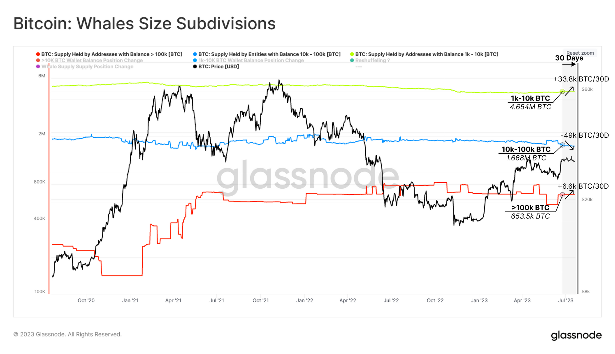
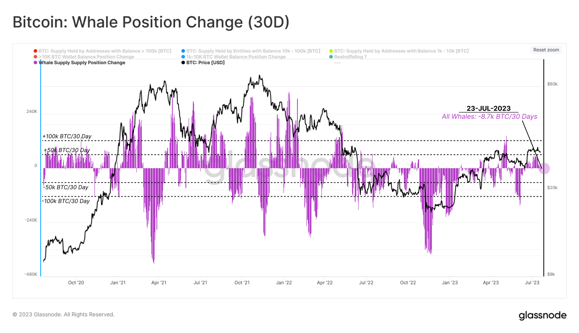
Across all whale groups (including exchanges), we can see a net reduction of just -8.7k BTC over the last month. Despite the extreme values shown in the Trend Accumulation Score, whale entities have been somewhat neutral in recent months.
We have a case where:
- Whale inflows to exchanges is historically large, with 255k BTC flowing from whales to exchanges.
- Internally, whale sub-cohorts are seeing balances shift in size by between -49k to +33.8k BTC.
- In aggregate, the whale group has seen just -8.7k BTC in net outflows.
Since the aggregate balance change is relatively flat, yet there are significant changes taking place both internally and via exchange flows, it is highly possible that these whale entities are moving funds internally. We will refer to this as ‘Whale Reshuffling.’
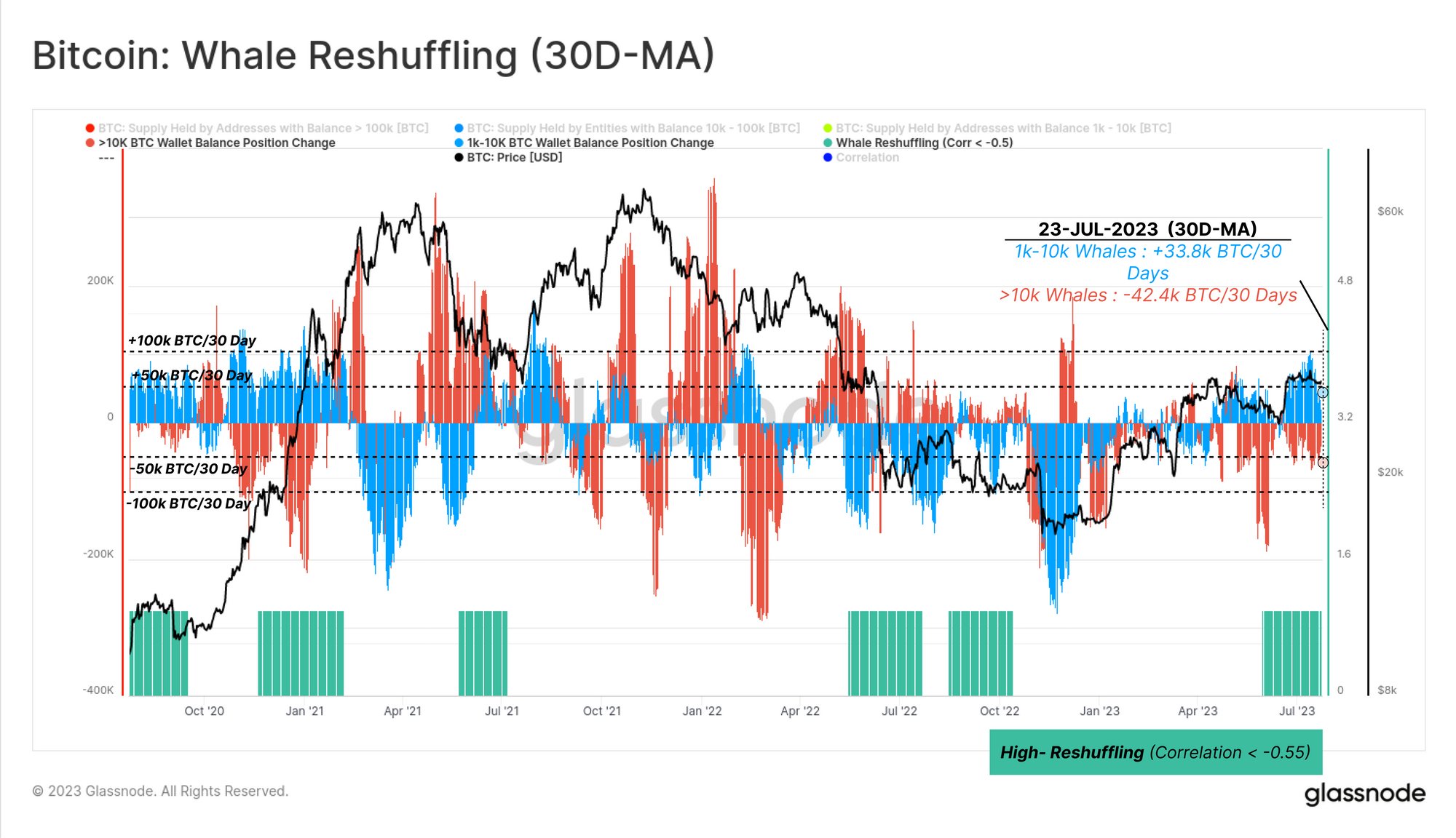
To test this Whale Reshuffling hypothesis, we can investigate the 30-day position change for whale subdivisions (>10K BTC 🟥 and 1k-10k BTC 🟦). Our goal is to find periods where one group sees a balance increase, whilst the other sees a similar scale decrease.
In the chart below, we have highlighted the periods where a strong inverse correlation of -0.55 or less 🟩 can be identified. We can see that such an interval coincided with the recent market surge toward the $30k range.
Thus suggests that whales have indeed exhibited a relatively neutral balance change of late, with much of their recent activity being reshuffling via exchanges.
Whales and Exchanges
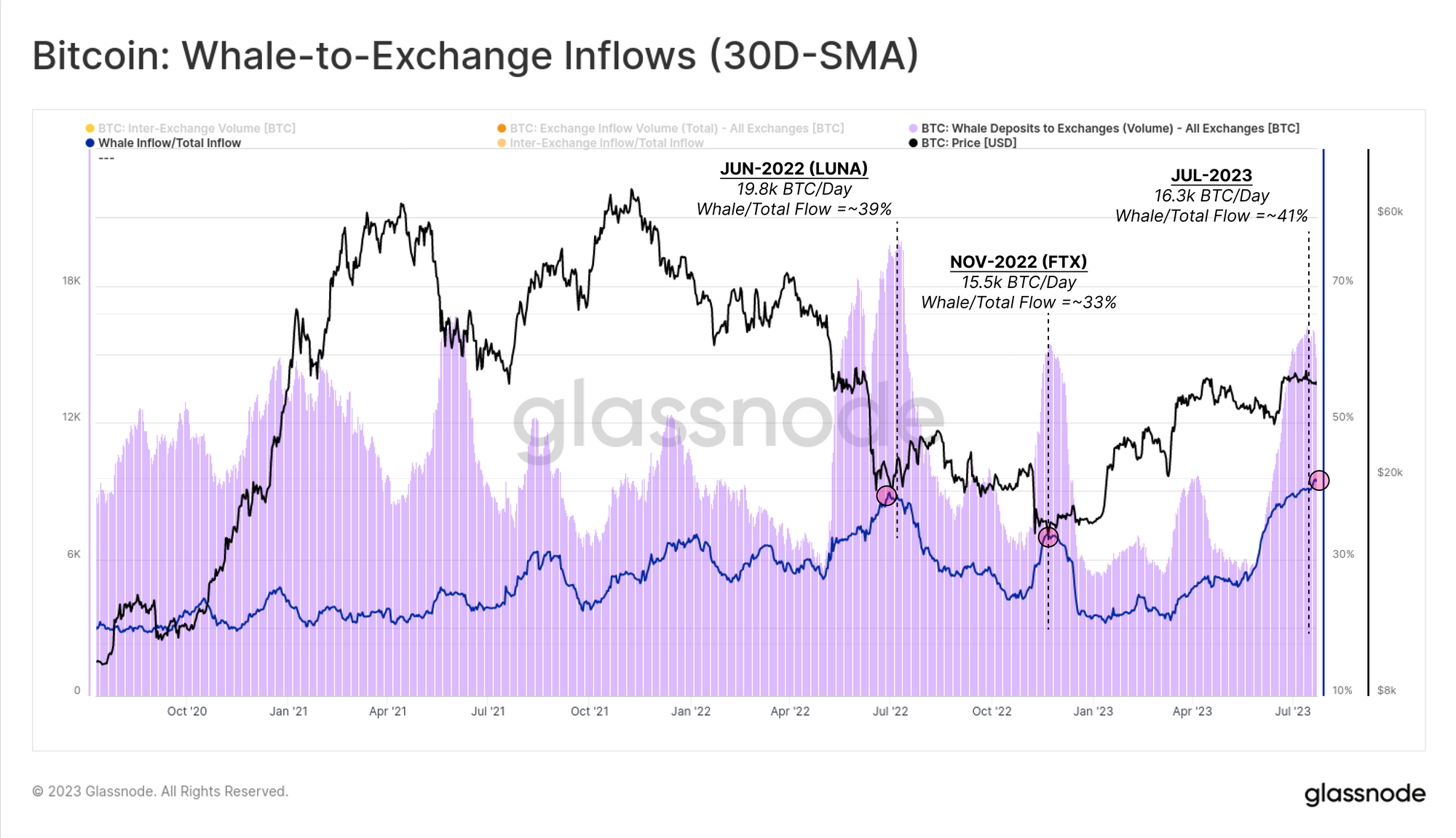
With this whale behavior in mind, we can now try to observe any impacts on the market, with a focus on exchanges. The next chart can be used to analyse the relationship between whale entities and exchanges via two traces:
- 🟪 BTC-denominated exchange inflows attributed to whales
- 🔵 Percent of all inflows attributed to whales.
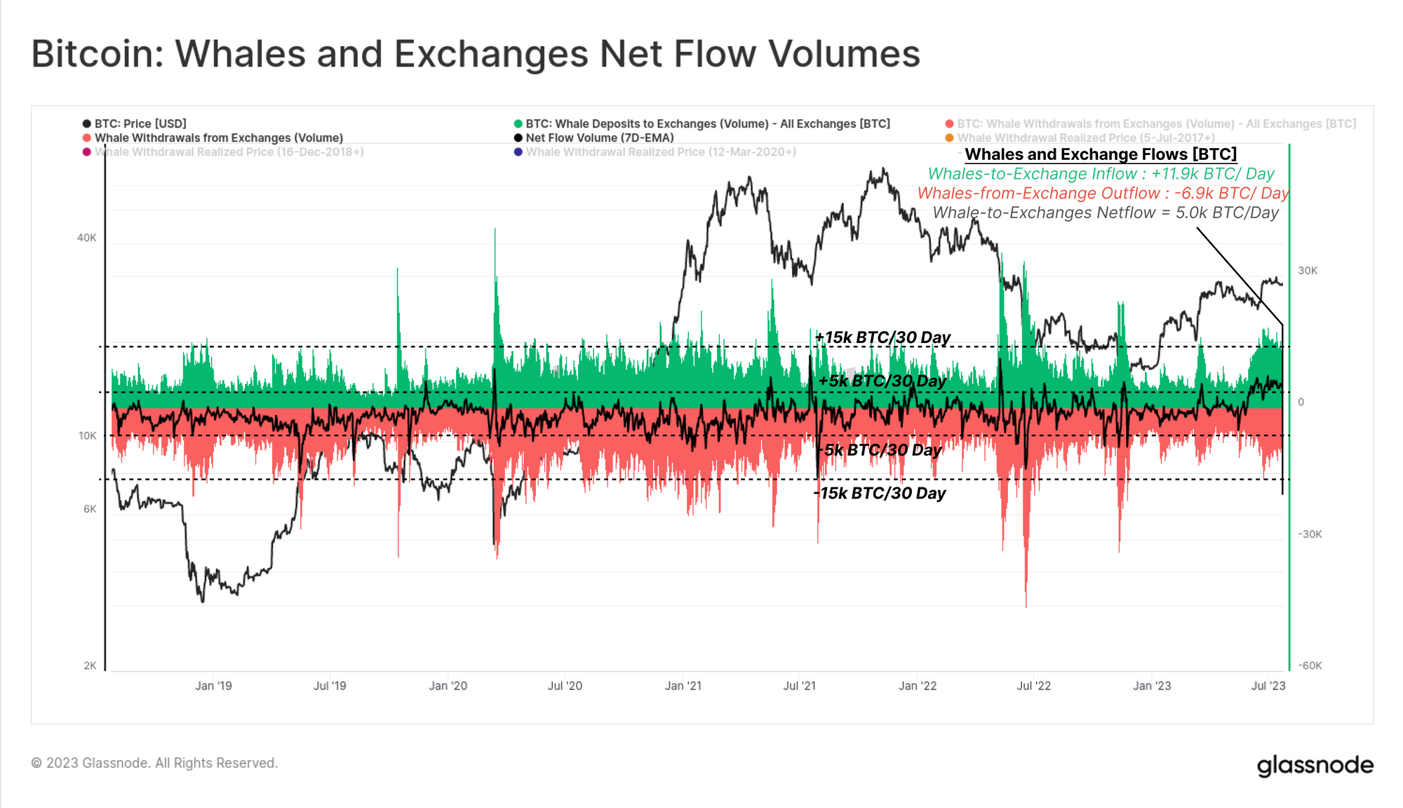
During the recent rally, whale inflow volumes to exchanges picked up quite significantly, hitting +16.3k BTC/day. This is a whale dominance of 41% of all exchange inflows, which is comparable to both the LUNA crash (39%) and the failure of FTX (33%).
Analysis of the Whale Netflow to Exchanges can be used as a proxy for their influence on the supply and demand balance. Whale-to-exchange netflows have tended to oscillate between ±5k BTC/day over the last five years.
However, throughout June and July this year, whale inflows have sustained an elevated inflow bias of between 4.0k to 6.5k BTC/day.
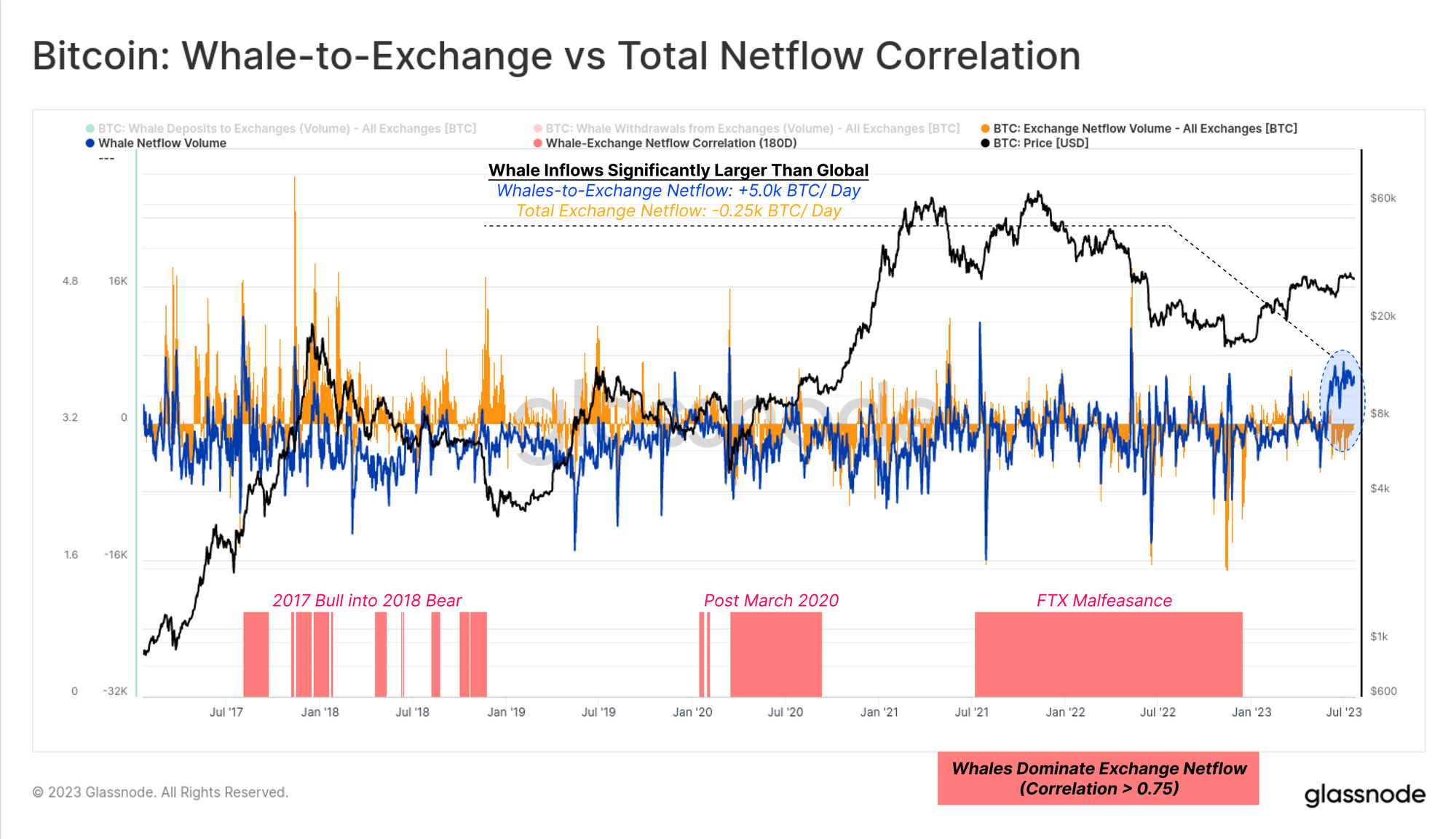
We will return to a simple correlation tool to identify periods where whales dominate the global exchange netflow to exchanges. The chart below shows periods with a high correlation (0.75 or more) between Whale netflows and global exchange netflows 🟥 (suggesting whale dominance), with three key periods visible:
- The 2017 bull into the 2018 bear market (market transition and maturation).
- The post-March 2020 period (institutional adoption and expansion of GBTC).
- Late 2021 into 2022 (the unfortunate malfeasance of the FTX/Alameda entity).
From this view, we can again see that Whale behavior (strong inflow bias) is quite divergent from the rest of the market (modest outflow bias).
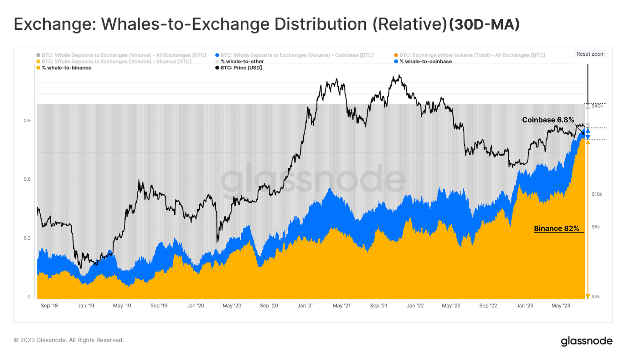
Arguably the most interesting component of this story is the destination of whale coins. If we break down whale inflow volumes, we can see that around 82% of whale-to-exchange flows are heading into Binance 🟨, while Coinbase 🟦 accounts for 6.8%, and all other exchanges account for 11.2%.
This implies that almost 34% of whale inflows during the July rally were sent into Binance, with an extraordinary uptick in Binance dominance visible over the last 12 months. This also speaks to some of the regional divergences we observed in prior weeks (WoC 26).
Short-Term Whales
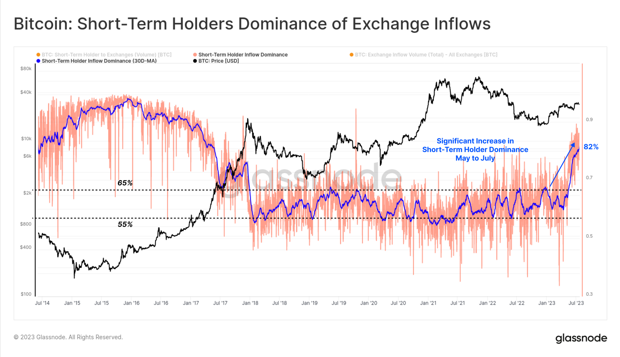
Having established that whale entities are dominating exchange activity at present, we can connect these observations to last week's report, where we noted that most exchange activity was linked to Short-Term Holders (WoC 29).
Short-Term Holder Dominance across Exchange Inflows has exploded to 82%, which is now drastically above the long-term range over the last five years (typically 55% to 65%). From this, we can establish a case that much of the recent trading activity is driven by Whales active within the 2023 market (and thus classified as STHs).
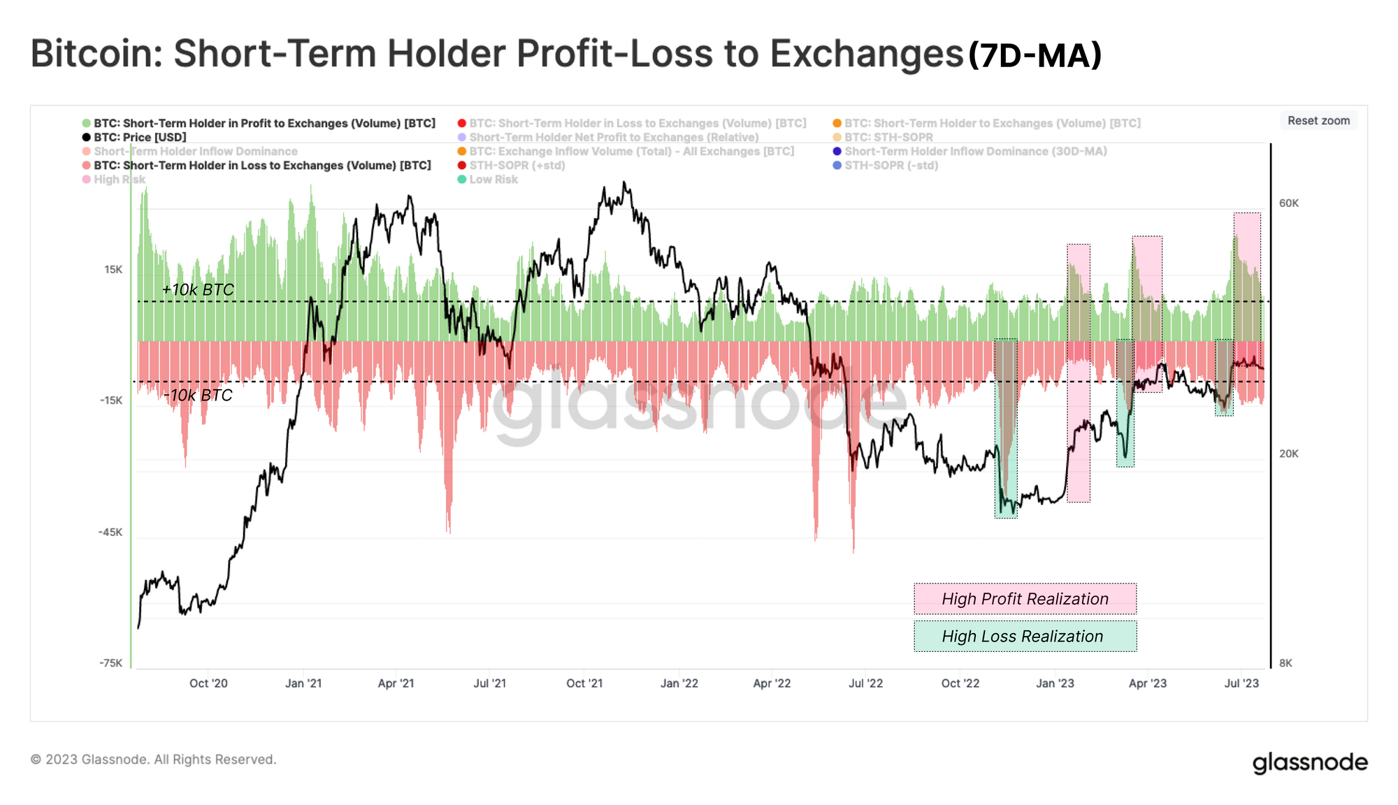
If we look at the degree of Profit/Loss realized by Short-Term Holder volume flowing into exchanges, it becomes evident that these newer investors are trading local market conditions. Each rally and correction since the FTX fallout has seen a 10k+ BTC uptick in STH profit or loss, respectively.
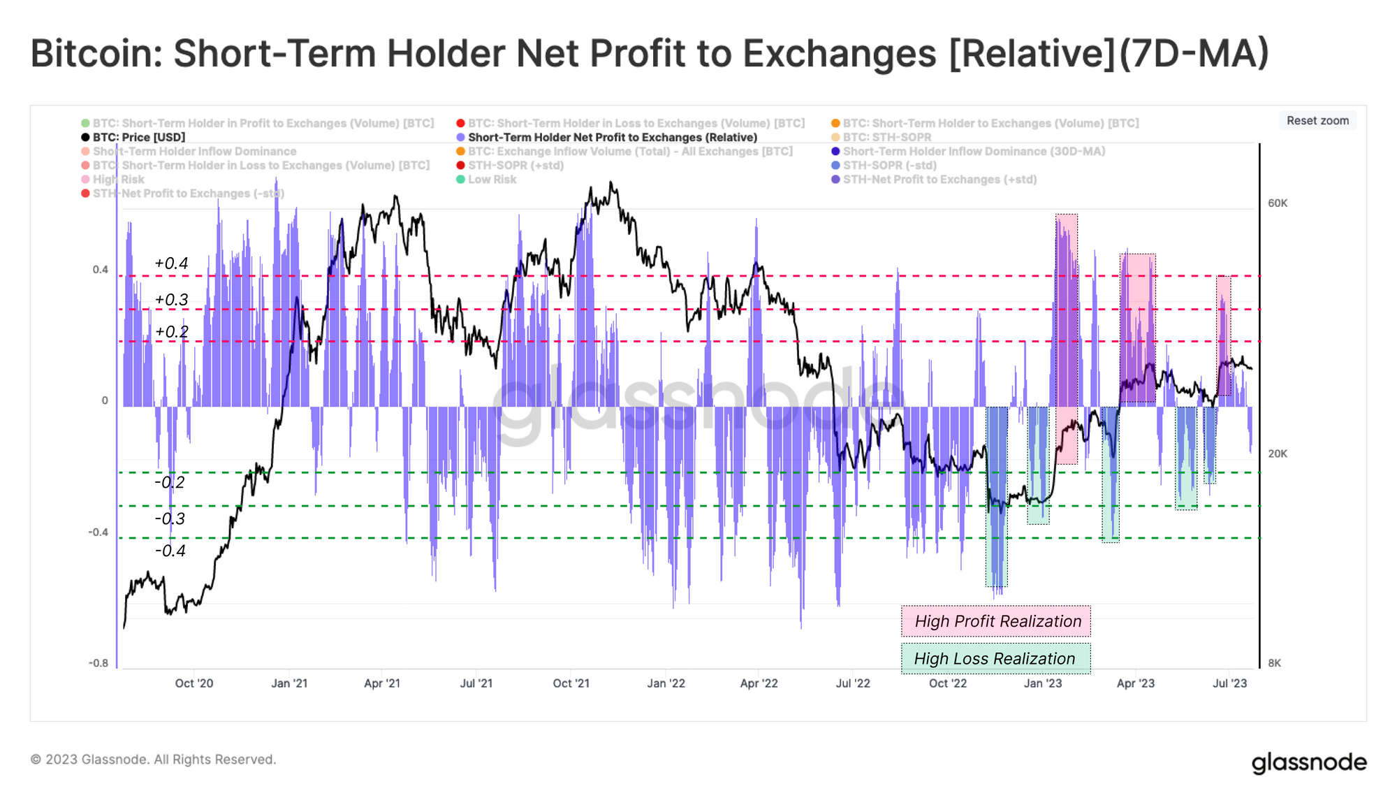
We can see this behavior even clearer by looking at the net profit/loss bias for coins sent to exchanges by the STH cohort. Here, we can see local market extremes see STHs locking in a high degree of profit 🟥, or loss 🟩, indicated by this metric trading above or below ±0.3, respectively.
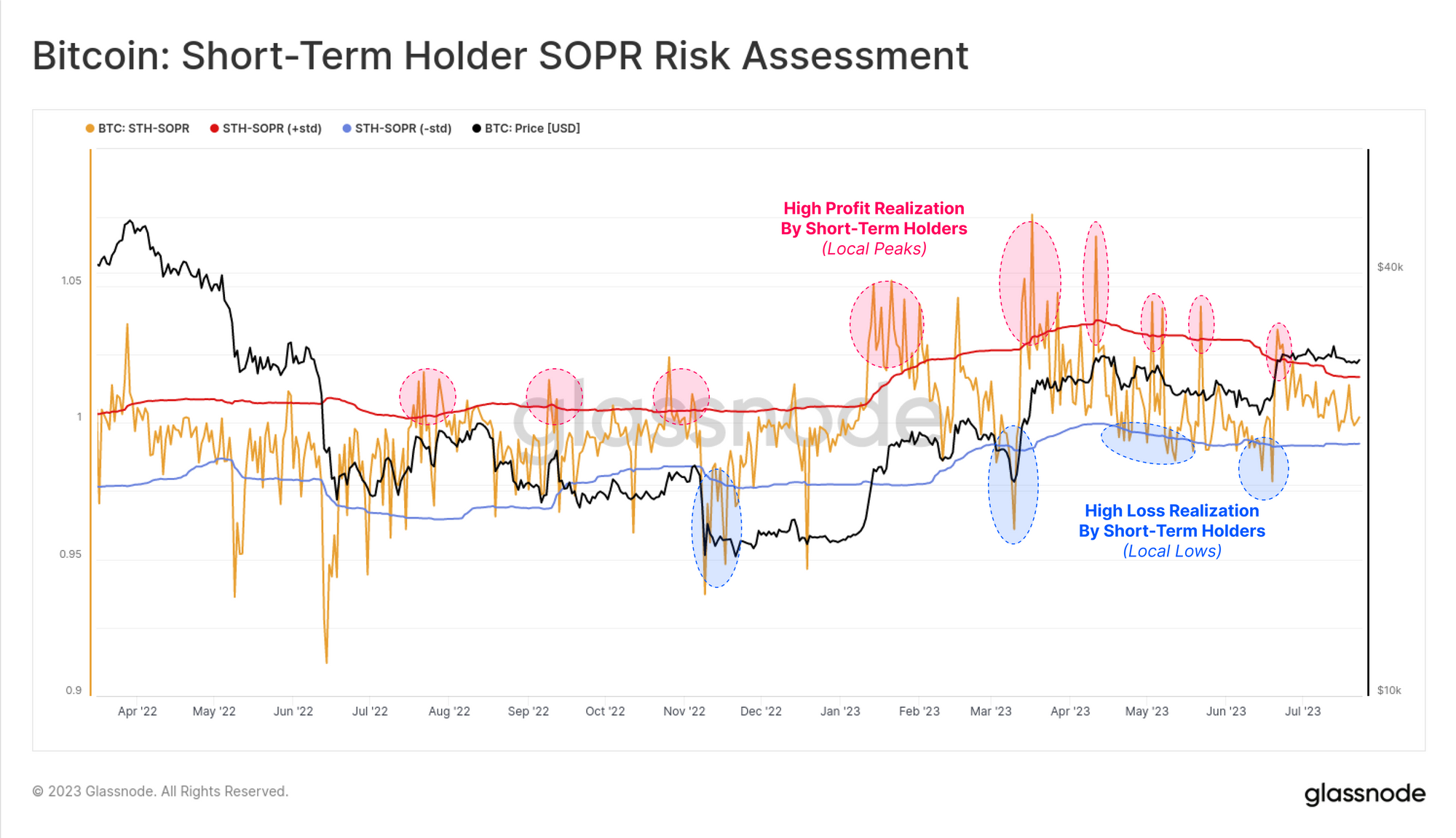
Short-Term Holder SOPR 🟠 is another powerful tool to provide confluence for this local trading behavior in spot markets. SOPR tracks the ratio between the average spending price (disposal) and the acquisition price for Short-Term Holders' coins.
The following chart employs one standard deviation bands (90-day) to periods where excess profit or loss is realized. We can see several instances where these pricing bands were breached around 2023 local market extremes.
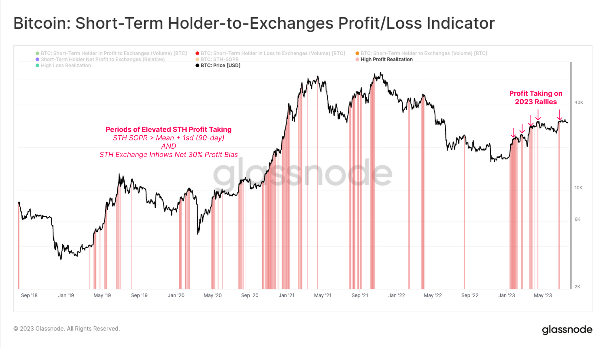
Finally, we can combine these observations using Workbench to develop a tool which highlights when both of these conditions are met:
- STH SOPR is trading above the mean + 1sd band (90-day).
- Relative net STH profit/loss bias to exchanges exceeds 0.3.
This tool can help to identify when the STH cohort is locking in a large degree of profit relative to recent history. There have been several such events throughout 2023, with many establishing local market peaks.
Summary and Conclusions
Whale entities for Bitcoin are often cited as being a key influence on market price action. Whilst it is quite challenging to track and monitor these entities, they appear to be increasingly active in recent months. In particular, 42% of exchange inflows are related to whale entities, with a super-majority of these destined for Binance.
We can also deduce that most of the active whale entities are classified as Short-Term Holders. By combining these observations, we can develop a suite of tools to track periods of strong profit and loss realization by this cohort. From this, we can develop a set of tools to help navigate local market extremes using on-chain data.
Disclaimer: This report does not provide any investment advice. All data is provided for information and educational purposes only. No investment decision shall be based on the information provided here and you are solely responsible for your own investment decisions.
- Join our Telegram channel
- Follow us and reach out on Twitter
- Visit Glassnode Forum for long-form discussions and analysis.
- For on-chain metrics, dashboards, and alerts, visit Glassnode Studio
- For automated alerts on core on-chain metrics and activity on exchanges, visit our Glassnode Alerts Twitter


