A Bear Market Mirage

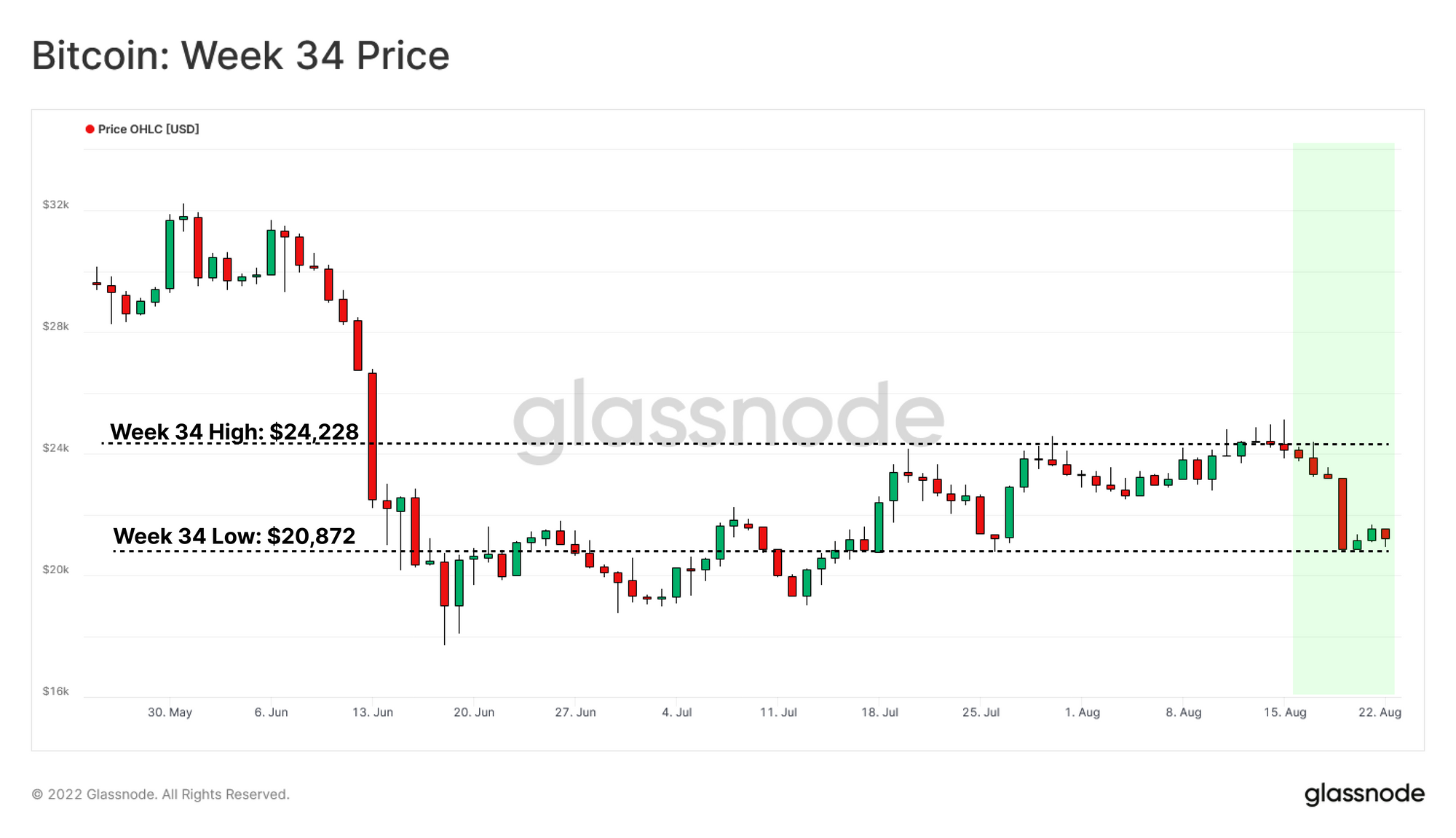
The Bitcoin market recently experienced a wave of short relief, with prices trading above the Realized Price for 23 consecutive days. However, weakness in the underlying network activity has manifested as a sell-off this week, with prices falling once again below this key cost basis level.

A Bear Market Mirage

The Bitcoin markets recently experienced a wave of short relief, with prices trading above the Realized Price for 23 consecutive days. However, weakness in the underlying network activity covered in WoC 31 has manifested as a sell-off this week, with prices falling once again below this key cost basis level.

The Realized Price currently trading at $21.7k, while spot prices are slightly below the Realized Price at $21.3k. During the 2018-2019 bear market, prices fluctuated below the Realized Price for 140 days, making the prevailing bear market duration of 36 days relatively brief, and thus indicating more accumulation time may be required (as discussed in WoC 28).

In this edition, we will explore the underlying weakness leading to this weeks sell-off, alongside metrics to keep an eye on to support a more macro scale recovery.


🔔 Alert Ideas are presented throughout to help identify key metric levels of interest that may signify significant shifts in market/network performance. Any Glassnode member can set an alert directly from Glassnode Studio.


Translations

This Week On-chain is now being translated into Spanish, Italian, Chinese, Japanese, Turkish, French, Portuguese, Farsi, Polish, Russian, Arabic and Greek.

The Week Onchain Dashboard

The Week Onchain Newsletter has a live dashboard with all featured charts available here. This dashboard and all covered metrics are explored further in our Video Report, which is released on Tuesdays each week. Visit and subscribe to our Youtube Channel, and visit our Video Portal for more video content and metric tutorials.


Diving Back Underwater

With the Realized Price now overhead, two additional on-chain price models sit below the market as potential support levels. Delta Price and Balanced Price are well-known on-chain models with a track record for converging with prices around cycle bottoms.

  • Delta Price ($13,760 🟣) is a hybrid pricing model founded on both Technical and On-chain bases. It is calculated as the difference between the Realized and the all-time Average Prices. Delta price has previously caught the bottom wicks of bear markets.
  • Balanced Price ($17,180 🔵)represents the difference between Realized Price and Transferred Price (coinday time-weighted price). This can be thought of as a form of 'fair value' model, capturing the difference between what was paid (cost-basis) and what was spent (transferred).

The chart below highlights the similarities between the current market structure and the bottom formation phase in 2018-2019.

Live Advanced Workbench

An Opportunity For Distribution

Initially, we will examine the Trend Accumulation Score by Cohort to provide granular insight into the accumulation/distribution behavior of all market participants separated by wallet size. Zooming in on the recent recovery from the local bottom in mid-Jun, we can observe two distinct phases:

  • Phase A 🟡: After crashing below $20k, Shrimps (<1 BTC) and Whales (>10k BTC, excluding exchanges and miners) were net accumulators, while other investing classes showed a Balanced Regime.
  • Phase B 🔴: Following the initial reclamation of the Realized Price, all cohorts seized the opportunity to distribute their coins. Interestingly Shrimps' persistent strong accumulation momentum (<1 BTC) has also weakened in this phase.

Therefore, the recent price appreciation triggered a distribution phase across the board, adding sell pressure to the market.

Live Professional Metric in the Engine Room

Tracking Demand via Network Activity

Following the principles of Supply-Demand, the sustainability of a bear market rally can be critiqued when the Supply side is not balanced by new Demand and rising network activity.

The number of unique New Addresses which appeared for the first time is an effective tool to gauge the activity in the network. Due to intraday volatility in activity, the absolute value of new addresses on any given day can be uninformative. However, the trend of new addresses entering the market can provide a strong signal for network activity. Therefore, we shall compare the monthly average of new addresses against the yearly average to underline relative shifts in dominant sentiment and help identify the tides turning for network activity.

  • Bear Market Confirmation 🔴: Alongside prices plunging from the April 2021 ATH, the 30 DMA of the New Address fell sharply below the 365 DMA. This established confirmation that the bear market phase was likely in effect through the lens of network activity.
  • New Demand Confirmation 🟢: After a lengthy market consolidation phase, an abrupt spike of 30 DMA above 365 DMA for New Addresses has historically signalled a promising sign of new demand entering the market.

Examining the recent spot price bounce above realized price shows that the monthly average of New Addresses is still lower than the yearly average 🟡. This pattern can be considered a validation of low demand in the market.


🔔 Alert Idea: New Addresses (30 SMA) breaking above 408k (365 SMA)  would signal an uptick in on-chain activity, suggesting potential market strength and demand recovery.

Live Advanced Workbench

Probing further into the demand side, Miner Revenue From Fees allows for evaluation of the competitiveness of Block space. This can be considered a measurement of network congestion and demand for inclusion in the next block.

  • Low Demand 🔴: The early stages of bear market realization frequently coincide with the evaporation of fees from miners’ revenue. Here, the typical range of 2.5% to 5% has acted as a historical threshold between high and low demand in the market.
  • High Demand 🟢: In contrast, a sustained entrance above the aforementioned 2.5%-5.0% range can be considered a constructive sign for assessing a new wave of demand.

The current structure of this metric demonstrates a low but noticeably rising level of demand for block space. Despite its simplicity, measuring the momentum of paid fees for total settled value is an insightful macro indicator for assessing the complex dynamics of increasing network demand.


🔔 Alert Idea: Percent Miner Revenue From Fees (30 SMA) breaking above 2.5%  would signal an uptick in on-chain activity, suggesting potential market strength and demand recovery.

Live Chart

The presence of retail investors in the network can be gauged by analyzing the long-term trend of small transactions. The following chart displays the 90D moving average of the total volume of transactions with a USD value of less than $10K.

Assuming small-size transactions are primarily attributed to retail investors, the quarterly smoothed average of this metric can be used to track the dominant sentiment of the market. Long-lasting bullish phases 🟩 are attractive to retail investors and bearish periods are less 🟥, so the trend of small transaction volumes can be used to gauge the market atmosphere.

Interestingly, the recent positive movement towards $24.4k was not accompanied by any shift in retail-sized transfer volume or demand 🟦. This pattern adds additional confirmation of the underlying weakness of this market rally.

Live Professional Chart

Looking at the stacked Total Inflows & Outflows to All Exchanges (USD value), we can also extract a similar correlation between the cyclical behavior of Bitcoin prices and USD-denominated exchange inflows 🟥 and outflows 🟩. Exchange flows have now declined to multi-year lows, returning to late-2020 levels. Similar to the retail investor volumes, this suggests a general lack of speculative interest in the asset persists.

Live Advanced Workbench

To establish an explicit indicator based on this connection between exchange flows and wider market sentiment, we defined a new metric, Exchange Flow Multiple. This metric equals the ratio between monthly averaged exchange flows and its yearly average value.

Exchange flows are defined as the average of USD-denominated inflow and outflow volumes related to all exchanges (i.e. inflows + outflows divided by 2).

The Exchange Flow Multiple can be used as a threshold level which can be used to map the early 🔴 and later stages 🟢 of a bear market. In agreement with previously discussed charts, the recent price comeback from the Jun 2022 bottom 🟦 was not accompanied by a significant influx of speculators into the market.

Thus, from the above observations, it appears the recent price rally had little substance behind it from an on-chain perspective and thus confirms the weakness we originally highlighted in WoC 31.

Live Advanced Workbench

Short-Term Holder Confidence

Monitoring Network Demand and Activity with an emphasis on retail investors and speculators can provide insight into mapping the twilight stages of a bear market. However, to complete this puzzle, we will close with an evaluation of Short-Term Holders’ Confidence.

The current market structure does resemble past bottom formation patterns, as discussed in Week On-Chain 29 report. Generally nonspeaking, after a lengthy accumulation phase has taken place, any positive price movement tends to bolster the confidence of short-term investors with a cost basis near equivalent to market value.

In line with this, a sustainable bullish uptrend is usually accompanied by two macro shifts:

  • Declining Realized Losses as all remaining sellers are exhausted from the market.
  • Profits Realized by Short-Term Holders as new demand absorbs sell-side pressure.

Decreasing Realized Loss

Investigation of the 2018-2019 bear market shows that at the very final stages of bottom formation, the Net Realized Profit/Loss (90DMA) has gradually recovered to neutral, as the final sellers are exhausted from the market.

We use the Net Realized Profit/Loss (90DMA), looking for a structural decline in Realizing Net Losses 🔵. If it persists longer, this pattern pivots to Realizing Net Profits that the market can comfortably absorb. The current inclination towards net loss realization demonstrates the price vulnerability against any negative forces in the market.


🔔 Alert Idea: Net Realized Profit/Loss (90 SMA) breaking above Zero would signal an uptick in on-chain activity, suggesting potential market strength and demand recovery.

Live Advanced Workbench

Absorption of Profit Taking

Looking at the Short-Term Holders SOPR (90DMA), we can see a quarterly-smoothed ratio of investor selling prices relative to buying prices. The important threshold level in this metric is a cross-over of 1.0, with a break above indicating a return to profitable spending.

Following the capitulation from the November ATH, short-term holders (top buyers) realized heavy losses, causing a sharp drop in Short-Term Holders SOPR (90DMA) below 1 🟥.

This phase is usually followed by a period of low conviction, where the break-even value of 1 acts as overhead resistance. This occurs because investors are quite willing to sell at or around their cost basis to simply get their money back 🟡.

Finally, after sufficient bottom accumulation takes place, a sustainable break above 1.0 often confirms that new capital is flowing into the market and is absorbing the profit taken by short-term holders 🟩.


🔔 Alert Idea: STH-SOPR (90 SMA) breaking above 1.0 would signal an uptick in on-chain profitability, suggesting potential market strength and demand recovery.

Live Chart

Summary and Conclusion

In this report, we have discussed the main factors that led to the weakness and subsequent rejection of the price from $24.4k back below the Realized Price. Investors from a variety of wallet-size cohorts decided to distribute during the recent rally above the market average cost basis level.

The recent price uptrend also failed to attract a significant wave of new active users, which is particularly noticeable amongst retail investors and speculators. The monthly momentum of exchange flows is also  not suggesting a new wave of investors entering the market, implying a relatively lacklustre influx of capital .

The current market structure is certainly comparable with the late-2018 bear market, however does not yet have the macro trend reversal in profitability and demand inflow required for a sustainable uptrend. Therefore, the ongoing cycle bottom consolidation phase is most likely, as Bitcoin investors attempt to lay a firmer foundation, subject of course to the persistent uncertainty and unfavourable events of the macroeconomic backdrop.


Product Updates

All product updates, improvements and manual updates to metrics and data are recorded in our changelog for your reference.

Disclaimer: This report does not provide any investment advice. All data is provided for information purposes only. No investment decision shall be based on the information provided here and you are solely responsible for your own investment decisions.