Assessing Risk in a Bitcoin Bull
On-chain data provides both investors and analysts with a plethora of new tools to diagnose and assess the state of the chain from a multitude of viewpoints. In this article, we produce a new framework for assessing the degree of market risk across various data categories.
Executive Summary
- In this article, we introduce a new Risk Assessment framework which utilizes a suite of core on-chain instruments covering both Short-Term and Long-Term risk cycles.
- Equipped with this new framework, we aim to provide investors and analysts alike with a robust model for assessing drawdown risk from a data-driven standpoint.
- In conclusion, we compile all metrics considered into a heatmap to assess the confluence of risk across a variety of data categories.
Macro Risk Analysis
There are many models and metrics available to analysts which can be used to assess market risk at any given point in the cycle. In this piece, we will specifically consider ‘risk’ as that of a major drawdown in the spot price of Bitcoin.
As such, ‘High-Risk 🟥’is defined as a point where the market is likely in a speculative bubble. By contrast, ‘Low-Risk 🟩’ environments are considered those where much of the speculative excess has been cleared, and the market is more likely to be within a bottom formation pattern.
Price Bubble
As a first building block, we monitor the deviation of price from two long-term mean reversion baselines:
- MVRV Model 🟠: This model measures the ratio between the spot price and the overall cost-basis of the market (Realized Price).
- Mayer Multiple 🔵: Leveraging the 200D-SMA as a technical cyclical mid-line, measuring the premium or discount relative to this baseline.
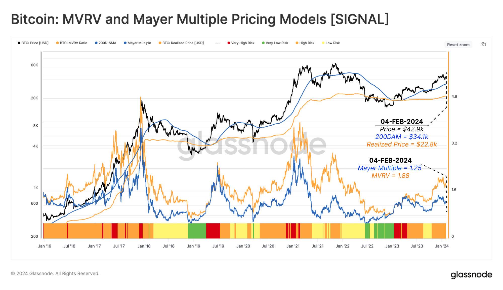
In the chart below, we have defined the following risk categories by combining MVRV and Mayer Multiple (MM) models.
Very High Risk 🟥
Price is above both models (MVRV > 1 and MM >1), and the Mayer Multiple is trading two standard deviations higher than its cumulative mean (MM > +2 STD).
High Risk 🟧
Price is above models (MVRV > 1 and MM >1), and the Mayer Multiple is below two standard deviations higher than its cumulative mean (1.0 < MM < +2 STD).
Low Risk 🟨
Price is above the realized price (MVRV>1) but under the 200D-MA level (MM<1).
Very Low Risk 🟩
The price is below both the realized price (MVRV<1) and 200D-MA level (MM<1).
Spot price is currently at $42.9k, while the realized price and 200D-MA are trading at $22.8k and $34.1k, respectively. This puts the market within a High Risk 🟧 environment.
Gauging Supply Profitability
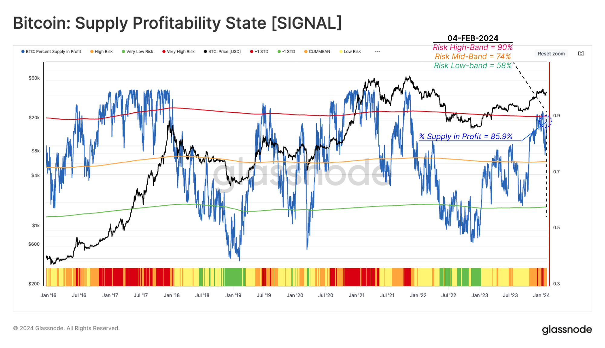
The Percent of Supply in Profit (PSIP) 🔵 metric measures the proportion of coins with a cost-basis lower than the current spot price. This indicator can help identify the potential risk of increased selling pressure as investors see a growing incentive to take profits.
Very High Risk 🟥
PSIP is more than one standard deviation from its historical mean.
(PSIP > 90%)
High Risk 🟧
PSIP is less than one standard deviation above its historical mean.
(75% < PSIP < 90%)
Low Risk 🟨
PSIP is below its historical mean but above its statistical lower band.
(58% < PSIP < 75%)
Very Low Risk 🟩
PSIP is more than one standard deviation below its historical mean.
(PSIP < 58%)
When this indicator trades above the upper band, it has historically aligned with the market entering the ‘Euphoric Phase’ of a bull market. During the recent market rally around the Spot ETF launch, this metric reached the Very High Risk 🟥, which was followed by a price contraction down to $38k.
Sizing Fear and Greed
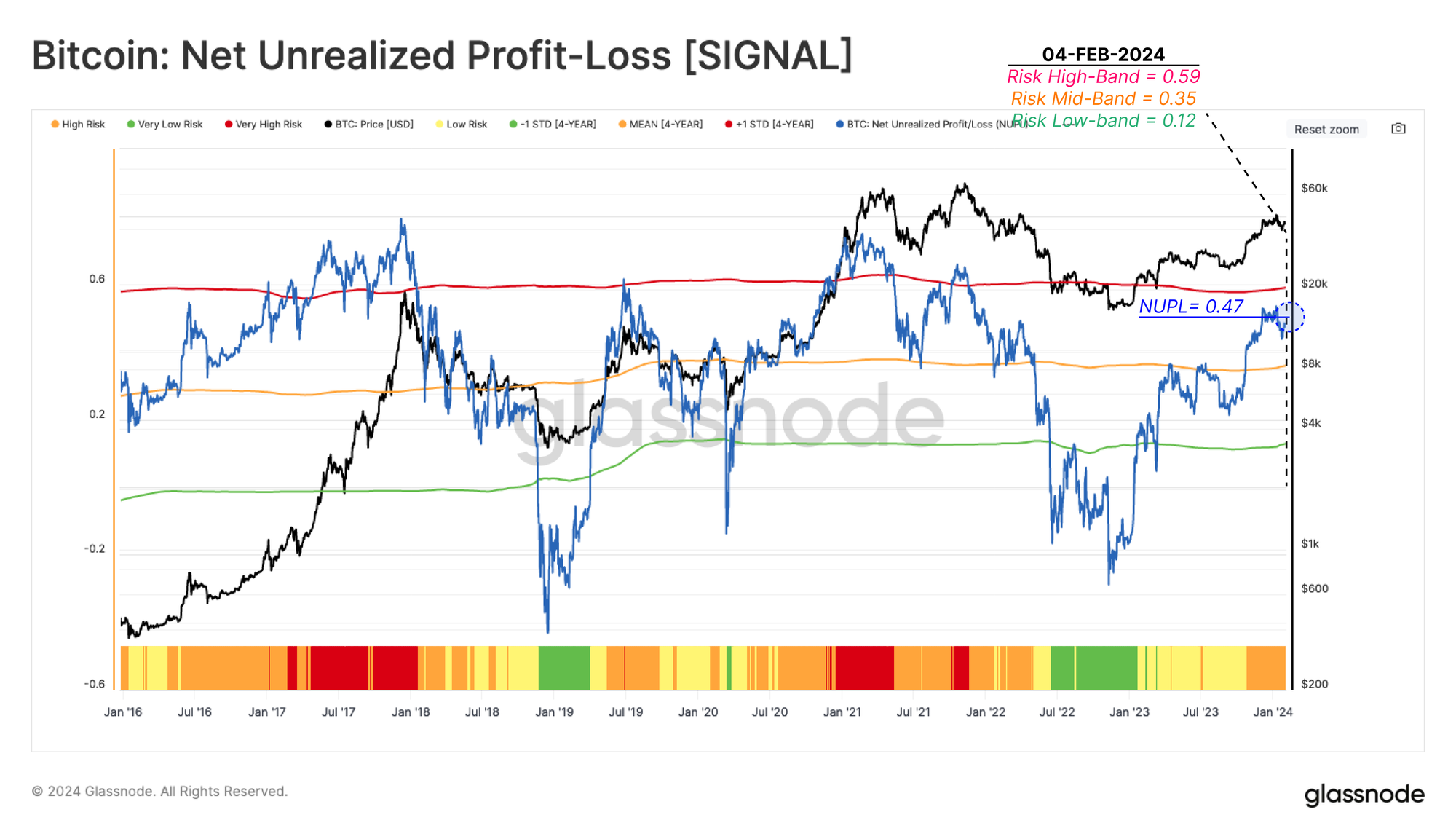
Another powerful tool to quantify the associated risk with growing Fear and Greed sentiment in the market is the Net Unrealized Profit/Loss (NUPL) metric. This indicator examines the dollar value of the total net profit or loss as a percentage of the market cap.
Therefore, after estimating the number of coins in profit using the Percent of Supply in Profit, we can employ NUPL to measure the magnitude of investor profitability.
Very High Risk 🟥
NUPL exceeds one standard deviation over the 4y average, suggesting the market is in the Euphoria phase, where unrealized profit reaches extreme levels (NUPL > 0.59).
High Risk 🟧
NUPL is between the upper band and the 4-year average, suggesting the market is in net profit, but below the statistically high levels (0.35 < NUPL < 0.59).
Low Risk 🟨
NUPL has fallen below the 4-year average, but is above statistically low levels (0.12 < NUPL < 0.35).
Very Low Risk 🟩
NUPL has plunged below the statistical low band, which has historically coincided with the Bottom Discovery phase of a bear market (NUPL < 0.12).
Following the October 2023 rally, NUPL entered the High Risk 🟧 range, reaching a value of 0.47. Despite the significant jump in coin volume held in profit, the magnitude of USD profit did not reach the Very High Risk 🟥 state. This suggests a large proportion of coins were accumulated at a cost basis around the ~$30k consolidation range throughout H2-2023.
Realized Profit and Loss
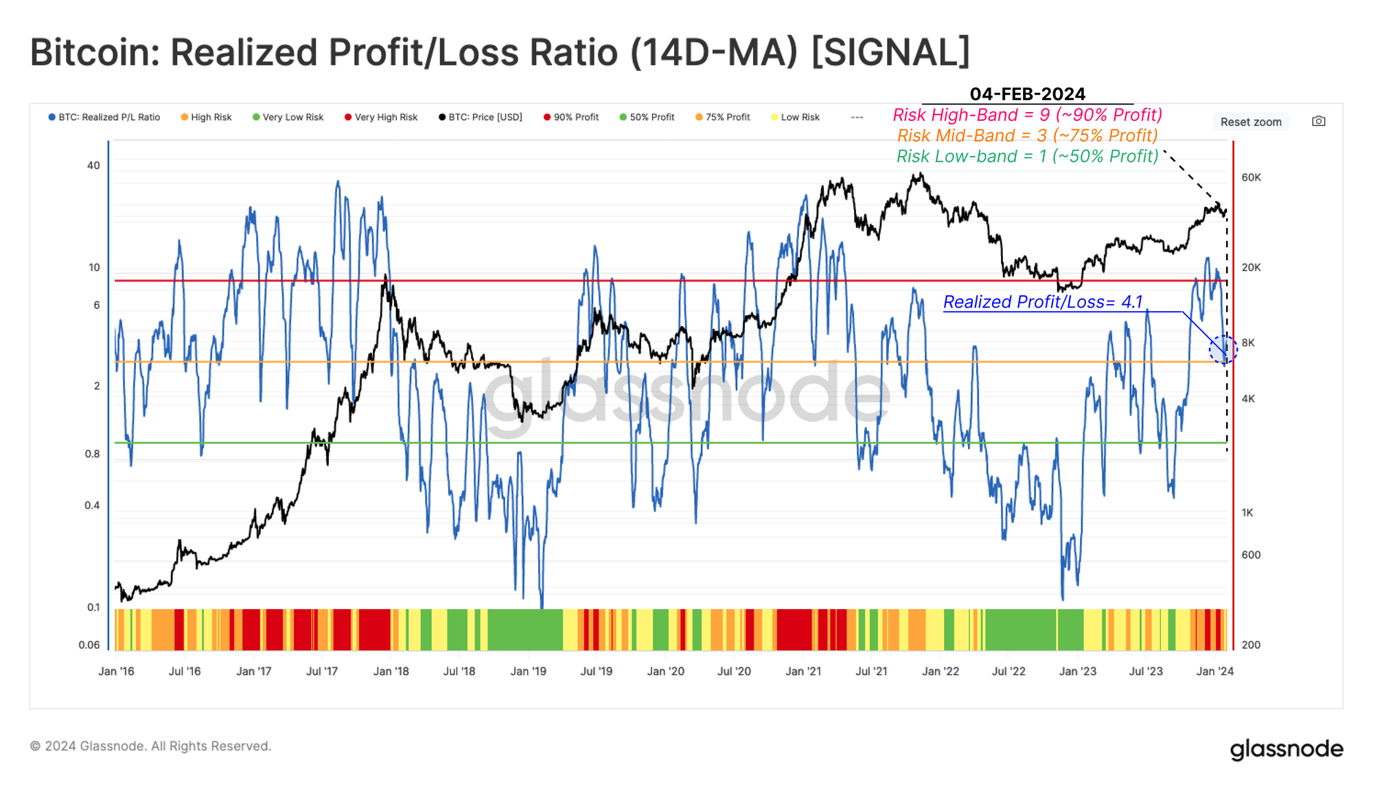
The next step is to assess how market participants are adjusting their spending patterns, with the Realized Profit/Loss Ratio (RPLR) being an excellent compass to achieve this goal.
This indicator tracks the ratio between profit taking, and loss taking events occurring on-chain. We use a 14D-MA of this ratio to smooth out the daily noise and more clearly identify macro shifts in investor behavior.
Very High Risk 🟥
RPLR is above 9, meaning more than 90% of coins moving on-chain are spent in profit, a typical characteristic of market demand reaching exhaustion (RPLR > 9).
High Risk 🟧
RPLR is below 9 and above 3, indicating that between 75%-90% of coins are moved in profit. This structure is frequent before and after market peaks (3 < RPLR < 9).
Low Risk 🟨
RPLR has declined below the mid-line of 3, which usually occurs when the market undergoes a transition between high and low-risk regimes (1 < RPLR < 3).
Very Low Risk 🟩
RPLR trades below 1, indicating a dominance of coins moving in loss, which is a signal of investor capitulation, typical during late-stage bear markets.
This indicator recently flagged a Very High Risk 🟥 regime as prices hit the recent $48.4k peak. The Realized Profit/Loss Ratio is currently at 4.1, residing in the High Risk 🟧 condition.
Activity Risk Analysis
Switching gears slightly, we will now assess risk through the lens of demand, measured using a suite of adoption metrics related to network activity.
Demand For Blockspace
Given the capped blockspace in the Bitcoin network, a powerful method to gauge demand is via examination of the fee market. Usually, consistent growth in demand leads to a sustained rise in fees, as competition for inclusion in the next block increases.
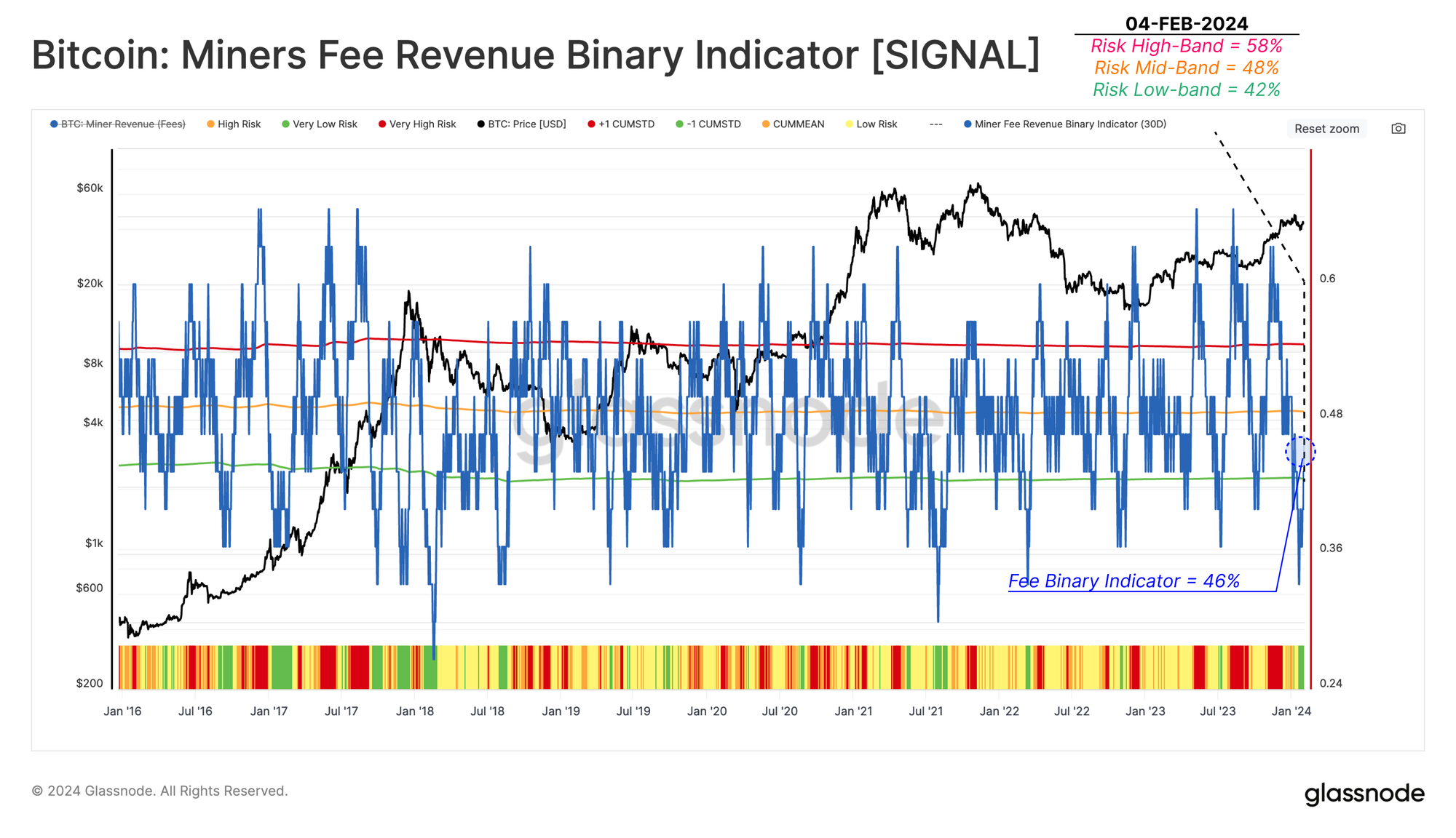
The Miners Fee Revenue Binary Indicator (MFR-BI) shows the proportion of days over the last 30 days where the fee market has seen increasing pressure day-on-day.
Very High Risk 🟥
MFR-BI is heating up over more than 58% (+1 STD) of days in the last month. This is an indication that the urgency of investor spending is growing (MFR-BI > 58%).
High Risk 🟧
MFR-BI is between the historical average and the upper statistical band (48% < MFR-BI < 58%).
Low Risk 🟨
MFR-BI has dropped below the historical average, suggesting diminishing competition in the fee market (42% < MFR-BI < 48%).
Very Low Risk 🟩
MFR-BI has fallen below the low statistical band at 42% (-1 STD), suggesting a declining urgency for investors to move their capital (MFR-BI < 42%).
During the sell-off drop to $38k, this indicator triggered a Very Low Risk 🟩 signal. As spot prices bounced back to $43k, this metric returned back to the Low Risk 🟨 zone (~46%).
Speculation Momentum
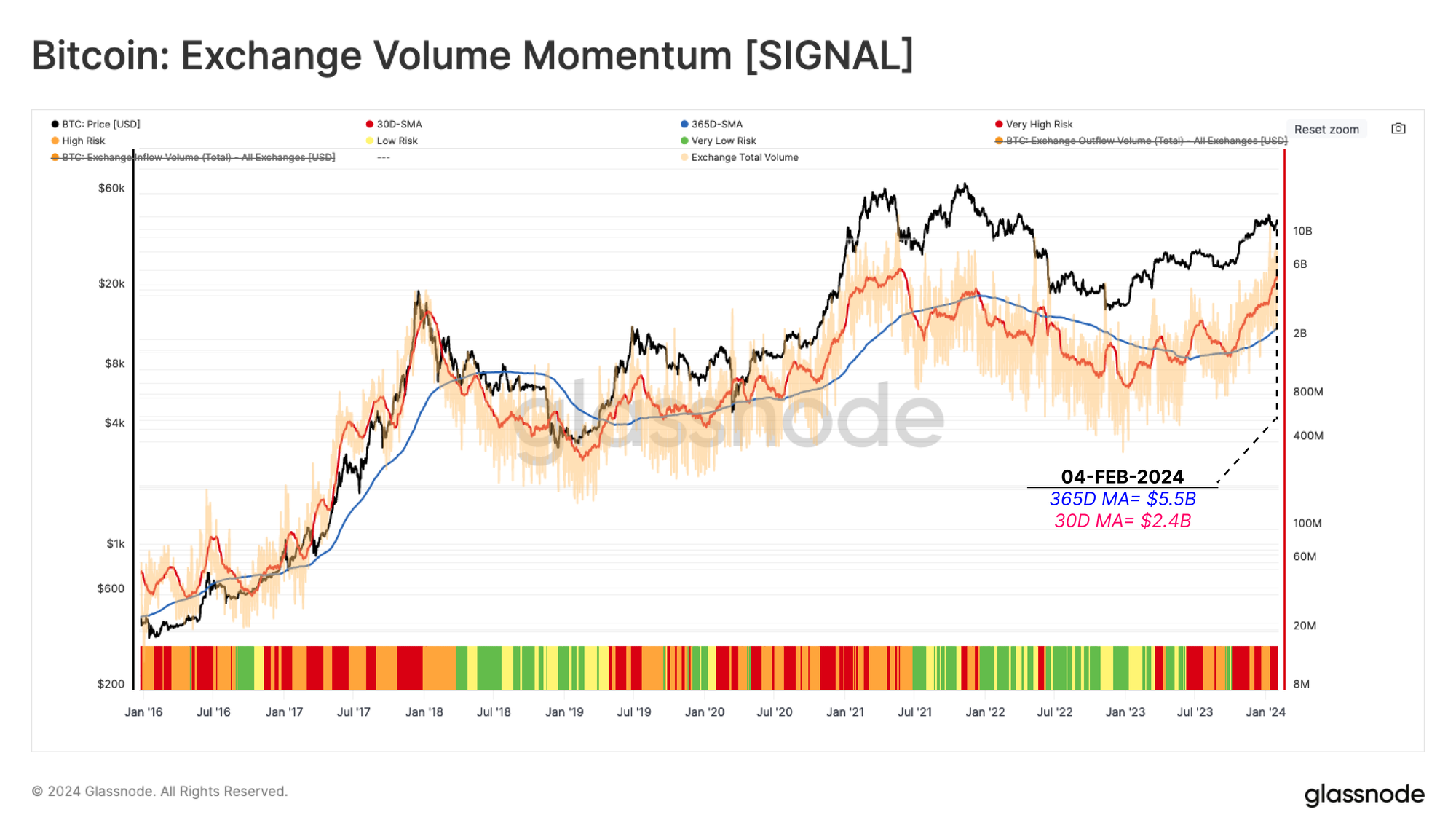
As the last component of the activity risk analysis suite, we revisit the Exchange Volume Momentum metric, which compares the monthly and yearly average of volume transferred from/into all exchanges. This tool acts as a proxy for the market's appetite for speculation.
This risk indicator measures the magnitude and direction of change in the faster monthly moving average’s (30D-MA) relative to the slower yearly moving average (365-MA).
Very High Risk 🟥
When the monthly average trades above the yearly average, and keeps rising, the risk factor is considered very high (MA-365D < MA-30D and MA-30D 🔼).
High Risk 🟧
When the monthly average trades above the yearly average, but is declining, the risk factor is labelled high (MA-365 < MA-30D and MA-30D 🔽).
Low Risk 🟨
When the monthly average is below the yearly average, but is increasing, the risk factor is labelled low (MA-30D < MA-365D and MA-30D 🔼).
Very Low Risk 🟩
When the monthly average is below the yearly average, but is decreasing, the risk factor is labelled very low (MA-30D < MA-65D and MA-30D 🔽).
The monthly average of Exchange Inflow Volumes has been trending strongly higher since October, putting this indicator in the Very High Risk 🟥 regime. This suggests that the market is currently in a relatively speculative state.
Short-Term and Long-Term Risk Analysis
The risk analysis above considers a relatively macro and global perspective. In this next section, we will assess patterns at a more granular level, considering the behavior of short-term and long-term holder cohorts.
New Investors in Profit
Revisiting the conclusions made in prior reports (WoC 38, 2023 and WoC 50, 2023), Short-Term Holders tend to have an outsized influence in shaping near-term price action, such as local tops and bottoms.
Therefore, we take a Cause and Effect approach for spotting high (or low) risk intervals. This is based on a two-step assessment:
- Unrealized profit (or loss) held by these new investors (the incentive to spend).
- Realized profit (and loss) locked in by new investors (the actual spending).
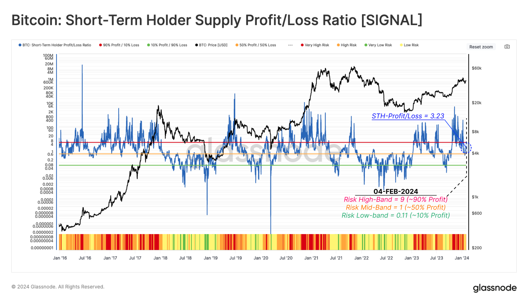
We start with the Short-Term Holder Supply Profit/Loss Ratio (STH-SPLR), which captures the balance between supply held in profit vs loss for new investors.
Very High Risk 🟥
STH-SPLR is greater than 9, it indicates 90% of new investor coins are in profit, creating a strong incentive to spend (STH-SPLR > 9).
High Risk 🟧
STH-SPLR is between 1 and 9, indicating between 50% and 90% of new investor coins are in profit, and a moderate risk of spending (1 < STH-SPLR < 9).
Low Risk 🟨
STH-SPLR is between 0.11 and 1, indicating between 10% and 50% of new investor supply is in profit, putting a majority underwater on their holdings (0.11 < STH-SPLR <1).
Very Low Risk 🟩 STH-SPLR falls below 0.11, indicating that more than 90% of new investor supply is held at a loss, typical of late stage bear markets (STH-SPLR < 0.11).
This indicator recently signalled a Very High Risk 🟥 condition between mid-Oct-2023 and mid-Jan-2024 as ETF speculation peaked. This suggested that a super-majority of new investors were profitable, suggesting an increased probability of profit-taking. This has since cooled off towards the neutral Low Risk 🟨 range.
Locking In Short-Term Gains
The next step is focusing on the actual spending by these Short-Term Holders, measured through the lens of their realized profit or loss. The chart below highlights examples of high profit-taking 🟩 (or loss-taking 🟥) regimes since January 2016. As shown, these periods of high spending tend to coincide with both strong rallies and corrections.
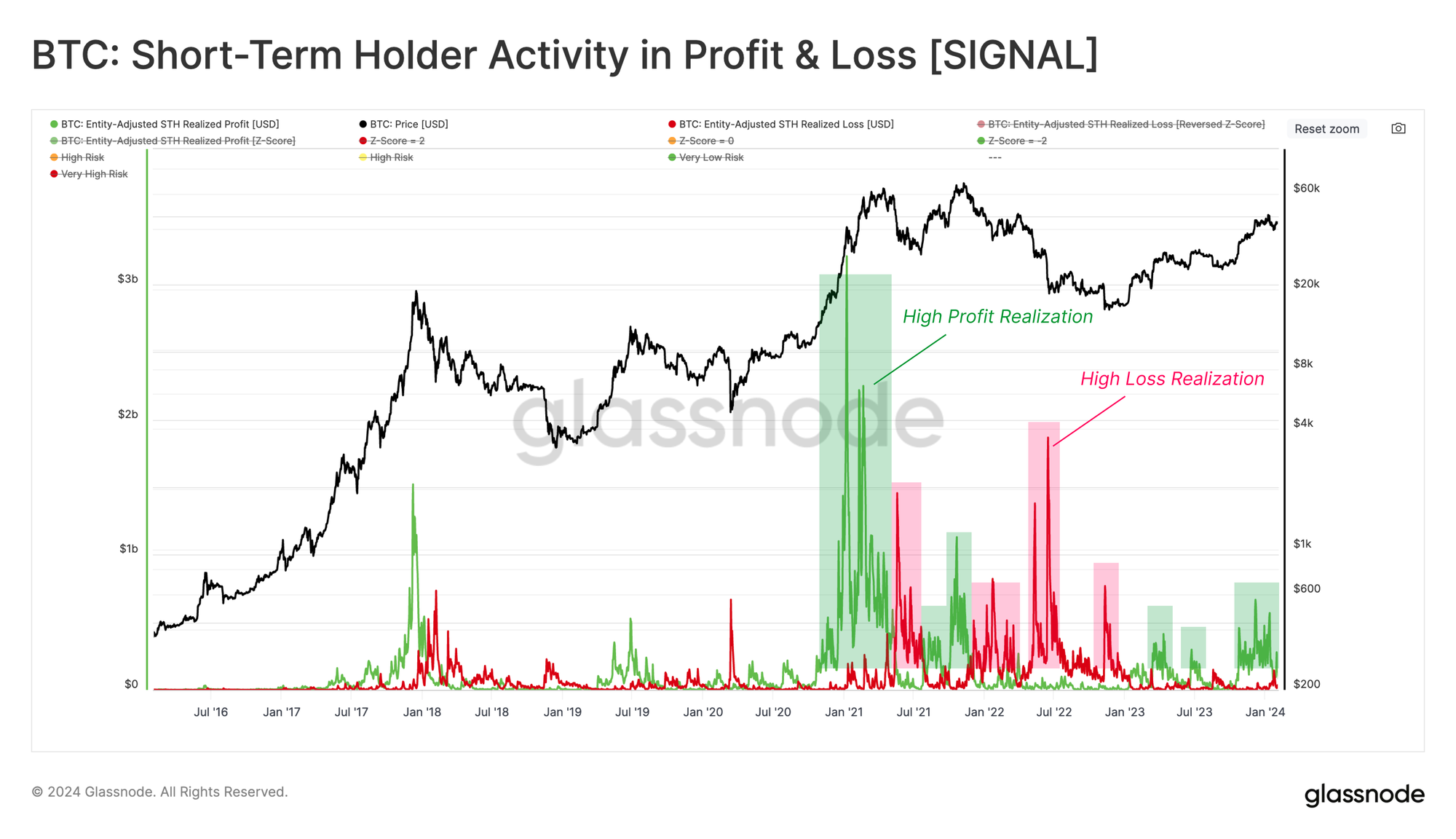
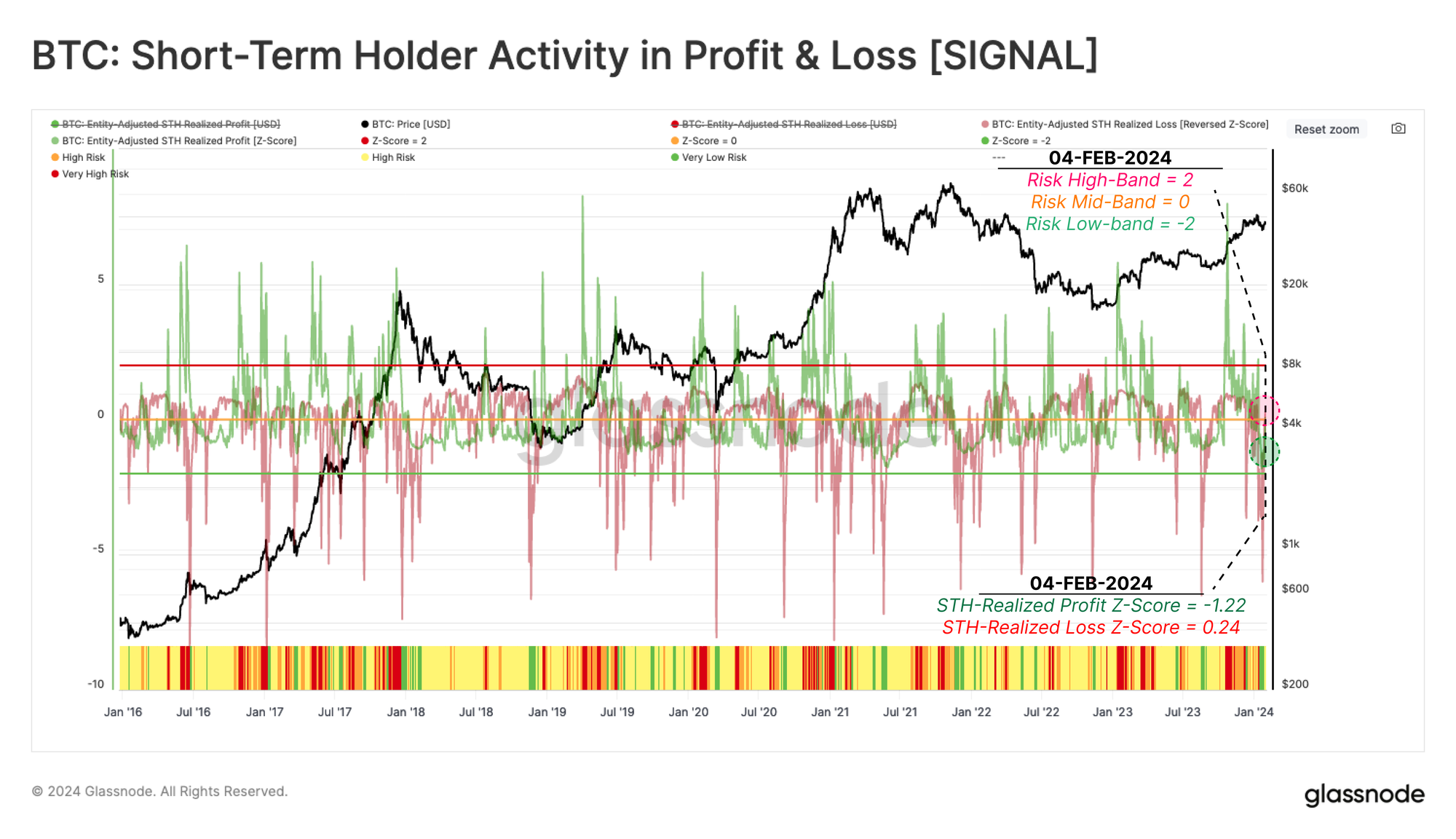
We transform and normalize these metrics using a 90-day Z-Score function, which standardizes this USD-denominated activity of short-term holders. This technique helps to spot when short-term holder spending is outside statistical extremes, which can be translated into potential local top and bottom formations within the market.
Note that to improve the visual aspect of this risk indicator, we have inverted the realized loss z-score (multiplied by -1).
Very High Risk 🟥
STH in Profit Z-Score is more than +2 standard deviations above the 90D average, indicating significant profit taking (STH-Realized Profit Z-Score > 2).
High Risk 🟧
STH in Profit Z-Score is between the 90D average and the +2 standard deviation level, suggesting modest profit taking (1 < STH-Realized Profit Z-Score < 2).
Low Risk 🟨
STH in Profit Z-Score drops below the 90D average, indicating a marked reduction in profit taking, often paired with increasing realized losses. (STH-Realized Profit Z-Score < 1)
Very Low Risk 🟩
Similar to the Low Risk 🟨 category, the STH in Profit Z-Score drops below its 90D average, while at the same time, realized losses increase above +2 standard deviations above its 90D average (STH-Realized Profit Z-Score < 1 and STH-Realized Loss Z-Score > 2, noting the inverted visual aspect).
The recent correction to $38k following the ETF launches caused a notable reduction in market risk according to this metric. The STH-Realized Profit Z-Score is currently at -1.22, while the STH-Realized Profit Z-Score is at -0.24. This places the present market structure in the Low Risk 🟨 regime.
Old Hands Locking In Profit
We introduced a framework similar to the Short-Term Holder Risk assessment above, except it focused on Long-Term Holders (LTHs) in a prior report (WoC-22-2023). The goal is to assess when the degree of unrealized profit held by the Long-term holders has advanced to statistically extreme levels, then trace whether this cohort ramps up their spending accordingly.
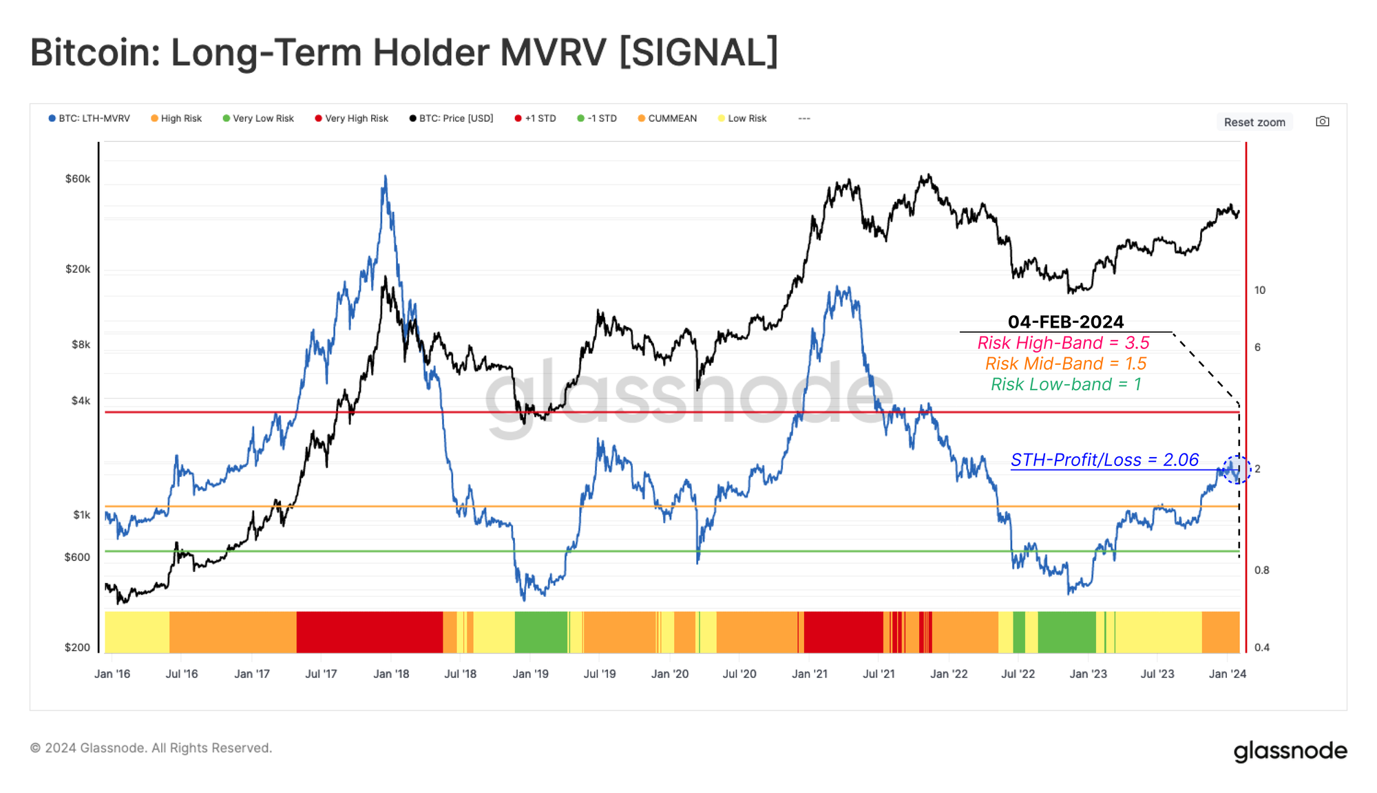
The first indicator gauges the unrealized profit component of LTHs using the Long-Term Holder MVRV Ratio. This measures the divergence between the market price, and the average LTH cost basis.
Very High Risk 🟥
LTH-MVRV is greater than 3.5, indicating LTHs are in an average unrelized profit of 250%. This range is often reached as the market reclaims the prior ATH (LTH-MVRV > 3.5).
High Risk 🟧
LTH-MVRV trades between 1.5 and 3.5. This condition is typically seen during the early stages of both bear and bull markets (1.5 < LTH-MVRV <3.5).
Low Risk 🟨
LTH-MVRV trades between 1.0 and 1.5, indicating LTHs are only slightly profitable on average, typical during late-stage bear, and early-stage bull markets (1 < LTH-MVRV <1.5).
Very Low Risk 🟩
LTH-MVRV trades below 1.0, as the spot price plunges below average LTH cost basis. This often highlights a state of seller exhaustion and investor capitulation (LTH-MVRV < 1).
After the challenging recovery since the FTX collapse, this indicator has advanced to 2.06, entering the High Risk 🟧 regime. As noted, these levels are typically seen during the early stages of bull markets, as long-term investors return to a relatively meaningful level of profitability.
Long-Term Holders Spending
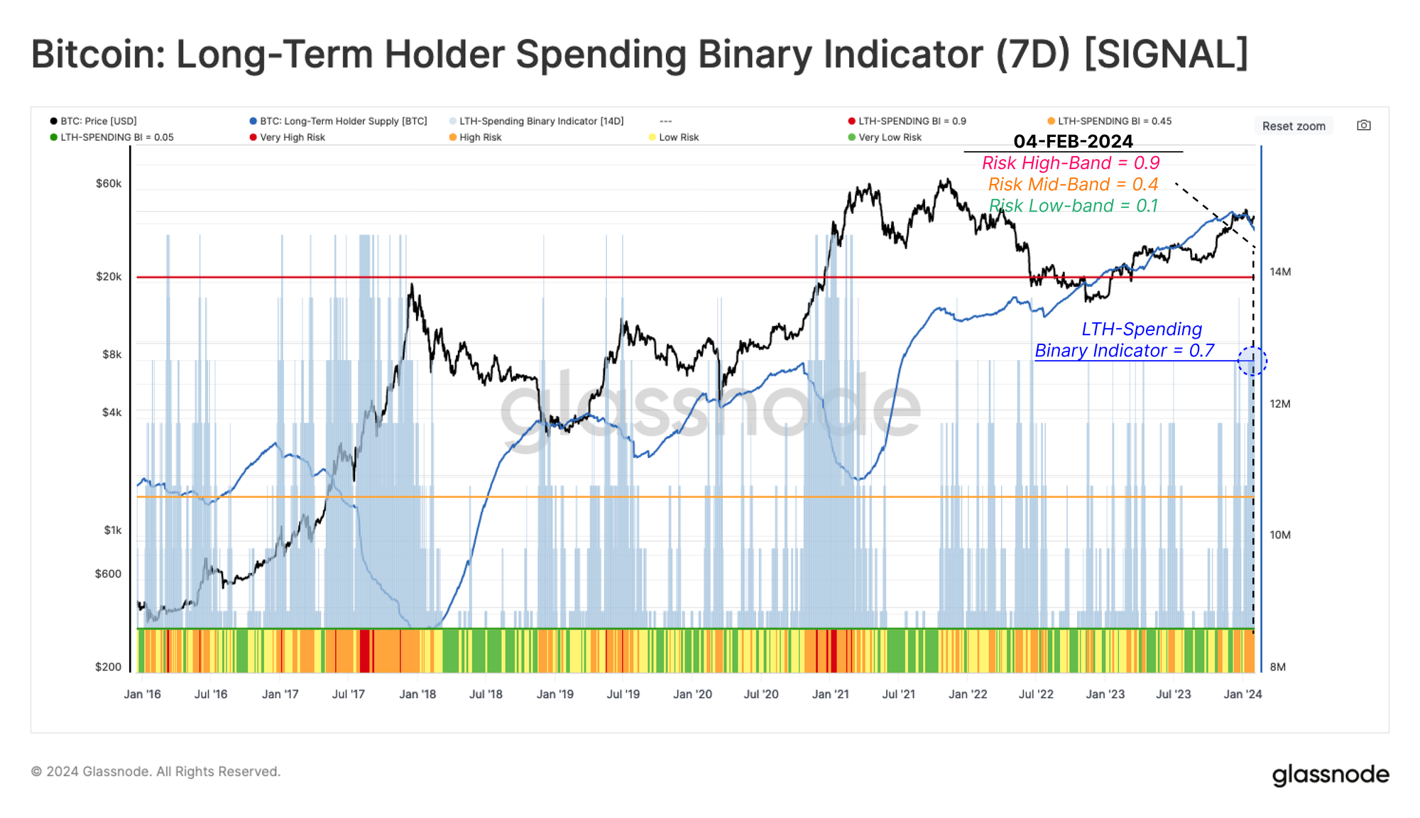
In this risk analysis study's final step, we built a binary indicator to assess when LTH spending is increasing at a sustained rate. The Long-Term Holder Sending Binary Indicator (LTH-SBI) tracks periods when LTH spending is sufficient to decrease the total LTH Supply over a sustained 7-day period.
When LTH supply decreases, it indicates a reintroduction of long-dormant supply back into liquid circulation, working as an offset to new demand.
Very High Risk 🟥
LTH-SBI reached above 0.85, indicating LTHs have increased their spending for 6 of the last 7 days. This pattern relates to old hands seizing the opportunity to lock in profit at elevated prices (LTH-SBI > 0.85).
High Risk 🟧
LTH-SBI trades between 0.50 and 0.85, suggesting a modest increase in LTH spending for at least 3.5 of the last 7 days (0.50 < LTH-SBI < 0.85).
Low Risk 🟨
LTH-SBI trades between 0.14 and 0.50, indicating a relatively small degree of LTH spending is taking place over the last week (0.14 < LTH-SBI < 0.50).
Very Low Risk 🟩
LTH-SBI falls below 0.14, indicating LTH spending is minimal, and their aggregate supply is decreasing for 1 or fewer days over the last week (LTH-SBI < 0.14).
The ETF speculation rally towards $48.4k pushed this risk indicator from Low Risk 🟨 into the High Risk 🟧 range. The current value is 0.7, suggesting a degree of elevated spending by LTHs, as investors and ETF re-balancing (namely from GBTC) transfer coin ownership.
Conclusion
In this piece, we developed a procedure for assessing the risk of a drawdown within the Bitcoin market. These risk factors consider a wide set of data and investor behavior categories, helping to establish a framework for analysts and investors.
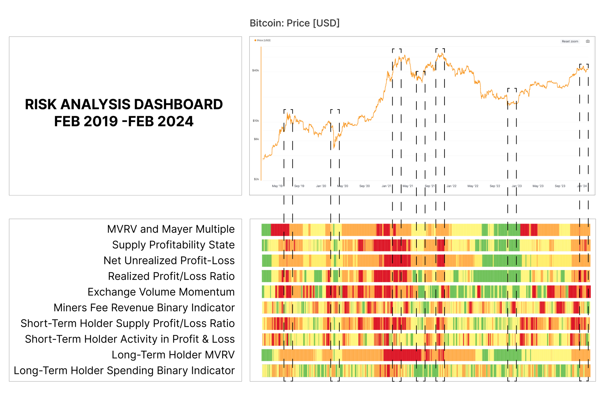
Whilst each indicator can be used individually, the combination often provides a more comprehensive picture of the state of the market. The chart below compiles these into a heatmap view of the various risk indicators over the last 5-years. From this, we can compare the indicators to noteworthy tops and bottoms, where significant confluence can be seen.
The levels and transformations are intended as an initial guide and should be iterated on by analysts and practitioners to optimize for specific points of interest.
Disclaimer: This report does not provide any investment advice. All data is provided for information and educational purposes only. No investment decision shall be based on the information provided here and you are solely responsible for your own investment decisions.
Exchange balances presented are derived from Glassnode’s comprehensive database of address labels, which are amassed through both officially published exchange information and proprietary clustering algorithms. While we strive to ensure the utmost accuracy in representing exchange balances, it is important to note that these figures might not always encapsulate the entirety of an exchange’s reserves, particularly when exchanges refrain from disclosing their official addresses. We urge users to exercise caution and discretion when utilizing these metrics. Glassnode shall not be held responsible for any discrepancies or potential inaccuracies. Please read our Transparency Notice when using exchange data.
- Join our Telegram channel
- For on-chain metrics, dashboards, and alerts, visit Glassnode Studio
- For automated alerts on core on-chain metrics and activity on exchanges, visit our Glassnode Alerts Twitter


