A Trial by Fire

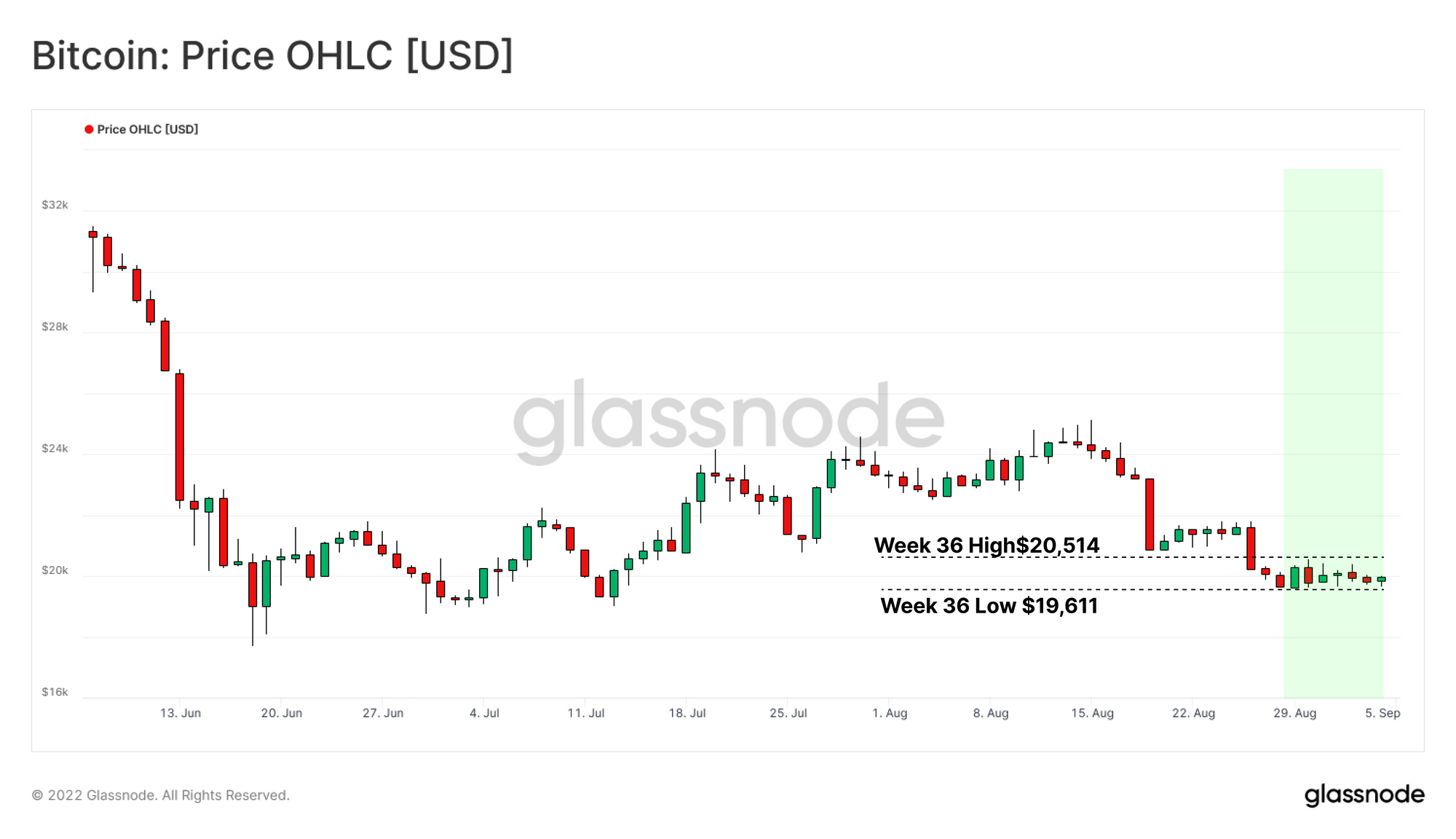
Amidst a persistent contraction in global liquidity, Bitcoin Short-Term Holders find themselves under immense pressure, with Bitcoin markets struggling to hold the psychological $20k support level.

A Trial by Fire

Liquidity across all asset markets continue to fade this week, as persistent dollar strength pushes the DXY Index to a new 20-year high of 110.27. The Eurozone finds itself under increasing stress, with the balance of trade in deficit, concerns over energy shortages, and the Euro falling deeper below USD parity.

With weakness in almost all other currency pairs, the pressure remains on equities, bonds and Bitcoin markets alike. For Bitcoin specifically, the underlying market very much resembles the macro scene, with a volatile and uncertain short-term, whilst the longer-term outlook is more consistent, and characterized by well developed trends.

In this edition, we shall explore this dichotomy from the lens of market spending behaviors, inspecting regions of local distribution, within a macro scale accumulation regime. We shall supplement this assessment with more granular deep dives into various cohorts, including HODLers, Short-Term Holders, and by different wallet sizes to understand their isolated stress levels.


Translations

This Week On-chain is now being translated into Spanish, Italian, Chinese, Japanese, Turkish, French, Portuguese, Farsi, Polish, Arabic, Russian and Greek.

The Week Onchain Dashboard

The Week Onchain Newsletter has a live dashboard with all featured charts available here. This dashboard and all covered metrics are explored further in our Video Report, which is released on Tuesdays each week. Visit and subscribe to our Youtube Channel, and visit our Video Portal for more video content and metric tutorials.


Local Distribution

To begin, we shall assess the degree of accumulation / distribution occurring in response to the current price range. The Bitcoin Accumulation Trend Score can be used to understand participant spending behavior, and help contextualize the market response to price action.

In the last 12-months, we have seen four distinct phases:

  • Phase 1 (Accumulation): Following the capture of a new ATH in Nov 2021, investor elation translated into perfect accumulation scores, as the market readily bought what they believed to be an opportune dip.
  • Phase 2 (Distribution): A slow, but sustained collapse in price left the recent accumulators severely in loss. This sparked a transition in emotion from elation to desperation, as underwater participants distributed coins, as the bear market reality started to set in.
  • Phase 3 (Accumulation): The LUNA Collapse rippled across the heavily entangled leverage throughout the industry, prompting a unilateral, and wide-scale deleveraging event. Despite plunging the already weak market to new lows, participants reacted by transitioning into near broad scale accumulation throughout both capitulation legs below $30k, and then again below $20k.
  • Phase 4 (Distribution): Following months of accumulation, the market managed to rally above $24k, however as covered in WoC 34 and WoC 35, this opportunity for exit liquidity was taken via distribution, and profit taking.
Live Advanced Chart

We can further isolate this behavior by cohorts, to assess the primary participants in each regime.

The cohort of most interest in the current market are the Whales (10k+ BTC) who have begun to aggressively distribute coins into the range highs of $24500, capitalizing on any exit liquidity present amidst global market uncertainty.

The excess supply provided to the Market by the Whales appears to have overwhelmed the already eroded demand side, culminating in the formation of a local top.

Live Metric in the Glassnode Engine Room

We can confirm this behavior using the Whale-Exchange Net Position Change metric. This tool allows us to see the 30-day net change in Whale balances (1k BTC+), considering only coins flowing in and out of exchanges.

  • Positive values (🟢) indicate net Whale balance growth (and exchange withdrawals).
  • Negative values (🔴) indicate net Whale balance decline (and exchange deposits).

A stark reversal can be noted following the sell-off to $17.6k, where Whale transfers rapidly reversed towards net deposits to exchanges. Peak distribution was hit around the recent local top of $24.5k. This provides confluence with the results from the cohort analysis above, with the 10k+ cohort seen to be the dominant actor.

Live Professional Workbench

Macro Accumulation

Transitioning from a local time horizon to a macro perspective, we shall next assess the levels of accumulation / distribution occurring over a multi-year time frame

To assess the macro state of Bitcoin long-term behavior, we initially can turn to the Liveliness metric. Liveliness measures aggregate network activity by balancing the all-time aggregate Coin Day Destruction against all-time Coin Day Creation. The trend and gradient of it then provide information on wider market preferences for HODLing (downtrends) or spending (uptrends).

Liveliness is currently in a strong downtrend, and has convincingly broken below the triple peaks of the post 2018 bear market. This event suggests that Coin Days are being accumulated by the supply much faster than they are being destroyed, and is coincident with a HODLing dominant regime.

Live Advanced Metric

Next, we can inspect a derivative of Liveliness that brings it into the supply domain; the HODLer Net Position Change. This metric can be used to assess an implied monthly change to HODLed supply, with two notable phase shifts during this market cycle:

  • Price appreciation from Nov 2020 to Apr 2021 triggered a large scale HODLer distribution event, with long-term investors distributing at a peak rate of -150k BTC per month.
  • This period of distribution has been currently balanced by HODLer accumulation throughout the second half of 2021 to present. Currently, we are seeing a position change of +70k BTC per month, the largest monthly HODLer position change since March 2020.

Assessing the period from Nov 2020 to present day, we can observe that macro HODLing behaviour is at a multi-year high, reaching 70k BTC/month, and aligning with a longer-term conviction (even whilst price action remains dire).

Live Professional Metric

We can now critique the net effects of the two above described regimes. We can calculate the net supply change for the HODLer cohort since Nov 2020, at the start of the 2020-21 bull cycle, to observe the net HODLer inflows and outflows.

  • Phase 1: From Nov 2020 to May 2021 saw a cumulative outflow of -394k BTC in a few short months, as HODLer’s aggressively spent coins and took profits.
  • Phase 2: From May 2021 to Present, a cumulative inflow of +394k BTC can be observed, effectively replenishing the previous distribution phase.

The aggressive period of distribution used to propel the initial 2021 bull run has been effectively counterbalanced by a consistent period of HODLer accumulation, spanning almost twice the duration of the distribution regime. This effectively describes an 'exuberance detox', which largely aligns with an expulsion of all Bitcoin tourists, a concept we started profiling in WoC 27.

Live Professional Workbench

We can support these observations from the ‘implied supply domain’, with observations from the measured Long-Term Holder (LTH) Supply. LTH Supply has seen an uptick of +250k BTC since the recent decline in supply, pushing the total balance to just 30k BTC shy of the ATH.

The coin age threshold to be considered LTH supply is approximately 155-days, putting the minimum acquisition date in early April 2022. This threshold currently sits within the peak of the aforementioned Phase 2 distribution phase, at a price around $46k, and just before the LUNA inspired sell-off took hold.

Thus it is possible that LTH supply slows and stagnates in the coming month, perhaps until mid-October where the threshold will be post-LUNA and well within the Phase 3 accumulation period.

Live Professional Metric

We can also compare LTH supply to the number of Accumulation Addresses, and to Illiquid Supply to gain a more comprehensive view of potential changes to supply dynamics. Note that Illiquid supply is defined as coins held in wallets with little, or no history of spending. Accumulation addresses are those which have received more than two payments, but have never spent.

STH-to-LTH threshold is shown on the chart below. This threshold aligns with an explosive increase in both Accumulation Addresses, as well as a ramp up in momentum for Illiquid Supply. Also note that both metrics have largely continued to push to new highs ever since.

This adds weight to a case that LTH supply may continue to push higher over coming months, which would provide confluence with the HODLer regime denoted by network Liveliness.

Live Professional Workbench

In the face of seemingly endless market uncertainty, the HODLer class are resolute in their conviction. Short of a significant reversal in LTH Supply, Liveliness, or HODLer Net position change, the longer-term prospects for Bitcoin actually remain quite constructive.

Thus we turn our attention to the near-term Short-Term Holder cohort, who by deduction, are more likely to be driving recent weakness in prices.

Short-Term Stress Test

The Entity-Adjusted URPD is below, and presents the supply distribution split into STH (red) and LTH (blue) supply. Here we can identify an extreme concentration of STH supply around the current price, reflecting recent acquisitions, and day to day trade volume.

However, following with recent drop in price, the majority of the STH Supply is now holding an unrealized loss, hurling this cohort into a severe degree of financial stress.

Live Metric in the Glassnode Engine Room

By inspecting the percent supply in profit, we can supplement the thesis that the majority of transactions within the current price regions are propagated by STH cohort. By comparing the percentage change for the supply in profit between two price points, insight is provided into the the total number of BTC “trapped” within the select range.

Therefore, we can observe that 13.3% of the circulating supply lost their profitable status during the move downwards from $24k to $19.6k. This suggests that 2.55M (13.3%) of the circulating supply last transacted within this price range.

Live Advanced Metric

This stress is echoed in absolute terms by the Short-Term Holder Supply in Loss. Here we can see that 1.53M STH owned coins fell below their break-even price during the move down from $24.4k.

Thus 1.53M out of 2.55M (60%) coins trapped within the aforementioned range are represented by Short-Term Holders. This is a disproportionate representation for a cohort with only a 16% share of the circulating supply, further demonstrating the movement of coins in this region is Short-Term Holder dominated.

Live Professional Metric

We can bolster the above observation with the percentage of Short-Term Holder Supply in Loss. The recent move from the local top of $24k plunged 50% of the aggregate STH Supply into loss in the span of just a few days.

This bring STH Supply in loss close almost to full saturation, with 96% of the STH Supply now underwater on their holdings. Full loss saturation has occurred three times within the prevailing downtrend, which interestingly marked local bottom formation events. This is in effect a result of capitulation, as sellers transfer coins to new STH buyers, who put in a local bottom, and then return to profit upon any meaningful price recovery.

Live Professional Workbench

With HODLer conviction remaining steadfast, the onus now falls to the Short-Term Holders to hold the line, as the market is clearly testing their resolve. It appears that the majority of daily trade volume and churn is being driven by recent buyers, as they jostle for the best entry.

Plunge Protection

Given the somewhat dire price action of late, and a high concentration of trigger happy STHs in the current price range, the chances of another capitulation event are non-trivial. Thus, it is prudent to prepare for all outcomes, and in the event of further price slippage, we can consult two pricing models hovering below the market:

  • The Balanced Price metric attempts to capture a fair value model for BTC. This is produced by calculating the difference between Realized Price (the aggregate sum paid for all coins) and the Transfer Price (the cumulative USD value of Coin Days Destroyed).
  • The Difficulty Regression Price attempts to model the all-in cost of production for Bitcoin mining, calculated by running a log-log regression model between Difficulty and Market Cap.

Both models supported the 1 hour wick during the capitulation to the current cycle low, and are currently providing a confluence of support at the $17k mark. Therefore, the two models pricing may be considered an area of interest, and a fundamentally derived area of support in the event of further market weakness.

Live Advanced Workbench

Summary and Conclusions

The global bear market remains in full effect with price continuing to linger above range lows. Periods of price elation have been met with aggressive distribution from the largest of investor classes, as the search for exit liquidity persists. However, macro accumulation over a multi-year scale remains in effect, with HODLers and Long-Term Holders seemingly unfazed by prevailing economic conditions.

With HODLer conviction resolute, the market has begun to stress test its statistically weakest hands, the Short-Term Holders. This cohort has been the primary proponent of day-to-day acquisitions within the current price range, culminating in a large concentration of coins clustered around the current market value.

The most recent move lower in price action has lead to a large majority of the Short-Term Holder supply suffering unrealized losses. Thus, Short-Term Holders find themselves heavily questioned by the market in a Trial by Fire. Two outcomes remains, capitulation through heat, or a cohort emboldened, hardened by the very flames who questioned them.


Product Updates

All product updates, improvements and manual updates to metrics and data are recorded in our changelog for your reference.

Disclaimer: This report does not provide any investment advice. All data is provided for information purposes only. No investment decision shall be based on the information provided here and you are solely responsible for your own investment decisions.