A Calm Before The Storm

Recent weeks have seen an uncharacteristically low degree of volatility in Bitcoin prices, in stark contrast to equity, credit, and forex markets, where central bank rate hikes, inflation, and a strong US dollar continue to wreak havoc. Against this backdrop, Bitcoin has been remarkably stable and has gained ground against many assets on a relative scale.

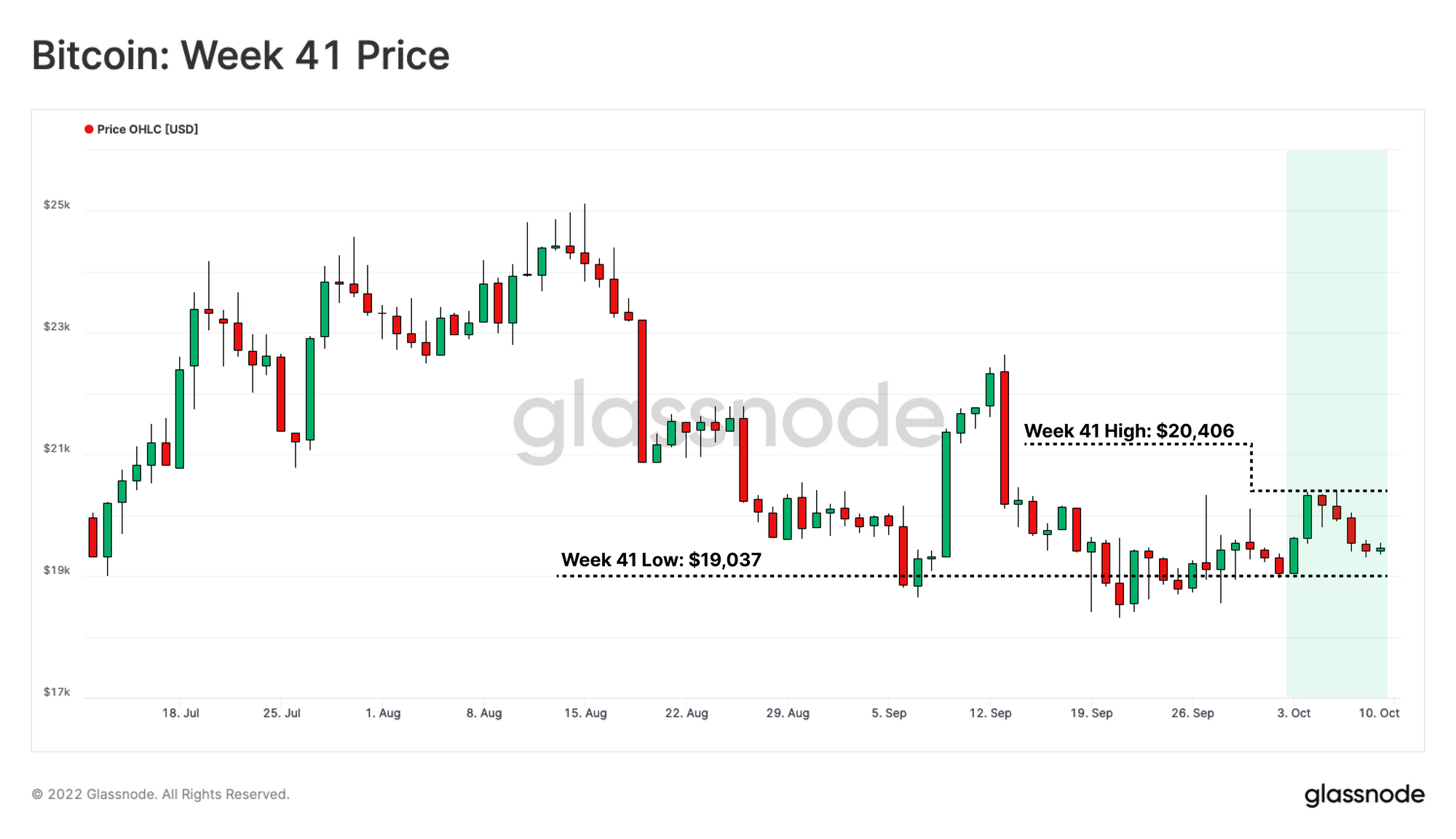
Bitcoin markets traded slightly higher this week, rallying from a low of $19,037 to a high of $20,406. Prices remain rangebound, consolidating for over 120 days since the major deleveraging event in mid-June.

As investors attempt to establish a bear market floor, we can compare the market structure to past cycle lows. In this edition, we undertake a series of studies assessing the behavior of Whale sized entities, and make adjustments to many bottom formation metrics, to better account for the influence of lost and long HODLed coins.

Translations

This Week On-chain is now being translated into Spanish, Italian, Chinese, Japanese, Turkish, French, Portuguese, Farsi, Polish, Arabic, Russian, Vietnamese and Greek.

The Week Onchain Dashboard

The Week Onchain Newsletter has a live dashboard with all featured charts available here. This dashboard and all covered metrics are explored further in our Video Report, which is released on Tuesdays each week. Visit and subscribe to our Youtube Channel, and visit our Video Portal for more video content and metric tutorials.


A Fragile Equilibrium

Generally, a sustained price momentum can often be associated with a supporting trend in net on-chain accumulation, or distribution. This correlation is often most heavily driven by larger entities’ behavior (i.e. High net worth Individuals, Whales, and institutional capital).

The significance of large entities can be gauged by their share of the total circulating supply. As the Relative Address Supply Distribution chart shows, bigger addresses (holding >100 BTC) has gradually declined from 70%, to 60% share in of the total supply since early 2011 (although note that the coin value has changed significantly over this time).

Live Professional Chart

The Accumulation Trend Score reflects the aggregated balance change intensity of active investors over the past 30 days, where a higher weight is assigned to larger entities. Approaching value of 1 indicates that, on aggregate, larger entities (or a large sub-set of the network) are adding meaningful volumes to their onchain balance (and vice versa for values close to 0).

Reviewing values during the later stages of the 2018-2019 bear market, a series of distinctive intervals can be identified:

  • Pre-Capitulation Equilibrium: While the spot price converges towards the long-lasting cycle baseline (dash line), the supply and demand sides remain in Equilibrium 🔲.
  • Capitulation: With price action breaking below the cycle baseline, the market enters a capitulation phase. Interestingly, the larger entities tend to intensify their Accumulation 🟢. These strong-accumulation intervals are usually followed by an Equilibrium 🔲 period.
  • Bottom Discovery: Throughout the bottom formation stage, due to the lack of demand, there are one or more incidents that a short-term rally is met with large entities Distribution 🔴 (known as Bear Market Rally).

Remarkably, after breaking the current cycle baseline at $30K, a series of consecutive events similar to the 2018-2019 bear market has taken place. Throughout the capitulation in early 2022, the Accumulation Trend Score indicates significant accumulation by large entities has taken place, as well as the seizure of the recent bear market rally to $24.5k for exit liquidity. At present, this metric suggests an equilibrium (neutral) structure in the market, which remains similar to early 2019.

Live Advanced Chart

To conduct a more detailed analysis, the Accumulation Trend Score by Cohort can be consulted. Here we compare the market structure to the post-capitulation stage of the 2018-2019 bear market.

We can see that large entities, particularly 1k-10k BTC wallets, contributed to a distribution event 🟥 during a rally off the lows in March 2019, and entered a period of equilibrium afterwards. Small retail-level participants (< 1 BTC) maintained heavy accumulation 🟦 throughout 2018 and 2019.

 Live Engine Room Chart

In our current market structure, and noting an approximate 10x in BTC prices, we can see very similar behavior occurring in large entities, however driven more so by the 100-1k BTC cohort during the August rally.

In addition to the relative neutrality across small to medium-address cohorts, the Accumulation Trend Score for whales holding 1k-10k BTC highlights aggressive accumulation since late September. Whales owning >10K BTC are biased towards weak distribution over recent months.

 Live Engine Room Chart

We can see increased net whale withdrawal volumes in recent weeks, with a net outflow from exchanges hitting 15.7k BTC, which is the largest since June 2022.

Live Professional Chart

We can calculate the cost basis for all whales who have been actively speculating over a chosen time period, can deliver a threshold level that is psychologically important to these investors. By price stamping the deposits and withdrawal volumes of the whale cohort (1k+ BTC) to/from exchanges, we can estimate the average price of Whale Deposits/Withdrawals since Jan-2017. This Whale cost basis is currently around $15.8k.

Live Professional Workbench

New Product Updates: September

September was an extremely exciting month for Glassnode, engaging our entire team, from engineering, data scientists, and analysts, to deploy a brand new suite of Ethereum Merge and Proof-of-Stake metrics. We released 8x Analysis Reports, 16x Metrics, 19x Workbench Constructions, and 2x Dashboards.

Read our Product Updates for September

Declining Profit and Rising Pain

As we discussed in Week 25, tracking the diminishing supply in profit is a powerful technique to identify points of elevated financial stress, which have exhausted sellers in previous cycles.

Surveying the Percent Supply in Profit during the bottom formation stages of prior bear markets shows that cyclical lows have generally occurred alongside supply profitability of 40%-42%. Currently, 50% of the circulating supply is in an unrealized profit, suggesting that supply profitability remains elevated in relation to historical analogues. This insinuates a full detox in profitability may not have occurred yet.

Live Advanced Chart

Moreover, the rising trend of cyclical lows in the Percent Supply in Profit graph has been a prominent pattern since the 2014-2015 bear market. A key driver of this macro trend is the impact of lost coins, and inactive supply (including the Patoshi coins). To investigate the effect of these coins, the chart below illustrates the total Supply in Profit alongside the Supply Last Active +7 Years Ago, which can be presumed lost or inactive.

Currently, 3.7M bitcoins have been inactive over the past +7 years, which is equal to 34% of the current Supply in Profit.

Live Advanced Chart

By adjusting the Supply in Profit 🟠 with this inactive supply, we can calculate the Adjusted-Percent of Supply in Profit 🔵. The resulting chart shows that at the lowest point of bear cycles tends to drop to around 39%, however with a similar conclusion; it has been worse in prior cycles.

Live Advanced Workbench

The intensity of implied financial strain on the remaining investors can be traced by the Relative Unrealized Profit metric. This indicator measures the normalized total profit of all coins in the supply, which adjusts for an increase in capital flows into the Bitcoin asset each cycle.

An investigation of historical data shows that when aggregated Unrealized Profit compresses to ~30% of the Market Cap, a large proportion of the selling pressure has been alleviated (seller exhaustion). The price depreciation since November 2021 has caused this ratio to sink to 0.37, reflecting a meaningful, but not as painful outcome as prior lows.

Live Advanced Chart

The Net Unrealized Profit/Loss (NUPL) is a metric which maps out the difference between unrealized profit and loss of the network as a proportion of the market cap. NUPL takes into account both the loss and profit held in the supply through various phases of a market cycle.

Since early June, NUPL has dropped into a compressed negative range of 0% to -15% on two separate events, lasting a total of 88 days so far. From a comparative perspective, NUPL has traded down to levels lower than -25% in prior cycles, and remained negative for between 134-days (2018-19) and 301-days (2014-15).

Note that NUPL cycle lows have also gradually climbed as a result of both lost and long HODLed coins.

Live Advanced Chart

Next, we can apply the same methodology utilized to adjust the Percent of Supply in Profit for the NUPL metric. This corrects for any contribution from inactive supply producing the Adjusted-Net Unrealized Profit/Loss (aNUPL) 🔵.

The key observation from this modification is that by removing the impact of >7 years old coin (inactive supply), aNUPL has has been trading below zero for the last 119 days which is comparable with the time length of prior bear markets’ bottom formation phase.

Also, the lowest value recorded for aNUPL (-39%) in the current bear market has dropped below the -25% threshold level, which indicates the severity of the ongoing undervalued market structure.

Live Advanced Workbench

Distribution of Pain and Gain

After evaluating the intensity of financial stress across the network, we can examine its distribution of across both Long-Term (LTH) and Short-Term Holders (STH). This analysis aims to identify equivalent market structure patterns during the bear market.

Looking at Short-Term Holder Supply in Profit/Loss, there are many instances where price corrections paused as the entire (>99%) of short-term holders’ supply fell into loss 🔵. At the moment, 18.1% of the total supply is in possession of STH, with 15.1% held at an unrealized loss. This leaves just 3% of supply held by STHs and in profit, which after such a prolonged downtrend, is likely approaching a degree of seller exhaustion.

Live Professional Chart

Studying the Long-Term Supply in Loss metric suggests that at points where LTH Supply in Loss surpasses 20% of the total supply 🔴, the probability of capitulation amongst these investors reaches a peak.

With over 31% of the supply now held by LTHs in loss 🟥, it is increasingly likely the market has passed this stage, which also suggests a similar condition to prior bottoming formations. The market has been in this phase for 1.5 months, with a previous cycle duration ranging from 6 to 10 months.

Live Professional Workbench

Finally, we can compare the average acquisition price per coin for the STH cohort 🔴 against the LTH cohort 🔵, to approximate the relative stress levels. As discussed in WoC 37, the continuous price depreciation during a prolonged bear market leads the STH Realized Price to fall below the LTH Realized Price 🟪.

This market structure denotes periods where the average cost of acquisition over the past 155 days, is now lower than the average LTH-cost basis. In other words, those who are just entering have a better cost basis than those who have weathered months of volatility.

This is a direct outcome of LTH capitulation, where coins purchased near the cycle top are sold and change hands at much lower prices.

Two weeks ago, the market entered into this stage and compared to prior bears, has taken between 145-days and 339-days to recover. With the LTH cost basis at $23.3k, and STHs at $22.1k, this sets a key price zone to expect resistance at first, but potentially greener pastures if prices trade higher, and stay higher.

Live Professional Workbench

Summary and Conclusions

Bitcoin prices have shown remarkable relative strength of late, amidst a highly volatile traditional market backdrop. Several macro metrics indicate that Bitcoin investors are establishing what could be a bear market floor, with numerous similarities to previous cycle lows.

Network profitability has not quite hit the same level of severe financial pain as past cycles, however adjustment for lost and long HODLed coins can explain a reasonable portion of this divergence.

In many ways, many on-chain metrics, market structure, and investor behavior patterns are dotting of the i's, and crossing the t's for a textbook bear market floor. A principle piece which is missing is duration, of which history would suggest there may be several months still ahead before a full recovery.


Translated channels

We are proud to have launched new social channels for:


--

Disclaimer: This report does not provide any investment advice. All data is provided for information purposes only. No investment decision shall be based on the information provided here and you are solely responsible for your own investment decisions.