A Case for Bitcoin Bulls and Bears

As the volatility of Bitcoin markets compress to historical lows, we present both the bull and the bear case for Bitcoin. We cover the $1.5B overhang of a miner deleveraging, weak on-chain activity, persistent draining of exchanges, and unwavering HODLer conviction.

A Case for Bitcoin Bulls and Bears

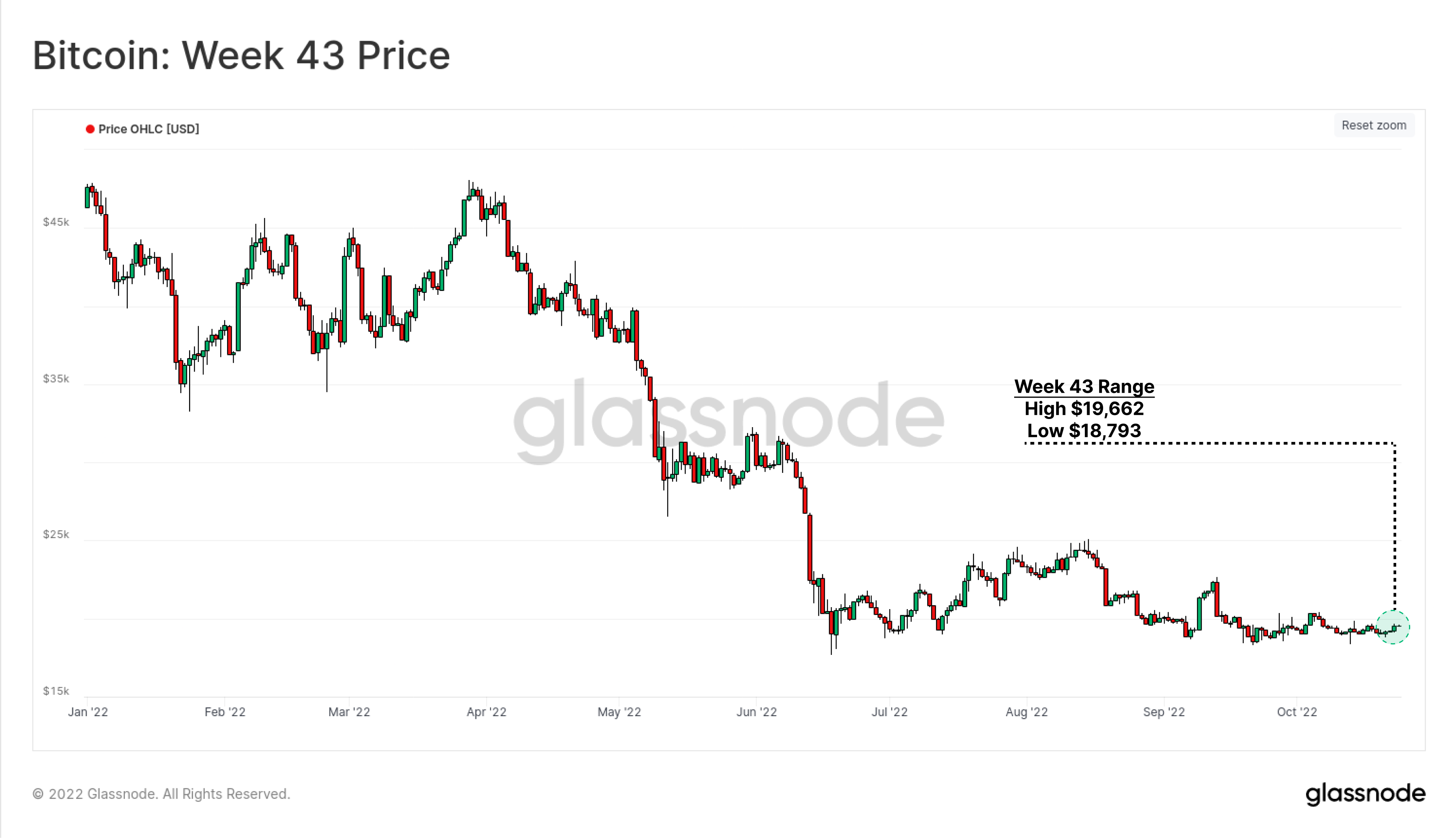
The volatility of Bitcoin markets have come to resemble those of a stablecoin, trading within an incredibly small $869 range. Just 4.6% separates the weekly low of $18,793 from the high of $19,662.

As covered in last weeks newsletter, periods of extremely low volatility for Bitcoin are very rare, and there are historical examples that have broken both higher, and lower, with extreme force.  Thus, in this weeks edition, we will lay out both a Bull and Bear case from a primarily on-chain perspective, covering the following topics:

  • On-chain activity and utilization of the network remains persistently weak, suggesting lacklustre network effect expansion.
  • Miners are on the cusp of severe stress, with some 78.2k BTC held in treasuries at risk.
  • Exchange BTC balances continue to drain, whilst an excess of $3B/month in stablecoin buying power is flowing in.
  • The HODLer cohort have reached all-time-high coin ownership, and steadfastly refuse to release coins back into the market.

Translations

This Week On-chain is now being translated into Spanish, Italian, Chinese, Japanese, Turkish, French, Portuguese, Farsi, Polish, Arabic, Russian, Vietnamese and Greek.

The Week Onchain Dashboard

The Week Onchain Newsletter has a live dashboard with all featured charts available here. This dashboard and all covered metrics are explored further in our Video Report, which is released on Tuesdays each week. Visit and subscribe to our Youtube Channel, and visit our Video Portal for more video content and metric tutorials.


🐻 A Case for the Bears

There is Nobody Home

On-chain activity is a powerful suite of tools for measuring and modelling network utilization. The simple interpretation framework is that network effects are constructive, and thus a sustained and positive momentum in Bitcoin user activity is likely constructive for the asset.

The chart below assesses the momentum of new on-chain addresses, comparing the short-term (monthly 🔴) vs long-term (yearly 🔵) moving average. As can be seen in Nov 2018, a failure of the monthly average to attain positive momentum was a precursor to a sell-off from $6k to $3.2k. Conversely, Jan 2019 represented a burst of new activity which propelled markets from $4k to $14k.

New Address Momentum is on the cusp of yet another push higher, but is yet to show a convincing 2019 burst of strength. With a slight curl over in recent weeks, this suggests a lacklustre inflow of new demand at present.


🔔 Alert Idea:New Addresses (30D-SMA) breaking above 410k would signal an improvement in momentum, and an early signal of a potential market recovery.

Live Advanced Chart

The growth rate of addresses with a non-zero balance has also stagnated since August, which is also similar to the November 2018 period. This indicates that despite there being some 400k New Addresses per day, there are as many which are being emptied of their entire balance.


🔔 Alert Idea: Non-Zero Balance Address Count breaking below 42.6M would signal a significant purge of wallets is underway, and may signal distribution and market weakness.

Live Advanced Chart

Transfer volume (USD) has also collapsed towards this cycle lows, falling to $19.2B/day. This is now below the transfer volume peak seen back in December 2017, and is only marginally higher than the lows in May to July 2021.

This indicates a significant degree of apathy exists within the Bitcoin network, with extremely muted on-chain activity suggesting a lacklustre read on network utilization, attention and user base growth.

It is very quiet on-chain.


🔔 Alert Idea: Change-Adjusted Transfer Volume (7D-EMA) breaking below $18B would signal a notable decline in network settlement throughput, and may signal further market weakness.

Live Advanced Chart

Of note however, is a recent character change observable in the mempool. The volume of coins transferred in transactions hitting our nodes mempool has seen a sustained burst higher since September.

Live Advanced Chart

The same can be seen in the number of transactions sent, with a very modest increase in the average fee rate paid. Whilst very early, and short-term in nature, this aligns with New Address Momentum approaching the yearly average.

These metrics provide a potential view of a changing tide, albeit require an uptrend to be established and sustained to increase the odds of a true market recovery. In the instance these turn out to be simply fleeting events, the macro negative trends described above are more likely to prevail.

Live Advanced Chart

Miners on the Cusp of Chaos

The mining industry has been in the spotlight of late, with hashrate and difficulty pushing to new all-time-highs (covered in WoC 40). This acts to increase the cost of BTC production, despite miner revenues per hash falling to all-time lows.

The Difficulty Regression Model is an estimated all-in-average cost of production, and is coincident with the spot price of $19.3k at the time of writing. A bearish cross-over was last seen in mid-2018, with a major mining industry capitulation following soon after, and persisting for several months.

Live Advanced Chart

Indeed, the mining Hash Price has reached all-time-lows this week, with miners earning just $66.5k/day per Exahash applied. With Hash Price now falling below the post 2020 halving lows, despite coin prices being ~2x, this demonstrates just how extreme the recent increase in hashrate competition has become.

Live Advanced Chart

In order to quantify the risk of miners distributing their treasuries, we need to first consult a metric which demonstrates our label coverage of Bitcoin miners. Here we use the Miner Block Subsidy as a proxy measurement of hashrate. The assumption is that any labelled miner who earns 10% of the block subsidy, won 10% of the blocks, and thus likely has 10% of the hashrate.

In the post March 2020 era, our labelled miners 🔴 cover upwards of 95% of the network hashpower (especially since the May 2021 Great Migration out of China). Unknown miners labelled as 'Other' 🟡 account for the remaining < 5%.

Thus, we can reasonably consider the balance held by all miners excluding Patoshi and 'Other', to provide a gauge on the coin volume at risk in miner treasuries.

Live Advanced Chart

The chart below shows that miner balances have increased by 10x since 2019, with a total of 78.2k BTC held today. This is worth $1.509B at a price of $19.3k, which is a non-trivial overhang for an increasingly distressed industry.

Of this, the vast majority is held by miners associated with BinancePool, Poolin, Lubian, and F2Pool. All have seen a stagnation of their balance in 2022, suggesting that prices below $40k have imposed income stress, and motivated a behavioural shift.

Live Professional Chart

Overall, the Bitcoin demand side, as measured by on-chain activity and network participation, is lacklustre to say the least. There are some green shoots of hope in the mempool, however there remains a $1.5B overhang of coins held by the mining cohort, whom are in extremely distressed territory.

A deleveraging event of miners may lead to distribution into thin orderbooks (WoC 42), historically light demand, and persistent macroeconomic uncertainty and liquidity constraints.


🐂 A Case for the Bulls

Exchanges Drain

Despite fairly unimpressive on-chain utilization profile, the net impact of the transactions which are taking place maintain a constructive undertone.

October has seen a marked shift in balance change behaviour by most wallet cohorts. Cohorts from Shrimp (< 1BTC) through to Whales (up to 10k BTC) have altered their behaviour from one of net balance decline and distribution 🟥, and towards one of net accumulation and balance increase 🟦.

Given prices have remained flat and of low volatility, this suggests a tendency towards patient accumulation at range lows.

Live Professional Chart (Glassnode Engine Room)

This can be visualized in the URPD chart, broken into Short-Term Holders (STHs, 🔴) and Long-Term Holders (LTHs, 🔵). We can see that the volume of coins changing hands to new recent buyers (STHs) increases notably at prices between $18k and $20k, reinforcing the observations above.

A significant 'air-gap' exists between $12k and $18k, where very little coin volume has transacted, and thus price discovery to the downside could be highly volatile in the event the bulls fail to hold the line.

Also apparent is a very large distribution of coins held by LTHs at prices well above $30k. As we have covered in prior editions (WoC 39), these Bitcoin holders are the least price sensitive, and at this stage, could be argued to be at peace with their held unrealized losses.

Live Professional Chart (Glassnode Engine Room)

The reserves held on exchanges have also continued their relentless decline, dropping to multi-year lows throughout October, and retracing back to Jan 2018 levels. In effect, all coin volume which flowed into exchanges since the last cycle high, has now been withdrawn into a non-exchange associated wallet.

October alone saw 123.5k BTC withdrawn, equivalent to 0.86% of the circulating supply. Whilst exchange reserves alone are not a signal unto themselves, within the context provided above and below, it provides a constructive backdrop.

Live Advanced Chart

Coinbase has seen a very large scale net withdrawal of -41.6k BTC this week, bringing the total decline from the post-March 2020 balance peak to -48.4%. It is important to note that these outflows are based on our best estimate wallet clusters, and appear to be a combination of coins flowing into both investor wallets, and/or institutional grade custody solutions.

At the very least these wallets have not intersected with any other exchange related wallets, and thus are highly likely to reflect a changing of hands.

Live Advanced Chart

Another observation associated with exchanges is the balance between the 30-day net flows of the two major assets, BTC and ETH, compared to the combined 30-day net flow of the four largest stablecoins USDT, USDC, BUSD and DAI.

This metric consists of two components:

  1. The barcode will return 🟠 when the flow of BTC and ETH  into exchanges is positive (i.e. net USD denominated inflows of the two major assets).
  2. The net position change will return 🟢 when the flow of stablecoins into exchanges is larger than the USD value of BTC and ETH (positive buying power), and conversely will return 🔴 when more BTC and ETH value has flowed in than stablecoins (negative buying power).

At the moment, we can see that the 30-day netflow of BTC and ETH has been withdrawals, and simultaneously, an excess of $3B/month in stablecoins have flowed into exchanges, increasing relative buying power.

USD reserves are increasing, whilst coin available to buy is declining.

Live Advanced Chart

HODLers HODL On

With the on-net flows through exchanges appearing to have a bullish lean towards appreciable accumulation, we can then assess whether there is any loss of conviction amongst existing longer-term holders.

The total USD wealth held in BTC, valued at the time of each coins last transaction, is now disproportionately skewed to longer-term holders. The proportion of wealth held in coins that moved in the last 3-months is now at an all-time-low. The reciprocal observation is that wealth held by coins older than 3-months (increasingly held by HODLers) is now at an all-time-high.

Live Advanced Chart

This is further validated by the Binary Liveliness metric, where we can draw two key observations:

  1. The steepness of the Liveliness decline is accelerating, indicating the market is very heavily aligned with HODLing style behaviour. Old hands are simply not spending.
  2. The Binary Liveliness oscillator, which compares recent steepness vs a rolling 30-day baseline, is at extreme lows. Such events are coincident with extreme HODLing behaviour, usually seen during early-mid stage bear market accumulation (the grind), and immediately prior to bullish reversals (a supply squeeze).
Live Advanced Chart

To close, we can confirm the above observations have a bullish bias by observing the trend and magnitude of long-term holder supply. Here we have two traces shown:

  • 🟣 Shows the actual trace of LTH-Supply, which is now at an all-time-high of 13.82M BTC, representing 72% of circulating supply.
  • 🟠 An offset applied to LTH-Supply, moving it backwards by 155-days. This is an attempt to model where the original acquisition took place by this cohort.

Inspecting the latter 🟠 curve, we can see a very similar bear market pattern to 2018 emerges with respect to the LTH acquisition behaviour. Of the most interest however, is the extremely strong upwards trajectory ↗️ throughout the LUNA collapse in May 2021.

Despite prices having since sold off 56%+, from $40k down to sub-$18k, an industry wide deleveraging event, and historic global macro-economic turmoil, the LTH cohort added significantly to their holdings throughout this period.

Live Professional Chart

The bullish case for Bitcoin at present is one of unwavering conviction, and persistent balance growth by the HODLer cohort. Liquid coins continue to flow out of exchanges, relative stablecoin buying power is increasing, and extreme volatility and severe downside has thus far failed to shake out Bitcoins most die-hard believers.

Summary and Conclusions

In this edition, we sought to provide a bearish and bullish case for Bitcoin given the historically low volatility profile, which rarely ends with a whimper. With a likely explosive move on the horizon, we can use on-chain data to gauge the supply an demand balance.

The Bear Case is one of a historically low on-chain utilization profile, and a looming miner deleveraging event. With a $1.5B miner overhang, being just one source of distressed BTC, and multi-year lows in both trading and transfer volumes, significant distribution may meet thin orderbooks.

The Bull Case takes a view on the HODLers of last resort, whereby the supply flows out of exchanges, and into HODLer wallets is at an all-time-high. Despite being small in relative number, the conviction of Bitcoins die-hard believers is unshaken, and their balance continues to grow, through thick and thin.


Product Updates

All product updates, improvements and manual updates to metrics and data are recorded in our changelog for your reference. See our latest Product Update for September for a full overview of or latest metrics, workbench constructions, analysis and insights.

September Product Update

Translated channels

We are proud to have launched new social channels for:


Disclaimer: This report does not provide any investment advice. All data is provided for information purposes only. No investment decision shall be based on the information provided here and you are solely responsible for your own investment decisions.