The Road to Recovery

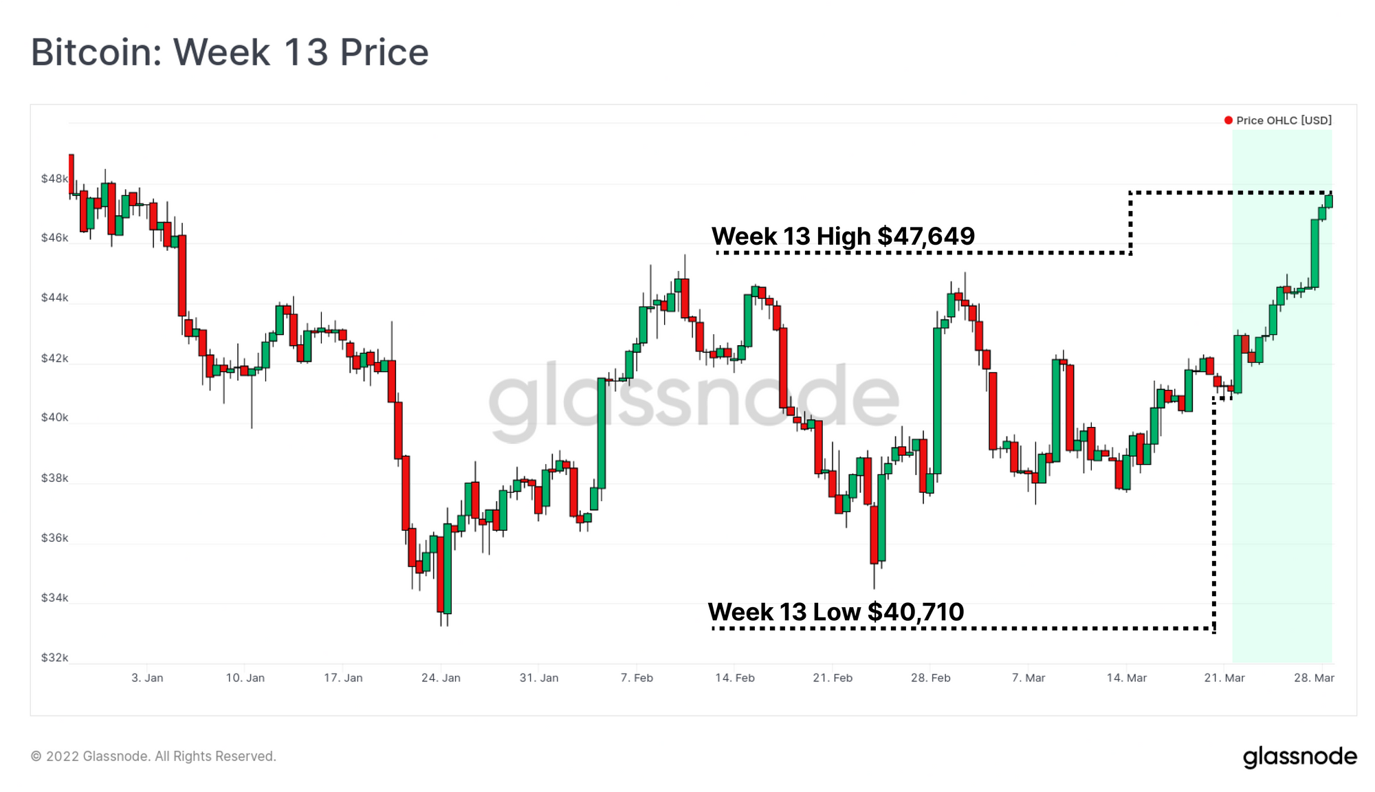
The Bitcoin market has seen a stronger week, rallying off the lows of $40,710, and breaking out of the consolidation range to a new local high of $47,649. This is the first sustained rally after many months of sideways choppy price action.

Over the last few months, we have outlined various cases and angles that describe Bitcoins market structure as being in what is most likely a bear market, arguably commencing as far back as May 2021. However, as the market saying goes, bear markets author the bulls that follow.

The process of bottom formation and investor capitulation in a bear market is often a lengthy and painful process, and Bitcoin is by no means out of the bearish woods yet. Nevertheless, in this edition we seek to look further out, in an attempt to identify metrics that are indicate whether a constructive recovery is underway in the longer term.

Executive Summary

  • The proportion of coin supply aged 1yr+ is rapidly approaching all-time-highs, as coins accumulated in Q1 of the 2021 bull market remain unspent in investor wallets.
  • This generally signifies that Bitcoin investors maintain a strong conviction in the asset, despite the many macro and geopolitical headwinds.
  • Comparing these supply dynamics to past cycles, it is most likely that Bitcoin is well into the second half of the bear market.
  • There is however modest spending taking place by owners of more mature coins (possible smart money divestment), however heavy accumulation appears to have taken place between $35k and $42k absorbing the sell-side pressure.
Translations

This Week On-chain is now being translated into Spanish, Italian, Chinese, Japanese, Turkish, French, Portuguese, and Farsi.

The Week Onchain Dashboard

The Week Onchain Newsletter has a live dashboard with all featured charts available here. This dashboard and all covered metrics are explored further in our Video Report which is released on Tuesdays each week. Visit and subscribe to our Youtube Channel, and visit our Video Portal for more video content and metric tutorials.


Old Supply Approaches New Highs

One of the foundational tools we use to assess investor conviction in on-chain analysis is coin lifespan (or coin age). Lifespan is broadly defined as the period of time since the coin was last moved (time since UTXO creation).

Statistically speaking, the longer a coin remains dormant, the more likely it is to remain so. Given Bitcoin's characteristic volatility, investors who hold coins for an extended period of time are more likely to experience wild price swings, and are thus more likely to be experienced, and higher conviction HODLers.

As we approach the end of Q1-2022, we can see an extraordinary increase in the proportion of coins aged 1yr+, which has risen by 9.4% of circulating supply over the last 8-months. These coins largely reflect BTC volumes accumulated in the Q1-2021 phase of the bull market and the owners have thus held through two 50%+ drawdowns, and three all-time highs. This recovery is quite similar in scale and duration to the 2018-19 recovery.

Live Chart

Whilst the chart above shows BTC volume > 1yr as a proportion of circulating supply, it is also useful to know how much USD denominated 'wealth' is held in those coins. The reality that most investors make decisions regarding portfolio allocations in relation to its fiat denominated value, and cost basis, and thus proportional USD value is very relevant.

The Realized Cap HODL waves  are the ideal tool for this assessment, and the chart below is filtered for these same 1yr+ old coins. We can see the following:

  • Q2-Q4 of 2021 has many similarities to past bear markets where the total wealth held in 1yr+ coins reached a cycle minimum from May to Dec 2021.
  • Bear Phase 1: When a low proportion of wealth is held by older, more experienced investors, it means the converse is true, and much of the wealth is held by newer, less experienced investors, which is top formation and bear market material.
  • Bear Phase 2: This wealth disparity is recovering strongly as more coins transition into 1yr+ age bands, and more wealth, with a higher cost basis is is HODLed (setting a higher floor value than the last cycle).

The current market is in the process of recovering (Phase 2), however it can be seen in past cycles, this process can take many months for a price floor to fully form, and find sustained upside momentum.

Live Chart

On-chain analysts will often consider an abundance of 'older coins' as a signal of market strength and conviction for the following reasons:

  • Macro increases in the aggregate lifespan of the coin supply show a desire to hold BTC, despite volatile price swings, suggesting higher investor conviction, and future value expectations.
  • It reflects a general reduction in 'liquid' coin supply available for marginal buyers purchase as a result of historical accumulation by 'smarter money' buyers.

The RHODL Ratio captures this behaviour into a single elegant oscillator. It calculated as the ratio between 1-week old, and 1yr-old Realized Cap HODL Wave bands. It will peak when a maximum USD wealth is held by new investors (market tops) and bottom when more of the wealth is held by 1yr age bands (market bottoms).

Here we can see a macro downtrend is in now play, reflecting the growth in 1yr+ coins moving into the metric denominator. RHODL currently describes a balance between new, and experienced HODLers that is coincident with late stage bear markets, and also with early stage bull markets. Note however that only in 2012 was RHODL in a macro downtrend, whilst market pricing was in a bull market.

Live Chart

Another oscillator that captures an impressive amount of investor psychology one elegant curve is Reserve Risk. This metric will trade at low levels when there is heavy investor accumulation and HODLing is the preferred market strategy. Conversely, it is extremely reflexive to the upside (requires a log scale) when these experienced investors exit their positions.

Reserve Risk has traded at historically undervalued levels for 77-days so far, although this is far shorter than the multi-year periods seen in 2015-17 and 2018-20. Note however that Reserve Risk generally signals undervaluation well into the bull market as HODLers typically commence distribution only after a new price ATH is set (explored further here).

Live Chart

Visit our Reserve Risk metric user guide, or video tutorial below for more information.


Short Term Support meets Long-Term Spending

As is seen in the above metrics, the transition from bear to bull is rarely obvious at the time, and usually takes long periods of time to play out. An underlying reason for this is that even the strongest of hands may take exit liquidity during bear market rallies to conserve and maximise capital efficiency.

If we look to the Spent Volume Age Bands (SVAB), we can see that a sizeable portion of the 6-month+ aged coins have increased their spending throughout March. Around 2% of all on-chain transaction volume is associated with these coins which is relatively significant.

Live Chart

This is confirmed by looking to Revived Supply 1yr+, which demonstrates that between 7k to 10k BTC aged 1yr+ have been spent per day over the last 30-days. There are two takeaway interpretations from this:

  • Older coins are on the move during this price consolidation, which suggests a degree of investor uncertainty, and de-risking is taking place. This is likely to create overhead supply that must be absorbed.
  • Market prices have not broken to new lows despite this additional sell-side pressure, suggesting that there has been sufficient demand to absorb this expenditure.
Live Chart

Returning the the Realized Cap HODL waves, we will now look to the younger coin bands, aged 1-month and less. Here we can see that around 16.23% of the USD wealth stored in Bitcoin is currently held in these younger age bands. These bands will swell only when the above older coins are spent and change hands to newer buyers.

During late stage bears, these age bands tend to reach relative minimum values, as all remaining speculators and market tourists leave the space, and smarter money accumulate coins at cheaper prices. The proportion of value held in these age bands is similar to the 'disbelief and exit liquidity' periods of 2012, 2016 and 2019-20.

Live Chart

Supporting the suite of observations above, we have the Realized Price Distribution of the current UTXO set (TA analogy: on-chain volume profile). This version is an unreleased version of the URPD that is broken into Long-term and Short-Term Holder cohorts.

What we can see two important observations:

  1. Long-Term Holders still hold a very large proportion of supply that was acquired at higher prices (> $45k). These coins are holding an unrealized loss, and likely have been for a number of months. It is notable that these investors are yet to liquidate, suggesting strong sentiment persists.
  2. Short-Term Holders have accumulated a large proportion of the supply between $38k and $45k. This indicates that many investors see the current consolidation range as a value zone, and this has similar characteristics to the $30k to $40k range of May-July 2021 (explored in Week 29, 2021)

Risks remain that these buyers may be sensitive to any downside volatility. However, the degree of accumulation that appears to have taken place during this consolidation range, especially in the face of world changing macro and geopolitical risks, is truly a signal of strength and conviction in Bitcoin.

Unreleased Metric from the glassnode Engine Room

Short-Term Pain for Long-Term Gain

Bitcoin bear markets have historically ended with one last major flush out. A capitulation event that shakes out even the most hardened HODLers. Examples include Jan 2015, Nov 2018, and March 2020, all of which saw Bitcoin prices drop over 50% in just a few days.

During these events, All remaining sellers are exhausted, and we typically see both profitable coins and underwater coins sold at scale. The chart below presents the degree of profit/loss realised on coins specifically sent to exchanges (most likely for sales).

We can see that we have experienced two such events in the last 12-months, although they are of notably smaller magnitude relative to the 2018-20 bear cycle. Given two 50% drawdowns in this time, it is more likely this reflects increased investor confidence in Bitcoin as a viable asset on the macro stage.

Unreleased Metric from the glassnode Engine Room

The concept of 'realized value' is captured entirely within the Realized Cap, which reflects the aggregate investor cost basis for the Short-Term and Long-Term Holder cohorts. The chart below shows:

  • The Short-Term Holder Realized Cap (pink) is more volatile, and typically provides resistance in a bear market (investors selling at their cost basis). It is currently trading at $45.9k. This is a key level to watch in case the market can break and hold it, which may suggest a regime shift towards greener pastures.
  • The Long-Term Holder Realized Cap (blue) is much slower moving, lags the standard Realized Price (orange) by ~155-days, and rarely trends downwards.

A downtrend in the LTH Realized Cap indicates that the aggregate LTH cost basis is declining. This can only happen when

  1. LTHs who bough the top capitulate, or
  2. When 155-days ago LTHs accumulated large coin volumes at cheaper prices.

Given 155-days ago was the October ATH, this makes point 1) the more likely outcome, suggesting LTHs have, or are well into the process of capitulation.

Live Chart

To Finalise this observation, we introduce the LTH Realized Cap Net Position Change Z-Score. This metric:

  • Calculates the 30-day change in LTH realized cap as a gauge for USD denominated capital inflow/outflow into this cohort.
  • Converts to a Z-Score to enable comparison to past cycles where USD valuations were much smaller.
  • High Values indicates that large volumes of USD value are maturing into LTHs status, lifting their aggregate cost basis.
  • Low Values indicate that the LTH cost basis is declining significantly, driven by points 1) and/or 2) above.

What we see is that LTHs are currently experiencing the largest decline in their aggregate cost basis in history, with the Z-Score is trading 2.33 standard deviations below the mean. When coupled with the URPD metric and the Profit/Loss bands to exchanges metric, this describes a very healthy redistribution of coin supply from higher prices, into a new floor range between $38k and $45k.

Live Chart

Summary and Conclusions

Bitcoin bear markets can be long, painful, and drawn out, however they have the ultimate result of reshuffling supply ownership away from weaker, and towards stronger hands. Bitcoin has seen fairly heavy accumulation occur between $35k and $42k, suggesting many investors see a value zone in the current consolidation range.

There is modest spending taking place over the past few weeks, with much of it being coins held at a loss. As a result, the aggregate cost bases of both Long- and Short-Term holders are in decline, the former to a historically significant degree. So far the Bitcoin bulls have provided adequate support


Product Updates

All product updates, improvements and manual updates to metrics and data are recorded in our changelog for your reference.


Disclaimer: This report does not provide any investment advice. All data is provided for information purposes only. No investment decision shall be based on the information provided here and you are solely responsible for your own investment decisions.